Hey there, sales rockstars! Let’s achieve greatness together in the world of sales and marketing management! Let’s chat about something that’s gonna supercharge your sales game – Sales Collateral. Buckle up, because we’re about to dive deep into this game-changing tool that’ll have your prospects practically begging to buy from you!
What’s the Deal with Sales Collateral, Anyway?
Alright, picture this: Sales collateral is like your sales team’s trusty sidekick. It’s Batman’s Robin, Sherlock’s Watson, or even your morning coffee! It’s that collection of media that jumps into action to support your sales reps during their epic quest to win over clients.
In plain English? It’s all the cool stuff your sales squad uses to convince clients that your brand is the bee’s knees in the competitive market. We’re talking everything from snazzy brochures to mind-blowing product demos and sales pitches to case studies. It’s content marketing made easy for your sales team to use
Now, you might be wondering, “How do businesses actually use this sales collateral stuff?” Well, my friend, it’s not a one-size-fits-all situation. Think of it like an all-you-can-eat buffet – the options in your sales content are endless, and it all depends on what makes your prospect’s mouth water!
But here’s the kicker – sales collateral isn’t just a one-hit wonder. It’s the gift that keeps on giving! Like a master chef repurposing leftovers into a gourmet meal, you can recycle, repurpose, and repackage your sales collateral to keep wowing your customers time and time again.
To really make your sales collateral sing, it needs to hit three key notes:
- On-brand: It should scream “This is us!” from the rooftops.
- Client-centric: Make your prospects feel like it was made just for them.
- Sales enablement friendly: It should play nice with your sales enablement strategies.
Think of sales collateral as your 24/7 salesperson. While your human sales team is catching some Z’s, your collateral is out there, working its magic, attracting new customers, and boosting those sales numbers. Now that’s what I call a hard worker!
Why Should You Care About Sales Collateral?
Okay, so now you’re probably thinking, “This sounds great and all, but why should I really care?” Well, buckle up, buttercup, because I’m about to blow your mind with the importance of sales collateral!
First off, sales collateral isn’t just some fancy term for paperwork or digital stuff. Nope, it’s so much more than just a practice in marketing! It’s like the secret sauce that makes your prospect’s experience absolutely delicious while making your sales team’s life a whole lot easier. It’s the meaty content that complements your sales process like a fine wine pairs with a gourmet meal.
But wait, there’s more to this effective sales strategy! Let’s talk benefits:
- Client Magnet: Good sales collateral is like a tractor beam for new clients. It pulls them in and keeps them orbiting your brand.
- Sales Booster: It’s like giving your sales numbers a shot of adrenaline. Watch those figures climb!
- Journey Aligner: It’s the GPS of the buyer’s journey, guiding prospects from “Who are you?” to “Shut up and take my money!”
- Content Buffet: It serves up helpful, tasty content at every stage of the buyer’s journey. Yum!
Now, if you’re in the B2B world, sales collateral is your new best friend in effective sales management. Why? Because B2B buyers are like information sponges – they need to soak up all the details before they make a decision. Your sales collateral is like a well-organized library, giving them all the juicy details about your products, services, and solutions in one handy package. Plus, it keeps your brand front and center in their minds. Talk about staying power!
But here’s where it gets really exciting. Sales collateral doesn’t just impact the sales process – it defines it! It’s like the director of a blockbuster movie, orchestrating every scene from awareness to advocacy. It can turn tire-kicking leads into paying clients faster than you can say “Where do I sign?” How? By building trust and showcasing your brand’s value like a boss.
Remember, though – one size doesn’t fit all in the world of sales collateral. You’ve got to tailor your approach for each stage of the buyer’s journey with effective sales collateral. It’s like dressing for a date – you wouldn’t wear the same outfit to a coffee shop meetup as you would to a fancy dinner, right?
So, there you have it, folks! Sales collateral isn’t just important – it’s your secret weapon in the battle for sales supremacy. Ignore it at your peril, or embrace it and watch your sales soar!
How to Whip Up Persuasive Sales Collateral That’ll Make Your Prospects Drool
Alright, sales champions, let’s roll up our sleeves and dive into the nitty-gritty of creating sales collateral that’ll have your prospects reaching for their wallets. Don’t worry, it’s not rocket science – with a few smart strategies, you’ll be crafting collateral like a pro in no time! We’ll dive into some sales collateral examples and ideas too.
Know Your Audience (Like, Really Know Them)
First things first – you’ve got to get inside your buyers’ heads. What keeps them up at night? What makes them tick? Understanding their needs and pain points is like having a cheat code for creating killer collateral. The more you know, the more personalized and effective your materials will be. Remember, in the world of sales collateral, one size definitely does not fit all!
Content is Still King (Long Live the Sales and Marketing King!)
Now, let’s talk about the meat and potatoes – your content. It should always, always, always offer value. Think about how your product or service can swoop in and save the day for your buyer. Then, present that solution in a way that’s clearer than a mountain stream and more engaging than a Netflix binge. And don’t forget to keep your message aligned across all stages of the buyer’s journey – it’s all about that seamless experience, baby!
Consistency is Queen
Here’s a pro tip: keep your brand voice consistent across all your materials. It’s like your brand’s signature – it should be recognizable whether it’s on a napkin or a billboard. This consistency makes your business stick in your prospects’ minds like that catchy tune you can’t get out of your head. And in sales, being memorable is half the battle!
Designing Sales Material
Ready to make your collateral look so good it hurts? Start with clarity. Your design should be cleaner than a whistle and easier to understand than a traffic light. Avoid clutter like the plague – you want your prospects diving into the effective sales funnel, not running for the hills.
Strike a balance with your info. Too much, and you’ll overwhelm them. Too little, and they’ll be left wanting. It’s like Goldilocks – you want it juuuust right.
And let’s not forget about visuals! They say a picture is worth a thousand words, so make those images count. Use them to drive your message home, but make sure they play nice with the rest of your content.
Last but not least, make your call-to-action (CTA) pop like fireworks on the 4th of July. Your CTA is the grand finale that guides prospects to make that buying decision. Keep it short, sweet, and impossible to resist!
Types of Sales Collateral: A Buffet of Options
Let’s talk about the different flavors of sales collateral. Just like a well-stocked buffet, you’ve got options for every taste and every stage of the buyer’s journey. Effective sales and marketing teams use sales collateral to move prospects along the pipeline, and every piece of sales collateral has it’s place in the buyer journey. Let’s dig in!
Awareness Stage: The Appetizers
At this stage, you’re trying to catch your prospect’s eye with an engaging idea. It’s like being the peacock of the sales world – you want to stand out and get noticed. Here’s what’s on the menu:
- Blogs: Bite-sized pieces of wisdom that leave them wanting more.
- Ebooks: The all-you-can-eat buffet of information.
- Webinars: Like a TED talk, but for your product. A time to showcase a unique feature or component of your product, solution, or industry.
- Social media content: The amuse-bouche of the sales world – small, but packing a punch! New feature releases, changes in the market, even a “day in the life” can be valuable to share on social media.
Consideration Stage: The Main Course
Now we’re cooking! Your prospects are interested, and it’s time to serve up some hearty content. Here’s a few examples of Sales Collateral you can use to speed prospects along and improve their likelihood to buy:
- Datasheets: The nutrition facts of your product. This type of collateral can contain details of your product or solution, and highlight it’s characteristics. You can even compare your data sheet against a competitors if it’s in your favor.
- Case studies: Real-life success stories that make your product the hero. Bonus points if the case study is of a peer in their network, or in their market. Case studies equip your sales team to show prospects examples of great successes others have had with your product.
- Buyer’s guides: The roadmap to making the right choice (spoiler: it’s you!). This type of collateral can help make the buying process less intimidating.
- Product brochures: The glossy magazine spread of your offerings. Highlight the best parts of your product, and make it easy for prospects to learn more! These can help your sales team understand where your prospect is most interested
- ROI Calculators: Showcase how your products or products like yours make a difference, and propel them/ their company upward. These can be included with case studies for a truly tasty meal.
Decision Stage: The Dessert
This is where the rubber meets the road. Your prospect is ready to buy, so let’s seal the deal:
- Pricing guides: The price tag that shows your value in the sales funnel.
- Agreements: Allow your prospect to clearly visualize what you are providing and what they are agreeing to – making it easy to digest and effectively organized can help prevent confusion and mitigate churn later.
- Product presentations: The grand unveiling of your solution. Sales presentations can be difficult, but doing them by showcasing your product makes it easier for your prospects to digest and enjoy.
Retention and Advocacy Stage: The After-dinner Mints
You’ve won them over, now keep them coming back for seconds:
- Onboarding programs: The welcome wagon for new customers.
- Customer newsletters: The “What’s new?” of your business world.
- Customer surveys: The suggestion box that shows you care.
Other: Sales Enablement Collateral
You can think of these as the ovens in the kitchen helping you cooking up all the right sales collateral for your prospects.
- Sales playbooks: An essential guide for your reps to know which direction to go as they’re asked questions by clients. If you don’t have an official one, it’s anyones guess as to what’s being said or sent. A playbook makes it easy to know what to do next, and keeps your sales enablement content streamlined and effective for your sales representatives.
- Sales call scripts: The secret recipe for closing the deal. Sales call scripts can help sales personnel keep on track when on the phone with potential prospects. B2B sales often have a lot of calling by BDR and LRR reps – make it easy for them with a sales call script.
Remember, these aren’t one-and-done deals in your sales cycle. Like a master chef, you can recycle and repurpose these ingredients to create new, exciting dishes that keep your customers coming back for more!
Marq: Your Secret Ingredient for Killer Sales Collateral
Now, let me let you in on a little secret – Marq. It’s like having a sous chef in your sales collateral kitchen, and boy, does it bring some spice to the table!
First off, Marq’s got this cool SalesForce/Hubspot Integration. It’s like having your information Bat-Signal – always keeping your data in sync. This means your sales team can dish out personalized, on-point info to prospects faster than you can say “closed deal.” And, your marketing team can create marketing collateral and keep every piece of content on brand.
But wait, there’s more! Marq’s got customizable templates that’ll make your collateral look slicker than a greased pig. And with their fast sales collateral feature, you can whip up materials quicker than a short-order cook. Less time making documents means more time making deals. Ka-ching! That’s the sound of achieving your sales goals!
And let’s not forget about sales automation. It’s like having a robot assistant that never sleeps, automating tasks like sending emails or scheduling calls for your sales reps. Marq can fit into your current automations, making personalized content creation and delivery as seamless as ever.
Remember, your sales collateral is the supporting actor in your customers’ buying journey. It’s Robin to your Batman, Watson to your Sherlock. With tools like Marq in your utility belt, creating sales collateral becomes less of a headache and more of a superpower.
You Can Produce Great Sales and Marketing Collateral
After diving deep into sales collateral, we clearly see its weight in successful marketing and sales strategies. We’ve unraveled its utility in businesses, its crucial importance, the way to create persuasive materials, and the various types it includes. Finally, we’ve touched on how Marq can simplify and enhance the creation process. With proper sales collateral, we streamline our messaging and respond swiftly to market opportunities. You’re now armed with everything you need to know about sales collateral. Now go forth and conquer those sales goals! Your prospects won’t know what hit ’em!
This is a list of artificial intelligence (AI) design tools, statistics and trends of their usage, current standing and growth updated through 2023.
In the rapidly evolving world of design, artificial intelligence is making a profound impact.
From Midjourney to Mar, AI design tools are empowering creative professionals to streamline workflows, boost productivity, and create cutting-edge designs with unprecedented ease.
We’ll explore these data-driven insights and how these tools are revolutionizing the way we conceptualize, iterate, and execute design projects. While this list is by no means exhaustive, it is rather comprehensive to give you a good idea of some leading Design tools that are utilizing AI to their advantage and the advantage of their users.
Contents
The Rising Demand for AI Design Tools
Interest in AI design by State in the United States
The Impact on Design Efficiency
Enhanced Personalization and User Experience
The Power of AI in Creativity
AI Design Companies, Trends, and Statistics
- Figma
- Adobe Firefly, XD & Illustrator
- Sketch
- Axure RP
- Marq
- Framer
- InVision
- Proto.io
- Midjourney
- Canva
- Dream Studio
- CorelDRAW
- TopazLabs
- Uizard
- Autodraw
Growth in AI-Integrated Design Platforms
Data Security and Privacy Concerns
Bridging the Gap Between Designers and Developers
Conclusion
The image below comes from explodingtopics.com showcasing some of the high level statistics of the AI industry as a whole including all types of generative AI including but not limited to design.

The Rising Demand for AI Design Tools
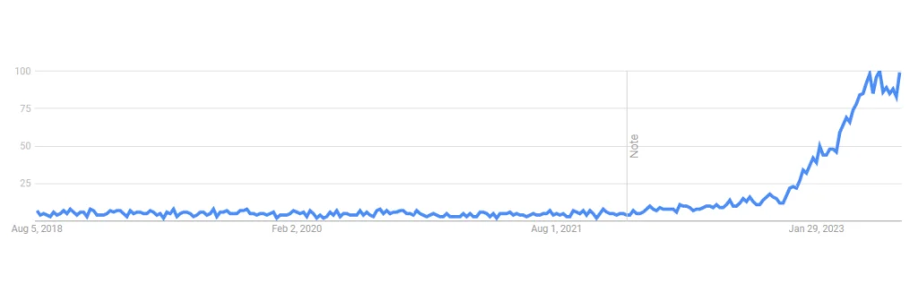
The demand for AI design tools has witnessed an unprecedented surge in 2023. According to Google trends, the search volume for AI design related tools and software has increased 1700% from 2022 to 2023 alone.
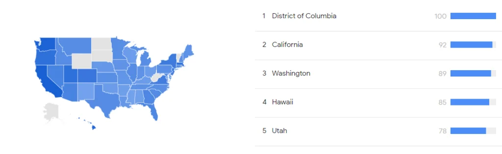
Interest in AI design by State in the United States
The interest in AI design when broken down into sub topics and related queries spans from ai image generation to Ai design tools that allow teams to take components of AI and marry them to their own brand and designs speeding up and making more efficient their own design teams and processes.
The interest in AI design across the United States is ubiquitous. The regions/states in the top 5 positions of high interest are; 1. District of Columbia 2. California 3. Washington 4. Hawaii and 5. Utah
The Impact on Design Efficiency
AI design tools have proven instrumental in streamlining design workflows. By automating repetitive tasks and offering real-time suggestions, these tools save designers valuable time and effort. Surveys indicate that a significant percentage of design professionals believe that AI has significantly improved their design efficiency, allowing them to focus on more creative and strategic aspects of their work.
IDC suggests that generative design, even more broadly generative AI, finds value in creating something for humans to react to. With AI’s initial start and its recommendations overseen by humans creates increased velocity and efficiency in creating on-brand design.
Enhanced Personalization and User Experience
In the age of personalized experiences, AI design tools are helping designers cater to individual user preferences more effectively. By analyzing user data and behavioral patterns, AI-powered tools provide valuable insights into user preferences and expectations. This data-driven approach enables designers to craft highly tailored and user-centric designs, resulting in enhanced user experiences.
Per Gartner, “A good experience designer brings user insights from research as well as knowledge of human psychology – and blends them with the organization’s product vision”. They continue, “Advances in AI will mean that designers spend less time building . . and more time focusing on solving real problems for users”.
The Power of AI in Creativity
Contrary to the misconception that AI stifles creativity, statistics reveal that AI design tools foster innovation and creativity. With AI-generated design suggestions and intelligent pattern recognition, designers are inspired to explore novel ideas and experiment with new concepts that they may not have considered otherwise. This synthesis of human creativity and AI assistance leads to groundbreaking and aesthetically captivating designs.
AI Design Companies, Trends, and Statistics
As mentioned above, the interest in AI design is wide because the use case of artificial intelligence in design is also quite wide. While AI image generation alone has made massive strides in 2023, for many companies looking to streamline their own design teams and processes, the AI images alone don’t fit the bill. Which is why there are design tools now that offer AI as a part of the complete design tool. *Data provided by Crunchbase, SEMrush, and Google Trends.
1. Figma:
Figma is a collaborative design tool that allows teams to work together on UI/UX design, prototyping, and user testing. It has plugins and integrations that support AI design-related functionalities.
Figma has witnessed a significant rise in popularity among designers, with over 4 million users as of September 2021. Its collaborative features and cloud-based nature have contributed to its widespread adoption.
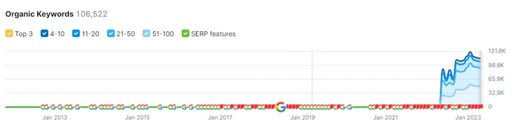
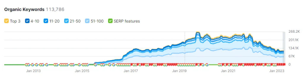
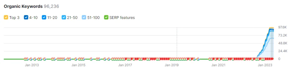
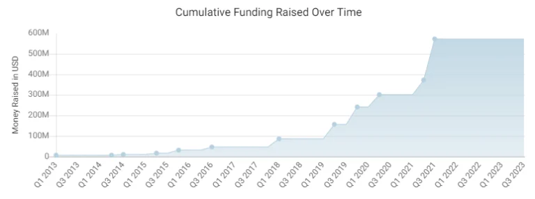
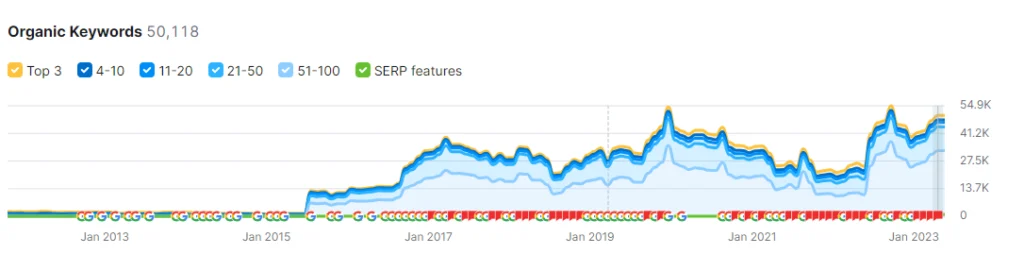
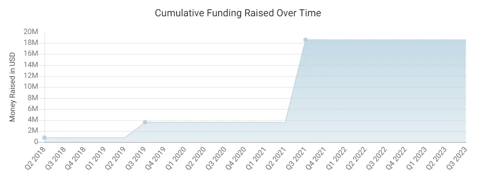
See Figma’s cumulative fundraising over time and note the 150% increase year over year Q2 of 2020 to Q2 of 2021.
Also note the considerable increase in organic presence up 115% year over year (June 2022 to June 2023, website traffic coming from organic search results in search engines due to content and features put out meeting their audience needs.
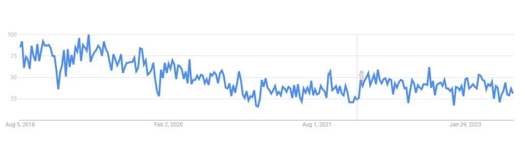
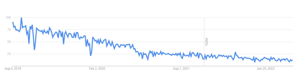
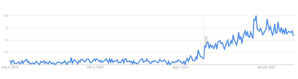
Below you can see the increase in brand awareness by the search volume trend in Google for the keyword “Figma”. While relative to its own position, from June 2021 to June of 2023, Figma has seen a 355% increase in awareness and demand.
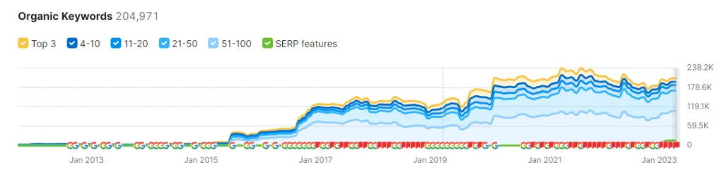
2. Adobe Firefly, XD & Illustrator:
We would be remiss to not include the vast world of adobe when talking about design tools. And Adobe has certainly not missed the AI train. With several products fulfilling different needs and niches, Adobe has cast a wide net helping many different audiences. The catch, you’ll pay quite the penny to get all the features from all the products. Adobe Firefly is an AI design tool that can generate images from text. It is still in beta, which means you may have to get on a wait list and be a subscriber to other Adobe tools to get a chance to test it out.
Adobe XD is a vector-based design tool that supports designing and prototyping experiences for websites, mobile apps, and more. It integrates with Adobe’s Sensei AI technology to assist designers with content-aware layout suggestions and other AI-powered features.
Adobe XD has gained prominence as part of the Adobe Creative Cloud suite, and by September 2021, it had over 3 million users. Adobe’s reputation and continuous updates have attracted designers to use XD as their go-to design and prototyping tool.
Adobe Illustrator is a vector graphics editor that is widely used in various design fields. Although it’s not an AI-specific tool, Adobe has been incorporating AI features into its Creative Cloud suite, which includes Illustrator.
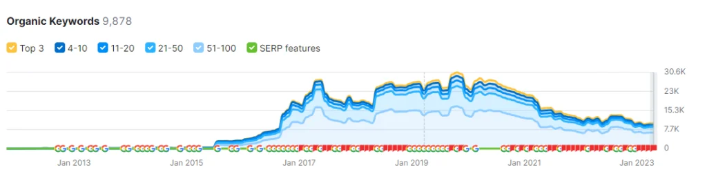
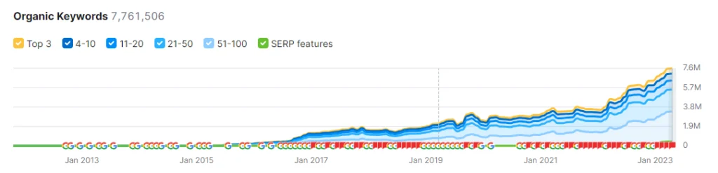
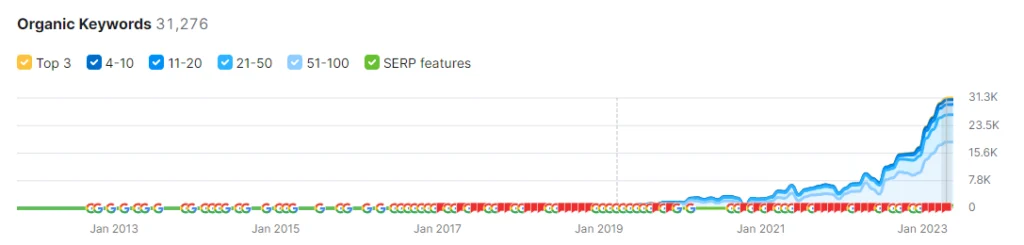
Check out the increased organic performance for Adobe over the last 7 years with the amount of organic search keywords they’ve captured. They’ve seen a 32% YoY increase with an 80% increase in 2 years and a whopping 886% increase 7 years.
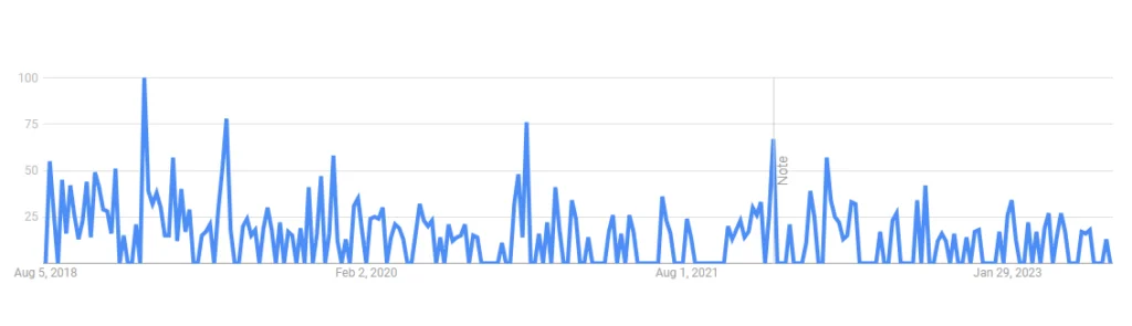
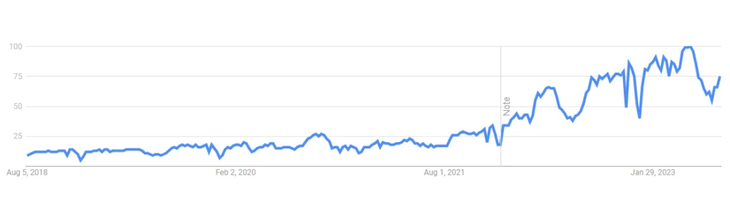
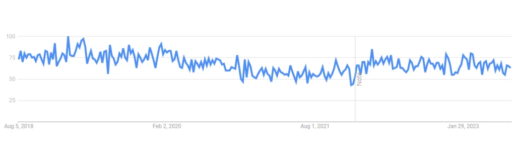
Interestingly enough, despite the increased performance with their site, the volume of people searching adobe in general has tapered in recent years as seen by the trendline below representing users searching for “adobe” in Google. This could be due to the generic parent brand vs each individual product that they offer which was not taken into consideration.
3. Sketch:
Sketch is a macOS-based design tool popular among UI/UX designers. While it doesn’t have native AI capabilities, it can be enhanced with various plugins that incorporate AI functionalities.
As of September 2021, Sketch had a strong presence in the macOS-based design tool market, with over 1.5 million active users. It remains one of the top choices for UI/UX designers who value its performance and ease of use.
See the organic performance trend of the last 5 years below. Sketch has seen a 7% growth in organic presence year over year and a 49% increase in 2 years.
Despite its popularity, Sketch has seen a rather consistent decline in trend for overall volume of searches for its primary branded keyword “sketch” (segmented by the company name vs the word itself).
4. Axure RP
Axure RP is a prototyping and wireframing tool that allows designers to create interactive prototypes for websites and applications. It may not have native AI features, but it can be integrated with external AI tools.
Below you can see Axure RP has seen some volatility over the last 5 years performing quite a bit lower in the organic search results of Google than it has. While it is currently trending positively, it has some ground to make up for. Axure saw a 3% drop year over year and a 29% drop from 2 years prior.
The trend of search volume tells a similar story with the primary branded keyword “axure rp” seeing a negative trend through the last couple years.
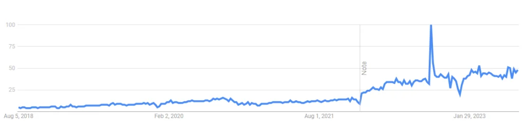
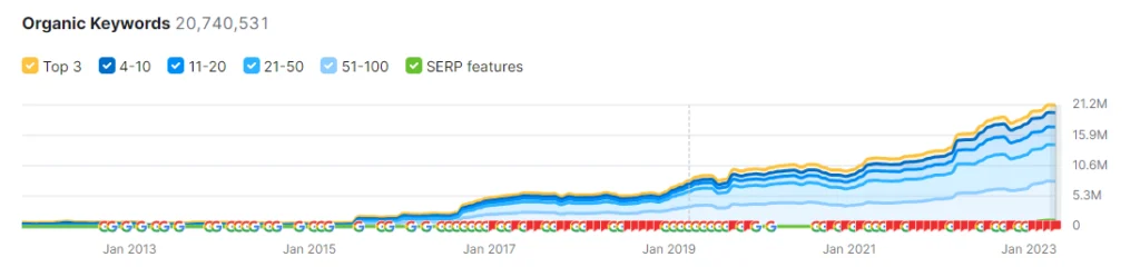
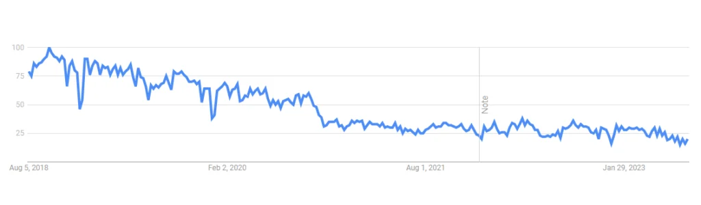
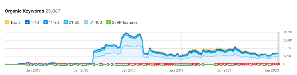
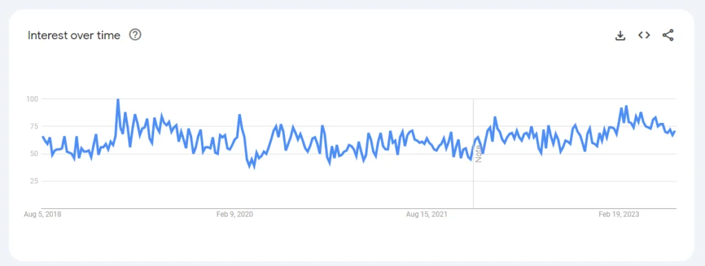
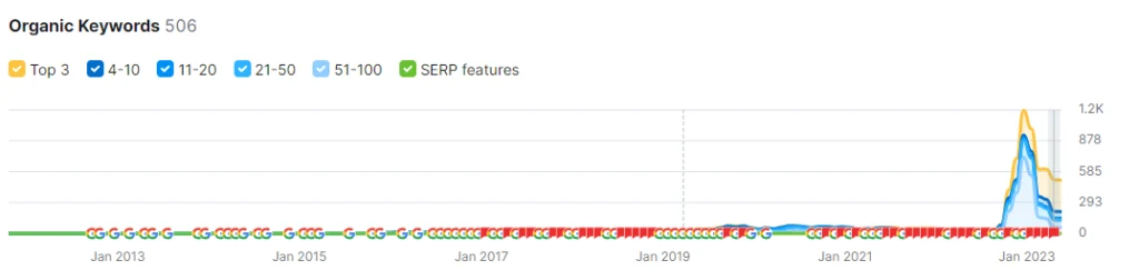
5. Marq:
Marq is an innovative design tool that has been gaining significant traction in the design industry. Leveraging cutting-edge artificial intelligence capabilities, Marq aims to revolutionize the way designers conceptualize, create, and iterate on their projects. In this section, we explore some key statistics and emerging trends that highlight the impact of Marq in the design landscape.
Marq has seen a remarkable surge in user adoption. Within just six months, Marq’s user base has grown to over one million active users, making it one of the fastest-growing AI design tools on the market. Designers from diverse backgrounds, including UI/UX designers, graphic artists, and marketers, have embraced Marq for its intuitive AI-driven features.
While Marq has undergone a relatively recent rebrand to an entirely new domain, they’ve retained much of their previous organic performance, and have since increased their brand presence in the market as seen by the short period of time available in the trendline below.
While it’s not an apples to apples comparison as there’s a bit of a ramp up period to anticipate with a new brand going live, Marq boasts a 6062% increase YoY. Let’s factor in the ramp up taking a full month’s worth of data and comparing it to the next closest month this year, Marq still shows a 73% increase year over year.
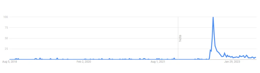
It’s clear from the volume of their branded keyword “marq” in Google trends, that Marq still has opportunity to grow, but is certainly trending positively in the last several years despite the rapidly changing industry, AI, and the market pitfalls with the worldwide pandemic and other recent anomalies.
6. Framer:
Framer is a design tool that enables designers to create interactive and animated prototypes. It also offers integrations with AI-powered tools to enhance the design process.
Framer, known for its powerful prototyping capabilities, had gained traction among designers and had over a million users by September 2021.
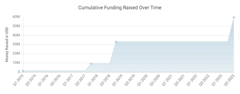
Note the cumulative funding raised over the last 5 years, with 267% increase from 2017 to 2018 and an additional growth of 81% from Q1 to Q3 of 2023.
Below you can see that despite a considerable setback of website performance, Framer has regained and continues to thrive in the acquisition of new awareness through the keywords obtained for organic search. From their low point to their current high (1 year of time) they’re up 621%. Looking at the year prior before the set back, Framer is seeing a 98% increase from 2 years ago.
7. InVision:
InVision is a digital product design platform that allows teams to collaborate on design, prototyping, and user testing. It integrates with various AI plugins and external AI tools to facilitate the design process.
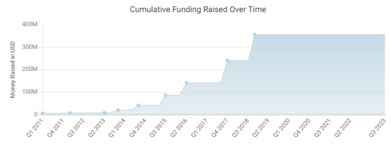
InVision has been a dominant player in the digital product design platform market, boasting over 7 million users as of September 2021. See the growth and anticipated growth manifest in the cumulative funding that they’ve raised over the last 10 years. Certainly a consistently healthy and robust measured effort trending positively. According to crunchbase their fundraising was up 48% year over year from 2017 to 2018 and has sustained through the years.
InVision’s website, however, can’t say the same. While organic presence in Google is not a primary indication of a business’ health, it can be an indicator of spending money in the right place, being aware of important aspects like digital presence, and potentially other factors like overall industry interest. Year over year, InVision has seen a 26% drop in organic presence, and 52% down from 2 years prior.
The volume trend in Google trends corroborates the trend of site performance. While the site’s ability to rank and put out the right content to meet its audience appropriately is one side of the coin, the other is the awareness and demand for a brand which can be seen through the volume of searches. InVision (company segment) has seen a consistent decrease over the last 5 years.
8. Proto.io:
Proto.io is a prototyping tool used for creating interactive prototypes for web and mobile applications. While it doesn’t have built-in AI capabilities, it can be combined with external AI tools.
Proto.io joins the group of companies and AI design tools that did not fare well through the storms of the pandemic. They are down 15% year over year for 2023, 49% from 2 years prior and even more from the year before.
The google trend graph below is one typically seen by companies or keywords with considerably low volume. The volatility and difficult to see trend line is due to the low volume of total searches for the brand. Unfortunately for Proto.io, with the little volume that is there, the trend is clearly negative.
9. Midjourney:
Midjourney has certainly found popularity among many online groups utilizing the platform discord to interact with it. It has acquired quite the reputation for being the leader in the image generation space with considerable enhancements in its abilities in a short amount of time. However, the tool can be difficult to reign in identifying the right prompt and ultimately getting an image out of it that is more than just fun to see.
Midjourney is a nonprofit organization that has clearly come out of nowhere and not only entered the scene but is leading it when it comes to AI image generation. There isn’t yet a full year of data to compare to, and any month compared to the prior is a considerable increase.
It’s clear from Google trends that while Midjourney saw some quick wins in the AI design space, it’s experiencing some trouble with the frustrations to use their product for anything meaningful. This illustrates a primary separation between design tools using AI to enhance an already valuable product to individuals and businesses and those that are banking on a potentially quick and fleeting model that will require far more iteration before becoming valuable on their own.

10. Canva:
Canva is a user-friendly graphic design tool that offers AI-powered features like automatic design resizing and layout suggestions.
Canva had over 60 million active users globally by September 2021, indicating its widespread appeal among non-professional designers and small businesses.
Canva has clearly seen success in the past few years despite the hard times that other tools and companies have seen. Check out the fundraising trend below. It illustrates not only consistent growth and progress, but a considerable jump to double the funding from Q1 to Q2 of 2021. This not only illustrates Canva’s growth but their anticipation to continue to grow.
Canva’s site performance is another voice in the positive story of the path that they’re on. As seen in the image below, the site’s organic performance reiterates not only consistent growth, but an increase in pace over the last 2 years. Good signs of product meeting users where they are, understanding their needs and fulfilling them. Also a positive indication of spending money in the right places to fuel their momentum. Canva is up 65% in organic presence year over year, and up 106% from 2 years prior.
Google trends show some ups and downs consistent with releasing new features and possibly other PR efforts. Despite some fluctuations in volume the trend is overwhelmingly positive and adds its voice to the strength of their growth and progress.
11. DreamStudio:
DreamStudio is another prompt based, text-to-image AI image generation tool focussed on minimizing the energy required to generate their images. While the output may not initially seem as robust as some of it’s competitors, DreamStudio boasts an iterable version of images making it easy to edit and upscale.
DreamStudio is rather new to the seen as made apparent to their trended organic presence below. It would appear that while they saw considerable initial success, they’ve hit massive headwinds that could be indicative of getting some items out of priority.
The volume of searches around their brand was a little difficult as it appears that Google hasn’t yet identified a segment for their brand name that is separate from the generic search term. However, looking at the shape of the volume over the last year, it appears to correlate with the initial release and the drop in interest.
12. CoreIDRAW:
CorelDRAW is another vector graphics editor that focusses on illustration, layout, photo editing, and typography tools. They offers various design that including some AI-assisted functionalities.
While CoreIDRAW has been around for a while, they’ve managed to continue to grow their online presence and continue to provide content and features that meet the needs for a select user base which is apparent from their ranking and keyword acquisition of their website. CoreIDRAW shows a 6% increase year over year in organic presence, and 3% drop from 2 years prior.
While not explicitly negative, it’s clear that the volume trend indicating awareness and demand has seen a negative trend through 2021 and then some increased volume that has slowly trended negatively since. Despite this, it would seem that CoreIDRAW continues to thrive in the AI design tool space.
13. TopazLabs:
TopazLabs is a design tool that uses AI for image editing. Primarily to enhance the quality of images and videos with some pretty impressive results.
TopazLabs has seen some ups and down over the years, but is currently thriving and positively trending with their audiences providing the right kinds of content to be promoted in the search engine results pages and driving valuable traffic to their site. They grew 87% in organic presence year over year.
Google trends shows a very positive trend corroborating the story of their site’s positive performance. It’s clear that the volume of those aware and searching for the brand has bee on a steady increase.
14. Uizard:
Uizard is an AI design tool that can be used to create some pretty robust products like web applications, mobile apps, as well as desktop software with a pretty easy-to-use editor.
It’s clear from Uizard’s funding raised over the last 5 years, that they’re continuing to grow and anticipate further growth. They’re showing a massive 417% increase from quarter to quarter in 2021.
It appears that Uizard has been around for a few years, and while progressing, it hasn’t really taken off until 2023 where it’s seen considerable growth. Uizard is up 327% year over year in organic presence!
Google trends corroborates the story with minimal search volume seen since 2018, and then in 2023 it appears consistently and trending positively. Whether this is due to some good marketing and well spent PR funds, increased functionality and features or some combination of both, it’s clear that Uizard is making its way into the space and generating some pretty big waves.
15. Autodraw:
Autodraw is the last product we’ll include in today’s list of AI Design Tools trends and statistics. While small, Autodraw has been around for a handful of years and is one of the few to start before the AI boom. Providing value early on, AutoDrawl allows users to illustrate to their heart’s content, and the tool will use machine learning to take a guess at the illustration and then provide a closely related professional version to be used.
From the graph below, it’s clear that Autodraw has been through some ups and downs since its inception. While Autodraw shows a 28% decrease in organic presence year over year, it’s able to boast a 140% increase from 2 years prior which is still a positive trend for the lifespan of the company.
The volume illustrated in Google trends reflects roughly the same story, with a recent drop in interest through the last couple of months.
Growth in AI-Integrated Design Platforms
Major design software companies have recognized the potential of AI in design and are rapidly integrating AI capabilities into their platforms. The inclusion of AI-powered plugins, features, and modules has transformed traditional design software into intelligent ecosystems that support designers in their quest for excellence. Notable players in the industry report a considerable increase in user adoption of AI-integrated tools.
Data Security and Privacy Concerns
As AI design tools rely on vast amounts of data for analysis and decision-making, data security and privacy concerns arise. Designers and organizations need to address these issues diligently, ensuring compliance with data protection regulations and safeguarding sensitive design assets. An informed approach to data handling is crucial to ensure trust and confidence in AI design tools.
Bridging the Gap Between Designers and Developers
AI design tools are bridging the gap between designers and developers, fostering better collaboration and communication between the two disciplines. AI-powered design platforms facilitate smoother handoffs by generating design specifications and assets that developers can readily work with. This alignment leads to more efficient development cycles and reduces friction in the design-to-development process.
Conclusion
The advent of AI design tools has ushered in a new era of creativity and efficiency in the design industry. As AI technology continues to advance, designers can expect even more sophisticated tools that amplify their capabilities and enhance the overall design process. By embracing data-driven insights and combining them with their creative vision, designers can harness the full potential of AI design tools to shape the future of visual communication and user experiences. As we move forward, the harmonious collaboration between human ingenuity and artificial intelligence will continue to redefine the boundaries of design innovation.
AI Design Tool Statistics FAQs
AI design tools refer to a new generation of design software that incorporates artificial intelligence and machine learning capabilities. Unlike traditional design software, AI design tools can automate repetitive tasks, offer intelligent design suggestions, and analyze user data to enhance the user experience. These tools empower designers with data-driven insights, enabling them to create more personalized and efficient designs.
AI design tools improve design efficiency and productivity by automating time-consuming tasks, such as generating design variants, creating layout suggestions, and automating design handoffs to developers. By leveraging AI-powered features, designers can focus on the creative aspects of their work, leading to faster design iterations and better overall productivity.
According to market research, the global AI in design tools market has witnessed significant growth in recent years. Several leading AI design tools have amassed millions of users, indicating their popularity and widespread adoption in the design community. Surveys also reveal that a substantial percentage of design professionals report increased design efficiency and improved user experiences through AI-powered design solutions.
AI enables designers to create more personalized user experiences by analyzing user data and behavioral patterns. Designers can use AI-driven insights to understand user preferences, optimize content layouts, and offer personalized recommendations. By tailoring designs to individual users, designers can deliver more engaging and relevant experiences, ultimately leading to higher user satisfaction and loyalty.
In most organizations, the disconnect between brand and the rest of the organization is real.
On the one hand, brand and creative teams are constantly bombarded with requests, trying to fulfill as many as possible with limited time and resources. Most requests come with unrealistic turnaround times, leaving creative teams in a tough place to deliver.
And on the other hand, creative teams sometimes evolve into the “brand police,” which can make a brand feel “off limits” to other orgs. Doing so limits cross-functional creativity, introduces creative bottlenecks, and creates a negative dynamic between brand and other teams.
The result? Creative teams feel like short-order cooks feeding the never-ending content beast, and customer-facing teams start creating rogue content when marketing can’t fulfill their one-off requests.
That’s why modern organizations need a brand enablement solution that puts the power of your brand in the hands of your employees without sacrificing the most critical elements of your brand.
What Is Brand Enablement?
Brand enablement is the strategic process of equipping teams across your organization with the content, guidelines, and tools they need to promote your brand effectively.
It’s much more than a brand guide; it’s the process of empowering your people to promote your brand across the channels they’re in every day.
Modern brand enablement solutions help your people promote your brand by:
- Connecting employees to the most up-to-date content pieces
- Allowing employees to personalize content when they need it most
- Giving visibility into the content teams are creating
- Speeding up the approval process for quicker turnaround times
- Getting more personalized content into the hands of your customers
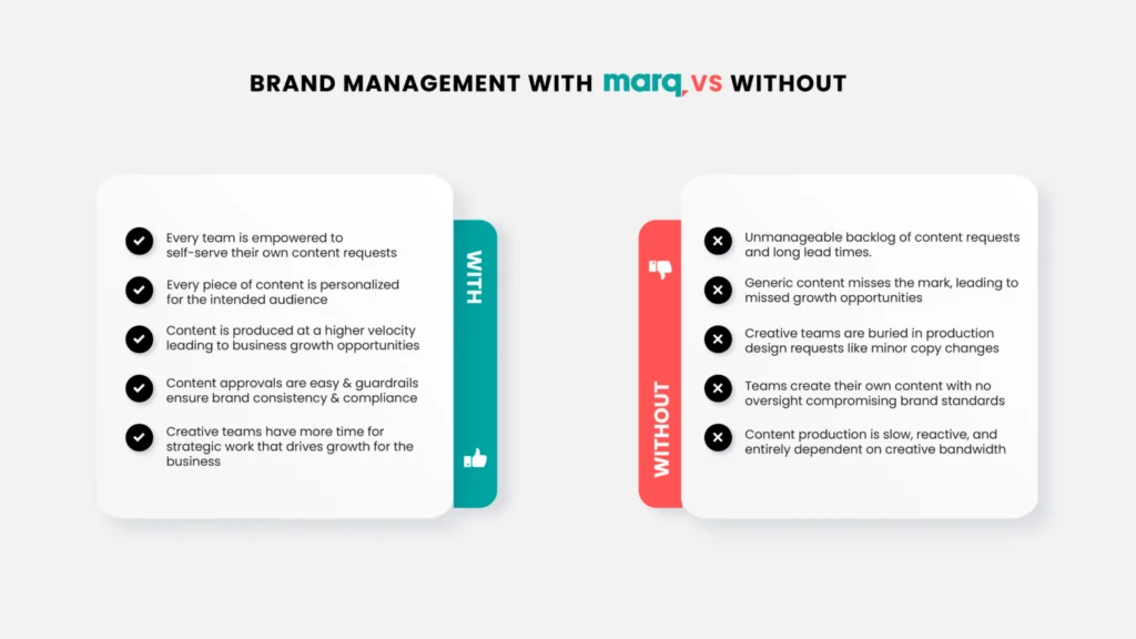
Organizations with Brand Enablement vs. Without
To compete in today’s fast-moving market, teams need a way to produce highly-personalized content for their customers at any given moment. For most businesses, content is the key to convincing potential buyers that you’re the right business for the job.
But without a brand enablement solution, it can be easy to overload creative teams with an endless queue of content requests.
Let’s look at how brand enablement can unleash your brand’s potential while saving your organization time and money.
 Brand Enablement Drives Business Growth
By equipping your teams with proven brand enablement tools, you’re making it easy for every existing and potential customer to have a meaningful interaction with your brand.
With easy access to lockable brand templates, your teams can deliver personalized content to potential customers faster than ever. This unique approach takes the burden of small content requests off of design teams and gives customer-facing teams the tools they need to win business.
Brand Enablement Speeds Up Content Creation
When potential customers come to you, they want to know instantly how your product or services can solve their problems.
They don’t want generic content; they want content that’s tailored to their needs.
With a brand enablement solution, team members can choose an approved template, customize it, and send it to a customer. This process shortens turnaround times, guarantees brand consistency, and removes tedious requests from the creative backlog.
Brand Enablement Improves Brand Reputation
Opening up content creation to everyone doesn’t mean content chaos. It means you’re empowering your people to promote your brand the right way.
With lockable templates, team members can personalize and deliver fresh content that’s always compliant with your brand standards.
Creative teams have complete visibility into the content being created, and customer-facing teams feel empowered with a way to create on-brand content.
How to Implement Brand Enablement
Whether implementing brand enablement from the ground up or refining a system already in place, you’ll want to take inventory of your current brand assets and creative processes. Doing so will help you identify gaps to build a more holistic brand enablement plan.
Here are six steps we recommend you take when getting started with brand enablement:
Step 1: Create a culture of alignment
How well do your brand and creative teams collaborate with other departments?
Without a solid brand enablement process in place, your answer might be: “Not that well.” And that’s okay.
Your first goal is to build cross-functional relationships across the company to ensure everyone is aligned with your brand enablement vision.
Step 2: Determine the content goals of other departments
For brand enablement to work, you need to equip your teams with the content types they need to be successful. Take the time to identify cross-functional partners’ content needs and goals and build them into your content production plans.
Step 3: Establish clear brand guidelines
When it comes to branding, consistency is everything. Whether you have a brand style guide or a brand enablement platform like Marq, make sure you have a source of truth that outlines everything that matters to your brand, from typography and color to logos and imagery.
Step 4: Choose the right technology to facilitate content creation
Multiple file types across hundreds of programs create a mess of content only usable by the original content creator. You need shared technology that won’t break the bank, ensures brand consistency, enables users to self-serve their content needs, and empowers everyone to personalize and share content easily.
Step 5: Implement a process for approvals and check-ins
Brand control doesn’t stop with brand enablement. Instead, it should be easier to get content out the door, and content approvals should work for you, not against you. Align on a process that works for your cross-functional teams and brand protectors.
Step 6: Establish performance metrics and implement feedback loops
Your content is only effective if it drives results. Decide what metrics you will use universally to measure performance and create feedback loops so your team is always looking at the data to drive better content decisions.

How Marq Makes Brand Enablement Easy
Not all brand enablement tools are built the same, but the best, most comprehensive brand enablement platforms will empower your teams to create stellar on-brand content that drives growth for your business.
With Marq’s ability to convert all of your designs into reusable branded templates, everyone in your org can create and share on-brand content.
Here’s how Marq works:
01 Design Anywhere
Creative teams can import existing design files from any platform or create designs locally in the Marq editor.
Why organizations love this
- Creative teams can build designs on the platforms they’re most comfortable with
02 Templatize Anything
With Marq, you can turn any design into a template by locking critical brand elements like fonts, logos, and colors.
Why organizations love this
- Creative teams create one version of a lockable brand template instead of updating the same design file hundreds of times.
- Other teams can access approved templates for pitch decks, social posts, one-pagers, and more.
03 Personalize Everything
Share brand templates across your organization so teams can customize content for their unique audiences.
Why organizations love this
- Creative teams save time by allowing teams to fulfill their own content requests.
- Other teams can quickly personalize approved templates without submitting a creative request.
04 Share Everywhere
Teams can immediately publish content without having to leave the Marq platform. Quickly post any project to social media, send it to print, or embed it in an email.
Why organizations love this
- Creative teams feel confident that every piece of content that’s shipped meets brand standards.
- Other teams win more deals by getting content into the hands of customers faster.
Imagine the content output and level of personalization when you put brand enablement to work for your organization.

Upgrade your brand management strategy to a brand enablement strategy today. You can schedule a demo here.
Brand Enablement FAQs
Brand Enablement is a strategic approach that goes beyond traditional branding. While branding focuses on creating a brand identity and recognition, Brand Enablement takes it a step further by empowering brands to thrive in the modern marketplace. It involves providing brands with the necessary tools, technologies, and resources to enhance their presence, engage their target audience, and adapt to evolving market trends. Essentially, Brand Enablement enables businesses to translate their brand vision into tangible, sustainable success.
Brand Enablement offers numerous benefits for businesses seeking to establish a strong market position. By investing in Brand Enablement, your business can:
Drive Customer Engagement: It helps you create compelling brand experiences that resonate with your target audience, increasing customer loyalty and advocacy.
Competitive Advantage: Brand Enablement allows you to differentiate your brand, making it more memorable and recognizable in a crowded marketplace.
Adaptability and Innovation: With the right tools and technologies, Brand Enablement empowers your brand to adapt quickly to changing market conditions and embrace innovative strategies.
Brand Consistency: It ensures consistency across all brand touchpoints, including online and offline channels, fostering trust and credibility among customers.
Employee Alignment: Brand Enablement aligns your employees with the brand vision, fostering a sense of purpose and enhancing overall productivity.
Content creators are expected to produce large volumes of high-quality, effective, and informative content. A typical content strategy might call for blog articles, white papers, case studies, ad copy, web copy, social media posts, videos, podcasts, and more—all of which have to align with the business’s marketing goals, brand identity, and values.
To achieve the quality, consistency, and creativity essential for marketing success, it’s not enough to have a team of talented creative individuals. Your team needs to work together as a coherent group. Each member must play their role and fulfill their responsibilities. But how can they if those roles and responsibilities are not clearly defined?
In this article, we explore creative team roles and responsibilities. You’ll learn:
- What creative team roles and responsibilities are
- Why defined roles are critical to a content team’s success
- How to define roles and responsibilities for your content team
We’ll talk about how to find the best roles for your team members based on their skills and strengths, give them the right responsibilities, track their progress over time, and make any changes that are needed along the way.
What Are Roles and Responsibilities?
A job responsibility is a duty or activity a particular employee is expected to carry out. For example, a copywriter’s responsibilities might include writing ad copy, which can be further broken down into the tasks that make that possible: understanding the client’s needs, crafting effective copy, proofreading, etc.
Some of the roles on a typical content team might include:
- Content Strategist: Develops and implements a content strategy that aligns with the organization’s goals and objectives.
- Content Writer: Creates written content, such as blog posts, articles, and white papers.
- Content Editor: Reviews and edits written content for accuracy, clarity, and consistency.
- Graphic Designer: Creates visual elements such as images, infographics, and videos that support the written content.
- Videographer: Shoots and edits video content.
- Social Media Manager: Manages the organization’s social media channels and creates content that engages the target audience.
- SEO Specialist: Optimizes content for the search engines to improve rankings and increase organic traffic.
- Analytics Manager: Measures and analyzes content performance, identifying trends and providing insights to the team.
- Project Manager: Manages the content creation process, ensuring that projects are completed on time and within budget.
On smaller content teams, these roles might be combined in the job description of a single individual. The content strategist might also take on the content editor role. The SEO specialist might also be responsible for analytics.
On larger teams, one role might be shared between multiple employees. There may be a team of content writers who report to one or more content editors.
Why Define Content Team Roles and Responsibilities?
Roles and responsibilities help content teams work more efficiently and produce better results. Without defined roles, team members are unclear about who is responsible for what. If your team is confused, they will waste time and lack accountability.
Many creative people find a lack of structure frustrating, so you may experience higher employee turnover. That’s true even if individual team members are committed, productive employees. Even the most self-motivated creatives need a structure in order to work effectively.
Role definition also keeps creative professionals focused on their objectives, helping them to make faster progress towards collective goals. They gain a sense of purpose from knowing each role has specific responsibilities that need to be completed to achieve the team’s objectives.
Finally, setting up roles eliminates overlap or duplication of effort because it is clear who is responsible for different tasks. Outlining these expectations from the start facilitates collaboration and reduces miscommunication or misunderstanding that can hurt team productivity.
Defining Roles for Your Content Team
We’ve established why you should consider defining roles and responsibilities for your creative team. But what’s the best way to go about it? Every team and company is unique, so it’s not simply a matter of handing out roles from the list we suggested above.
If you have a team already established, it’s more effective to figure out how it works and then make tweaks where necessary to improve efficiency, clarity, and productivity. When developing roles and responsibilities, keep in mind that you will ultimately assign them to team members, so consider each person’s preferences and strengths.
Observe and Analyze Content Team Processes
It is essential to understand the dynamics of your content team before assigning roles and responsibilities. A thorough analysis of how each member contributes can provide insight into areas where there are gaps in productivity or efficiency.
When observing your team’s creative processes, pay close attention to how ideas are generated, discussed amongst members, and implemented into projects. Review existing documents that serve as guidelines for both individual workflow and team collaboration, such as weekly calendars or longstanding management goals.
Additionally, take note of what works well across all aspects of your teams’ workflows; it may be beneficial for certain roles to focus exclusively on providing support in those specific areas rather than having one person juggle many duties at once.
Understanding every member’s role allows them to have more control over their own workload while creating a sense of autonomy within the group dynamic, which ultimately leads to better results with less overall effort.
Create Roles Based on Your Team’s Needs
Examine the tasks that make up each step of the content creation process, from coming up with an idea to publishing and distributing it. List the activities associated with each task and consider how they can be combined into useful roles that reflect the real-world demands on your team.
You don’t have to split roles along conventional lines if there is an overriding reason not to. For example, if you don’t want one person to handle everything related to a certain area, such as keyword research or copywriting, break it down into smaller responsibilities and create roles that allow for more granular delegation.
When defining roles for your team, take into account both individual strengths as well as any existing gaps in skills or knowledge within the group. You may find that you need to create additional positions to fill all the roles—an indicator that someone on your team has too much on their plate.
Assign Responsibilities to Roles
It’s easy to get caught up in the process of role design and miss key responsibilities. Take another look at the activities, tasks, and outcomes for which your team is responsible. Doing so will help you find process gaps that hurt productivity and undermine the whole process. Delineate responsibilities and carefully consider which roles they belong to.
Discuss Roles with Your Team
When developing these roles and responsibilities, discuss them with your entire team before assigning anything. In fact, your team should be involved from the start. They know what their day-to-day looks like, and you are unlikely to have a complete understanding of everything they do.
Ask team members about their responsibilities, and when you have created a set of roles, ask them to pick holes in your plan. It’s better to find out you’ve missed something during the planning phase than several months down the line.
On the other hand, don’t let team members dictate roles and responsibilities. Just as you do not have complete insight into their activities, they lack your view of the activities of the team as a whole.
However, try to be open-minded; allow others to have their say since they might have creative ideas about how to best distribute resources or consolidate duties, which could ultimately lead to greater efficiency and productivity.
Assign Roles to Team Members
Assign roles to team members or hire new employees to fill roles the existing team can’t accommodate. For long-established teams, this can be a disruptive process—team members may not like new responsibilities, and they may resent having responsibilities removed.
In the long run, though, rationalizing roles and responsibilities should result in a happier and more productive team. Everyone will be aware of their responsibilities, and every responsibility will be assigned to a role.
Monitor Team Performance and Iterate
You’re unlikely to get everything right at first. There’s no substitute for real-world testing, and you may find that you have missed responsibilities or that workflows don’t function as you had envisioned. Perhaps the allocation of roles to team members doesn’t prove as successful as you might have hoped.
In the months following the reorganization, monitor team productivity and the quality of their output. Talk to team members to get their feedback. Be prepared to adjust roles and responsibilities as new information comes in.
Marq Helps Creative Teams Manage Roles and Responsibilities
Marq’s brand templating platform empowers creative teams to automate content production workflows and produce consistent branded content. We recognize the importance of roles and responsibilities for creative teams, so the Marq platform offers powerful creative team management features. Administrators can create user and group structures that reflect their organization and share assets, projects, templates, and folders with granular permissions. To find out more, request a free demo with a brand templating expert.
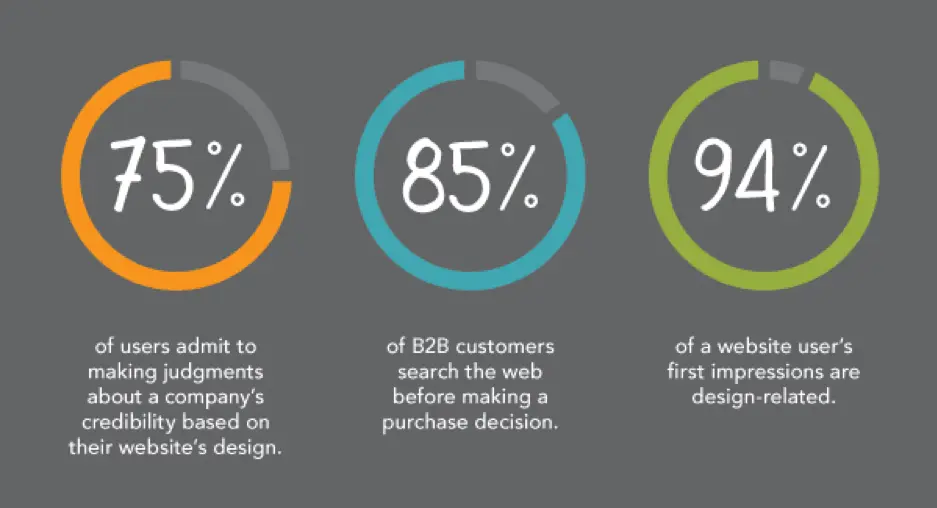
The internet is teeming with sites vying for attention, and a poor first impression could very well be your last. It’s a fine line one walks when it comes to nailing that website design. Some get it right; many don’t. From the layout and navigation to the colors and fonts, everything has something to say about the brand behind the scenes.
Related: 8 best practices of high-converting websites
Some studies suggest that it only takes 50 milliseconds for a user to decide whether your website is appealing enough. With such a short amount of time, your website needs to wow them fast and leave a strong impression.
Let’s delve deeper into three areas—design, user experience and content—that can make an impact on your viewer, to give you insight into what your website says about your brand.
Driven by design
With dwindling attention spans and fast-changing loyalties, the design of your website plays a huge role in holding the attention of fast-moving visitors and encouraging interaction.
Source: Kinesis
Organizations spend top dollar to help their websites stand out amongst the noise. With special emphasis on digital marketing strategy, a great website design will help you grab your consumer’s attention.
Traits of a well-designed website
Visual appeal, but for the right audience
Looks matter.
In fact, 38% of users will stop browsing your website if they don’t find it attractive enough. So, a visually appealing website is half the job done. But remember—you are not trying to appeal to everybody.
Good design addresses the target audience with a brand personality users want to engage with. Check out this website, Crypton. It’s designed ideally for a tech-savvy audience.

Source: Crypton
Parallax scrolling heightens the user engagement here, but you don’t have to include parallax functionality on every website. Research your buyer personas and use design elements, functions and colors that make your target audience feel right at home.
Your above-the-fold section should do the job
A Nielsen study says the majority of your website visitors will spend 80% of their time above the fold. That’s the section you see without scrolling—call it the opening screen.
The best websites explain what they do in this opening screen. A general practice is to use a headline (think your company’s tagline or mission statement), followed with a brief subtitle text describing your services or products. Top it off with a CTA button to direct visitors toward the next stage in your conversion funnel.
Airbnb does this brilliantly; the headline is the CTA. While there’s no subtitle text, their call-to-action is strengthened by a slideshow of awesome travel photos. Just beneath the headline, a search bar is intuitively placed. The example text in the search bar encourages interaction.
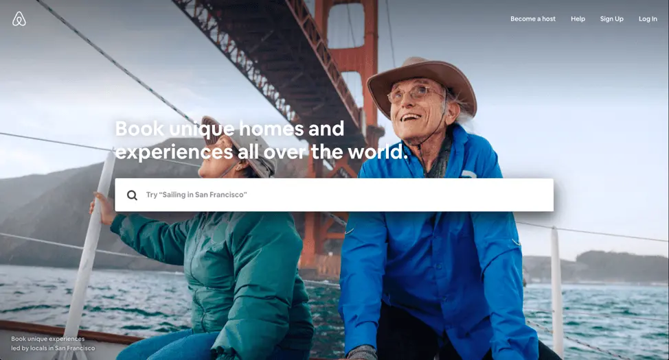
Source: Airbnb
Your design might be ineffective if:
- Your colors are wrong. For example, you’re targeting B2B consumers with a color theme that appeals more to B2C consumers.
* Your site has no visual hierarchy. This confuses the visitor, resulting in missed opportunities and eventual sales.
The design approach you take depends on many factors. Location, age brackets, and target groups will certainly affect how your website should look. Having said that, these factors should be the starting points for your design. A well-designed website that considers all these factors will set you apart from the crowd.
User experience counts
Today, it’s all about experiences. You could have a brilliant product or service, but if your website fails to deliver an enjoyable user experience, all that will be for nothing. It all comes down to how you make your customers feel.
The kind of experience users have, good or bad, will stay with them for a long time, even after the browser window is closed. A well-thought-out homepage or landing page with content that resonates will go a long way towards creating a great user experience.
Let’s see what your website’s UX has to say about you.
Good user experience:
- With good UX, your website tells the world that you think clearly about the end user. See Crunchbase’s website; its UI is done beautifully. There’s the search bar on top if you want to explore specific results, or you can click the menu on the left side to browse sections that interest you.

Source: Crunchbase
- Clean, intuitive user interface shows that you have a clear purpose.
* Got a 404 page built? Small things like this send out signals that you don’t skimp on your efforts to deliver an optimized experience.
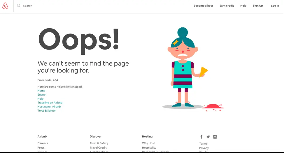
Source: Airbnb
Poor user experience:
- Your website doesn’t respond well to mobile or other screen sizes. This will send a bad message about the lack of strategy and planning behind its setup.
* Too many calls-to-action on one page show a lack of purpose for what your website aims to achieve.
User experience can make or break your website. To stay ahead of the game, it’s important to take feedback from your visitors. Incorporating that feedback will give your users a sense of gratification and improve future visitors’ experience.
Content will make it all work
Content might be the most important aspect of any website. Well-written content will bring you new traffic and repeat visits.
These days, content isn’t limited to the stuff you read. There’s now an increased demand for visual content. Animations, infographics and GIFs tell stories and illustrate data like never before. Compelling content with clear calls-to-action will eventually drive your users toward conversion.
Take a look at how the quality of your content reflects your brand’s personality.
Characteristics of good content:
- Great headlines and a call-to-action above the fold—nice. Videos on the landing page to engage fast-moving visitors—even better. This shows that you want users to get the best, most relevant material quickly without wasting their time.We especially love HubSpot for its content. The blog is fabulous, and there are explainer videos on all their landing pages, plus a video testimonial section. In short, almost every aspect of content necessary to build trust and conversion is present.
Source: HubSpot
- Use the language and verbal style your target audience speaks in. This shows that you’ve spent time thinking about and curating the content your target audience would appreciate.
* A blog should offer well-researched pieces that add value to your consumer’s decision journey. It will drive home the point that your content strategy cares more about the readers than ranking. This helps build trust and thought leadership.
Characteristics of poor content:
- Grammatical errors or typos on your site. Careless content informs your users that quality doesn’t matter to you. If you can’t pay attention to your content, who’s to say your product, services or customer support will be any better?
* Articles published just for the sake of traffic. If your content doesn’t target your audience or speak to a niche, it will be difficult for audiences to determine who your site is really for.
* Generic content that doesn’t offer anything valuable or new. This demonstrates a lack of research and understanding. The users goes away thinking you don’t really care about their needs.
Key takeaway
With so many sites competing for dollars and attention, it’s more important than ever to offer the user an exceptional experience. By breaking down your website into these three areas of design, user experience and content, you can evaluate how well each one contributes to your brand’s success. Conversely, you can also isolate areas that aren’t working and try new ways to engage your audience. When all of these areas represent your brand authentically and consistently, you will enjoy higher traffic, conversions and customer satisfaction.
Want to learn more about building & managing a brand? Check out our free eBook: Managing your brand in the cloud.
Our perception, to a large extent, is governed by vision. We’re attracted to visuals that make us feel good. It’s why retail stores promote special offers with balloons and other decorations, because they know shoppers will get curious enough to come over. The same principle applies to web design and digital marketing.
Related: 32 stats & facts that prove infographics aren’t dead
To illustrate just how effective visuals are in attracting visitors, consider these statistics:
- In 2016, over 60% of B2B marketers and small businesses planned to increase investments in video marketing strategies. (CMI)
- On average, tweets with images receive 150% more retweets than tweets without. (HubSpot)
- On average, Facebook posts with images receive 2.3x more engagement than posts without. (BuzzSumo)
Point is, visual design leaves an impression on visitors. You must learn how to use them wisely. In this post, let’s discuss how visual content like infographics and video can encourage your visitors to convert.
1. Create impact with the right typography
Unlike someone reading a book, visitors on a website don’t consume content from left to right then go down to the next line. In fact, virtually nothing happens in progression. Visitors will either go straight to what they need, or they’ll stop in their tracks if something more interesting catches their eye—like a 30% discount on another brand of detergent, for example.
Today’s designers are using typography to catch and keep visitors’ attention. The size, shape and placement of different fonts will enhance your message, and you can direct the focus where you want it most.
Consider the bold typography on this webpage. The cursive font complements the typewriter font, giving the site a vintage, personal feel. The use of color to emphasize certain words attracts the eye and sets a positive tone.

Source: Intechnic
2. Present data visually with infographics
Would you rather read through a bulky PDF filled with stats and long-winded sentences, or a colorful infographic which uses simple icons and text to display information? The choice is pretty obvious. Including a well-designed infographic in your blog post or webpage will persuade people to pause and see what you have to say.
But does it increase conversion? Here’s some compelling evidence:
- Images increase memory retention. People who hear information will only remember 10% of it three days later. But, if the information is paired with an image, they’re likely to remember 65% of it in the same timeframe. People will have an easier time reading and remembering an infographic detailing the health benefits of bananas than they would three paragraphs of text. And the more time visitors spend with your content, the more likely they are to convert.
* More shares lead to more exposure. According to NN Group, infographics are shared and liked on social media 3x more than any other type of content. Since people are more likely to share a post with an infographic, it helps you reach more people on social media faster.
3. Demonstrate your products with video
Studies show that 73% of consumers are likely to buy a product after they see a video explaining it. The medium has become many shoppers’ favorite way to find information.
Unfortunately, internet users have short attention spans and will only stick around to watch your video if the first few seconds get them hooked. With this in mind, here’s how you can make videos work for you.
- Focus on the product. Videos make it possible for brands to showcase their products in ways that might actually entice people to buy. Instructional videos provide an opportunity to familiarize an audience with your wares. For example, the furniture brand IKEA has its own YouTube channel where different how-to videos show viewers how to assemble the brand’s products.
* Focus on quality. Now that video is so popular and widespread, you have to compete on a professional level. Tailor your video for the platform it’s on. For example, Facebook visitors are more likely to stop and watch an auto-play video if it includes subtitles. If your video looks amateur or shaky, viewers will notice—and assume your brand is unprofessional.
4. Convey emotion with creative visual design
There’s a reason why people in life insurance ads are smiling. It’s to reassure us that, despite the somber nature of insurance, these folks are happy and secure with their purchase decision—and you will be, too.
Point is, humans are empathic creatures. We base our emotions on what we perceive around us. We find ourselves smiling involuntarily when we hear someone else laughing, or feeling sad when we see someone else looking miserable.
Brands can use this tendency to their advantage. All it takes is a little creativity. Consider the image on this landing page. Combined with the clever use of typography, it sends a powerful message to anyone who sees it.

Source: Scott Michael Davis
Key takeaway
To recap, even visual elements that seem simple—like the font you use—can impact conversion. Visuals that present information in appealing way, like infographics, help to retain visitors and persuade them to convert. If you’re making videos, aim for high quality polish and keep the focus on your products. Finally, visuals stir emotion. Use this to your advantage by getting creative with your visual design.
Create striking visual content in minutes with our easy-to-use desktop publishing software. Get started for free today!
When I was first hired at Lucidpress, I was asked to handle nearly all of our content writing, including the monthly email newsletter. It was a terrifying prospect. Most marketers know that email is a specialized skillset, and it’s easy to screw something up. But not only have we avoided major newsletter snafus, I’ve been able to cut down my time creating a newsletter from one workday… to one hour. That’s a time savings of about 800%, and the newsletters look (and read) better than ever.
Related: How to make a newsletter in 9 steps
So, how did I streamline my process? Here’s how to write a newsletter in three easy steps.
1. Do your homework
I hate starting newsletters from scratch, so I always do research beforehand. If you’re at a larger company, attend important meetings and take notes a few weeks before you start writing. If you’re running a one-man shop, make notes throughout the month. You’ll want to record things like:
- Improvements or updates to your product
- Business initiatives, like a push for more customer feedback
- Random thoughts and ideas like “Are there any upcoming holidays we can capitalize on?” or “Should we start a referral marketing program?”
Always write down a point-of-contact’s name next to your notes so you know who to seek out for more details. As for the third point, you may not use all the random ideas that pop up, but before long, you’ll have a working list of future email campaigns to test.
2. Clarify your goals
Develop a clear goal, and make sure it’s displayed front-and-center in your newsletter. You might be trying to:
- Publicize new features or offerings
- Increase traffic to a store or website
- Boost sales with a newsletter discount or promotion
- Capture customer feedback on your product
- Get subscribers to tell their friends about you
- Remind customers what your product does
- Make an emotional connection with your audience
In all likelihood, you’re trying to do several of these at once. Pick the most important one, and make sure it’s represented at the very start of your newsletter. It should also be presented (in a compelling way) in your subject line. The other major points will fall into place and can often be accomplished without text (think strategically placed links, images and calls-to-action).
3. Make it pretty (and repeatable)
Now that you have notes and a clear goal, you can easily write the text of your newsletter. The most important step here is to format your text for maximum readability. You’ll also want a nice-looking layout that communicates your company’s professionalism. Here are my tips for making it happen in under an hour:
Distribution
Ask yourself where your audience is, then decide on your method of distribution. You can go old-school with a printed newsletter or distribute your content digitally; the latter is more common nowadays. Lucidpress’s company newsletter templates allow you to quickly build a professional-looking newsletter, then print or share with a URL. All of our templates can be customized to make school newsletter templates, Christmas newsletter templates and more.
You can push out the link via social media or a website, but remember that you’ll still want to use a dedicated email service to email it. That way, you don’t have to handle subscribes/unsubscribes, CAN-SPAM compliance, and other time-sucking aspects of email management. I’ve had good experiences with MailChimp and Hubspot, but there are many others to choose from.
Here’s how a Lucidpress newsletter looks when you embed it in MailChimp. Pretty snazzy, right? We generate the code for you—just copy and paste it in.
If you’d rather build a newsletter with HTML than embed a Lucidpress newsletter, pick an email service that offers prebuilt layouts. If you can’t do that, enlist the help of a professional web developer to create a few plug-and-play templates.
Text formatting
Lead with items that have the broadest appeal to your audience.
Keep it short, unless you have a good reason to do otherwise. My newsletters rarely exceed 400 words and are usually closer to 200.
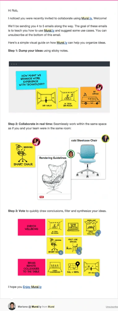
This email from MURAL is a great example of how to use text sparingly to get your point across. The copy is brief and easy to read, while the images are carefully positioned to support the text. It all adds up to a highly consumable newsletter.
Design
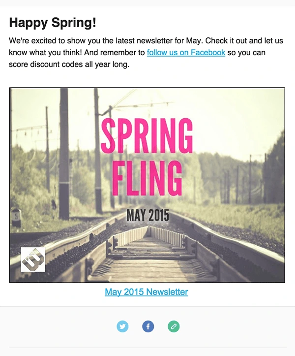
Break up the text with relevant images, buttons and links. Use enough negative space to let all of your design elements breathe. This example from Litographs shows how striking a clean, roomy design can be.
And that’s all, folks: how to write a newsletter in less time than ever before. We’d love to hear your own tips for maximizing effectiveness in marketing—just leave them in the comments.
Ready to make your own newsletter? These free newsletter templates are a great starting point.
Perhaps the term “long-form content” has made its way into the Promotions tab of your inbox a few times recently. Typical best practices for creating digital content suggest short-form content frequently seen in social content and webpages are easier to digest. However, there is a growing demand for long-form content in digital marketing.
What is long-form content?
Basically, long-form content is content with a word count of 1,200 words or more (according to Forbes). It can be a traditional blog post as well as a magazine, an eBook or a white paper, and a lot of voices are saying it’s the next big thing.
Do you have a negative knee-jerk reaction when you see someone touting long-form content’s wonders? Maybe what comes to mind is 7,000 words of text forming an intimidating mass that could cause minor head trauma if picked up and swung. Or possibly horrible flashbacks to school textbooks.
Let me start by saying that I am a millennial through and through, so thinking about a lot of boring text doesn’t really get me going. However, I am a believer in using long-form content in your content strategy.
Why?
Because if content (of any kind) is good enough, then people will stay on board for the long haul. [![]() ]
]
This means they’ll spend more time with your brand and come to rely on you for dependable information and thought leadership.
Sure, our attention spans are getting shorter, but I like to think that, in many cases, what that really means is that we’re getting better at quickly determining what we want to spend time on and what we don’t care about. To survive a digital world filled to the brim with content, we have to pass on a lot of things, and do it quickly.
But think, for example, of the enormous success of The Lord of the Rings film trilogy. Though each of the films had a runtime of about 3 hours, the trilogy became a sensation and earned a whopping $2.9 billion worldwide. Why were people willing to follow 9 hours of film? Because there was a good story to tell. It was engaging and entertaining, and it was important to people.

To really drive this point home, think about all the people that weren’t satisfied with just 9 hours of LOTR and bought the extended editions so they could get even more of what they loved. If you’re on an exciting roller coaster, you’re not waiting for it to end—you want more!
So how can your content marketing capture people’s attention like The Lord of the Rings? It boils down to two things: looking good and being interesting. The trilogy was visually stunning, and it had a captivating story. With hard work, your content can achieve the same results.
If you find an engaging story to tell and give some thought to the design of your content, you can create something that will add value to your readers and keep them coming back for more. The film example demonstrates that length and storytelling easily coexist when the story’s right—but what about good design?
How can long-form content look good?
To speak to aesthetically motivated fears, I actually think that good long-form content can sometimes be more visually appealing and less intimidating than its alternative. Take for example, these two versions of the CRM tool Highrise’s website.
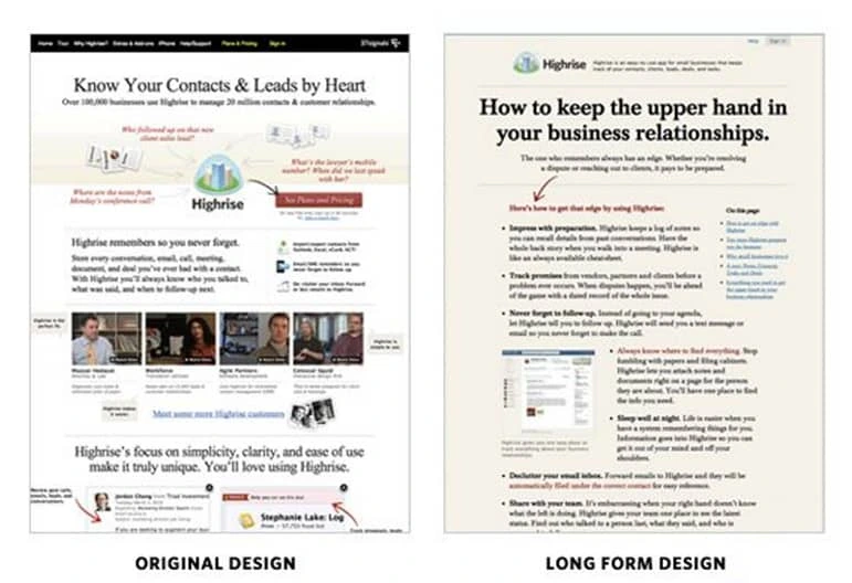
My first impression is that the original design is overwhelming and all over the place. It stresses me out trying to decide where to begin. The long-form design, on the other hand, is inviting and easy to follow. It’s designed in a way that is engaging, even while being longer. And here’s the kicker: Highrise’s long-form redesign increased conversions by 37.5%.
One reason that people may be more comfortable with a long-form design like Highrise’s is that it jives with what we’ve become accustomed to over hundreds of years. We’ve been reading books for a long time, so the layout of a long-form piece of content recalls familiar memories of your favorite novel. This effect is the result of careful design, and that’s where I feel Lucidpress can make a big difference. But more on that later.
What are some other benefits of long-form content?
In 2012, serpIQ conducted a study of more than 20,000 keywords and found that the top 10 search engine results had an average content length of more than 2,000 words, with the average number of words in the #1 spot at 2,416. Since long-form pages rank better in search engines on average, it’s likely more people will find your page and become customers. A few words from Google hint at the SEO possibilities of long-form content marketing:
“Users often turn to Google to answer a quick question, but research suggests that up to 10% of users’ daily information needs involve learning about a broad topic. That’s why today we’re introducing new search results to help users find in-depth articles.”
Pandu Nayak, creator of the Panda algorithm update
Another long-form content success story is Crazy Egg. They increased conversion rates by more than 30% with the use of long-form content. Also, this long-form content was approximately 20x longer than the previous version. That’s pretty dramatic, but so is a 30% increase in conversions. Here’s what Conversion Rate Experts had to say on the matter:
“The media would have us believe that people no longer have any capacity to concentrate. In reality, you cannot have a page that’s too long—only one that’s too boring. In the case of Crazy Egg’s homepage, visitors wanted their many questions answered and that’s what we delivered.”
I completely agree.
How to get started creating long-form content:
1. Determine your area of expertise. This will help you know what topic to write about. For me, I work in content marketing, so I feel like I have something to offer there. For you, it may be design, SEO, entrepreneurship, or, I don’t know, beekeeping. You’ll be able to tell the best story if you’re talking about something you’re closely involved with.
2. Research. For this post, I started out by googling “innovative long-form content.” Build on your expertise by looking deeply into current trends, statistics, and conversations.
3. Identify your target audience. All content needs to be relevant to your audience, but it’s especially important for keeping your reader’s attention with long-form content
4. Decide on your medium. It may be a blog post, but it also might be a magazine, an eBook or a white paper. Determine the type of content that will give your story the best presentation and resonate most with your audience. For example, this post could have worked with a white paper or eBook template, but it wouldn’t have been right for a magazine. A magazine might be better for a monthly newsletter with highlights across several different areas rather than a singular focus.
5. Start writing, then tell everyone you know about it once you’re done!
Standout examples of long-form content
Now that we’ve talked about the benefits of long-form content, let’s take a look at the innovators. There are some companies and organizations out there who are really nailing long-form content, and I’d like to go over 5 examples. Let’s dive in.
1. NewsCred
NewsCred has mastered the art of the seemingly impossible by making the white paper sexy. They understand visual storytelling, and they’ve invested a lot in the future of content marketing. Here’s a page from one of their white papers:
It’s manageable, it’s compelling, and it goes on for 35 pages. And you know what? I read through all of it. It captured my attention, and I walked away with valuable insights. NewsCred shows not just how long-form content can be compelling, but content in general. The long-form aspect of their content isn’t a gimmick—it’s just the best way to present the story they’re telling.
What NewsCred got right:
- Thought leadership (statistics, quotes, innovative ideas)
- Scannable and easily digestible
- Great design and striking images
2. Insider Journeys

Take a look at the beginning of this piece of content on Insider Journeys’ blog. Does it look like the start to an intimidating, boring content piece?
No. It’s immediately engaging and intriguing. Right when I opened it up, it had my attention, which it kept as I scrolled through page after page of what I think is best categorized as a mini-site.
I think this piece is the most elegant and beautiful long-form content I’ve come across in my research. It also defies expectations of what long-form content is. As you progress through the mini-site, there are intriguing facts, fun stories, and even a recipe for “the perfect Vietnamese coffee.”

On Insider Journeys’ mini-site, we see a marriage of design, copywriting and storytelling presented in a refreshingly compelling way. They’ve set the bar for what businesses can strive for with their content, and I have a hunch that content like this will stand out as the web gets increasingly crowded.
What Insider Journeys got right:
- Great organization and natural progression keeps readers from getting lost while scanning
- Powerful storytelling
- Image-based presentation that holds readers’ attention
3. Towergate Insurance
Wait! Don’t click away because you saw “insurance” and nearly died from boredom. Yes, insurance isn’t the most entertaining subject you may come across, but Towergate has made a noteworthy accomplishment with long-form content by making insurance accessible.
The piece of content I’d like to specifically point out is a guide to commercial property insurance, which isn’t really my cup of tea. But I was impressed with how, after a quick scan, I was able to comprehend the main idea of a fairly dense topic.
Towergate’s clarity kept me from getting lost in volumes of unbroken text. This effect was enhanced by the clean layout of the content. Take a look:

What Towergate got right:
- Straight to the point (still possible with long-form content)
- Clean layout
- Relevant section titles that aid in comprehension
I’d like to give credit to this great Moz article for helping me find this and the previous example.
4. Hip-Hop University
This example, along with the following one, are examples of long-form content that was made in Lucidpress. Before I go further, I want to be transparent about my motives here. First of all, I think these are great examples of well-designed, interesting long-form content made by smaller organizations. Beyond that, at Lucidpress, we really feel that businesses and organizations can benefit from using our product to revitalize their content marketing, especially in the long-form content space where design is crucial.
“Lucidpress template design makes everything very user friendly. I signed up to Lucidpress with no experience, but was able to achieve all of my needs and more.”
Albert Carter, co-founder of Hip-Hop University
Now back to Hip-Hop University’s digital magazine. There are two big reasons why I really like what they’re doing with this magazine. First of all, it’s a great example of long-form content presented in a unique way. Second, I appreciate Hip-Hop University’s commitment to furthering digital publishing and embracing its potential for content marketing.
Long-form content goes beyond the blog. You can have phenomenal long-form content in the form of digital magazines, eBooks, and as we saw earlier, white papers.
What Hip-Hop University got right:
- Innovative medium
- Professional cover that makes people want to read
- Blend of informative content and storytelling
5. International Academy of Wedding and Event Planning
This academy did a beautiful job with its 2016 Wedding Trend Report, and it’s all made in Lucidpress. This report is similar in form to an eBook, and it shows how diverse long-form content can be. The 2016 Wedding Trend Report combines illustration, photos and text to keep the content interesting, and it even utilizes Lucidpress’s interactive features with an embedded Youtube video.

What the International Academy got right:
- Interactive presentation
- Beautiful use of graphic elements
- Extensive thought leadership
Go forth and be awesome
I hope that something in this post has resonated with you and sparked some ideas about long-form content. It might be worth noting that this post is itself a piece of long-form content, and that’s because I really do think that long-form content will play an important role in content marketing’s future.
Go out and start experimenting with your content to find what fits best with your brand. You’ll need to determine what story you want to tell, and then tell it in a genuine, transparent way that lets your passion shine through. If it’s a good story, people will listen.
Learn how Lucidpress can streamline your brand’s content marketing and keep your whole team on the same page.
As the great Hannah Montana once said, “Everybody makes mistakes!”. Still, when it comes to your brand, some mistakes can’t be laughed off. Bad design choices can not only cause confusion among your customers, but can ultimately damage your brand’s legitimacy and cause you to lose business.
In this post, we’ll explore several of the most common design mistakes we see from brands, and explain how to avoid making them.
7 common design mistakes
Lack of white/negative space
Let’s say you’re designing a flyer for your business. You might think you need to cram in as much information as you can – you want people to know exactly what you’re all about, right? But good design is all about balance, and this line of thinking often creates designs that are way too busy.
Too much text, graphic design, or competing elements can be overwhelming and intimidating for your audience. Take old website designs like this for example:
I don’t know about you, but thinking about having to navigate through all of that clutter is already making me tired.
How to avoid: Be intentional about incorporating enough negative or white space into your designs. Choose 1-2 key elements to highlight and give them plenty of space to breathe.
Inconsistency
Inconsistency in design can happen in a variety of ways, from using too many different fonts and colors, to simply not having a unified look and feel to your designs. And while it certainly doesn’t look good, the problem here goes deeper. Inconsistent design is at best annoying, and at worst confusing – and the last thing you want your customers to be is confused.
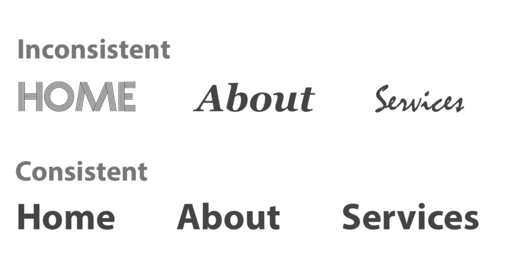
How to avoid: We’re big believers in brand consistency, and we recommend brands take the time to build out a comprehensive brand style guide before getting started on any marketing materials. Your style guide will outline exactly what fonts, color palettes, and types of imagery to use so you never have to worry about publishing something inconsistent with your brand.
Walls of text
Unless you’re reading a gripping novel, no one likes having to muscle through walls of text. According to research, only 1 in 5 people actually read web content word for word. Most people skim or quickly scan to see if they want to continue looking at something in greater detail. You’ve only got a couple of seconds to hook someone – so don’t immediately turn them off with imposing blocks of text.
How to avoid: When designing with text in mind, follow the rules of visual hierarchy. This is the idea of placing your graphic or textual elements in order of importance. Let people know what to read first, second, third, and so on. Here’s a great example of visual hierarchy in action.
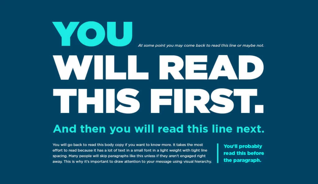
Low contrast
Have you ever had to squint to read something, even if you were holding it up close? That could possibly be because of low contrast. Check out the examples below:
Which is easiest to see? Definitely #1, right? That’s why whether you’re working with visual or textual elements, you want to be designing with high contrast in mind. High contrast means everyone will be able to read and understand your design.
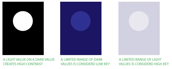
How to avoid: Double check your color palettes for contrast using this handy tool here. Anything above a 4:5:1 ratio for normal text is considered readable.
Lack of accessability
Speaking of low-contrast, let’s talk about some other common ways designs can inadvertently become inaccessible.
A few of the most common accessibility mistakes we see are:
- Forgetting about mobile design when designing for the web
- Using color alone to convey information or meaning
- Not providing stop/start controls for digital content that starts automatically, like videos, audio, carousels, etc.
How to avoid: Accessibility makes your content open and available for everyone. Familiarizing yourself with design accessibility standards can help give you a new perspective, and offer valuable tips on how to design for everyone.
Poor quality, irrelevant imagery
The pictures, images, and graphic art elements you choose to use says a lot about what you’re brand is all about, and nothing looks more unprofessional than blurry, pixelated, or irrelevant imagery.
When thinking about visual elements, make sure they make sense in the context of your overall brand or product goals. For (an extreme) example, you wouldn’t use imagery of tropical fruits and palm trees to advertise an Italian restaurant.

How to avoid: Always ensure your imagery is consistent with your brand. Then, don’t forget to use the right image format to ensure proper scalability and applicability. For example, since raster images are made up of pixels, they look pixelated when blown up. Vector images, on the other hand, can be sized however you need without becoming blurry or pixelated.
Not investing in quality software
If you want to create and publish professional-quality designs, then you need professional software. While there are many free design softwares available online today, many don’t offer the flexibility and usability that professional tools do. What’s more, many of them rely on stock images and raster graphics, which as we mentioned before, have limited utility.
How to avoid: Investing in a quality design software can drastically improve your design workflow, from allowing you to save and reuse templates, to opening up collaboration with anyone in your business. Take a look at our platform overview for more info on the kinds of features a great design platform should offer.
Key takeaway
Your designs can uplift your business – or take it downhill. Understanding the basics of good design will help you avoid the most common mistakes, and take your creativity to new heights. Want more resources on how to build a stunning brand? Check out our blog here.
In today’s digitized, inter-connected world, it’s all too easy to send a text or an email to someone and forget about it. Whether it’s an e-card for Mom’s birthday or a PDF brochure for a prospective client, digital content is incredibly efficient and convenient. But as any library lover will tell you, there’s just no replacement for the printed word.
Related: Not everything is online—How print materials can raise brand awareness.
Here at Lucidpress, we offer our own Print & Ship service, so users can create unique designs and bring them to life through print. We’re talking cards, business cards, flyers, documents, brochures, you name it. Ordering gorgeous, high-quality prints is a feature that more of our users requested than any other—and we’re here to deliver (pun very much intended).
Not sure about the value of print in a digital world? Here’s a few reasons why we believe print will never die.
Scarcity

Now that so many things are shared digitally, print stands out. Well-placed printed materials can grab attention for your business, so they’re a boon to your marketing. And because printing is more expensive, printed materials carry more authority and credibility than they did before, because someone took the effort to produce them.
Ever hear of “supply and demand”? Digitized content eliminates the supply and demand curve, because supply is infinite. But with printed content, the curve still stands. Printed items are tangible and maintain their scarcity. Certain printed items, like concert and movie posters, can even become collectibles because they evoke strong memories of a certain time and place. Can’t do that with a PDF.
Beauty

No matter how popular eBooks get, there is always a stalwart bunch who refuse to get rid of their old books. Why? One possibility is this: books and printed materials have physical beauty that can be appreciated again and again over time. Book-binding itself can be described as an art, one which has evolved and developed a rich history. We know how important aesthetics are—just take a look at our previous blog post about book covers.
The point is, printed materials like books have varied appearances and styles. Digital materials are often homogenized down to black text on a white screen. And while that is useful and efficient for conveying information, the appreciation of unique physical beauty is lost.
Sentimentality

How many photos are saved on your phone or hard drive? When I last checked, mine had over 3,000 (and counting). But when was the last time I sat down and flipped through all those photos? Hardly ever.
Photos in particular are a record of permanence, a memory you can hang in your home or office. I may not glance at the pictures on my phone very often, but I pass by the picture of my nephew hanging on my wall every day. And each time I see it, my heart fills with joy. Certain photos deserve to be printed and cherished in scrapbooks, frames, lockets and wallets.
Printed materials are a powerful reminder of something concrete. Following the same principle as photos, you can create strong impressions by providing printed materials for your business. If you’re at a trade show, for example, it’s far more impactful to hand someone a brochure than to give them a link to a landing page.
Practicality

Wait, but didn’t I say digital materials are the more convenient choice? Sure. But that doesn’t mean print is lacking in practical benefits. Here are a few reasons you might choose print over digital:
- Many find print easier to read, especially for long periods of time, so as to avoid eye strain.
- Readers are less likely to skim a printed document than a digital one.
- Printed materials feel more inviting and immediately engaging than files which have to be opened first.
- As unscientific as it sounds, print simply feels better to humans because it uses more of our senses to create a stronger memory. (Think “old book smell.”)
Digital might have its advantages, but one thing is clear: print is not now, or ever, really going away. Its purpose and value might shift over time, but today, it makes more sense than ever to print what matters most. Whether you’re sharing a photo postcard for the holidays or business cards at a trade show, Lucidpress can help you bring your ideas into the real world.
Ready to design your own print ideas? Lucidpress makes it easy to create beautifully branded content in a matter of minutes.
A picture truly tells a thousand words. From pie charts to cartograms, infographics have been around since the first humans learned to scratch symbols into the dirt. After all, an infographic is composed of only three vital elements: visual, content and knowledge—qualities shared by the earliest of cave drawings and the most technical of modern computer-aided data visualization.
Today online tools empower anyone to create infographics, but this visual format is not new. In fact, they are among the oldest forms of communication, and it only makes sense that they’ve retained their function throughout human history. People are visually wired.
Related: 32 stats & facts that prove infographics aren’t dead
An astonishing 50% of the human brain is involved in visual processing, and 70% of its sensory receptors are in the eyes. It takes less than one-tenth of a second to take in new visual scene: 150 milliseconds to process a viewed symbol, and another 100 milliseconds to attach meaning to it.
Every day, people are exposed to increasing amounts of information. In fact, the average person is exposed to five times as much information today than in 1986. As our brains adapt to process more information, the infographic’s efficiency at quickly and clearly conveying a message makes it a more vital form of communication. It’s no wonder the use of infographics in literature has increased by more than 400% since 1990. Likewise, the use of infographics on the internet—where users are barraged with a constant stream of changing information—has grown nearly 10x since 2007.
People of earlier times may have had less data to deal with, but that didn’t make the infographic any less useful for them to share their understanding of the world. Early forms of visual communication helped people of long ago tell stories, document the lay of the land and visualize scientific discoveries. Here are 6 ways infographics changed the course of human history.
Cave paintings
In its most basic form, an infographic is a visual communication method that tells and records a story—and isn’t that precisely what prehistoric cave drawings did? Forty millennia ago, the first storytellers painted the tales of early human culture, recounting births, deaths, massacres and celebrations, as well as plants and animals living among them in the Ice Age. Those early recordings provide invaluable information to modern audiences. For example, the paintings within Brazil’s Serra da Capivara, thought to date back as far as 36,000 years ago, challenged the theory that humans first migrated into South America in about 9,000 B.C.

But cave paintings are more than mere artwork; they were also informative to ancient men. Western European cave drawings depicted complex designs that archaeologists believe are primitive maps of the stars. One particular French cave contained thousands of drawings of people, animals and abstract representations believed to be part of the Summer Triangle constellation. Other cave paintings studied by archaeologists are now thought to be the earliest-known depictions of volcanic eruptions and help modern scientists understand volcanic activity in the early days of human history.
Hieroglyphics
It’s been 5,000 years since the ancient Egyptian civilization thrived, but the society left vast recordings of its culture. Hieroglyphics are a form of infographic used to describe ancient Egyptians’ lives, work and religion, while fabulously preserving their way of life. Not only did hieroglyphics feature drawings that represented objects and ideas, the written language also evolved to represent sounds with symbols.
Like many infographics, Egyptian hieroglyphics were meaningless to early archaeologists without a key. Therefore, the Rosetta Stone, the 1799 discovery that deciphered Egyptians’ pictorial language, is without a doubt one of history’s most valuable infographics.
The stone engraving, a decree from King Ptolemy V, features three scripts: Egyptian hieroglyphs, Egyptian Demotic script and Ancient Greek. By comparing the pictorial decree to other known written languages, archaeologists were finally able to decipher the ancient hieroglyphs uncovered across time.
Just as the Rosetta Stone unlocked the secrets of Ancient Egypt, translation and common understanding are key in today’s global society. According to K International, translation can make or break a brand now more than ever before—all because of the e-commerce market. Since 2007, global online sales have increased 17%, and China is now the largest global consumer of luxury goods—25% of all sales.
While words and phrases may vary, images are universally understood around the world.
Maps
Maps were one of the first infographics early people designed and distributed, and cartography has remained an integral science for thousands of years. From primitive maps drawn inside caves and the ancient maps of Babylon to the Age of Exploration’s changing maps and 21st-century maps of the universe, people draw diagrams to help them navigate the world.
The earliest-known maps don’t depict cities, roads or waterways at all, but the heavens above. Dots drawn within caves map out parts of the night sky and its constellations. Dots drawn inside a French cave more than 16,000 years ago map stars as seen by ancient Europeans. The oldest atlas ever discovered, the Dunhuang star atlas, was created on an ancient Chinese scroll almost 1,400 years ago.
The earliest-known map representing the natural landscape was a crude representation discovered in the Czech Republic and has been dated to 25,000 B.C., and ancient Babylonians were already using accurate surveying techniques by 600 B.C.—although their view of the world was limited to the known environment of the time: a circular area surrounded by water.
Regional maps retained the primitive qualities of the Babylonian Map of the World for centuries, but by the end of the medieval period, Europeans were mapping their nautical trade routes using accurate navigational directions.
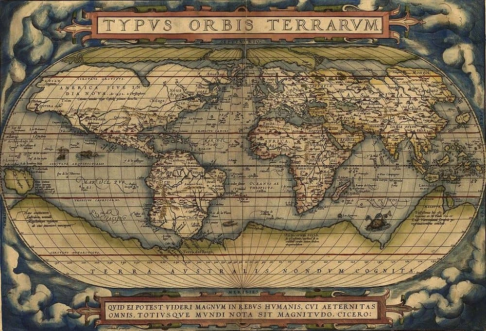
With the discovery of the Americas, Europeans’ interest in mapping piqued as nations struggled to control new lands and resources. The first-known cartographic representations of the Americas—as well as Europe, Asia and Africa—were designed by Spanish cartographer Jean de la Cosa, who sailed across the Atlantic with Christopher Columbus. Were it not for him and a handful of other Spanish and Portuguese explorers, the New World would have remained in darkness, discouraging the settlement that followed.
Even today, maps are one of the most common forms of infographics. Easily-recognizable locations form the basis of many efficient infographics that instantly convey a message. For example, when Fractl needed to create an infographic that was not only timely but could appeal to a large audience, it chose to map the hometowns and locations of 75 Marvel characters. The infographic was highly effective, and the map was featured in 365 publications.
“Maps are great for compiling a lot of information into a single graphic,” explained the map’s designer. “When you look at a map of the United States, you are effectively viewing 50 different data sets at once, but because we see maps all the time, the mind can easily absorb the information being presented.”
Early charts & graphs
Throughout most of human history, data visualization was limited because data was limited. Then, thanks to various sciences, scads of information—about demographics, economics, geography and weather patterns—emerged. And people needed a way to more easily analyze all this information.
By the end of the 18th century, most charts used today—histograms, pie charts, bar and line graphs—were already in use, introduced to the world in William Playfair‘s 1786 publication, Commercial and Political Atlas.
A Scotsman schooled in drafting, Playfair decided to use his skills to illustrate economic data. At the time, such information was commonly represented in tables, but Playfair transformed the data into infographics. In one famous line graph, he charted the price of wheat against the cost of labor, countering the popular opinion that wages were driving up grain costs and demonstrating that wages were, in fact, rising much more slowly than the product’s cost.
Playfair held a keen understanding of data visualization for his time, and he speculated that the brain can process images more efficiently than words. He argued that good data visualization is about “giving form and shape to a number of separate ideas, which are otherwise abstract and unconnected.” According to Playfair’s writings, data should “speak to the eyes,” because they are “the best judge of proportion, being able to estimate it with more quickness and accuracy than any other of our organs.”
Political diagrams
One of the greatest social issues of the 19th century, slavery was the subject of one of America’s most historical infographics. After the southern states seceded in 1860 and 1861, Union military leaders needed a strategy to invade Virginia.
Meanwhile, the federal Coast Survey department produced a map of Virginia that would prove pivotal in the Civil War. Based on data from the 1860 census, the map depicted slave populations in each of Virginia’s counties, one of the first to represent population with shading—the darker the county was shaded on the map, the more slaves were held there.
By examining the map, it immediately became evident that eastern Virginia was a slavery hotspot, while the western portion of the state was relatively slave-free. Therefore, Union forces deduced that Virginians in the western counties would likely fight for slavery less ferociously, and they might even change teams.
“It was a breakthrough map,” noted Susan Schulten, University of Denver historian and author of “Mapping the Nation.” “It was an attempt to influence how the government saw the nation, and how the military understood it. It drove Lincoln’s attention to where slavery was weakest.”
Later, when the U.S. Coast Survey produced another map that charted slave density across the Confederacy, President Lincoln consulted the infographic throughout the remainder of the war, relying on it to understand in which areas Southerners would be more and less dedicated to a fight.
Political maps and diagrams continue to influence public policy today. Although the United Nations High Commissioner for Refugees consists of an 8,000 person staff that collects enormous amounts of data on global refugee displacements, the organization has struggled to communicate its information in a meaningful way.
In a new approach, the agency commissioned an infographic to narrate 40 years of refugee data. The interactive graphic highlights where and when refugees emigrate and tells the complex stories of political, social and economic turmoil that lead to each displacement.
Since launching in 2014, the project has accrued more than 5 million page views, has been shared on Twitter to millions via humanitarian organizations such as Amnesty International, and it was even awarded a Gold Medal for Interactive at the prestigious Molofiej 22 Infographic Awards.
A message from Earth
The 20th century saw the advent of mass media, and publications quickly adopted infographics to efficiently convey complex information and data. As programming languages were born, computer-generated graphics pictorially depicted massive amounts of data, advancing all aspects of science and technology. But throughout all the advancements in visual storytelling, one thing remained clear: infographics are a universal language.
Thus, when NASA decided to send a message from mankind to extraterrestrial lifeforms, it determined an infographic would most likely do the job. In 1972 and 1973, aluminum plaques were placed aboard the Pioneer 10 and 11 spacecraft, each depicting a pictorial message. Each plaque featured simple drawings of a nude male and female human, as well as symbols designed to indicate the Sun’s position in the galaxy.
The Pioneer 10 and 11 spacecraft were the first human-built objects capable of enough velocity to escape the solar system. NASA turned to world-famous cosmologist Carl Sagan to design the ultimate message in a bottle. One diagram depicted the chemical makeup of hydrogen, the most abundant element in the universe.
The drawings of the humans included a diagram that pictorially calculates their height compared to the spacecraft, and the man’s right hand is raised as a sign of good will. (Of course no person on Earth can know if extraterrestrial intelligence will identify that raised hand as a peaceful symbol, but scientists hope the gesture is universal.)

A radial pattern on the plaque consists of 15 lines emanating from a center origin, indicating the distances of pulsars to the Sun, allowing recipients to pinpoint the location of launch in space and time. Finally, a diagram of the Solar System was inscribed on the plaques, depicting the launch location and trajectory of the two spacecraft. With any luck, the universal languages of mathematics and visual storytelling will tell unknown intelligent life that we are here, and we come in peace.
We most certainly live in an era of data visualization. Graphics charting everything from election polls to physical activity are found everywhere from the newspaper and television to the computer and smartphone. But in order to understand the elements of a successful infographic, we must remember that visual storytelling isn’t a new phenomenon, and the elements that worked for the ancients are still at play today.
Ready to make history with your data? Try Lucidpress to create gorgeous infographics for your brand—no expert design knowledge required.
If you’re thinking about pursuing a design career, you probably already know that you should learn from those who came before you and left a permanent mark in the world of graphic design. Being familiar with the big names and their influential works will provide inspiration as you learn from the best.
Related: 10 influential black designers from past to present
There are hundreds of designers who have bent the rules and challenged boundaries, completely changing the way we see design. But today, we’re looking at just 5 pioneers of modern graphic design that we think you should know.
1. Milton Glaser
Milton Glaser is one of the most successful graphic designers in the world. He’s an American, most famous for his “I love New York” logo. He designed it in 1977 to promote tourism in the city, and it’s become the most widely distributed logo ever.

His other masterpieces include the Brooklyn Brewery logo, the DC Comics logo and a psychedelic Bob Dylan poster, among a number of stunning designs that made him one of the most celebrated graphic designers ever. He’s received many awards for his work, and many pieces have found permanent homes in the collections of art museums. He was also the first graphic designer to receive the National Medal of the Arts award from President Obama in 2009.
2. Stefan Sagmeister
Stefan Sagmeister is an Austrian graphic designer and typographer who started his design career at the young age of 15. He’s based in New York, where he’s co-founded a design agency with Jessica Walsh called Sagmeister & Walsh Inc. He introduced his first agency (Sagmeister Inc.) to the design world in 1993 with a nude photo and has continued to produce provocative designs that rarely fail to capture an audience’s attention.

He’s known for unorthodox, thought-provoking designs and has worked with a number of artists. Some of his famous clients include HBO, the Rolling Stones, and the Guggenheim Museum. He’s also collaborated with musicians Lou Reed and David Byrne. The artwork he created for Reed’s album Set the Twilight Reeling is particularly striking.
3. Neville Brody
Neville Brody is an English graphic designer, typographer and art director. He founded Research Studios (now Brody Associates) and works at the Royal College of Art in London as the department head of Communication Art & Design. He’s widely known for his work in the magazines Arena and The Face. He also redesigned The Times newspaper (introducing the Times Modern font) in 2006. Many of his works are included in the permanent collection of New York’s MOMA.

He’s famous for designing album covers for artists like Depeche Mode, the Bongos, and Cabaret Voltaire. He once said: “Design is more than just a few tricks to the eye. It’s a few tricks to the brain.” That is exactly what his designs accomplish—they carve their way into the mind, where they inspire us to see the world through different glasses.
4. David Carson
David Carson is an American graphic designer and art director who is best known for his “grunge” typography that defined a new era in graphic design. He was the art director of Ray Gun magazine and once used Zapf Dingbats as the font for an entire article in the magazine—a font that contains only symbols.

That is exactly why his designs are so compelling—because he is bold and not afraid to experiment with our assumptions. He thinks beyond common practices in design and typography, which makes his work unique and, often, mesmerizing. Interestingly, he was also a professional surfer and ranked as the 9th best surfer in the world in 1989.
5. Paula Scher
Paula Scher is an American graphic designer and educator whose impact and influence run deep. In 1991, she became the first female principal at the design studio Pentagram, and she’s widely known for designs that offer bold identity and outstanding visual personality.

Some examples of her design work include the logos for Microsoft Windows 8 and Office 2010, as well as branding for The Public Theater, the New York Shakespeare Festival in Central Park, the Museum of Modern Art, The Metropolitan Opera, and the New York City Ballet. She also designed the interior for the New Jersey Performing Arts Center and created a middle-school program for environmental graphics in Brooklyn. She’s a renowned painter whose works go beyond the realm of graphic design.
Key takeaway
Learning from the greats will certainly inspire you and get your creative juices flowing. Have these five inspired you in your work? Who else would you add? Tell us which designers inspire you below, and we just might include them in a future post.
Inspired to bring your own graphic design projects to life? Here’s why Lucidpress is the best choice for gorgeous online design.
Bonus: ASMR for graphic designers
Need a laugh? Put on those headphones and settle into this vector-tracing, Comic-Sans-destroying, design-thinking ASMR experience.
From Facebook posts by old friends asking you to try products that “really work,” to those email subscriptions you’re sure you never signed up for, people are constantly bombarding you with information from all platforms. Everyone wants your attention, and it’s up to you to determine what makes the cut. Our eyes can only process so much—and our brains can interpret even less.
Related: What is an infographic? A comprehensive guide
This fact is well-known to marketers, who constantly work to create new and exciting content to be consumed by target audiences. The job of marketers is growing increasingly more difficult as the days of simply creating interesting, insightful, witty, easily understood yet informative content are over. On top of everything their positions entailed before the age of social media and email campaigns, marketers now have the additional task of differentiating themselves from everyone else who is trying to do the exact same thing.
So, how is it done? How can one business’s content stand apart from the overabundance of black-and-white text being hurled at consumers across the globe?
The answer lies in visual content—like infographics. We’ve compiled a list of 32 stats and facts that demonstrate the importance of visuals in your marketing messages. These stats can help you disseminate content that is read instead of skipped.
How do we process information?
- 90% of information sent to the brain is visual. (MIT)
- 65% of people are visual learners. (Pearson)
- When people hear information, they’re likely to remember only 10% of that information three days later. However, if a relevant image is paired with that same information, people retained 65% of the information three days later. (Brain Rules)
- 99% of all sensory information is filtered out by the brain almost immediately. This means that only 1% of information actually gets through to the brain. Infographics are in this 1%. (QUE Publishing)
- Visuals with color increase people’s willingness to read a piece of content by 80%. (Saurage Research)
- People following directions with text and illustrations do 323% better than those following directions without illustrations. (Springer)
- Eye-tracking studies show internet readers pay close attention to information-carrying images. In fact, when the images are relevant, readers spend more time looking at the images than they do reading text on the page. (NN Group)
- 81% of people only skim the content they read online. The average user reads 20-28% of words during an average visit. (NN Group)
Why should you use infographics?
- Infographics can increase web traffic by 12%. (Demand Gen Report)
- Posts that include images receive 650% higher engagement than text-only posts. (Webdam)
- 30% of marketers use original graphics, such as infographics, more than any other type of visual content, including videos and GIFs. (Venngage)
- When asked which types of visuals had the highest engagement, 42% of marketers reported that infographics and other original graphics were the most engaging. This was higher than any other form of visual content. (Venngage)
- Content with relevant images gets 94% more views than content without relevant images. (Quick Sprout)
The importance of visual content in social media
- Infographics are liked and shared on social media 3x more than other any other type of content. (NN Group)
- Tweets with images receive 150% more retweets than tweets without images. (Buffer)
- 74% of social media marketers use visual assets in their social media marketing, ahead of blogs (68%) and videos (60%). (Social Media Examiner)
- 37% of marketers say that visual marketing is the most important form of content for their business. (Social Media Examiner)
- Facebook posts with images get over double the engagement than those without images. (BuzzSumo)
- In an analysis of over 1 million articles, BuzzSumo found that articles with an image once every 75 to 100 words received double the social media shares as articles with fewer images. (BuzzSumo)
- On LinkedIn, images generally result in a 98% higher comment rate. (LinkedIn)
- Tweets with images receive 18% more clicks than those without. (Buffer)
- Facebook posts from brands that included images earned 87% of all engagements. (Quintly)
How does this affect marketing?
- Infographics were the B2B content marketing tactic with the biggest increase in use from 2015 to 2016, up from 50% to 58%. (CMI)
- From 2015 to 2016, the use of visual content by marketers increased by 130%. (Venngage)
- 71% of marketers claim to spend less than 5 hours per week making visuals. 11% spend over 15 hours per week, and 18% spend between 5 and 15 hours per week. (Venngage)
- 29% of marketers report that the biggest struggle they face when creating engaging visuals is being able to produce well-designed visuals. (Venngage)
- 36% of marketers predicted that they will spend more than a third of their entire budget on visual content in 2017. (Venngage)
- 53% of marketers stated that 91-100% of the content they published in 2016 contained visuals. (Venngage)
- 65% of senior marketing executives believe that visual assets are core to how their brand story is communicated. (MediaPost)
- 65% of marketers say that a lack of time or staff resources are the biggest challenges to creating effective visual marketing. (Chute)
- 58% of marketers say they are looking to consolidate platforms and processes to increase visual marketing output and effectiveness. (Chute)
- Publishers who use infographics see traffic grow an average of 12% more than those who don’t. (Anson Alex)
The statistics speak for themselves: visual content is essential to capturing and holding the attention of potential readers. As the data shows, however, over 17% of marketers spend more than five hours per week creating visuals in order to brand their business and disseminate information. Five hours per week spent creating infographics is five hours per week not spent improving your business.
So how do you keep up with the stunning visual content of competitors but also spend significantly less time in the creation process? The solution is Lucidpress: a web-based design platform that empowers even the most novice of designers to create impressive visual content. Using our simple drag-and-drop formatting will help you spend less time branding your business and more time building it.
Create striking visual content in minutes with our easy-to-use infographic templates. Get started for free today!
A well-constructed digital marketing campaign can offer limitless possibilities for businesses who are open to implementing new, proactive strategies to go along with their most-revered traditional ones. After all, mixing up some old and new campaigns can bring interesting and promising results to data-driven businesses.
Among the most cost-effective ways to build and maintain a connection with your audience is through an email newsletter program. Yes, those recurring emails you’re used to receiving from your favorite brands and personalities can also be a catalyst for your own brand’s long-term success.
Related: How to make a newsletter in 9 steps
It’s easy to set up, too. For example, newsletter software like ActiveTrail’s email marketing automation platform (which offers newsletter templates and a responsive email editor) can be a great complement to the visuals you design in Lucidpress. But in any case, if you’re not yet implementing this strategy, here are 4 reasons to set up your own newsletter program soon.
Stabilize the flow of information
Your website and blog might offer the best content on the internet, but the thing is, most online visitors will still rarely spend more than a few seconds on any webpage. That’s why a proactive support system should be in place to keep people coming back. Remember, a blog often requires people to initiate contact, and as a business, this behavior can translate to inconsistent returns. But if you have an ongoing newsletter campaign, you can conveniently reach out to your customers and drive further engagement. By giving your audience instant access to promotions, new products and other updates, people will have a much easier time understanding what your brand can do for them.
Increase brand awareness
A newsletter can carry a substantial amount of information, making it easier to create awareness around your products and services. By proactively sending out new messages, customers and prospects will come to feel your brand is familiar and will think of it more often. It’s an efficient and consistent way to remind people of your presence, and if your content is timely and compelling, it’ll drive your audience to act.
Connect with new prospects
It’s no secret that people love to window-shop online. Much of the time, people are passively looking for products and services that they want, but they simply don’t have the time, money or right reason to buy now. A newsletter that provides prospective clients with valuable information helps them make favorable decisions when the right time comes. Use your newsletter to prove your expertise and stay in touch with potential customers until they’re ready to strike a deal.
Keep existing customers in the funnel
You lose some and you gain some. But how about gaining more? Companies can never completely eliminate churn, but a thoughtful newsletter campaign can certainly reduce the risk of annoying your recipients. By keeping them in the loop, getting their feedback, and introducing them to your latest offerings, customers will feel like you have something more to offer and that you’re consistently improving your services. The more you stay in touch with customers, the more likely they’ll feel valued and appreciated. [![]() ]
]
Are you feeling inspired and optimistic about starting your own newsletter campaign? Don’t wait—roll out a program now and keep the deals coming in, not only from your existing customers, but from the thousands of prospective customers out there.
Here’s more than a dozen free newsletter templates to help you get started.
A good content marketing strategy should explain why a company is making the marketing decisions that it is. Anyone reading should see why content marketing is being used, why certain decisions are being made, and why the company wants the image it’s pursuing.
Unfortunately, since content marketing varies as widely as the brands using it, myths and legends about how to make it work still abound. With 70% of B2B brands planning to use content marketing next year, these myths will continue to spread into a new generation of marketing campaigns. That is, unless we marketers agree to let these myths go the way of Bigfoot and Nessie.
New to content marketing? Start off on the right foot with Lucidpress.
Myth #1: Trending topics will always work out
Let’s go viral! There’s this idea that the best way to market a brand is by latching onto an outrageous topic which will immediately grab the attention of anyone around. (Oh look, a shiny thing!) While interesting topics are undoubtedly fun, they’re not always a surefire win. Marketing topics should always coincide with the company’s message and values. Remember that trending topics rarely remain so, and one can quickly change from being adored to being annoying. Sigh—crowds can be so fickle. But setting smart goals for your content, whether it’s brand awareness or targeted selling, will help you keep the company’s mission as your North Star.
An example of doing this the right way? Our sister brand Lucidchart created this hilarious video about dogs (erm, that is, “doggos”) that is not only timely Internet humor—it also shows off what you can do with the product. In this case, the topic and the brand fit neatly into the middle of the viral Venn diagram, and the video has been a huge success.
Myth #2: Keywords are the most important factor
One particularly pervasive myth is that marketers should trust keyword data above all—even over the intentions of potential customers as shown by their search queries. In order for keywords to work at their best, they must be focused on the customer’s journey. SEO tools will only get you halfway there. [![]() ]
]
Use keyword data to inform your content marketing strategy, not determine it outright. Think about why someone would search for a particular keyword—and what questions they have that aren’t being answered by existing search results. Match individual keywords to the different personas your brand targets so you can speak to the audience who most wants to hear what you have to say. All of this should lead to more interesting, relevant content that’s more valuable than simply writing about a keyword.
Note: Another myth surrounding keywords is that using them removes any creativity from writing altogether. Not only is this pretty lazy thinking—it actively undermines content writing as a means of marketing the business. SEO and content marketing should work together to support one another, and neither should become too dominant in your strategy. This leads us to our next myth…
Myth #3: All storytelling, no selling
Content marketing is a form of marketing (shocking, I know) which uses storytelling to draw in prospects and excite them about your brand, product or service. Around half of marketers admit to focusing more on the creative work than on measuring the results—which means they’re missing an opportunity to bring themselves into closer alignment with the needs currently driving their customers. You can tell great stories all day long, but if your audience isn’t being moved down the funnel, it does very little for your brand’s bottom line.
To an extent, content marketing can be considered a form of brand building. People often remember the content of a marketing campaign more easily and affectionately than they do the products and services on offer. This has contributed to the belief that storytelling is more important than selling, when in reality they should be equal. The content marketing should enhance your brand’s offerings—not the other way around. And speaking of brand building…
Myth #4: Content marketing is separate from brand building
We touched on this briefly in the previous section, but there is a pervading myth that brand building and content marketing are separate disciplines. In today’s world, they intersect. Brand building is accomplished through marketing; the specific nature of content marketing makes it even more useful to growing brands.
Brand building and content marketing are best mixed together because they build trust and good rapport between a brand and its followers, while simultaneously helping the brand become more visible and easily recognized. Combining the two results in consistently well-branded content that contributes to a brand’s image, reputation and conversion funnel.
Myth #5: Your content should only be hosted on your website
Content marketing can cover a variety of mediums and senses. However, many brands miss out on exciting possibilities and partnerships by keeping all of their work on their own sites. Podcasting, vlogging and guest blogging open doors to entirely new audiences who might not have interacted with your brand otherwise. You can even look for new channels to help distribute your content. For example, we’ve had success with a Lucidpress publication on Medium because it plugs us into active reading communities who are interested in our niche.
Key takeaway
Content marketing has become a popular branding strategy, but it’s still shrouded in a variety of myths which make it less successful than it should be. Toss these myths by the wayside and use these tips to connect with loyal brand followers and new audiences.
Ready to get started? See how Lucidpress can streamline your content marketing efforts today.
What makes the design world exciting is that there’s never a dull moment. Design is continually evolving with new trends, and these trends often dominate the scene for a time. We’re in the middle of 2017, and already, there have been several logo design trends enjoying their share of popularity.
As we know, a logo is critical to your branding regardless of business type, products or services. It is the first thing that catches the attention of your target audience and establishes a strong business persona.
Related: Learn the 10 essential brand assets for digital success
Keeping track of these trends is enough to make anyone’s head spin. Well, we took a dive into the subject so you don’t have to. Today we present you with what we believe are the 5 most popular logo design trends in 2017.
1. Minimalism
“Through simplicity comes great beauty.” It is often the simplest of logo designs that catches attention. Perhaps this is why flat design is currently dominating the business world. Its popularity has been spurred by the likes of PayPal, Airbnb, Foursquare and Netflix. Minimalist logo designs are purpose-driven, easy to remember, and can be identified at a glance. No matter what trends come and go, a minimalist logo design has timeless appeal.
Example: Nike
Can it get more minimal than the classic Nike swoosh? The logo design for this popular sports brand is simple, iconic, and anyone can understand the message behind it.
2. Negative space
Negative space refers to the space in or around an object that is creatively used to form another shape within the logo design. Logos with negative space are popular because they encourage the audience to pay attention and discover the hidden clue. A logo with negative space can be cleverly designed, witty, and come with a deeper message.
Example: FedEx
The FedEx logo was created in 1994. Since then, it has won around 40 design awards and been ranked as one of the best logos in the last 35 years.
If you take a closer look at the space between the E and the X, you will see a tiny arrow hidden within it. This arrow symbolizes FedEx’s fast speed coupled with accuracy.
There is significance in the color choices, too. To creatively separate the whole of FedEx from its individual services, they use different colors for “Ex.” For example, the orange Ex stands for “Express,” while the red Ex is for freight. FedEx has managed to pack a whole lot of information in its simple, clean logo.
3. GIF (moving logo)
GIF logo design features animated images that are continuously moving. This kind of logo design is like a hybrid between static images and video. It’s caught on recently because they offer a whole new way to capture a viewer’s attention.
Thanks to social media sites like Twitter and Tumblr, GIFs are enjoying a new heyday of popularity. Including tiny animations in the logo design is fun and can be done fairly quickly.
Example: Giant Owl
The logo of Giant Owl (a London-based production company) features two giant, owl-like eyes that illustrate the company’s name and resemble digital tape spools. The logo is further brought to life by animating the eyes, which grabs a viewer’s attention because the movement is so unexpected.
4. Letter-stacking
Letter-stacking is a technique designers use to place long phrases and text without spreading across a large area. Logos can include vertical or horizontal inscriptions along with complimentary graphic elements—a great visual combination. Letter-stacking logos are compelling: spending a few extra seconds to unravel what it says results in increased memorability.
Example: Oakland Museum
The Oakland Museum of California created a logo which playfully arranges the letters of its lengthy name into three sections and emphasizes its initials. Letter-stacking logos are a great option for incorporating long, verbose business names.
5. Hand-drawn style
Despite the name, hand-drawn logos are not technically drawn by hand—rather, they give the impression of a free-form sketch. These logos offer a retro sense of charm and connect with audiences on a personal level. The warm, down-to-earth appeal that hand-drawn logos offer is sometimes hard to achieve with a purely digital design.
Example: The Fitness Lab
In this case, a hand-drawn logo design perfectly expresses the fun, quirky and casual vibe the brand is aiming for. Your business logo doesn’t always have to feature pristine digital design—a cheery doodle or sketch can be a great starting point (like this version!).
Wrapping up
Your logo is possibly the most significant branding tool in your arsenal, so make sure you have a strong one. These logo design trends will help you stay on top of the game even as they keep evolving.
Learn more: Do you know the 10 essential brand assets for digital success?
When used correctly, Facebook advertising can be an incredibly effective tool to boost sales. But before you can expect people to whip out their credit cards and buy out your inventory, you need to establish brand affinity. In this post, we’ll go over just a few of the best ways you can maintain your current following and attract new customers.
Related: 5 ways to grow your email marketing list with Facebook
1. Create captivating, on-brand creative
One of the most important tasks of a successful Facebook advertising campaign is to create ads that will catch the eye of target consumers—which can be difficult to achieve since there’s so much competition on the platform. Using alluring images and bright colors in your ads is a good start, but be careful. If you have 20 advertisements that all use different styles and colors, it’s unlikely that new customers will gain any familiarity with your brand. Instead, stick with brand colors whenever possible and always include your logo in the ad. You should also use the same principal font that’s on your site, and never use more than two fonts in one ad.
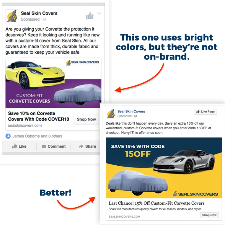
2. Use targeting filters and “Lookalike audiences” to find new fans
While remarketing campaigns are like shooting a fish in a barrel, finding new consumers who will have a genuine interest in your brand is a far more challenging task. Luckily, Facebook has a variety of unique targeting features that can help you refine your audience. Consider the demographics, behaviors and interests of your ideal customer and use that information to narrow your selection. For example, if you own a bridal shop and want to increase your wedding dress sales, you could target people who recently became engaged.
Facebook also has a unique feature called Lookalike audiences. With this tool, you can import a list of existing customers, and the platform’s algorithm will automatically identify new consumers who are likely to have an interest in your products or services. This can be an incredibly valuable tool for new brands looking to grow their fan base.
3. Establish a brand voice—and stick with it
To build strong brand affinity on Facebook, use ad copy that aligns with your unique brand voice. For example, if you own a mortgage firm and your brand voice is authoritative and professorial, then you don’t want to run ads that are filled with over-the-top puns and jokes. It’s also important to be consistent with your terminology. If your e-commerce company refers to buy-one-get-one-free sales as “BOGO,” this should be a consistent term in all your ads. If you have more than one person writing copy for your Facebook ads, create a style guide with tips and rules to follow.
When crafting your brand-consistent copy, be sure to write in a way that appeals to your target audience. Alongside the ad’s image or video, copy and headlines are important deciding factors in whether the consumer clicks your ad.
4. Advertise free content, too
Instead of focusing exclusively on advertisements that sell your products and services, promote free content that will spark an interest in your brand and help consumers see you as an industry authority. This is particularly wise when you’re marketing to new leads who’ve never heard of your company before. You want to offer some informative content that will warm up your leads—such as a free guide, video, blog post or infographic. Once the consumer has clicked through to your site, you can move them further down your marketing funnel by entering them into retargeting ads for other content offers or products.
Ready to make a social splash? Create an updated Facebook cover.
A friend of mine says she could not help but be swayed by what people were saying about the importance of social media for increasing sales. Some people kept rhapsodizing about how they were able to achieve rocket sales by establishing brand recognition and strengthening their brand’s presence in social networking sites.
So this friend opened an account on Facebook, created a blog, squeezed in a post here and there, and sent out newsletters to introduce her product—and generated no significant increase in sales at all. Why?
Related: 7 serious social media mistakes brands still make
The truth about the use of social networking sites
My own research shows that I should not rely on luck to sell my brand—not even when I use social networking sites. I cannot expect mere presence in social networking sites to work magic and automatically land me great sales.
How can I successfully market my brand in social media? How can I increase customer conversion rate?
I looked into case studies and marketing research. I read up on what the technical marketing experts had to say. Here’s what I found.
Put your brand where your target market is
Alex Chris is an author and Digital Marketing Consultant. He is an expert in Internet Marketing and SEO. He says that based on updated surveys, Facebook dominates the social media scene today. A massive 1.79 billion people actively use the site monthly.
Alex says that you have put your brand where your target market is. With 60% of people on the Internet using Facebook, there is no greater tool to promote your brand, find new customers and gain a loyal following.
He suggests that you create an optimized Facebook page, add friends to your personal Facebook page, and get as many “likes” as you can. He suggests putting a “like” box in your website. You have to put this “like” box in a conspicuous, readily accessible spot.
Create relevant content
Alex and a great number of other marketing specialists, say that it is not enough to create social presence. You have to create high-quality content for your followers. If you are able to do this effectively, you have a greater chance of turning your followers into constant website visitors, and eventually to customers.
Connect with your audience before selling your product
Kristen Matthews is a creative digital strategist. As an influencer marketing consultant, she has worked on a variety of case studies with innovative brands.
A Huggies case study highlights the need to create not just any content, but one that emotionally connects to your target market—even before you push your brand.
Speak, listen & respond to your audience
Brittany Berger heads the Content & PR Division of Mention.com. She says that when you send out newsletters as part of your marketing campaign, you speak directly to your target market.
Make your audience feel that you are listening to them. You create positive vibes when you respond as soon as you can to any queries or points that they want to clarify.
Do not be too promotional
When I create posts, I am representing a vision, specific objectives, and explicit principles. I am also creating awareness and recognition of my business brand.
I am not simply selling. I am informing and educating my audience.
If I become too promotional and focus exclusively on trying to sell my brand, people may see my posts as self-serving. I may lose my audience.
Online entrepreneur, writer, and founder of UpFuel.com Chris Guthrie agrees that you have to find the right blend of marketing and educational values. The right mix provides true value for your customers. It will also give you the opportunity to sell your brand.
Cater to your audience
I have a website on social media. I have a responsibility to my followers. I have to come up with content that has to do with my particular niche. I have to create posts that are engaging and useful to my audience.
If I want to maintain a loyal following, I have to go out of my way to share relevant posts in a variety of interesting ways that include written articles, videos, info graphics, images, and charts.
I want my followers to feel that they are important to me. If I send out e-mail, I have to respond to queries as soon as possible.
If I do not think my content through and create posts that do not offer anything substantial, I may end up hurting my business reputation instead of helping spark brand awareness.
In a nutshell: what to do
- To sell a product or service to people, build a strong social presence.
- Elicit interest. Build trust.
- Provide appealing and relevant content.
- Use storytelling effectively.
- Find out your audience needs and wants. Tell your story based on these.
When you are able to do these, you will be able to generate more traffic to your website. You will be able to create a bigger following. And you will be able to enjoy a higher conversion rate.
Ready to drive more leads with social media? Grab a copy of our free eBook: How to adapt your brand to social media
As designers, we know how important it is to deliver creative and compelling designs. Designs that catch the eye and gets the viewer thinking “That must be one hell of a product!” And over time, ads have gotten so creative and innovative that our expectations only get higher every time we see a head-turning advertisement.
Even in the age of digital marketing, print media advertising still plays a decisive role in the effectiveness of a marketing strategy. And as today’s world gets increasingly digitized, it might be easy to dismiss the idea of traditional print advertising, from cheap business cards to print flyers and product brochures.
Related: 5 elements of the perfect print job
If you want to increase your brand’s favorability and improve purchase intent, you must learn to adapt to the latest design trends and adopt new ways of doing print ads. Here are a few ways you can play with print layouts to achieve print perfection.
Experiment with your layouts
When designing print ads, you attempt to piece together the elements of the ad into a visually pleasing arrangement. The number of patterns you can use are endless, and it’s your duty to fit them into print advertisement mediums. You can do so by structuring them according to different layouts.
The frame-up
Easily frame a layout with the help of borders. This keeps the elements within bounds and sets them apart from other aspects of the page. The composition emphasizes a central component which surrounds the entirety of the ad, be it partially or wholly, focusing the attention on its center.
The big type
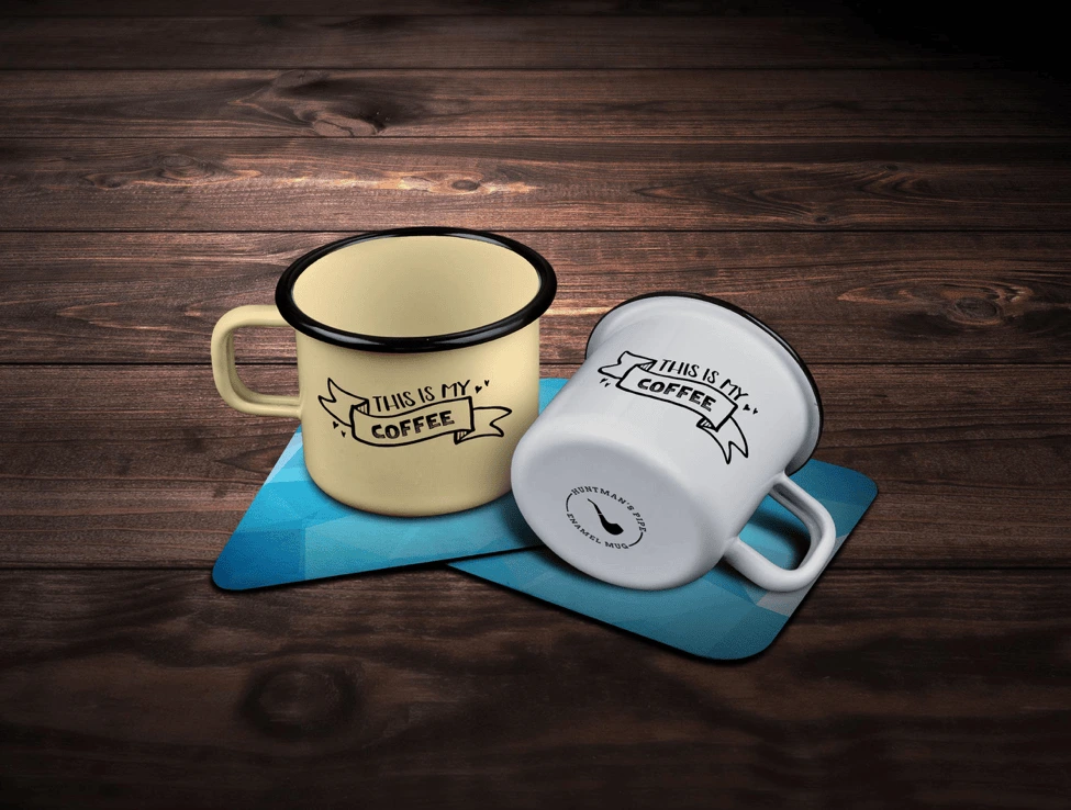
Types, especially in their larger forms, hold a particular appeal for viewers and even for artists themselves. Big types command greater attention due to their curves and stroke orders. They work seamlessly without the need for additional artwork or images, and designers can play with the typeface’s readability to convey different moods, from professional to playful.
The multi-panel layout
You can use panels for an variety of functions. They can be used to tell a story, or to display a set of information, or in our case, show off the products we want to advertise. This layout uses several frames to compare different perspectives or different features.
Designers often keep a proportional variation between every panel block to set the headline apart from the body and the signature. One of the most common examples is when you order business cards or promotional flyers online. You may notice that many designers opt for the clean, paneled look to help readers glide through the content.
Look at the bigger picture
“Big Picture” layouts, also known as the picture-window layout, highlight the main visual—usually a single, large illustration that dominates the canvas. This type of layout shows the importance of the main visual without any further accents, other than the brand logo and a line of text. The image should speak for itself.
The Mondrian-esque

Inspired by Dutch painter Piet Mondrian, the Mondrian layout consists of black bars and solid areas of primary color, divided across the canvas into squares and rectangles. A Mondrian layout focuses on the proportion as the main design principle that proves to be an easily workable and logical way to showcase art and typefaces.
Incorporate different strategies
You have your product and design concepts with you, but the industry remains competitive, and consumers have higher expectations for your ads. To meet these expectations, here are four techniques to try out.
Show, don’t tell

“Show, don’t tell” is a well-known technique across many creative fields. It states that you should always take the chance to show something rather than explain it. Use your print designs to help consumers conceptualize the product with their five senses.
This Curtis tea poster is a great example. Instead of telling you how the tea would taste, they visually appeal to our senses of smell and taste to convey what the teas are like.
Play with the medium
Make your design interactive using the physical parts of your print. You can make your centerfolds show motion every time you flip through the pages. Use your pages as transitional devices if you want to tell a story. For instance, you can print business cards with thin sliding panels that contain more information about your company.
Food for thought

Print media is all about imagery and visualization. Use a series of images to draw the viewer into your message and show them what’s hidden underneath your clever design. Keep this famous mantra in mind: “If you have to explain it, then it probably isn’t that good.”
Invoke an emotional response

Be it via humor or deep subject matter, engage your audience through emotion. Designers can use emotional appeal to evoke sentiment and nostalgia from viewers. Consider your topic and tweak your design to enhance the emotional effect of your ads.
Key takeaway
As Pablo Picasso said: “Learn the rules like a pro so that you can break them like an artist.” To be a good designer, you need to know how to look at your product from the viewer’s perspective. You need to know how to apply different rules and techniques to create a compelling print ad. It’s up to you to decide: play by the rules, or dare to be different.
Ready to design your own print ideas? Lucidpress makes it easy to create beautifully branded content in a matter of minutes.
It’s been more than 10 years since eBooks became a bread-and-butter strategy for generating leads. So why isn’t every business making eBooks today? I’d wager that it’s because they don’t know how easy they are to make.
If you haven’t made a branded eBook before or in a long time, I wanted to share 9 reasons why you should seriously consider creating more eBooks for your business.
But first, let’s get some context.
In the marketing sense, eBooks (or electronic books) are informative, text-based documents presented in a digital format. They most often take the form of a PDF with 10 to 20 pages and resemble highly detailed blog posts.
EBooks burst onto the marketing scene in the early 2000s. Unlike major publishers who converted traditional books into digital formats to increase book sales, marketers had the idea to offer free eBooks in exchange for contact information. A new lead-gen tactic was born.
The secret sauce behind eBooks has everything to do with the marketer offering something of true value to the customer before the sales pitch or call-to-action. It’s like Costco’s buffet of free samples, or a 30-day free trial of Netflix.
In short, consumers crave value. If you want their business and their loyalty, you have to prove your value before they buy. So the question is, out of the panoply of digital marketing tactics, why should you invest your time and resources into eBooks?
Without further ado, here are 9 reasons why you should create more eBooks for your business.
1. Expand your upper-funnel with high-quality leads
EBooks are perfect for increasing the volume and quality of leads. Why? People are more willing to give up their contact info when they get something valuable in return. And if you’ve written it wisely, your eBook will also teach them how your product or service solves their pain point.
2. Increase your credibility
Consumers are constantly comparing you to the competition. Just like a best-selling author, multiple eBooks make you look like the thought leader in your field. And, as you write more eBooks, you’ll be forced to research and think critically, making you even more of an expert.
3. Return on your investment
In relation to the value you get out of them, eBooks are very easy to make—especially if you start with an eBook template. And once they are on your website, they can generate leads forever. Unlike other forms of content marketing like social media and most blog posts, eBooks retain their value long after they’re published.
4. If you have a blog, the hardest part is already over
Figuring out a subject for an eBook can be frustrating, but there’s an easy trick to it. Start with your most popular blog post, then dive deeper and add more detail to it. Or, consolidate a handful of similar blog posts into a comprehensive guide. There are lots of ways to repurpose and update your content for an eBook-reading audience.
5. Give your branding a boost
Most people won’t hesitate to read a 10-page eBook if it’s on a topic they already care about. This interest represents a perfect opportunity for you to give them a 5-minute sermon on your brand doctrine. This might not lead to a purchase straight away, but it plants an acorn of awareness that you can nurture with future marketing efforts.
6. Stand out from the crowd
If you’re a small or medium-sized business, your competitors are probably not writing eBooks, which means you can tap into that audience with first-mover advantages. It’s an open door leading to more market share. Beat them to it.
7. Engage your target audience
You already have their email. An eBook offers the perfect opportunity to start a conversation and get feedback. For example, you could create a survey and write an eBook about your discoveries and insights from the results. You could also interview current customers and quote them in the eBook.
8. Easily measure success
When each eBook is optimized with call-to-action links and has its own landing page, it’s easy to measure the impact on your business. Since content marketing ROI can often be hard to pin down, this can provide a valuable metric of success.
9. Making an eBook is easier than it sounds
If you have a blog and a good design tool, you are well on your way to making an eBook. Since people have short attention spans, err on the side of less text per page and use lots of great imagery to convey your message. Unsplash is a great place to find free images to fill out your pages.
Now that you know why it’s important to create more eBooks, it’s time to get started. Dive into the template selection in Lucidpress to get a head-start on your next lead-generating masterpiece.
Try Lucidpress today to create professional, compelling eBooks for your brand—no expert knowledge required.
When done well, flyers can be an incredibly effective (and inexpensive) way to promote your business, no matter your size. In fact, 89% of folks remember receiving a flyer, more than any other form of advertising. What’s more, 45% hold onto the flyers they receive for future reference.
Still, while flyer distribution is one of the most widely used marketing strategies, simply copy and pasting something together isn’t enough to stand out in today’s busy marketplace. If you want to grab people’s attention long enough for them to actually read your flyer and then act on it, you’ll need to be intentional in your messaging, design, and distribution.
Below you’ll find our comprehensive guide to flyering. From how to design a flyer for maximum impact to tips on distribution, we’ll help you create the perfect piece of print marketing for your business.
How to design an incredible flier
1. Create an attention-grabbing focal point
What’s the first thing that you want people to notice? Intentionally designing your flyer around a singular focal point will catch people’s eye and make sure your message comes across loud and clear.
Using unique, professional imagery, bold colors, and easy-to-ready fonts will help you stick the landing.
For example, we love how this Cinco de Mayo flyer immediately draws your attention in with a beautifully drawn taco that conveniently tells you exactly what the flyer is about. Fun colors + a casual, handwritten lettering style make this super easy on the eyes and a joy to read.
2. Speak to your target audience
Who’s your target audience, and how do you want them to respond to your flyer? For example, you might want them to stop by your shop, visit your website, or call for more information.
Knowing your target audience will help you craft messaging that appeals directly to them.
The goals of this flyer’s messaging and design are clear:
- To highlight the event is one night only, so people should act now to buy tickets/mark their calendars
- To catch the attention of film and poster enthusiasts
- To establish legitmacy by including the names of well-known print artists who will be featured
3. Focus on the benefits
It’s not enough to grab your customer’s attention. You need them to stick around so you can convey your whole message. Keep them interested by rewarding their attention. Answer their main question, “What’s in it for me?”
4. Keep the content simple
When it comes to creating flyers that stand out, less is more. Remember that you only have a couple seconds to capture the attention of your potential customers, and only one or two more seconds to hook them in with your product. That’s why you need to be straight-to-the-point content when describing what your product/service/event is, its benefits and other important details.
This funky design let’s people know exactly what kind of guitar lessons are being offered, what level they’re for, and how to get in contact.
5. Include a call-to-action
After conveying your message, tell readers exactly what to do next, whether that’s to order now, call now, visit your website, etc. Get them excited about what they’ve learned on your flyer.
Be clear how you want them to interact with you by including important details about your business, like your website, contact info, location and more.
6. Print in high quality
Another vital element to creating attention-grabbing flyers is the final print. A quality print finish can be just as important as everything else you put on your flyer. Using a glossy finish and quality paper for your flyer creates a great first impression and can reflect the same quality of your products or services. Need a printer? Marq delivers high-quality prints of any design you create in our software.
7. Consider the impact of folds
Different folded finishes can create a unique impact and lasting impression. F Adding folds to your flyer will not only make it stand out but can also guide your audience through your intended information flow. Just remember to plan how you’re printing your flyer before you start with the design.

How to nail flyer distribution
Now that you’ve learned how to design a flyer, we want to make sure that flyer gets as much attention as possible. Design is only ‘half the battle’ so to speak – nailing your distribution strategy is key.
Here’s how to make sure your flyers get the attention they deserve:
1. Consider your timing.
We might be stating the obvious here, but flyers aren’t known for being particularly durable. If you’re hanging flyers outside, their lifespan could be substantially shortened by the elements. Before you get out the staple gun, check your local weather forecast for rain, snow, and heavy winds. If harsh weather is on the horizon, you might have to adjust your plans.
While we’re on the subject, take holidays into account as well. Around certain ones, like Halloween and Christmas, your flyer will be competing with a lot of decorations. Space might not be as readily available as it was before. That doesn’t mean you shouldn’t advertise around a holiday—especially if your message is seasonal or topical—but you should still take note.
2. Consider your distribution method.
How are your flyers getting to your intended audience? You have a few choices. The most popular methods are:
- Hanging the flyers in public/community areas.
- Handing the flyers to people directly.
- Keeping a stack of flyers in a high-traffic area.
- Delivering the flyers door-to-door (or car-to-car).
The method you choose will have critical ramifications on your distribution plan. For example, how many flyers will you need to accomplish your goal? How long will it take to get rid of them all?
No matter where you’re flyering, make sure you get the right permissions. Not all places that are open to the public are open to flyering as well. Parks have maintenance staff. Neighborhoods have soliciting policies. Storefronts and cafés have managers. Schools have approval forms.
Don’t give up hope, though. Many times, you can chat with property owners to determine whether they’re open to flyering. If you see shops with flyers already out front, that’s a good sign. Many places, like college campuses and laundromats, have corkboards especially for flyers and local ads. Take a look around, and don’t be afraid to ask!
3. Build your distribution team.
If you’re hanging or handing out flyers all by your lonesome, it’s going to be a long ride. Flyering moves much faster in a team. Fortunately, you can call on your support network for help. If you’re announcing a new store, employees can help. If it’s a party or a concert, you can recruit family and friends. If it’s a club or organization, it shouldn’t be hard to find volunteers.
The lower the quantity, the easier it will be to get all those flyers out into the world. However, if your back’s against the wall, you still have options. If you don’t have the time—and no one else seems to, either—give a flyering agency a call.
There are specialized businesses out there who take care of the entire distribution process, from start to finish. They can help you create a smart plan that targets your audience in a timely fashion. Some even offer GPS tracking so you can watch in real-time. Just keep in mind that you can’t control how the staff does its job, so choose your agency partner carefully.
4. Target your distribution.
Finally, take a good hard look at your distribution plan and make sure you’ve accounted for all the steps up to this point. Now that you have all the basics in line, you can make some advanced adjustments. Targeting your distribution is the final consideration that will have a major effect on your success, and there are two ways to do it.
- Geographic targeting. If you run a local business, you can target specific areas who are more likely to benefit from your services. You can choose the zip codes, cities, streets, or even neighborhoods to flyer. Take into account the topography and landscape of these areas. Some terrain will be harder to cover than others, such as hills or neighborhoods where houses are far apart.
- Demographic targeting. If you’re announcing a new location for your business, you might target loyal customers who you know will be interested. Or if your flyer addresses a specific need, like babysitting or landscaping, you might be selective about who gets a flyer. The idea is to give flyers only to the people who actually benefit from your message, so your flyer has a higher chance of success.
Key takeaways
No matter your level of experience, flyers can be a powerful tool to grow awareness around your brand or business. Just make sure to follow these tips and you’ll be set.
Check out our extensive library of flyer templates and get started designing yours today!
New to content marketing? Start off on the right foot with Lucidpress.
Want to super-charge your brand visibility? The best way is through great content.
Now, hear me out. I know you’ve probably heard the old phrase, “Content is king.” It’s a hackneyed aphorism, but it does give us a reason to chat about how brands use content to get ahead—and how you can follow those same practices to earn more visibility for your brand.
How brands use content to get ahead
- Content marketing: Content marketing is creating content specific to the industry you’re in, without directly promoting your own brand. So if you’re a store selling wooden floors, for instance, you could use your expertise to write and publish articles like “7 creative examples of parquet floors.”
* Thought leadership: Also a form of content marketing, thought leadership goes the extra mile. It aims to take a brand representative and position them as an expert and visionary—someone who shapes the industry and whose words are important. Think of thought leadership as a cross between content marketing and public relations.
* Everything else: From press kits and ads (both traditional & digital) to pamphlets, hoardings, brochures, newsletters and email marketing—content is literally in everything.
The owned, earned & paid tripod
Another way of looking at content is through the trifecta of owned, earned and paid media. In a nutshell, owned media is what you put up on your own digital property or website. This is the first destination for the articles & feature content you generate.
Earned media is what happens when people like what you share, then re-share and re-blog it. Think of it as online word of mouth. Remember all those kitten videos that went viral? That’s earned media.
Paid media is fairly straightforward. It’s when you buy ads or pay to promote content. Google Banner Ads are an example. Most social platforms—like Facebook, Twitter & LinkedIn—have tools where you can pay to promote your content and run ads.
Any cohesive content strategy usually has a mix of all three.
3 super-charging content tips
Now that we’ve described the playing field, let’s delve into a couple of playbook ideas on how to use content to boost brand equity.
1. Decide on a strategy
A single piece of content can’t be all things to all people. Decide whether you’re doing content marketing, authoring a thought leadership piece, or writing a press release for distribution. All these pieces of content have their own styles and best practices—and their own goals and metrics for success.
You also have to decide which types of content you’ll be creating for your campaign. There are many possibilities, and you can repurpose ideas across different content types.
2. Have a distribution plan
Content that just sits there in your owned media isn’t much use. It doesn’t boost your search engine rankings, it doesn’t attract more eyeballs, and it doesn’t increase sales. The trick is to turn that static block of words into a flowing river of shares and likes.
Most marketers have a handy funnel that they push their content through. You can start by posting on your own website. Then, the next step is to share on your social pages. Here, you might decide to give it a boost by paying for extra promotion. A day or so later, start submitting to content aggregators like StumbleUpon. Eventually, re-blog on social blogging sites such as Medium.
By following a planned distribution strategy, you’ll have a far better chance of turning your words into traction-grabbing content.
3. Figure out your audience
So you’ve got your strategy in place, and you know whether content marketing or thought leadership, or both, is the way forward. The next step is to figure out the audience you want to tap, and what they might be interested in. If your audience is composed of silver-haired retirees dreaming of Caribbean cruises, chances are they won’t read a blog about buying their first home. So, pick topics that are relevant, timely and valuable for your audience.
Use these techniques as you build your next content marketing plan, and you’ll have a far better chance of resonating with your audience and reaching your content goals. Make sure that everyone who creates content for your brand understands these concepts. Finally, ensure brand consistency with a tool like Lucidpress, which uses smart lockable templates to keep everyone on-brand.
Ready to get started? See how Lucidpress can streamline your content marketing efforts today.
Many marketers want to step into millennials’ shoes, find out their preferences & dislikes, and speak to them in the best way possible. Despite being skeptical of advertising, millennials are fiercely loyal to brands, which gives you a unique opportunity to reach them. Content marketing, one of the newer tools in a brand’s arsenal, is leading the way.
Related: 5 myths that devalue your content marketing strategy
The connection between content and brand loyalty was established by MBC Research. The results of its study revealed that 62% of millennials feel that content drives their loyalty to a brand.
Millennials are among the biggest consumers of content online. Take Nielsen’s Q1 2016 Total Audience Report which shows that, in the U.S., content consumption by millennials can shoot up to 18 hours per day. Yet, that doesn’t make it any easier for marketers who want to target this demographic that can be split into as many as six distinct types.
So, how do you encourage this demographic to engage with your brand? Here are 5 top content tactics to help you get started.
1. Rev up the nostalgia
Nostalgia works wonders for the millennial generation, as we’ve seen in the case of Pokémon Go and its phenomenal success. Another example: Disney resonates intimately with millennials because it runs high on emotion. They feel connected with the brand because it was a crucial part of their years spent growing up. It was nostalgia, too, that generated 14 million views for Netflix’s reboot of the 90s sitcom Full House.
You can infuse nostalgia to amplify your own content by:
- Using your audio & visuals to tell a story that establishes a strong connection to common memories.
- Creating interactive content that brings back fond feelings of the past. Remember all those quizzes on Buzzfeed?
- Use retro charm to deliver a message in the latest content formats.
2. Forget text, embrace multimedia
A study from August 2016 shows that the leading social media platforms for millennials were Facebook, Instagram and YouTube. All three of these thrive on images, videos and multimedia content. Yet another survey showed that millennials communicate better via GIFs, emoji & stickers than via text. [![]() ]
]
Brands like Starbucks and Nike are forerunners in creating multimedia content that engages millennials. They use trending formats like Instagram Stories to build brand affinity using micro-content that disappears after 24 hours.
3. Personalize, personalize, personalize
Personalization works for everyone, and millennials are no different. Start with curating your content.
“Personalized and timely content recommendations are one of the most powerful ways to make your leads stay longer on your website and recall your brand at crucial times. Bloggers and large content publishers vouch by predictive recommendations for awareness, reach and engagement (as opposed to ads).”
Jeff Bullas
Personalization requires in-depth research and careful coordination between content creators, technical marketers, automation specialists, customer service and more. While personalization is subjective, the core of your brand messaging and values should remain uniform across the board. A project collaboration tool like Workzone or Trello can keep everyone on the same page. If team-oriented tasks are disorganized, personalization can quickly turn into a mess.
4. Let influencers do the talking
According to Nielsen’s Millennials on Millennials report, this group is distracted. They’ll easily find ways to avoid advertising when given the chance. In fact, they’re more likely to depend on word-of-mouth and social media. Enter influencers.
Social media influencers can help you spread the word about your brand. This tactic can give you an edge over traditional advertising, because millennials trust influencers more than they trust ads. Also, influencers can come up with interesting content that you might not have thought of—as demonstrated by the Clorox brand Brita. Teaming NBA superstar Steph Curry with King Bach, a social media influencer, Brita generated an ad for YouTube that earned 2 million views and led to a 2,000% mobile search lift.
5. Encourage user-generated content
In contrast to baby boomers, millennials are more likely to trust user-generated content. Be it a status update, review or blog post, they take everything into consideration to form an opinion. For example, if someone’s considering a particular shade of lipstick, they’ll likely look at swatches and reviews posted by their peers and other users, rather than trusting the experts.
One way to generate user content is experimenting with branded hashtags. From KFC’s #NationalFriedChickenDay to Oreo’s #OreoHorrorStories, good hashtags can work wonders for brand awareness. It might take some innovation, but finding a winner is well worth your time.
Key takeaway
Millennials are going to remain a favorite demographic of marketers for the near future. Keep up on the latest tools, techniques and channels emerging on the market, and use them to propel your content and brand engagement.
Learn how Lucidpress can streamline your brand’s content marketing and keep your whole team on the same page.
Poster design has come a long way since the 1880s, changing in style for different eras and often strongly influenced by political or social events of the day. Posters have become a powerful and popular medium for advertising (sometimes referred to as street or guerilla marketing).
Let’s take a look at some of the creative poster templates from our Lucidpress poster collection and how you can use them effectively to convey your unique message and reach your targeted customer base.
Choosing a design
We admit it’s not always easy to choose a design, so to help you make up your mind, we’ve assigned two keywords to each poster. These keywords capture the mood of the poster and what it’s ideally suited for. We’ve also identified “niche” posters, such as real estate or restaurants. Still, remember: Lucidpress templates are fully customizable. If you wish to use our restaurant poster to promote your software business, go right ahead. You can easily change the tone by using different color schemes or fonts.
The ins and outs of poster design
Poster design — like colors, shapes, lines and patterns — plays a central role in creating memorable content. All poster templates here were inspired by different combinations of these key elements.
99Designs succinctly illustrates the six core elements of great design. Some tips:
- Lines — The Golden Ratio is a number calculated by dividing a line into two parts so that the longer part divided by the smaller part is equal to the whole length divided by the longer part. (Phew.) It’s a golden rule for pleasing design.
- Color — Try to use your brand colors in all business collateral. Use a color picker to get the shades right. Color is an integral element for professional business designs.
- Shapes — Shapes and images are central to any design, and Lucidpress makes working with them easy and intuitive. Custom shapes can be used to great effect in fun, trendy and modern designs.
- Textures — Use the Lucidpress image editor to texturize your images and poster background. Texture is a core element of whimsical and innovative designs.
- Framing — Frames and borders help to focus a viewer’s attention. Use them to structure your layout and content, and to layer design elements. Layering adds depth to posters and is a key element of sophisticated, cosmopolitan and luxury designs.
- Type — Don’t forget: Fonts used for educational and research project designs should never be distracting to the reader. In Lucidpress, users can upload custom fonts.
Getting started only requires an internet connection — which you clearly already have. Imagine a blank wall. To decorate it, head over to our free online poster maker. Bring your ideas to life!
Blue and pink empowering poster template
Make someone’s day sparkle — try adding more shapes and sparkles

Click on the image to see the template
From motivational quotes to inside jokes, the blue and pink empowering poster template is bound to uplift a special someone’s day. The simple execution of this poster’s creative design lends equal parts positivity and inspiration.
Delivery and curbside pickup poster template
Allowing only three customers in the store at a time? Customize based on your needs
Click on the image to see the template
An ideal poster design for storefronts and buildings whose occupancy limit has been impacted by the pandemic, changes in fire regulations or construction, this poster empowers you to communicate clearly and easily.
Campaign poster template
Keep copy simple to avoid distracting the reader
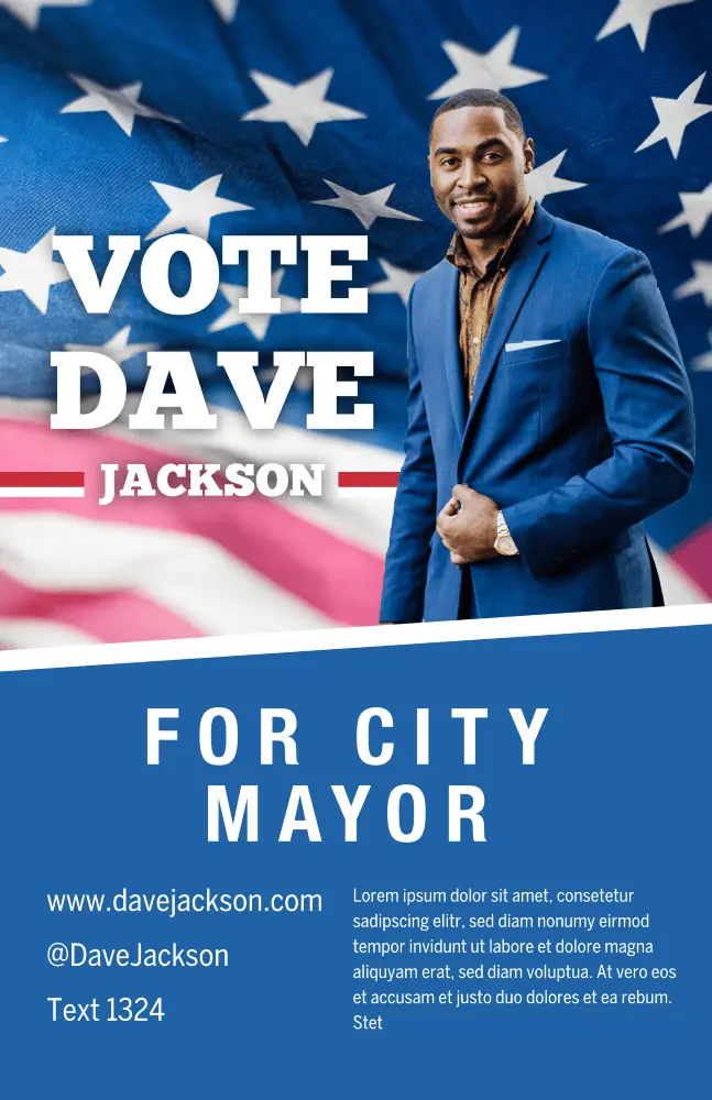
Click on the image to see this template
Make your campaign’s purpose loud and clear with this patriotic campaign poster template. Change up the layout design by swapping out the flag for an illustration, or insert different colors instead of using blue.
University poster template
Pick a background image that reflects the event

Click on the image to see this template
An excellent choice for schools and alternative education platforms, this poster design assures your org’s message will stand out. Bold colors make your advertisement feel loud and clear — swap out your organization’s logo for the provided one.
Nature quote poster template
Too moody for your vibes? Brighten things up by overlaying shapes and color

Click on the image to see this template
Whether you’re looking to meditate, motivate or inspire, the nature quote poster is here to do it all. Customize the graphic design with your own photo or use a stock image to change things up.
Coming home movie poster template
Make the text pop with a border or shape

Click on the image to see this template
Quick, somebody grab the popcorn! And don’t forget the sour gummies! Shhhh!!! It’s time to cozy up and get ready for the character arc, story development and more with the Coming home movie poster template.
Duo campaign poster template
Keep your tagline simple

Click on the image to see this template
Give them a reason to try and name a more dynamic duo with the Duo campaign poster template. Showcase your running mate, as well as upcoming town hall events or speaking sessions. Don’t forget to include your campaign’s motto!
Orange & blue passion quote poster template
Don’t stop at one version — make a few till you get it just right

Click on the image to see this template
Equal parts jazzy and simple, the orange and blue passion quote poster template keeps the eye centered on your quote of choice. Be sure to include or note who originally said the quote. Everyone appreciates credit where credit is due.
Blue soccer game day poster template
Be sure to include important details — like event times and such

Click on the image to see the template
Get your fans ready to rumble with the Blue soccer game day poster template. Use the colored overlay to highlight your school or team’s colors — plus you can swap out the image to feature one of your very own athletes!
Student council campaign poster template
Limit CTA usage to one — get folks out and votin’

Click on the image to see this template
Make an impact on your school experience with the Student council campaign poster template. Swap out the stock image for a candid, congenial photo — and be sure to include a little bit about yourself and your campaign initiatives.
One day movie poster
Use the image and icons to tell a story

Click on the image to see this template
Lean into your zany, mad scientist side and use an abstract image to tell a story about your movie. The font is completely customizable, as well as the copy and text box placement. Wherever this template inspiration takes you, may it be nothing short of magical.
Blue and green track schedule poster template
Create a visual timeline aid to help keep folks informed

Click on the image to see this template
Keep your school and sports teams on track to win (ayyy, see what we did there?) with the blue and green track schedule poster template. Customize the colors however you see fit, and swap out dates for any upcoming events, like the homecoming match or what have you.
Forests research poster template
Let your content do the talking
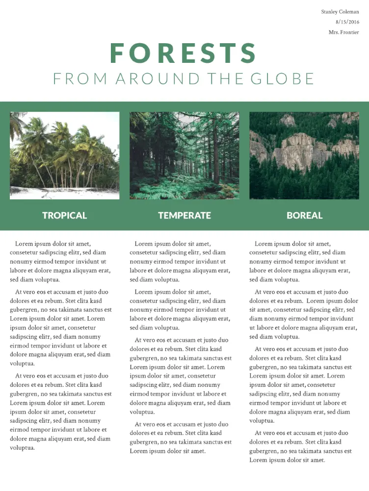
Click on the image to see this template
Created with research and educational projects in mind, this poster provides ample space and graphic design opportunities for images and content in a structured, brochure-like design. The slideshow is both modern and practical, and you can easily add or duplicate pages. The beauty of a one-page template is that your design remains consistent.
Western wanted poster template
Get what you want while paying homage to the original poster

Click on the image to see this template.
Our designers created this poster design tongue-in-cheek. It’s eye-catching and memorable with an instantly recognizable theme. Have excessive quantities of stationery gone missing at work? This is a fun and subtle way to draw attention to outlaw behavior in the office or at home.
Standard advertising poster template
Swap out the red placeholder with your brand’s color palette
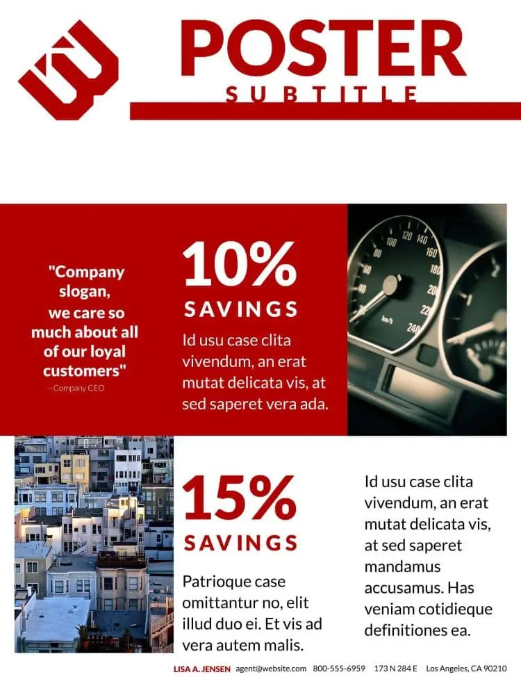
Click on the image to see this template.
This 3-page poster design is perfect for marketing your business at trade shows and exhibitions, or it can be used for an online catalog to advertise special offers. The format is deliberately simple so as not to distract from the content and to make it easy to update if you have regular campaigns.
Motivational quote poster template
Use an action verb for maximum inspiration
Click on the image to see this template.
Motivational quotes and typography are powerful tools to inspire innovative thinking and promote a sense of well-being. Psychologist and motivation expert Jonathan Fader, PhD, says well-structured messages that use strong imagery and appeal to our aspirational nature can be powerful in changing our thought patterns and behavior.
Heartland business poster template
Don’t have quite the right photo for the event? That’s okay — try Unsplash!
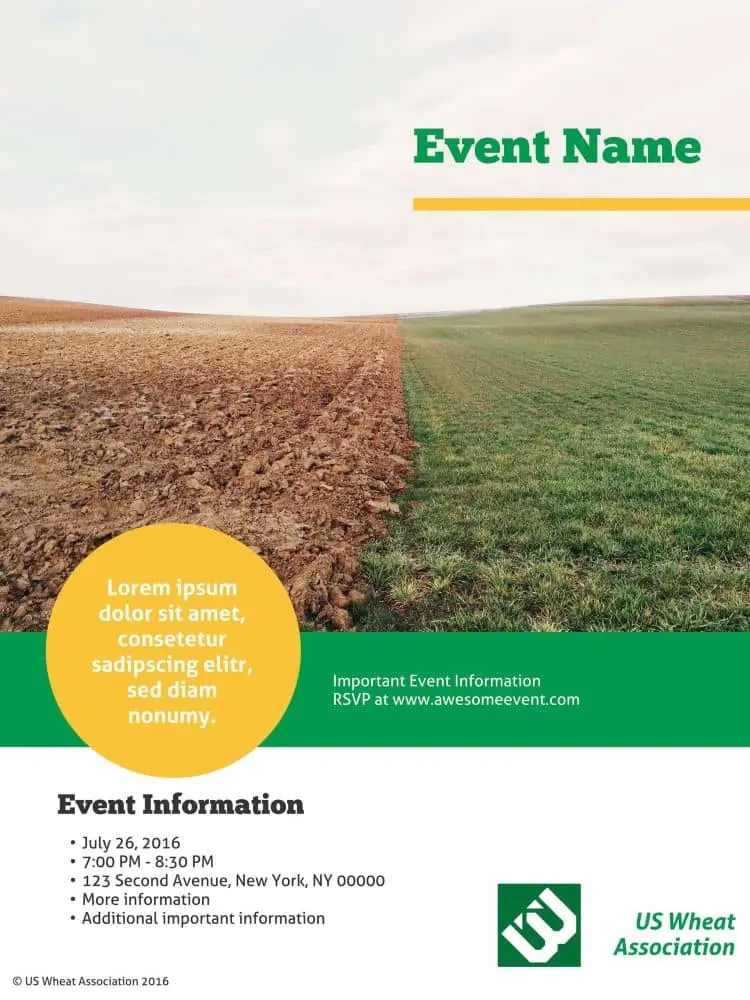
Click on the image to see this template.
This business poster design template provides a surprising and unusual variety of content placeholders so you can sneak in a wealth of information. The placeholder and graphic design space demand your customers’ attention, and the longer they’re looking at your poster, the more likely they’ll absorb your message.
Homegrown event poster template
Keep your colors simple — avoid using discordant color combinations like purple and green
Click on the image to see this template.
We call it Homegrown because this poster design has multiple layers, just like a home-baked pie. If you really want to stand out from the crowd, putting a bit of effort into creating a layered poster will help you to demonstrate the depth and originality of your company’s vision.
Ecosystem scientific poster template
Avoid large walls of text — use illustrations or graphic design to break up walls of copy
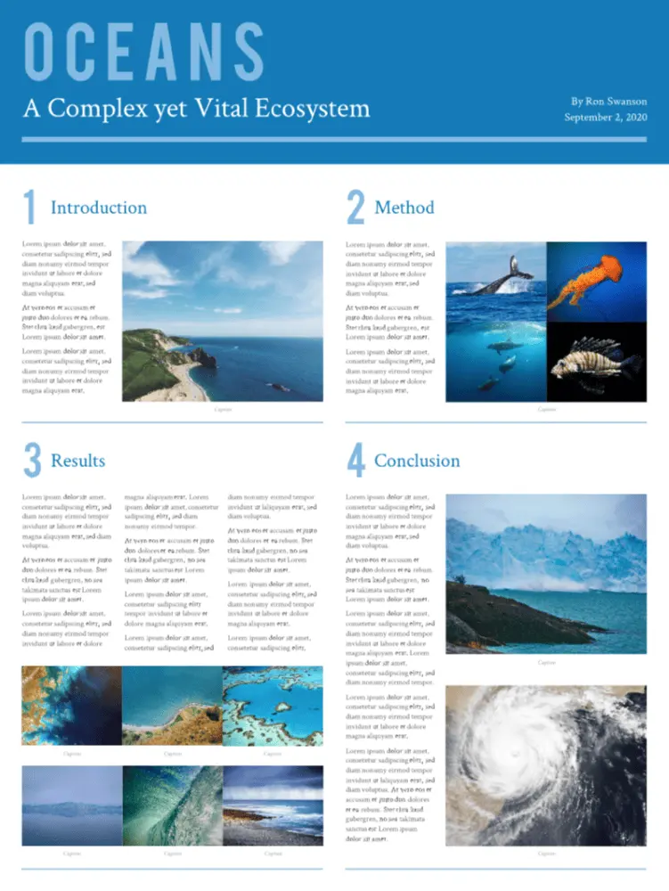
Click on the image to see this template.
Blue is the new green — and this eco-theme disrupts the traditional color mold quite innovatively. This huge 36″ x 48″ poster gives you the physical space to cover even the most complex research projects without having to resort to smaller fonts or cropped images.
Weekend away photo poster template
Start simple with an easy-to-read font and play around from there
Click on the image to see this template.
This trendy poster design showcases your professional photographs, however, your message still takes center stage. It’s ideal for travel and tourism businesses, for exhibitions, and for luxury brands to announce corporate events and exhibit their products. The Weekend Away is a great example of design layering.
Swiss Alps travel poster template
Want to make a bold statement? Use a vivid, contrasting color for your font

Click on the image to see this template.
Contemporary and bold, this poster paints a strong message. It’s a single-focus design, and you should customize it with your own bold background photograph and daringly creative fonts. The unusual text layout makes it a unique and original choice for technology startups and entrepreneurs.
Nature retreat poster template
Don’t love the included typography? That’s ok, customize with your brand’s font

Click on the image to see this template.
Inspired by the layout of quality print magazine covers, Nature Retreat is eminently versatile. Our customers have used it in projects as diverse as publishing upcoming event information and showcasing their portfolios, and for school projects. The style is informal and slightly whimsical.
Origami banner event poster template
Concise and clear, make the most of this simple layout design

Click on the image to see this template.
Origami is the Japanese art of folding paper into decorative shapes and figures, dating back to the 1880s. This template combines traditional origami with a fresh, modern look to create a perfectly structured design ideal for formal and professional corporate posters.
Block party poster template
Use colors, be it bright or soft, to communicate the vibe of the party

Click on the image to see this template.
Everyone likes a party. Its vibrant graphic design and no-nonsense block layout works well for invitations and holiday events. It’s a one-pager, easy to modify and with placeholders for the “who-what-when-where-why” information. The blocks and frame design are reminiscent of the calling cards of yesteryear.
Night life poster template
Juice up the tone with an abstract illustration for your background
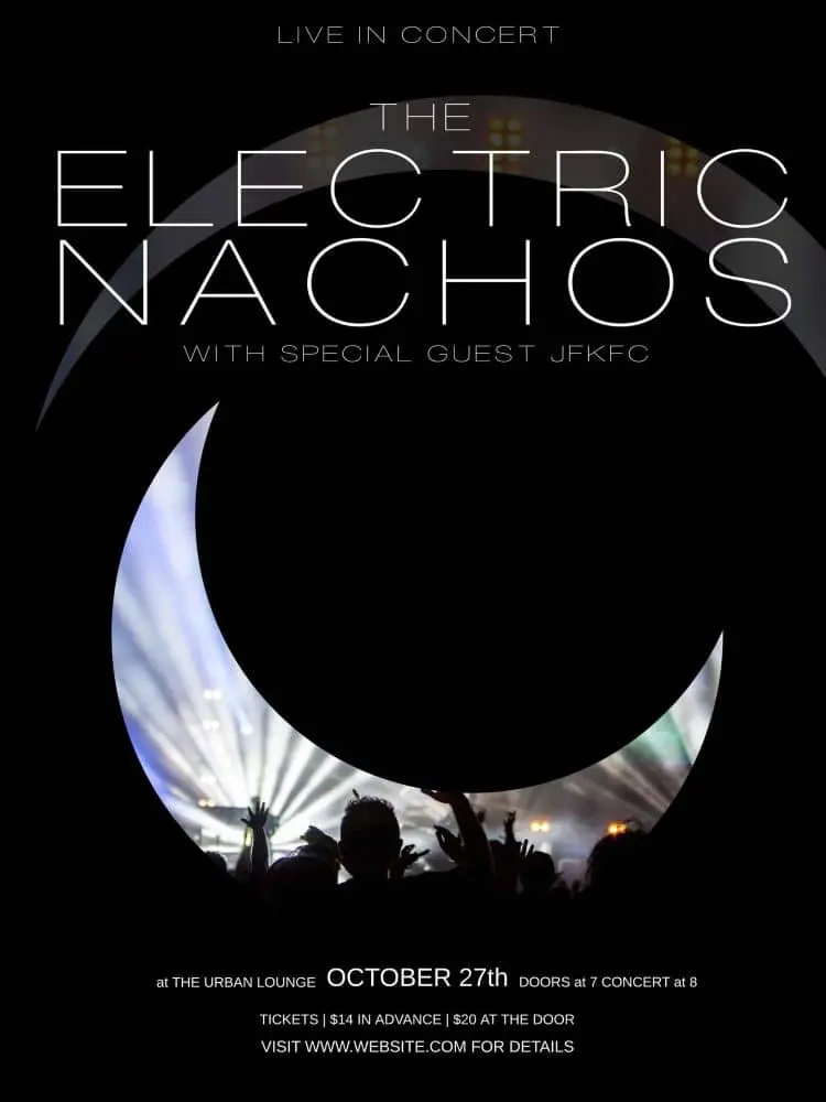
Click on the image to see this template.
Evocative of torn classic denim and multi-layered dresses, this poster design and typography ushers in a new trend of visually captivating posters that challenge design rules — you could even say that we wouldn’t be surprised to see it in the MOMA one day. Light and dark are juxtaposed to evoke excitement and anticipation.
Real estate poster template
Highlight the diversity and variety of your selling history through various images

Click on the image to see this template.
Arguably the most versatile and stylish template in the Lucidpress collection, this block design is ultra-bold and is anything but lacking in the design inspiration department Rather than simply invite, the poster compels customers to attend a home viewing. We’ve incorporated vintage and trendy elements both formal and informal… and the result rocks.
Cobalt café poster template
Avoid using stock photos if you’re looking to highlight a unique restaurant
Click on the image to see this template.
When it comes to real estate, location is everything. And when it comes to food, presentation is everything. The design for this creative poster mimics those used for magazine food pages, arousing your taste, visual and smell senses. The Cobalt is warm, welcoming and very practical.
Cut glass marketing poster template
Use this template to communicate official corporate events
Click on the image to see this template.
Cut Glass presents a sharp graphic design look and feel, perfect for technology startups and real estate innovators. Diagonal lines are more striking than horizontal or vertical ones. As explained by Vanseo Design: “Their kinetic energy and apparent movement create tension and excitement.” Use this template boldly and aggressively.
Cosmopolitan business poster template
Swap out the included stock photo for a snap of your city or HQ

Click on the image to see this template.
Cosmopolitan means cultured, suave, polished and refined… an image you may want to cultivate, particularly if you have an international, sophisticated client base. The hallmarks of cosmopolitan design include the avoidance of “fluff,” subtlety, attention to detail, intricacy and cohesiveness. Would these graphic design and marketing tactics serve your brand, too?
Reflections company poster template
Have official health comms that need relaying to employees? Look no further

Click on the image to see this template.
The creative inspiration for this design was the subtle reflection of images in water, clouds and shadows, conveying the impression of depth and intelligence. This poster would work particularly well for a beauty technologist, health spa or clinic, or even a luxury brand.
Poster design with Lucidpress is simple thanks to our user-friendly, intuitive interface. It gives you all the functionality of traditional desktop publishing software—but without the learning curve needed when using professional packages. Now it’s time for you to grab one of our free poster templates and get creative.
Feeling inspired? You can design and order your brand new poster right here in Lucidpress.
Creating an ebook—especially for the purpose of generating leads—can be a critical marketing technique for your business. If you’re not a designer, this can be a truly daunting task. After all, not only do you have to create the content, you have to design the layout, choose fonts & color schemes, and tweak orientation.
Fortunately, it’s possible to create a professional and effective ebook, even without expert design skills. This can be done with the help of free ebook templates. Not sure where to begin your search? We’ve compiled five of our finest ebook templates which you can explore below.
Would you rather go straight to the source? Head over to our gallery of free ebook templates to see all your options.
1. Marketeer Business ebook
If you’d like to take a traditional approach, this business ebook template geared toward marketing is your best bet. With a traditional vertical design, and a 10-page pre-made layout, this template can be used to promote your products & services or engage your customers.
There’s no reason your business ebook needs to be boring. In fact, the inclusion of images on each page makes it easy to spice up the content. You can easily use stock images or upload your own. What more, you can test out different fonts & layouts in the easy-to-use Lucidpress editor.
Click on the image to see this template.
2. Boutique Lookbook
For creative businesses—including boutiques and salons—it’s important to bring a unique touch to each piece of content you create. This extends to ebooks, and it can be easily achieved with the Boutique Lookbook.
With a muted color scheme and full-feature image pages, you can use this template to create a lookbook, product catalog or seasonal spread. The vertical design makes it well-suited to any device: smartphones, tablets and e-readers. In addition, the bold black text against the light-colored background makes it easy to read.
Click on the image to see this template.
3. Colorblock Creative ebook
A grid-based layout is perfect for a variety of industries including architecture, photography and consulting. Even better, this modular layout means you can create a truly unique design. You don’t like how the blocks are laid out? No problem—with the Lucidpress editor, you can easily ‘snap’ each block into a new position.
Additionally, the use of elegant font styles, as well as a minimal color scheme, makes this ebook template easy on the eyes. The pops of blue color on each page also add a unique element without cluttering the layout.
Click on the image to see this template.
4. Lead Magnet ebook
Even Lucidpress (a company with its very own talented designers) uses templates to create quick & easy ebooks, one-pagers and more. In fact, this is the very template we use on much of our in-house content.
The gray & green color scheme can be changed to fit any brand. However, be sure to pick contrasting colors to ensure your content is legible to readers. You can even personalize each page; all contain a header & footer with a placeholder for company name, website and phone number.
Click on the image to see this template.
5. Global Photography ebook
A horizontally designed template can be love-it or hate-it for many readers. However, this particular template is great for immersive photography or other media-heavy topics.
You can create beautiful collages and even split your ebook into different sections. With 20 pre-made pages, you have plenty of space to feature your content. And, with the use of white space, you won’t have to worry about cluttering the pages or overstimulating your readers.
Click on the image to see this template.
Using ebooks to promote your business and attract new leads can be incredibly effective. However, the quality of that ebook will play a large role. Fortunately, even non-professionals can create truly stunning designs & layouts.
With the help of Lucidpress’s design software, you can create beautiful templates that rival even InDesign and Photoshop creations. You can then publish or save your ebook as a webpage, PDF, JPG and more. If you’re in need of some more inspiration, be sure to check out more ebook templates & layouts here.
Ready to wow your marketing leads with beautifully designed ebooks? Lucidpress will help your brand send the right message.
2017 was the year of digital marketing. Brands of every size depended on digital to raise awareness and win over their customers. As the year ended, digital marketers turned toward the future to strategize new plans and techniques.
Related: How to boost your brand identity with influencer marketing
Digital marketing is big, volatile and constantly evolving. While some experts believe this will be the year of AR and IoT, others see the market’s future as more complex. Let’s look at the top 10 trends currently dominating digital marketing in 2018.
Top digital marketing trends in 2018
1. AI might be the performer of the year
Yes, it’s true that AI is being adopted in nearly every consumer-facing industry today. But have you considered how AI could help your business on the backend? You know about chatbots and Siri, but what about using AI for trend analysis and customer profiling? This year, AI will help brands dig into the data, then reach their target audiences with more precision and effectiveness.
2. 2018 is seeing more video ads
According to recent reports, video marketing is set to capture about 82% of the internet’s traffic by the end of 2019. You can expect to see more video ads on all web platforms, especially social media. What may change is the duration and content of the videos as brands compete to hold viewers’ attention.
3. IoT is being used like never before
2017 saw the emergence of numerous products and applications for IoT, and its scale continues to grow. Together, IoT and data are expected to revolutionize industries like healthcare, education and manufacturing. They’re not only improving the efficiency of these sectors-they’re changing the very way these businesses perform their work.
4. Mobile marketing won’t flinch
After several delays, Google is soon expected to release its mobile-first algorithm. What remains to be seen is how this mobile index will impact the search results. It’ll no longer be enough to have an SEO-optimized site—or even just a “mobile-friendly” site. Google will examine the mobile performance of your website (and all of your competitors’) and rank you accordingly. Regardless of the devices your customers use, mobile compatibility is going to take precedence if you want to retain your search rankings.
5. AR could take the lead over VR
Despite the grand predictions, VR and AR haven’t impressed the general public much in the last two years. However, analysts predict that 2018 will bring major changes to the field of augmented reality. Since Apple has released its ARKit for app development, developers have been testing the limits and publishing some incredible new apps. It’s anyone’s guess as to which ones will catapult AR to the top.
6. Content marketing is going visual
The basis of any form of digital marketing is, essentially, content. However, the nature of content marketing is shifting based on the expectation that content is going mobile. There’s also a trend towards visual content as people have started engaging more with videos, images, data visualization, and infographics.
7. SEO is going mobile
As we already pointed out, simply having an SEO-optimized website might not work wonders for you this year. With Google shifting to the mobile-first algorithm, your SEO’s website auditing checklist is going through a revamp. On top of all the other signals Google likes to see, brands should re-examine their websites and get them optimized for mobile viewing now—rather than waiting to take a hit later.
8. Dark social offers new opportunities
It’s estimated that about 70% of social sharing is classified as “dark social.” This includes links shared on native mobile apps, via email messages, and in chat conversations (like WhatsApp or Slack). Though marketers don’t have perfect visibility into this data, it’s becoming easier to track. Brands are taking advantage of this by targeting audiences with ads, 1:1 messages, and chatbot experiences.
9. Advertising is exploring the blockchain
It’s not just for Bitcoin anymore. Today, the blockchain is offering new ways to track and verify online advertising. Imagine being able to verify each time an ad is consumed and for what duration—and then compensate the consumer for their time and attention. The blockchain can prevent ads from being over-served, ensure that influencers have real followers instead of bots, and verify voting for sponsored contests. Expect blockchain to take on more roles as the technology is adopted.
10. Dedicated apps are on the rise
Dedicated apps offer the benefits of a mobile-optimized website in a more convenient, accessible format. With Google’s app-indexing, brands are investing more in app development and discoverability. Often, these apps provide a better brand experience. Though apps have a long way to go before replacing websites, the love for apps is driving their growth and adoption.
These are some of the top trends driving digital marketing in 2018. As the year unfolds, we’ll see which ones rise to the top… and which ones fall to the wayside.
How many advertisements do you remember fondly? Probably not that many, considering we’re bombarded with content on a daily basis.
But the ones you do remember seem to creep into your subconscious. It’s like a catchy song that you can’t help but remember.
Good visual content has a lot to do with psychology. Appealing to human emotions will influence people to react to your ad a certain way.
Related: 4 ways to increase conversions with visual content
Corporate Executive Board did a survey on this in partnership with Google. They contacted marketing leaders, vendors, consultants, and over 3,000 B2B buyers to understand the rise of emotion-driven content marketing.
In their report From Promotion to Emotion, it’s revealed that 86% of buyers believe that brands are all selling the same stuff. Unique value propositions are not turning out to be… not so unique. But, brands that connect with customers on an emotional level will see 2x more impact than those trying to sell based on functional value alone.
If you’d like to tap into that influence, here are 7 emotions that drive people to connect with brands—and real-world examples of each.
1. Urgency
Even when your customers want your product, they can still be hesitant. Maybe they feel like they can buy from you any time, so why spend money now? Later, they say, later.
This is when you need to infuse a bit of urgency. Add a timer or an expiration date in your email newsletter or video ad, and buyers will take the cue. No one wants to miss out on a good deal.
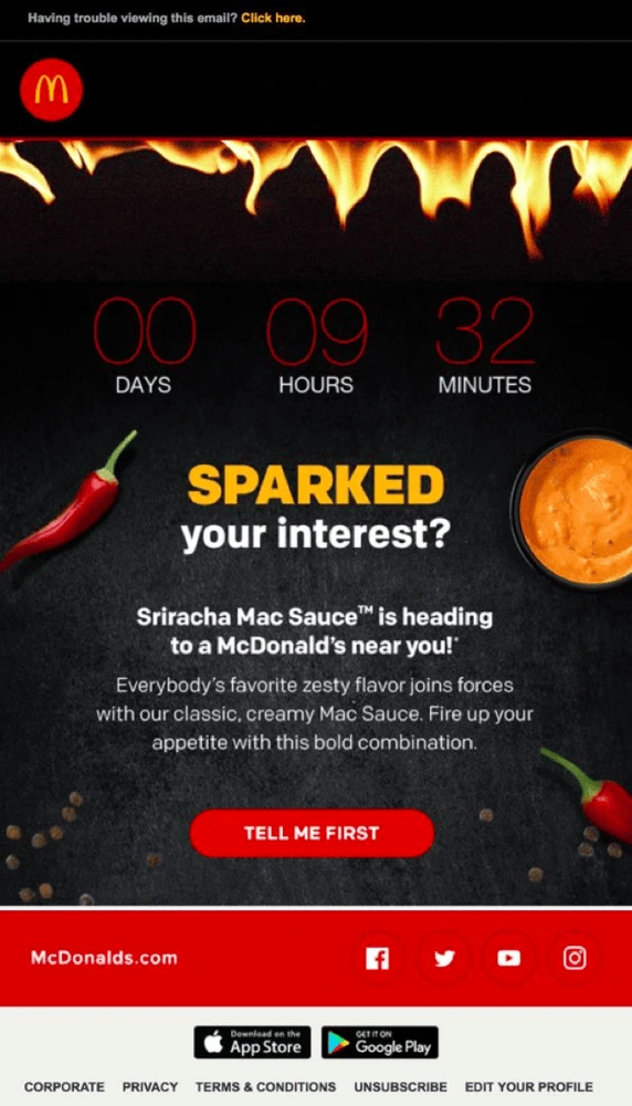
Source: McDonald’s
Big retail & e-commerce brands use urgency (tick-tock) to promote instant consumer action or purchase decisions. However, make sure you have a good reason for incorporating urgency in your offer. For example, countdown timers are often used for festive occasions or limited product runs.
Urgency even works better when you pair it with scarcity. Use phrases like “limited stocks available,” “limited tickets,” or “first come first serve.”
Source: 4YFN
A similar psychological catalyst is FOMO. Fear of missing out is a social worry that if you don’t participate in time, you won’t be able to enjoy the same rewards other people are reaping. One study reveals that around 69% of millennials experience FOMO when they can’t attend a popular event. You can use that fear to your advantage.
2. Desire
Desire is a powerful emotion. Almost every action we take and purchase we make is driven by desire. Many brands channel desires into their visual ads to capture an audience’s interest.
One way to do this is through before-and-after images. Olay took this concept even further with their “Identical Twins” campaign, where one of the twins uses the product and the other does not.
Source: Olay
But, before-and-after images don’t have to be about skin care or weight loss products. Check out this GIF, for example. SiteFlood creatively uses the before-and-after concept to show prospects what kind of results their service delivers.
Source: SiteFlood
Similarly, most explainer videos use a “problem-and-solution” format to identify prospects’ needs, then provide a solution to help them fulfill that desire. This video explores the desire to live in the Caribbean, the problems one faces to achieve this, and the solution.
At Lucidpress, we used the same animated format to introduce our brand management platform—complete with white knights, bodyguards and Mama bears.
3. Compassion
We’re social creatures, and that’s frequently reflected in our behaviors and reactions. We care about our family, our friends, and even random strangers. Doing something for others makes us feel good.
Thai Life Insurance produced a series of heart-warming videos that showcase the sentiments of altruism and care, even in adversity. In the end, it’s wrapped up nicely as part of the brand message.
Attaching your brand to feelings of love, care, attachment, altruism and charity can give your visual content a strong emotional pull.
4. Delight
Humor provides more delight than almost any other emotion, but it can be difficult to pin down and execute well. You must know your audience and their sensibilities, so you don’t end up missing the mark, falling flat, or even offending them instead of making them laugh.
Old Spice has perfected the art of appealing to its demographic in a variety of fast-paced, cinematic ad campaigns. It’s delightful, humorous and exciting to watch.
5. Personal care
Advertising is everywhere, and it rarely feels like an ad is speaking directly to you. In this constant deluge of content, personalization is valued more and more. If you want my business, make me feel special. Show me that you care.
Starbucks is no more “special” than any other coffee brand, but they show their patrons that they care. It’s a brand synonymous with warmth, comfort and convenience, and it’s easy to make it your own.

Source: Tumblr
Starbucks proves that it cares about the individual experience by providing a casual meeting space, a work environment, a place to relax, free Wi-Fi and other comforts. Perhaps more importantly, they ask each customer for their name and write it on every cup of brew they order.
In some ways, Starbucks has come to resemble a hospitality brand without actually being one, simply by extending a comforting personal touch.
Introducing customization or personal touches to your brand can make you far more appealing to your audience, because they will feel special and cared for.
6. Trust
Your customers have their own personal tastes, values and opinions. Likes and dislikes. Movies or music that they love or hate.
It turns out that personality will largely determine a customer’s shopping behavior. They buy products and experiences that either reinforce their personality or help them get closer to who they want to be.
So it stands to reason that if you associate your brand with a celebrity they like (or want to be like), that would give them a reason to trust in your brand and buy from you.

Source: Nike
This is why brands hire celebrities and influencers to drive brand awareness and adoption.
The idea here is to create an image your target customers will like or aspire to. Do some research on who your customers are (or who you want them to be). Once you’ve sketched out a buyer persona, including their likes and interests, you can solidify brand messaging that speaks to their personality and values—and earns their trust.
7. Motivation
Participating in social causes you believe in can be very gratifying. But, that gratification often comes from harrowing personal experiences, or at the very least, a visualization of others’ worst experiences.
CoorDown, an advocacy group for people with Down syndrome in Italy, made a beautifully profound video featuring people with Down syndrome delivering their own messages of reassurance to a future mother who’s worried about what kind of life her child will have.
The video is a rollercoaster of emotions that culminates in the promise of a happy, fulfilling life.
Find a cause that speaks to your brand values or to your employees. You can draw on personal experience or the hardships of others to create stories that inspire hope and motivation for your audience.
Key takeaway
Emotions are fundamental. You don’t need a PhD in psychology to figure out what makes people tick. You just have to do some research on your buyers. Draw up a buyer persona, then create visual content that will resonate with that audience.
Perception determines reality with branding. The impression you make with customers and potential customers ultimately influences the overall strength of your brand. That’s why even simple mistakes with brand consistency can create costly headaches.
Branding mistakes aren’t simply a concern affecting novice entrepreneurs taking their first steps into the marketplace. Businesses of all shapes and sizes can take missteps with their branding and lack a consistent voice or direction in their products and services.
Large companies can be especially vulnerable to the impact of brand inconsistency. It can lead to lost revenue and diminished customer loyalty. Those companies will end up yielding ground to more savvy competitors and often struggle to create a positive image and voice for their brand.
Here are 7 common brand consistency mistakes that large companies typically make. The good news is many of these mistakes are fixable or can be avoided.
1. Slow content creation
It’s no coincidence that new content seems to pop up on websites and social media channels at the speed of light. The digital age has revolutionized how we acquire information and put it right at our fingertips. Taking a slow and steady approach may win the race for the tortoise, but it doesn’t work with content creation.
If your brand is locked down to the point that it stifles new content creation, corporate marketing will turn into a bottleneck. Your brand will acquire a perception of being outdated and irrelevant within your industry. Timely and relevant content creation, on the other hand, will help put your company forward as a subject-matter expert and establishes it as a voice that customers can trust.
2. Wasted designer time
Do your designers work overtime making mundane updates to existing content, like a brochure or flyer? If that’s the case, they’re not properly utilizing their talents — and it could be limiting your company’s reach and costing you on the bottom line.
Burdening designers with too many small tasks causes the focus to slip from the bigger picture. Free them up to work on projects that incorporate their creative talents. Those creative juices flow when a designer isn’t handcuffed to simply doing brand housekeeping. Their minds are less cluttered and have room for dynamic ideas to emerge.
3. Off-brand content
Going rogue works when it comes to stealing Death Star plans. It doesn’t work with creating content. [![]() ] Brand guidelines need to be in place for a reason. If a department is creating rogue content that doesn’t follow established brand guidelines, it can spell disaster for your company in a hurry.
] Brand guidelines need to be in place for a reason. If a department is creating rogue content that doesn’t follow established brand guidelines, it can spell disaster for your company in a hurry.
Establish your brand identity and create a branding guide that adheres to that vision. Educate individual employees and managers across all departments on these guidelines, so they understand how to communicate with your target audience without going off the rails. Permitting individuals or entire departments to tweak your brand to fit their whims will undermine the brand’s integrity. Offer them plenty of resources to help them keep content on target with your brand’s voice.
4. Outdated brand assets
Few things are more embarrassing than taking the time to update your company’s logo, slogan or other key brand assets… only to see the old assets show up in your company’s messaging. That’s the risk of not keeping everyone on the same page. It can make your brand appear indecisive, outdated or out of touch.
Each department and employee should have a working knowledge of which brand assets and templates are in current use. Store these things in a central, online place and make them easily accessible for all of your brand marketing efforts. Each brand asset should be reviewed periodically to ensure it remains uniform with the core brand messaging.
5. No brand champion
Creating a consistent brand voice starts at the top. Your CMO is like the pace car leading the rest of the pack to the starting line. It falls on their shoulders to be a brand champion. Without their voice leading the way, employees will not understand the importance of strong branding and your brand will end up veering off course.
An effective brand champion at the top can steer your marketing efforts in the right direction. They set the tone for what works and what doesn’t by establishing a core vision and identity. This makes it easier to identify a natural target audience then build branding efforts around appealing to that group.
6. Branding is over-complicated
Flashier isn’t always better. Some of the most iconic brand logos, like McDonald’s or Fed-Ex, are memorable because they use a simple and clean look that’s easily identifiable. Throwing more bells and whistles into the mix isn’t going to make you stand out from the crowd. If it does draw extra attention, it could be for the wrong reasons.
Avoid tossing in complicated graphics and color schemes that distract from your core message. Don’t clutter your brand. Keep it simple by using simple colors and symbols. This will give your brand a chance to communicate quality and authenticity and increase the possibility that it can stick with a person long after they are introduced to it. Using branded templates can make this an easier task to check off your company’s to-do list.
7. Not understanding your audience
Your brand will only stand out when it offers something fresh and unique. If your target audience can’t tell you apart from competitors in a meaningful way, what incentive do they have to embrace your brand, products or services? Failing to understand what makes them tick or what they want can lead to your brand’s death knell.
Make your brand timeless by building to your brand strengths. Avoid being too trendy. Embrace market research and communicate regularly with customers and potential customers alike. Resist the temptation to put your brand everywhere, and instead, focus on being sincere with what your brand does and how it can positively impact the lives of your target audience.
Want to know more about the power of brand consistency? Download our free 32-page report, chock full of stats & great insights.
Regardless of your industry, it’s becoming increasingly difficult to gain and keep an audience’s attention online. You have mere seconds to capture their interest, so it’s critical that you create engaging content.
While we all understand the value of content marketing, how you develop your content is just as important as what you actually put out there. Providing consistent, interesting content will boost traffic, which will increase brand recognition, engagement and (eventually) sales.
But, how do you provide engaging content in a world where everyone is fighting for the attention of the consumer? Answer: Include visual assets in your content strategy. The human brain processes visual information quickly, and people remember more of what they see than what they read.
What is visual content?
Visual content is any piece of content that incorporates visuals or is primarily image-based. Visual content examples include video, infographics, photos, charts and GIFs.
Why create visual content?
We often say not to judge a book by its cover, but our brains are hardwired to do just that. It’s the reason why we ‘eat with our eyes’—we like when things look nice. The visuals that accompany your content are what viewers will see first, whether that content is an advertisement, the packaging of your products, your business card, a social media post or anything in between. Thus, these visuals are the first impression potential customers will get of your brand, and they’ll use them to decide whether your brand appeals to them or not.
To illustrate just how effective visuals are in attracting visitors, consider these statistics:
- In 2016, over 60% of B2B marketers and small businesses planned to increase investments in video marketing strategies. (CMI)
- On average, tweets with images receive 150% more retweets than tweets without. (HubSpot)
- On average, Facebook posts with images receive 2.3x more engagement than posts without. (BuzzSumo)
Point is, visual design leaves an impression on visitors. You must learn how to use them wisely.
Beyond first impressions, the importance of visual stimulation doesn’t diminish. Once the eyes aren’t engaged anymore, the brain knows it’s time to move on. Digital marketers pay close attention to engagement metrics because they show how many consumers were driven to react or interact with the content. Of all the possible customers that were reached, those that engaged with the content were the ones that stayed from beginning to end. Visually stimulating content helps engagement because it compels users to continue watching, reading or experiencing the content.
Additionally, visually exciting content is much more memorable. When someone is stimulated with pleasing, compelling visuals, the brain has a much easier time paying attention and remembering the information it processes. You may encounter an online lead who doesn’t need your product or service yet, but in the future, they will. By visually stimulating them during their interactions with your brand, they’ll be more likely to recall you when the information is relevant. This also makes visually pleasing content more shareable, because the longer someone can recall it, the higher the likelihood of finding it relevant to a friend or family member.
How to make visually stimulating content
Visual stimulation has long been a primary concern for marketers. If the eyes are bored and unstimulated, then the brain will tug the viewer’s attention to something else. In the digital age, where consumers are exposed to several different brands and messages all at once, that “something else” is likely going to be a competing brand’s content. In other words, if your visuals don’t provide high levels of stimulation, then your online leads will be more likely to defect to a competitor.
All these reasons make a compelling argument for the relationship between visual stimulation and client retention, which might’ve started the wheels turning about how you can produce more visually stimulating content. Before those wheels drive you in the wrong direction, it’s important to look at how you should improve your visual content.
- Quality is paramount: As already mentioned, quality is a huge indicator for your brand. In your quest for more visually exciting content, pay close attention to the images and other visuals you use. Visuals are great, but bad or low-resolution visuals are not.

Source: Contemporary Communications
- Relevance follows quality: Like avoiding bad or low-quality images, you want to avoid visuals that aren’t relevant to the information being provided. In other words, don’t include visuals for the sake of adding visuals. (See: cats.) They should make sense and pertain to the content in question.
- Cover is crucial: We already know that people judge a book by its cover. Your initial visual should be the most compelling because users only spend a few seconds on a webpage before making the decision to stay or go.
- Over-stimulation is real: If there’s too much going on with too many visuals, the brain won’t be able to accurately process it all. Think of it like an action movie: while there are scenes with explosions, lasers and car chases, there are also slow scenes to develop the plot and its characters. Why? Because if the whole movie were action, we’d be overloaded and our brains would mentally withdraw us from the experience.
- Visuals carry the eye: Researchers have been studying the way the eye moves across a page for decades. By understanding eye tracking, marketers can ensure that the viewer’s eyes move logically across the page to pick up all the vital information. Images are one way to influence how someone’s eyes scan a page. We’re naturally drawn to images, so by placing them strategically, you can control where the eyes travel.
Types of visual content
In this post, let’s discuss how visual content like infographics and video can encourage your visitors to convert.
1. Create impact with the right typography
Unlike someone reading a book, visitors on a website don’t consume content from left to right then go down to the next line. In fact, virtually nothing happens in progression. Visitors will either go straight to what they need, or they’ll stop in their tracks if something more interesting catches their eye—like a 30% discount on another brand of detergent, for example.
Today’s designers are using typography to catch and keep visitors’ attention. The size, shape and placement of different fonts will enhance your message, and you can direct the focus where you want it most.
Consider the bold typography on this webpage. The cursive font complements the typewriter font, giving the site a vintage, personal feel. The use of color to emphasize certain words attracts the eye and sets a positive tone.
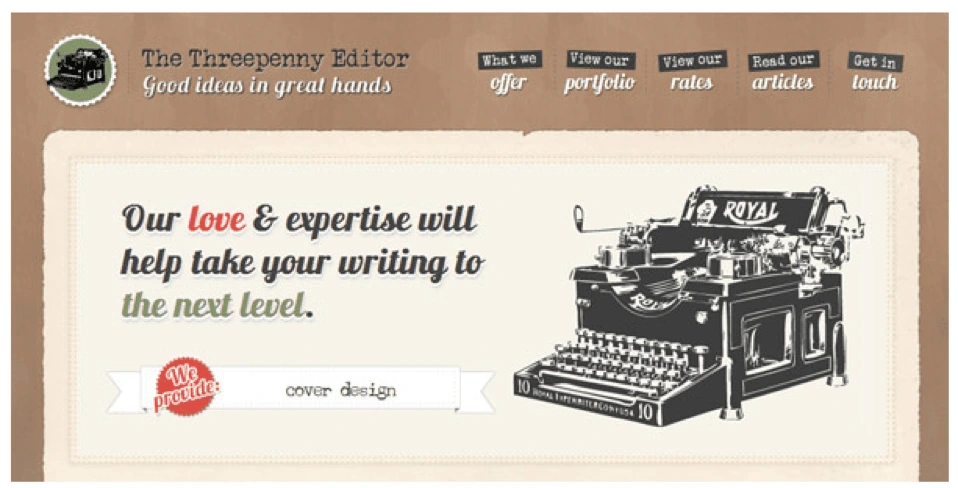
Source: Intechnic
2. Present data visually with infographics
Would you rather read through a bulky PDF filled with stats and long-winded sentences, or a colorful infographic which uses simple icons and text to display information? The choice is pretty obvious. Including a well-designed infographic in your blog post or webpage will persuade people to pause and see what you have to say.
But does it increase conversion? Here’s some compelling evidence:
- Images increase memory retention. People who hear information will only remember 10% of it three days later. But, if the information is paired with an image, they’re likely to remember 65% of it in the same timeframe. People will have an easier time reading and remembering an infographic detailing the health benefits of bananas than they would three paragraphs of text. And the more time visitors spend with your content, the more likely they are to convert.
- More shares lead to more exposure. According to NN Group, infographics are shared and liked on social media 3x more than any other type of content. Since people are more likely to share a post with an infographic, it helps you reach more people on social media faster.
3. Incorporate video
It’s estimated that adding video to a marketing email can improve click-through rates by a whopping 200-300%. Need more proof? Additional research indicates that 73% of adults in the U.S. are more likely to purchase a product or service after watching a video that explains what it is.
Videos can be used to evoke emotion, explain how your product or service works, or introduce your company. It helps potential customers put a face to your name, which makes your company more relatable. The keys are to keep it under 2 minutes (even 30 seconds might be ideal for certain social channels), optimize it for mobile, and ask a question or tease the content in the caption.
4. Create a gifographic
Speaking of using video, you can also upgrade a static infographic by incorporating animation. Gifographics are still relatively new, which means your content will stand out. While some marketers worry that gifographics might be difficult to make, it’s worth the effort to present your information in a way that’s more engaging and dynamic.
5. Use quality photos with text overlays
Using compelling photography is a strategy that should always be in your back pocket as a marketer. Images make content more interesting, and it’s easy to overlay a quote if you have a quality image to start with. Photos with quotes or callouts are super shareable and can gain traction on social media very quickly.
Using high-quality images is obviously important if you’re creating campaigns for Instagram, but it’s also effective on Twitter. Tweets with photos are 150% more likely to be retweeted than those without pictures. If you’re concerned about your ability to create shareable pictures on your own, don’t worry. Plenty of companies like Lucidpress have templates you can use to create clear, engaging visuals for your next post or status update.
6. Incorporate comics or memes
If you’re looking to bring a little humor into your marketing strategy, creating a comic or meme is one of the best ways to do it. Memes—like those tweeted by restaurant chain Denny’s—offer excellent social engagement if you do it right. Watch out, because you’ll have to take care to not overstep your brand. Comics are also easily recognizable. If humor isn’t part of your brand voice, comic-style fonts and formats lend themselves to a more lighthearted vibe and make it easier to explain complex products or topics.
7. Present information in a tool
Making content interactive is another way to engage with potential customers while demonstrating the value of your product or service. This runs the gamut from tools that help readers figure out which streaming services they want to bandwidth speed-test calculators.
The benefits here are two-fold: you can garner a lot of traffic on the main tool page itself, and you can also include smaller widget versions of the tool on other pages to inspire readers to act. Clickable graphics that link to your tool can also grab the attention of readers who are scanning another article or blog.
8. Develop a quiz or checklist
As a marketer, your job is to convert leads into sales. Use a visual quiz or checklist to help prospective customers figure out what they already have, which services they need, and how your product can get them to the next step.
You can also use interactive graphics to gather email addresses and create custom ad targeting. For example, if someone takes a home security quiz, they’ll likely be interested in follow-up information about how they can fill in the gaps to keep their family safe. Then you can provide that info and, eventually, lead them to a sale for a product to meet that need.
9. Go back to basics with charts and graphs
Charts and graphs are a quick and simple way to visualize information. They make complex information very easy to understand and are regularly shared because it saves other people the effort of creating a graphic to explain the original concept or statistic. Just make sure you don’t sacrifice clarity for style. If your reader is short on time, clear and direct charts are often the best way to go.
10. Leverage screenshots
If using screenshots in your content sounds easy, that’s because it is. Include screenshots to show client testimonials, create step-by-step tutorials, or introduce a new feature in your product. Screenshots provide clear context if you’re talking about something that people can customize (like a toolbar), making your point easier to understand.
11. Try flowcharts
A lot of online content deals with complex and sometimes confusing processes. In those cases, try simplifying concepts with a flowchart. Breaking down an idea will give your readers insight into the bigger picture—and where they fit into it. Don’t be intimidated by building a flowchart on your own. There are plenty of tools out there that can help you create clear, customized charts to take your ideas from start to finish.
Key takeaway
To keep up with other brands, it’s imperative to incorporate visual design into your marketing strategy. The key is to do it purposefully so that your content stands out from the rest. If done well, we’re confident you’ll see a great return on your efforts.
Three years ago, Gartner predicted that 30% of our interactions with technology today would happen via conversations with smart machines—and mainstream adoption would be just around the corner.
Related: 10 digital trends that are transforming marketing in 2018
We can see the evidence of this change all around us, from Siri and Cortana to Alexa and Google Home. And while we haven’t reached mainstream adoption quite yet, marketers shouldn’t wait for the masses to catch up before grappling with the implications of voice search.
In particular, voice search represents a move from the abstract to the physical. Certain aspects of your brand—voice, tone, personality—will soon become real in ways they never have before. Just like mass marketing has shifted into digital marketing, we’re now seeing the dawn of conversational marketing with voice search. Here are five factors that show how voice search will impact your brand.
1. Copy that can be read aloud
As more people turn to smart machines to ask questions, brands should be prepared to respond in kind. Creatives will have to write copy that sounds good when read out loud—often in the form of answering a question. Offer the most important information first (remember the inverted pyramid?), and for goodness sakes, keep it brief and unambiguous.
For example, in an older blog post of ours, we discuss the definition of branding. If someone were to ask “What is branding?” today, our blog post would respond like this:
To begin to understand what a brand is, you must first understand that your brand does not exist in your marketing department, your public relations team, or your CEO’s office…
And as pretty as it looks on the page, no one is going to stick around to listen to that. Instead, our response should get straight to the point. Again, from the post:
A brand is the sum total of all the impressions a customer has, based on every interaction they have had with you, your company and your products.
If we wanted to optimize this content for voice search, we could restructure it intelligently by putting the important data first. Then, we have plenty of space for the kind of writing that’s meant to be read rather than spoken aloud.
Finally, keep in mind that voice search is more conversational than traditional search. The queries are longer, and they’re often localized (e.g. “What’s the weather like today?” or “When does The Copper Onion close tonight?”). Your responses should follow suit, mimicking how real people talk (including conversational phrases).
2. New advertising rules
With new advertising mediums come new advertising guidelines. This doesn’t just mean best practices, like we see with paid and organic digital search. We’ll also see big players in voice search (like Google) establishing new rules for brands who want in.
Remember this voice ad from Burger King last year? The commercial was designed to hijack your Google Home device by asking “What is the Whopper burger?” This request prompts devices to begin reading the Wikipedia entry for the Whopper—which, of course, Burger King had edited to their benefit.
The Whopper is a burger, consisting of a flame-grilled patty made with 100 percent beef with no preservatives or fillers, topped with sliced tomatoes, onions, lettuce, pickles, ketchup, and mayonnaise, served on a sesame-seed bun.
Oh, be quiet, already!

My feelings exactly.
Not only did this violate Wikipedia’s terms because it so clearly sounds like ad copy, it also left open the door to vandalism. People were quick to edit the Wikipedia entry to include phrases like “cancer-causing” and ingredients like “toenail clippings.” Not exactly what the fine folks at Burger King had in mind.
Even when the ad worked as intended, people were annoyed by the tactic—but online trolls had made it so, so much worse. It should come as no surprise that Google shut down the ad 3 hours later, and Burger King pulled it entirely.
Consumers aren’t used to advertising in voice search yet. Take care not to annoy them with lengthy descriptions or aggressive sales pitches—and follow the terms and guidelines of the services you use.
3. What does my brand sound like?
Today, Alexa always sounds like Alexa, but it’s not hard to imagine a future where voice search becomes highly customized. Brands will be able to choose their own vocal characteristics, which opens up a world of questions and considerations.
If your brand was a real person, what would they sound like? How would you determine:
- Gender
- Age
- Language or dialect
- Accent
- Conversational tone
- Conversational speed
- Personality

Source: Pexels
Some of these characteristics even raise ethical considerations—like gender, for example. According to OnBrand’s State of Branding report, 54% of marketers prefer a female voice assistant (while only 17% prefer a male). Nearly all the voice assistants we’re familiar with today default to female voices, which raises the question why.
“The simplest explanation is that people are conditioned to expect women, not men, to be in administrative roles—and that the makers of digital assistants are influenced by these social expectations,” says Adrienne Lafrance in an article for The Atlantic. Power structures influence our technology all the time, and it’s important for brands to consider these traits (and their impact) carefully.
In the mean time, it’s likely that female voices will continue to answer most consumers’ vocal commands. How can masculine brands compensate for this—punch up their language, perhaps?
4. Consistency matters
Voice search does not alter the impact of brand consistency, but it does present new channels to manage. Once you’ve decided what your brand sounds like, it’s important to convey that across all channels and communication. Voice and tone need to remain consistent for the brand to be distinct and recognizable.
After you’ve set the tone and refined your brand voice, go back and make sure it’s reflected everywhere:
- Voice-optimized content on webpages (especially Q&A format)
- Voice-optimized ad copy
- Product descriptions
- Social media posts (hashtags & emoji don’t always translate)
- Program dialog
- Chatbot dialog
Interesting note about chatbots: If your brand already has one, you might be ahead of the game. Because chatbots are designed to be conversational, they can help to inform your strategy for voice search. Look to them for guidance as you explore this brave new world!
5. First-mover advantages
And now, the good news. Because voice search has yet to reach mass adoption, there’s still plenty of time to move into the space before other brands catch up. It’s a rare opportunity to reap first-mover advantages without being one of the big, established brands.
“Given that many people are currently rather disappointed with their voice search interactions, the first brand to create a genuinely standout experience is going to garner a lot of excitement,” says Rob Curran in this article for Campaign. And like we’ve seen with other new mediums like augmented reality, it’s only a matter of time before someone does. Could it be you?
Key takeaway
Equal parts scary and exciting, the adoption of voice search represents enormous opportunity for savvy marketers. With it, you can deliver a digital brand experience that’s more personal and human-like than ever before—and hopefully, one that’s consistent with your brand messaging. Drive the conversation and address these factors now to enjoy the benefits while we head into the next decade.
Want to know more about the power of brand consistency? Download our free 32-page report, chock full of stats & great insights.
Bonus: Voice search infographic
Want to share these insights with your followers? We’ve adapted the main points of this article into a sharable infographic perfect for Facebook, Twitter, LinkedIn and Pinterest.
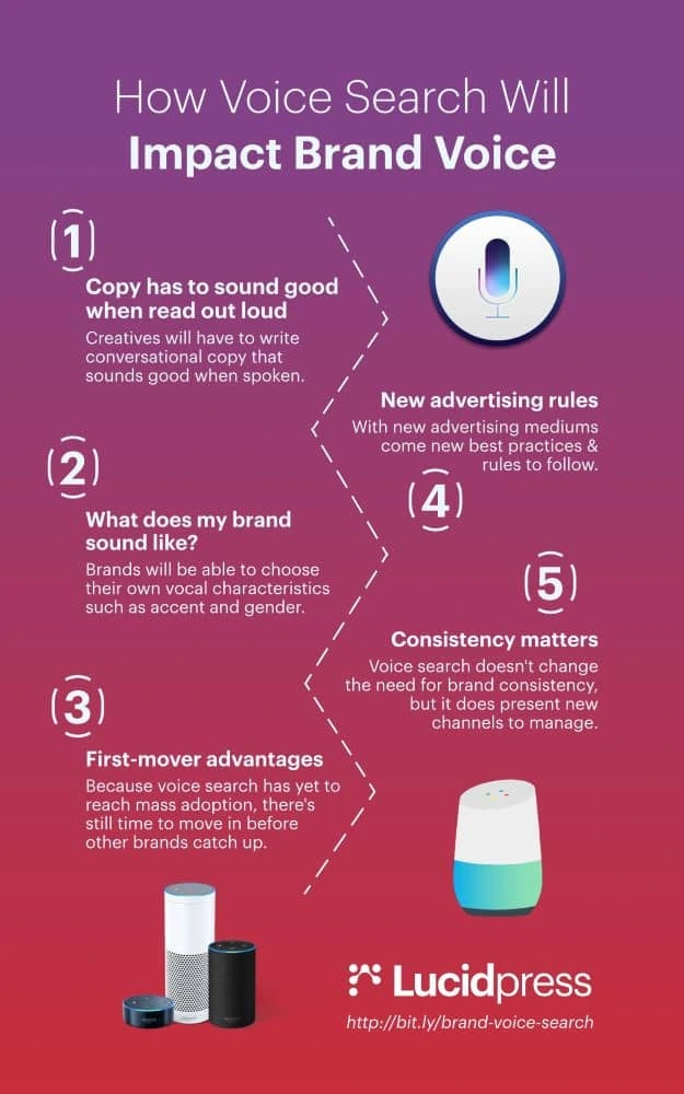
Okay, so you’ve recently made the conscious decision to focus more of your energy on creating content with the hope of collecting more leads.
As an avid devourer of content yourself, you’ve seen a ton of other brands leverage content to generate massive amounts of buzz for their companies.
You’ve heard the success stories and statistics. You know content marketing can drive in 3x as many leads as traditional marketing—and it costs businesses 62% less than traditional methods, too.
Related: 5 myths that devalue your content marketing strategy
So, you decide to give it a shot. You spend hours creating a number of insightful and informative blog posts that you know your target audience will find valuable. You post them on your site, sit back, and wait for the new customers to start rolling in.
But… nothing happens. Those blog posts? Nobody’s reading them. Or—and this might sting even worse—people are reading them, but it hasn’t made a lick of difference to the size of your customer base.
In either case, it can be incredibly disheartening to realize your efforts haven’t paid off as well as you thought they would. On top of that, figuring out where you went wrong can be rather difficult, which may lead you to throw in the towel on your content marketing initiatives before they even get off the ground.
Before you throw your hands up in resignation, though, let’s take a look at some of the most common reasons many content marketing campaigns fall short of their intended goals.
4 content marketing mistakes that may be costing you leads
Before we dive in, let’s admit that the true list of reasons a given content marketing campaign could fail is inexhaustible. Because so much goes into content marketing, Murphy’s Law can rear its ugly head at almost any given time, for many different reasons.
For our purposes, though, we’re going to discuss some of the overarching mistakes and problems that could sabotage your content marketing campaign before you even get started.
Not focusing on your true purpose
Presumably, your goal is to generate more leads (and eventually more sales) by publishing intriguing and informative content for your audience to devour.
But have you really thought about how creating such content will actually lead more people to purchase your product?
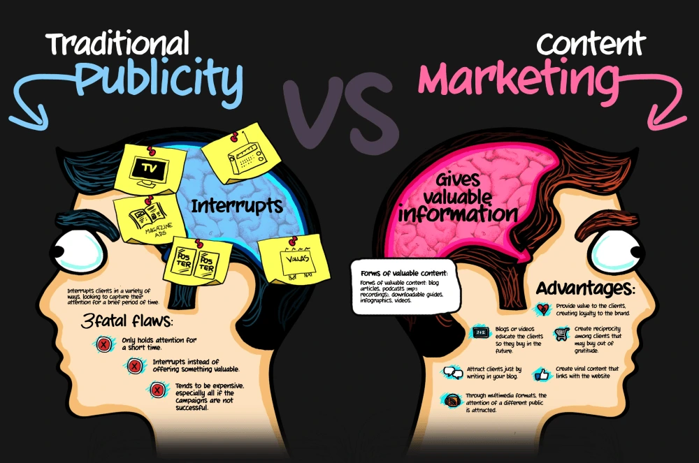
Source: 87 seconds
The only thing worse than seeing no increase in your visitor count is seeing an increase in your visitor count but no increase in your sales numbers.
As you begin creating content, it can be easy to lose sight of the fact that your purpose is to create awesome content that leads your readers toward conversion. It can be easy to slip into a routine of churning out pieces of content that, while interesting and informative, simply don’t do anything to move your readers further along the buyer’s journey.
Solution:
Ask yourself the following question before you begin creating any piece of content:
How will this content benefit my reader and bring them closer to conversion?
It’s essential to keep in mind that content is not your product; it’s part of your marketing plan. [![]() ] While the content you create absolutely should provide value to readers, it should also provoke them to take action and engage further with your brand.
] While the content you create absolutely should provide value to readers, it should also provoke them to take action and engage further with your brand.
For individual pieces of content, you might aim to get your audience to sign up for a mailing list, follow your brand on social media, or share the article they’ve just read. Depending on the context, you might ask them to sign up for a demo of your product. While such calls-to-action are typically found at the end of a piece of content, they can also be placed within the content as appropriate.
Over a longer series of content, your goal is to build your readers’ understanding and curiosity about your brand and the services you provide. As this article from Copyblogger points out, you can use content to create “open loops” in your readers’ minds that essentially keep them wanting more—meaning they’ll look for ways to engage with your brand that ultimately may involve making a purchase.
Always remember that your main goal is to have them come away from your content closer to converting than they were before they read it.
Writing for a mass audience
As the old saying goes:
“If you try to please everyone, you’ll end up pleasing no one.”
Unfortunately, when getting started with your content initiatives, it’s tempting to create content that you believe will appeal to your entire consumer base at once. In doing so, you end up creating content that is either:
- So general that it doesn’t provide value to any individual audience members
- So packed with information that it completely overwhelms your audience
In either case, the result will almost certainly be the same: your potential customers will bounce from your content without taking the action you hoped they would.
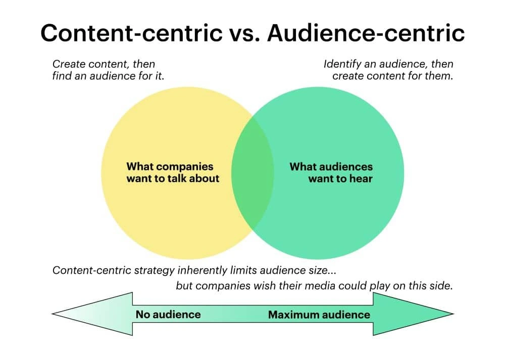
Source: Content Marketing Institute, lovingly recreated in Lucidpress
Solution:
First things first, make sure you’ve developed a variety of personas to target. Find out as much as you can about the people who belong to these segments: their demographic and geographic data, their personality types, and their actions and behaviors as consumers.
Once you’ve defined and developed a number of customer personas, you can begin planning content intended for each of them (rather than using a “one-size-fits-all” approach).
While this means you’ll be creating more pieces of content, you’ll ensure each piece of content will resonate with its intended audience.
You can make sure the right content gets in front of the right person in a few ways:
- Categorizing posts on your blog by topic
- Implementing a search function on your site
- Allowing mailing list subscribers to choose which content they receive in your newsletter
Focusing on one content format
Typically, when most people hear the phrase “content marketing,” they automatically think about blogs.
But there are many, many more types of content out there for you to choose from.
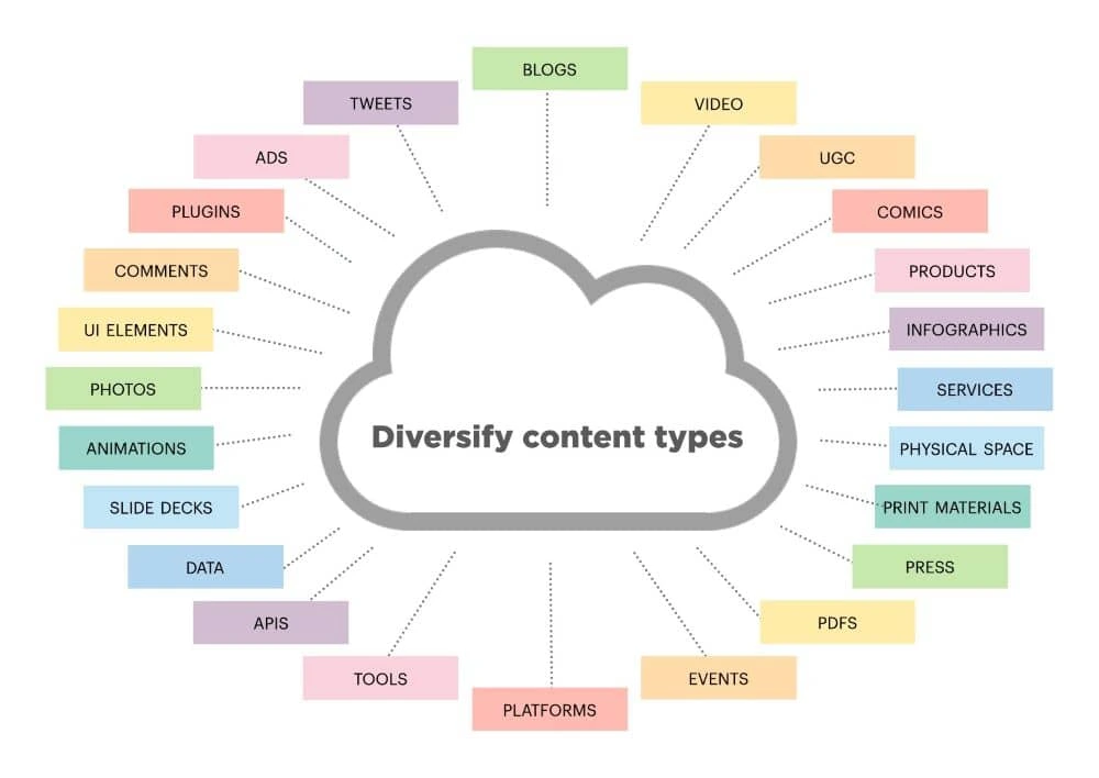
Source: iPullRank, lovingly recreated in Lucidpress
Content marketing is the act of using content to market your brand. With that in mind, the following are just a handful of content types that you can leverage for marketing purposes:
- Podcasts
- Webinars
- Social media posts (see templates)
- eBooks (see templates)
- Infographics (see templates)
Simply put, sticking to one type of content is a good way to bore your audience. No matter how valuable your blog posts may be, your readers will likely get tired of them at some point if you don’t change things up a bit.
Solution:
Your first order of business is to determine which formats will best engage your audience.
Some individuals devour podcasts on a daily basis during their morning commute, while others would rather read an eBook while relaxing on their couch at night. Still others might not have the time to devote to these ventures and would prefer to get quick-hitting information via infographic.
As you do when figuring out what your audience wants to know, it’s also important to determine how they want to receive this information.
Even though you’re going to create content in a variety of formats, that doesn’t mean you need to create completely new content for each. In other words, you can repurpose content you’ve previously created and present it through a different format.
You’ll definitely want to tweak the content so it fits its new platform, but generally speaking, the meat of the content will remain the same. For example, when repurposing a blog post into an infographic, you’d typically include only the hard-hitting facts and statistics mentioned in the article (leaving out the “discussion” parts).
By repurposing your most successful content in a variety of formats, you can give the piece maximum exposure across the customer segment it was intended for.
Not following up (or through)
In the intro, we set up a hypothetical scenario in which a content marketer creates a handful of blog posts, publishes them, then sits back and waits for business to start booming… and it never happens.
A big mistake many marketers make when starting out with content is living by the old adage, “If you build it, they will come.”
It just doesn’t work that way. With over 2 million blog posts being published every day, the chances of new readers just happening upon your content are practically zero.
But, even assuming you do generate some traffic to your new content, you still haven’t succeeded yet, and you can still miss out on major opportunities. Another mistake beginner content marketers make is failing to engage with their audience members after they’ve reeled them in. They also miss out on the opportunity to not only nurture these individuals through the buyer’s journey, but to learn more about their needs.
Solution:
The solution here is two-pronged.
First, focus on promoting your content. There are a number of ways you can do this, including:
- Sharing links via social media, adding relevant hashtags to the post
- Posting links in appropriate online communities, such as Reddit or Quora
- Engaging with influencers and bloggers who write about your industry to see if they’d be interested in sharing your content
Once you’ve gained some visibility and have begun seeing audience members engage with your content, don’t let them go. If they’ve left a comment on your blog, keep the conversation going; if they’ve shared your content on social media, shoot them a quick “thank you”; if they seem to be looking for more information, give it to them!
Technically speaking, once your content has attracted a potential customer, it’s done its duty. But the work you put into this content will be for naught if you don’t follow up with the lead as soon as you possibly can.
Key takeaway
It’s no secret that content marketing can be an effective way to attract highly qualified leads that have a good chance of converting. This is, in large part, why 92% of companies view their content marketing efforts as a business asset.
But if done haphazardly, your content marketing efforts can lead to nothing but wasted time, energy and money.
Before you dive into your next content marketing campaign, keep in mind that the purpose is not just to create amazing content, but to create amazing content that ultimately leads your audience toward conversion.
Learn how Lucidpress can streamline your brand’s content marketing and keep your whole team on the same page.
Are you emotionally connected to a particular brand? Maybe it’s the design of its packaging. Maybe it’s the colors they use or the shapes that remind you of something good. Maybe it’s the smell of the store. When you go into a small fragrance boutique, you’re mesmerized by a unique scent that sticks in your memory. Whenever you decide to buy perfume in future, you’ll prefer going to that specific store.
Why does this happen? When you understand the psychological theory behind the human senses, you’ll realize why sensory marketing is so important. Our senses are our connection to the outside world. Our brain interprets the messages they send and forms its perception of the world in accordance with those interpretations.
Related: The subtle art of using emotion in your visual content
Marketers can implement sensory experiences to make their campaigns more effective. With sensory marketing techniques, you lay the foundation for a positive brand impression. Let’s see how our senses influence our perception of a brand, so we’ll understand this approach a bit better.
1. Taste
Unless you own a restaurant or coffee shop, this is the sense you can influence the least. However, taste can still become an important aspect of your marketing strategy. For example, if you’re promoting an Italian brand of jewelry, you could organize a cocktail for your most faithful customers where you serve Italian gelato and wine. These tastes will remind people of the Italian lifestyle, and they’ll see how your jewelry fits in.
The sense of taste can deeply influence our memories, emotions and moods. A savvy marketer will find ways to use that fact to the campaign’s advantage.
2. Sound
You already have experience with sound affecting your perception of a brand. When you dine in a fancy restaurant, you want slow, calm music in the background, right? When you’re at a nightclub, the music that’s being played affects your experience. When you enter a store, the music can make you feel energized or relaxed, depending on the selection.
But it’s not limited to in-store experiences. Daniel Monroe of BestEssays explains how sounds are important even for online services: “The element of sound was crucial when we were designing the live chat. We didn’t want our website visitors to be disturbed, which is why the live chat is never activated without their request. When they drop us a message, however, they surely want to be notified when the agent sends a response, so the sound has to be noticeable yet subtle. It has to create a sense of urgency without making the website user nervous.”
Think: what behavior are you trying to encourage in your target audience? What kind of music would promote such behavior? Once you answer this question, it becomes easier to implement music and sound effectively in your brand experiences.
3. Touch
The sense of touch also influences our behavior. Research has shown that touching rough or smooth objects has an effect on our decisions. Hard surfaces, for example, evoke the impression of firmness, stability and security. However, they also impose a sense of strictness. They might be great for offices or banks, but you’d want to include a bit of softness in a store that sells products for kids, right?
Many brands neglect the sense of touch in their campaigns, mainly because they’re selling products that already have a particular structure. The way you design the packaging and space around the products, however, will have a huge effect on the brand experience.
4. Sight
This is probably the sense that affects our brand perception the most, since we first see a product before involving any other senses in the experience. That’s why brands invest so much effort and resource in visual content.
When you’re presenting your brand to the world, advertising and packaging have a huge impact on audience perception. This effect is heightened when all your branding is consistent and cohesive. Posters, social media posts, flyers, newsletters and other promotional materials should all share a similar design and color scheme. After all, those colors are rarely chosen by accident.
For example, when we’re trying to evoke optimism, warmth and clarity, we often reach for the color yellow. Orange is cheerful and fun (like Fanta), and red is bold and exciting (like Virgin). Blue evokes trust, strength and dependability—think Dell and HP. Green is peaceful and symbolizes growth and health, which is why you’ll find it in the logos and marketing of many environmentally friendly or healthy lifestyle brands.
5. Smell
Have you ever wondered why brands like L’Occitane and Lush sell their products in specialized boutiques? It’s because their marketing campaigns are based on the sense of smell, and they don’t want their scents being diluted by other products in the store. When you get to the Lush store, you’re so mesmerized by the smells that you simply cannot leave without a new bar of soap. That’s how powerful scents can be.
Even if your brand is not related to scents, you can still benefit from sensory marketing. Researchers found that the smell of chocolate can boost sales in bookstores. They observed the behavior of the customers and concluded that when the bookstore smelled like chocolate, people were more engaged with the staff and the books. They looked more closely at books, read the summaries, and lingered in the store. That’s not a coincidence.
The smell of chocolate is comforting and inviting. It’s no wonder why many real estate agents like to bake something in the kitchen before showing the property to a potential customer. They also make sure the property is clean and smells nice in every room.
Just as a pleasant scent promotes better behavior, an unpleasant odor will have a negative effect. If the store is dusty or smells funky, it won’t matter how awesome your brand and products are. The smell will distract visitors from taking the action you want to encourage.
Key takeaway
Our senses have a major impact on our purchasing decisions. Sensory branding is a well-established practice in some industries, such as cosmetics and food. However, brands from all other industries can benefit from this approach, too. Which sensory marketing techniques could you take advantage of in your next branding campaign?
When shopping for a new home, real estate buyers want to know what it’s really like to stroll through the kitchen, stand on the balcony or lounge in the backyard. Since they’ll be investing years in a house or apartment, they want to imagine themselves in the space before they contact a real estate agent. Next to physically being there, listing videos provide the best experience for persuading buyers that their dream home is just a click away.
Related: Guide to an effective real estate listing marketing strategy
Although listing videos are big in real estate marketing, few real estate agents actually take advantage of the power of video to immerse and move buyers to purchase. The National Association of Realtors found that 85% of buyers & sellers prefer to work with a real estate agent who offers video marketing… but only 15% of agents actually use video to market their listings.
High demand and low supply gives those real estate agents willing to invest in video an edge in finding potential buyers. With a little practice, it’s easy to create real estate listing videos that’ll get your properties moving.
Planning shots in a listing video
You should already be familiar with the property, so make a shot list of all the rooms, outbuildings, porches, pergolas, and other pertinent features you want to capture beforehand. Focus on the interior first. Plan your shots like you would plan an actual walkthrough with a prospective buyer. Start with the entryway, then move into the living room or the next logical place. This will make the final edit feel natural as you take the buyer from shot to shot.
As a general rule, you’ll want your video to contain around 75% interior shots and 25% exterior. You don’t need to show every nook and cranny of the property. Concentrate on the most visually appealing and emotionally moving parts—the selling points.
One must-have is the “hero shot” that will be the climax of the story you’re telling. It may be a beautiful vaulted ceiling, an indoor pool or a breathtaking mountain view from the backyard. Whatever it is, your hero shot should be the star of your listing video, and you’ll want to place it where it has the biggest emotional effect.
Pro tip: Take still photos from all the vantage points you use to shoot video. Use the images to create a storyboard of your video. The images will work as reminders and guides for the best angles and spots to put your camera. You can import all of your images into a storyboard template and organize them how you want.
Estimating video length
Your video’s length depends on the size of the property. A video for a small, 2-bedroom apartment should be shorter than a sprawling 6-bedroom estate with 10 acres. To estimate length, take the number of planned shots and multiply them by 5 seconds per shot. That’ll give you an approximate run-time.
Ultimately, your video’s length should be dictated by the shots that you capture. You don’t want to rush past the selling points of the property, but you also don’t want to induce yawning. Remember, it’s a video, so prospects can play it back or press pause for closer examination, so err on the side of shorter. For quality control, enlist friends and family to critique the video before you publish it.
Using professional video equipment
Editor’s note: This section contains links to products on Amazon.com. These links are provided for reference only, and should not be taken as endorsements for any of the brands or products listed. Also, Lucidpress does not receive any payment or commission from sales of these products.
At minimum, you’re going to need a camera, a tripod and some editing software. Many of today’s smartphone cameras work well enough to produce decent video footage, but a DSLR camera is a better choice for quality and flexibility.
A fluid head tripod is a must-have. A good tripod keeps your camera steady and lets you produce smooth, fluid movements. Jerky camera movements distract viewers and make your videos look amateurish.
If you’re using a DSLR, buy a zoom lens with a focal length around 17mm-40mm or 16mm-35mm. Wide-angle lenses like these will capture a good chunk of a space without distorting or barreling the image. If your image is too rounded at the sides, your lens is too wide.
For basic video editing software, many operating systems already come with free versions, like iMovie or Windows Movie Maker. These programs are easy to use, but they’re also limited in their color-correction abilities, number of transition choices, and audio enhancement capabilities. To up your post-production game, invest in professional editing software like Final Cut Pro or Adobe Premiere Pro. Both come with powerful video tools but are harder to learn.
If you plan on capturing dialogue with your video, snag a lapel mic or shotgun mic and an audio recorder. However, recording dialogue is a difficult task, especially for beginners. It’s better to find stock music that creates a powerful, emotional effect in the background. Besides, you should assume that a large portion of people will watch your videos on mobile phones with the sound muted.
Pro tip: Handheld gimbal systems aren’t cheap, but they offer the ultimate in flexibility, compactness and convenience, letting you capture smooth, professional video without a tripod. Gimbal systems keep your shots steady even when you’re walking around, so you can create sweeping shots in any direction that look like scenes in Hollywood blockbusters.
Lighting the scene
You can go all out and invest in a basic photography lighting kit to make your listing videos look their best, or you can just shoot on a nice, clear day. Most of the rooms you’ll want to feature will be well-lit on sunny days, so take advantage of nature and show your properties in their true light.
For exteriors, shoot during the “golden hour,” that time just before sunrise or sunset when the sun is in the horizon and casting warmer colors. The warmer light makes exteriors more attractive.
Pro tip: Some of your interior lighting will come from tungsten bulbs, which produce a warmer color than daylight or fluorescent bulbs. When possible, replace tungsten bulbs with ones that have a color temperature of 5500K. When you keep a consistent color temperature in your scenes, it’s easier for your camera to maintain its white balance.
Prepping the area
Before you start shooting, take your shot list and walk through the house. Stow away any distracting objects. If the house is unoccupied, this might be stuff like cleaning supplies, drop clothes or painting equipment. If it’s still occupied, put away any clutter on kitchen bars, pick up dirty clothes on the floor, and take down family photos. If possible, also take down any mirrors that would show your reflection while shooting. Turn on interior lights when appropriate and open window coverings for better lighting.
Pro tip: Don’t shoot towards an open window. Your camera will struggle to balance the intense brightness of the window with the relative darkness of the interior rooms, and your images will suffer. Shoot with the camera pointing away from open windows, or cover them.
Shooting the video
You’ll only need two to three shots per room. You’re not shooting a film, so just get the best angles in the best lighting and move down the shot list.
For interior shots, get a few good tilts (up and down movements) and pans (left and right movements) of each room. If you have a tripod slider or steadicam system, also grab a few dolly shots, moving slowly from left or right. Multiple takes of the same space gives you more choices during editing. You don’t want every shot to be the same pan from left to right. That bores viewers. Instead, mix it up and provide them with a variety of views to hold their interest.
Set up your tripod so the camera is at waist height, not at eye level. Interior spaces look more attractive from a slightly lower perspective. Any pans, tilts or dollies should be slow and smooth.
For a pan shot, start the camera pointing at one side of the room, then use the tripod handle to slowly move it to the other side. Start and stop each camera movement with a five-second pause. This will create a “head” and “tail” for the shot, giving you some room to work with when editing them together.
For exteriors, you’ll need two to three shots that show the front and back yards, any separate structures, and any hero shots. But, don’t just piece together the whole property through multiple images. Prospective buyers want to see the entire home within the context of its surroundings, which could include the lawn, nearby structures or a body of water. Get at least two shots that show a more encompassing vantage point.
If you include shots that are static, use them sparingly. The viewer’s attention is captured by movement and color. You’re making a video, not painting a picture. Keep the action going.
Pro tip: If you want Hollywood-style shots that will really wow house hunters, consider renting an aerial lift for the shoot. These professional lifts get up to 60 feet above the property to capture high-angle aerial shots. They’re safe, easy to set up, and give you the platform to grab dramatic footage that will make your listing stand out.
Video storytelling in real estate
To really sell a piece of real estate, you have to connect with viewers on an emotional level. Good cinematography and editing is key, but without storytelling and music, you’re just presenting moving images. Storytelling can involve following a character as they move around the home doing domestic things, as in this listing video from Savvy + Co Real Estate or this one by The Boutique Real Estate Group.
But, storytelling doesn’t have to include actors or characters at all. It can simply suggest feelings and emotions that connect with viewers. For example, if the residence is occupied, use the existing furnishings to tell the story of the absent individuals who inhabit it.
That doesn’t mean going into personal details, but you could suggest how the spaces are being used by including a close-up of a child’s toy sitting on a dresser, or a porch swing as it moves in the wind. These personal touches tell the story of lives being lived in the home. Such images connect with viewers, letting them imagine their own lives there, turning a house into a home.
Pro tip: If you really want impressive exterior shots, consider investing in a drone. Every year, drones get smaller and cheaper, and the image quality for prosumer models works great for these projects. You could even use them to shoot interiors… if you’re brave enough. They’re challenging to learn, and you can’t just fly them anywhere (per the FAA guidelines), but their sweeping movements and intense aerials create emotional connections with viewers.
Related: Real estate video marketing — The ultimate content marketing tool
Publishing listing videos
Even if you produced a video that could make the list of top 10 stunning real estate listing videos, it won’t matter if no one sees it. Video hosting platforms like YouTube or Vimeo are the best places to store your listing videos. While YouTube provides unlimited storage, Vimeo only lets you upload a specific number of videos at a time. Both let you embed videos on your own website.
After uploading your real estate listing videos to YouTube or Vimeo, optimize them for search engines. Here are some things to include:
- Descriptive titles. Don’t just call it “Farm House Video.” Include more descriptive words like “Property at 1132 N Elm St.”
- Video descriptions. Include a short explanation of the video and property. Add your name, business address and website.
- Free or licensed music. Use either public domain music or licensed stock music so YouTube doesn’t flag your videos.
- Suggested videos. Set your channel to display “suggested videos” so viewers can see your other properties.
Pro tip: Hosting platforms are only one avenue for distribution. Digital lookbooks are mixed-media catalogues made from still images and videos that can showcase your properties in fuller detail. You can create and host them directly on the web for free.
Key takeaway
While these tips are helpful for getting started, rising above the competition means upping your game over time. Listing videos are getting less expensive to produce as equipment and software prices come down. Staying above the fray means finding creative ways to engage potential buyers. The best training is to stay current with video trends in the real estate space. They’ll show you where the benchmark is, and you can use your creativity and skills to exceed it.
Visual representation of your brand matters. Learn how to protect and elevate your real estate brand in this branding essentials guidebook.
It’s getting harder to put your marketing messages in front of consumers. Increased digital competition, changing algorithms, and a crowded social media space mean you have to work hard to stand out.
So how are marketers breaking through the clutter? By revitalizing some tried-and-true, pre-digital strategies like direct mail.
Related: Direct mail marketing: Does it still work?
Receiving something in the mail is sure to get people’s attention. These 11 direct mail examples will inspire you to launch your own effective direct mail campaign. We’ve chosen each one because it showcases a particular strategy you can use to generated direct mail ideas for your own marketing pieces.
Bold text

Your central marketing message should be the first thing a recipient sees when they receive your direct mail piece. The Waterfront open house postcard has big, bold text taking up almost half of the design, so the main marketing message gets across right away.
If you design your own piece with bold text, just remember not to go overboard—you can overdo it. Balance the text with complementary images, and leave some space for the design to breathe.
Shaped text
Another great way to get people’s attention is with interesting shapes. This office party invitation from Every Door Direct Mail organizes text into a Christmas tree shape, a surefire hit around the holidays. You can organize text into all sorts of shapes, from beer bottles to flowers. It’s a fun and creative way to add some eye-catching visual interest to your direct mail piece.
Stunning images

While your marketing pitch lives in the text, great images capture attention and evoke emotion. This Parisienne travel postcard gets viewers thinking about travel and romance with a pretty, black-and-white photograph of the Eiffel Tower. It’s good practice to choose an image that complements your brand and your offer, but the primary goal is to make a strong emotional connection.
Macro photography
Direct mail pieces have to stand out from the stack of mail that people receive every day. Macro photography is a great way to provide a new perspective on a familiar object—and this direct mail piece from Canva puts this strategy to good use. Rather than a standard cup of coffee, this alluring photo evokes the scent, taste and tactile feel of coffee beans.
Of course, you don’t have to use coffee beans—or any food, for that matter. If there’s an object that represents your brand, product or service, use macro shots to highlight it. If you can use an image that’s personalized to your customers or local area, even better.
Eye-catching colors
When you look in your mailbox on an average day, what do you see? Probably a sea of white (and off-white) envelopes, most of which look the same. The bright red stripe on this gym fitness flyer immediately stands out and draws attention to the value proposition. Be prudent with your color pops—an overly bright direct mail piece can look tacky and overwhelming. Stick with tasteful highlights like those showcased in this design.
Different shapes
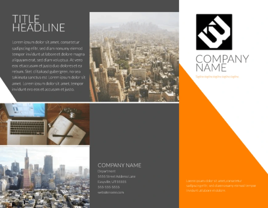
Mailboxes are crammed full of standard envelopes and flyers every day. If your advertising needs to stand out, why not try a different shape? This modern tri-fold brochure will grab people’s attention not only with its color-blocked design, but also with an unusual shape. Folded pieces have a three-dimensional aspect to them, making it more likely to get noticed.
A personalized map

Personalization is a standard digital marketing tactic, but it’s more difficult to achieve in the direct mail space. Maps4Mail solved that by printing customized maps on each piece of mail, showing the recipient exactly where they need to go. The map is intuitive, personalized, and makes it easy for anyone to find your business. This is a great way to show customers you personally value their business as individuals.
If you don’t have the budget for such a granular campaign, you can still try other ways to add a personal touch to your direct mail. For example, you could include something specific to the local area, or you could include your signature.
Unusual materials
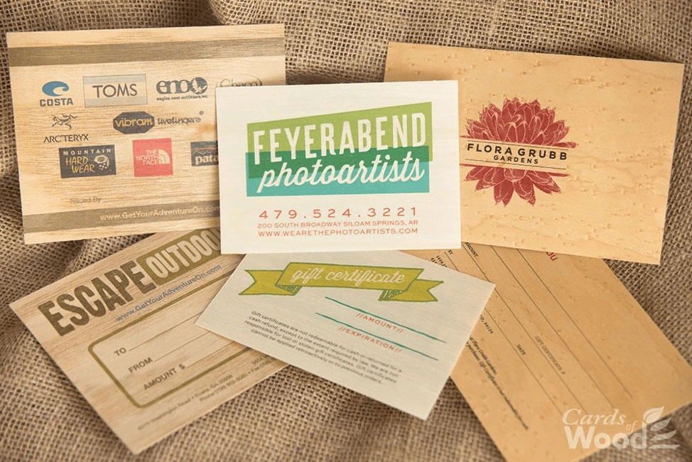
Most letters and flyers are printed on the same white paper. That’s not very exciting. If you can find materials or textures that stand out, you’ll have a big advantage over the competition. Heavy or textured paper work nicely, but if you really want to branch out, check this: These postcards from Cards of Wood are (as you would guess) made entirely of wood. Wood you believe it?
3D objects

People are curious creatures, and we’re more likely to open packages that contain objects. If you can get your brand message across with an object, it can serve as a fantastic ad. Amnesty International sent out these pencil chopsticks to encourage people to write to the Chinese government. Thinking outside the box (or should we say inside) can get great results in direct mail because people spend more time with it.
Interactive mailers
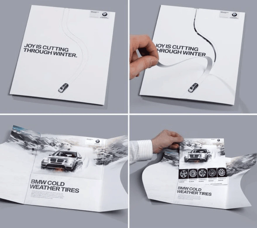
Not every brand can afford to design interactive mail pieces—but if you can, there might be no better way to connect with your customer. This piece from BMW had customers cutting a path through a wintery postcard to emphasize the reliability and control of their snow tires. Their combination of an envelope and mailer is great creative thinking.
Gifts
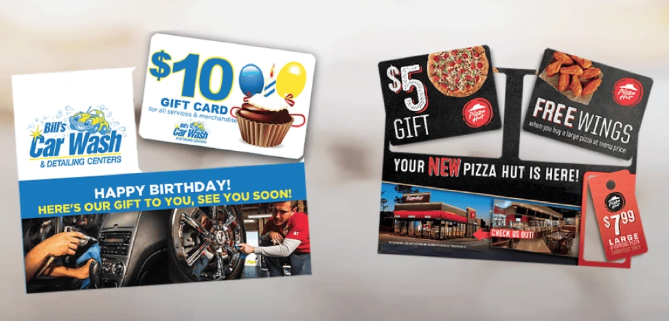
Many direct mail pieces focus on the value brands can provide to their customers—but you’ll have to go further if you want to stand out. A coupon is a good start, but that’s still fairly common. Consider including a punch-out gift card instead. It lets you take advantage of an unusual material (plastic) and give the recipient a gift. A great combination that’s tough to beat.
Key takeaway
People get a lot of mail they didn’t ask for, and different brands will find success with different types of direct mail. The most important thing is to stand out and provide real value to your audience. These examples should get your creative juices flowing and inspire the best direct mail campaign for your own marketing goals.
Ready to create your own direct mail designs in minutes? Check out our direct mail postcard templates.
Memes are one of the most popular forms of expression online, and for good reason. First of all, they go hand-in-hand with just about any social media platform, which helps them spread like wildfire. Second, people have fairly short attention spans online, so the concise nature of memes makes them a perfect medium for quick consumption.
Related: How to create social media posts that get noticed
Memes are like an inside joke everyone wants to be in on. They’re a fun way to reflect on current events, clichés and trends. Memes are popular among brands because they engage audiences and drive traffic. If you’re thinking about using memes in your social media marketing, this guide will help you get up to speed.
What’s a meme?
The term itself was coined several decades ago by the evolutionary biologist Richard Dawkins. In his book The Selfish Gene, it refers to the way an idea spreads from person to person within a culture. Like genes, they replicate and change as they spread. Some of his examples include catchphrases, melodies, fashion, and even the technology of building arches.
Today, we understand the concept a little differently, thanks to the internet. Memes are still representations of ideas, and they still spread from person to person, but they involve an element of human creativity.
Simply put, a typical meme is an image or photograph accompanied by a caption that’s funny, ironic or entertaining. Although memes have many different permutations, effective memes are instantly recognizable.
Early internet memes
Before the days of social media, memes were shared via email, blogs and forums. One of the first memes was the Dancing baby, which was so popular in the 90s, it made a cameo on the TV show Ally McBeal. Another popular early meme was the Hampster dance, a webpage born as the result of a competition between two sisters to generate the most web traffic.
Memes can grow and evolve, and they don’t necessarily have a short shelf life. For instance, the LOLcats meme is still around—ancient by internet standards. Rickrolling was huge a decade ago and has mostly been put to bed, but Westworld’s creators recently decided to post a video containing spoilers for its next season… which turned out to be fake. Another enduring meme is a video clip from the movie Downfall, which chronicles Hitler’s last days and has inspired numerous parodies—usually by pairing the serious scene with a frivolous topic.
Other types of memes
- Rage comics. These memes use a library of pre-made cartoon faces (or “rage faces”) to express a particular emotion. Usually, they humorize a relatable experience. Because they use facial expressions, they’re easy to identify and understand. Examples include the Trollface, Like a Boss, Cereal Guy, and Forever Alone Guy.

The iconic Tootsie Pop ad reimagined as a rage comic
- Image macros. Probably the most recognizable type of meme, these are images that feature a witty caption or catchphrase. Thanks to meme generator sites like I Can Has Cheezburger, most of these memes use a bold, white Impact font with a black border (like the header image of this post).
The internet is powered by humorous pictures of cats.
- Trending memes. This type of meme bursts onto the scene, feels ubiquitous for a few weeks or months, then disappears and nobody ever mentions it again. They’re often tied to current events, news, popular culture and trends.
Ahh, yes, the “Yanny vs. Laurel” of its generation. (2015, that is.)
- Exploitables. Exploitables come in various forms, including single-pane or multi-pane comics, but the central idea remains the same: a template that’s easy to modify into new permutations of a joke. Four-pane comics are an especially popular exploitable format.

About 802 now, if you’re still counting.
- Copypasta. Unlike many memes, copypasta isn’t visual. Rather, it’s usually a section of text that gets copied and shared over and over. It’s most commonly used as a response in forum discussions and social media comment threads.

Since most recent examples are wildly inappropriate for this blog,here’s an oldie but a goodie.
The rules of using memes as a marketer
Like any type of humor, using memes as a brand poses a certain amount of risk. You don’t want a poorly constructed or offensive joke to confuse or drive away your audience. So, before you start spamming your social media feeds, review these simple guidelines.
- Decide whether memes are appropriate for your brand. Memes are predominantly created and shared by younger audiences. To get the joke, you have be clued into the broader online discussion. If your marketing campaign is aimed at an older audience, they might not follow memes or get the reference. Thus, your attempts at humor could fall flat.
Also, consider brand voice. If your brand uses a serious tone, memes probably won’t help you establish credibility or authority. Research your audience and review your brand guidelines before introducing memes into your strategy. - Don’t overdo it. In a way, memes function like a good jump scare in a horror movie. They can be incredibly effective 1) when used sparingly and 2) when the timing is right. Using them all the time will diminish their impact and bore your audience.
- Memes can’t replace original content. Memes can be a great addition to your content, but you can’t rely on them all the time. They’re there to amplify your message to a broader audience. All memes and no content is like eating dessert but never actually having lunch—fun at first, but eventually, you’ll want something more substantial to chew on.
- Be thoughtful. Memes can easily backfire if you’re not careful about the tone you use to get your point across. Sarcasm and irony don’t always translate well via text, which can cause confusion or backlash among your audience, despite having the best intentions.
Additionally, make sure you research and understand the origins of a meme before you use it. It might have problematic connotations (like racism, sexism or ableism) that you don’t want associated with your brand. Know Your Meme (potentially NSFW) is a great resource if you want to learn more about a particular meme.
3 examples of brands using memes on social media
There’s a veritable boatload of brands using memes effectively out there, but here are a few of our favorites.
- Seamless. A few years ago, food delivery service Seamless introduced a meme to join the buzz surrounding the Oscars. This one took the form of a hashtag; you can still find them by searching #OscarNomNoms. The idea was to use puns and wordplay to parody popular movie titles. We especially loved made-up titles like “Gravitea,” “American Mussels” and “The Wolf of Waffle Street.”
* Nickelodeon. Nickelodeon uses clips from its own cartoons to create memes, then posts them to Twitter and Instagram. Usually, they focus on issues younger viewers can relate to—such as going to school, having an annoying sibling, or enjoying time alone when parents aren’t around.
* Hipchat. In a move that seems like it never should have worked, Hipchat brought an existing meme into the real world by putting it up on billboards. Even though it’s a clear example of offline marketing, the digital search for HipChat rose 300%! In this case, being bold definitely paid off.
Key takeaway
Although individual ones come and go, memes are here to stay. They’re easy to create and even easier to share. From a marketer’s point of view, they’re inexpensive and have the potential to go viral. Still, they require you to research their content, your audience, and your brand. When all these elements align, memes can spread your brand message to a broader audience than ever before. To the moon! ???
A well-designed website is a valuable investment that will generate revenue for your business—but 38% of people say they won’t explore a site if they find it unattractive. If your website hasn’t been updated in a while, your web design could unintentionally be hurting your business by turning people away at the door.
If it’s time to refresh your website, we’ve put together a list of 10 website design best practices and coupled them with the do’s and don’ts of great web design. Follow these best practices as you update your site.
1. Target audience
- Don’t ignore the users
Always keep your target audience in mind. Your point-of-view, as a professional, might be very different from that of the user. Pretend you’re visiting your website with fresh eyes. Walk through the user’s journey as they explore different pages. Focusing on this experience will help you create a user-friendly website.
Good design addresses the target audience with a brand personality users want to engage with. Check out this website, Crypton. It’s designed ideally for a tech-savvy audience.

Source: Crypton
Parallax scrolling heightens the user engagement here, but you don’t have to include parallax functionality on every website. Research your buyer personas and use design elements, functions and colors that make your target audience feel right at home.
- Do optimize for search
Websites that don’t rank well on Google and other search engines have very little chance of breaking through the noise. As you update your website and add new pages, make sure you’re following the most recent SEO guidelines. Your page titles, meta descriptions, and content are all important players in driving better search signals.
2. Layout
- Don’t create a cluttered layout
Have you seen websites that look like rows of boxes—all different sizes and arranged haphazardly? Would you spend more than two seconds sorting through it? Probably not. That’s because cluttered websites are visually confusing; the viewer doesn’t know where to direct their attention. A well-organized layout, on the other hand, guides the viewer where you want them to go.
- Do create a focal point
So, where do you want your visitors to go? It depends on the purpose of your website. An e-commerce site will drive visitors to purchase, while a SaaS site might drive visitors towards a demo or a free trial. Whatever purpose your website serves, make it the focal point of your homepage.
- Do use catchy headlines and call-to-action
The first things that attract a visitor’s attention when she lands on your homepage are the headline and call-to-action. Not the contact info, articles or product specs, but these two elements. For this reason, the more action-oriented your headline and CTA are, the higher your chances of success rise.
CTAs are designed to incite an immediate response from a customer. That’s why clear, concise CTAs are more effective. One software company reported that their site’s conversion rate increased by 106% after it got a makeover that included a clear, direct call-to-action.
3. Color scheme
- Don’t use all the colors
Using too many colors will make your website design clash. Colors have strong psychological impact, and they will affect a viewer’s opinion of your brand. If you’re unsure how many colors to use, the rule of thumb says your design should not use more than three colors. If you’re working with a brand palette, you might be able to use more, as long as you balance them well.
- Do use color combos that enhance your content
Your website’s colors should reflect the brand, complement the content, and visually delight viewers. [![]() ] Avoid selecting random colors just based on what you like. Instead, think about the brand and its users. If you have a primary color but don’t know how to make color schemes, you can use an automatic color scheme generator to help fill out your palette.
] Avoid selecting random colors just based on what you like. Instead, think about the brand and its users. If you have a primary color but don’t know how to make color schemes, you can use an automatic color scheme generator to help fill out your palette.
4. Text placement
- Don’t fill the page with long paragraphs
Just like the layout, you don’t want the design to be cluttered with text. If you have long-form content on the website, create a clean, spacious design that divides the content into readable chunks. You can do that by adding ample white space, using images, and creating proper flow.
- Do make it easily scannable
If your pages are easy to scan, you have a better chance of luring readers to the bottom. Attention spans are short online, but if you can make your content easy to absorb, readers will get more value from it. In addition to high-quality writing, use headings, bullets, quotes and blocks to emphasize the essentials.
- Do establish trust & credibility
Potential customers are less likely to enter their contact information or make a purchase if they suspect that your website is not secure or trustworthy. Communicate your trustworthiness by featuring customer testimonials, case studies, reviews, security badges and your privacy policy. Make sure your contact information is easy to find so visitors know they can reach you. All of these signals will help you establish trust and credibility as a reputable brand.
- Do communicate your value proposition
Use compelling language to convince and show readers how your brand will add value to their lives or resolve their problems. What benefits can customers expect to enjoy by making a purchase or signing up for your service? What features make your products better than what your competitors offer? If you can excite your visitors with your value proposition, you will see your conversion rates improve.
5. Search & navigation
- Don’t make it hard for users to find what they need
Everything on your website should be easily searchable. Whether it’s the sign-up form, the “About Us” page, or your contact information, readers should not have to spend more than a few seconds finding it. To make things even easier, include a search box so people can find things that don’t align with the page’s primary focus.
- Do set up proper navigation
If your site requires users to sign up, use colors to make the navigation simple. For instance, if your navigation headers are blue, make your sign-up button green or some other color. Organize your content into categories that users can browse if they like. You can also organize content on various hub pages.
With good UX, your website tells the world that you think clearly about the end user. See Crunchbase’s website; its UI is done beautifully. There’s the search bar on top if you want to explore specific results, or you can click the menu on the left side to browse sections that interest you.
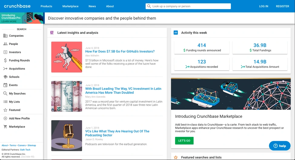
Source: Crunchbase
6. Fonts
- Don’t use too many fonts
A website that uses five different fonts loses users in seconds because it takes too much effort to read. Too many fonts on the screen can make a website look chaotic and unprofessional. The ideal number of fonts is three: one for main headings, another for sub-headings, and the third for the body text.
- Do select the right font sizes
Font size has a huge impact on legibility. It’s important that they’re neither too big (taking up half the page) nor too small (uncomfortable to read). The sizes of your fonts should reflect the importance of each element. For example, section titles and taglines are more significant than the body text, so they’re bigger. This helps readers scan the content, too.
7. Images
- Don’t use too many images
Too many images will crowd out your message, so use them sparingly and impactfully. Remember, search engines can’t read images very well, so don’t rely on them to convey text. If you’re using a background image, keep it under 1 MB. Large images slow down your site’s loading time.
- Do make it visually attractive
People think visually, which is why images are so effective. Feel free to use images in your web design, but find ones that are visually attractive, high resolution and not pixelated. Make sure the images you use reflect your brand’s personality. Don’t forget that you can also use textures and gradients to add visual appeal.
8. Mobile compatibility
- Don’t forget to optimize for mobile
57% of mobile users won’t recommend a website that’s not optimized for mobile. More people are browsing and shopping on mobile devices, and they expect websites to provide great mobile experiences. Invest in responsive or mobile-first design so you don’t miss customers during crucial moments.
- Do test for functionality
It’s not enough for your website to look good on mobile—it needs to be fully functional as well. Give your mobile users the tools to get things done, such as product search, store locators, service details, and more. If you can seize these opportunities, you won’t lose customers who are searching on the go.
- Don’t compromise on speed
People are not patient, and slow-loading webpages will almost certainly lead to a higher bounce rate. If your page takes longer than five seconds to load, it’ll frustrate your visitors and give them a reason to search elsewhere. To increase the loading speed of your webpages, consider removing any nonessentials, such as videos or large images that take extra time to load. Compressing images will also reduce loading time. Finally, utilize browser caching for storing cached versions of static resources to speed up your pages significantly.
9. Conventional vs. unique design
- Don’t ignore the power of convention
People are used to certain structures and formats on the web. This familiarity makes it easier for the brain to absorb content and make decisions. Your visitors shouldn’t have to be detectives to figure out who you are and what you offer. The power of traditional web design is that users will understand what your website is about with a single glance.
Your above-the-fold section should do the job
A Nielsen study says the majority of your website visitors will spend 80% of their time above the fold. That’s the section you see without scrolling—call it the opening screen.
The best websites explain what they do in this opening screen. A general practice is to use a headline (think your company’s tagline or mission statement), followed with a brief subtitle text describing your services or products. Top it off with a CTA button to direct visitors toward the next stage in your conversion funnel.
Airbnb does this brilliantly; the headline is the CTA. While there’s no subtitle text, their call-to-action is strengthened by a slideshow of awesome travel photos. Just beneath the headline, a search bar is intuitively placed. The example text in the search bar encourages interaction.

Source: Airbnb
- Do use floating menus
It’s very frustrating for users to have to move all the way to the top or bottom of a page to navigate the site. What many websites have now are floating menus: menus that move along the top or side of the screen as you scroll, making navigation a lot easier.
AMD, a giant in the computer hardware business, uses floating “share” buttons that visitors can use to share the content they find interesting across a variety of social sites like Twitter and Facebook. This helped AMD drive a whopping 3600% increase in social sharing, as more and more people found and shared their pages.
- Do be creative & unique
Still, you do want your brand to stand out from the crowd. Be creative, and use elements that make your site unique without disrupting the flow of information. Whether you experiment with moving images, video, or other design elements, try different things and monitor the results. You might be surprised what works.
10. Test it out
- Don’t forget to take it for a test drive
Once you’re done designing the site, test it to make sure everything is working correctly. Use multiple devices to navigate your website and see if it’s doing what it’s supposed to do. A user’s experience can vary depending on device type, internet browser, and location. Try to recreate different scenarios so you can catch any bugs or performance issues before they do.
- Do think like a CEO
A successful web designer needs to think like a CEO as well as an artist. This will help you view the website with business strategy in mind. Critical evaluation will give you a site that looks good, is user-friendly, and helps the business reach its goals.
Ready to design? Try Lucidpress today to create professional, compelling graphics for your brand’s website.
As you’re building your brand with new ideas and projects, you might not always have access to an in-house designer to assist with all your creative needs. Leaving you, someone with less creative experience, to face the perils of graphic design alone.
Okay, okay, it’s not (usually) that dramatic.
Related: 3 design tips to make your flyers stand out
But to those of us who aren’t used to creating aesthetically pleasing or practical designs, creating a line of marketing labels or flyers can be a daunting task.
These 5 design tips go out to the non-creatives of the world. You, too, can make beautifully branded designs if you start with this advice.
1. Seek & gather inspiration

Source: Etsy shop banner template
One critical element of good design is starting with a strong idea of what you want to create. But without much creative experience, you might be at a loss for where to begin.
Start by visiting some of your favorite brands’ websites or artists’ portfolios and look for designs that stand out to you. Save a few examples that catch your attention (in the creative biz, we call this a “swipe file”). Try to gather different styles to begin learning how to differentiate between them.
Once you’ve gathered a good number of examples, open that folder up and review your selections. Pay special attention to the following aspects of design:
- The color palette
- The fonts used
- The placement of various elements
You’ll begin to see that all design can be broken down into a number of basic elements. As you start to build your own designs, focus on these elements one at a time to create a cohesive finished product.
2. Use negative space correctly

Source: Large promotional banner template
Have you heard of negative space?
Negative space is the area of a design where things are simply left blank or unfilled. Not every inch of the flyer or booklet you’re making needs to be covered with visuals—and in fact, that makes the design look too busy.
Instead, use negative space to your advantage. By leaving certain areas blank, you ensure the eye will be drawn to the most important information.
There are a few easy-to-identify areas where you can intentionally make unique shapes or words within negative space:
- Between letters of the alphabet (like the Fedex logo)
- Within letters of the alphabet (like this logo for Shift)
- Writing a word with negative space on top of an image or logo
- Using a negative space logo on top of a colored section
Using negative space can be tricky but effective. Why? Because our minds search for messages in everything, even in blank space. By using negative space deliberately, you’ll stimulate the viewer’s mind and capture their interest.
3. Limit your fonts

Source: Block party flyer template
When beginners get into design, they’re likely to be amazed and overwhelmed by the sheer number of fonts available. From pre-programmed fonts to free-use fonts that can be found online, there are literally thousands of options… and that can lead to some design disasters.
Beginners and non-creatives have been known to use five, six, or even more fonts within a single project. While it can be fun to choose these fonts, the end result will usually be messy.
Follow these guidelines to keep the fonts clean and classy:
- Limit font types to 2 or 3 typefaces per project.
- Try to choose typefaces within similar font families for smooth transitions.
- Don’t change fonts in the middle of a piece of text.
- Make important information the largest and most eye-catching.
4. Consider your color palette
Source: Contempo modern brochure template
Choosing the right color scheme is an essential part of design. Colors have strong psychological effects on the viewer, so you want to be sure that your colors send the right message and match your brand palette.
Think about common color associations that people’s minds make:
- Red: energy, boldness, love, excitement
- Pink: romance, soft, appreciation
- Orange: warm, young, enthusiastic
- Brown: rugged, simple, serious
- Yellow: happy, warm, friendly
- Green: healing, safety, growth
- Blue: dependable, trustworthy, loyal, calm
- Purple: luxury, mystery, sophistication
- Black: elegance, distinction, tradition
Now that you see the reactions different colors can evoke, let’s see how you can inspire those feelings with your color palette.
- Create a mood board of photos that represent your brand’s personality. Once you have a large collection, find six colors that appear regularly in those photos.
- Try out different tones, shades and variations of these colors until you find a balance between them.
- Check out pre-existing color palettes to see if any of them line up with your colors.
There are more concepts that can help you finalize your color palette—such as monochromatic, analogous and complementary—but most non-creatives probably won’t need to get into the weeds quite this much.
Instead, it’s time to move forward with what you’ve already created.
If you’re using a design template, you have access to a range of color options. These pre-selected color palettes are well-balanced and specially created for those designs, so copying them can make your project simpler. You can also choose a color scheme that matches previous in-house designs.
5. Creatively challenged? Don’t worry

Source: Cosmopolitan business poster template
Even with these design tips, those of us who are creatively challenged may still struggle to create a design we feel confident in.
And that’s okay! There are ways to keep it simple and still create a great design.
Lucidpress offers hundreds of templates for various types of marketing materials, and they already include font selections, color palettes, and all of the design aspects covered above without you having to think about it. Better yet, each of these elements is customizable, so you can quickly and easily adjust templates to match your ideas.
Want to browse our free template gallery? Lucidpress has over 1000 professionally designed templates for business, education, personal projects & more.
You’ve built a great website and have an impressive email database, and you’ve even built a decent following for your brand by following tips you’ve read in real estate marketing guides.
Now you want to know what content you need to keep you at the front of the pack.
Related: Real estate branding—a comprehensive guide
First, while it’s true Google likes fresh content, mediocre fresh content will not help you. Prospective clients look for informative, valuable or entertaining content that prioritizes high-quality visual design.
If you’re searching for ways to do that, here are our tips on how to post great real estate content for your audience.
Why content marketing in real estate?
Content marketing is a valuable tool for building up brand awareness and driving leads. Blog posts optimized to show up in search engines can drive organic traffic to your website saving you from paying for ads and media buys month after month. Building up a presence on social media as a skilled real estate agent can help drive referrals and help potential clients to think of you the next time they are considering buying or selling a home.
Generating real estate content marketing ideas
In content marketing quality is better than quantity. Agents will see a much higher return on investment by focusing on generating content that potential business leads will be interested in. Before sitting down and coming up with a list of ideas, think about what your overall content strategy will be. How will potential business leads find your content? Is there a particular content marketing platform you will use?
Some common channels include:
- Search engine optimization (SEO)
- Social media
- Communities such as Facebook groups
- Content co-creation
By selecting one or two channels to focus on you will be better able to come up with content ideas that will perform well. If you are focusing on SEO, use keyword research tools such as SpyFu, Ahrefs or the Google Ads planner to identify topics people search for that are relevant to your industry. If you’re focusing on social media, communities or co-creation, get to know what members frequently discuss and brainstorm content you can create that will be relevant and useful to that audience.
Hire a good writer
We’ve all been drawn to some click-baity content at some point, often because we’re drawn in by an enticing headline.
By now, however, most of us realize that anything that claims to be jaw-dropping (like “You won’t believe what happened to this third grader when he opened his lunch”) isn’t actually worth clicking. Your real estate clients want content with more substance—information that relates directly to the industry—and to get that, you need to find a good copywriter.
You might already have a talented writer on staff who knows how to write good articles about rent rates, homeownership and mortgage financing. Otherwise, you can reach out to a PR firm or real estate marketing agency that specializes in content.
What should you publish?
Whether you’re marketing an apartment unit in Chicago, Illinois, or a New York City micro-apartment, the place to start is with website copy, blogs and newsletters.
If your website has been around for a few years, make sure it’s up-to-date and that the copy is fresh.
Publish a blog post at least once a week, and make it better than all the regurgitated content out there. Newsletters can help you spread the word, and there are still many real estate pros who send newsletters by snail mail.
For a look at a few shining examples in the real estate industry, check out this list of the top real estate blogs.
Once you’ve mastered the basics, remember content marketing is more than just blogging. Visual content such as infographics, photos and videos perform well on social media and can better communicate ideas that are difficult to describe.
Repurposing a blog post into an infographic or video is also a great way to spruce up your email marketing and send engaging content to readers who don’t have time to read an entire blog post.
Long-form content such as ebooks or webinars are also effective lead generation tools. Provide a guide to buying your first home or investing in a rental property and ask for a name and email to access it. Then place your new contacts in an email campaign and nurture those leads into your next client.
What should you say?
Your website should clearly and cleverly explain who you are and what you do. Blogs can cover a variety of subjects that your clients are interested in, like:
- Saving energy
- Lawn care tips
- Home winterization
- Interest rate trends
- Financing pitfalls
Your newsletters should be more specific, covering:
- New listings
- Market trends
- Financing trends
- Economic projections
- Recent sales
Each month, you can highlight a relevant, timely subject like:
- Summer pest control
- Preventative HVAC maintenance
- Cleaning out the gutters
- Lawnmower winterization
Remember: You’re the expert
A client who’s trusting a real estate agent to sell their home or purchase a new one will feel far more comfortable if you can show you know the neighborhood inside and out.
That’s why your content should cover local interests like reviews of new restaurants, lists of local daycare centers, and articles about any subject that make it clear you thoroughly understand the community.
Expert guides are a great way to establish credibility. Try researching and writing about things like:
- How to finance your first home
- Cleaning up your credit score
- What to do after your offer has been accepted
- Avoiding the bad-faith offer
- How to market your first property
- Marketing tools you must use as a real estate agent
Key takeaway: Content rules
It’s a digital world, and content is king.
While there’s still plenty of room for traditional marketing, most of your content will be published online. Make sure it’s timely, well-written, and of course, original.
Most of all, your content should be engaging and informative. If you can provide value to your readers, they’ll remember you any time they need your services, because you’ve already established yourself as a professional who they can trust.
Learn more about building a strong brand with this free guide to real estate branding.
Like every other industry, real estate has experienced rapid change due to new technologies. Perhaps the area that’s felt the most impact is marketing. It’s imperative to keep up with how it’s evolving to stay ahead.
Although direct advertising methods are still popular in real estate marketing, they’re not the only way to help consumers change their minds. That’s where influencer marketing comes in.
Related: How to boost your brand identity with influencer marketing
Word-of-mouth is no longer limited to meeting people in person; it’s expanded to include social media, too. Influencer marketing in real estate aims to draw in potential clients with content they’ll find engaging and valuable. Here are five influencer marketing strategies your brand can try.
Don’t underestimate the power of Facebook
Facebook offers ample opportunities for influencer marketers to connect with audiences organically. For example, you have personal pages, business pages & groups, all of which can provide multiple touchpoints.
There are various content options, such as photos, blog articles and videos, through which you can engage potential clients. Facebook posts that get the most likes are creative, genuine and have your brand’s personality written all over them.
In addition, Facebook is proven to be a brilliant tool to expand your database and sphere of influence. Personal interactions, even a simple birthday wish, are a great way to reconnect with clients and remind them you’re available.
Work with a combination of influencers
Many brands make the mistake of pairing up with the wrong influencers. Not every influencer will work for you, so it’s best to realize this early on. Influencers can usually be divided into three categories: mega-influencers (celebrities), macro-influencers (well-known), and micro-influencers (niche).
To determine which influencer would be right for you, you need to define your target audience. Are you looking to attract families and professionals? Perhaps millennials? People tend to follow influencers that represent the lifestyle they hope to achieve.
Many real estate brands choose a variety of influencers to maximize their reach on different platforms. The best influencer would be the one who’s most relevant to your campaign and can reach the most significant potential audience.
Be creative with video marketing
Video marketing, today, is a force to reckon with. Video marketing stats show 84% of consumers choose to buy something after watching a video and, by 2020, 82% of all consumer web traffic will be video. Compared to content that’s text-based, video has proven to be very effective and is perhaps the biggest trend for content marketing this year.
What does it mean for real estate brands? Well, it means more creativity. Audiences aren’t interested in the same old content anymore and are looking for something that’s authentic and hits home. Videos seem genuine, are fun, and add a degree of reality to the business.
A brilliant example of video marketing is Bedrock Real Estate’s “Anthem of Us” to encourage purchases in the Detroit area. The award-winning video starts off with a voiceover by rapper Big Sean (a native of Detroit) and highlights its culture and, most importantly, its people.
The video employs the use of a mega-influencer and multiple micro-influencers, a combination that hits the bullseye. Big Sean’s voiceover would be not worth sharing if it weren’t for the local people & businesses whose promotion led to the video going viral. The micro-influencers played a massive role in the campaign gaining ground locally, so if you’re aiming for a regional campaign, then local influencers might be more effective than international ones.
Related: Real estate video marketing — The ultimate content marketing tool
Build long-term relationships
With the growth of influencer marketing, the demand for influencers is at an all-time high. The number of brands getting in on the game has led to a rise in cost. In the past, brands could get away with free products as a form of compensation—not anymore.
Today, brands have to invest more time and effort in working with influencers. Once you’ve built a healthy relationship, you can ask them to promote your content. Perhaps the best way to get a referral is to make your influencer a client and have them share their own positive experience with their followers. There’s nothing more impactful than a genuine review.
Invest in Instagram
Last year, Instagram ranked as the best platform for influencer marketing campaigns. There are over 800 million users using the app every month, and that number is still rising.
Influencer marketing is likely to cross $2 billion by 2019, and Instagram is the best platform to use for brands and influencers alike. Its visual nature inspires you to get creative with your content and grab the attention of your target audience.
The best content on Instagram doesn’t just flaunt your product; it flaunts your personality. Don’t just post pictures of luxurious houses—post pictures of what makes it a home, too. How about a dog in the backyard? Or people enjoying food at the open house?
Influencer event marketing, in particular, is gaining momentum and is something you should start thinking about. Host an event and invite people with large followings to attend. The influencers are then responsible for creating engaging content that will drive awareness for your brand.

Source: Instagram
For instance, look at the photo above. Isn’t it gorgeous and fun? Would you believe me if I told you it’s from an open house in Los Angeles and the woman in the photo is an influencer?
The open house was set up in the most Instagram-worthy fashion and encouraged social media sharing. These real estate professionals understood the importance of making open houses seem less like what they are and more like a fun, eye-catching event that’s worth telling your friends about.
Key takeaway
Influencer marketing can boost your brand awareness efforts and be a valuable addition to your content marketing arsenal. The right influencer and the right platform are bound to set you on the road to success.
Marketers are getting inventive with their opt-in freebies, offering software, interactive quizzes, and entire video trainings in a bid to grow their email lists and generate interest for their products or services.
But in spite of all these creative possibilities, there’s still one type of lead magnet that hasn’t lost its rustic charm: the PDF download.
Related: Save time with these 5 amazing eBook templates for content marketers
It’s easy to see why. PDF content, such as ebooks & white papers, is cost-effective, easy to produce, and—believe it or not—still converts.
Did you think PDF downloads were dead?
Overthink Group did a study of HubSpot’s most popular lead magnet types in 2017, and eight of the top ten included PDF-type content—whether ebooks, how-to guides, slide presentations or templates.
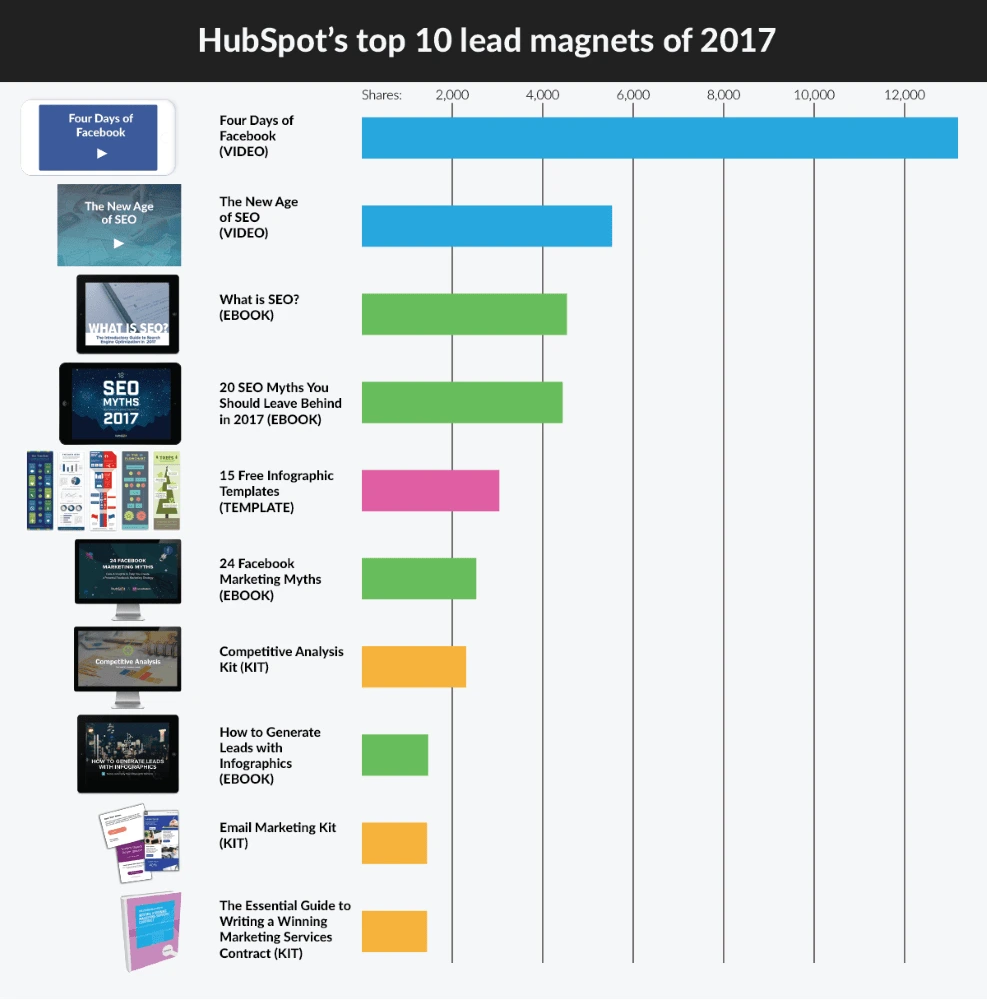
Aside from ebooks, here are a few other PDF content types that are as popular as ever:
- Cheat sheets
- Checklists
- Case studies
- Industry reports
- Expert interviews
- Resource lists
All of these formats are easy to digest, offering new subscribers the instant gratification they seek. As a bonus, they’re less expensive and time-consuming to produce than a full-blown video course.
Today, on-brand lead magnets are easier to create than ever. With a desktop publishing tool like Lucidpress, you can start with an existing template or create your own using the drag-and-drop editor.
After you’ve created your lead magnet and a landing page to host it, it’s time to get some eyeballs on it. Here are nine ways to do just that.
Tell your audience about your latest free offer
Lead magnets make handy tools for building an email list, but they can also be shared with your existing audience to generate more buzz or segment email subscribers based on their interests. Incorporate your ebook into your full content strategy.
Your existing audience includes your clients or customers, social media followers, and current subscriber base. Ask them to check out your latest resource and to consider sharing it if they find it useful.
Don’t forget to link to your lead magnet in the following places:
- Social profiles
- Pinned tweets on Twitter
- Pinned Page posts on Facebook
- Facebook Page CTA button
- Gravatar profile
- Forum signatures
Feature it throughout your website
Your website can be your best promotional tool. By strategically placing opt-in forms and links to your free offer throughout your site, you can control which type of visitor sees your offer and when.
If you want to get a bit more creative, here are a few more ways you can showcase your lead magnet on your site:
- Link to your landing page from your website’s main navigation (e.g. “Free Stuff”).
- Create an attention-grabbing sidebar graphic and link it to your landing page.
- Announce your lead magnet using a floating notification bar.
- Experiment with slide-ins, welcome gates and lightbox popups.
Certain types of opt-in forms, such as those that obscure the content, can be frustrating for mobile users, so consider displaying a different type of form depending on the device a visitor is using.
Link to it in your email signature
How many emails do you send in a day—or a week?
Your email signature is prime real estate for promoting your latest offer.
Create a professional and eye-catching signature with a link to your landing page and a bit of text enticing your email recipients to click. Using a free email signature generator like WiseStamp, you can easily add a CTA to your sig:

Promote it via your blog
Indirect promotion of your lead magnet via your blog can be a more effective long-term strategy than repetitively plugging your free offer.
The bottom of every post is a logical place to include a call-to-action. For example, you might add a post-footer opt-in form or invite readers to visit your landing page.
You can also link to your freebie within the body of your posts when it makes sense contextually. Use an attention-grabbing callout box or try the subtle (but highly effective) two-step opt-in form, which doesn’t display a form until the user clicks on the link.
Whenever you publish a new post, notify your audience via social media and your email newsletter. You can expand your post’s reach with some additional promotion techniques:
- Share your posts in relevant online communities.
- Answer questions related to your industry on Quora, and include a link back to your article for people who want to learn more.
- Reach out to the other websites linked to in your posts.
- Comment on popular blog posts in your industry, and include a link back to your post when it makes sense to do so.
Link to it in your guest author bio
Guest posting is still one of the best ways to reach new audiences and generate powerful backlinks to your content. In exchange for a well-written article, many websites will let you include a call-to-action and a link to a landing page of your choice.
To help you narrow down which blogs are worth writing for, use free tools like SimilarWeb and Alexa to get estimations of a domain’s traffic, and the MozBar Chrome extension to compare the domain authority of guest post prospects.
If you plan to do a lot of guest posting, it’s worth investing in a keyword research tool to help you choose article topics that 1) are relevant, 2) people are searching for, and 3) the host website has a good shot at ranking for. This will boost the visibility of your guest articles and the quality of referral traffic to your landing page.
Share it in relevant online communities
There’s a group for every professional subject.
Online communities—Facebook and LinkedIn groups, Google+ communities, subreddits, public Slack channels, etc.—offer a place to get support from experts, develop business relationships, and share your latest work.
Instead of trying to be everywhere at once, you can get more mileage by choosing a small handful of high-quality groups and being active in them. Get to know the group culture and participate in the discussion before attempting to drop any links.
In many groups, self-promotion or links are not allowed, although some group admins have a weekly “show-and-tell” day as an exception to this rule.
If group admins seem strict about self-promotion, don’t automatically write it off as a bad group. Often, heavily moderated groups are higher quality—and they tend to relax the rules for members who regularly contribute to the community.
Drive traffic to it with Facebook ads
With Facebook ads, you can generate sign-ups right on Facebook or drive traffic to a page on your website, like Marketo is doing with this ad:
If you’re curious to know the average CPC, CTR and conversion rates for your industry so you can see how your Facebook campaigns stack up, check out this study by WordStream.
Repurpose it
Repackaging your lead magnet into other formats and distributing it across multiple platforms is an economical way to generate more interest and exposure.
For instance, you could share pointers from your ebook in the form of YouTube videos, SlideShares, Medium articles or social media graphics, with a link to the download page.
PDF content can also be repurposed into offline marketing collateral—such as brochures, booklets, newsletters and flyers—and distributed to prospects at networking events and trade shows. (Not to brag here, but Lucidpress can help you transform your digital creations into on-brand print collateral and even send them via direct mail.)
Once you’ve created your first lead magnet and begun to collect subscribers, try creating a few new offers and see what resonates best with your audience. By targeting your lead magnets to specific blog posts or types of website visitors, you can continue to grow conversions while offering individual prospects and customers the best possible experience.
Ready to wow your marketing leads with beautifully designed eBooks? Lucidpress will help your brand send the right message.
Before the rise of social media platforms, marketers relied on evergreen content. Evergreen content is content that’s always interesting, valuable or relevant to readers.
In contrast, ephemeral content is content that’s designed to last for only 24 hours. Snapchat, Instagram Stories and Facebook Live are all examples of places to post ephemeral content.
Related: How to use memes for social media marketing
The psychological concept of FOMO (the fear of missing out) makes ephemeral content great at increasing customer engagement.
Here, we’ll discuss how you can take advantage of FOMO to build your brand with ephemeral content.
Why should brands create ephemeral content?
When Snapchat came to smartphones, many people didn’t get it. What was the point in making a video or a photo that would disappear?
At that time, content creators focused on creating evergreen content to capture the interest of readers and stand the test of time.
Although evergreen content lasts, ephemeral content offers a sense of exclusivity. If you miss it, you miss it for good.
By making content ephemeral, you can keep your audience on its toes. They don’t want to miss out, so they pay attention. And on the internet, attention is king.
Large brands are already taking advantage of FOMO with their content. In 2016, an estimated 21% of BuzzFeed’s total traffic came from Snapchat views. As of 2018, Instagram Stories has an estimated 400 million users.
If you don’t get in on this trend soon, you’ll be the one who ends up with a bad case of FOMO.
How to use ephemeral content effectively
Ephemeral content offers unique ways to engage an audience. There are several different strategies you can use, depending on your preferred platform. Here are a few of them.
Reach out to your users and make them feel special
First, you have to reach out to your users. There are two good ways to do this: remarketing and influencer marketing.
If you’ve already established contact with your users, you can try remarketing. Use remarketing to announce new products, sales or discounts on products or services they’ve bought before to keep your audience engaged.
If you haven’t reached your audience yet, you can tap influencers to attend expos or invite-only events. Provide opportunities for them to take great pictures and try out your product. These influencers can then share their experiences with your brand via their social media accounts.
Keep in mind that not all fans have the clout or money to go to these events. Instead, you can give your regular users a “sneak peek” that not only makes them feel special, but also makes your brand feel real and authentic.
Be authentic and humanize your brand
Speaking of authenticity, one of the things that makes ephemeral content attractive is that it feels more real. However, to do this, you first have to know who you are and what you want to do as a brand.
According to Shopify, putting to paper the intangible facets of your brand (e.g. principles, philosophies, etc.) “should provide an ample introduction of why you’re in business, why you’re different, what you have going for you, and why you’re a good bet if you’re asking for an investment.” These will give you a guide for how to appear more authentic in your social media posts.
But, it’s not enough to know who you are and why. You also have to run your brand in line with your identity. When you have an identity and stick to it, it’s reflected in your content. Users like seeing employees at work behind the scenes—or real people using products in their own way. Take advantage of this and show users the unpolished side of your brand.
Keep your audience on its toes with live video
Live video is one way to show your audience that you’re authentic. But aside from that, it hooks them immediately.
When you use live video, your users are the seeing it at the same time as everyone else. According to Facebook, users spend up to three times more of their time watching live videos than non-live videos.
Here are a few ways to use live video:
- Show what goes on behind-the-scenes. You can show snippets of processes in your business, or company culture by showing staff in their element.
- Training videos. These videos are great for technical or creative brands. You don’t have to do full training sessions. Instead, you can treat users to related tips & tricks, Q&As or how-to guides.
- Contests or giveaways. These would not only reward loyal customers, but they can bring in new customers, too.
- Share live events. Not everyone has the chance to attend exclusive events. Live video lets you share memorable event moments with all your users.
Facebook Live is a popular platform for live video streaming. If you plan on using Facebook for your live videos, make sure you know when the best times are to go live so you can get the most engagement.
Get your users involved with a call-to-action
In the end, you want your users to do something. That’s why you include a call-to-action.
With ephemeral content, the call-to-action is usually a link to a landing page. Because ephemeral content doesn’t last forever, you need to make your CTA clear and concise.
Make sure you tell your audience exactly what you want them to do. “Click this link!” and “Swipe up!” are good examples of clear calls-to-action.
Best platforms for ephemeral content
Now that you have an idea of how to maximize ephemeral content, it’s time to decide which platform to use. Each platform has its own features and user base. Here’s a short breakdown of three popular platforms.
Snapchat
Snapchat is popular with younger users, so you should consider Snapchat if they’re your target market. Snapchat uses Snapcodes, which are QR codes users can scan to follow brand profiles. Snapchat also has geo-filters, which can be used for time- and location-sensitive events or promotions.
Facebook has a huge user base that’s varied in demographics. If you plan on integrating ephemeral content with a brand page, Facebook is the way to go. Facebook Stories gives users a way to enjoy ephemeral content without clogging up their newsfeed. It also allows you to supplement your ephemeral content with posts on your main page.
Instagram has a huge user base. In 2017, Instagram Stories had more than 200 million daily active users, a number that’s doubled since then. If your brand is visual in its marketing style, Instagram is worth a look. You’ll be able to supplement your photo feed with Stories. Instagram also allows in-story links, making calls-to-action easier for users to follow.
Key takeaway
Ephemeral content is a trend that isn’t going away soon, even though these posts only last for 24 hours.
If you’re looking for a new way to engage your users and keep them interested, ephemeral content is something you should think about. Are you already using ephemeral content? How is it working for your brand? Show us your favorite examples on Twitter by mentioning @lucidpress.
Why talk about sustainability?
You’re probably fed up with the terms “millennial” and “Generation Y,” but they’re still helpful when describing that particular group of consumers.
For example, one trend that keeps popping up is their desire to buy from brands brave enough to set standards of behavior and live by a set of principles.
Related: 5 content tactics to ignite brand engagement with millennials
I’m a millennial, and for the first time this year, I was able to go to my local zero-waste store and buy travel toiletries for my summer vacation. I even paid a lot more for the privilege and left the store with a fuzzy feeling and a huge smile. Does this sound unusual? Trust me—I’m not the only one in my peer group who looks for opportunities like this.
If you’re looking for more reasons to build your brand around sustainability—and examples of brands that are doing just that—read on.
Boosting that bottom line
If you want to show the market that your company is in it for the long haul, having a sustainability strategy is a case of when, not if.
We know that 75% of millennials millennials say sustainability is a shopping priority, more than any other group. [![]() ] Yes, we came of age during the Great Recession and aren’t the richest generation (hello Boomers), but we are getting wealthier. And, importantly, we are willing to pay more for things that matter.
] Yes, we came of age during the Great Recession and aren’t the richest generation (hello Boomers), but we are getting wealthier. And, importantly, we are willing to pay more for things that matter.
The problem with sustainable business practices is the misconception that being good equals less revenue.
Even Forbes agrees that you can earn better returns from investing in good companies. If you’re not positioning your company to look after the planet and its people, you’re already behind. The time is now.
Leading from the front
Do you want your brand to be on the cutting edge, forming relationships with international audiences? Or do you want to be trying to figure out why your quirky social media campaigns aren’t getting the engagement they used to?
The United Nations are fully focused on achieving their Sustainable Development Goals by 2030, and your brand can be part of that through the work of the Global Compact division.
Of course, this is step one in the process. Your brand won’t survive on goodwill alone. It has to produce a steady profit to grow and spread your positive message further.
Step two is telling your story, integrating sustainability into your brand and making sure the entire company is on board and proud of the work you’re all doing.
Telling your “triple bottom line” story
If you’re not familiar with the triple bottom line, it’s the idea that your business should be measuring and reporting not just a financial bottom line, but social and environmental bottom lines, too.
This is how you truly integrate your business with sustainability. There are several ways to get started on this, but some useful resources are:
- B-Corporation. This is a framework any business can pick up and follow. It guides you on best practices for triple-bottom-line business plans, and you get a certification at the end.
- Global Reporting Initiative. The GRI is the go-to resource for sustainability reporting. Using GRI, you can easily figure out what you can report and how to report it.
- Integrated Reporting Council. Integrated reports are becoming increasingly necessary, bringing together financial and non-financial data in one place. It helps your stakeholders get a fuller picture of your company’s performance.
You can use these frameworks that are already created and layer them throughout your business. It’s a time-consuming process to get all of the data in place, but once you have it set up, it’s well-worth the effort.
What’s important to you?
The next part is understanding which issues are important to you and your audience. For smaller brands, your audience will include customers, employees and management teams. For bigger brands, that list might also include governments, local residents and other organizations.
A great place to start with your sustainability efforts is to pick an issue that you all feel strongly about. This will get everyone excited to transition, and while we all know that change can be difficult, successfully launching one project makes it easier to do more.
If you’re thinking of starting a business or just launched one recently, this can still apply to you. Think about your processes as you build them, and ask the question: “Can I repeat this action for the next five years and feel good about it?” If the answer is no, then you have an opportunity to future-proof.
Now that you have an amazing project going on—whether you’re off-setting your carbon output, adding mental health support to your team’s healthcare packages, or engaging your local community in a social development project—it’s time to tell the world.
Using social media
We’re past the point of debating whether social media is relevant. It is. It’s also a fantastic place to tell your brand story in an authentic and engaging way.
The number-one rule here is not to just throw out a few posts about sustainability and expect them to get the engagement they should. Create a new marketing plan with your project at the heart of it, and find ways to tie more of your posts back to sustainability.
The power of Instagram and live-streaming
For Instagram, consider using longer captions. If you have a good reason for a long post, then don’t be afraid. Yes, social media is often about standing out, but that in itself is not a sustainable business practice. If you’re just using pictures of puppies because research shows that puppies get the most likes, then you’ve missed the point of marketing.
Make your social media pages (especially Instagram) reflect your authentic self. Check out @ErinOutdoors or @SophieHellyer, who’ve both attracted loyal communities with their authenticity. Let it showcase the values of your brand so you can attract an audience who cares about those same things.

A post shared by Erin Sullivan (@erinoutdoors) on Oct 12, 2018 at 8:00pm PDT
If you have someone who’s particularly good on camera, give them a platform to talk about your project in a live stream. Most social platforms now have a solid live-streaming option. Take advantage and give your audience access to backstage conversations about your brand. Be brave and be there for your community.
Building a community
Having worked in marketing for a long time now, the most common thing I see is a fear to stand up for something important because it might upset some of your customers. You could sell anything to anyone, but that’s not building a brand legacy—that’s trying to make a quick buck.
If you consider community-building to be part of your marketing strategy, then you need to have a positive message. Brands that build positive messaging in their content and communication are the ones that stand out against the negative cycle of mainstream news.
Examples of great sustainable storytelling
There’s nothing like seeing examples that work, so we’ve curated a few samples of brands we absolutely love.
TRIBE — Sports nutrition with a conscience
At Conscious Creatives, we try to encourage physical activity as part of a healthy lifestyle, getting our team healthy through running, cycling, surfing and more. One of our biggest forms of inspiration in this respect is Tribe—a brand dedicated to making sports nutrition products with natural ingredients.
What we love about Tribe is that their marketing plans are based on creating a community. They’re a collection of people who love being outdoors, brought together by sporting events all over the world and a combined effort to rid the world of human trafficking.

A post shared by TRIBE (@the_tribe_way) on Oct 15, 2018 at 12:46pm PDT
Tribe is a community of nutrition experts who care about the world. It just so happens that they also sell nutrition products.
Lewis Pugh — Swimming to save the seas
An example of someone who definitely fits the definition of inspirational is Lewis Pugh: swimmer, speaker and general mind-boggling human being.
He’s just completed The Long Swim, a 560-kilometer effort spanning the length of the English Channel.
Why would a person attempt such a thing? To raise awareness of the sorry state of our oceans. Lewis’s feat is the start of a worldwide campaign that aims to fully protect 30% of our oceans by 2030.
A real-life hero and conservationist, Lewis defies all logic and pushes himself to the limits to earn media coverage of the cause. See this photo of his encounter with a plastic bag during his long swim. He used a powerful image, a long caption and specific instructions to make our oceans cleaner.

A post shared by Lewis Pugh (@lewis.pugh) on Aug 22, 2018 at 7:19am PDT
That is how sustainable marketing will change the world.
rCUP — Recycling reusable cups
I am proud to share a hometown with these folks. They discovered that only 0.4% of recyclable coffee cups were actually being recycled. So, they set about designing a product made from precisely those cups.
The rCUP is a reusable coffee cup that is affordable, looks great and has some wonderful little design elements that make it really easy to use.
A post shared by rCUP (@rcuponeplanet) on Jul 21, 2018 at 11:32am PDT
Sustainable marketing is so much easier when you’ve got products that make a real difference.
How to get started
If you’re reading this and are equal parts excited and confused, you are not alone. I suggest finding a community of like-minded business folks who are also looking to make more money by doing the right thing.
LinkedIn is a great resource for finding sustainability professionals, and our community is strong in voice. We’re all so proud of the work our peers are doing and the causes that we stand for.
Look into your industry to see which organizations support sustainability. You’ll be surprised to discover wonderful groups ready and willing to help, no matter what stage you’re at. For example, if you work in fashion, the Ethical Fashion Initiative is a wonderful example.
The key, though, is to start.
Don’t be afraid to try. Know you aren’t going to do it perfectly, but also know that simply trying is a great thing. Watch as your community grows and rallies around your brand for years to come.
Since 2008, real estate has gone up by an incredible 11.4% and created a fantastic opportunity for real estate agents to sell more clients.
Millennials will quickly become over a quarter of the real estate market, and only 1% of those millennials didn’t search online while looking for a house. Just one percent.
Related: How to handle inbound real estate leads
The internet has forever changed the way real estate agents get leads for their business, and you’re definitely behind the curve if you haven’t optimized your website for lead generation.
How do you generate real estate leads online? In this guide, you’ll learn various methods for obtaining quality leads online and the secret to converting your website into a real estate marketing machine.
Let’s get started.
1. Social media
If you’re not a frequent user of social media, it’s time you got started. Most people have a Facebook account, and many are active users on Instagram as well.
Instagram in particular is a fantastic avenue for sharing high-quality images and videos of properties and advertising your latest content (e.g. blogs & newsletters) effectively. By engaging with different channels each day and adding value to others, you’ll begin building a devoted following online.
Lots of real estate agents don’t do social media because they lack time for it. But with tools like Buffer and Hootsuite at your disposal, you only need an hour to set up a whole week’s worth of posts. All that’s left is checking the comment threads and responding whenever you have a few seconds throughout the week.
Read more about social media for real estate: How to build a social media campaign for real estate
2. Website
Source: Colorlib
If optimized properly, your website could be the foundation for attracting real estate leads online. It gives you the ability to provide value to your target market and help them engage with your brand.
Many real estate agents make mistakes in this area, and your website is not the place to describe your greatness in detail. Make your copy about how you’ll add value and better the lives of your customers.
An easy way to check whether your website is focused on your target market is to count how many times your site uses the word “we.” Customer-focused websites will use the word “you” more often.
3. Newsletter
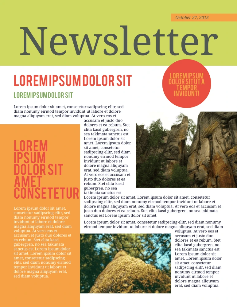
See more newsletter templates from Lucidpress
It’s always a good idea to keep your name top-of-mind, and a newsletter is a great way to do so. Newsletters can share real estate news, recent listings, and tips to deal with typical homeowner struggles—like preparing your house for the winter.
A newsletter is especially useful if your leads live in urban areas. Cities such as San Francisco, Los Angeles and Chicago are massive and busy, so it’s easy to miss out on events if you’re not paying attention. It’s also an excellent opportunity to inform subscribers about the latest news and events in their area.
Read more about newsletters: 13 best newsletter design ideas to inspire you
4. Blog
Blogging is one of the most popular and effective ways to generate leads online. But like any lead-generating tool, it has to provide great value to your target market. A blog post about the staff holiday party is not going to get the leads you want.
The best information to share with your target market is actionable. This could include topics like making a down payment, picking a lender, listing their home, and working with a real estate agent.
Free advice will grow your influence and make you a valuable resource—so when someone needs to sell or buy a house, they’ll think of you first.
Read more about blogging for real estate: How to use content marketing in real estate
5. SEO
The first page of search results has only ten slots. 33% of the people searching will click on the first result. 18% will go a step further and click on the second result. The further down the page you go, the fewer clicks there are—only 4.4% click on the sixth result.
That’s why every business wants to be on top. The lower you are, the harder it gets to attract your target market’s clicks.
The ideal SEO strategy is about finding the best keywords (and phrases) to target, then using them deliberately in your content to attract the customers you want. SEO powerhouse Moz has lots of free resources and tools to help you get started.
6. Video
If seeing is believing, then showing off the fantastic features of your properties is a surefire way to win converts—and there’s no better way to do that than with video.
Videos empower your potential clients to take a guided tour of your properties. They’ll be engaged by your content, but more importantly, they’ll be motivated to reach out for more information.
A video is far more than just a slick way to show off a property. On average, an online video converts 33% of leads. If you want a more captivating way to connect with your target market, video marketing is a great way to increase interest in your properties.
Read more about video marketing for real estate: How to create stellar videos for real estate listings
7. Influencer marketing
Connecting with others in your industry is always wise, and doing it online makes it easier than ever. You can share and amplify each other’s work through social media and comment on posts each of you publish.
Influencer marketing takes this one step further. It starts by figuring out who your target market is—specifically. Then, you can find influencers who are popular among the folks you want to target. By partnering with these influencers on advertising campaigns, you can reach wider audiences and attract more people to your brand.
Read more about influencer marketing in real estate: 5 influencer marketing strategies for real estate
8. Mobile optimization
Industry professionals often spend tons of time and money making sure their website is professional and easy to use… then forget to check how it looks on a smartphone or tablet.
Mobile search has surpassed desktop search, so it’s more important than ever that your website works with mobile devices. (Google is going as far as penalizing sites that haven’t created mobile-friendly layouts.)
Make the switch. Not just to protect your website from Google, but to impress customers who encounter your brand exclusively via mobile device. Aim for the same goals as your regular website: clear copy, attractive design and intuitive function.
Want to go even further with mobile? Read more about using mobile text messaging for real estate: 5 steps to build out your real estate mobile text messaging strategy
9. Referrals
When you start off as a real estate agent (or in any field, really), you won’t have a network. So, it’s up to you to build one.
As you begin to deal with customers, don’t forget to ask for referrals. Encourage them to share your name with others—make it easy and worthwhile for them to do so. Whether it’s to their friends, family or coworkers, advertising by word-of-mouth is powerful. People are more likely to follow recommendations from people they know than an anonymous review online.
10. Retargeting
Although we covered social media all the way at the beginning of this guide, we left out one element that deserves its own section: retargeting via Facebook ads.
Facebook ads are not a popular method of advertising in real estate circles, despite how high the ROI can be. Here, retargeting simply means that people who have shown interest in your brand will see your ad again. This “interest” is measured by actions such as reading your blog posts, clicking on one of your ads, or even signing up for your newsletter.
Your conversion rate will improve if you target people who want what you’re selling. People who are actively interacting with your brand are more likely to buy than those just scrolling through their feeds. Retargeting keeps your brand top-of-mind for the folks who matter most.
Key takeaway
Leads don’t just magically appear in your inbox. You need a strong lead-generating strategy that helps you cultivate interest in your brand and set you apart from the competition. These tips should get you on the right track to generating real estate leads online.
Hungry to hear about the best marketing practices for real estate? Hop over to our real estate marketing guide for more ideas & inspiration.
Attracting a steady stream of new customers is one thing, but building customer loyalty is integral to a brand’s long-term success. And it begins with making a good first impression.
Think about it: when looking up a brand online, what do you remember about the ones that stand out? More than likely, it’s their logo or their overall style—like meeting a person wearing a great suit. When you run across that brand again, that image can stick with you—more so if you keep on seeing it in different places. This is a brand’s visual identity, and it’s what you want potential customers to remember.
Related: 6 Instagram post ideas to boost sales
Having a memorable visual identity is important for social media, now a standard tool in the digital marketer’s arsenal. Instagram in particular is a powerhouse for using visual content to promote products and services, with Instagram stats showing 71% of U.S. businesses have an Instagram profile (25 million business profiles total). Standing out and earning engagement and followers depends on how well-defined your visual identity is. Here’s how to do it.
1. Know your brand inside and out
Before you create a visual identity, you need an actual identity first. Know the key aspects of your brand you want to communicate to your audience, then translate them into a visual medium. [![]() ]
]
Essentials for this step are copies (in writing!) of your brand’s mission, vision and values. These should be easily accessible on both your official website and any internal marketing documents. When you have them, answer the following questions to figure out what you’ll need to base your visuals on.
- Why was my brand made?
- What does my brand value the most?
- What words would I use to describe my brand?
- What does my brand offer in terms of products, service and experience that others do not?
- What kind of people do I want my customers to be?
Using your answers to the questions above, you can isolate a set of keywords closely associated with your brand.
2. Create a set of branding guidelines for social media
Source: Spotify
Do not underestimate the logistical power of good documentation. Brand guidelines enforce consistency in your branding, graphic design and marketing—keeping everything together so that everyone is on the same page when it comes to how to visually present your brand.
While it does take time and effort to create, having all these details in one place saves more time in the long run. It’s also a mark of professionalism: no having to go back and forth, emailing each other files and instructions every time you design something new.
Looking at some great branding examples, here’s what to include in your brand guidelines:
- The theme of your brand
- The feel and philosophy of your company
- Relevant taglines
- Font styles & typefaces to use
- Acceptable ways to use your brand logo, including its size & placement
- Color palette to use when associating with the brand
- Guidelines on composing imagery
3. Make social media post templates
Source: Sephora
If you want to be remembered for a certain color or type of imagery, or if you want your logo to be visible on the feed and not just in your profile photo, turn to Instagram post templates. Some examples are backgrounds for text posts or borders to place around photos. They might include your logo, brand name or slogan and should be used when appropriate—not all the time, but just enough to be noticed.
You can use these templates when you share some of your favorite quotes to Instagram, which can make an otherwise plain text post look interesting. You can also place template borders on user-generated content that you’d like to share on your profile—especially useful if you’re running an Instagram giveaway or photo contest using a particular hashtag that can be incorporated into the template.
Remember to mix it up once in a while as well. While you want it to be memorable through retention, you don’t want it becoming stale. Try mixing it up every month or two and changing it according to season or campaign.
4. Have a consistent photo-editing style
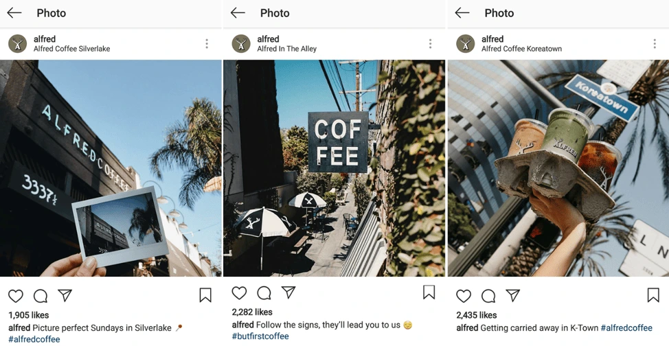
Source: Alfred
Once you’ve identified the feel of your brand and the colors you associate it with, fold that into the way you edit photos. Color has long been known to be a powerful force in marketing, and by post-processing images before you post them online, you can influence what they convey.
Use a similar editing style with your pictures so they all communicate your message—and slowly, users will connect that feeling to your brand. Away from your computer and need something quick? For extensive editing on the go, download a reliable photo application like Instasize to your mobile phone.
5. Do social media right
Last but definitely not least, make the effort to use Instagram right.
What does this mean? No matter the amount of content you share, and no matter how elaborate your photo editing is for each image, your efforts won’t matter if you don’t make use of the rest of the platform. Instagram has boomed—and so has its features.
One of the biggest don’ts of Instagram right now is to post strictly to the feed only. Instagram also has Stories and IGTV, the former of which can be an informal way to connect with your customers, while the latter gives space for long-form videos that followers would otherwise miss.
Of course, don’t let all your efforts towards keeping your visual identity end with social media. After all, using Instagram is just one step in the marketing funnel. Creative consistency builds trust, showcases reliability and improves customer perception—especially in visual branding. Keep your branding consistent across touchpoints before, during and after purchase, and you’ll be crafting a brand story customers won’t forget any time soon.
Want to know more about the power of brand consistency? Download our free 32-page report, chock full of stats & great insights.
“We need a logo” is a loaded request that designers and creative agencies hear from their clients. High expectations are always involved—that’s a fact. Every client wants a remarkable logo for their brand, and they’re counting on you to create it.
Related: 9 excellent logo redesigns for famous brands
How do you deliver an innovative, impactful design on demand? If you’re running low on creativity, we’re here to fill in for your muse as she turns a blind eye to your deadline. Load up on logo design inspiration from the guidelines and examples below to get those juices flowing again.
Logo design examples for your inspiration
Consulting Logos
Consulting logo idea #1: Accenture
Accenture is one of the biggest management consulting firms. The company offers strategy, consulting, digital, technology and operations services. Their revenue was around $40 billion in 2018, so we could definitely learn some design lessons from them.
Consulting logo idea #2: Capgemini
Capgemini is another consulting giant that can teach us a valuable design lesson.
The key lesson here is that you can build a financial empire… even if your logo isn’t closely related to the services you’re selling.
The Ace of Spades has been present in their logo since its inception, but it has little to do with their business. In fact, it refers to bridge—a card game that the founder of the company, Serge Kampf, enjoys. In bridge, the Ace of Spades is the highest-value card.
Consulting logo idea #3: DLA Piper
If you’re offering legal consulting services, here’s what you can learn from one of the biggest global law firms. (How big? DLA Piper has lawyers in more than 40 countries and over $2 billion in revenue—that’s how big.)
The open-ended shapes represent out-of-the-box thinking. Something you might actually want from a lawyer, right?
If you look at it from a different angle, the logo seems like a talking bubble, which shows they value the art of communication… or that they’re friendly. You decide.
Lucidpress: Click the image to use the template
Use one of our consulting logo templates as inspiration for your own logo. Switch out colors, fonts and texts to create your logo in seconds.
Real estate logos
1. Smith Mountain Homes
First up is this beautiful logo from Smith Mountain Homes.

2. Cabo Cribs
If you’re looking to buy property in Cabo, I’ll bet Cabo Cribs’ logo catches your attention.

3. Williams & Williams
If you’re in the market for a luxury property, you’ll love Williams & Williams’ logo.

Lucidpress: Click the image to use the template
Use one of our real estate logo templates as inspiration for your own logo. Switch out colors, fonts and texts to create your logo in seconds.
Health and fitness logos
1. Heavy Mettle Fitness
When you have too many ideas, just stick to the basics, even if it’s cliché.

Source: GLDesigns
2. Peachy
What’s that number-one thing your audience wants? Point it out, and people will remember you as that gym or that fitness instructor or that nutritionist who can help them get it.

Source: 99designs
3. Necessary Payne
If your ideal audience is into hardcore training, a logo like the one below could be a great strategic move.

Source: Design your way
Lucidpress: Click the image to use the template
Use one of our health and fitness logo templates as inspiration for your own logo. Switch out colors, fonts and texts to create your logo in seconds.
Striking use of color
Powerful colors make a logo vibrant and eye-catching. In recent years, logo design trends favored simple and spirited colors that appeal to new generations of customers.

It’s interesting to see the process behind this logo and Volusion’s brand identity design.

TeleMadrid’s rebranding is another example of a colorful and adaptable logo design.
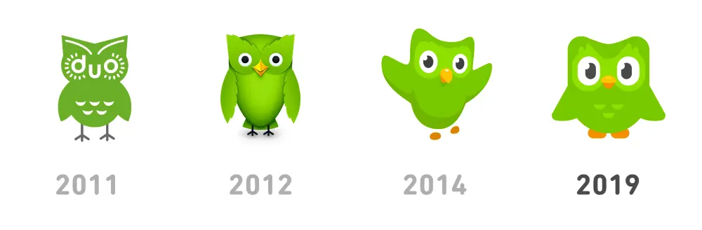
And Duolingo’s 2019 logo update builds on their playful and energetic brand.
Memorable use of layout
Another way to make your logo unforgettable is to surprise people with an unexpected layout.

This example from Bajo Protección invites a second look with its 3D effect.

The Dutch National Opera & Ballet logo has us peeking from the balcony.
And Moonpig champions creativity by updating their logo to match their surreal name.
Beautiful use of typography
Fonts are another excellent source of inspiration.
Typography can help you balance simplicity and intricacy in logo design. It’s also an essential element for your brand creation process.

Typography was just what Tom Sands needed to make this logo a timeless presence on their acoustic guitars.

Typography can also create a sense of motion, as it does in this example.

And sometimes, like in the case of UK-based creative agency Dry, fonts are all you need to capture your brand spirit.
Clever use of symbols
The symbols you include in your logo give people a glimpse into the brand’s spirit and generate emotional connectivity.

This redesign concept uses the nave ship, a historical symbol of Paris.
Airbnb logo redesign is a great example of mixing various symbols into a memorable logo.

Chairish provides an honest and straightforward testimony of their dedication to their craft.
Creative use of patterns
You can incorporate different patterns into logos while still maintaining brand consistency—and these examples are proof.
The redesign of Melbourne’s logo provides a playful space for patterns and placements.
The German Historical Museum’s logo uses juxtaposed shapes that can fit well in intricate contexts.

In this example, patterns and negative space convey a message of unity.
Surprising use of negative space
“In the end, creativity isn’t just the things we choose to put in, it’s the things we choose to leave out.”
Austin Kleon
In this quote from his book Steal Like an Artist: 10 Things Nobody Told You About Being Creative, author Austin Kleon captures the inspiration negative space can unleash.
The Swan & Mallard logo challenges you to find the intertwined characters.
Whether you’re into cats or bears, you can’t help but spot the figures that hide behind this typeface.

This Flight Finder logo creates a sense of motion and pleases the eye with its symmetry.
Surprising use of animation
We live in the golden age of GIFs, and their cultural impact now influences logo design ideas as well. These examples show how you can add animation to a professional logo.
PetCloud’s logo has adorable spelled all over it, wouldn’t you agree?
I bet the designer behind this logo knew his clients would be over the moon with its design.
And this creative used animation to deliver his logo design with a bang!
Before you go, remember this
As a designer, you know coming up with cool logo ideas is a complex process. What helps is to lead with a deep understanding of your client’s business and brand values.
It’s equally useful to draw inspiration from diverse sources and experiment with your ideas until you find the right fit. Play with colors, layout, typography & symbols to design the creative, custom logo your client expects.
Once you have it, use the logo to build branding that’s consistent across all channels. Give customers a familiar and reliable presence to count on and build meaning with.
Use this 5-step process to design creative logos
Unfortunately, a clear creative brief for logo makers is a rare occurrence. That’s why designers and agencies explore, select and clarify ideas before proposing anything.
Here’s a secret experienced creatives know: Sometimes you can reach your best ideas by using a systematic approach.
Whether you’re building a brand from scratch or planning a thorough rebranding, this 5-step process can help you come up with cool logo ideas.
1. Understand the customer’s business
The logo is central to a brand’s identity. In fact, the best of them are deeply rooted in the company’s mission. If you’re lucky, your customer has their mission clearly articulated. If not, roll up your sleeves and focus on research.
First, observe and analyze how their customers talk about them.
Explore:
- Testimonials & reviews that highlight their best features (for B2B, try G2Crowd or Clutch; for B2C, try TrustPilot or Google Places)
- Answers to surveys that show how customers feel about the business
- Case studies that reflect their process and results
Source: TrustPilot
For brand new businesses, you can look for similar details in their competitors’ activity to give you a starting point.
2. Map out the brand’s values
The best branding relies on a deep understanding of what people want when they buy something. ![]()
A custom logo that builds differentiation has to speak to customers’ psychological needs. A powerful design triggers a reaction and influences the choices consumers make when they see it.
Define what the business stands for to ensure your logo design speaks to the brand’s values.
For example, Patagonia strives to “build the best product.” They aim to “use business to protect nature” and do so in a way that’s “not bound by convention.”
Buffer commits to “default to transparency,” “cultivate positivity” and “improve consistently,” among other values.
Source: Buffer
Using your customer’s brand values to guide your logo design can be incredibly inspiring.
3. Choose a series of adjectives
Now that you know what the business is all about, you use this information to pin down specifics. Make a list of adjectives that capture the brand personality.
For example, when you think of Patagonia, words like humble, altruistic & adventurous may come to mind. Buffer inspires words such as helpful, calm & dependable.
Examples of adjectives you could use:
- Bold
- Serious
- Rational
- Imaginative
- Idealistic
- Generous
- Clever
- Humorous
- Whimsical
- Luxurious
- Glamorous
- Rugged
- Brave
- Rebellious
- Cooperative
- Edgy
- Gentle
- Playful
- Old-fashioned
- Youthful
Want to go the extra mile? Analyze the vocabulary customers use when they talk about your client and dig up adjectives from it.
Single out associations that point to what makes the company different. Narrow your list down to 3. Now you have the emotional substance that fuels your logo.
4. Collect inspiring ideas
Logo design ideas often come from unexpected sources. Take it from people who faced the same challenges as you do now:
“I use weird sources for inspiration. I look at forms in nature and try to reduce them to basic shapes. I’m always trying to invoke a sense of humanity to a logo.”
Josh Baron, Media Art Director at Sparxoo
Multiply the opportunities for creative inspiration to kick in and increase the chances to get that grand idea. Look for compelling symbols, icons and patterns.
Check out fresh photography from sites that offer free stock images. Peruse design websites like Dribbble, Behance, Designspiration & Dunked.
Even better, browse countless logo examples on Logoed, Logospire, Logo Gallery, Brand New, Logo Moose & Logo Design Love.
Collect fonts & color options to create a mood board. This collage of elements helps define your concept at this stage. Include notes to explain your thought process so you can give your client a consistent overview of your creative direction.

Source: Dribbble
Ask for feedback at this stage. Get input from your client to save you time and energy down the road. For example, knowing which elements your client notices can help you come up with better, more relevant logo design proposals.
Feedback in hand, it’s time to create the best logo you can.
5. Choose & validate the best ideas
Fast forward through dozens of iterations to logo_v27_final_FINAL.indd.
You’ve received feedback, integrated it and designed (what you assume will be) the final version.
Source: Tubik Studio
Your moment of glory awaits, and so does your deadline.
Use this time constraint to strengthen your creative process. Stop before you get caught up in a never-ending cycle of “I know I can do better.”
Instead, focus on shaping a logo that can outlive design trends. Give people a chance to build meaning into your logo over time. ![]()
Here’s what experienced creatives recommend:
“All logos should be four things: simple, memorable, timeless and flexible.”
Cory Schearer, Creative Director at Ferebee Lane
Keep in mind adaptability when you design your client’s logo. Your creation will be used in print, in emails, on social media, on websites and digital advertisements.
Wherever it may be featured, the logo’s role is to get an emotional reaction.
Ready to design your logo? Give us a try.
Despite the prominence of digital marketing, print collateral still has an important role to play in a balanced marketing strategy. A professionally produced brochure suggests a high budget and an established reputation.
Related: How to make a stunning travel brochure
Not only that, but brochures are versatile marketing tools. You can distribute them at trade shows, put them in brochure racks, send them via direct mail, and even publish them on your company website.
(They’re also very portable. Many people would prefer to grab a brochure and read it at their convenience rather than engage with a salesperson.)
Most brochures are just a few hundred words in length, so you don’t have a lot of space to get your message across. It’s important to make every word count. Here are eight tips for writing a brochure that signals professionalism and competence — and spurs your readers to action.
1. ) Create an outline or plan of attack
Brochures vary in content and length, but most follow a standard format.
- The front panel displays the company logo and headline.
- The inner panels make a case for the product/service using supporting facts and details.
- The final panel contains contact info and a call-to-action.
Please note: At the end of this post, we’ve included a cheat sheet of content types you can put in your inner panels.
Before you start writing, identify your target persona for the brochure including age, gender, location, role, income, interests and challenges.
This information will guide the tone, language and content of your brochure. It’ll also help you choose a call-to-action that appeals to your readers. For instance, an offer for a free white paper would likely be of interest to an executive, whereas a mobile app download would be more fitting for a college student.
Make note of where your target audience is in the buying cycle. Don’t waste space going on about the history of your organization if your readers have done business with you before.
Also consider the level of understanding your prospects already have about the topic. Are they experts, novices or somewhere in between? Keeping this in mind will help you avoid alienating readers by talking down to them or confusing them.
2.) Write a compelling headline
Your headline will determine whether a prospect picks up and reads your brochure or tosses it aside.
Avoid using headlines that don’t tell the reader anything about the contents of the brochure — for example, “Make a Good Impression.” What does this mean, who are you making a good impression on? And for what purpose?
You can provoke a reader’s curiosity without being vague. These example headlines spark interest while also telling readers exactly what they’ll get from reading the brochure:
- Scared of the Dentist? Learn How Sedation Dentistry Can Help
- The Ultimate College Prep Checklist: A Four-Year Plan for High School Freshmen
- 4 Reasons to Think Again Before Buying a Foreclosed Home
Don’t be afraid to use “power” words like free, quick, easy, results, exclusive, proven, etc. What they lack in originality, they make up for ineffectiveness.
3.) Be concise and use plain language
Your brochure should focus on one product or service. A trifold brochure only has space for about 350-450 words, so keep words, sentences and paragraphs short. Edit ruthlessly and include only the most relevant information, leaving room for white space and images.
Big walls of unbroken text look intimidating to readers, so use subheads liberally. Try not to put more than a couple of paragraphs in a row without introducing something else to break up the monotony, such as a subhead, bullet-point list or image.
With the help of Lucidpress’s online drag-and-drop editor, you can quickly design a professional-looking brochure with elements like callouts, pull quotes and tables.
4.) Limit the copy to 1-2 typefaces
The typefaces you choose should be easy to read and consistent with your branding. Often, if the subhead copy is in a serif face, the body copy will use a sans-serif face, and vice versa. There are some great free tools available to help you select a complementary font pairing.
Select font size, spacing and color with readability in mind so your prospects don’t have to work to read the brochure.
5.) Give readers a reason to keep your brochure
If you can, include a handy reference of some kind in your brochure to dissuade readers from throwing it away—for example:
- a map of a town marked with top attractions
- a “normal body weight” chart based on the reader’s height
- a list of program-specific student scholarships
- a cheat sheet for first-time homebuyers in a specific city
Also, consider printing the brochure on a high-quality glossy paper to boost its perceived value.
6. Include next steps or a call-to-action
The goal of your sales brochure should be to persuade your readers to take a specific action.
This call-to-action is usually placed on the last panel of the brochure, along with the contact info. To boost response rates, offer an incentive, such as a promo code or free product.
The following are some example actions you might want your readers to take:
- Sign up to your email list for a free white paper
- Visit your website to make a purchase or sign up for a program
- Call to book a free consultation
- Scan a QR code to download an app
- Enter for a chance to win
- Visit your store for an upcoming sale
7.) Proofread your brochure
No matter how much effort you put into your messaging and design, errors and inconsistencies in your printed literature can kill your credibility.
Verify that the tone of your brochure matches the rest of your brand messaging. Unlike informational brochures (which may take the third-person point-of-view), sales brochures usually use the second-person to build rapport with the reader.
Refer to your brand style guide for how to handle things like numerals, dates and titles in the text. If you don’t have a brand style guide, use an established style reference like AP Stylebook. And of course, look everything over for correct spelling, punctuation and grammar.
8.) Double-check for important details
Before the brochure goes to print, check that your logo and contact information are present and error-free. Also look for details you may have forgotten to include, such as:
- Purchasing info—how to place an order, accepted payment types, guarantees, warranties, refunds, shipping, etc.
- Visitor info—accessibility for people with disabilities, hours of operation, seasonal times, admission rates, group sizes, pets, directions, etc.
- Legal info—copyrights, trademarks, registration marks, disclaimers, etc.
You can also create branded templates for your brochures so you don’t miss anything important when you start a new project — Lucidpress handles printing as well.
Bonus: What should I put in my brochure?
For inspiration, here’s a cheat sheet of content types often found in sales brochures:
- Descriptions of products, services, exhibits or attractions
- Features and benefits
- Product specs
- Pricing charts
- Pros and cons
- Itinerary (e.g. winery tours)
- Narrative (e.g. history of a winery)
- How a product works
- How a service is delivered
- How to do something
- Checklists and questionnaires
- Images, illustrations, charts, graphs and maps
- Frequently asked questions
- Company blurb
- Social proof: case studies, testimonials or media quotes, client list, executive bios, etc.
Experiment with a few of these items and see where it takes you. You might be surprised at how quickly you run out of space!
What are you waiting for? Try your hand at design with any of our design templates.
Interactive marketing is a customer-oriented approach to marketing that engages the user and requires their participation. The most popular forms of interactive marketing content are polls, surveys, quizzes and games. This type of content can help you drive awareness, engage your audience, generate high-converting leads, convert to sales, or nurture brand loyalty.
Let’s take a look at the four types of interactive content that are most likely to bring you results.
Polls & surveys
Polls and surveys are probably the simplest and oldest form of interactive marketing. They’re a great way to get in touch with your audience, but despite their simplicity, you can use them in several different ways to help you build a genuine connection with your followers.
The easiest and most straightforward way to use polls and surveys is to ask your audience or customers for opinions about your product, service or content.
Source: Twitter
For example, many content creators run regular polls to inform their content creation strategy.
Source: Twitter
While many marketers use polls as part of their content creation process, it doesn’t have to be the only way to engage with your audience or customers.
You can use polls to obtain relevant statistics from your industry and later turn them into a valuable source of unique content that will boost your authority in the business field.
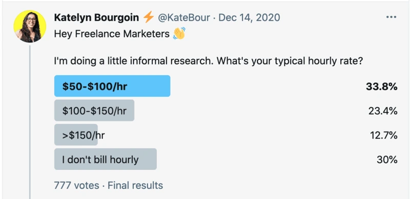
Source: Twitter
Of course, polls don’t have to be all work and no play — if your brand relies on aligning with your customer’s lifestyle, values and interests, you can always use entertaining content to nurture friendly relationships.
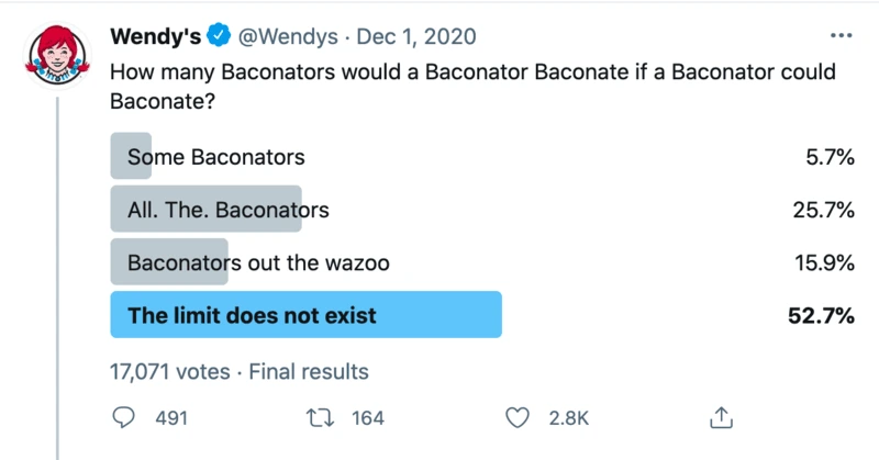
Source: Twitter
If you have any doubts on whether polls draw engagement, you can see the number of votes, likes and retweets in each screenshot. Even though the likes and retweets are often low, the number of people who voted in the polls is much higher, showing that polls really do engage your followers.
Incorporating polls in your content marketing strategy is pretty much a breeze — polls are a regular feature on both Facebook and Twitter, and it only takes a few clicks to create them.
Contests
Another well-known marketing strategy that still delivers amazing results is the gamification of various contests and challenges.
In terms of content marketing, challenges and photo/video contests are a great way to gather user-generated content that can later be used or repurposed for brand development.
Unless you’ve been living under a rock, you probably remember the famous ALS “Ice Bucket” challenge that managed to raise awareness about a rare neuron disease, engage 17 million participants, and collect $115 million in donations that led to a breakthrough in determining the cause of ALS.

Actors Henry Cavill & Amy Adams do the ALS challenge. Source: YouTube
The ALS awareness campaign challenged people to dump a bucket of ice over their head (or have another person do it to them). Then, participants nominated the next participant — the only way to opt-out of getting showered with ice was to donate money to the ALS Association.
Similarly, you can challenge your audience to a little photo or video contest with a unique hashtag on social media in exchange for a fitting reward. Of course, whatever the topic of the contest is, it has to align with your brand values and product. There’s not much point in organizing a photo challenge depicting the wonders of nature if you’re selling used car parts — but there are plenty of other challenges that would fit splendidly.
Source: National Geographic
In the end, your contest should neither be too easy nor too difficult. You want people to put some time into connecting with you in exchange for a prize or benefit that seems attainable and worthy of the work it requires. You don’t want to frustrate people or make them feel cheated.
A good challenge will bring out people’s natural curiosity and competitive spirit. The better you are at that, the greater your chances of going viral. If your contest is engaging, people will be eager to share it.
Quizzes
You’ve probably procrastinated by doing dozens of absurd quizzes with titles like “Tell us your favorite One Direction member and we’ll tell you which garlic bread you are.” Apart from being addictive and fun, quizzes can also be a great way to boost your content marketing and sell more. How?
Quizzes have high completion and click-to-conversion rates. They satisfy our need for introspection, self-confirmation, recognition and belonging — making them super clickable, convincing and shareable (qualities you definitely want in your marketing content).
For example, you can capture people’s attention by running a quiz on your website or social media, promising they’ll discover something about themselves (ideally, something relevant to your brand). The results they get can direct them towards a landing page or collect their email address in exchange.
But, don’t think that quizzes are only good for retailers and entertainment websites. This type of interactive content is also a great way to reach out to business clients. By identifying the unique challenges of your B2B buyers, you can create quizzes that offer them practical, customized solutions in the form of quiz results.
Interactive websites
Interactive websites engage and inspire your potential customers to explore content in a way regular blog posts don’t. Take, for example, this piece of sponsored content in The Washington Post.
Source: The Washington Post
The National Association of Realtors published an article with the goal of reaching their target market of first-time homebuyers. As the younger generation is more cautious and skeptical about purchasing real estate, realtor marketers knew they had to step up their game.
Source: The Washington Post
And the article itself does feel like a game, constantly requiring the reader’s attention and interaction. (For example, there’s an interactive infographic.) Content sections are intertwined with relevant survey questions about personal experiences, opinions and expectations.
Source: The Washington Post
Apart from reaching a skeptical audience with content that responds to their common complaints and questions, the survey was also a way to help realtors gather data about their ideal customer.

Source: The Washington Post
While interactive websites require extra work and time in development, that investment pays off. Try it on yourself — even if you’re not a first-time home buyer, did you feel compelled to check out the article anyway? Exactly. A great interactive website encourages visitors to explore, click and read(!) your content.
Key takeaway
As the digital sphere grows more personalized, interactive content is becoming the norm. Software developers are keeping up, providing marketers with tools that turn interactive content creation from a daunting task into a 10-minute routine.
If you decide to dedicate more time and resources to this type of content marketing, keep in mind the reward: more pageviews and more conversions. Why not give it a try?
Infographics are a creative, interesting visual presentation of your ideas, statistics or research. These can be used throughout your brand’s marketing plans—whether on Pinterest or in proposals.
Related: 32 stats & facts that prove infographics aren’t dead
You don’t need to be an expert graphic designer to create your own infographic, as there are several pre-made infographic templates available in Lucidpress. The key is to find an infographic design that best suits your communication goal.
To give you a dose of inspiration, check out these unique and creative infographic ideas you can use to set your brand apart.
For the business startup: develop your brand.
Give a clear, brief breakdown of your product or brand development with this clean infographic template. Creating a visual map of your business brand will help keep things on track, as well as provide an overview for your contractors, investors or employees.
This infographic template is clear, clean and includes enough room to get into the details without overloading your reader. Use each section to outline your brand vision from brief to delivery. Include this infographic in your marketing strategy or print it out for a quick reference.
For the chef: share your recipe.
Share your passion for the delicious by customizing this infographic template with your own recipe, step-by-step. Food, drink and other recipes make up some of the most shared content on social media sites like Pinterest, Tumblr and even Facebook.
This template has room to break down even complicated recipes. Each step has room to expand with details, as well as editable titles. Share this infographic on your blog, or print and fold into the size of an index card for your kitchen.
For the entrepreneur: sell your product or pitch.
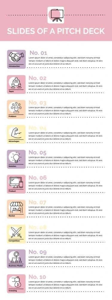
Minimize your speech anxiety by using this infographic template to plan out your business pitch. Using an outline is a proven speech tactic to look and feel more confident in your presentation. Notate your key points to keep yourself on track.
Each of the ten bullet points has room for a short paragraph. The clean, colorful and professional design is perfect for leaving with your audience to review later. Print it out after easily customizing it, and fold it into the size of an index card.
For the financial advisor: break it down step-by-step.
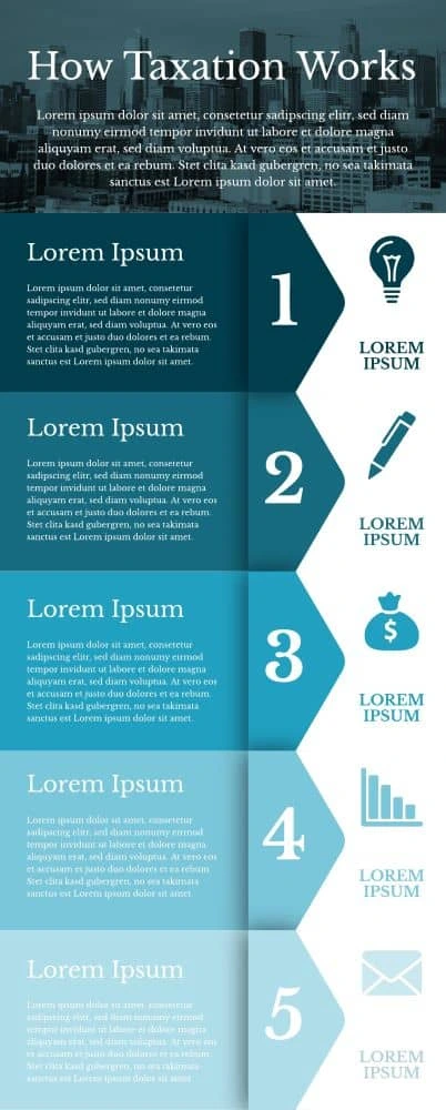
Build trust with your clients by helping them understand complicated processes without causing an overload of information. Educating your clients will help them make decisions and build your credibility as an expert in your field.
This template allows full paragraphs in a beautiful, professional presentation. The right side features steps, while the left serves as an in-depth description. It is color-customizable to accommodate your brand colors. Create a handout with this infographic template to explain taxation, loans, collections and other processes.
For the manager: guide your team to success.
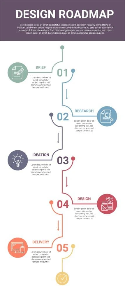
Give your employees clear direction with this visually interesting infographic. This roadmap to success may be used to outline goals, instructions or steps. Your team will love the change of pace, and you’ll love the results.
Provide a title and in-depth introduction, then edit the short descriptions under each of the colorful five steps. The leading lines guide your reader to the next step. Print this out for your staff members’ desks or include it in the new hire orientation.
For the marketing specialist: present your audience demographics and traits.
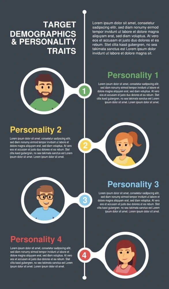
Buyer personas are often used in marketing strategies to organize audience characteristics, goals and needs into a visual representation, based off real research and data. Help your team picture clients or customers with this vibrantly professional infographic template.
This template gives you plenty of room to play, while leaving enough space to breathe. Each persona has a customizable title and description. The simple illustrations prompt your mind to imagine your real clients. After making this infographic template your own, add it to your annual marketing strategy plan, board presentation or product proposal.
For the personal trainer: remind your client of their goals.

Help your clients visualize their health success with a visualization of their plan. Starting a new health and fitness routine might seem overwhelming, but this infographic will simplify instructions into an easy-to-digest quick guide.
This infographic features blocks of text and in-depth instructions without clutter. Use each segment to outline forbidden foods and daily exercise routines. After customizing the infographic template, print or email a digital version to your client as a portable, visual reminder of their game plan for success.
For the professional: stand out against the competition.
First impressions are important—and most employers expect one page that briefly summarizes who you are in the workplace. Make your resume stand out with a beautiful, unique resume.
This template takes advantage of the full page with multiple sections and columns. It feels professional but with a modern twist. Make it your own by customizing the color scheme, graphics and, of course, the text.
For the real estate agent: educate your client.
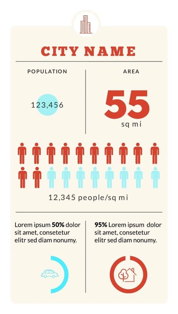
Real estate agents and realtors are well-known for providing personalized customer service. Educate your client on their new neighborhood or city with a quick guide to the local population, population density, area and other demographic insights.
Using this infographic shows your clients you care about taking the extra step. Each section is customizable and easily changed so you can update it as needed. The clean layout makes it easy to focus on the numbers. Add this infographic template to your client’s portfolio or to your personal website and listings.
For the teacher: give tips to success.

Help your students prepare for the SAT, ACT, SASVAB or other test by outlining effective study habits and tips. Outline a timeline or provide six different methods—it’s up to you with this very customizable template.
Knowing how to study is half the battle. Update the six titles and descriptions with your tips and other helpful information. Each segment allows for several lines of text. The thin dimensions make this a great bookmark for your students.
Ready to wow your audience with beautifully designed infographics? Lucidpress will help your brand send the right message.
You already know that sales collateral can help your sales reps close leads much faster. They speed up the sales process by offering prospects the information they need to make a buying decision.
But, which types of sales collateral should you use? And most importantly, which ones convert best?
Related: What is sales enablement and why it matters
Let’s find out—and let’s go over the top three tips you need to know if you want to get the most out of your sales enablement content.
Here are some of the best types of sales collateral and how you should use them.
Blogs & ebooks
Let’s say you want to make a brochure to promote your business. You google around for a tutorial, and you land on our blog, where we have a step-by-step tutorial to show how it’s done.
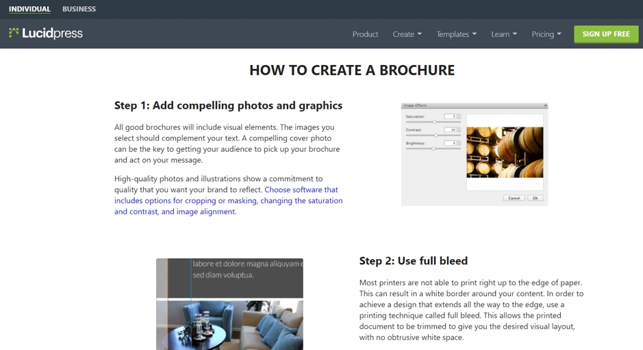
Next, you might sign up for a free account to use a template and quickly create your brochure.
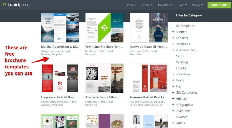
Now, here’s where the interesting part begins.
After a couple of days, you might hear from one of our sales reps. You’d already be aware and excited about our product because it helped you.
At this point, the job of the sales agent isn’t to arouse your interest, it’s to answer your questions. You’ve already completed the first part of the sales funnel before our team ever reached out to you—and as a result, you’re that much closer to conversion.
The bottom line is this: A blog, article or ebook can short-circuit the sales process and fast-forward it directly to the closing part. It helps you close more sales faster.
Landing pages
Here’s another example of sales collateral from our own brand. Our brand templating platform is well-suited for both individuals and large companies.
But, since our software serves different customers with different needs, we created two separate landing pages for them.

How does this help sales? Well, let’s say a marketing manager visits the business page and sees that she can request a quote right away. Now, the job of our sales agent is much easier.
He knows:
- why this person wants the product (for organizational use)
- which features & benefits to present
He isn’t bombarding the prospect with benefits and waiting to see what sticks. Instead, he knows exactly which of the buyer’s buttons to push.
The point is this: A landing page helps you segment your audience, and it helps your sales agents talk about what interests the buyer, which makes their pitch much more persuasive.
Case studies & testimonials
Case studies are one of the most effective types of sales collateral because they rely on a powerful principle of persuasion: social proof. [![]() ]
]
According to Dr. Robert Cialdini, this psychological & social phenomenon is driven by the assumption that people around us are more knowledgeable about a particular situation than we are.

When a prospect reads a case study, it provides them with valuable information about the historical performance of your company. They’re able to project their business or brand into the narrative and “try on” your company as a partner. If you could help a business like theirs achieve success, it stands to reason that you could help them, too.
The bottom line is this: A case study not only makes the prospect want your product more, it also resolves objections a person might have about your company’s performance and trustworthiness.
Live sales presentations with product demos
Sales presentations are sometimes perceived as boring or annoying. Actually, they can be one of the most effective pieces of collateral—if your sales reps are properly trained.
For instance, what brochure, flyer or ebook could be more convincing than this? (Watch how sales come pouring in…)
The bottom line is this: When delivered properly, sales presentations can be one of the most compelling types of sales collateral out there. People buy from people, and live presentations are a great way to build that relationship.
Explainer videos
The biggest disadvantage of a live sales presentation is that you cannot scale it. For instance, you can’t demo a product in front of a million people at once, right?
Actually, the internet can help you do that. For instance, if we bring one million people to our website, they can see in a matter of seconds how our product can help them.
Source: Lucidpress.com
As you can see, it doesn’t have to be a super complicated video production. And you don’t have the logistics of a live sales presentation—where you have to reserve a room, take care of your guests, make sure you have the proper equipment, and so on.
The bottom line is this: An explainer video helps your prospect have an a-ha moment that brings him closer to the buying decision. It’s a scalable way to create interest & desire with your clients before a salesperson steps in.
Brochures & flyers
What do you do when a sales agent offers you a flyer or a brochure? You probably thank them politely and throw it away around the corner, right?
Well, it doesn’t have to go that way. Not if it’s clear that your brochure will provide value to the reader.
Here are a few tips to make brochures & flyers some of your most effective sales collateral:
- Put the benefits front & center—don’t just talk about your company; tell prospects how their life will be better with you.
- Create a compelling offer (like a discount or a free sample) that’s exclusive to your print materials.
- Take advantage of great design—a vibrant, colorful brochure with neatly organized sections looks far more professional than a quick job done in Microsoft Word.
Sales scripts
There are basically two ways to learn anything:
- The slow, risky way: You can try every idea and fail until you eventually find the formula for success.
- The fast, sure way: You can skip all that and do what’s already proven to work.
Instead of letting your sales reps waste time & money to learn what works and what doesn’t, why don’t you provide them with sales scripts that already work?
All you have to do is take aside your top sales agents and ask them how they do it.
The bottom line is this: Sales scripts are one of those growth hacks that can bring you 80% of the results with 20% of the effort. Plus, it costs next to nothing to implement.
Other useful sales collateral types
Sales collateral includes any materials that help reps close deals faster by offering prospects the information they need to make a buying decision.
The format can be just about anything. Above, we discussed some of the most efficient types both on and offline.
Here are some other types of sales collateral that can be handy for your sales agents:
- FAQ sheets
- Buyer’s guides
- Newsletters
- Email templates
- Technical data sheets
- Slide presentations
- Objection-handling sheet for prospecting calls
Sales collateral tips & tricks
Stay consistent with your branding
If you’re a beer drinker, you can probably guess which product is being advertised below, right?

It’s Carlsberg, and that is a banner they used at the Euro 2006 Football Cup in France. They couldn’t use their brand name due to a French law that forbids advertising alcohol or cigarettes at sporting events (even though they were a sponsor).
But because they kept their branding consistent throughout the years, they had the confidence to leave off their logo (a move few brands could pull off), and people still recognized the brand.
No matter what type of sales collateral you use, make sure you convey:
- the same value proposition
- the same benefits
- the same tone of voice
- the same keywords
- the same fonts
- the same colors
- the same brand personality
This will help you build a strong brand over time that inspires loyalty and trust in your customers—and recognition and credibility with your prospects.
Collaborate with other departments
Different departments have different insight that could help prospects make buying decisions quicker.
For instance, digital marketers could look into their analytics and find out that certain features of your product are used more often than others.
Sales reps, on the other hand, have direct objections from the field.
If your departments communicate with each other, you can get maximum results out of your sales collateral.
Make sure your sales collateral stays up-to-date
At some point, you’ll probably have to make changes to your sales materials. Maybe you’ll go through a rebranding. Or maybe you just want to refine your value proposition.
No matter the changes, you must make sure that everybody stays on the same page. Otherwise, you might confuse your prospects.
There are two ways to avoid this.
The hard way: You track all the edits you’ve made to your sales collateral in a document you share with all team members. Of course, this is time-consuming, and you can easily make mistakes.
The easy way: Use a brand templating platform to make updates much easier, and you can be 100% sure there are no errors because your changes will sync with everyone else.
For instance, with Lucidpress:
- Your team has access to all brand assets in one place.
- You can lock down branded elements in your templates that should never be changed.
- You can collaborate in real time to make sure your brand stays consistent throughout every channel.
Before creating your next sales collateral…
No matter what type of sales collateral you create, you should answer the following questions:
- How does this material help the prospect?
- How does this material fit into the buying journey of my clients?
- What are the top 3 to 5 benefits that matter most to my clients?
If you can answer these questions, you’re on the right track to create compelling sales collateral that streamlines the process and helps your team close more deals.
Learn how you can lead your organization to creating an effective sales enablement program with consistent storytelling across your sales org.
When you’re managing a busy sales team, you might fall into the trap of “anything goes.” It doesn’t really matter how your reps take someone from stranger to customer; it matters that they’re doing it, right?
Not necessarily.
A mismatched sales team could deliver promises they can’t keep, fail to convert leads, and be generally unproductive—something that costs companies at least $1 trillion every year, along with poorly managed leads.
Related: How to create engaging assets for your sales team
What if I told you all of those issues could be prevented by spending a few hours creating one single document?
Spoiler alert: You can. It’s called a sales playbook.
In this guide, we’ll show you how to create a winning sales playbook, with tips & tricks to help you format your own.
What is a sales playbook?
A sales playbook is a document that outlines everything your sales team needs to know to succeed.
It covers basic elements like a rundown of the products or services they’re selling, while also diving into detail with things like your brand’s tone of voice, cold email scripts, and information about the people they’re selling to (i.e. buyer personas).
In a nutshell: A sales playbook is the one document your entire sales department needs to close deals… and close them often.
Why bother creating a sales playbook?
I know where you’re at right now: You’re sick of creating boring documents that lurk in the bottom of your Google Drive, never to be seen again a few weeks after you initially introduced them.
Trust me when I say sales playbooks aren’t like that.
These documents contain everything your sales reps need to make a sale, which is bound to lead to more efficiency.
A report by HubSpot found that salespeople spend just a third of their day talking to prospects. The other time is spent writing emails (21%), entering data (17%), and prospecting or researching leads (17%). [![]() ]
]
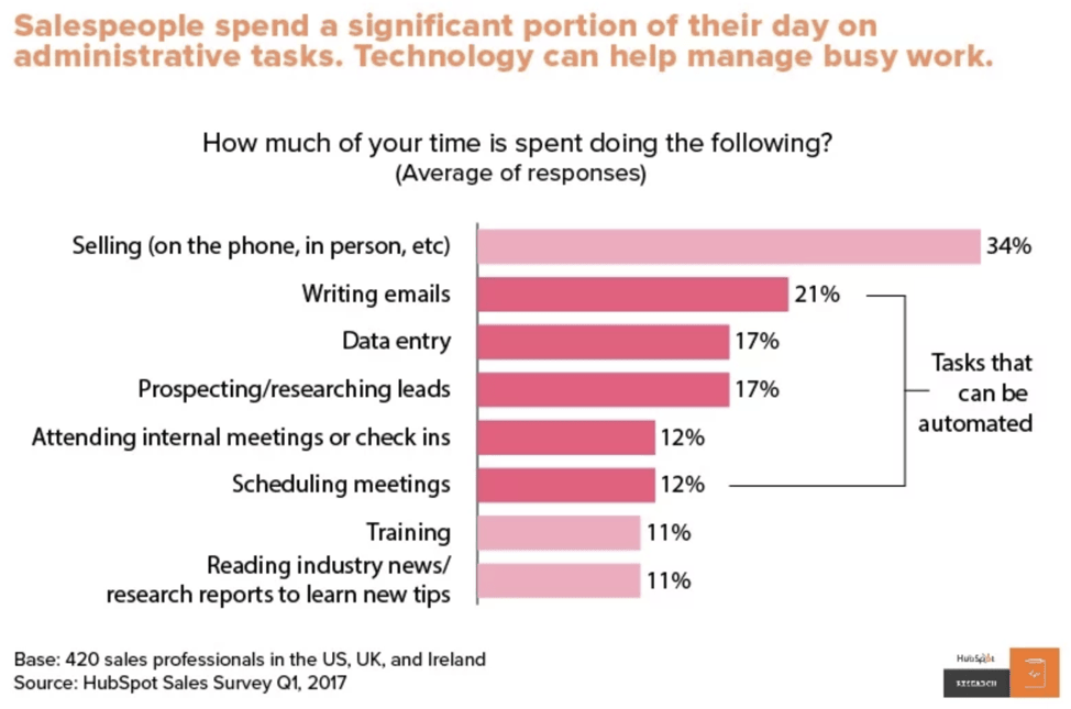
Source: HubSpot
A sales playbook will solve all three problems because:
- It contains scripts for cold emails.
- It shows sales reps how to use their CRM more effectively.
- It specifies the step-by-step process for finding warm/hot leads, while detailing buyer personas so they don’t spend time trying to convert irrelevant people.
That’s over half of their daily schedule that could be better-spent talking to customers.
But if that’s not enough to convince you, remember that a sales playbook is the “ultimate guide” for your entire sales team.
Think about the reputation your business gains when your sales representatives are discussing your brand to the public day-in, day-out. You want to make sure they’re giving a good impression, right?
Sales departments who reference an in-house sales playbook are always on the same page. They know what’s expected of them, understand how to communicate without going against your brand values, and stick to sales processes you know aren’t too pushy or forceful.
That’s bound to lead to brand consistency—and the chance to increase overall company revenues by as much as 23%.
You’d be mad to miss out.
What should my playbook include?
Are you convinced it’s time to create your own sales playbook?
Before you rush off and hold a sales department meeting to run through the notes you’ve put together, think about what actually needs to be included in your document.
That usually includes the answers to these questions:
- Company info: Why did your company start? Who owns or manages it?
- Your products/services: What does it do? Why does someone need it?
- Brand guidelines: Are you a cheeky brand known to tell the odd joke, or are you serious and professional?
- Buyer personas: Are your typical customers aged 55+, live in California, interested in expensive cars and own a software company?
- Sales & buying processes: Do you typically offer a free trial before convincing someone to buy? Or is your product a one-off, low-value purchase that usually converts after sending 3-5 targeted emails?
- Selling methodology: Do you use cold emails or account-based marketing tactics?
- Pre-made content: What should your emails, follow-ups & cold call scripts look like? What additional sales enablement content do you need?
- Tools they’ll need (with access details): Which CRM do you use and how can they access it? Do you use any other sales tools or software?
- KPIs: How does a sales rep know they’re performing well? How many sales are they expected to close per week? When do they need to improve? Learn about specific sales KPIs in this post.
- Payment for commission: What percentage does your sales team earn on deals they close? Do all sales generate commission? If not, what’s the qualifying criteria?
How to create your own sales playbook template
By this point, you’ve got a solid idea of what your sales playbook should include. What you might not be so certain about is how you’ll package so much information in one document.
It’s a tricky situation: You don’t want it to be overwhelming (to the point where it becomes a chore to read), yet you also want to arm your sales department with enough information to be productive.
The good news? You don’t have to start from scratch.
There are hundreds of other sales templates that you’re able to customize by simply searching for them in Lucidpress—like a proposal or presentation, for example.
Simply add your information and create more pages, and you’ll create your own professional sales playbook that’s almost ready to distribute across your entire team:
Source: Bright business ebook template
The sales playbook you create in Lucidpress is totally secure. Links are protected, meaning only your team can access it—and it’s not visible to Joe Bloggs if the link accidentally goes public.
3 tips for maximizing the value of your playbook
By this point, you’ve got a fancy-looking document that’s in review—and almost in the hands of your sales team.
Take some time to check whether your sales playbook is easy to read. Nobody is going to extract value from your document if they can’t understand it, right?
Here are three incredible tips you can use to maximize the value of your sales playbook.
1. Deliver a mini-training when introducing your playbook
Chances are, your sales team won’t read your playbook if they aren’t motivated to do it. But, you don’t want to be jumping down their throats or sending daily reminders to open your playbook. Both of those are a total waste of time.
That’s why you should consider delivering a mini-training when you’re introducing it. Bring your playbook up on the big screen and invite the entire department to see it. Then, run through the entire playbook from start to finish, and end with an ask for questions.
That way, you can spot areas that need improving before they start regularly referencing it.
2. Don’t start from scratch
It’s easy to get carried away with your sales playbook template and want to overhaul your entire sales process. However, starting from scratch could do more harm than good.
Start by analyzing the content you already have, instead.
Does your team already use email or phone call templates? Do you have a branding guidelines document that you send to freelancers? Did your CEO record a video on why they started the company in the first place?
Each of these sales playbook features can be copied and pasted—saving time and effort.
3. Ask for feedback
Whether your cold email script has an extra comma or you’re missing a key trait your typical customer has, some issues are easier to spot when you get a second opinion.
That second opinion should come from your experienced sales reps, because they’re the people who know your target customers inside out, and they likely have their own techniques proven to nudge a lead into purchasing your product or service.
However, you should get feedback from all staff, not just your best sales reps.
Why? Because other members of staff are likely experienced with each part of your sales playbook. For example: While a sales rep might have a cold email template, it’s wise to have a copywriter look over it for any spelling mistakes or recommendations to make it easier to understand.
So, invite your:
- CEO or founder
- Copywriting team
- Product marketers
…to glance over your sales playbook template before you begin to roll it out.
It sounds simple, but it’s a fantastic way to prevent small mistakes from becoming big, conversion-blocking problems.
Key takeaways
As you can see, creating a winning sales playbook isn’t an easy task for any sales manager.
You’ll have to dive in and analyze your sales process, create solid buyer personas, and give a full rundown on how to use your product or service before it becomes a lead-dripping ultimate guide.
But as hard work it is, remember it’s the only document your entire team will need to become a sales powerhouse—and grow your business at a rate you’ve never seen before.
Not sure how your next fitness logo should look and want a few examples to get your imagination’s wheels in motion?
Maybe you want to see some design ideas from well-known brands in the fitness industry. Or, perhaps you’re looking for creative logo ideas that stand out from the crowd.
Related: Best logo design ideas for your inspiration
No matter whether you’re a fitness consultant, own a gym or have any other fitness business, by the end of this article, you’ll have plenty of ideas to get you started.
But, first, let’s see what makes a good fitness logo and what mistakes you should avoid.
3 fundamental rules to create a fitness logo people will remember
1. Make sure your logo doesn’t communicate the wrong message
Every aspect of your future fitness logo will evoke an emotion, from the colors to the fonts and shapes you choose.
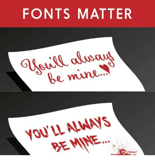
This is why you have to be careful about the first impression your visual identity makes.
For instance, a dark, sober color isn’t something you might want for a fitness logo if you’re also helping people keep a balanced, fresh and healthy diet.
2. Keep your logo simple and clean
Ideally, your logo should tell a story. Maybe the origins or the philosophy of your brand. Or, maybe just your unique selling proposition.
This doesn’t mean you have to overcrowd your logo with all kinds of elements in order for people to get your message. When you try to convey too much in a single logo, it comes overly complex and difficult to recognize and replicate.

3. Avoid using outdated design trends
Imagine someone hands you a business card with a logo that looks like this:
What’s your first impression? Other than nostalgia, probably not a good one, right?
Of course, you don’t have to update your logo every time a new design trend comes along. Just make sure your logo doesn’t look like it’s stuck in the ’90s.
These are three critical aspects you should take into account when creating a logo. Now, let’s dive into our pool of fitness logo ideas and see what you can learn from each one of them.
Fitness logo design ideas for your inspiration
When you have too many ideas, just stick to the basics, even if it’s cliché
Sometimes we spend too much time brainstorming and browsing through thousands of logo ideas just to find that “perfect one.”
And, too often, the result is a complicated design that few will remember.
When this is the case, it’s better to stick to something classic that anyone can recognize as a fitness business.
Plus, you have the advantage that most free logo makers have these elements in their gallery so you won’t have to customize your design too much.
Source: GLDesigns
If you want to be compelling, point out something your audience wants
What’s that number-one thing your audience wants? Point it out, and people will remember you as that gym or that fitness instructor or that nutritionist who can help them get it.
Notice how, in a second, you know this fitness business can help you just by looking at their logo. Then, note how it brings us nicely to our next point…

Source: 99designs
Make sure your fitness logo doesn’t drive away parts of your audience
Let’s say you’re a fitness trainer, and you chose the logo below to represent your business.
Source: Design your way
It’s great for people who are looking for hardcore training. But, there are lots of people who just want to stay in shape. Your logo might tell them that you’re not a good fit for them.
Of course, if your ideal audience is into hardcore training, this could be a great strategic move. What’s important is for you to think through these considerations before you make your final decision. For example, take a look at our next point.
Make sure your logo isn’t limiting future expansion of your fitness business
Let’s say that you start out as a yoga fitness trainer, but you plan to grow your business beyond the yoga niche.

Unless you go through a complete rebranding, your logo will limit the growth of your business.
When you’re looking for design inspiration for your logo, make sure you also take into account any future plans. If you can spot them now, ahead of time, you’ll save yourself an expensive and time-consuming rebrand in the future.
Use a well-known symbol
Sometimes keeping a logo simple and clean can be most effective at showing what your brand is about.
Source: Lucidpress
Incorporate a top benefit into a classic fitness logo design
In logo design, it’s efficient to incorporate an element that people can easily recognize, such as a gear or muscles if you’re in the fitness business.
But, these elements are also a bit overused, and you might want something more creative for your logo.
Well, why not incorporate additional benefits that your brand has to offer—such as good music, for example. Now people have two reasons to choose you over the competition instead of one.
Source: Design your way
Your fitness logo doesn’t necessarily have to be related to fitness
Apple’s logo has nothing to do with phones. Nike’s logo doesn’t represent shoes, clothes or sports gear. Subway doesn’t have a sandwich in their logo.
Your fitness logo doesn’t have to be related to muscles, fit bodies or any kind of elements related to sports. It could be something as simple as two shapes that convey motion.

Source: Design your way
Use a color combination that stands out
Even if you don’t have a super creative logo layered with hidden meaning, you can still stand out from the crowd by using a powerful color combination.
Take Google, for example, or FedEx. Or, this fitness logo below.
Source: Logojoy
Think about all the different ways you’ll use your logo
A highly detailed concept might look great on a large banner.

Source: 99designs
But, how would this logo look on a small business card? Would it be as effective?

Suddenly, all those details become so small that people can’t recognize them.
Before you finalize your logo design, make sure you test it in all the different scenarios you know you’re going to use it.
Try to include a special meaning behind your logo
Let’s review a classic example for this one. FedEx uses negative space to hide an arrow that subliminally conveys speed and accuracy.
Source: Pixellogo
You, too, can use different elements in a clever way to give your logo a double meaning. For instance, here’s a clever way to incorporate the infinity symbol as a yoga fitness instructor.
Source: BrandCrowd
Incorporate a sense of motion
As a species, we seem wired to detect motion, thanks to our neural underpinnings.
And since motion is a key aspect of your business, why not include it in your fitness logo? A dynamic design attracts attention and motivates people to get more active.

Source: Design your way
Before you create your next fitness logo, do this
If you want your next logo to be something creative or to have a special meaning, you first have to understand your brand’s identity. What is the most important message you want your business to communicate?
Only after you answer this crucial question can you start looking for ideas for your next fitness logo. Otherwise, you might find some good inspiration, but it won’t represent your business. So, take your time and do your research—then try out a few ideas.
Ready to start exploring your new brand identity? Try creating a few logo variations in Lucidpress, using your brand colors.
Color is a big part of our world.
The colors we surround ourselves with can impact our mood, change our energy levels, invoke memories, and even influence our decisions. As you can imagine, color is a powerful player in people’s perceptions of your brand as well.
A blog post on Elle & Co. says 60% of people decide whether they’re attracted to a message based on the color alone — and color reinforces brand recognition by up to 80%.
Point is, color makes a big impact on customers.
This is why Google has reportedly tested 41 different shades of blue in its logo to see which blue performed best. The winning color, according to dozens of charts and graphs, was not too green and not too red.
“It’s interesting to see how you can change the way that people respond to the Web in ways that are not intuitive,” Google executive Marissa Meyer explained.
Color branding is about your customers
Many brands have a signature color (or colors) that makes them easily recognizable.
In many cases, it would be odd to see their logo in a different color. Can you imagine McDonald’s golden arches in a bright purple instead? What if Starbucks’ logo wasn’t green & white, Pepsi’s logo wasn’t blue & red, and Target’s wasn’t red all around?
When we see that bubblegum-pink writing, we know it’s Barbie — and when we see the tiny blue f, we know it’s Facebook.
But, it’s not just the logo. As an article on SpellBrand suggests, there are many ways to incorporate color into your branding:
- advertising
- business cards
- employee uniforms
- interior design at retail locations (and in the office)
- letterhead
- marketing materials
- product packaging
- signage
- social media graphics
- website
According to Aprimo, marketing activities should focus on customers to create positive experiences each time they interact with your brand. Color will be part of those interactions, so deciding which color to use often comes down to who your customers are.
Emma Foley, design lead at Clique Studios, says, “As much as you might want them to, everyone is not going to be your audience. So, if you focus in and build a strong community of people you want to talk to, you can do a lot with using color as the first interaction with those people.”
For example, color has the power to make your website stand out among similar websites.
“One of your website visitors might think, ‘They are using this hot pink in a world of traditional blue and that’s really interesting. I want to learn more about this company’,” Emma explains.
She says there are really two schools of thought about how companies should manage color: 1) this is our brand color so we have to use it or 2) play around with colors because the rest of the brand is strong.
Before deciding which color makes sense for your brand, it’s important to take a step back and think about what colors mean.
What is color psychology?
Simply put, color psychology is the study of colors and their impact on human behavior. Sometimes color can influence unexpected things like our sense of taste. According to Neil Patel, “Color is 85% of the reason you purchased a specific product.” Sounds like good enough reason to implement a couple color psychology tricks into your own branding efforts.
However, keep in mind that our feelings about certain colors are personal and depend on both life experience and culture. For example, while the color white is used in the Western world to represent purity & innocence, in Eastern countries white is a symbol of death & mourning.
Types of colors and their impact on human behavior
The color wheel features two types of colors: warm tones & cool tones. Warm colors include red, orange & yellow and are associated with energy, passion & creativity. These tones are great for adding life to your designs. Cold colors include green, purple & blue and have a calming, soothing effect on people. (This is why you never see flashy colors in hospitals and waiting rooms.)
There’s another type of color which isn’t represented on the traditional color wheel: neutral tones. Neutral tones include white, grey & brown. In design, these colors are mostly used for backgrounds. To make those colors stand out more, you can add texture to your artwork.
Color psychology in branding
The concept of branding is based on the belief that colors (and other design choices) can evoke specific reactions & feelings. Despite the ubiquitous use of color in marketing, there’s not enough research to back up every assumption. However, over the years, marketers & designers have identified patterns that appear to influence customers’ purchase decisions.
If chosen correctly, your color palette can influence how customers feel about your brand.
Red

Source: Unsplash
The color red is associated with intensity, emotion, and a sense of urgency. It can invoke feelings of active energy, passion, trust, love, intensity, aggression, excitement and appetite.
McDonald’s uses red to provoke the appetite and a feeling of urgency. (Good move for a fast-food chain.)
Made in Lucidpress
Brands that use red: McDonald’s, Audi, Coca-Cola, CNN, Lego, Canon, KFC, TLC, ESPN, Target, Levi’s, Virgin and Netflix.
Blue

Source: Unsplash
While there are many shades of blue that mean different things, blue is generally associated with depth and stability. It’s associated with conservative judgment, confidence, truth, order and understanding.
Invoking feelings of peacefulness & reliability, blue is the favorite color of tech & finance companies. For example, look at Facebook and Twitter. Those two companies use different shades of blue to portray trustworthiness & authority.
Made in Lucidpress
Brands that use blue: United Airlines, Chase Bank, Dell, Ford, General Electric, Twitter, Oreo, Lowe’s, AT&T and Samsung.
Yellow

Source: Unsplash
Yellow is a bright & vivid color associated with positive energy, sunshine and freshness. It can make people feel alive, energetic, cheerful and optimistic. In branding, yellow tends to grab attention as a very bright color that stands out. Snapchat uses yellow to appeal to younger generations and make their experience light & fun.
Made in Lucidpress
Brands that use yellow: Subway, Shell, Post-it, Lay’s, Denny’s, Hertz and Snapchat.
Beige & ivory

Source: Unsplash
While it’s not used too often, beige and ivory can invoke a feeling of simplicity, calm and pleasant stability.
Tilemark is a great example of a brand that uses beige & ivory.
Source: Tilemark
Gray

Source: Unsplash
Gray is associated with security, reliability, dignity, practicality, conservative judgment, calm and intelligence.

Made in Lucidpress
Brands that use gray: Wikipedia, Swarovski, Lexus and Nissan.
Green

Source: Unsplash
The color green is associated with the harmony of nature, the environment and renewal. When looking at green, people often feel calm, relaxed, trusting, peaceful, hopeful and healthy.
Green is all about nature and is used by bio-friendly, organic and sustainable brands. If you want to portray your services as environmentally safe, green is your color of choice.
Made in Lucidpress
Brands that use green: Holiday Inn, Starbucks, Animal Planet, Spotify, Land Rover, John Deere, Tropicana, Tic Tac and Hulu.
Purple

Source: Unsplash
Purple is symbolic of luxury, royalty, glamour, power, nostalgia, romance, introspection, nobility, spirituality and wisdom. It also stimulates creativity and problem-solving.
For centuries, purple has been the color of royalty. (Before the modern age, purple dyes and fabrics were both expensive and rare.) With its history, it’s not surprising that companies use purple to portray their brands as expensive & luxurious.
Made in Lucidpress
Brands that use purple: Yahoo, Marketo, FedEx, Syfy, Taco Bell, Purplebricks, Purple, Hallmark and Wonka.
Orange

Source: Unsplash
The color orange is associated with happiness, sunshine, citrus and the tropics. Orange is a playful color that makes people feel enthusiastic, creative and determined. It stimulates mental activity and supports energy, vibrancy and warmth.
Orange can be also associated with fire, combining the warmth of red with the happy brilliance of yellow. Orange tends to communicate energy & optimism. Usually, orange is associated with youth and creativity. If you want to look adventurous & competitive, orange is your color!
Made in Lucidpress
Brands that use orange: The Home Depot, Nickelodeon, Firefox, Izze, Amazon, Fanta, Payless and Harley Davidson.
White

Source: Unsplash
White symbolizes cleanliness, peace, innocence, youth, simplicity, purity and safety. As a reminder that colors mean different things in different cultures, it’s interesting to note that white carries connotations of death and mourning in many Asian cultures.

Made in Lucidpress
Brands that use white: The North Face, Tesla and Vans.
Black

Source: Unsplash
Black symbolizes luxury and the mystery of the night. It’s bold, serious, powerful, elegant, wealthy, stylish and sophisticated.
Like red, black can convey both positive & negative emotions. It can invoke associations of power & minimalism, or on the other hand, it can portray something dangerous or gloomy. Depending on the context, its meaning can differ. In branding, however, black usually comes across as exclusive & luxurious.

Made in Lucidpress
Brands that use black: Chanel, Nike, Adidas, Louis Vuitton, Prada, Puma and Lamborghini.
Pink

Source: Unsplash
Pink symbolizes love, romance, tenderness, caring, sweetness, warmth and youthful fun.
Made in Lucidpress
Brands that use pink: Barbie, Baskin Robbins, T-Mobile, Lyft, LG and PINK.
Brown

Source: Unsplash
Brown is associated with the earth, reliability, support, dependability, the outdoors, simplicity, endurance and support.
Made in Lucidpress
Brands that use brown: UPS, Hershey’s, M&Ms, Gloria Jean’s Coffee and Cracker Barrel.
Key takeaway
While color has the power to affect people’s moods, choosing your brand colors shouldn’t be based on emotional response alone. As Emma Foley of Clinique says, “There’s so much more that goes into a brand than a logo and color.” Once you understand your brand’s customers and values, you can create a brand color palette that speaks to them.
Ready to start testing your new brand identity? Try creating a few logo variations in Lucidpress, using your brand colors.
If you’re anything like me, when you see a new business or marketing vocabulary word, you skim over it and make a few assumptions based on context for what it means. I recently learned how this habit is not only holding me back, but my business ventures as well.
Related: How to create engaging sales enablement content for your sales team
The term that got me? Sales enablement. This concept is fairly new and has been trending in the sales industry for a few years, but what does it mean and how is it implemented? In this guide, I will explain what sales enablement is and how you can incorporate it into your company’s sales process.
What is sales enablement?
Defining sales enablement: Sales enablement is the process of providing your salespeople with sufficient tools, resources and game plans to sell effectively.
When I first saw this phrase, I interpreted it to mean ‘the act of enabling sales.’ Real deep, I know.
Then I actually did the due diligence of conducting research and immediately felt regret for not initially recognizing the importance of sales enablement and its rightful place in sales content and the sales process itself. It’s more than a fancy buzzword — it’s a real tactic that can be formalized and followed, whether your company has one or one thousand employees.
It is the responsibility of sales managers to facilitate the success of the sales team. Part of this is done by building a sales content strategy — one that, after reading this, hopefully includes sales enablement.
It’s very likely that you as a sales manager or sales trainer have already enacted some form of this in one way or another, but by taking a deep dive into its meaning and practice, you’ll have a better defined and self-helping strategy that efficiently delivers success.
So what is sales enablement? Simply put, sales enablement is the process of providing your salespeople with sufficient tools, resources and game plans to sell effectively. This buyer-focused strategy gives the sales rep tools to engage the prospect. It is made up of outward-facing content the sales rep will provide the buyer at some point during the sales process, and inward-facing content such as information, sales training, best practice guidelines and branding.
Benefits of sales enablement
1. Maintain and improve revenue growth
A study from Aberdeen found that companies with great sales enablement strategies see a 13.7% annual increase in deal size or contract value. Sales teams benefit from having continued support and education on who their buyers are and the message that will be most impactful for that buyer. With a sales enablement program, companies offer their salespeople a constant resource for training and support rather than trying to get by with occasional training meetings.
2. Shorter sales cycles
A 2015 study found sales reps can spend up to 43 hours every month searching for information they need to make a sale. Sales enablement reduces that lost productivity and can even shorten sales cycles by allowing sales teams to focus on speaking with prospects instead of looking up case studies and finding product one-pagers.
3. Improve sales and marketing alignment
Companies with great sales and marketing alignment have 36% higher customer retention rates and 38% higher sales win rates. Yet, many organizations fail to bridge the divide between sales and marketing. Sales enablement helps bridge this gap by creating a collaborative environment for marketing to understand the needs of sales and for sales to be trained on how to use the research and content marketing provides. Sales enablement platforms also provide analytics data on what content is being used, providing instant feedback to marketing on the quality of their sales enablement materials.
4. Relevant, personalized touch points
Sales reps dealing with a long sales cycle need to establish multiple touch points with a prospect without always hopping on a call or emailing the same information over and over. Sales enablement provides relevant content for every part of the buyer’s journey, so sales reps can stay in touch by providing content that moves a prospect closer to a deal. Sales enablement also makes it easier to personalize outreach by providing a library of content tailored to various personas and industries.
5. Consistent brand messaging
Sales enablement also ensures that the messaging leads read while engaging with the website is the same messaging they hear when they get on a sales call. Given that presenting a brand consistently is attributed to a 23% increase in revenue, marketing and sales leaders would be wise to take this benefit seriously.
Who owns sales enablement?
Typically marketing and sales jointly own sales enablement. During the production process, the sales team acts as an adviser to the marketing team on what content they need and the types of questions prospects have. Marketing provides content and messaging materials based on persona research and strategic messaging and train the sales team on how to use the content. Overtime, both departments develop a continuous feedback loop to improve the sales enablement process.
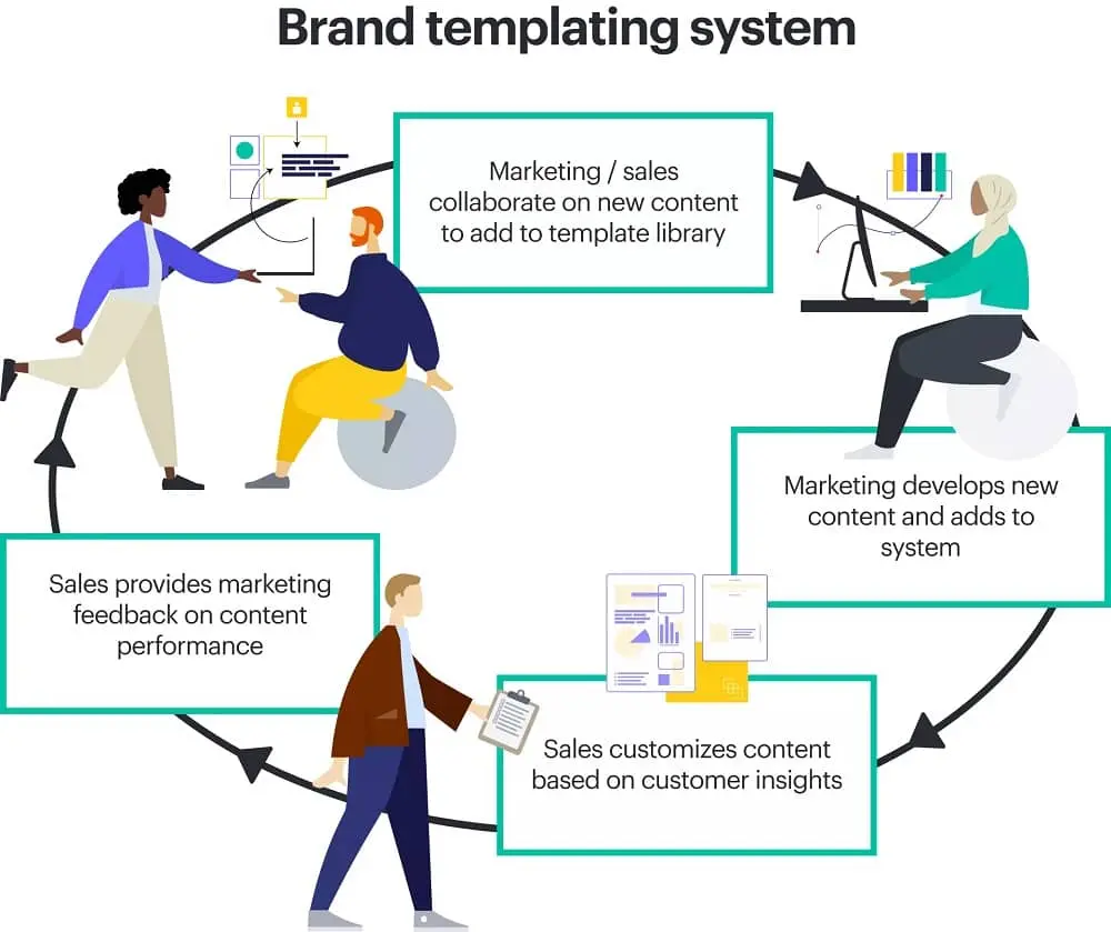
Smaller companies will typically rely on a product marketer or content manager to lead out on identifying sales enablement priorities and coordinating content production. Mature companies will often hire a sales enablement manager.
Common responsibilities for a sales enablement manager include:
- Producing sales enablement content
- Training sales teams on persona research and content usage
- Measurement of programs
- Acts as a liason between marketing, sales and product teams
- Manage sales enablement tools and software
Sales operations & sales enablement
While sales enablement is a critical tool for improving sales performance, it should be seen as a distinct function from sales operations. Sales operations focuses on the day-to-day activities that help a sales team run smoothly from setting up compensation, assigning territories, contract management and recruitment to setting up sales tools like CRMs.
Sales enablement is primarily focused on optimizing sales’ interactions with prospects through optimized sequences, personalized content and optimized messaging.
Where to start with sales enablement
The first step is to define the sales objective. Because this is a buyer-focused method, this means defining your target audience. Ask yourself, who wants your product or service? Who needs it? Create marketing personas to identify your prospects’ buying habits, traits, income and expectations. (Pro tip: your marketing team may already have these ready to go.)
Next, identify what information a sales rep will need to engage the buyer. What information does your team need about your company, its products, mission or background? How do you start the initial conversation? What will push a prospect into becoming a buyer?
In today’s digital world, the most successful companies do this through compelling storytelling methods like blogs, research papers, webinars and other high-quality sales content. Remember that sales and marketing go hand-in-hand!
Sales and marketing alignment helps ensure that you can create effective content strategies that cater to the needs of both teams and, ultimately, empower you with brand consistency.
To get started, you’ll want to evaluate the following:
- Sales and marketing goals — Sales and marketing have similar goals. However, the difference lies within the time it takes to achieve these goals. For example, sales teams are driven by meeting a monthly (or quarterly) quota, which requires fast-paced flexibility and readiness at a moment’s notice. Marketing goals are less frenetic in nature. They wind up being more long-term and methodical in comparison to their sales counterparts. To achieve a happy medium between sales and marketing, you’ll want to identify overlap in goals and make specific goals surrounding that overlap to ensure success.
- Sales and marketing roles — Sales and marketing cannot be siloed into their roles: there has to be common ground between the two departments. Sales need to stretch and flex the leads that marketing supplies. Whereas marketing needs to equip sales with easy-to-use resources or content collateral that empowers them to push through quotas quickly and easily.
- Software and process crossover — Different processes and software work better for sales, and the same goes for marketing. Where you can, bridge the gap between the two by using the same processes and technology. Keep in mind — because Lucidpress is a brand templating platform, it can effectively cater to both marketing and sales, which empowers sales and marketing teams to focus on their respective goals while working together.
Your sales team must have a clear grasp on when to wield each tool. Education workshops, training sessions, best practice tipsheets, and one-on-one coaching should occur regularly to foster growth and success.
Because using the right resource at the right time is an important part of sales enablement, team members must know where to find what they are looking for quickly in the heat of battle — or rather, in the heat of a sale.
How to create sales enablement content
Sales enablement content fall in the later stages of the customer journey. In the consideration stage, content should focus on the value your product brings to the customer. As the customer moves into the decision stage, content becomes much more product-focused. Expanations of features, competitor comparisons and case studies are helpful at this stage.
Don’t forget about customer retention and renewals. Ensuring the sales team has the resources to properly set customer expectations and communicate the value you’ve provided will ensure a smooth renewal process.
This may seem like a hefty (or even overwhelming) task to take on. Work smarter by taking advantage of a brand templating platform, such as Lucidpress.
As sales managers and sales trainers, I know you wear several hats — and expert graphic designer isn’t usually one of them. Brand templates will help your team maintain brand consistency, build content quickly and easily, and store it all in one location. You will then have access to a large library of marketing and sales content templates, which are all customizable.
For example, if you wanted to create a sales enablement starter pack using only Lucidpress templates, you could edit these to showcase your company’s branding, information and guidance.
For internal use:
- Essential branding infographic
- Blue icons marketing proposal
- Business pitch presentation infographic
- Target demographics & personas infographic
For external use:
Software & templates like these are extremely helpful when defining your sales content strategy, as they already include space for sections you don’t want to miss, while still letting you control the direction your sales content takes.
Some additional sales enablement content examples:
- FAQ sheets
- Buyer’s guides
- Newsletters
- Email templates
- Technical data sheets
- Slide presentations
- Objection-handling sheet for prospecting calls
- Case studies & testimonials
- Explainer videos
- Sales scripts
Sales enablement technology
Sales enablement software generally fall into categories of content management, CRM, sales Intelligence, lead management & sales coaching. We’ve listed some examples below. Click here for the full list of software.
Lucidpress is a collaborative brand templating tool that lets your sales team and your marketing team design sales content together.
HubSpot CRM offers free tools to increase productivity, all while integrating with the other platforms you use.
Technographics provider and sales management software Datanyze helps companies use analytic insights to close more deals.
Velocify provides an easy-to-use platform for following up with leads.
Gong is a sales coaching platform that lets you replicate what your best reps are doing to lift your whole team up.
How to measure sales enablement results
Lastly, it is critical to enforce and measure various outcomes in the sales process. How long is the sales cycle for each sales rep? What is the value of each sale? How many people on your team are meeting the quota?
How well is your sales enablement content performing?
There are a few things you need to keep in mind as you create future content AND evaluate current content.
- Y / N: Is your brand being consistently portrayed?
- Y / N: Are you collaborating with other departments to ensure the content is effective and strategically aligned with the brand?
- Y / N: Is the content up-to-date and on-brand?
And no matter what type of sales collateral you create, you should answer the following questions:
- How does this material help the prospect?
- How does this material fit into the buying journey of my clients?
- What are the top 3 to 5 benefits that matter most to my clients?
If you can answer these questions, you’re on the right track to create compelling sales collateral that streamlines the process and helps your team close more deals.
If done well, each one of these metrics should show steady growth. If you are not receiving the desired results, find the weak points in the strategy. Reevaluate both the new hire sales training and routine training, determine if there is any content prospects are asking for but not receiving, and ensure sales members are leveraging resources at the correct time.
Key takeaways
To summarize, sales enablement is a formalized sales content strategy that focuses on the buyer. It consists of a series of steps:
First, outline the sales objective.
Second, create and provide your sales team with both internal & external sales content.
Third, train your sales reps regularly.
Lastly, analyze the outcome and adjust if necessary.
Now that you have a better understanding of sales enablement — well past ‘the act of enabling sales’ — you should feel more confident and prepared to build or strengthen your sales content strategy. With a strong strategy in place, your sales reps will feel empowered to achieve.
Ready to get started? Consider Lucidpress your sales enablement solution.
Sales enablement, elevated: Learn how you can lead your organization to creating an effective sales enablement program with consistent storytelling across your sales org.
Everybody loves a good poster. From colorful movie posters to out-of-the-box wood cut prints and more, there’s something about this versatile medium that always grabs our attention. Still, creating a memorable design can be challenging. Unlike a magazine or flyer, you’ve got much less wiggle room to include information, and your graphic elements need to immediately capture someone’s eye. With the right understanding of design principles though, designing an incredible poster for your brand or business can be a breeze.
Working on your own graphic design poster? Take a look through this quick guide to explore our top tips and advice on designing a fluid, unified, and memorable poster.
6 essential elements of graphic design posters
Typography
One of the most important but often overlooked aspects of poster design is font usage. Whether loose and flowy or strict and rigid, your choice of font can go a long way in relaying your poster’s message.
While it may be tempting to pick multiple creative fonts, ideally, you want to choose two or three total fonts for your design. Fonts used for titles should be a display typeface (either creative or sans serif fonts), while fonts used for text should be serif fonts because they are designed for readability. Your chosen fonts should be different enough to be easily distinguishable from one another, but also similar enough to convey a unified design.
We like how this graphic design poster incorporates two main fonts – one to immediately grab your attention, and one to convey more detailed information.

Balanced
The second element of graphic poster design to consider is balance. Balance in graphic design is exactly what it sounds like – how unified and cohesive something looks. When designs are unbalanced, they feel off, and can be uncomfortable or confusing for your audience.
In general, there are two different ways to create balance: through symmetry and asymmetry.
Symmetric layouts
In a symmetrically balanced layout, similar design elements are aligned in an equal way on either side of the vertical axis. This often results in a mirror-image effect, making it a great layout for a formal or static look. If you’re designing graphic posters for formal events, art gallery viewings, or informative gatherings, a symmetrical approach might be just right.

Asymmetric layouts
In an asymmetric layout, balance is achieved with an unequal arrangement of elements. Often, with the asymmetric layout, there could be a large object on one side balanced by a small object on the opposite side.
In general, these designs are more difficult and complex because the visual weight of each element and its arrangement need to be carefully considered. Asymmetric designs appear more casual than symmetric layouts and create excellent posters for rock concerts, museums and personal services.
Below are three excellent examples of asymmetrically balanced graphic design posters.


Color
Color is incredibly powerful, not only in conveying meaning but creating a cohesive look and feel to your graphic design poster. No matter who your audience is, color can be universally appreciated and used to communicate a variety of things. Learn more about color theory and color meanings here. When deciding which colors to use, consider how they will look together. Harmonious color schemes are based on balance, and can help tie your poster together. Below are a few different types of harmonious color palettes:
- Monochromatic palettes are limited to tints and shades of a single color

- Complementary colors color palettes include colors that are opposite to each other on the color wheel, such as red and green, or blue and orange. These color pairings can often look intense or bold.
- Split complementary colors occur when hues in a color scheme are equidistant from one another on the color wheel. For example, green, red-orange, and red-purple.

- Analogous color combinations
Contrast
Like balance, contrast is an essential element in creating a memorable, easy-to-look at poster. To create contrast, place two elements in opposing ways. This helps draw the eye and create a focal point within your design.
The elements you can use to create contrast include shapes, colors, lines, size and negative space. In the image below, you can see how the juxtaposition of distinct colors makes certain elements stand out.
Poster design hierarchy
In addition to contrast, utilizing visual hierarchy in your poster design can also create a focal point. Visual hierarchy is the arrangement or presentation of elements in a way that implies importance. Put simply, it provides an intuitive direction for your eyes to move from most important information to least important information.
Here are a couple of ways to create hierarchy in your design:
- Alignment
- Size and scale
- Color and contrast
- Leading lines
- Negative space
- Repetition
- Proximity
Here’s a great example of a poster using the size, scale, and color/contrast of its typography to create a sense of visual hierarchy.

Shapes in poster design
A seemingly basic element, shapes have the power to help create a path for your eyes to follow as they scan a poster. When used intentionally, shapes can also give emphasis to the most important information in the poster. For example, designers often place text in front of squares or rectangles to draw attention.
Shapes can also alter the mood of your design. Softer shapes with curves, circles and organic lines can create a more fluid and relaxed mood.
Take the easy, breezy, flowing lines of this St. Tropez poster, for example:

Triangles, squares and other geometric shapes with sharp edges, on the other hand, are often associated with more serious, elevated, or masculine ideas.
5 graphic design poster templates to help inspire you
University poster template
With a bold color palette and a clear place for your call-to-action, this poster template makes a great choice for universities and educational centers. Just swap out your logo and choose a picture that best represents your school.

Duo campaign poster
Great for speaking engagements, local government, or other events, this template makes it easy to grab attention quickly with its asymmetric design.

Nature retreat poster
Inspired by the layout of print magazine covers, this informal, slightly whimsical poster template is super versatile – especially when it comes to drumming up hype for events.

Into the unknown movie poster
Sometimes the best way to make an impact isn’t through your messaging. If you’ve got a beautiful piece of art or photography you want to showcase, this is the poster template for you.
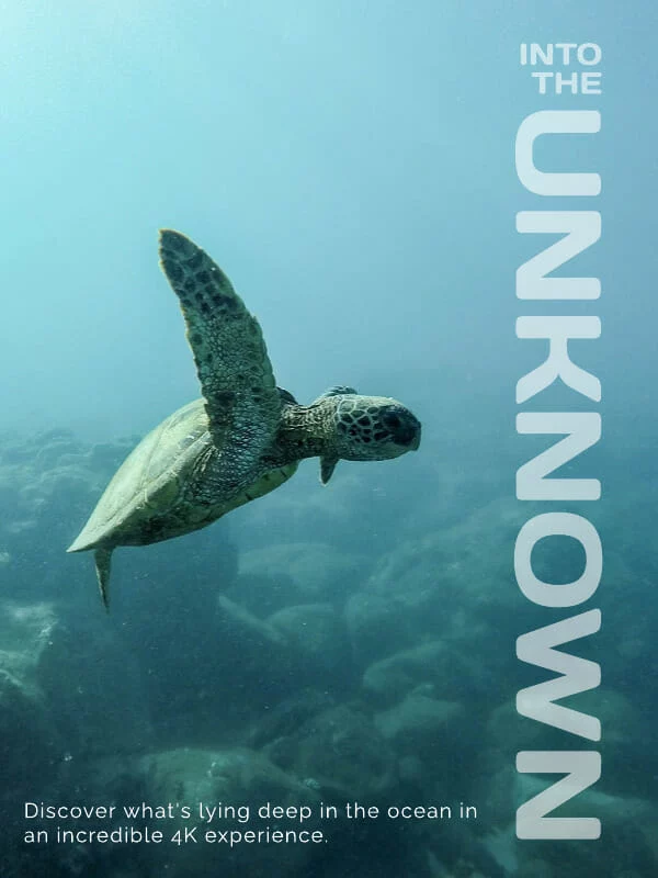
Cobalt café e-poster
Great for highlighting visual businesses like restaurants and real estate, this balanced poster template makes it easy to highlight your unique brand imagery and provide detailed information for readers.

Ready to design your own poster? Explore our full free template library here.
Today, most companies prefer the ease and lower costs of digital marketing as a substitute for regular print marketing. But while social media and digital advertising might now be the default, print advertising can still be an incredibly effective way to reach your target market.
Studies show that nearly 80% of consumers act on messaging they’ve seen in magazine ads, compared to just 45% of consumers who act on online advertisements. There’s a huge opportunity for influence here. In fact, 82% of consumers trust print ads the most when making a purchase decision.
When used in conjunction with digital marketing tactics, print marketing strategies like placing magazine ads can make your campaigns even more effective. In this guide, we’ll walk you through how to design and make a magazine ad that will help get your business in front of the right audiences.
How to design a magazine ad
There’s a lot that goes into creating a successful magazine ad. From understanding who you’re trying to reach to choosing the right publication, there’s plenty of strategy at play here.
In this blog though, we’re zooming into the design process. To help your ad stand out on the page, we’ve assembled some basic design principles that will give you the foundation you need to begin.
First off, one of the most basic (but most important) principles of good ad design:
Use color to your advantage
Take a look at a color wheel. When designing your magazine ad, you’ll want to not only choose colors that represent your brand, but colors that provide good contrast. If you’re having trouble, consider using complementary colors – these work well together and can be found opposite each other on the color wheel.
But don’t be afraid to get creative with other color palette options as well, as pictured below.
To mix up your color scheme, you can use different hues, shades and tones of the colors you’ve already chosen.
Check out this great example of using complementary colors (blue-green and red-orange) to make this Colgate ad pop.
When choosing your palette, don’t forget to consider the psychology of color as well. For example, yellow is often seen as cheerful and playful, while grey and black can signify luxury or utility.
Be careful when using bold, bright or loud colors on your print ad. It’s easy for the focus of your main message to be lost in a see of loud colors if you’re not intentional. You can use bold color for accenting or to make a certain message or image stand out, but use it sparingly. For example, pay attention to how Nike uses the color red to draw attention to its signature ‘swoosh’ here:
Create a sense of balance
While your design doesn’t have to be a perfect mirror-image on both sides, it should have some sense of balance that creates unity and ties your whole design together. An easy way to create balance is to use the rule of thirds. Basically, this means that if you divide your image into thirds, you should center your main focal point on the outer vertical line and center it on the horizontal lines. This makes your photo more dynamic and interesting to look at. For example, check out how this ad centers its main subject – the couple – on the horizontal lines.
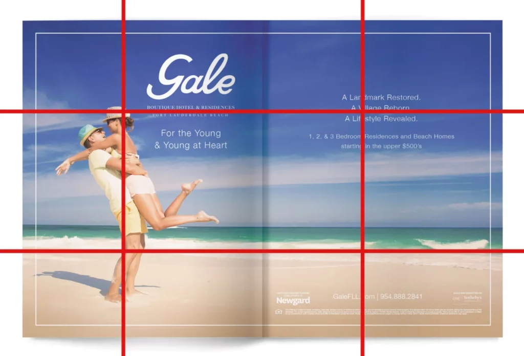
If you’re having a hard time finding the right way to balance your design, try viewing your layout under a grid. This will help you create an underlying unity and structure for your design.
Use the right font
You’ll want to make sure your font and font size are consistent with your other marketing materials. Additionally, make sure your font is applied consistently throughout your magazine ad design.
Typically, sans serif fonts are used for headings, while serif fonts are used for body text. Here are a few examples of popular font pairings:
Using sans serif versus serif fonts can provide contrast between your heading and your paragraph type. You can also contrast type by using different:
- Colors
- Sizes
- Structures
- Thickness of the font
- Typeface
- Weights
Just remember as we mentioned before, it’s not a good idea to use a different font than you use in your other marketing materials. Sticking with the same (or a similar) font will build brand consistency over time, helping people remember your brand.
Apply the Gestalt principle
The Gestalt principle argues that the human eye sees objects in their entirety before perceiving their individual parts. You can use this principle to help you make a better design. There are five parts that make up the Gestalt principle:
- Figure/Ground: Similar elements (figure) are contrasted with dissimilar elements (ground) to give the impression of a whole. Oftentimes, you’ll see this principle applied in movie poster design:

- Similarity: When objects look similar to each other, people perceive them as a group or a pattern and see them as belonging together, even if they’re not close together in a design.

- Closure: Our brain will see patterns and fill in the blanks, even when certain information is missing. This ‘triangle’ is a great example – it’s not actually there, but our eyes fill in the missing pieces.

- Proximity: When elements are close together, people will perceive them as a group. A woman and young boy posed together create a scene of a mother and son, and covey a sense of safety.

- Continuation: Using direction to move the eye from one object to another. The Coca-Cola logo is a master example of this principle in action. Our eye’s naturally follow the curvature of the ‘C’, creating a sense of movement and dynamism.
Use signs and symbols that are significant to your consumers
Are there any symbols that carry a significant meaning to your customers? You can use them to help your consumers create quick associations within your magazine ad.
For example, seeing a “stop” sign automatically creates a subconscious signal to stop and pay attention.
More best practices for making a magazine ad
Here are a couple other general tips for creating a great magazine ad design
Write a good headline
It should go without saying, but writing a powerful headline takes time. Don’t just go with the first one you come up with. Take the time to craft a headline that catches the reader’s attention and draws them in.
Use powerful images
What do you want your images to convey? Intentionally choosing your imagery can help your message make that much more of an impact. Also, don’t forget to make sure your images look professional and aren’t pixelated.
Use engaging copy
Keep it simple. You can let the images do most of the talking here, and chances are, there won’t be a lot of room for copy. Be concise, point out a problem, then identify your solution to that problem.
Proper logo use
Your logo will need to be included somewhere, but don’t make the mistake of making it the most important thing on the page. If possible, let it become part of the overall design. And, don’t hide your logo away in the copy — give it some space so it stands out.
Include a call-to-action
Ask yourself what you want your readers to do because of your ad. Include a call-to-action at the end of your copy that encourages them to take action and gives them the resources to do so. For example, if you want people to engage with you on social media, include a branded hashtag they can use to tag your company with.
Well-designed print ad campaign examples
Here are a few recent favorites we’ve come across – can you identity the design principles they use?
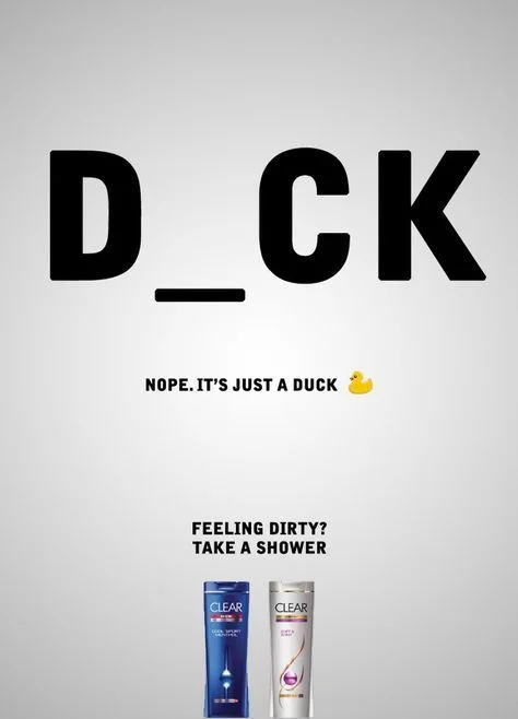
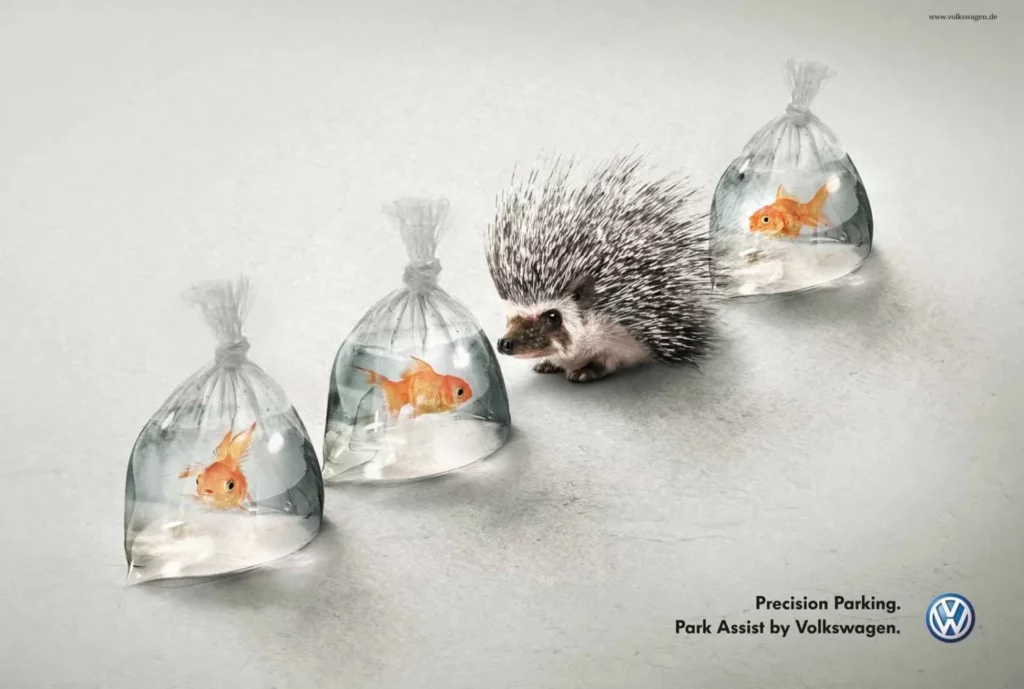
Key takeaways
Print is a classic form of marketing that we don’t ever think will go out of style. These five basic design principles and best practices will help give you all the foundation you need to get started on your magazine ad design. Want even more of a head start? Check out Marq’s free library of templates.
Ready to design your own magazine ads? These free magazine design layouts are a great starting point.
We’ve all heard “Don’t judge a book by its cover,” but I suspect we’ve all been guilty of it at some point.
A quality book cover design is your chance to make a positive first impression. Although first impressions aren’t everything, a bad one is hard to overcome. You could string together some of the most impactful and moving words ever combined in history only to see them fade away because the book cover looks like amateur hour.
Related: Why brand quality counts — Judging a book by its cover
The book industry is growing more competitive and more digital. Ebooks now make up 30% of all book sales.
Instead of taking several minutes to find a good book by casually strolling through the library perusing book titles, readers now scroll through the internet’s webpages in seconds. With vats of information competing for everyone’s attention, visual clues can help viewers identify superior content.
As we go over these 10 ideas to design the best book cover, feel free to jot down a few of your own observations to inspire your own design.
1. Set the tone with your design

Source: TIME
The verdant design of The Giving Tree by Shel Silverstein reflects the simplicity of a children’s book and depicts the dependent nature of a child. Instantly, you understand the themes explored in the book and feel an emotional connection with both characters.

Source: Behance
“Little Spines,” an anthology of creative writing by students at RMIT University, uses the image of a single tree in two different seasons to depict a story of change — revealing the poetic theme of the book.
2. Speak to your audience’s emotions

Source: WTTW
The Shack by William Paul Young is a good example of using design to appeal to one’s emotions. The conflicts of sorrow and hope, fear and faith are illustrated in the sunshine cutting through the snow and darkness.
3. Create a focal point
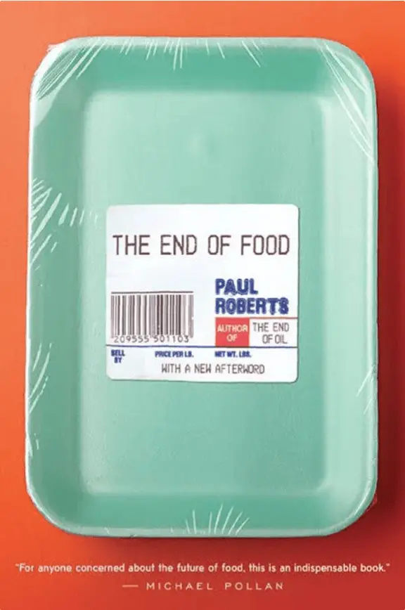
Source: Amazon
On the cover of The End of Food by Paul Roberts, the use of white space helps the reader focus. The white tag on the product packaging draws attention to the title which, after reading, the image effectively illustrates.
4. Use custom photography
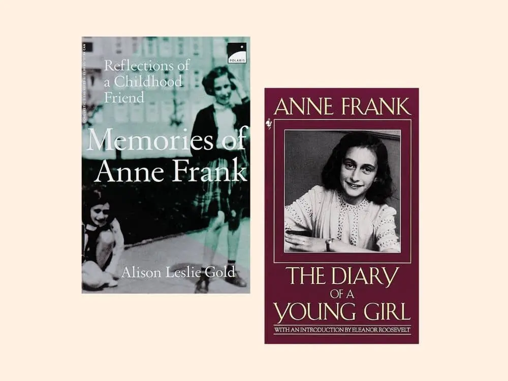
Source: Barnes & Noble
In The Diary of Anne Frank, photographs of the young author help the reader relate and empathize with her on a more intimate level. This is why custom photography is highly effective for biographies and documentaries. It is also helpful if you are trying to build personal recognition.
5. Your design should function as a thumbnail, too

Source: Brandon Hill Design
Given the digital nature of book shopping these days, it pays to create a book design that makes a great thumbnail. On Making the Climb by John C. Bowling, a brown shoe print is easy to identify and will be recognizable even as a small image.
6. Include reviews & awards in the design

Source: Books & Books
Working awards and reviews into the design of your book cover helps establish credibility to the reader. As humans, readers are social creatures, and testimonials from literary authorities provide enticing and trustworthy social proof. You can see this principle demonstrated elegantly on the cover of The Girl on the Train by Paula Hawkins.
7. Use imagery to spark imagination

Source: Paul J. Bartlett Art
On this modernized cover of The Wonderful Wizard of Oz by L. Frank Baum, images of a tin pipe hat, feline eyes, a girl’s face and a burlap necktie allude to the main characters in the book. The green tint hints to the Emerald City. This is a good way to weave your narrative into the cover design without giving too much away.
8. Let typography take center-stage
Source: Barnes & Noble
Here, on the cover of The Shallows by Nicholas Carr, the words are the imagery and help expand on what the author wants to communicate. By utilizing typography, the design is kept simple, not distracting the flow of the reader’s eye from one design element to the next.
9. Figure/ground Gestalt principle
Source: Pinterest
Things get interesting when the foreground and background contain two distinct images, as shown on this cover of Peter and the Wolf. Impressively, this creative use of negative space doesn’t distract from the main focal point.
10. Keep colors simple

Source: Pinterest
On this cover of JAWS, blue and black are the only colors used. The dark shading of the blue makes it identifiable as the ocean against a white background. The darker tip of the letter A reveals a shark fin breaching the surface of the water.
Key takeaways
An effective book cover is both planned out and meaningful. It’s a billboard on the highway directing readers to your pages. Your book cover’s role as a marketer is important and shouldn’t be treated like an afterthought. Use these tips to design a book cover you’ll be proud to share. You can start by customizing a book cover template in our gallery.
Ready to design your own book cover? Customize one of our professional book cover templates online for free.
Creative briefs are a lot like lighthouses: they provide essential guidance and direction for creatives working on large and small projects alike. Without a beacon, it’s easy for your project to get moored or lost at sea — think Castaway but at your job. And no Tom Hanks or Wilson by your side for company or relief.
Related: Essential client onboarding checklist for agencies in 2019
You want your creative briefs to be both concise and thorough. A good creative brief goes a long way. It helps maintain efficiency across teams and ensures individual contributors feel supported, happy and appreciated. But it also takes time. To help you maintain steam and produce creative briefs that (ahem) get the job done, we compiled a shortlist of questions to consider as you write:
- What is the end goal of my project?
- Are there templates I can use to fill out the creative brief and reduce the time spent on this task?
- Which departments should be involved in this project?
Answering these questions provides you with the clarity and structure needed to fully flesh out your creative need. So whether you need a one-page press release or a 15-page ebook, you can trust your brief to communicate your project’s scope effectively.
Now, let’s cover some basics.
What is a creative brief?
A creative brief is a detailed summary of a creative project.
Typically a brief is filled out by whoever is making the request. At a baseline, it needs to include The Basics:
- A project summary is a brief synopsis of the project.
- Some background context (such as data, products, or research articles) helps the creative team better understand your project goals.
- Your objectives, otherwise known as project goals, shed light on the project’s long-term (and short-term) strategy.
- Timeline(s) and a list of expected deliverables provide the creative team with a clearer picture of how and when they can take on your project.
- Include a list of the key stakeholders or people the creative team should contact when questions pop up.
- The target audience tells the creative team who they should be speaking towards throughout the campaign (so to speak).
- Brand guidelines or rules, like voice, tone, and style preferences, are crucial details for creatives to know. Including these notes in your creative brief helps eliminate time spent on revisions.
- Including a project budget is optional. However, if there’s any chance of sending it to freelance, be sure to include one.
That said, different types of briefs have different kinds of requirements — but don’t worry about that right now, we’ll touch more on that shortly.
What are the benefits of a creative brief?
Two parties benefit the most from creative briefs: the requesting party and the creative team.
- For the creative team, creative briefs help people like designers or copywriters do their jobs better and more efficiently. Not only that, it helps them craft great content that your audience will love.
- For the requesting party, a creative brief helps you understand the strategy and goals behind your project. It also helps to ensure that the work you get back is aligned with your vision for the campaign.
For example, say a sales agent needs a unique one-pager for an event they’re planning to attend in a month. That sales agent would fill out a creative brief and then send it to the creative team. From there, the creative team can slot the project into their production queue, quickly fill the request using a pre-templatized format, or temporarily backlog it depending on their workflow.
Now that we’ve covered the basics, let’s dive into how to write a creative brief for copy, design, and PR departments.
What are the main types of creative briefs?
Creative briefs are built to cover a broad spectrum of project needs. We’ve identified three different types of briefs:
- Copy — Anything word-related.
- Design — Anything visual-related.
- PR — Anything newsworthy that’s public-facing.
What do I need to include in a creative brief?
A copy brief is going to be a little bit different than a design or PR brief. No matter what, you’ll want to cover your bases thoroughly. We recommend using a pre-formatted brief template to make your life easier. (You can mark the fields N/A if they don’t apply to your project.) And keep in mind all creative briefs need to include The Basics — plus a few extra tidbits.
But, how do you know what information goes into what brief? We’ve outlined what you’ll need to include in 3 different types of briefs (copy, design, and PR) to help you get the ball rolling.
Copy brief
- The Basics
- Project summary
- Background context
- Objective
- Timeline(s) and deliverables
- Key stakeholders
- Target audience
- Guidelines
- Budget (optional)
- Word count — This helps the writer gain a clearer understanding of how much time it will take to complete the project. Additionally, some social media platforms have word count restrictions so you’ll want to make sure the writer is aware of these ahead of time.
- SEO keyword list — SEO keywords help boost your content’s ranking in search engine optimization results. Most demand generation copy projects include one.
- Examples — Content examples can help guide the writer if you’re looking to produce a specific type of content.
Design brief
- The Basics
- Project summary
- Background context
- Objective
- Timeline(s) and deliverables
- Key stakeholders
- Target audience
- Guidelines
- Budget (optional)
- Distribution — Where you’re planning on placing this visual asset matters. Are you posting the visual asset to social media, on the company blog, or distributing it to your customers?
- Deliverables and size requirements — Designers need to know these details ahead of time. Including this information prevents designers from sizing something incorrectly or creating a digital asset instead of a hands-on one.
PR brief
- The Basics
- Project summary
- Background context
- Objective
- Timeline(s) and deliverables
- Key stakeholders
- Target audience
- Guidelines
- Budget (optional)
- Publication — Location, location, location! Where you publish PR content matters, so be sure to include where you’re planning on having the content live.
- Word count — Most PR efforts are copy-heavy. And some publications have word count requirements, so you want to make sure the writer is aware of project expectations. You can include the word count in the “deliverables” section of the content if you’d prefer.
Examples of creative briefs
In case you wanted a frame of reference before you get started (visual learning style, anyone?), we’ve included some modified creative brief examples from our template gallery.
Copy brief
Modified from our Simple project proposal template
Design brief
Modified from our General project proposal template
PR brief
Created in Lucidpress
In brief
At the end of the day, creative briefs bridge the gap between good ideas and polished projects. They empower creative teams to stay on-task, on-time, and on-brand. And with the help of a pre-formatted creative brief template, you can quickly and easily insert information, send and process requests, and do more as a team. After all, who doesn’t want to save time and energy — while getting more done as a company?
Okay, so, now that you’ve been briefed on how to write a creative brief, it’s time to let your colors fly. Show us your briefs!
Download a free creative brief template to get started
As a sales leader, pipeline management is one of the most challenging aspects of your job.
In the past, communication only took place through phone, snail mail and in-person meetings. Cold-calling was the strongest tool in your sales arsenal.
Related: The 160 best sales tools & software
In 2007, sales pros could reach prospects one the phone in about one out of four attempts. Today, it takes about eight tries to get a potential client on the phone, and sales cycles are longer.
Your role as a sales leader is vital, but it means you don’t usually hear from prospects until they’re almost ready to buy. It takes heaps of patience & organization to keep track of potential leads.
Not only that, but the vocabulary of the industry has become more complex.
In this post, we’ll review the concepts you need to know to understand sales pipeline and offer specific strategies on how to manage sales pipeline effectively.
Sales terms you need to know
Sales jargon can be confusing.
Before we dive into what a sales pipeline is in more detail, let’s cover some commonly misused sales terms.
Though the following terms are related, there is a difference between the terms sales pipeline, sales funnel and sales process.
- Sales pipeline: Traditionally, this meant the stages a prospect moves through in their journey from stranger to customer. The sales rep moves this process along. Sales pros also use the term sales pipeline in another way. They often refer to their “pipeline” as the dollar value of current leads they are moving through the stages of a pipeline. While it’s fine to use this term, sales forecasting is a more accurate way to refer to the amount of potential revenue in your pipeline.
- Sales funnel: The stages a prospect moves through in their journey from stranger to customer. As mentioned, this is often confused with sales pipeline. The stages in the funnel are different than the pipeline, and the prospect is the one in control of how they move through those stages.
- Sales process: What the sales rep/team does to help prospects through the pipeline. These are specific actions, not stages as in the pipeline. Sales process & sales pipeline are often used interchangeably, even though they have different meanings.
Because different teams use these concepts to refer to different things, it’s important to clearly communicate what you mean by these terms and how you expect them to be used on the floor.
Do sales pipelines fit into inbound marketing?
Inbound marketing is a bit of a buzzword these days. Specifically, it’s a marketing process pioneered by HubSpot as a way to convert prospects digitally, using content to attract them.
What is inbound marketing? Inbound marketing uses a sales funnel that prospects move through on their own. The traditional sales pipeline is a function of outbound marketing, though it may be adapted to work well in an inbound marketing process.
As the internet became an integral part of our everyday lives, companies dived into the bottomless ocean of inbound marketing – sometimes hastily. Many abandoned traditional sales techniques (a.k.a. outbound marketing) altogether. The sales pipeline was ignored because it didn’t fit with the inbound marketing model.
What followed was an explosion of content: blog posts, landing pages & email newsletters galore. Back in 2014, business expert Mark Schaefer saw the writing on the wall and we entered the age of content shock.
Today, thankfully, many businesses take a more balanced approach. This raises the question, though: does inbound marketing with content still work?
Of course it does.
But, there are certain situations where traditional outbound marketing techniques often work better. This is where sales pipeline management becomes a critical skill for sales leaders to have. Some examples where outbound is more appropriate include:
- High-ticket consumer goods with five- to six-figure price tags
- B2B services with long-term contracts
- Service-based businesses like home contractors, etc.
Inbound marketing & outbound sales are the perfect pair in omnichannel marketing strategies. This combines traditional outbound techniques like TV ads and cold-calling with inbound marketing techniques like landing pages and educational content.
Stages of the sales pipeline
Sales pipelines are structured in stages based on how close a prospect is to converting from a stranger to customer.
Sales pipeline stages can look very different depending on a variety of factors, including:
- Businesses that rely on one-off projects or services
- Subscription-based business models (software subscriptions, web hosting, service contracts)
- How many sales are needed to achieve company revenue goals for a specified time period (monthly, quarterly & yearly are the most common).
A business that relies on one-off projects will need more prospects in the pipeline than a subscription-based model because the length of the relationship is usually shorter.
Here’s a basic pipeline that works across all business models. The length of time each prospect stays in a specific stage (and the number of leads needed in each stage at any given time) vary greatly.
- Prospecting – the process of finding potential buyers for your product or service. 40% of sales pros say prospecting is the hardest part of the job.
- Qualification – when you determine the prospect is a good fit. This can happen via meeting, phone call, email, or some other method.
- Proposal – After qualification, you present a proposal to a prospect. This can be verbal, delivered via a formal document (most common in high-ticket sales), or even sent as a price list.
- Sale – If the prospect accepts your proposal and buys, they are now a customer.
CRM (customer relationship management) software is a great sales tool to help determine where your prospects are in your sales pipeline. It can also help you analyze the prospects who didn’t make it to the end of the pipeline.
Sales forecasting: How pipeline value is calculated
Pipeline reports provide a dollar value of all deals currently in a salesperson’s pipeline. Most CRMs automatically calculate this amount.
We mentioned before that sales forecasting is a better way to talk about what’s in your pipeline. There’s no 100% guarantee that all those prospects will become customers, so it’s important to keep filling your pipeline with prospects to continue closing deals.
Experienced sales leaders can often predict (not 100%, but often) which leads are likely to turn into customers quickly (hot leads), which will take more hand-holding (warm leads), and which are likely to fizzle out. Over time, you will develop and refine this sense as well.
Tools of the sales leader’s trade: CRMs & sales collateral
Both newer technology and “old school” techniques play a crucial role in sales. Here are two of the most important sales tools to master.
CRMs
The more leads you have in your pipeline at the same time, the more likely it is you’ll need to use a tool like a CRM to keep track of all your customers & deals.
Software programs like Salesforce harness the power of technology to keep you organized without a secretary. You can track all emails, calls & meetings with particular prospects or client companies.
CRMs provide huge benefits to those who deal with a high volume of leads, because you can:
- create pipeline reports
- see percentage of deals won versus lost
- automate follow-up and check in with your leads via drip emails
- attach branded materials like brochures & sales sheets to emails
When used efficiently, CRMs eliminate the tedious work of keeping track of which lead is in what stage of the sales pipeline. CRMs like HubSpot Sales have mobile apps that connect to phones so you can record conversations.
Sales collateral
Before the internet was around, sales enablement collateral (like brochures & business cards) was mailed, handed out or left behind at in-person meetings.
Now, meetings take place both in person and virtually. But, that doesn’t printed sales collateral is dead. Far from it.
Consider this:
If a prospect is meeting with you, they are probably interviewing several potential vendors at once. Since companies often provide a lot of information (like flyers) about different products & services, the prospect needs an easy way to keep everything organized.
Because information is exchanged both in person and via email, all your company’s sales collateral should match so the prospect knows which flyer belongs to what company. This way, they can make an informed decision using all of your information. If you email them a plain Word document but hand them a colorful flyer that looks completely different, they might mix up or throw away critical information and you lose the sale.
That’s why Lucidpress is a stellar sales tool for your entire organization. It gives your entire team flexible access to branded sales & marketing templates.
Though you likely won’t be involved in designing the documents, sales reps on your team can use Lucidpress to provide prospects with the same documents digitally and in print. They can also personalize everything they hand out, so prospects feel seen and know how to get in touch quickly & easily.
With branded templates, you don’t even have to worry about whether colors, logos & fonts are being used properly – those assets are already present & locked down, so everything stays consistent.
Sales pipeline management tips & tricks
Ready to learn some pro tips for managing your sales pipeline? Check out these six strategic ideas to master the process.
- Don’t use a CRM if you don’t need to. If you’re responsible for managing only a few leads at a time, a CRM may be overkill. You can often get away with using a free CRM like Streak – or even a spreadsheet.
- Know your numbers. Even if you don’t use a CRM, you should still measure your average sales cycle, average dollars per deal, average lifetime value of a customer, and retention rate.
- Use your numbers. Take advantage of the data you uncovered to make decisions regarding how much time you should spend working with prospects, how often to follow up, and when to give up on an unresponsive lead.
- Keep accurate records. Your team has to keep track of who they’re working with and what’s been discussed, especially if they’re working with multiple people at the same company.
- Cold-calling is your friend. It’s not as scary as people make it out to be. If you get a prospect’s voicemail, keep your message between 8 and 14 seconds.
- It’s okay to use your personal phone. These days, most people have consolidated to one phone with one number. If you plan to use your personal mobile for business, record a professional voicemail greeting.
Key takeaways
Managing your sales pipeline can be complicated, but it isn’t impossible. Here are some key points to remember as you tackle this month’s quota:
- Understand the difference between pipeline & funnel, and make sure your team understands how you’re using these terms.
- Mastery of sales tools like CRMs & sales collateral make it a lot easier to close deals.
- Follow best practices to manage your pipeline – they really work!
Boost your bottom line and do more as a team with Lucidpress.
The digital customer experience is the quality and sum of all digital interactions a consumer encounters with a company. This includes the company’s brand, products and services.
Unfortunately, some companies are still struggling to achieve a productive digital experience. Good digital experiences can lead to more sales, more loyalty and even more customers. On the other hand, poor digital customer experiences can cause a loss of sales by frustrating customers and ultimately driving them to competitors.
With a good plan of action centered around digital customer experience and the aid of digital experience management, businesses will be better equipped to achieve growth.
What is digital experience management?
Digital experience management is the software, product or service that helps you track, monitor and analyze your customers’ experiences.
Digital experience management helps you connect the dots between the digital experience and customer expectations, and in turn provide customers with the experience and content they need.
Digital experience management platforms
The more insight you can gain from your audience, the more informed and strategic your content and digital experience can be.
So, in order to create an effective online customer experience management strategy (and therefore nurture a memorable digital customer experience), there are a few digital management platforms worth leveraging:
- Liferay DXP
- IBM Experience Manager
- Adobe Experience Manager
- Core DNA
- Lucidpress
Why digital experience management matters
Brands are struggling to differentiate themselves in today’s crowded marketplace. Consumers encounter multiple brands across multiple countries all offering the same goods or services.
Because of this, you need to give consumers a good reason to choose you over all the other players. In fact, many experts believe that successful customer experience will become more important than product quality or price when differentiating one brand from another. Keeping this expert prediction in mind, it’s clear that digital experience management matters more than ever.
Elements of a great digital customer experience
When crafting a digital experience, include the following elements in your strategy.
Consistency
When your customers open up your website, Instagram, Facebook or Twitter page, they expect to see consistency. The same message, layout, logo, etc. Customers expect this consistency no matter the location, device or channel they are using. This consistency is especially important if you are delivering rich media. Today, brands have defined “best practices” across all channels to ensure consistency in the online customer experience. These best practices can include responsive design and well-known concepts among others.
Usability and accessibility
According to Forrester, 61% of U.S. online adults state that they are less likely to return to a website if it doesn’t provide a satisfactory experience. Based on this alone, the digital experience you want to create can be your greatest competitive differentiator. Improving the usability and accessibility of your channels can maximize functionality while also positively affecting lifetime customer value. And don’t forget that no matter how sleek and shiny your design looks, if customers are stumbling along the way your pretty design won’t help provide a good user experience.
Convenience
In the digital world, consumers prefer to find their own answers rather than call someone for support — a large majority of people now expect companies to offer self-service options. Because of this, a great digital customer experience gives consumers the option to interact with your brand with little human interaction. Overall, the brands that rate the highest in terms of customer satisfaction do so because they offer self-service options along with a seamless experience when moving across channels.
With customers using mobile apps and smartphones to make payments, purchase products, schedule appointments, access information, book travel and more, self-service is more important now than ever. Consider restaurant apps like Chick-fil-A or Starbucks, customers can place an order ahead of time and also manage their loyalty points all through the app. Nearly 16% of Starbucks purchases are made through the app alone.
Personalization
Studies have shown that having a large number of options can make it harder for customers to make a decision. Accenture collected data that indicated an increase in frustration from customers’ online experiences. Their data showed that 48% of consumers have left a website only to purchase a similar product elsewhere simply due to a poor digital customer experience. Alternatively, 91% of consumers were more likely to shop with a brand that remembered, recognized and provided them with relevant recommendations and offers.
Your business can harness machine learning to better gain insights into consumers’ needs and wants in real-time. The growth of artificial intelligence (AI) in recent years has provided us with exceptional technology to better help us create digital experiences that focus on individual customers. This alone can help differentiate your brand from your competitors by providing accurate insights into your customers in order to give them a personalized and meaningful interaction. In addition to this, machine learning and big data can help ensure that your message reaches the right customer on the right channel and in the right format. It can also help you utilize insights and recommendations on consumer behavior and industry trends.
Deliverability
Another element of great online digital experiences is deliverability, better understood as the amount of effort a user experiences when navigating through your channels. The ultimate goal of deliverability is for you to empower your customers to accomplish their goals and feel good about it. Every turning point in their customer journey should be designed to deliver exceptional digital experiences centered around your brand’s promise. One survey provided statistics showing that only 11% of customers who experienced a complex transaction were likely to continue with purchasing the product. On the other hand, 68% were more likely to purchase when experiencing a low-effort transaction.
Related: 9 ways to improve the customer experience
Steps to develop a digital experience program
Along with the elements above, follow these steps to develop digital transformation through an excellent digital experience program.
Objectives then solutions
As you develop a digital experience program, begin by focusing on your business objectives first, then worry about solutions. Common objectives for many companies include:
- Deliver a better digital experience
- Understand the customer experience
- Differentiate on the customer experience
- Listen to your customers
As you look more into differentiating the customer experience, you may want to consider accessing outside help from customer experience consultants.
Omnichannel
An omnichannel approach to your program can help you succeed in providing a consistent and cohesive experience for customers across all channels. Make sure that you design your program in line with all other channels that your brand utilizes, from brick-and-mortar shops to mobile apps. By delivering a consistent omnichannel user experience you can improve your reputation and build trust among consumers.
Customer Journey
Mapping the customer journey is paramount when developing a digital experience program. In order to do this effectively, you will need to identify key turning points between the consumer and your brand that ultimately shape brand loyalty and perception.
Use the customer’s journey to localize where customers are getting stuck or where they are enjoying the experience. And don’t just do this at the end of the journey or when you’re starting to see your revenue tank. You should be mapping the customer journey often and always. Just as ecommerce continues to evolve, your own brand will need to evolve to better meet customers’ needs and wants.
Diagnose
As you map your customers’ journeys, take the time to also track and diagnose problems, existing and potential. You need to find which journeys are common and diagnose the most common problems within them. Additionally, you will need to find what resonates with your customers. Through diagnosis, you will want to capture high-level metrics such as the goal of your website or app visitors, along with the likelihood of them returning to your site.
Customer experience — the summation of every interaction a customer has with your brand — is critical. A great customer experience translates into satisfied customers, therefore boosting customer retention, improving the reputation of your business and elevating your bottom line.
Today’s brands have to develop a trusting relationship with their customers to continue to grow, and the majority of CMOs recognize the importance of customer experience (CX). But implementing an effective customer experience strategy that flows seamlessly from touchpoint to touchpoint and department to department is easier said than done.
How to improve the customer experience
Naturally, creating a memorable and good customer experience can feel challenging. But like any large project, you just have to break it down into smaller bits and pieces. To help you navigate it, we’ve compiled eight tips you can undertake to enhance the customer experience within your company.
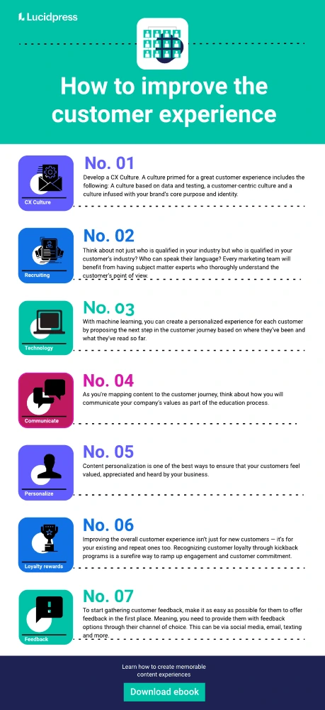
Develop a CX culture
Since every employee is a potential touchpoint for failure in a customer experience program, customer experience has to be infused into the very DNA of your brand. Successful companies develop a culture where customer experience can flourish.
A culture primed for a great customer experience includes the following:
A culture based on data and testing
Gone are the days when a persona based on intuition and sweeping generalities is enough to produce a relevant experience. Instead, every team must learn to collect and use data to understand the customer as people. Then use that data to create experiments to see what experiences best resonate with customers and which ones fall flat.
Creating a culture that embraces diversity and inclusivity for many different perspectives opens your organization up to be more empathetic and understanding of your customers’ point of view. Not only does it give your employees the language and tool kit to know how to understand your customers but it also creates an environment where employees feel heard and cared for opening them up to extend that same feeling to the customer through great customer service.
A customer-centric culture
Creating a customer-centric culture sounds like a given for any company prioritizing CX, but according to the CMO Council, “Only 14% of marketers say that customer-centricity is a hallmark of their companies.” One reason for this is the majority of metrics and compensation plans still focus on sales or the product rather than customer service and success. Developing trackable metrics for every team that ties directly to the customer experience will put the customer front and center in the minds of every manager and employee.
A culture infused with your brand’s core purpose and identity
A great customer experience strategy should be intentional, which means your brand’s core purpose should be easily identifiable and should influence every decision made by every department. Adoption of a brand’s purpose starts at the top and must be an ongoing conversation to ensure it becomes a part of the company culture rather than a nice saying on the wall.
Shift Your Recruiting Mindset
You also need the right people on your team. These folks are an essential part of making sure that your customer experience is the best that it can possibly be. Because, at the end of the day, if your employees aren’t paying attention to the needs of your customers, you’re never going to be able to create the kind of customer experience you want.
Think about not just who is qualified in your industry but who is qualified in your customer’s industry? Who can speak their language? Every marketing team will benefit from having subject matter experts who thoroughly understand the customer’s point of view.
Find people who are right-brained and left-brained– people who can understand the CX data points. A marketing team that’s both creative and analytical will be better able to understand and apply customer data.
Beyond the marketing team, every addition to the company should be hired for customer orientation. Make it a mandatory part of the interviewing process for every hiring manager. This not only ensures you’re getting the right talent in place but also re-enforces a customer-centric culture.
Use CX technology
CX technology plays a critical role in understanding where people are at in their customer journey. Start by developing a centralized command center to unify global data. Data silos limit your ability to see the entire picture and can create disjointed experiences.
With machine learning, you can create a personalized experience for each customer by proposing the next step in the customer journey based on where they’ve been and what they’ve read so far.
Many organizations have experimented with customer-facing bots to provide instant one-to-one interaction. However, agent-facing bots can also be a great tool to help coach customer service agents to answer questions faster and improve customer service.
A brand templating platform democratizes the content personalization process, so anyone on your team can quickly create professional, personalized content.
Communicate values
Creating content that is relevant and insightful is an important part of the customer journey, but today’s buyer often prioritize working with companies that share their values over the product’s value proposition or price. As you’re mapping content to the customer journey, think about how you will communicate your company’s values as part of the education process.
Hubspot, for example, communicates openly about their culture code and how they’ve actively worked to create a place where their employees love to work.
Personalize content to the customer
You know your customers, or at least you think you do, right?
For the most part, yes. Most successful businesses will already have a strong idea of their customer base, but it’s not enough to think about this in terms of broad strokes.
Your customers offer unique insights and highly informative data sources — from conversion driver and motivating factors to content funnels and more. You must pay attention to your customers’ habits and preferences.
You’ll want to create a detailed profile of your average customer. Use reference points like:
- Demographics
- Occupation
- Income
- Behaviors and preferences
- Goals
- Pain points and motivations
- Objections to sale or purchase
- Channels of choice
Once you’ve done that, you’re in a much better position to personalize the content based on how you can meet your customer’s needs. Content personalization is one of the best ways to ensure that your customers feel valued, appreciated and heard by your business.
Unsure how to personalize your content? Try customizing:
- A call-to-action
- Geolocation pages
- Industry-specific content
- FAQ or help center content
- Personalized email or direct mail campaigns
At the end of the day, this kind of targeted experience makes everything feel much smoother and more effortless for your customers.
Related: How to create a great digital customer experience
Customer loyalty rewards
Improving the overall customer experience isn’t just for new customers — it’s for your existing and repeat ones too. Recognizing customer loyalty through kickback programs is a surefire way to ramp up engagement and customer commitment.
That said, loyalty isn’t just about giving out discount codes: there are other ways you can gather customer loyalty by highlighting that you appreciate and value their opinion, as well as their purchase. For example:
- Offers or discounts
- Members-only promotions
- Customer preferences (based on membership tier)
- Early access (based on membership tier)
- Customized services (based on membership tier)
- Promotional updates to products
- Referrals
- Surveys
- Reviews
- Feedback quizzes
- Satisfaction quizzes
Loyalty rewards are a wonderfully simple way to make sure that everyone — from a brand new customer to someone who has been connected to your business for years — feels as though they get something in return when they choose to do business with you.
Pay attention to customer feedback
Understanding your customers isn’t terribly difficult. But unfortunately, a lot of marketing leaders find themselves wondering what customers do and don’t want from them — and how they can acquire that information.
The solution is pretty dang simple: your customers will tell you. But they’ll only tell you if you give them that opportunity.
To start gathering customer feedback, make it as easy as possible for them to offer feedback in the first place. Meaning, you need to provide them with feedback options through their channel of choice. This can be via social media, email, texting and more. Find out what makes the most sense for a majority of your customers and customize it from there.
Ultimately you want to ascertain customer opinions — what do they think is going well, what went wrong, and what could be improved. Doing so will give you a solid grasp on the direction your business is moving, and it allows your customers to feel as though they have a great deal more agency in the direction of your business, too.
Pre-empt solutions
Of course, if you want to be sure that your customers are always having the best possible experience with your business, you need to be able to predict and preemptively deal with any and all problems. This means carefully testing your various user experience touchpoints to make sure that they always function properly and dealing with any potential problems as quickly as possible.
A final note on how to improve the customer experience
This might seem like a great deal of effort in a lot of different directions just to focus on one specific element of your business. But the truth is, the experience your customers have with your business is simply too important for you to ignore.
If you’re not able to nurture an improved customer experience, then it won’t matter how great the other elements of your business are. You could be running the most efficient business in the world with the most incredible product, but that doesn’t matter if the experience of interacting with your business isn’t a pleasant one for your customers. Without this essential ingredient, your business simply won’t be able to reach the kinds of heights that you know it to be truly capable of.
Elevate your content experience with Lucidpress.
Why the customer experience matters
Existing in today’s business world requires much more than simply producing a product or service for people to buy. So much of it comes down to creating a great customer experience (CX). In fact, the vast majority of buyers are willing to pay more for a better customer experience and more than 62% of companies are recognizing the impact customer experience has in contrast to competitors.
With a large part of shopping and customer interaction happening digitally, great customer service has evolved beyond discounts or quick product fixes. Now, it is more about giving people a good feeling about your business and nurturing customer loyalty — with the end goal being that customers spread their love for your brand by word of mouth to friends, family, colleagues, which ultimately concludes with more sales and more loyal customers.
To stand out among the competition, your brand and business need to create and deliver more customer-centric experiences and campaigns as it gives your target audience a compelling reason to stay and become repeat customers.
That said, in order to deliver this customer experience, you need to combine data from your online and offline initiatives. You also must create an emotional connection between your brand and customers, putting them at the center of your marketing strategies. To give you an idea of how to accomplish this, we’ve rounded up some of the best customer experience examples.
Check out these unique customer service experience examples below.
7 of the best examples of great customer experiences
1. Microsoft: customer-centric innovation and engagement
In the early 2000s, Microsoft was experiencing a hitch in its growth until its new CEO came in and led the change from a bureaucratic corporation to an innovative collaborator who focused more on its partnerships and customers.
Microsoft began partnering with B2B companies and sharing best practices to build new products, which not only gave Microsoft the boost it needed, but it democratized access to technology and empowered businesses and teams with the type of technology they truly needed to get the job done.
They also began to invest more in their social media presence. Today, Microsoft has a strong presence on Twitter with multiple accounts dedicated to various themes, which include careers, development, events, security and customer service. Through social media, Microsoft customers can interact and engage with just about every aspect of the brand.
CX lesson: It’s easy to accomplish this type of approach by simply asking questions through polls, surveys, chats, forums or asking for feedback. Each of these can encourage engagement, which can lead to innovation or changes that keep the customer involved and coming back for more. Just remember to respond to comments on social media in a timely manner. The quicker you respond, the more satisfied customers will be and the more they will feel that your business values them and their feedback.
2. Tommee Tippee Cups: 1-to-1 marketing
Small but mighty, one of the best examples of a great customer experience comes from Tommee Tippee Cups.
Through social media, the company stumbled upon a father looking for a replacement of a limited edition Tommee Tippee sippy cup for his son, Ben, who has severe autism. The sippy cup was the only one Ben would drink from, as such, the father created a hashtag #cupsforBen. The result was a viral tweet, amassing thousands of likes, retweets and shoutouts, which of course caught the company’s attention.
The company ended up announcing they would be creating a limited run of the discontinued cup, especially for Ben.
CX lesson: By paying attention to your business’ social channels, you can turn listening to your customers’ feedback into truly memorable customer experiences.
3. AirBnB: Personalized user experience
AirBnB provides a great example of personalized customer experiences. By recognizing the two different types of customers in their industry — those looking to rent out their place and those looking for a place to stay — AirBnB has made a simple search experience for both audiences on the same platform.
Through their home page, you can either become a host or book a place to stay. Additionally, with consistent branding and design across their mobile app and web browser, they’ve made this marriage between UX and customer experience even more seamless.
CX lesson: When customers lead, you follow — and understand that your customers do not exist within a binary. There might be other important use cases your company offers. Be on the lookout for what those might look like.
4. McDonald’s: In-restaurant customer experience
When McDonald’s started suffering a decline in sales, they decided to turn things around not by changing their marketing tactics, but instead by focusing on customer experience.
They started by making an effort to listen to their customers and providing them with a more streamlined experience — like the one customers had been requesting. Based on customer feedback, McDonalds created a simpler menu, improved order accuracy and started using higher-quality ingredients.
McDonald’s also took the time to upgrade store interiors for a better look and installed digital, self-order kiosks and table service, resulting in lower wait times for customers. As these changes were implemented, BTIG projected a sales growth of 4.1%. And in turn, McDonald’s is able to set themselves above competitors by elevating their overall customer service experience.
CX lesson: Listen to what your customers are asking for — and then implement changes as best you can.
5. Adidas: Digital customer experience
In recent years, Adidas has been fine-tuning its digital experience by committing itself to better customer experiences
One of its biggest initiatives came about as it recognized customers were shopping online more. Adidas ended up pouring resources into a simple and tailored-to-fit customer experience by personalizing its messaging and content based on data insights and user engagement.
The company also began listening to customer feedback. This introduced them to a desire for more sustainable goods from customers. The company began producing shoes from ocean waste and sold over 1 million pairs in just one year.
CX lesson: By investing in CX, you can change your company’s growth trajectory and even establish yourselves as a leader in your field.
6. Delta: Empower employees
Delta Airlines has been awarded high praises for their customer experience and many of these are due to the way in which they empower their employees. They boast a retail-like experience which is a new way to think about air travel given that it is a generally stressful situation for most.
Delta was named best overall service airline and their latest marketing campaigns feature customers sharing their great experiences due to the employees. From their pandemic response to their acts of empathy, Delta has cultivated a reputation that is built on the people who work for them.
CX Lesson: When you empower your employees to engage with your customers and offer human interactions that identify with the human experience, your brand will be known for it.
7. Casper: Omnichannel customer experience
A truly unique approach to perfecting the customer service experience can be seen through mattress company Casper.
The ship-to-your-home mattress company created a free chatbot just for insomniacs. By simply texting “Insomnobot3000” from their mobile phones, customers can talk to the chatbot about whatever is on their mind and have a real conversation.
But the Insomnobot3000 isn’t just for insomniacs to get a little peace of mind to help them fall asleep. Through the chatbot, Casper is able to collect mobile numbers and send promotional offers and discounts. And courtesy of the Insomnobot3000, Casper pulled in $100 million in sales in just the first year of the chatbot’s launch.
CX lesson: Make it easy for customers to connect with you on their channel of choice. And furthermore, you need to humanize the customer experience as you do so. Because, after all, we all sleep on mattresses, but who or what audience can you tap into and elevate the customer experience for?
Make your customer experience a memorable one
By looking at these seven great customer experience examples and the approach each company took to improving its customer experience, you can find your own solutions to help your business outpace the competition.
So much of the customer experience entails listening to and collecting feedback from your target audience and then using that feedback to incite change. Whether this change happens in your products or services — or even a design flaw in your website or app — it can result in better UX and CX experiences for your customers. And in turn, result in happier customers.
But don’t forget! Listen to your employees as their perception of your brand can also influence their own interactions with your audience, for good or bad.
In today’s digital economy, it’s easy for businesses to look dated quickly and out of sync with what’s “in.” If you’re worried that customers or clients are finding your work or services blasé, you can easily send the message that you are on top of your game with a webinar presentation.
A well-curated webinar presentation can be a game-changer by keeping your branding consistent, visible and top-of-mind. It also engages the audience by offering visuals that help them retain information for longer periods.
With the aid of our modern marketing presentation template, you can easily highlight how your business is staying on top of current trends. And, ultimately, our professionally-designed slide template saves you (or your sales team) time by not requiring you to start from scratch.
To create the perfect webinar slide or webinar template (for others to recreate down the line), follow along with the tutorial below using our modern marketing presentation template.
Best practices for creating a webinar slide
In short, you need your webinar template slides to be:
Captivating
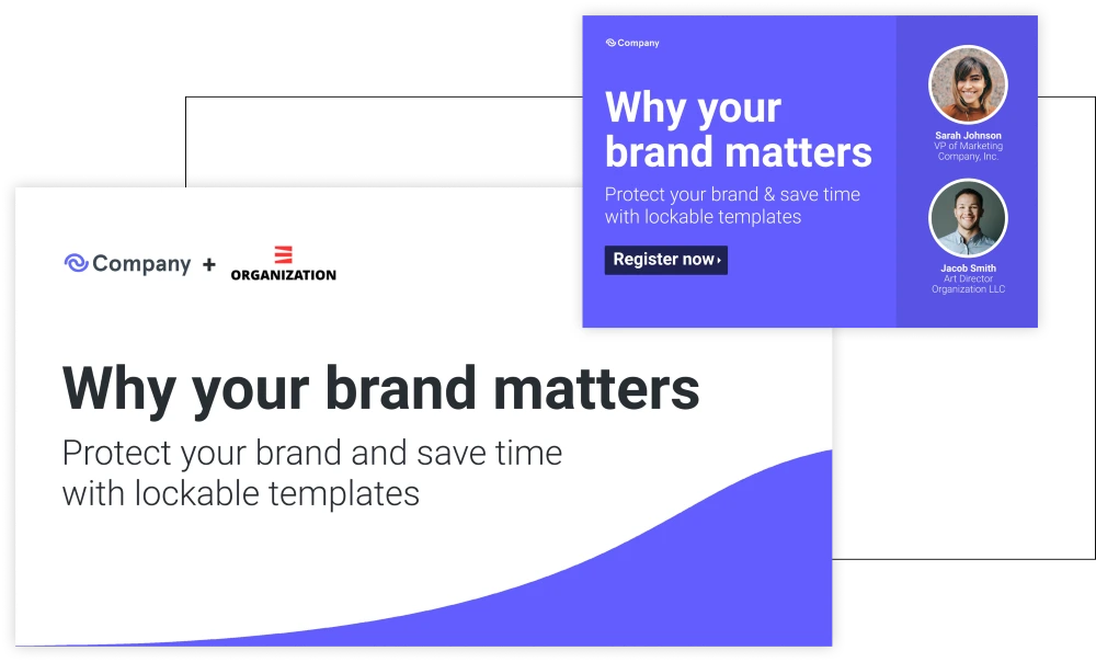
Just as you were taught in school, you need the beginning of your webinar presentation to be captivating.
Remember how your teachers drilled it into you that that first line of your book or essay was the thing that would hook people into continuing [to read your piece]? Well, that same principle will apply for your title webinar slide.
Not only will the title slide be the first thing your audience will see, but it can also potentially be used for promotions along with the splash screen (a.k.a. the thumbnail) for the on-demand version of your presentation.
To create a captivating and enticing title slide, you will need to use a few things:
- Title: Keep the title of your presentation exciting but straightforward. Use an easy-to-read sans serif font.
- Subtitle: The subtitle will be smaller in size than the webinar title and should also be written using the same sans serif font — but with styling such as italics or bold. Use this section to expand on your title so your audience will know exactly why they should click and continue.
- Logos: Never forget to include your logo in any promotional material that your business produces. On your title page, this will clearly show who is hosting the webinar. If you are co-hosting with another company, be sure to include their logo on the title slide as well.
- Image: Select an appealing and eye-catching image as the background of your title slide, or as a supplement to the design. With our modern marketing presentation template, you can see how the title sits on a white rectangle, allowing readers to read the necessary information easily while also providing an engaging and professional look.
Consistent
With any (and all) branding for your business, your webinar slides need to have a consistent color palette, along with consistent font usage and other design elements.
You don’t necessarily need to use brand colors, but the colors should remain consistent throughout the slides. Pick two to three colors that are easy to read with your text and stick with them throughout the entire presentation. You can use these colors for shapes and backgrounds, text boxes, or even as transparent image overlays.
Simple
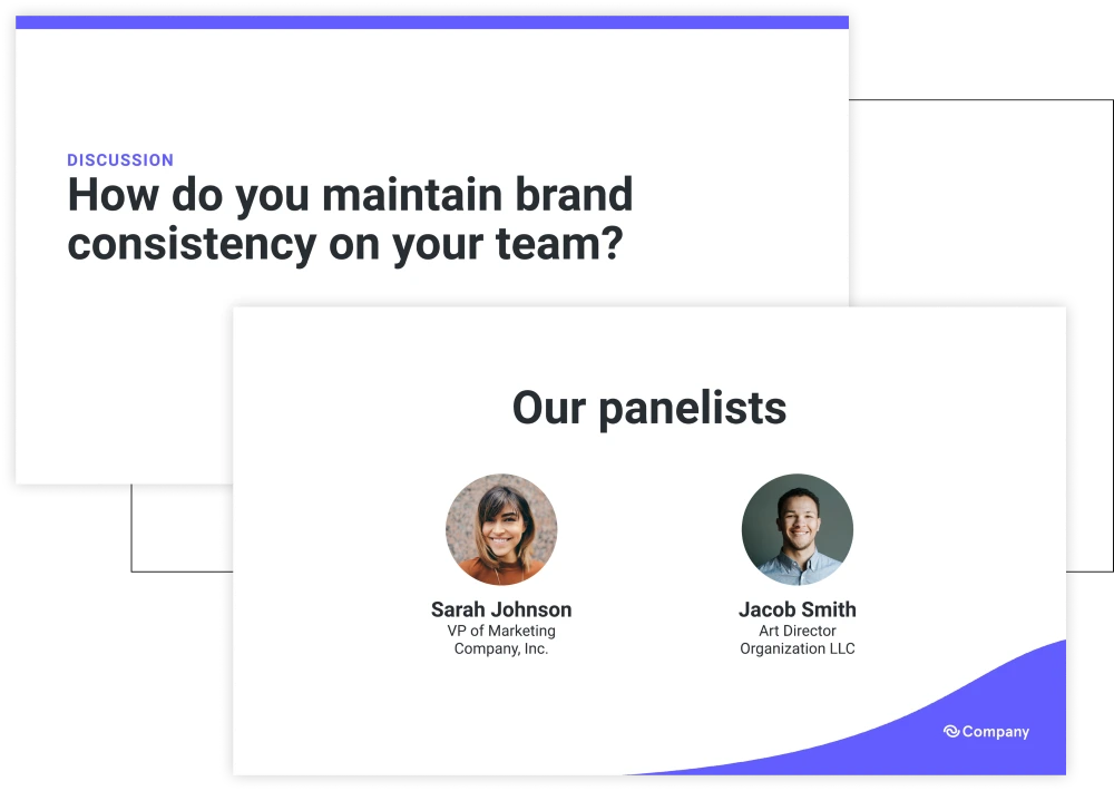
The more crowded your webinar slide deck, the more likely you are to lose your audience.
For example, when creating your webinar template slide, if you create a slide to introduce your webinar speakers, have the slide include headshots of each presenter along with their name and title. Skip the bios. Those can be included in your script, but will only clutter the slide. A good rule of thumb is that if you are going to be talking about the context of the slide in your script, then don’t include it as text, or only do so as bullet points.
Compelling
Include an agenda slide at the start of your webinar presentation. By doing so, this slide will help your audience know what to expect from your presentation.
Make this slide extra compelling — tell them right off the bat what they stand to gain by engaging with you and your webinar. The more compelling this slide, the more likely they are to continue. Remember to keep it simple by using bullet points and keeping the slide’s text concise.
Informative
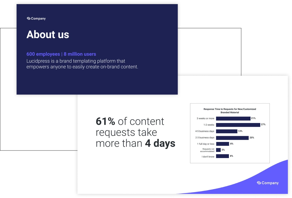
Try to include a few slides highlighting stats about your business or services. Stats can add credibility to your message while also solidifying your script. Infographics are a great way of demonstrating compelling stats.
That said, you also need your webinar to have:
Screenshots
Because we spend so much time on our phones and computers, there is a chance you will need to include screenshots during your presentation to help explain things.
Your webinar template should include slides featuring mobile screenshots and computer screenshots. Again, keep these slides simple: include the screenshot with a couple of explanatory bullet points.
Visual aids
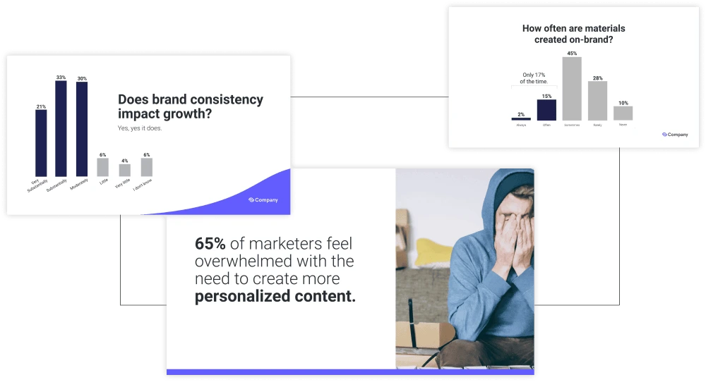
Graphs, charts and icons can take your webinar to the next level.
They will help explain key points while also aiding in getting end goals across. Photography is another way to make your presentation stand out. If you don’t have in-house photography, consider using stock photos.
A recap
A recap slide is a helpful way to wrap up and remind audience members about the key takeaways for your webinar.
Enough of us know what it is like to get to the end of a webinar and have already forgotten several key points. Use a recap slide that provides key takeaways. Repetition will help your audience remember your key message and also give them something to think about after the webinar.
A call-to-action (CTA)
A CTA slide is must-have-necessary for your webinar presentation template.
Use this slide to engage your audience by allowing them to sign up for another webinar, try a new product, complete a purchase, etc. Make sure your CTA truly resonates with the audience and make sure it’s the last thing they see before exiting the webinar.
Let’s get started
Now that you know the elements needed to create the perfect webinar template and presentation, you can start creating your own. Or better yet, download our modern marketing presentation template here and save even more time. You can also find more marketing presentation templates right here.
If you are looking for help in hosting a webinar, check our blog post “How to host a webinar.”
Measuring marketing effectiveness and performance are the keys to your brand’s success. As tempting as it might be to chalk up the effectiveness of your marketing campaigns to pure luck — bookended by witty headlines, captivating CTAs, strong visuals and magnetic content — you don’t want to do that.
Why?
Well, to start, measuring marketing performance tells you a good deal about the health of your brand — not measuring does the opposite.
Second, it puts unnecessary pressure on you and your team to magically market instead of nurturing a consistent, memorable brand experience.
And third, it also makes it incredibly difficult to internally self-market and get sales reps, channel partners and others to use the content you create.
Marketing is only as effective as the measurements you take and make. And the longer you hold off on measuring marketing effectiveness, the longer it will take you to get beyond the “Huh, Well That’s a Good Idea” phase and step into the “Well-Oiled Marketing Machine” segment of your brand potential.
So, if you’ve been using the “I-Don’t-Know-What-Exactly-I-Should-Measure-So-I’m-Just-Not-Going-To-Do-It” excuse, well, then this blog post is for you. Also, for what it’s worth, it’s totally okay if you didn’t know what exactly was worth measuring, because, one simply can not know everything.
Marketing effectiveness: Metrics you want to track
Measuring marketing performance is quite straightforward. To help you get the ball rolling, we’ve compiled a list of metrics you want to track and keep in mind as you concoct strategies, create content and more.
Marketing contribution to revenue — Can you tie your marketing team’s efforts to company revenue? To measure this, create and track key performance indicators, also known as KPIs. KPIs are a great way to manage your team, priorities and new projects. And more importantly, they provide insight into your team’s contributions.
Marketing contribution to pipeline — Can you tie your marketing team’s efforts to current leads or pipeline activity? Or are your leads trapped in Marketing Strategy Pipeline Purgatory, unable to move down the funnel? Be sure to track and evaluate funnel effectiveness, as well as lead growth and acceleration, as a means of identifying marketing health.
Customer lifetime value (CLV) — Do you know your customer lifetime value (also known as CLV)? As in, do you know how much net profit you can expect to gain from your customers? Your customer lifetime value provides solid insight into whether or not your marketing strategies are effective — and furthermore, it’s directly connected to your current customer experience. You can’t have a positive CLV without good customer experiences.
Unfamiliar with the term? Customer lifetime value is the net profit your company earns from a customer. To calculate CLV, take the average, annual profit contribution per customer and multiply it by the average years customers buy from you. Then, from this number, subtract your customer acquisition costs. And there you have your CLV.
If you’re not sure how to calculate your customer acquisition costs (CAC), don’t stress. Start reading the next section… ready, set — now!
Customer acquisition cost (CAC) — Do you know how much your customers cost you? Meaning, do you know how much it takes to get customers to purchase a product or service? Compiling the calculations is pretty simple. Take the total marketing spend on customer acquisition (also known as MCC) and divide it by total customers acquired (CA). The result is your customer acquisition cost.
ROI of creative services — Realistically speaking, do you know your current ROI of creative services? We’re talking about an ROI specifically on the content you and your team produce for sales reps, channel partners and so forth. Connecting the ROI of client creative services helps improve other ROI metrics and also strengthens marketing contribution to the pipeline (e.g., close rates, pipeline acceleration and so forth).
If you’re not sure, ask yourself and your team:
- How many folks (i.e., sales reps, channel partners, etc.,) use your internal design or creative services team?
- How much of your content is actually used by these people?
If your gut tells you that your ROI is pretty small, you’re not alone. Most organizations face similar challenges. For example:
- Most teams struggle with content adoption — 80% of companies feel like cross-functional team collaboration is ad hoc or non-existent.
- Creative time and energy is going to waste — 65% of content goes completely unused by sales reps.
To avoid the two statistics mentioned above, we suggest measuring marketing effectiveness through traditional brand equity measurements. Additionally, your organization could stand to benefit from periodic internal surveys or a brand templating tool.
Market share — How much of your market do you control? The numerical result of this is what you’d call “market share.” To calculate your market share, take the total amount of your company revenue during a specific time period, and then divide that by the industry revenue from the same time period.
Evaluating your current market share empowers you to see how you stack up against competitors and helps you leverage your unique selling points in emerging or even current markets. From there, your market share insights can be used throughout content creation and can be customized per target audience vertical.
Metrics that influence your market share are as follows:
- Brand awareness — Your brand is how people recognize you. To that end, are you telling a consistent brand story across all platforms? Keep in mind, in order to be recognizable, you need to be consistent across every touchpoint and on every piece of content that’s created. Rogue content or off-brand collateral hurts your image, reputation and conversion rate.
- Market appeal — You don’t have to be the most innovative in order to maintain market appeal. You do, however, need to be prepared to shift gears or update your appeal when needed. As fetch as it is to be unconventional and alternative, it’s worth staying in-step with the rest of your industry to prevent your brand from being perceived as outdated and irrelevant.
- Customer engagement and retention — Whether or not you show up and engage with your customers says a lot about your business. So, yes, your customers want you to engage with them. But, no, they may or may not want you to hit them over the head with a bazillion emails a day.
- Delightful content — This is a chicken and/or the egg scenario: you can’t really have one without the other. For the chicken — does your content delight your customers? Do they interact with it and enjoy it? It’s a yes or no question, really. And the egg — do you have enough resources in place to scale content creation? Furthermore, are you empowering your reps and channel partners to create personalized content?
Measuring marketing effectiveness for the long-term
It’s worth noting that while you can track these metrics all day, you need to maintain a holistic perspective on your marketing strategy. Should your numbers or measurements be low, take the time to evaluate your content and customer experience. Consistency between touchpoints and brand storytelling is a critical component in evaluating your brand health and marketing effectiveness. For many companies, achieving consistency is a struggle. If you find your organization is having difficulty iterating a consistent content story or is falling victim to rogue content, we’d recommend reading our ebook (The extra 1%: Delivering a memorable content experience) to learn more about scaling production relative to your customers’ expectations.
Social media can help real estate agents find a wide audience, in the right area and at the right time.
In fact, according to the National Association of REALTORS 77% of real estate agents use social media. Facebook is by far the most popular platform in real estate, followed by LinkedIn and Instagram.
Related: Real estate marketing guide
Even with limited resources, savvy real estate agents can build meaningful relationships and earn more clients with social media.
How do you do it?
The sheer array of social media platforms and real estate marketing techniques seem overwhelming. Here are seven and a half practical tips to get you started in no time.
Social media for real estate tip #1: The basics
If you are already set up on social media, go ahead and skip ahead to the advanced tips below.
Facebook for real estate
To get started, set up a business page on Facebook. This is more professional than posting to a personal account and gives you access to useful business features such as page analytics and the ability to promote posts to your audience. Posts with images and video perform best on Facebook, so be sure to use compelling visuals with every post you create.
The Facebook algorithm favors posts that get a lot of engagement, so ask questions to drive comments or share content your followers will enjoy such as an upcoming local event, so they like and share it. If you’re just getting started and don’t have a large social media following yet, holding a contest to bring awareness of your real estate page is a great way to build up your follower count.
Instagram for real estate
Instagram is quickly becoming one of the most popular social media sites. As a visual platform, every post will need to be visually compelling. Use the caption that goes with the photo to provide additional details and include your contact information. A single Instagram post can be made up of a series of images, making it a great way to show photos of a new real estate listing.
LinkedIn for real estate
Update your personal profile and if you are running your own business, create a page for the business as well. LinkedIn provides a great opportunity to network with other real estate agents, connect with real estate brokerages and connect with current clients.
Social media for real estate tip #2: Start two-way conversations
A staggering 94% of millennial homebuyers are taking their search online. This creates incredible opportunities for real estate agents to connect with them there—but only if they truly understand their audience’s motivations.
It’s tempting for real estate agents to promote their business and new home listings relentlessly on social media. After all, isn’t that what those platforms are for?
Not exactly. For potential homebuyers, constant, in-your-face promotion has minimal appeal. If they wanted endless advertisements, they could just flip open a magazine or turn on the TV. Treating them this way shows a fundamental lack of understanding about your target audience.
The vast majority of potential homebuyers are searching for information. They have questions. If they’re considering buying for the first time, they’re probably intimidated, too.
Savvy real estate agents use social media to walk everyone through the process, creating stronger bonds than the constant sales pitch approach. Instead of just posting endless promotional content (a one-way broadcast), you open up two-way conversations. The audience becomes a key creator of the shared experience.
This takes on many forms. It might be searching Twitter hashtags and offering real estate advice to those in your local area. Tomorrow it might be hosting a Q&A session on Facebook Live. Next week it might be something as simple as asking a question in your newest listing photo caption on Instagram. Whenever you can, invite your audience to participate in the conversation.
Yes, you can still find opportunities to promote your real estate listings. But, a commitment to being relentlessly helpful builds trust and authentic relationships.
Social media for real estate tip #3: Choose your social media platforms wisely
Social media is fast-paced, chaotic, and changing constantly. It’s easy to get overwhelmed by the sheer number of platforms.
Real state agents new to social media might feel the pressure to “be everywhere.” Pressed for time already, they drive themselves crazy trying to maintain a presence on a dozen different accounts.
This approach actually leaves them worse off than before. Because they’ve spread themselves so thin, it’s impossible to get the traction needed to build an audience on any platform.
What could you do instead?
Start by taking a deep breath. Acknowledge there are tons of platforms out there—and a lot to learn. And accept that you’ll see the best results for your real estate business by focusing on just a few right now. Begin the journey with proven social networks like Facebook, Twitter and Instagram.
Which platforms deserve the majority of your focus? A lot depends on your audience. Beyond the overall popularity of the platform, consider where your target market spends their time online. You wouldn’t want to launch a Snapchat strategy when trying to sell retirement condos—the demographics there skew too young. If you’re selling commercial real estate, consider connecting with successful professionals and industry organizations on LinkedIn.
Do some preliminary research to pinpoint where your audience is most engaged. Other real estate agent’s and brokerages accounts can be a great place to start. Using those insights as a guide, narrow your focus to a few platforms as availability allows… which brings us to the next point.
Social media for real estate tip #4: Post consistently (and strategically)
A successful social media for real estate strategy is a lot like a successful relationship-building strategy in real life. You need consistent contact—and interactions that provide value and motivate people to keep coming back.
The goal: create enough interactions for your audience to get to know you as a real estate agent without overwhelming them to the point they tune you out.
This is a delicate balance to maintain, but the good news is it’s something you can always adjust as you go. Feedback from your networks (whether you’re gaining or losing followers, their engagement, etc.) will tell you if you’re headed in the right direction.
You can use social media software to schedule posts beforehand. This gives you the freedom to meet with clients, work open houses, and attend closings all while building your presence automatically. It’s easy to post multiple times a day this way.
Posting frequency is one thing, but you also have to consider the nature of the content itself. Most content breaks down into three different types:
- Time-sensitive/promotional. These posts advertise new properties on the market, open houses, or your brand in general. Think of listing photos, tweets urging prospects to give you a call, and virtual tours with Facebook livestreams or 360-degree photos.
- “Evergreen” how-to or informative. This content answers questions, shares tips, or finds alternative ways to provide value. It’s just as valuable a year from now as it is today. This could be decorating tips, a checklist to help you see how much house buyers could afford, or cool DIY renovation project ideas.
- Fun or entertaining. This content might not be directly related to real estate, but it’s a great way for you to showcase your personality. It might be a review of a new restaurant in town, a heads-up about traffic on the way home, or even those viral cat photos. Social media just gets prospects in the door. It’s your personality and expertise—real-life relationship skills—that will close the deal.
Understand the goal of each post you make, and mix things up to engage your audience and keep them coming back.
Finally, remember that there’s no need to create all this content yourself. Supplement your own efforts by sharing, retweeting or linking to other great content in the real estate industry. Your clients are a great content source—whether it’s sharing a quote from their testimonial or a photo of them toasting a new home.
Social media for real estate tip #5: Incorporate storytelling
Every great real estate agent knows how to tell a compelling story. Include that storytelling element in the social media content you create.
Some examples:
Talk about the neighborhood. When posting a new real estate listing, do more than talk about the price and features of the home. Create a compelling story by including details about the neighborhood. Help the potential buyer picture what it would be like to actually live in that home.

A post shared by Dusty Baker (@dustyjbaker) on Nov 14, 2017 at 10:46am PST
Include client testimonials. Ask happy customers if they’d be willing to create a video testimonial. Testimonials make compelling stories that help build trust with your audience.
Share milestones. On LinkedIn, share milestones of your real estate business. This could be anything from 10 years in business to updated branding or a new website.
Using storytelling in your social media campaigns will help drive greater engagement and build trust with your audience.
Social media for real estate tip #6: Use great, on-brand visuals
Social media has transformed the way realtors and agencies connect with potential buyers and clients. Because of the visual nature of house shopping, it’s easier than ever for people to go online and find examples of their dream homes.
Ideally, this should make real estate marketing faster and easier… but unfortunately, that’s not always the case. If you’re unfamiliar with Photoshop or other desktop publishing software, it can be difficult and time-consuming to create content specially for each social media site.
Instagram is a completely visual platform, which makes it perfect for marketing real estate. Photos are nice to have, but it can leave buyers confused as to what to do next—”Is this property for sale or just for show?” they might be wondering. By using this square photo collage, you can show off multiple views of the property and guide folks toward the next step: contacting you for a walkthrough or an offer.

Speaking of visual platforms, Pinterest is a haven of gorgeous home ideas, which makes real estate a natural fit. Pinterest users build boards to house (heh) their pins, all of which come from various sources. It’s easy for your name or website to get lost in the shuffle—unless your images themselves are clearly branded. That’s what makes this perfectly sized Pinterest template a cut above the rest. The majority of space is reserved for eye candy, but all the important property details are right there, too.

When you want to get a new listing out fast, no platform is better than Twitter. Not only can you keep your followers in the know, you can also target new audiences with paid promotion to get the most mileage. Because things move so quickly on Twitter, it’s important to design posts that are easy to digest. This template is oriented horizontally; it’s compact and looks great on both desktop and mobile.
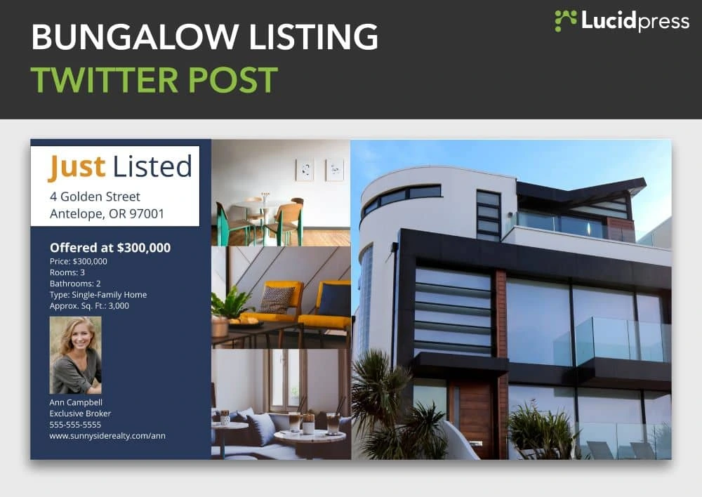
Social media for real estate tip #7: Remember your past clients
Social media is a great tool for realtors to build relationships and land clients. But, that’s only part of its appeal. It can also help maintain relationships you’ve already developed.
What happens when those closing papers are signed? Clients feel a rush of adrenaline, but after a few months, everyday life creeps back in. An incredible 70% of homeowners can’t even remember their real estate agent’s name one year after closing.
It’s a shame to have those relationships slip away after you’ve spent so much work building them. With a little social media love, it’s much easier to maintain them. That way, when clients are ready to move again or recommend a realtor to family or friends, you’ll be the first person who comes to mind.
How can you do this on social media?
Release a steady stream of that evergreen content we mentioned earlier. Brainstorm all the things you wish you knew when you moved into a home. Is it design inspiration? Checklists to get organized? Ways to prepare for the winter or save money on utility bills?
You can also broaden your content from real estate itself. Now that your client has moved, they’re living, working and integrating into the community. They might be interested in that new restaurant down the road. Or the best summer camps to send their kids. You can become their go-to source for all things local.
Social media for real estate tip #71/2: Measure and keep learning
You’re sending emails to clients, working open houses, and putting out yard signs. (Not to mention trying to keep up with your own personal life.)
You don’t have endless hours to pour into social media that isn’t paying off. How are your tweets performing compared with your Pinterest posts? Should you be posting on Facebook or focusing on Instagram?
These are the questions that can frustrate you to no end. Instincts might give you some indication, but measuring will let you know for sure.
Fortunately, it’s never been easier to collect data on social media performance. It’s easy to see which posts get the most engagement in terms of likes, retweets and comments. But, if you’re looking to see what’s really moving the needle in terms of sales, why not create unique landing pages for each platform?
A landing page simply directs visitors whenever they’re interested in contacting you, seeing a new listing, and so on. Tailoring them for each social media platform allows you to track where leads come from. You can also find out a lot more about each user’s interactions with your brand and their path to becoming a client.
Keep an eye out on which platforms, campaigns and topics perform best. As long as you keep tracking your analytics and tweaking your strategy, it will gradually get more effective. This optimization process never ends, but the payoff increases over time.
Over to you
Social media has become an essential piece in every realtor’s marketing toolkit. Thankfully, it doesn’t have to be overwhelming anymore. Apply the tips above while launching your real estate marketing strategy, and you’ll build an impressive audience, engage them, and bring in more business.
Kickstart your next social media campaign with our free templates for real estate.
Not too long ago, frozen yogurt shops were popping up all over the place. You could create a delectable dessert that was perfect for your tastes because, well, it was created just for you.
Imagine this same approach but in marketing form.
That’s pretty much the idea behind content personalization: the practice of tailoring a user experience to each customer or client. Content personalization creates a unique experience for your clients that can’t be replicated anywhere else.
This type of personalization is important to you because it can equate to keeping customers on your site longer and driving improvement in conversion rates and revenue.
Growth of content personalization
Thirty years ago, our access to content and information hit the acceleration button. On average, you could expect to see about 2,000 ads per day. Today, that number is closer to 10,000, and it’s only increasing due to the growth of content personalization.
The internet allowed the business world to create and publish content for a broad audience that had been inaccessible up until this point. By 2010, the world hit content overload, with over 152 million active blogs. To stand out from the noise, businesses have adopted content personalization as a way to entice viewers to engage with their content.
Benefits of content personalization
Content personalization is valuable. And must be part of your content strategy. The numbers speak for themselves.
- 55% of marketers say personalization increases visitor engagement
- 55% also say personalization improves the customer experience
- 51% say personalization increases conversion rates
Principles of a cohesive, personalized content experience
With the growth of content personalization, the world has become inundated with personalized ads. It’s now expected by customers and clients to see personalized content. Because of this, you need to look at content as a critical part of the customer experience and not just a marketing activity. To do so, you should follow these three principles of the personalized content experience.
Consistency
Your messaging and branding should be consistent at every point in the customer journey. And becomes even more important when developing a personalized content journey. Doing so can be challenging to accomplish, especially as more than just your marketers may be producing content for your brand. In a study of marketers and brand managers, Lucidpress found that consistently presented brands are three to four times more likely to have brand visibility. As you start moving forward with better, more personalized content for your audience, check out Lucidpress’s content marketing platform. It can help your marketers plan and create content while keeping it all in one place.
Scalability
Along with consistency, it’s important to make content accessible by creating a central source of truth and providing tools that non-designers can use to quickly personalize content while staying on-message. A great way to achieve scalability is to create templates of brand media that everyone within your organization can access. Templatizing your brand media provides brand control while enabling everyone to personalize content. This principle can also cut out mundane requests for your design team.
Redefine personalization
Now that you have resources in place, it’s time to redefine your idea of personalization. Personalized content is agile and genuinely reflects your customers. By redefining personalized content, you can start creating content that is so personalized that someone who isn’t a member of that audience doesn’t have the context to get the joke. It will provide extra delight to your desired customer and filter out those who aren’t your targeted audience. To achieve this you must first collect the data you need to understand your customers, distribute that information across your organization and then make personalization easy by creating content that is built to be dynamic.
Examples of content personalization
Accomplishing personalized content can be done in several different ways and across many different platforms, from individually tailored emails to product recommendations. Here are a few examples of things you can do to personalize your content.
Hubspot
Social media is an easy way to gain insight into what your customers are looking for, their pain points, and more. Hubspot leverages this plethora of available information and transforms it into personalized content that addresses customer issues and needs. From there, Hubspot applies the content strategically based on the prospect’s location in the customer journey, which creates more reliable leads and elevates the overall customer experience.
TLDR: From the horse’s mouth — use customer feedback and various other insights to personalize content production.
Slack
Content personalization also involves understanding your various channels. Slack provides a product that makes it easier for teams to collaborate, chat, share files, etc. They have a heavy social media presence, hitting the main platforms, plus a podcast and several blogs. Slack uses every one of these channels to connect with their customers. By being present on each of these channels, they can strengthen their brand identity, build trust and credibility, and start conversations with prospective clients. Because they’re on various channels with different content for each, they can reach a wider audience. Like Slack, you can also use social media to get inside info on your customers and provide even more personalized content.
TLDR: Get social — use social media to build trust and communicate with customers in a digital, yet personalized setting.
Shutterfly
Content personalization can be applied within the product as well. Shutterfly is an app and website that allows you to create photo books, calendars and more with your personal photos. When using their app, Shutterfly can access your photos and then identify pictures with faces in them and place them on items you can purchase from within the app. If you sell products that are already personalized, it can help to show your customers what they may look like before buying them, or even show them what they can do with your product.
TLDR: Lead by example — give your customers reason to see themselves [in your product] by showcasing their peers using it.
Today’s marketers have countless opportunities to create personalized content experiences. And as we mentioned earlier in the article, your customers have come to expect this, too. For many organizations, creating content personalization can feel trivial and overwhelming. But as you start to create better content and forge lasting customer relationships, be sure to check yourself and read our guide on how to deliver the extra 1% and provide customers with a memorable content experience.
If a single picture is worth a thousand words, then a video is worth an entire book. Buying or selling a house in the digital age requires digging into the high-tech toolbox to reach your customers. A simple well-crafted video can function as a living billboard for real estate agents and home sellers alike.
Related: How to create stellar videos for real estate listings
Real estate video marketing is mapping previously uncharted territory for reaching customers looking to buy a house. YouTube isn’t just for watching funny cat videos. It’s also an effective avenue for quickly getting your message to a wider audience. YouTube is now the second-largest search engine (behind Google). This means a real estate agent who uses video to sell properties will draw in a much larger crowd than one who relies on marketing the old-fashioned way.
Selling real estate is all about getting visual. Prospective buyers want to tour a house before purchasing, so they can see how everything looks both inside and outside. Real estate videos can be their eyes and ears for anything from virtual tours of a house to neighborhood guides.
Guidelines for using video marketing in real estate
Making videos doesn’t require complex skills, thanks to the abundance of smartphone apps designed to streamline shooting and editing. Uploading those videos to a YouTube channel, Facebook page or another social media platform is equally simple.
A high-quality video can be a huge asset for turning a real estate listing into a sale. It lets your prospective buyers feel like they’re actually there on the property, taking a tour inside the house. They can tour each room and get a sense of features, space and other design elements.
Here are a few guidelines to consider while crafting a real estate video.
Be a storyteller
Everyone loves a good story, especially if it relates to them or their life experiences. Making a hard sell in a video won’t go over well. The important thing is to craft a story. To do that, you need to identify your target audience, then figure out what feelings and thoughts you want to evoke in them.
Are you selling starter homes for first-time buyers? Is your prospective buyer looking for a fixer-upper they can make their own? Does your target customer want to upgrade their lifestyle with a luxurious home? Understanding your audience will help you brainstorm the right visuals and script to evoke the desired reaction.
Make the house feel special
Most people who buy a house aren’t making a temporary purchase. They want to put down roots and have this place feel like home. Making it feel like a home should be your focus.
Use the video to show how this can be a place where someone can make memories. The video should create positive feelings and leave a lasting impression. A buyer should be able to visualize welcoming a new child, spending a holiday with the family, or having a movie night with their spouse within those walls.
Another goal is to showcase what makes the house unique. Emphasize key features that align with your prospective buyer’s interests or lifestyle. Highlight design elements that stand out rather than simply going from one room to another like you’re moving down a factory assembly line. [![]() ]
]
Create your own blockbuster
Production quality means everything in shooting and editing a video. You don’t want to go the low-budget, B-movie route. You want to produce a blockbuster. Perception is reality in advertising.
It starts with investing in a high-quality camera and lighting props that will give your videos the professional look they need to stand out. Use appealing background music to set a comfortable mood. Music can pull viewers into the narrative and reinforce the message you want to leave with them.
Hook the prospective buyer
People have shorter attention spans in the digital age. They aren’t likely to sit through an online video lasting 15 to 20 minutes. That’s why it’s important to hook the viewer in the first few seconds. Keep the video short, but also be creative to persuade them not to click away.
If someone clicks on a video, chances are they either want a question answered, want to solve a problem, or want to be entertained. Your real estate video should be tailored to serve one or more of those purposes.
The bottom line is that people use the internet to search for homes. They will hit up Google, YouTube and Facebook to find what they are looking for. Your target audience is online, and you need to have media that will earn their trust and their business. Relevant video will draw people to your website and convince them to stick around.
End with a call-to-action
While putting together a slick-looking video is important, it shouldn’t be the end goal. A video serves the same purpose as a traditional open house. Leads should turn into sales. In other words, you want a prospective buyer to take the next step towards actually buying the house.
Plan out the next step you want them to take, and end your video with a call-to-action. It could be as simple as signing up for a newsletter or inviting them to an open house. Build on their initial interest, so they don’t forget about what you’re offering.
One way to do this is to incorporate digital designs that put your branding front and center. Lucidpress can help you create visually appealing designs—like fact sheets or flyers you’re your contact information—that you can edit into your video content.
Types of real estate videos
Video is a medium not a strategy, which means it can be used for a variety of use cases in every stage of the selling process. We’ll go over some common real estate video formats below.
Real estate listing video
The real estate listing video provides a virtual walkthrough of a property, so potential buyers can preview your home from the comfort of their couch. Listing videos can be as simple as a video tour of the home conducted by the real estate agent or can get creative with storytelling by showing what it’s like to live in the home and surrounding neighborhood. Learn more about creating your own real estate listing video in this post.
Real estate explainer video
An explainer video is, as it sounds, a video meant to explain something. This could be a video explaining the difference between two types of home loans, the role of a real estate agent or how to work with a mortgage broker. Explainer videos are frequently animated but feel free to keep graphics simple.
Real estate how-to video
Similar to an explainer video, a real estate how-to video is informational. A how-to video should focus on providing detailed instructions on how to complete a single task. These videos are great for building brand trust and real estate agent recognition among first time home buyers who are learning about the real estate buying process for the first time.
Business card video
Every great real estate brokerage knows that the relationship between the real estate agent and the buyer or seller is critical to the success of a sale. Introductory videos help potential clients get to know an agent at a more personal level than a written business card or website profile.
Real estate branding video
A brand video introduces your brokerage’s brand in a way that is personable and unique. These videos are meant to build awareness of and affinity to your brand rather than sell houses directly. These videos can tell the story of the brand itself or provide educational or entertaining content that matches the brand’s values.
Real estate testimonial video
Testimonials are a great way to build trust with clients and the video format gives you the unique advantage of allowing former clients to speak directly to future ones. When creating a real estate testimonial video, remember to make the customer the hero of the story. Ask the customer about what they were trying to accomplish, any fears or concerns that they had and how your brokerage helped them achieve their goal.
Devise a marketing plan
A real estate video is only effective if your target audience can see it and knows where to find it. Recording a video and posting it on social media is only the first step. You need to post it at the right times and places to maximize its effectiveness, and you need to make it visible to search engines.
Schedule videos like a tweet or a blog post. Don’t be random about creating real estate videos, either. Make a series of videos that will entice people to keep returning to your website. One series could offer practical advice to homebuyers. Another series could do the same for sellers. You could have videos dedicated to showcasing a specific neighborhood. Experiment with content to see what your viewers respond to most.
Use sound SEO principles for each video you post. You want to make it as easy as possible for a potential buyer to find your listing. Optimize your video by tagging the right keywords and using a descriptive title. It follows the same principle as using a hashtag in a tweet. Using the right keywords will make your video content more visible through search. Learn more about creating a comprehensive real estate marketing plan.
Where to post real estate videos
Where a real estate video lives depends on the goal of the video. For example, an agent introduction video would live on the website next to the real estate agent’s profile and on the real estate agent’s personal social media accounts. A listing video would be embedded on the website, and it could also be shared on Instagram or Facebook. Branding videos work great on brokerage’s social media pages, home pages or about us pages or embedded in an email signature. Explainer and how-to videos can drive new traffic to your blog or YouTube account by optimizing them for keywords potential clients are searching for.
What can video marketing do for you?
Customers are more likely to come across your real estate business online than anywhere else. Making a good first impression is important, and real estate video marketing can achieve that goal.
With an effective real estate video marketing plan, you can do much more to set yourself and your business apart from the competition in three distinct ways:
- Showcase your local expertise. Homebuyers want to work with real estate agents who actually know a thing or two about a house and the surrounding neighborhood. Videos are an effective means for building credibility as an expert. You can anticipate several frequently asked questions and share relevant information about a particular neighborhood or market.
- Create a positive social media impression. Doing business with a real estate agent often comes down to what impression they leave with a potential buyer. Videos can help you look more professional and make customers more comfortable listing or buying a home with you. They will see you have the skills to get the job done right.
- Elevate your brand presence. Everyone wants to stand out from the crowd, right? Quality videos cut through the social media noise and give customers a reason to consider your real estate brand above all others. Things like a satisfied customer testimonial or a virtual house tour can make a world of difference in setting you apart from the competition.
Key takeaway
Videos are experiencing a surge in popularity in real estate marketing. They’re mobile-friendly and give customers a quick, simple way to digest important information. Video production and distribution should form a core element of your real estate marketing strategy. If you want to fast-track building up your brand, video marketing offers a great path to reach that destination.
Want more great tips on how to set up real estate marketing campaigns? Check out our comprehensive real estate marketing guide for ideas & inspiration.
Content marketing within the financial services industry has been lagging for years now. Because of this, financial service firms need to evolve in the ways they target customers and clients. This is where content marketing comes in — it can provide that edge a financial services company needs to beat out their competitors.
To help you be successful in your financial services marketing, we’ve put together six ways you can market your services and business with content strategy.
1. Embrace social media
Social media has become a powerhouse for financial services marketing and nearly all other industries. More than 90% of Gen Zers, over 80% of millennials and 70% of Gen Xers believe brands need a Facebook page. Facebook, LinkedIn, Instagram … they each provide the chance for companies to target multiple demographics, and it’s critical for your team to know where your customers like to hang out on social media.
How to start
- Begin by learning what content plays well on which platform.
- Identify your target audience.
- Craft a specific message for each channel following best practices for that platform.
- Strive for a mix of content that includes educational material along with news or promotional content.
- Post on a clearly defined schedule.
- Remember to be consistent with your branding and messaging throughout each channel.
As you start to create content, aim for images and captions that humanize your business — these will pique your audience’s interest. Don’t forget, too, that social media can become a great place for getting feedback from clients and customers. When Barclaycard developed its Ring MasterCard, the company reached out to existing customers on social media and asked for ideas. The Ring MasterCard has been recognized as the first social credit card to be designed and built through the power of community crowdsourcing.
2. Create educational content
With so much information at our fingertips, we’re always learning. Content marketing financial services can be a great way to not just generate traffic to your website but also to create potential conversations and awareness. By providing educational content through a blog, you can make your brand name trustworthy and become a go-to for people who are looking for specific content on financial services.
How to start
- Consider starting a blog or having an “education” tab on your website that houses helpful articles.
- Do a little research to discover what kinds of topics people are interested in learning more about, even if it’s just simple jargon. Remember that your customers aren’t finance experts like yourself. Simple, straightforward content can be hugely beneficial to building trust with your audiences.
- Use a content calendar to help you produce timely, relevant content.
Creating educational content can be vastly beneficial for financial services marketing. Take it from Liberty Mutual, who created an Alexa skill for customers to “receive actionable advice on common home and auto worries.” American Express has also used educational content to its advantage with a blog dedicated to helping small business owners get more clients and engage with their customers more.
3. Incorporate content personalization
Following the themes from above, knowing your audience is a huge aspect of financial services marketing. People love personalization — it’s why the customer journey has become the main focus for just about every marketing campaign. In 2019 alone, 35% of marketers in financial services were focusing on personalization, and that wasn’t just for kicks. According to data from Boston Consulting Group, personalization can offer a revenue boost of 10 to 30%.
Ensuring your company knows who the customer is and what their needs are not only makes them feel valued but also gives you a way to offer more applicable services.
How to start
- To personalize your content in the financial services sector, you first need to understand your customer base. Create persona profiles for different types of customers and work to build accurate customer records.
- Invest in tools that give you a look into your customers’ behavior in relation to your platform. And then use this data to make not only your products more relevant but also your content more relevant.
- Get feedback. Conduct surveys to understand how your banking customer experience is fairing. Direct feedback from customers can help you see where you’re falling short on the customer journey and what needs to be fixed, enhanced or made more personal.
Matthews Asia, a financial services firm specializing in Asian investments, uses Episerver integrated with data sources like CRM to drive personalization within its organization. Technology like this can help financial orgs with personalization by doing things like customizing the user experience to match whatever search terms were used or whatever content was viewed. For example, if someone searches for “mortgage rates” on your website, you can then use that info to see that mortgage content shows up for them — similar to how cookies and targeted ads work, but more specific to your site.
At the end of the day, the best way to achieve content personalization is to simply put the customer first. You’ll learn their wants and needs, which will in turn influence the way you advertise and market to your audience.
4. Adopt video marketing
Would it surprise you to know that YouTube has become the second largest search engine? Around 86% of YouTube viewers say they use the platform regularly to learn something new, which is why financial services marketers have started to invest heavily in video marketing. In fact, nearly 97% of marketers say video has helped boost user understanding of their services, and 76% say it’s increased sales.
We are naturally more attracted to video content over large blocks of text. By incorporating video into your marketing campaigns, you can explain complex financial products simply while also building a more transparent relationship with customers.
Take Bank of America, for example, who’s created video testimonials and interviews for its audience. Its video series show real people with real jobs being asked how they handle financial responsibility, so viewers can find out how their peers navigate the world of work in their own words. Bank of America uses a video library to house all of the videos in the series in one location, making it easy for viewers to navigate while also increasing the amount of time spent on the website.
A good starting point is to begin with the following video topics: guarantees, competitor differentiators, testimonials, firm history, video guides and how-to videos.
Each one of the above video ideas has garnered success among other institutions. For instance, WealthSimple has used extraordinary brand storytelling to accumulate over 1 million views on average. The company highlights its brand messaging “Investing for Humans” by bringing real faces to the stories in the videos.
5. Employ digital storytelling
Storytelling became one of the most effective marketing mediums long ago, and it still holds that title today. Whether in video, ads, on social media or cross-channel platforms, digital storytelling allows your marketing to extend into the real world.
How to start
- Figure out what story you want to tell, and make sure it’s consistent across all departments.
- Don’t focus on just one marketing strategy or try to incorporate everything in all at once.
- Identify how to tell a story that captures interest and evokes emotion.
You want to excite and move your viewer through relatable and shareable content. This content can either educate, entertain or simply help the audience in some way.
Let’s look at Allstate’s “Worth Telling.” In this marketing campaign, Allstate focuses on telling the story of a handful of customers who are making a difference. Through this campaign, Allstate is not only promoting what its customers are doing but also building trust by sharing real people with real stories.
6. Ensure sales and marketing alignment
Breaking down walls between departments in your financial services is crucial for content marketing to be effective. Today, just about everyone is a content creator within your firm. It’s no longer solely up to the marketing team to share content or post on social media. As such, you need to ensure that your sales and marketing teams are aligned on all aspects surrounding financial services content marketing.
A great way to achieve alignment between departments is to use templatized content. Templates can give you the control you need to ensure brand consistency and compliance while also empowering anyone to customize and distribute content as needed. A content marketing platform with a library of pre-approved templates is a great way to start.
As you start your journey on this new content marketing road, you’ll come in contact with lots of information around the content experience and customer journey. To give you a leg up, we’ve created an ebook on how you can deliver the extra 1% to your customers by providing a memorable content experience. Download it for free below.
If Instagram feels unavoidable these days, it’s because it is. The social media giant has over 1 billion monthly users and 90% of them follow at least one business. Needless to say, it’s smart to have an Instagram presence for your brand.
A business Instagram account can seem imperative, and they’re also a lot of work. To keep your followers engaged and maintain a consistent brand presence, you’ve got to post regularly — at least a few times a week. All that posting means you’re going to need a solid social media planner (maybe even a team!) to get your content ducks in a row.
Related: Free Instagram post templates
Coming up with content for Instagram can get old quick: You’ve got to strike the right balance of human-interest topics, brand promotion, aspirational content and customer engagement. Just posting high-quality images isn’t enough to drum up excitement for your brand. You also need to know how to drive engagement and which types of posts can boost sales. Here are 6 tried-and-true Instagram post ideas to help you get started.
What to post on Instagram
1. Endorsements
“Influencer” has quickly gone from being a kind-of-funny thing to becoming an actual profession. Influencing sells, period. People are genuinely interested in what other people are doing, and we love a recommendation.
And even if you’re not ready to hire a handful of socially adept personalities who shine in front of a camera, you can always lean on endorsements and product reviews from other people — whether that’s a well-known celebrity, industry expert or an average joe.
Source: Sweetgreen
Sweetgreen regularly posts content that features chef’s favorites from their restaurants. This does a few things:
- It offers social proof. It lets you know that experts in their field (chefs with highly refined taste buds!) frequent Sweetgreen, i.e. the food must be high quality and delicious.
- It satisfies curiosity. What are successful, talented people eating at Sweetgreen? Now you know.
- It’s far more interesting than a bland product-promotion post. Having someone else recommend your product and put their own spin on things helps spice up the content.
There are lots of different ways to feature endorsement-related content that will entice your followers. Brainstorm how you can use your current customer base to review, endorse or promote your products on Instagram.
2. Giveaways
Let’s be honest: Everyone loves free stuff.
It’s no secret that the word free is powerful, and many marketers use it in their copy to grab shoppers’ attention. That’s why samples and giveaways have become such a popular promotional tactic.
When you give away your product, you attract a larger audience of people willing to try your brand. It’s an opportunity to build brand awareness and encourage shoppers to try your product before buying it. Plus, it lowers the risk of trying something new.

Source: Retrospec
Take Retrospec, for example, who gave away a much-sought-after paddleboard to keep their followers interested and engaged.
Since people love free stuff, this type of post often goes viral, attracting more followers who want a chance to win. If you want everyone to feel like a winner, you can even offer a discount to all entrants.
One point of caution: Not everyone who enters your giveaway will be interested in your brand. While the engagement may be impressive, you’ll likely notice a drop in followers once the promotion is over. That’s okay—those who leave probably aren’t a good fit for your target audience, and the ones who are will stick around.
3. Lifestyle photos
If you’re trying to sell a service rather than a product, give lifestyle content a try.
When you create an atmosphere that resonates with your followers’ lifestyle (or desired lifestyle), your brand feels more authentic. Don’t focus on your service; focus on your potential customer.
For instance, Sotheby’s International Realty uses lifestyle photography to hint at what clients can expect from their services. But it’s not about selling real estate, it’s about selling the lifestyle — sophisticated, comfortable and luxurious.

Source: Sotheby’s International Realty
Lifestyle photos can help people imagine how they might feel after engaging with your brand. If that lifestyle speaks to their desires and sensibilities, this Instagram post idea can easily contribute to future business.
4. Inspirational quotes
We all have moments when we need to motivate ourselves. When you’re looking for a quick pick-me-up, the right inspirational quote can really lift your mood.
Even though inspirational content doesn’t always contribute directly to sales, it helps to illustrate your brand’s values. Plus, it has more potential to go viral, as people like to share content that reflects their own values, too.
Below, SoulCycle offers a thought that would be sure to make you pause if you saw it while scrolling through your feed. Short, relevant quotes like this can inspire your community.
Source: SoulCycle
Sometimes less is more — and when it comes to Instagram, think first and foremost about fostering brand loyalty. If people draw inspiration from your brand, they won’t forget you.
5. Brand achievements
Your brand story matters to your customers, and so does your success.
When you share your brand’s achievements, you build trust and reinforce loyalty, which often leads to sales, support or donations. Reputation plays a big role when it comes to spending decisions, and your achievements prove that you’re a successful organization.
World Wildlife Fund often highlights its accomplishments on Instagram, showing its patrons and followers that their financial support is being put to good use. Content like this does double duty: It gives followers’ feeds a boost with good-news stories and it promotes the brand’s work.

Source: World Wildlife Fund
Achievement comes in many forms — brand development, product launches, customer growth, charitable initiatives — so keep your eyes open for opportunities to tell your story on Instagram. You might be surprised by how creatively you can visually represent your brand’s success.
Watch for ways to build trust and reinforce loyalty with your followers. Sharing your brand’s success will improve your reputation and impress potential customers.
6. Limited-time offers
As social creatures, it’s human nature to hate missing something important. Marketers should use FOMO (fear of missing out) to their advantage. One example is a limited-time sale, coupon or discount.
Take a look at Nékter. This franchise knows how to use sales to grab attention and encourage repeat purchases. How do they do it? Descriptive captions, a clear offer and bright, detailed photography all work together to deliver a compelling offer.
Source: Nékter Juice Bar
Nothing delays action more than uncertainty. Run your sales for a short period of time to give your followers a clear understanding of when and how they should act. If you run sales all the time, your audience will adjust and expect discounts continuously. Instead, make them feel like they’re getting a real deal by purchasing now.
Use compelling visuals to announce your offer, then provide followers with a clear deadline to increase urgency.
Key takeaway
Over the past few years, Instagram has evolved into a powerful marketing platform that gives brands new opportunities to boost sales. Investing in the right kinds of Instagram post ideas is a strategic way to influence the buying process.
Social media typically ranks among the top three sources of website referrals for most brands. And it’s affordable. Regardless of whether you have a budget of $0, $1,000 or $100,000, you can achieve your social media marketing goals with smart content and targeting.
Related: 7 serious social media mistakes that brands still make
The beauty of social media marketing is its umbrella of benefits. Its ROI isn’t restricted to the website conversions you see from social media referrals. It extends beyond that to include expanded brand awareness, mindshare, and the delayed effect of your social media campaigns on future purchase decisions. To create campaigns that deliver those benefits, you need to consider certain critical elements.
Things to consider before your next social media campaign.
1. Goals and outcomes
What does your brand want to achieve with social media? Defining this is necessary to set a sufficient budget, choose the right social media platforms, and create the right content.
Most businesses will track several different metrics from the table below to measure the success of their social media marketing strategy. While awareness and engagement metrics may be seen as “vanity metrics”, they can be a great way to gauge whether your content is resonating and will help drive conversions long-term.
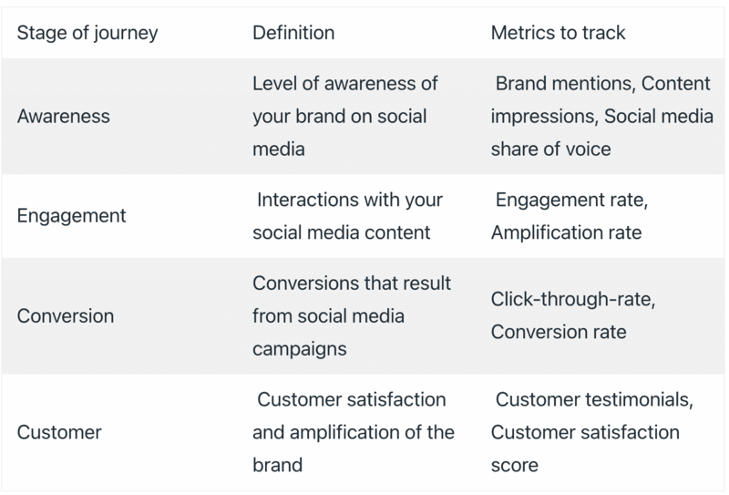
Once you have your goals, it’s important to focus on discovering what your customers’ goals are, so you can “figure out how your social media strategy connects both,” as Lee Odden, CEO of TopRank recommends. If you want people to pay attention to your content, the narrative should focus on them and not you—what value can you add to their lives? Which of their problems can you solve? To create such a narrative, you need clarity on your goals and your customers.
For instance, consider stem cell corporation LifeCell. Their goal was brand awareness among expectant mothers whose primary goal would be the safety and happiness of their children. So, they created posts that focused on the precious moments mothers share with their infants, like this one.
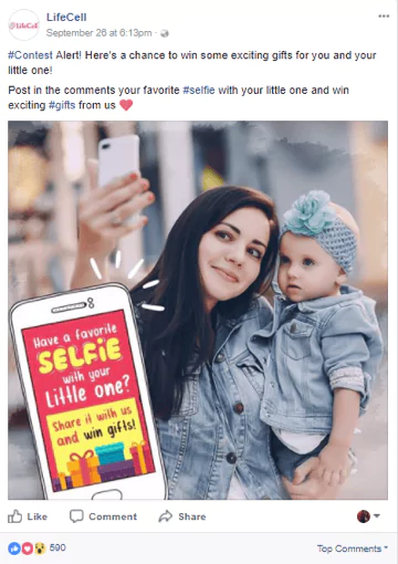
Target audience: Who is the ideal audience for this campaign? Most social media platforms provide options to filter your audience. Not all campaigns are designed to speak to your current customers—in fact, a good social media campaign should grow your audience and attract new followers. Think about the demographics and interests of your ideal audience, and target them accordingly.
Message: What is the main idea you’re trying to communicate with this campaign? Make sure your message is clear and focused. After all, attention spans are short on social media, so you’ve only got a few seconds to get your point across. Also, a word to the wise: Keep track of trending topics before delivering your message. A post that seemed like a great idea yesterday could be misinterpreted based on the news today.
2. Platforms and social networks
It’s never a good idea to spread yourself too thin by managing too many social media platforms. Especially if you’re a small business with limited budget and capacity, you’re better off choosing one primary social platform, so you can publish tailored content and fully participate in the responses you receive.
Facebook is a safe bet for most brands, since it’s become so ubiquitous. But for certain industries, such as fashion or food, image-sharing platforms like Instagram might provide a better rate of return.
Similarly, LinkedIn often works very well for B2B brands because it’s geared towards professionals. Research and choose a couple social media platforms that will best benefit your brand before starting a campaign.
To identify the best social media platform for your brand, you could simply survey your customer base or analyze your competitor’s social media presence. Choose the platform where most of your customers are active and where your competitors are receiving the best response. Alternatively, you could cross-post your social content to effortlessly create a multi-platform presence. Doing this manually is time-consuming, but an automation tool can simplify the process.
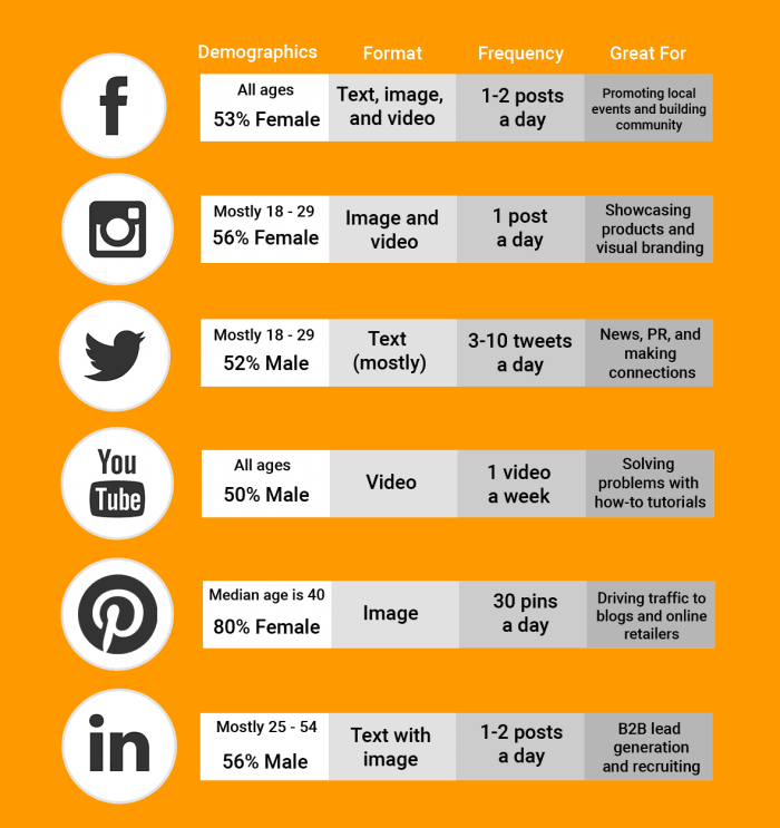
Source: Reaction.ca
3. Campaign timelines
Every social media campaign needs a definite timeline: a start date, an end date, and a publishing schedule. Without this, you won’t be able to connect your campaign to definitive results. Also, a timeline adds urgency and scarcity to whatever you offer during the campaign.
When creating a social media timeline, think about working in stages. Each stage can have its own content direction and outcomes. All of your plans can be documented on a campaign calendar. You can be more efficient by scheduling posts in advance, so you can review your content on a queued-up calendar and make any last-minute changes when needed.
4. Social media automation tools
Like a brand, running a consistent campaign is no joke. If you have time-sensitive plans, think about using a third-party tool for your publishing. There could be other features that matter to you, so it’s important to conduct some research before you decide to invest.
One example is DrumUp, a “set it and forget it” tool that can help with social media campaign management. If you decide to it, you can bulk-upload your social media posts from spreadsheets to libraries within the tool. Then, you can either custom-schedule your posts or queue up an automatic posting schedule. You can review upcoming posts in a calendar format and edit them any time before they’re published. Visit this post for a full list of social media automation tools.
5. Graphic design
Next, it’s time to create the actual content. For a coordinated campaign, you probably want to keep in mind the big picture when creating individual posts. You could begin by clarifying your core message. Once you have, you can create a “bucket of ideas” to work with for individual posts.
Keep in mind your ideal customer’s journey—how they move from awareness to conversion. You can then decide which format to create your posts in. Visuals work wonders when it comes to social media, where attention is sparse and distraction is plenty. If you aren’t sure what type of content you want to use, you could simply ask your audience, like IBM did.
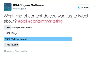
Worried about what your content will look like on different platforms? Use social media templates to make sure your graphics are on-point. Lucidpress has a whole gallery of social media templates sized to perfectly fit the platform of your choice, from Facebook and Twitter to Pinterest and Instagram. Upload your images and brand assets to your library, then edit the content with your brand colors and fonts. Creating social media graphics in Lucidpress is quick and easy, so you can have a full campaign designed in minutes.
Read more about designing social media graphics in Lucidpress here.
6. KPIs & tracking
Unless you continuously track the response to your content, you won’t have any points of reference to refine your social media marketing strategy. As people interact with your content, you can extract useful data based on their engagement. This data can prove useful in instances that aren’t related to social media marketing, such as product development and marketing on other channels.
Additionally, set KPIs alongside your goals, so you can measure your progress and assess the effectiveness of your efforts. Most social media platforms offer deep analytics, and there are third-party tools you can use to mine data. One of the tools I find useful is SimplyMeasured, because it offers several insights (in report format) for free. If you can’t log in to the tool on a regular basis, you could instruct the tool to send automated reports via email.
7. Social media management responsibility
Whether you’re a small brand with limited resources or a big brand with a large team, it pays to plan responsibilities in advance. Who will manage your social media campaign? Who will create the content, track the response, and interact with followers?
Some companies misjudge the amount of work involved in social media management. Content creation, community management, and analytics are demanding tasks that need people who can hustle, people who can stay on-point throughout the duration of the campaign. If you intend to outsource the work to an agency, you still need to track its progress. I recommend using Trello or Asana, so you can manage the review and approval process without having to waste time on calls and meetings.
8. Post schedule and cadence
The timing of your post matters a lot. It’s one of the most important factors in a particular post’s potential for engagement. To reach the highest number of people, content must be shared strategically to catch them while they’re online.
The peak times for various social media platforms are different. Conduct research to figure out the best times to post. There are tools like Facebook Insights and Followerwonk that can help you determine the right times to post.
9. Recycled content
You’ve likely noticed this: many popular pages will share the same content multiple times, continuing to earn engagement each time. Most followers will engage with the content without ever knowing that it was reposted.
It’s almost a given that your post will not reach your entire audience, so it’s not a bad idea to share the same content multiple times. However, do take time to review and make adjustments to the headline, description and image before sharing the content again.
10. Headlines and copy
People will read your headline before they decide whether to read the rest of your content. Your headline must be compelling enough to grab readers’ attention. It should contain a promise of value, information, or entertainment. Don’t forget, you’re competing with hundreds of posts from a variety of sources, so you’ve got to offer something exceptional.
Give yourself a leg up by testing your headlines. Don’t limit yourself to just one; instead, create multiple headlines and conduct A/B testing to see which one performs best. Then implement the winner across your campaign to boost your performance.
Not sure where to begin? Tools like Buzzsumo can help you research and discover high-performing social media posts.
11. Paid promotion
A little bit of advertising can go a long way. Most of the social media networks have a walled garden of advertising opportunities (as in they offer paid ad opportunities specific to that platform), which is great for anyone starting out with paid promotion. The key to ensuring a successful paid promotion initiative (and to refrain from wasting your budget) is to target specific audiences on specific platforms. So, place business ads for professionals on LinkedIn, or toss-up some self-serve ads on Instagram for Millennials. To dive a little deeper, we recommend checking out comprehensive article on social media advertising.
Ideas on developing your social media strategy
Want to kick butt and go viral on social media? Well you’ll need to establish a strategy. Here’s our recommendations as to how you can get started.
Research your competitors
Know thy enemy. Or something like it. Listen, you need to know who you’re up against (and why) — including what they’re doing well and what they’re totally dropping the ball on. So do some research. Create a shortlist, replete with similarities and differences. From there you’ll be able to plan how, where, when and why you’ll overthrow said competitor. Or you could just challenge them to a dance-off and see who wins.
Identify your content topics
Tempting as it might be to throw caution to the wind and just post whatever content comes to mind, we’d venture to say that you shouldn’t. Identifying content topics well ahead of time (and thus creating a content schedule) empowers you to use your time effectively and change gears should you discover that something’s not as effective as you’d like it to be. Plus, identifying content topics preemptively means you can bring more friends into the fold and ask for their assistance with visuals, copy and more. After all, no one likes being told “Hey I need your help but I’m not sure with what.”
Establish a visual identity and voice
Tragic as this might sound, recognition by association is what differentiates winners from losers. In other words, you want people to know who you are as it creates a winning environment. Therefore, by establishing a visual identity and voice, you create a foundation for recognition and success.
If you’ve been following Nest, you know they’re not your average home electronics company. Just check out the cool gadgets they make, and you’ll know what we mean, like:

Nest Learning Thermostat
Or this:

Nest Protect, a smoke & CO detector
But not only is Nest changing the home automation game, they’re also aces at marketing.
Recently, we had the chance to speak with the social media director at Nest to get the inside scoop on what makes for a successful social media marketing strategy.
Build a community
The first thing we learned is that Nest prioritizes community building. They do this by putting out a steady stream of social content that provides value for their customers. They’re also quick to retweet their customers’ content or respond to a comment by a customer who’s experiencing a problem.
Instead of thinking about what your business can gain from social media, think about what you can give. You could use social media to post helpful tips and friendly advice for your customers. This helps them get the most out of your product, and it builds the value of your brand. Here’s an example of this kind of post from Nest:
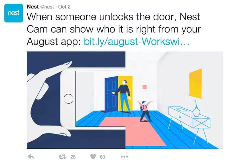
The more your approach to social media feels like a natural interaction between friends, the more success you’re likely to have. You want to build a community where customers share things they love with you, and you share things you love with your customers.
For example, Nest’s customers often mention them in tweets talking about how much they love using Nest’s products. Here’s one such tweet:
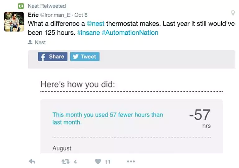
Happy customers give you free marketing and become your greatest assets.
Likewise, Nest is quick to share things they’re excited about, like this post that showcases a work of art a Nest user made to enhance their wall-mounted Nest thermostat:
A marketer’s dream: customers seeing your product as a work of art.
This is the zone where you want to be with your social media efforts. But how can you get there? You need to start by becoming familiar with your customers. This leads us to the next lesson from Nest, which is…
Use customer insights to inform your social media strategy
This is a simple principle, but that doesn’t mean it comes easily. To be personal and relatable to its customers, Nest needs to know them really well, and they’ve clearly invested the time to do so. You can’t help someone see how your product will contribute to the things they care most about without knowing what those things are.
Your customers and community should be the main consideration in your social efforts.
Nest has mastered the strategy of observing how their community is interacting and engaging with their social channels, then producing content that speaks to those interests.
What does this look like in action? One of Nest’s principal products is a smoke & carbon monoxide detector called Nest Protect. They recognize that their customers care about safety, and in response to that, they promoted a campaign to nominate local fire departments for a grant.

If you’re a local brand, consider looking for community causes you can get behind, then supporting them in a social campaign. It’s a great thing to do for your community, and it can help you gain some social media traction as well. Just make sure you’re sincere in whatever you do.
Additionally, all of Nest’s branding and content have a personal feel that gets to the core of what a good connection between the customer and company looks like. One of my favorite things that Nest does on social media is the Caught on Nest Cam video series, which consists of clips of funny or interesting moments captured by Nest Cams in the homes of actual customers. Here’s a good one:
With this social media effort and many others on Nest’s pages, they are using a technique perhaps best exemplified by one of my all-time favorite marketers: Apple. Though Apple is a huge company, they’ve managed to maintain a personal feel in their branding, and they often focus on the human element of their products.
Apple’s marketing shows their products integrating seamlessly into everyday life and enhancing the things that people care most about. Nest does the same thing by showing their products in people’s homes and providing the safety, peace of mind, and convenience that their customers crave. A recent ad by Nest did a great job of capturing the human element. It depicts a house as a speaking character talking about his experiences with the family.
Your business can do this, too. Think about the basic ideas behind why you started your business. What value does it add? How does it make people’s lives better? If you can answer these questions, then it’s just a matter of telling people about it.
If you own a sandwich shop and you think your food tastes the best and will make people happy, then post a photo of happy people eating at your shop, or your food bringing people together at a party. When you focus on your customers, your ideal strategy will become clear.
Customize the content for the platform
It’s not an easy task to customize your content for each social media platform, but if you’re serious about social media success, it’s a necessary investment. You should optimize the headlines, images, descriptions, and even your tone of voice to match the platform you’re posting on.
The same content that performs well on Facebook isn’t guaranteed to perform well on other networks. For instance, Twitter has a character limit. Instagram only supports certain image sizes. The tone you would use on LinkedIn is likely quite different from the one you’d use on Snapchat.
This is another good reason to limit how many social media platforms you choose. By focusing on the most important ones for your audience, you’ll have more time to craft content that feels native and authentic to the platform.
Embrace the visual
A recent study showed that visual content is 40% more likely to be shared than plain text content. And as you know, more shares lead to better reach and higher engagement.
Try to create attractive, eye-catching images not just for your brand’s profile but also for every single post. Try experimenting with different types of visual content such as infographics, memes, and so on.
In the case of image-sharing social media platforms such as Pinterest, Instagram and Snapchat, posts with poor visuals have no hope of attracting attention or engagement.
Ask questions
A great way to engage your followers is to ask questions relevant to them. Everyone wants to share their opinion, and the comment section is a good place for you to connect and interact with your fans. It helps your brand feel more human and build more personal connections.
There are plenty of creative ways to ask questions to your followers. Create a poll, a quiz, a would-you-rather, or a trivia question to stimulate conversation. Make sure someone is watching the discussion to keep it focused and productive—and to remove inappropriate comments if necessary.
Reach out to influencers
According to this study, an average return on investment for an influencer marketing campaign is $6.50 for every dollar spent. This speaks to the power of influencers and influencer marketing.
There are hundreds of influencers on social media platforms today, and each of them has curated a unique audience. Contrary to popular belief, you don’t have to find influencers with millions of followers to be effective. You’ll probably find that the best results come from partnering with influencers who share an audience similar to your own, so dig into your niche and make a shortlist.
Wrapping up
Finally, it’s important to consider roadblocks in advance. Social media is a constantly changing landscape, so be prepared to forecast and preempt potential disasters. Check whether the dates you’ve selected clash with any meaningful holidays, and consider whether your content has the potential to bump into sensitive issues. By considering this in advance, you can set yourself up for success.
Ready to make your own social media posts? These free social media templates are a great starting point.
Summoning creative inspiration can be a little like eating peanut butter on saltines while you’ve got cottonmouth. In other words: It can be difficult.
If we’re being completely honest, it’s safe to say that some days are just harder than others. And on those days, it’s easy to feel lonely in your pursuit of content marketing. But here’s the thing — you’re not. You don’t have to fly solo or reinvent the wheel. There’s a whole big world of marketing experts out there, replete with wonderful knowledge, sage advice and whatever else you can dream up.
So whether you’re crafting up a blog post like yours truly here, designing a bland (but “make it inspired!”) marketing brochure or wrangling some content for social media, you can look to our listicle of marketing quotes to get you jump-started — or to share with others!
Famous marketing quotes
“People don’t buy what you do, they buy why you do it.”
Simon Sinek
“Instead of interrupting, work on attracting.”
Dharmesh Shah
“I’ve learned that people will forget what you said, people will forget what you did, but people will never forget how you made them feel.”
Maya Angelou
“Good marketers see consumers as complete human beings with all the dimensions real people have.”
Jonah Sachs
“Our job is to connect to people, to interact with them in a way that leaves them better than we found them, more able to get where they’d like to go.”
Seth Godin
“Marketing is really just about sharing your passion.”
Michael Hyatt
Branding marketing quotes
“It’s quite fun to do the impossible.”
Walt Disney
“Behind every piece of bad content is an executive who asked for it.”
Michael Brenner
“A brand is no longer what we tell the consumer it is — it is what consumers tell each other it is.”
Scott Cook
“Making promises and keeping them is a great way to build a brand.”
Seth Godin
“Your brand is a story unfolding across all customer touchpoints.”
Jonah Sachs
“Do one thing every day that scares you.”
Eleanor Roosevelt
Social media marketing quotes
“Content is fire, social media is gasoline.”
Jay Baer
“Social media is about sociology and psychology more than technology”
Brian Solis
“Build it, and they will come” only works in the movies. Social Media is a “build it, nurture it, engage them and they may come and stay.”
Seth Godin
“Social media is about the people. Not about your business. Provide for the people and the people will provide for you.”
Matt Goulart
“Social media requires that business leaders start thinking like small-town shop owners. This means taking the long view and avoiding short-term benchmarks to gauge progress. It means allowing the personality, heart, and soul of the people who run all levels of the business to show.”
Gary Vaynerchuk
Content marketing quotes
“You can’t sell anything if you can’t tell anything.”
Beth Comstock
“Content builds relationships. Relationships are built on trust. Trust drives revenue.”
Andrew Davis
“Not viewing your email marketing as content is a mistake.”
Chris Baggott
“Whether B2B or B2C, I believe passionately that good marketing essentials are the same. We all are emotional beings looking for relevance, context and connection.”
Beth Comstock
“What separates good content from great content is a willingness to take risks and push the envelope.”
Brian Halligan
“Quality content means content that is packed with clear utility and is brimming with inspiration, and it has relentless empathy for the audience.”
Ann Handley
Storytelling marketing quotes
“Marketing is no longer about the stuff that you make, but about the stories you tell.”
Seth Godin
“Good content isn’t about good storytelling. It’s about telling a true story well.”
Ann Handley
“I’ve learned that people will forget what you said, people will forget what you did, but people will never forget how you made them feel.”
Maya Angelou
“If your stories are all about your products and services, that’s not storytelling. It’s a brochure. Give yourself permission to make the story bigger.”
Jay Baer
“The most powerful person in the world is the storyteller. The storyteller sets the vision, values, and agenda of an entire generation that is to come.”
Steve Jobs
At the end of the day
“Inspiration doesn’t respond to meeting requests. You can’t schedule greatness.”
Jay Baer
Your brand needs to go the distance. A memorable brand shows up for their customers. But, cultivating that type of experience is a whole other story. Because regardless of your role in marketing or what type of marketing content you’re creating, knowing and understanding the effectiveness of your content is the key to being “that brand” for “that customer — learn more about what constitutes effective content and how to begin nurturing it for your brand.
Telling the right story for your brand can connect you with customers and help your brand grow. But good storytelling, like any other skill, is something you have to work at. So, we asked around and got storytelling podcast recommendations from fellow marketers who love a good yarn. Here are the top 12 picks, including a few of our own favorites.
1. Building a StoryBrand

Building a StoryBrand is lauded for its entertaining episodes and inspiring insights. Donald Miller brings in big names like Matthew McConaughey and Seth Godin to talk about storytelling and crafting clear messages that will speak to your customers.
This podcast came highly recommended by Trevor Rappleye, the CEO of CorporateFilming, who said Building a StoryBrand will help you simplify your message and drive sales.
Listen to Building a StoryBrand
2. All Selling Aside
This podcast is for those who find themselves in the unfortunate position of having to sell when they actually hate selling. Host Alex Mandossian will walk you through different strategies to use the power of storytelling to achieve your sales goals.
Carol Tompkins, Business Development Consultant for AccountsPortal, recommends All Selling Aside because “it focuses on teaching consultants like myself, as well as other professionals, how to ethically influence others both personally and professionally, rather than just focusing on selling all the time.”
3. Be The Drop
Be The Drop is all about the intersection of business and good communication, and it’s sure to lift your mood. The show hosts diverse guests each week to hear how they inspire and motivate the people around them. This recommendation also came from Carol, who said that Be The Drop can ultimately help you manage your business more effectively by improving your communication skills.
4. Business of Story

Business of Story is another great bet for brand storytelling highlights. There are nearly 300 episodes, and the show even won a “Best Small Business Podcast” award in 2017. It comes recommended by John Peterson, editor at Safe Drive Gear. He told us Park Howell’s show features “brilliant business owners and entrepreneurs, handpicked influencers, startup founders, and more. The topics are always inspiring, and it leads you to astounding discoveries.”
5. Under the Influence

This popular CBC Radio program was recommended to us by Kevin Carney of Organic Growth. He says, “It’s my absolute favorite podcast about marketing and advertising, as it talks about strategy, not day-to-day tactics.” This pod isn’t specifically about storytelling, but it offers a behind-the-scenes look at the ad industry that’s sure to leave you with some interesting anecdotes.
6. The Employer Branding Podcast

The Employer Branding Podcast offers an international take on branding in business. This recommendation came to us courtesy of Dwight Zahringer, President of Pure Cabo. He says, “Weekly episodes are 20 minutes long and super digestible, covering tons ofbranding topics with a human focus. Plus, they interview some pretty cream-of-the-crop guests from Fortune 500 companies like SalesForce to L’Oreal to Deloitte. So you’re really hearing the best insights.”
Listen to the Employer Branding Podcast
7. How Brands Are Built
This podcast offers a view of the nitty-gritty, everyday details of branding. Also recommended by Dwight, he told us, “How Brands Are Built is fantastic for understanding how to share and build momentum around your origin story. Rob Meyerson interviews an eclectic group of folks for his episodes, from marketing analysts to logo designers. You really get a 360-degree view of what’s involved in a persuasive original story, plus how to share it for max impact.”
Listen to How Brands Are Built
8. Business Storytelling Podcast

The aptly named Business Storytelling Podcast hosted by content marketer Christoph Trappe will show you how to harness the power of stories to get results. Emma Bourke, CMO at Zodiac Guides, told us this podcast “provides invaluable tips … with content that’s relevant, engaging and educational.”
Listen to Business Storytelling Podcast
Editors’ Picks
We also wanted to throw in our own top picks to get your storytelling juices flowing. Without further ado, here are some of our faves, including some outside-the-box recs and Lucidpress’s very own podcast.
9. The Visual Storytelling Podcast

The Visual Storytelling Podcast can help you round out your storytelling skills with a fresh point of view. This podcast from Disney Artist Chris Oatley will walk you through how visual artists tell stories. Touching on subjects like children’s stories and character development may have surprising impacts on your own storytelling endeavors. If anything, it’s a nice break from the world of business podcasts.
Listen to The Visual Storytelling Podcast
10. On Writing

On Writing will give you a different perspective on storytelling and can help you refine your techniques. Host Joshua Pomare talks to writers of all stripes to dig into the writing and publishing process. If you want tips from the true pros of storytelling, this is the podcast to listen to.
11. Nonprofit Storytelling Living Room

This limited series features speakers from the Nonprofit Storytelling Conference with eight different episodes doing a deep dive on how to use storytelling to accomplish your nonprofit’s goals. It’s one of the best industry-specific shows we’ve come across and can help you craft engaging stories for your audience.
Listen to Nonprofit Storytelling Living Room
12. Brand Land
Well, well, well, what have we here? Yes, it’s our very own podcast, Brand Land. Our Director of Marketing, Garrett Jestice, talks to a new guest every week from diverse fields. The show is all about how to build a trusted brand, and each guest brings their own unique insight to give you tips on brand strategy, content creation, customer experience, storytelling and more.
Many of the current tactics used by tech marketers are falling short of leading to sales. But here’s the thing, there’s often not enough focus on strategy. If you’re finding that your team is great at digital marketing but doesn’t know much about traditional marketing, then you’ve got a problem.
Marketing in today’s world shouldn’t be traditional versus digital. Yes, your marketers need to know about SEO, email marketing, content marketing, etc., but they also need to have a foundation in marketing mix, messaging and the other good stuff that traditional marketing is founded on.
Tech marketing really isn’t that different from marketing for any other company in a different industry. It just takes a little translation to apply it to your business. So, we’ve found seven great strategies to help your team change the way you approach tech marketing, starting with the most fundamental elements of any marketing strategy.
1. Build a strong brand
Branding is one of the most important aspects when it comes to tech marketing. In fact, 60% of brands believe maintaining a strong brand is important when generating leads. It’s crucial for every business out there — your brand is what people will remember most about you. But remember, tech company branding isn’t just about logos and pretty designs; it’s about delivering your company’s mission in a concise way. It’s showing off your personality and telling people you live up to what you promise. With a strong brand, you’ll see a surge in new leads, customers and conversions.
Here’s where to start with renovating your brand:
- Set brand guidelines
- Offer your team a branding masterclass
- Provide branding resources
- Think beyond your website
When correctly implemented, your brand will establish credibility and trust with potential and current customers. Ultimately, a strong brand has a trickle-down effect, boosting your bottom line, employee morale and brand status.
2. Identify your target market
A crucial element to any tech marketing strategy is your audience. You cannot, I repeat, cannot have any marketing strategy, tactic, mission, product … anything without knowing and understanding your target market. Your target market answers fundamental questions that, in turn, influence almost everything you do in your company. Knowing and understanding specifics like what messages resonate with them or what channels will best connect you to them will pave the way for your tech marketing strategy.
Dive deep into the demographics: who your market is (age, ethnicity, gender), where they live, what industries they work in, what they care about, etc. If you don’t know these specifics, nothing else we say from here on out can help. You have to know who you’re creating a product or service for in order for it to work effectively.
As you begin to answer who your target market is, you can then move on to what channels they interact with most and then to what tactics you can use to deliver your message. Getting to know your target market and understanding how your product solves their problems will get you on the right path.
3. Create more effective content
The number of ads a single person may encounter in one day has grown exponentially in the last 20 years. Breaking through that noise to strike a chord with a potential customer can be difficult. And not all of those ads are effective — a lot of them are simply background music that people scroll or swipe past. Sadly enough, 60% of consumers believe that branded content is totally useless. Oof.
Don’t be part of that 60%. Make a point to create more effective content. If you’re not sure whether or not your content is effective, try this simple test we’ve put together.
If you find that your content isn’t as effective as you hoped or assumed, or if you’re just wanting to learn more about how brand templating can help you grow your business, check out our free eBook: Brand templating: How creating more effective content gets results.
4. Host or attend live events
Because audiences are inundated with digital marketing and ads, it’s more important than ever to include face-to-face interactions. Many tech buyers want to get to know you personally in a way that only IRL interaction can provide, and hosting a live event can help. Additionally, integrating live events into your tech marketing efforts can do the following:
- Heighten brand awareness. Sometimes, the biggest challenge when you’re starting out is simply getting noticed. Live events help you showcase the “wow” factor of your product.
- Provide leads. If you’re a more seasoned business, generating leads face to face can be critical for you. Before attending the event, make sure to reach out to key prospects to drive attendance.
- Strengthen customer engagement. Live events can provide an informal, low-pressure environment where you meet and greet current customers. This strengthens your relationships with them, leading to customer loyalty and retention.
- Educate. Educational content and workshops are some of the most effective live event marketing solutions. Workshops can draw in current and potential customers.
Promote the event heavily on social media and stay active and engaged on your social platforms before and after the event.
5. Enable automation
To stay on top of contacting potential leads for your tech marketers, you’ll want to invest in tech marketing automation tools. Automated systems can collect leads, build a marketing pipeline, segment contacts, and market to them on a consistent basis. Marketing automation can help you nurture, qualify, and pass leads from your tech marketing team over to sales when they’re ready. This is an essential tool since pre-sales and sales cycles can last anywhere from weeks to months. Finding the right automation tool will depend on the size of your company, along with the target buyer and the nature of your product.
A few tools you can check out to get you started are ActiveCampaign, Marketo, Pardot, Oracle Eloqua or Mautic.
6. Include influencer marketing
A recent turn in digital marketing is the reliance on influencers to help promote services and products. Business leaders and decision makers are starting to turn to experts in their fields as they evaluate new technologies. A partnership with an influencer or two can help up your credibility and your social media reach.
If you’re like me, you can see the benefits of reaching out to an influencer to help market your product or service. I follow experts and sometimes non-experts to help me when it comes to buying just about anything these days. I’d rather not spend the time doing the research. So if someone else already has done it, then you bet I’m going to take their word for it and invest or buy whatever they’re promoting. My Amazon account can prove it.
Decision makers are beginning to rely more and more on others they trust (or just simply admire) to share their experiences with a solution, platform, product or service before they invest in it. This creates an incredible opportunity for you to leverage influences who already have a loyal following to help market to your target market.
7. Harness video content
Video content has become an extremely prevalent marketing tool for tech companies. Some people just don’t have the time to go through a product datasheet, but we all have a minute or two to watch an engaging, entertaining video about a valuable solution. Here are some areas to focus on when producing original content:
- Great stories. Focus on telling a compelling story. Walk your viewers through how you specifically helped a customer get from point A to point B. Make sure to keep things as simple as possible. You can get into specifics during a sales call later.
- Fun concepts. We know you’re in the tech industry, but that doesn’t mean your videos have to be technical too. Creating humorous videos will help you stand out from the crowd.
- Useful content. As you strive to be funny, don’t forget that your video should also be useful or educational. Your video could be anything from a tutorial or product demo to industry best practices.
- Testimonials. Client testimonials are a powerful tool in marketing. They give potential customers a moment to see a business similar to theirs finding a solution. “If it worked for them, maybe it’ll work for us,” is the mentality.
Whether you choose to implement one or all of these strategies, we know you’ll start to see a shift in your marketing approach overall, along with lead generation. Although simple, these strategies could equal that secret sauce you’ve been needing to change your tech marketing from meh to wow!
And don’t forget to grab our free, mini-ebook Brand Templating: How creating more effective content gets results.
Data-driven decision making has gained increasing importance in marketing over the past few years due to the high availability of tools and sophisticated Martech stacks. The results? A level playing field that allows even small businesses to measure and act on customer data. It seems that nearly all companies are doing all they can to gather more market research and sales data — and what they can do to understand data implications better and apply it more effectively.
According to the joint survey published by the DMA and Winterberry Group, 40% of marketers said their companies intended to increase budgets for data-driven marketing somewhat and/or significantly. The most common marketing applications for data-driven decision making include customer journey analysis, A/B testing and personalization. While all of these are influenced by content, 44% of the respondents specifically chose copy optimization.
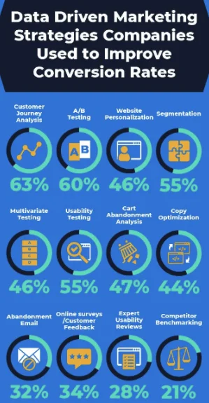
Source: https://www.invespcro.com/blog/data-driven-marketing/
There are undoubtedly countless benefits to relying on data to guide all types of strategies — but when it comes to content marketing, applying data insights can feel somewhat complicated. From what we’ve seen, marketers consistently struggle with proving ROI for content, and it seems that applying data insights can cause additional issues.
Before Covid-19 made a mockery of all surveys, opinions and empirical findings, the WARC reported in 2019 that big data management and digital transformation were among the top three challenges marketers faced across the board.
This finding leads many marketers to wonder — do all content marketing decisions need to be driven by data? What is the data’s place in developing and executing a successful content marketing strategy?
To that end, we’ve compiled a list of need-to-knows that all marketers must consider when applying data to the content creation process.
Content marketing doesn’t always deliver measurable results
One thing that sets content marketing apart from other strategies is its intention. More often than not, content creation aims to cultivate brand awareness and help customers along their journey rather than directly influencing sales.
Marketers use digital formats like blog posts, podcasts or content hubs to support the site’s overall searchability and drive in organic traffic. The most common use cases for these platforms is to highlight best practices, demonstrate product capabilities or engage existing customers. But the content isn’t necessarily intended to explicitly sell products or services — it’s more so designed to educate and inform. Many additional elements in the marketing mix lead to desired outcomes, like a conversion or however your org establishes an MQL.
Keep in mind; the modern customer journey isn’t as linear as it once was — it may take your customer up to seven separate interactions with marketing content before they even remember the brand, let alone convert.
Additionally, results aren’t always concrete. Despite the great availability of precise data from lead gen and sales-specific digital marketing channels, attribution modeling for conversions and pinpointing the exact touchpoint where a customer makes a purchase decision can be trying due to inconsistencies between the channels’ engagement data.
Content marketing is simply a building block along the customer journey — and it’s not always possible to zero in on where it fits best along the way.
What kind of (and how much) data do you have?
“Let data dictate the content you create,” is a frequent and over-used piece of advice dished out by marketing experts and keynote speakers in the industry.
The reality of data collection and application, as we all know, is different.
Now, this isn’t to say that it’s entirely impossible to utilize data when making decisions relative to content marketing. But all data is not equal — some are more relevant (and accurate) than others. Therefore, marketers must understand the difference between qualitative and quantitative data and how to use them effectively.
Quantitative data is the “hard” data points that are easily measured and organized. This includes statistics like costs, traffic numbers or sales revenue. Quantitative data is often the one that executives are most concerned with. However, quantitative data is merely just a small part of the puzzle.
Qualitative data is harder to organize, but it is equally (if not more important) than quantitative. For marketers, qualitative data points include influencer opinions, prospect intent and audience information from social media and review platforms.
Proving a direct correlation between qualitative content marketing and sales can be challenging. But other metrics like online traffic, brand recognition and customer sentiment can be cohesively and easily tied to content campaigns. Therefore, it is solidifying the importance of measuring and conveying this type of “soft” data and hard numbers when it comes to strategic planning.
One way to correlate soft data is by analyzing information like reviews or market research to measure overall sentiment before and after a campaign is completed. Using a structured process for sentiment analysis and noting any positive or negative shifts in overall remarks or ratings can be one way to prove the influence of content.
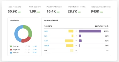
Source: https://www.semrush.com/features/brand-monitoring/
Take full advantage of technology
Thankfully, it’s become easier for content marketers to utilize available technology — like AI and machine learning — to make more data-driven content strategies.
Plus, good business leaders see the true value of investing in martech. An Adobe study on digital trends noted that top-performing businesses were twice as likely to use AI in their marketing strategies than their competitors. Even in hardcore sales (which is generally considered the antithesis to content marketing), the adoption of AI and automation technologies is predicted to increase by more than 100% as per Salesforce’s State of Sales report.
This is great news for content marketers who have long struggled to understand the data’s place in their work. New tech platforms and measuring systems make it easy to gather, organize and track metrics more accurately. What’s more — AI-enabled predictive algorithmic forecasting lets marketers precisely chart out trends and their impacts across industries in business, government and non-profit.
Correctly utilizing predictive analytics makes a content marketer’s job easier. A simple example is how marketers use Google Trends today to spot upcoming keyword trends and decide topics and themes on which to create content. Another content planning martech tool is MarketMuse, which uses AI to determine the topics that might work best for your site as well as the keywords that can generate the most traffic.
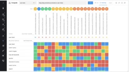
Source: https://www.marketmuse.com/
Finding balance
Although technology is becoming more common and prevalent in the content creation process, marketers need to understand its place in the overall scheme of things. Ultimately, content marketing relies on creativity and empathy, which algorithms and AI struggle to provide.
Data certainly has its place, and it can be used to support content marketing, but it must not be the end-all, be-all. As data tools become more popular to use throughout business strategies, marketers must learn how to balance their so-called human skills with technology to improve the content’s quality and results.
Customers want personalized and humanized content. So when content’s only purpose is to sell, it will likely be unsuccessful, so companies who continually dig for ROI from content marketing in terms of dollar value may be disappointed.
After all, Gary Vaynerchuck once famously asked, “What is the ROI of your mother?”
Like a relationship, content marketing is a series of conversations, and you can never assign a dollar value to each person-to-person conversation, be it parent-child or brand-customer. Consumers can sense when a piece is merely promotional and are often turned off by it. So, although an AI tool can gather hard data to “learn” about consumer segments, a content marketer is the one who actually “understands” their audience. Ultimately, it is up to content marketers to convey the value they offer without tying it directly to monetary gain.
Visual communication and storytelling are critical for any business in this day and age of social media and short attention spans. Infographics are a popular way to visually share information, but creating an effective one isn’t easy. This guide will walk you through what you need to know to understand what an infographic is and provide tips to create a great one.
Related: Infographic stats that prove infographics aren’t dead
What is an infographic?
In the simplest terms, an infographic is a visualization of data or information. Infographics can take on many different layouts but ultimately include visuals, charts, icons and brief sections of text to convey an idea.
Like any piece of content, every element used should help contribute to the reader’s overall understanding of the topic rather than simply being an addition to the content already there.
Take this infographic as an example. The design uses a road to direct the reader to each piece of information, but it also does more than serve as a visual cue. A quick glance immediately tells the reader that the infographic is about movement and transportation. The visuals of the car and bus quickly help the reader know where to find information about a specific type of transportation. The copy is brief and to the point building off of the message the visual has already created.

Why use infographics?
Creating an infographic should never be an end unto itself. Instead, carefully consider which medium makes the most sense for the content you are trying to create.
Creating an infographic makes sense when you have:
- A set of data to visualize
- An idea you need to summarize quickly
- A complex idea you want to explain through visual representation
- Two topics to compare and contrast
- A timeline or roadmap
- A checklist or process to follow
Infographics can be used across a wide variety of use cases and contribute to many goals.
Infographic examples
Marketers seeking to drive awareness of a brand or drive backlinks to their website can create infographics with unique stats and data. By presenting this data in a visual form, it not only makes the research more compelling but also makes it easy for other blogs or publications to share your infographic and link back to your website as a source. For example, this infographic provides interesting comparisons and stats from Marvel movies that only a fan willing to watch all of the movies and count the stats could create making it a unique piece of content to reference.
Marketers can also use infographics to create useful educational content for potential customers. For example, a company that sells cookware could create an infographic showing how to create a specific recipe. The graphic is then easy to promote on social media or in a blog to help drive brand awareness and loyalty.

Business owners can also use infographics to tell their stories to investors or provide a product comparison to potential buyers. Here you can see an example of a simple timeline infographic showing how a company has grown over the years.
A geographic infographic like the example below can show how many customers a business has or how many countries it’s located in.
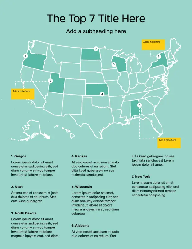
How to create infographics
Once you’ve decided that creating an infographic is the right medium for your marketing content, how do you go about creating a high-quality infographic?
Lucidpress offers a video tutorial with our professional designer that can walk you through the process in our drag-and-drop infographic maker. We also offer a variety of free infographic templates to get you started and outline best practices for designing infographics below.
Infographic outline
Start by creating an outline to help you focus your topic and stay concise.
Create an outline with the following
- Objective: what do you want to achieve with the infographic?
- Audience: who is the content being written for?
- Bullet points of the content or data you want to include
- Selected fonts and color palette
- A couple examples of infographics for inspiration
- Promotion channels: where will the infographic be published and promoted?
Once your outline is completed, you’re ready to start putting the infographic together. In general, an infographic should include the following elements.
Elements of an infographic
Explainer: Brief introductory text that explains what the infographic is about. Being concise is critical. Using complete sentences is not.
Sections: Create separate sections for each idea. Use icons, color and lines to clearly separate each section.
Explanatory Text: Use copy to briefly describe the idea for each section. The copy should support the graphic not the other way around.
CTA: Include a call to action at the end of the infographic to move your reader to the next step.
Headline: Write a brief, compelling headline
Subhead/Labels: Use subheads and labels for each section, icon and chart.
Backbone: Use a unifying design element that ties your infographic together.
Sources: Briefly cite your sources at the end of your infographic.
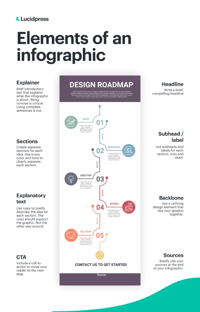
Types of infographic designs
While there are no hard and fast rules of how an infographic must look, infographics tend to fall into specific categories and layouts that can serve as a starting point for creating your infographic’s backbone and defined sections.
A timeline or roadmap layout uses a single, visible line either straight down the middle or on a meandering path to guide the reader from one point to another. A checklist or visualized article style infographic, uses a series of icons or visuals to organize information. Typically, a comparison-style infographic will use a symmetrical layout forming a natural line down the center of the graphic. To learn more about different types of infographics, visit our in-depth guide.
Infographic design best practices
Follow these design best practices to create a professional-looking graphic that is easy to read.
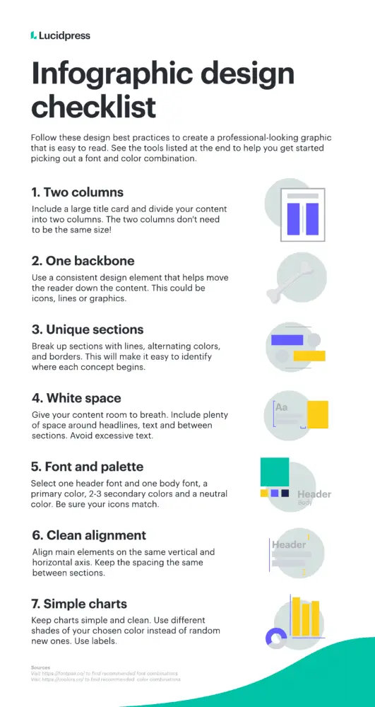
Two columns & a backbone
For beginning designers, divide your infographic into two columns with a large title card on top. Remember, the two columns don’t need to be symmetrical. Next, form a background with a single design element that helps the reader move through the content. A backbone can be made of a line, icons or visuals.
Clearly-defined sections
Just like a paragraph in a blog post, divide your infographic into specific sections based on topic. Distinguish each section by breaking them up with lines, alternating colors or borders. Each section should have a main subtitle or label and accompanying icon or image.
White space
White space is any area that is left free of any text or design element. White space gives your content room to breathe making it easier to consume and more visually appealing. Include plenty of space around headlines, between sections and avoid extensive text.
Font and color palettes
To start, keep your font selection and color palette simple. Use one font for the headline and one for the body. Your color palette should include one primary color, 2-3 secondary colors and a neutral color. Neutrals are typically white, black or gray. Be sure to use icons that match your color palette and have a similar style to each other.
Clean alignment
Once you have a draft of your design done, go back and make sure all main elements align on the same horizontal and vertical axis and that spacing is the same between each section. A perfect alignment will make the final design more professional.
Simple charts
Keep any charts or data you add to the infographic simple and clean. Be sure to stick to your color palette by using different shades of your chosen color rather than adding in a random assortment of colors. Always include labels with the chart, so the reader can understand the topic of the data.
Data visualization strategies
Using an infographic to visualize data is a common use case, but creating data visualizations that are useful and easy to read is its own art form. Selecting the correct chart for the data you are displaying will go a long way in making your infographic effective.
Types of data visualizations
Line chart:
Use to compare data over time.

Bar chart:
Use to compare quantitative data from several categories.

Scatter plots:
Use to show relationships between two data sets.

Pie charts:
Use to show parts of a whole. These should not be used for comparisons or changes over time.

Additional data visualization tips:
- Only include the data that’s necessary
- Avoid complicated visuals with multiple lines and charts
- Create the chart to have one specific takeaway that’s immediately obvious
- Avoid the overuse of data labels and keep the background simple
Infographic publishing & promotion strategies
Once your infographic is designed, it’s time to publish and promote.
When publishing your infographic, remember the following:
- Size the infographic to fit the width of the page
- Link the infographic to a full-resolution version of the image
- Use an embed code generator to allow others to easily share and link back
- Add a “pin it” button if relevant
- Include crawl-able copy for search engines
Your infographic promotion strategy should ultimately be defined by your objectives. A few to consider:
- Share the infographic image on a relevant social media channel
- Split the infographic up into smaller sections to promote on social channels
- Reach out to blogs/publications with similar content and offer the infographic as part of a guest post
Ready to start
Ready to get started creating your infographic? Lucidpress offers a free infographic creator with free infographic templates to choose from to help you level up your infographic design.
Infographic design doesn’t need to be overwhelming. Like other types of content, infographics follow typical structures and layouts as a starting point for arranging your copy and visuals. Instead of jumping right into your infographic design, start by determining which layout works best with the type of information you want to convey.
We’ll walk you through nine different styles of infographics and what information they’re best for.
Related: What is an infographic? A comprehensive guide
Timeline infographic
A timeline infographic is the best layout to use when you’re showing the history of something, placing events in chronological order or showing the steps of a project plan. A timeline can be arranged along a vertical axis as shown in this example.

Or it can be displayed horizontally like in this example.
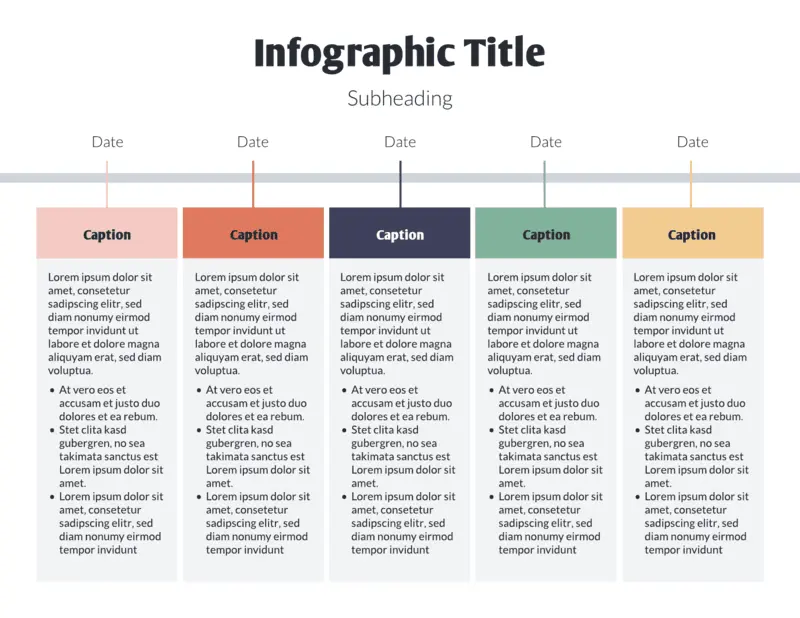
Tips for creating a timeline infographic:
- Choose a consistent cadence for your dates. Either show a timeframe over days, weeks, months, years or decades.
- Use visual cues to move the reader through the infographic. An icon representing each development in the timeline or a change in color can help distinguish each section.
Comparison infographic
Coke vs. Pepsi, pancakes vs. waffles — sometimes a direct comparison is the best way to help your audience make a decision. A comparison infographic has a symmetrical layout that compares two different options on the same data point. Comparison infographics can be used to compare your product to a competitor’s or to help a customer understand the differences between two products you offer and decide which option is right for them.
A comparison can include small sections of text on specific topics or if you have data, use charts and graphs like in the following template.
Tips on creating a comparison infographic:
- Be sure you’re able to make a direct comparison by choosing attributes both options have such as price, color or relative popularity.
- Avoid creating a list of random facts with no relation to each other.
- Use a centered section of text for any general commentary or context to help distinguish it from the two-columned comparisons.
Roadmap infographic
A roadmap infographic layout works best for anything with a start and end point, such as the steps of a process or project milestones. You can use a large icon to represent each step in the road map like shown here:
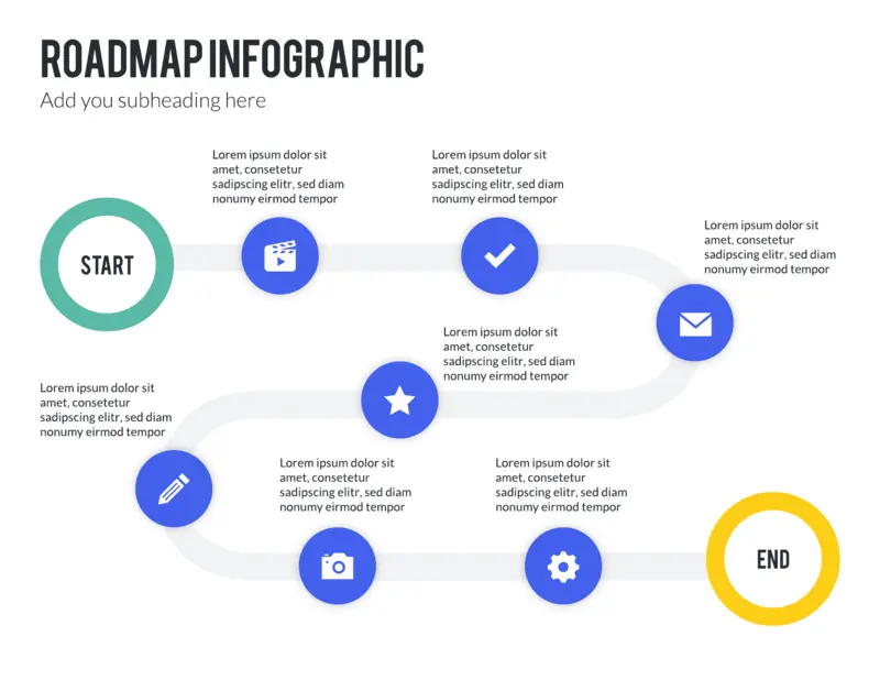
Or combine icons with a numbered list as shown in this roadmap infographic example:
Use this infographic template
Tips on creating a roadmap infographic:
- Focus on a series of stages rather than an exact timeline.
- Create a visual start and end point.
List infographic
A list infographic layout has a broad range of use cases from creating a checklist of things to do, to explaining how a process works, to creating a list of the top 10 reasons to create an infographic. A list can be arranged vertically like a traditional checklist.
Or you can alternate the copy and image for each section like in this template:
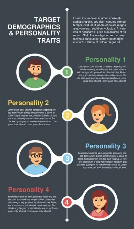
Tips on creating a list infographic:
- Use visual cues that represent each element of the list.
- Use a larger color palette of harmonious covers to differentiate each part of the list.
Geographic infographic
A geographic infographic works for any comparison or dataset specific to location. The infographic uses a map of the continents, countries or states you’re describing as the main data visualization element. Use lighter and darker shadings within the map to visualize differences.
Small callout boxes or reference points can be used to provide additional context and information.

Tips for creating a geographic infographic:
- Use darker and lighter shades of the same color to indicate a greater or lesser amount like population density.
- Use different colors to show different categories like red and blue states on an election map.
Numbers-heavy infographic
A numbers-heavy layout combines multiple types of graphs and charts to tell a story with data. This layout works best for summarizing a research report, synthesizing data to support an argument or sharing data that’s entertaining or insightful.
Charts can be relatively simple such as a scorecard or bar chart.
Or you can get creative and use visuals specific to the data set, such as a graph made up of a person icon to show population density.

Tips for creating a numbers-heavy infographic
- Be selective about which data you include. Every point should work together to tell a holistic story.
- Keep your graphs simple and stick to your color palette.
- Use subheads and labels to help the reader understand what the graph is about.
Article summary infographic
The article summary layout works best for providing a brief overview of a blog post or other in-depth article. The layout provides plenty of space for copy while incorporating imagery to create some visual interest. Each section can cover a different topic discussed in the longer article. This type of infographic is great for repurposing content to post on social media or send in a sales email.
An alternating layout can work best for disparate points that don’t necessarily build off each other in a particular order.
A linear layout works for summarizing a series of points or sequential steps like in this explanation of the taxation process:

Tips for creating an article-summary infographic:
- While this type of infographic will have more copy than other layouts, keep content as succinct and scannable as possible.
- Focus on the key points in the infographic and point the reader to the full article for additional anecdotes and examples.
Resume infographic
A resume infographic tells the story of a person’s work experience and professional skills in a visual way. Common uses include adding icons to represent each section, using charts to show relative experience with certain tools or incorporating a timeline. Job seekers in creative fields will frequently use this layout to stand out in the pile of resumes.
Tips for creating a resume infographic:
- Be sure to still include all of the necessary information for a recruiter to evaluate you. Keep graphics and illustrations simple.
- A less-is-more mentality works best when creating a resume.
Visual backbone infographic
This type of infographic uses a single large image as the center backbone of the piece with each point or data set breaking down one component of the visual. This style is best to use when visualizing parts of a whole, like interesting facts about a building or the layers of a sandwich.
For example, this infographic uses an illustration of the body as the center backbone and then uses symmetrical callouts to describe points relevant to different parts of the body.
This layout example uses layers of a hamburger to discuss interesting stats about the fast food industry.
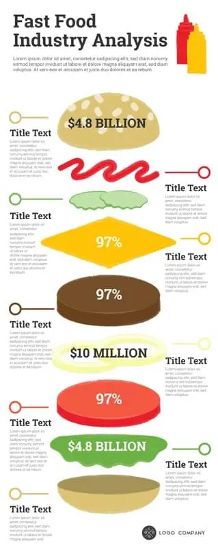
Tips for creating a visual-backbone infographic
- Choose visual that can be broken down into multiple relevant parts
- Place the visual in the center with sections of explanatory text placed evenly on each side of the image
In summary
Feeling empowered … overwhelmed? While creating infographics does require some extra lift, remember that eye-tracking studies show internet readers pay close attention to information-carrying images. In fact, when the images are relevant, readers spend more time looking at the images than they do reading text on the page. So get your audience engaged!
Sign up for our free infographic maker for an easy design tool and free templates to get you started.
Recipes are relatively easy to follow. They’re designed to be replicated and, to some degree, guarantee an element of success. Take chocolate chip cookies for example. They’re hard to screw up and generally liked by most folks.
The same concept applies to marketing. Certain marketing strategies, aka your chocolate chip cookies, are designed to succeed — but that doesn’t mean they work for everyone. As in: one size does not fit all.
Alternatively, you need to put a new, customer-friendly spin on your go-to recipes. AKA, swap out an egg substitute for those who don’t consume eggs, or maybe use a gluten-free flour for those who are allergic. Minor changes in your recipe can make a world of difference. And doing so can ensure your marketing campaigns actually move the needle and resonate with target audiences.
So, while we head out to the store to grab some cookie baking supplies, we’ll leave you to glean inspiration from some excellent marketing campaign examples.
11 examples of great marketing initiatives that move the needle
Interactive scoring quiz
Who worked on it: Plain writing team — Derek Gillette
What they did: “Schools will need to consider and prepare for things such as purchasing equipment, training instructors, getting board or executive level approval, and designing their course pathways……To assist, we designed a ‘Readiness Quiz’ to help educators understand where they were at in the process, including a downloadable guide at the end walking them step by step through the outstanding items.”
Why it was effective: “The quiz acted as a first step for prospects, giving them clarity, and then pointing them to the next best resources, such as course demos, presentations, equipment lists or an application. The results of the quiz were also fed back into the marketing database, making it easy for sales or field teams to follow-up in a meaningful way with prospects.”
Additional context: Readiness quiz
Customer affinities
Who worked on it: Cricket Depot — Content creators, content strategist and founder (Jeff Neal)
What they did: “To boost our conversion rate, we created ‘supplemental’ articles that complimented the roaches we sell. When we started, our content focused on the health benefits of crickets. This was decent content. But it attracted people who already knew they wanted crickets as feeders for the reptiles…. Instead, we pivoted our content strategy, and started writing care guides for popular reptiles like bearded dragons and leopard geckos.”
Why it was effective: “These care guides brought in a whole new group of people that were unaware they could buy crickets online. When they discovered our content, they then discovered they could buy from our store, which led to a very low 36% bounce rate, and a whopping 10% ecommerce conversion rate…..so content that indirectly helps our customers was a great way to quickly boost our conversion rates.”
Additional context:
Timely content
Who worked on it: Filter King — Writer
What they did: “Educating people on all things to do with the home offers us great leverage — reparation, improvements and safety. When Covid arrived, and it was evidence that it was here for the long ride, we created a Covid-centric marketing campaign. We wanted to educate people on how air filters are working to help in the battle against Covid. One huge noticable change due to Covid is how everyone is wearing a mask — Masks are basically air filters. So if you are to wear one while outside, why not ensure your home has high quality air filters to protect it from outside elements? Because, ultimately, you protect those indoors — your friends, family and loved ones. We sent one of our best writers to pull up the research and data of our air filters and to compile them into an educative, informative, and easy-to-read and understand blog post.”
Why it was effective: “It has taught us that when creating blog posts, we should concentrate on real world events and trends. If we want to get a larger response we need to be relevant.”
Additional context: “We sent the email with weekly blog posts — but the customer reaction was incomparable than emails before. We had a 39% open rate, with a 16% CTR!”
Mini product samples
Who worked on it: PLM — Helena Gutierrez Alvarez
What they did: “We reached out to potential prospects over Linkedin and shared a microlearning series, similar to what you can see at our company page at Linkedin. After sending three pieces of microlearning content, we invited our prospects to a strategy session.”
Why it was effective: It got people in the door! And in the product.
Additional context: “We sent 200 messages over linkedin and got three new customers from this campaign, it was a great success.”
Who worked on it: Mountain View — Matthew Lally, founder of TheGiftYak
What they did: “Post-covid world we shifted content strategy to heavily favor work from home and remote working productivity. The team worked hard to analyze the customer behavior (both large enterprise businesses and small business owners) and the shift that was occurring in our organic and paid advertising data. This led to a lot of whitepaper and blog content, as well as heavy paid advertising investment shifts. We also helped the client spin up and launch a completely new product offering.”
Why it was effective: “It was a free version of an adjacent digital product and allowed us to further tap into our core markets at a very fast pace.”
Additional context: “Our growth didn’t index as high as e-commerce clients during this period, but we had to have seen 20-30% higher ROI than other B2B brands that failed to execute.”
Virtual concert
Who worked on it: Fortnite Team — written about in The Verge
What they did: “Travis Scott’s April (2020) concert in the metaverse of Fortnite’s Battle Royale was an ingenious spectacle that effectively allowed Scott to release his new track to over 12.3 million participants.”
Why it was effective: “The partnership was ingenious because it included an entire ecosystem of IRL and avatar merch, tons of PR buzz, and a stunning production value while everyone was under Covid stay-at-home orders thus bringing more people into Fortnite and Scott’s fanbase and setting an all-time record for Epic Games.”
Additional context:

User-generated content
Who worked on it: Premium Joy — Hassan Alnassir, founder and owner
What they did: “We ran an online contest through Gleam using our products as the prizes and the goal was collecting high quality user generated content (namely funny children videos) for marketing purposes…..Those selected contest videos will be utilized in a future blog post and YouTube video to promote our business (i.e., content marketing).”
Why it was effective: “The valuable $100+ contest prizes attracted several video submissions from customers out of which the best five were awarded.”
Augmented reality
Who worked on it: CocoSign — Caroline
What they did: “Asos — a famous British fashion and cosmetic brand launched an innovative feature for their mobile app. This feature is named ‘Virtual Catwalk’ and it utilizes Augmented Reality technology in order to work. Through it, users can point their smartphone towards any surface and watch the models walking in that set on their mobile as if they are in front of them. This feature enabled buyers to see Asos products in a better way. Increasing the interest of buyers and clarifying the product view, the organization could improve its online sales efficiently even in pandemic times.”
Why it was effective: “It is one of the best (indirect) marketing initiatives that has an element of surprise and curiosity alongside the power to educate buyers.”
Additional context: “Augmented reality helps virtually connect consumers with products and services without physically going to a retail store. Thus, it is a great marketing medium with consumers putting a high value on convenience. When they can test out products without leaving their homes, people are more likely to buy them online.” — Stephen Light, CMO of Nolah Mattress
Celebrity collaboration
Who worked on it: Just Eats — McCann Creative and Snoop Dog
What they did: “Equipped with a tagline you can’t help but hum, Just Eat has unleashed its secret weapon upon the festive season, leveraging the rapper’s popularity to draw attention to its food delivery service this Christmas…..The rapper first gave Just Eat the Snoop Dogg treatment back in May. Billed as ’this year’s biggest collaboration’’ the campaign saw Snoop jazz up its jingle – ’Did Somebody Say Just Eat?’ – doggystyle. Created by McCann, who won the newly-unified account back in 2018, the fresh tagline was a marked departure from the reign of Karmarama which focused on the ’magical world’ of Just Eat’s service.” — The Drum, Snoop Dogg fronts Just Eat’s festive ad spitting bars about fried chicken stockings
Why it was effective: “Globally, the Dutch-based business — which reportedly paid rap star Snoop Dogg £5.3million to front its summer ad campaign — racked up orders of 151.4-million in the quarter to the end of September.” — Metro UK, Business briefing: Rap boost — Snoop Dogg in Just Eat ad
Interactive video content
Who worked on it: Tate Law — Stanley Tate
What they did: “Tate Law is an organization that helps students with their student loan problems. We’ve helped manage $400 million worth of student loans so far. Last year, because of the pandemic we were forced to go 100% remote. This took a toll on our sales process and we were forced to rely on online channels only. Thanks to referrals and some online funnels we were able to bring qualified traffic to our homepage. But our conversion rates were quite low. After a lot of experimentation, we finally decided to settle on a video chatbot that would reply with pre-recorded videos of mine. It would eventually lead them to schedule a call with me. It was an instant hit. Our conversion improved by 654%.
Why it was effective: “It was a huge success because it respected our customers’ time. They were given hyper-specific information based on what they asked for. It was such a contrasting experience compared to an explainer video explaining the whole service.”
Additional context: “Many delighted customers said that the whole experience mimicked a live video call and gave a personal touch. It was a very efficient way to give them a feel of what kind of person I am and how I work. The best part — being a bot, it works 24/7/365!”
Digital PR
Who worked on it: NeoMam Studios
What they did: “World heritage sites exist in constant danger of degradation or destruction. From militants to motorists, earthquakes to urbanization, these meaningful landmarks face both human-made and natural threats.
UNESCO’s List of World Heritage in Danger draws attention to sites at risk of losing the characteristics that make them special. By definition, these structures are significant to ‘all the peoples of the world……’ We worked with architects, Jelena Popovic and Keremcan Kirilmaz and industrial designer Erdem Batirbek to research and illustrate six of these legendary locations for the best online experience: a series of gif animations reconstructing each site from how it looks now to how it looked when first built.”
Why it was effective: Ultimately, they acquired 211 backlinks from unique domains due to this initiative. Additionally, “time doesn’t stand still. Human culture is built from moving parts. The way we define, preserve, and interact with sites of importance says as much about who we are as the monuments themselves.”
Holiday-focused campaign
Who worked on it: NASA’s Exoplanet Exploration Program Office
What they did: “With Halloween just around the corner, NASA has released its latest Galaxy of Horrors posters. Presented in the style of vintage horror movie advertisements, the new posters feature a “dead” galaxy, an explosive gamma ray burst caused by colliding stellar corpses, and ever-elusive dark matter; the posters are also available in Spanish.”
Why it was effective: “‘The poster art is a really fun way to imagine one of these happening,” said Racusin. “But I wouldn’t want to be those space travelers!’”
Additional context: “As fun and creative as all three posters are, they’re based on real phenomena. In a dead galaxy, new star birth has ceased and most remaining stars are the long-lived variety, which are small and red, giving the galaxy a crimson glow. Likewise, when dead stars collide, they sometimes create a gamma ray burst, or the brightest type of explosion in the universe. And while dark matter may sound like it’s right out of a Halloween tale, its gravity keeps stars inside galaxies and hold groups of galaxies together in clusters — yet scientists don’t know what this invisible stuff is made of.”
At the end of the day, the core commonality between all these marketing strategies is a memorable content experience. So, yes, while it may take extra time or creative energy to think outside the box and concoct a marketing initiative on par with any of the examples above, the long-term benefits outweigh the short term ones. Because to be memorable is to be reliable — and to be reliable, as an organization, gets you so much further than your competitors.
To learn more about how to deliver the extra 1% to your target audiences time and time again, check out our ebook.
As a marketing manager, you’ve got a content vision, and you’ve got a content strategy — and you know what kind of content you want to offer. And you’re also committed to establishing a system of content intelligence to inform content decisions.
But executing all of this may be more of a stumbling block than you imagined. Plus, it’s come to your attention that your content may be suffering from misuse or ineffectiveness. So what’s missing? How can you better connect the dots?
There’s a growing discipline called content operations, and it may be your missing link. It can help you sustain and scale your implementation while ensuring effective and efficient work from your team.
What are content operations?
Content operations are defined as the people, processes and technologies that empower an organization to implement its content strategy to produce and deliver content effectively. It’s considered the behind-the-scenes work of managing content activities.
Unfortunately, content operations are not often the priority for companies. Too many organizations justify scrambling once or twice a month to throw content together. If this sounds familiar, you might need to rethink your content work. To be able to sustain and scale effective content, you need to develop mature content operations.
Why pay attention to content operations?
It may feel like that monthly scramble is good enough for your creative and content marketing teams, but there are several benefits to implementing content operations at your org.
Ultimately, implementing content operations better aligns your backstage activities with your content vision and strategy, so you reduce the risk of failure while repeating or scaling success more quickly.
In more specific terms, content operations will help you make the most of your content assets by:
- Creating or streamlining repeatable processes with content playbooks
- Putting the right people in the right roles
- Distinguishing between content maintenance and ongoing content innovation
- Choosing the right tools and tech to support your operations
Content operations also help your organization avoid these costly growing pains:
- Duplicate efforts on content
- Conflicting or inconsistent content
- Off-brand voice or tone
- Gaps between customer needs and your content marketing
- Failure to grow content capacity and supply chain to meet demand
- Failure to optimize processes to create, deliver and manage content
- Purchase of duplicate or incompatible content-related technologies and tools
These aren’t the only things you can improve with content operations. A content science study found 51% of participants were scaling content operations across business functions. In that same study, it found that 65% of content goes completely unused by sales reps. Content operations can curb the production of unused content by guaranteeing that it gets used because it’s effective and fulfilling your team’s needs. Additionally, content operations offer a better ROI for your content along with unified customer experiences.
How to get started with content operations
That’s all well and good, but where do you go from here? If you feel your team and organization could benefit from implementing content operations, then let’s go over how you can get started.
Get the right talent on your team
Your team won’t be able to thrive if you rely solely on one content rock star. Your team needs to consist of content gurus who can make your content operations shine.
Consider hiring people who can tackle a variety of content jobs, such as these roles: content analyst, content strategist, content engineer and content designer. For your more basic or entry positions in content marketing and writing, make sure you look at people with these qualities: high output, curious, systems-thinking, considerate and competent in their content skill or role.
Implement brand templating
Brand templating has myriad benefits for content teams. When it comes to content operations, templatizing content helps reduce the costs of wasted and unused content. Templates can be stored in a central location and therefore accessed by all members of your team — and you can even give access to other members of the organization.
Because, realistically speaking, a lot of people are involved in the content creation process (even beyond your team), so giving access to templates ensures that branding and prospective customer engagement are consistent. It also gives people more autonomy with the knowledge that they are producing content in line with your content strategy and goals.
Empower analysis and evaluate the performance
Having access to data will help your team to make decisions around your content more effectively. It will also enable you to assess past content decisions and marketing performance, and ultimately providing your team with deeper insights and intelligent content. Innovation helps your organization push beyond the status quo of content.
You don’t have to rely only on metrics, though. Feedback from your team can be a great place to find recommendations. Including your team in the process will help boost morale and encourage innovation.
Make content a core competency
Content can and should not be siloed — it needs to function as a core competency in your organization. This competency will cut across business functions just as competencies like design and information technology cuts across business functions such as sales, product, marketing and support. By not elevating content to a core competency, you may end up suffering problems that cause your content to be ineffective while making its operations inefficient at scale.
A few ways to make content a core competency in your business are to hire a chief content officer or executive, empower content coaches and advocates, and create a center for content excellence.
Where there are content operations, there’s effective content
Now that you know what content operations are and how to start building yours, you’re ready to move forward. If it feels overwhelming or you’re stuck on a budget, unable to hire new talent, focus on one of these steps and then move onto the next as time and finances allow. Don’t try to implement them at once, as you may overwhelm your team and yourself with so many changes. Your first step could simply be to check out our ebook on creating effective content.
Creating content without a cohesive content strategy makes it harder to focus your efforts and find success, but there are a host of content creation tools at your disposal to help you plan, research and even create your content. Check them out below.
Content creation tools for visual content
1. Lucidpress
A stellar solution for any organization, Lucidpress offers a slew of options for creating your own content. From brand templating to banner ads, Lucidpress is easy to use and laden with user-friendly features. Lucidpress also offers team management of assets, real-time collaboration and tool integration.
Pricing:
- Free
- Pro, $10/mo.
- Team, $12/user/mo.
- Business, custom pricing
2. Venngage
Venngage is content creator software filled with hundreds of unique templates you can choose from to visually tell a story. Pick a template, add charts, text and visuals, and then customize your new infographic with colors and fonts to make it your own.
Pricing:
- Free, limited plan
- Premium, $19/mo.
- Business, $49/mo.
- Enterprise, custom pricing
- 50% off for students and nonprofits
3. Stencil
Stencil is a wonderful option for easily creating compelling ads, social media graphics, impressive blog headers and more. Its graphic design tool is user-friendly for anyone, whether you’re a social media marketer, business owner or blogger. All paid plans even come with a 7-day money-back guarantee.
Pricing:
- Free
- Pro, $9/mo.
- Unlimited, $12/mo.
4. Creatopy
Bring your designs to life with Creatopy (formerly known as Bannersnack). Transform stagnant content into designs that move with Creatopy’s video editing tool. Creatopy delivers templates based on your industry, expert guidance, timely resources and more all in one graphic design platform.
Pricing:
- Free
- Create, $17/mo.
- Automate, $35/mo.
- Enterprise, custom pricing
5. Visme
Need help with your visual content? Visme offers an extensive library of templates, objects, icons and so much more to choose from. You can build infographics, ad banners, reports, charts and social media visuals while also creating interactive assets.
Pricing:
- Free
- Standard, $15/mo.
- Business, $29/mo.
- Enterprise, custom pricing
- Discounts for education and nonprofit plans
6. Ceros
Ceros allows anyone in design or content marketing to create immersive content without having to write a single line of code. With Ceros, you can transform your emails, documents, and even Snapchat quizzes.
Pricing:
7. Foleon
Content creation software meant for driving engagement across multiple devices, Foleon helps customer-facing teams to create on-brand, high-performing content at scale. Foleon provides access to customizable templates, role setting and theme controls for everyone in your organization.
Pricing:
- Request a demo from Foleon
Content creation tools for copy
8. WordPress
Blogger or not, coder or not, WordPress is a solid option for creating copy. This user-friendly platform allows just about anyone on your team to build, post and share blog content.
Pricing:
- Free
- Personal, $4/mo.
- Premium, $8/mo.
- Business, $25/mo.
- eCommerce, $45/mo.
9. Socialbakers
If you need inspiration for the right content to create, check out Socialbakers. This content ideas tool helps you tap into the best performing content across social media platforms and lets you curate your own, knowing it’s going to work.
Pricing:
10. Scoop.it
Scoop.it gives you the ability to curate content from a range of third-party sources, all selected and editorialized for you. Create and share the content you want in a range of different ways, whether internally or on your social media.
Pricing:
- Individuals, free
- Businesses, request a demo
11. Google Trends
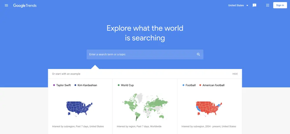
Google Trends analyzes the popularity of search terms across timeframes, regions and languages. It sounds technical, but it’s a truly useful tool that will help you create highly sought-after content without doing too much work behind the scenes.
Pricing:
- Free with a Google account
12. Hemingway Editor
Email requires short and concise copy, which can sometimes be hard to create. With Hemingway Editor, you can make your copy more readable and quickly shorten sentences. Run your written copy through the web app and you’ll see the opportunities to make it better for your readers in seconds.
Pricing:
- Free
Content creation tools for email
13. Lucidpress
Not just for creating visual content, Lucidpress is a great solution for email. Access our library of 1,000+ free templates to help grow your brand no matter what industry you’re in. You’ll never see a stretched logo or off-brand content again.
Pricing:
- Free
- Pro, $10/mo.
- Team, $12/user/mo.
- Business, custom pricing
14. Movable Ink
Movable Ink is designed to provide unique visual experiences based on a user’s individual preferences. It lets you target your audience based on their location, weather, time and even device.
Pricing:
15. GetResponse
In our list of email content tools, this one is pretty cool. GetResponse gives you the tools needed to build powerful emails that look stunning on tablets, mobile devices, laptops or desktop computers.
Pricing:
- Basic, $15/mo.
- Plus, $49/mo.
- Professional, $99/mo.
- Max, custom pricing
Content creation tools for video and audio
16. Animoto
Start creating and sharing your own videos with Animoto’s easy drag-and-drop video maker. Pick from one of the video templates, fill it with stock images and music, and make it all your own with Animoto’s customization tools.
Pricing:
- Free
- Professional, $15/mo.
- Team, $39/mo.
17. StreamYard
StreamYard is a live streaming studio in your very own browser. You can share your screen; interview guests; stream directly to YouTube, LinkedIn or Facebook, and so much more.
Pricing:
- Free
- Basic, $20/mo.
- Professional, $39/mo.
18. Biteable
Used by Airbus, Virgin and Panasonic, Biteable is a great option out of the wide array of content creation tools. Biteable has a ton of templates that let you create powerful videos with a professional air.
Pricing:
- Free
- Plus, $19/mo.
- Ultimate, $49/mo.
19. WebinarNinja
Famous for its simplicity, WebinarNinja is the perfect one-stop content creation tool if you want to launch your own webinar. It has an extensive template library that will help you create professional-looking sign-up pages without needing a developer or a designer.
Pricing:
- Starter, $39/mo.
- Pro, $79/mo.
- Plus, $129/mo.
- Power, $199/mo.
20. Zoom
Zoom comes with a cost-effective price tag, so you can not only host webinars but also customize and brand your registration forms and emails.
Pricing:
- Basic, free
- Pro, $149.90 annually
- Business, $199.90 annually
- Zoom United Business, $300 annually
21. Renderforest
Renderforest is a cloud-based branding tool that allows users to create video, infographic animations, slideshows and music visualizations. Even better, you get access to Renderforest designers who can help you build your own website or create a logo.
Pricing:
- Free
- Lite, $6.99/mo.
- Amateur, $9.99/mo.
- Pro, $19.99/mo.
- Agency, $49.99/mo.
22. Audacity

Want to start a podcast? Audacity may be the solution. With its user-friendly multitrack audio recording and editing platform, you’ll be on your way in no time. Audacity allows you to edit out mistakes and background noises or add in music before exporting to your required format.
Pricing:
- Free
We hope this list helps you find the right content creation tool, but if you need more help creating content, find out how Lucidpress works as a full content marketing platform.
We live in a visual world. Whether it’s through social media, popup ads or posters at the bus stop, we are constantly bombarded with visual information. And there’s a reason for this: Images help our brains retain information — this is what makes infographics such effective communication tools.
If you spend any time on the internet, you’ve likely seen dozens of infographic examples. They’re everywhere.
Infographics pair visuals with written information to present data in an easy-to-digest format. The good ones do, at least. Poorly made infographics can be confusing and, frankly, pretty ugly.
So what makes a “good” infographic design?
It’s a big question with a bigger answer. Rather than dive into a long-winded explanation, let’s take a look. (Show, nottell, right?)
In this post, we’ve collected 30 of our favorite infographic examples from across the internet and provided a brief explanation of what makes them effective. Whether you work in marketing, journalism, or something else entirely, look through our list to get inspiration for your next infographic!
30 great infographic design examples
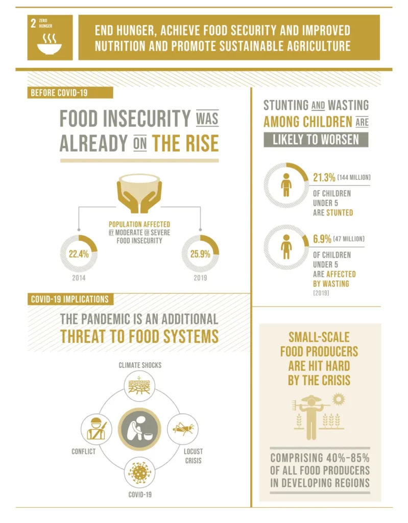
The Sustainable Development Goals Report
This infographic shows the power of restraint. The limited color palette and simple layout give the infographic a clean, striking look without distracting from the information being presented.

More Than 40% Of U.S. Renter Households Are At Risk Of Eviction
As soon as you see this infographic, you start to absorb information. It’s easy to see that it’s a map of the United States; the colors, ranging from yellow to dark red, clearly represent some data points (in this case, the percentage of renters facing possible eviction). By using familiar images and colors, this infographic says a lot without relying on blocks of text.
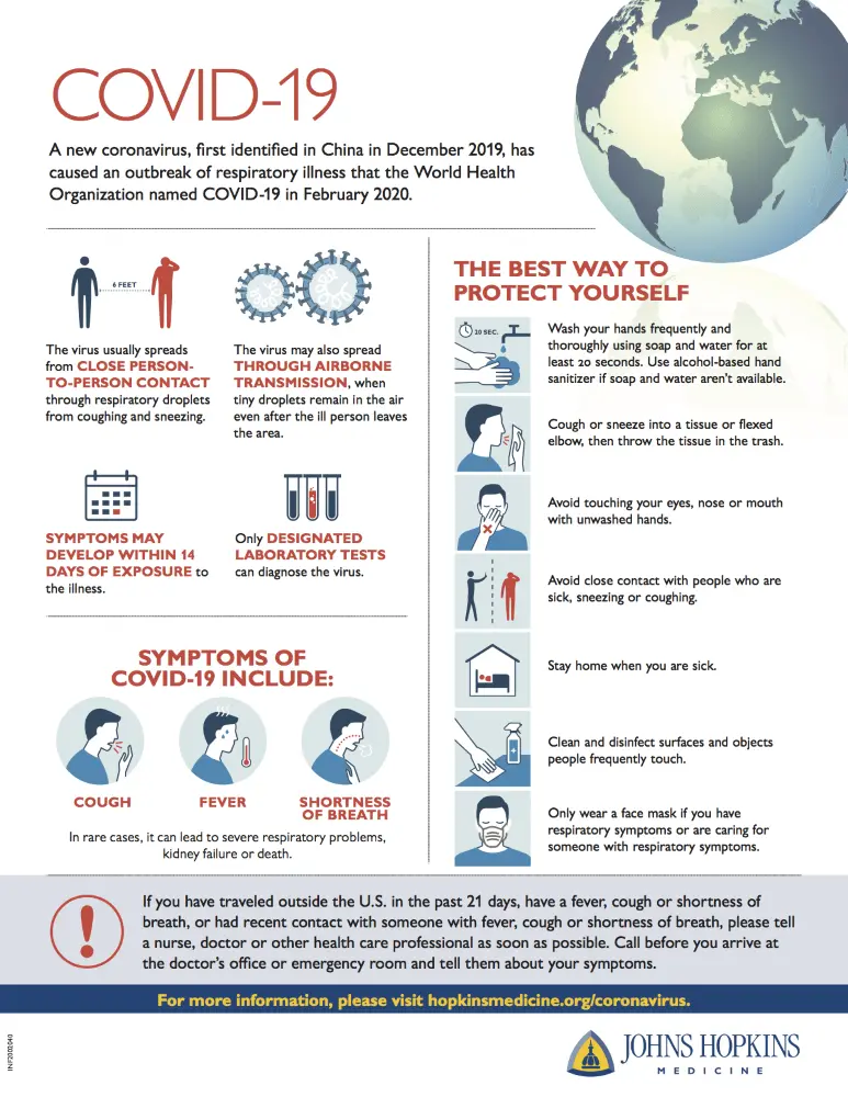
Font color helps guide the reader through an image. As you look at this infographic example, notice how the red text pulls your eyes towards the headers.
This is how alternative energy works
A striking background can be visually appealing and informative — just look at the map used as the backdrop for this image. To avoid a cluttered appearance, the designers placed the infographic’s diagrams and key in a dark area of the background.
What you need to know about COVID-19
We’ll be the first to admit it: From an aesthetic standpoint, this infographic could use some improvement. What it lacks in visual appeal, however, it makes up for in functionality. The information presented in this infographic flows logically, allowing the viewer to absorb crucial information about COVID-19 quickly.
Nobody would trust a poorly designed infographic about design. Fortunately, this infographic example walks the walk. From the colors to the geometry, it’s clear that every visual aspect was rigorously thought out, thus putting into practice important graphic design concepts.

This uncomplicated infographic example makes use of a simple linear design to visually guide the reader from top to bottom, while the muted colors give the design a cohesive appearance. Click here to customize this infographic template!
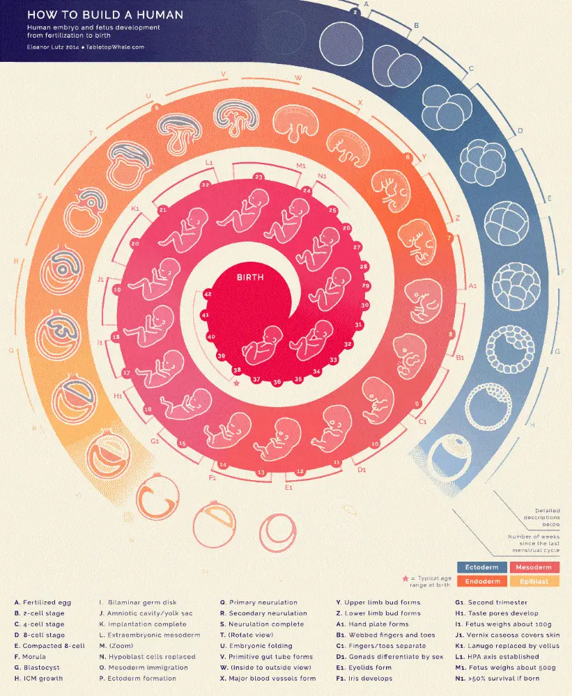
Any infographic depicting a process — be it abstract or easy to understand — needs to carefully direct the viewer through graphics. The spiral design of this infographic example is a creative way to do just that.
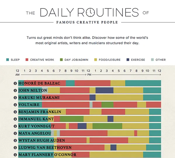
The daily routines of famous creative people
An infographic that has it all: a simple key, appealing color palette and straightforward layout. Out of all of our infographic examples, this one best highlights a key principle — Simple isn’t necessarily boring.
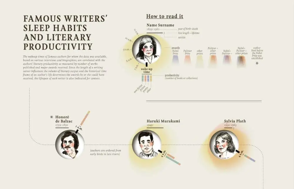
The sketched portraits of each writer on this infographic are an excellent use of accessible and user-friendly visuals. They add both information and style to the graphic without breaking the established color palette.
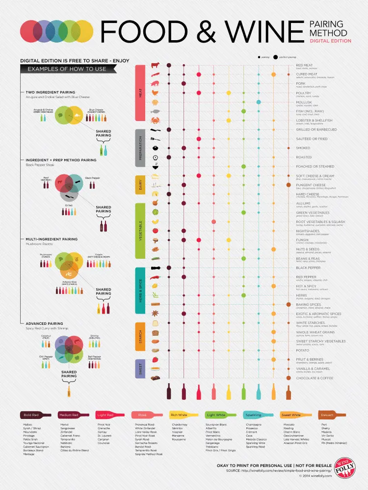
Though this infographic is visually busy and a bit loud, it’s never disordered or too chaotic. It conveys a lot of information, but there’s a logic to it, which prevents it from overwhelming the viewer.
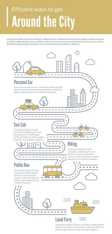
Between the visual cues and large header text, it’s immediately apparent that this infographic is about transportation. The road casually leads the viewer from one block of text to the next — customize the text to make this infographic your own!
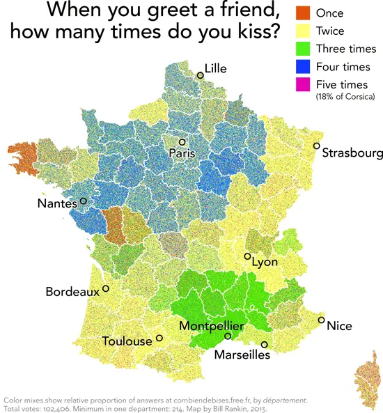
Most of our infographic examples are somewhat serious. So here’s a fun one! This infographic doesn’t take itself too seriously, both in subject matter and presentation. That being said, it still gets its message across.
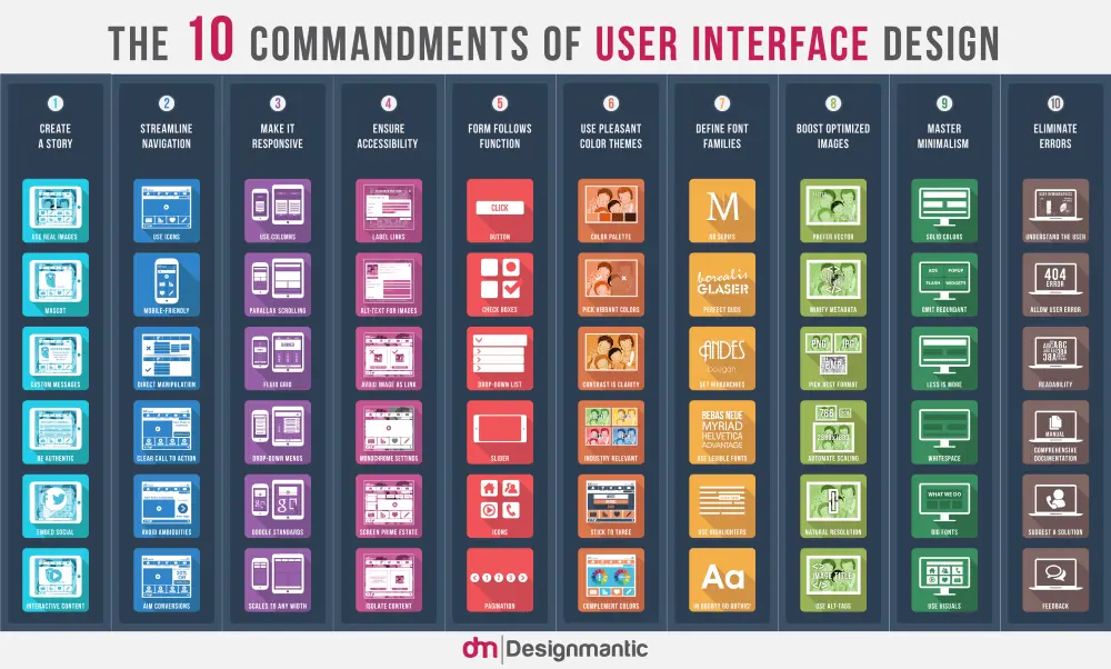
The ten commandments of UI design
If you’re trying to pack a lot of info into a small space, geometry is your friend. By using a grid layout, the infographic’s designers included ten UI guidelines, as well as examples of each guideline.
Out of our 30 infographic examples, this one pairs content and design best. The cheese wheel design is clever, relevant to the subject and still effective!
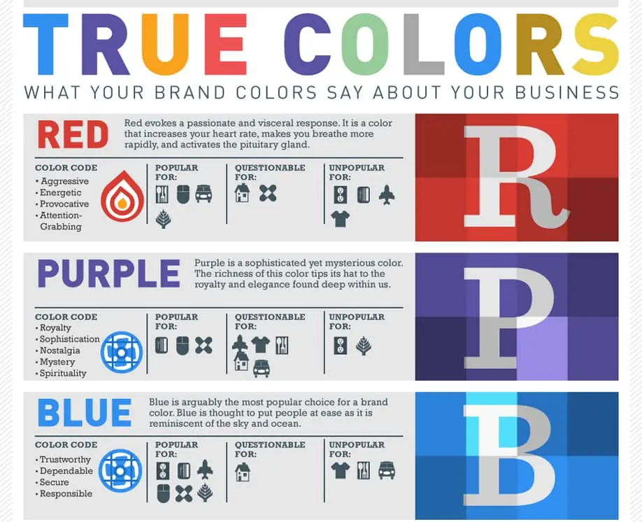
What your brand colors say about your business
The grey background of this infographic makes the colors — which are used sparingly — really pop. There’s a lot of information that could otherwise look and feel as though it’s competing for the reader’s attention, but instead it’s easy to find what you’re looking for based on the visual cues.
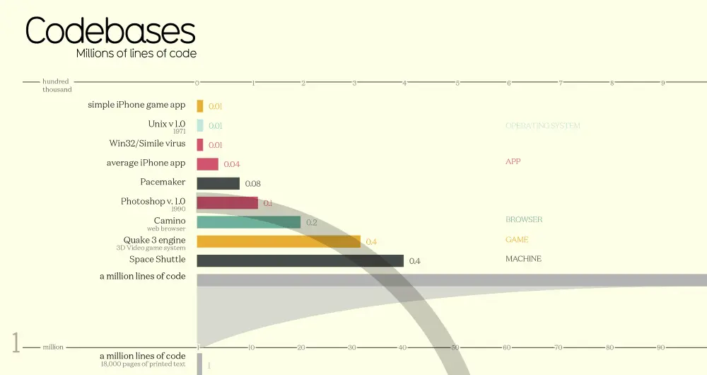
Bar graphs are one of the simplest, most effective ways to compare and present data. That said, there’s a small problem in using bar graphs: Visually, they can be, well, lacking. This infographic dresses the bar graph up a bit, making it visually appealing while maintaining its effectiveness.
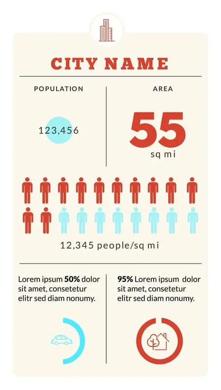
What do you get when you combine vertical and horizontal design elements? An infographic that boasts a simple and visually pleasing layout. Want to replace the generic information with your own? Try the template!
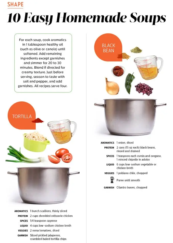
Most of the infographic examples in our list stick to charts and illustrations. But did you know that you can use pictures as well? This infographic uses photographs in a fun, relevant way.
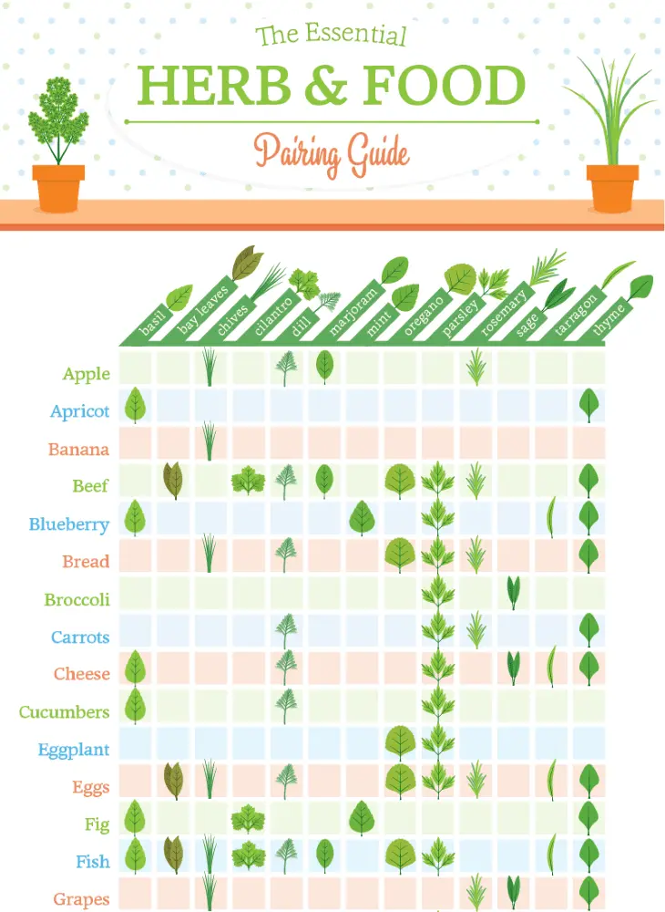
The essential herb and food pairing guide
Sometimes wordy descriptions just don’t cut it. Plus, imagine if you tried to describe what most herbs look like? All your descriptions would sound the same! The small, simple illustrations on this infographic provide the viewer with information that couldn’t be conveyed in writing: the actual appearance of each herb.
Best in show: the ultimate data dog
This infographic is both fun and informative. A two-axis grid is a simple way to organize data — but you might not expect that data to be dogs!

A strong central image immediately grabs the reader’s attention. This infographic uses visuals to pull the reader in, but only has filler text. Want to try adding your own text? Click here to try personalizing this template.
If you want to cut down on writing and clutter, color coding might be the move for you. Just don’t forget to include a key! The keys can be placed at the edges of your graphic, as seen in this example, to keep your visuals from becoming cluttered.
This is a deceptive little infographic. In very little space, the graphic carefully conveys each recipe and what the final product should look like.
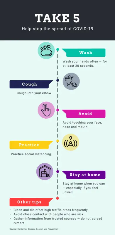
Inform and educate: stop the spread of COVID-19
This infographic pairs a vertical layout with minimal text to clearly convey its message. It only takes a glance to take in the information presented. Want to take a stab at customizing this template? Click here!
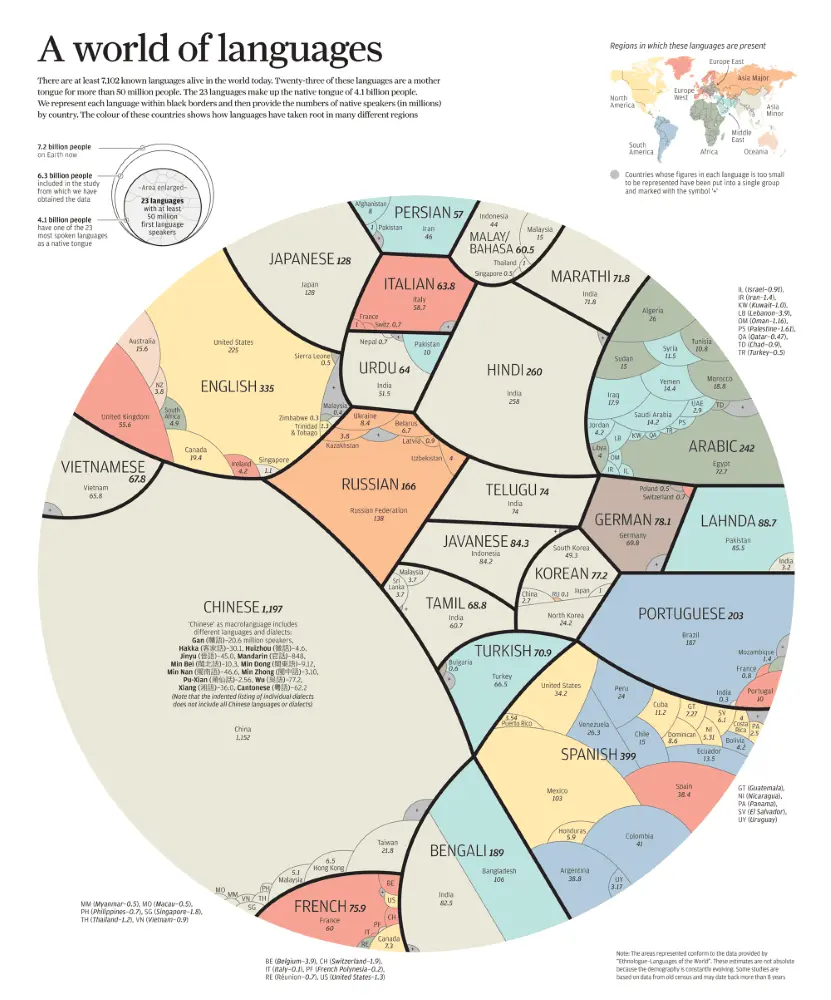
Proportional comparisons make for effective visuals. Without reading anything but the largest text, I can tell you that a lot more people speak Chinese than, say, Bengali. If I look a little closer, I can tell you exactly how many more.

42 butterflies of north america
The standout element of this infographic is obviously the beautiful illustrations. But the graphic has substance too, providing scale, location, and other important details.
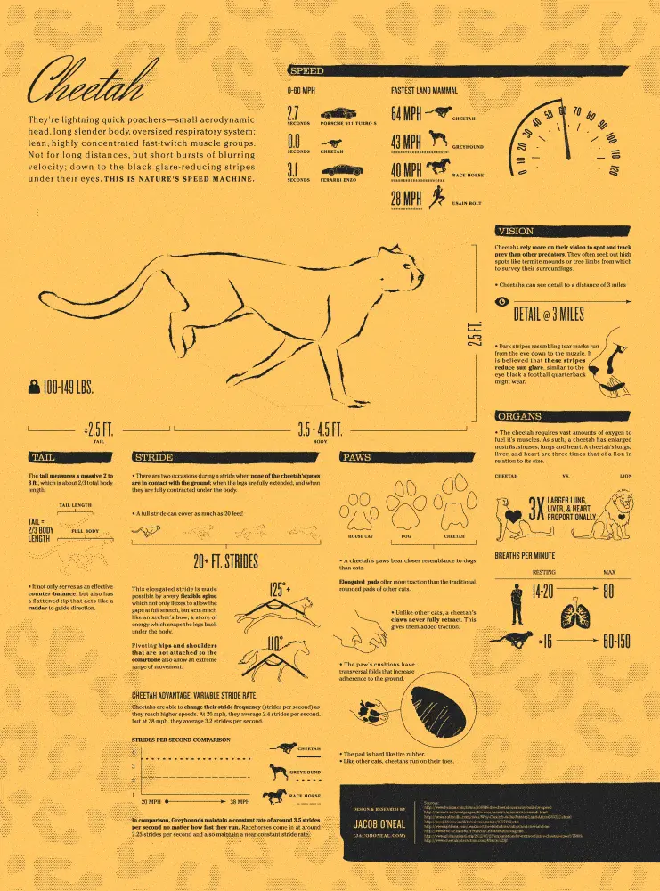
Cheetah: nature’s speed machine
If you’re going to go heavy on the information, sticking to minimalist design can help you illustrate your point or end goal more succinctly. For instance, this infographic example is jam-packed with info, but the two-tone color scheme keeps things feeling visually clean and simple.
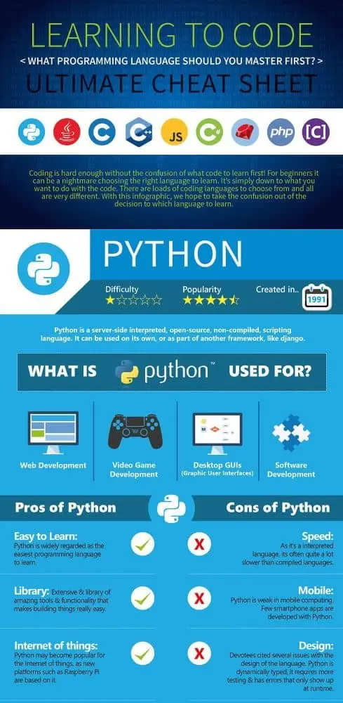
It’s worth noting that out of all the infographic examples on our list, this is one of the most text-heavy. Notice how the written information is organized into columns, making it easy to digest. So if you can’t find images or visuals that fit your infographic, there’s no need to fret. You can still organize information in an easy-to-digest manner.

Balancing charts and graphs with text can be tough — the layout is everything. This infographic example pairs visuals with text in a simple but effective way. And the best part? It’s completely customizable! Check out this template to make it your own.
Try it, you know you want to!
Feeling inspired? To start creating your infographics, you’ll first need an infographic maker — this is where Lucidpress comes in. Lucidpress is a cloud-based content creation platform for designers and non-designers alike who need to make pamphlets, infographics, and much more. And the best part? You can get started for free!
If starting your infographic from scratch feels a little daunting, don’t worry — we’ve got plenty of templates to get you started.
When Instagram rolled out Stories in 2016, it became a social media sensation. Since then, the use of Instagram stories has skyrocketed, with an estimated 500 million people engaging daily. Because of its reach, Instagram Stories are a fantastic business marketing tool for small businesses and large brands alike.
As you peruse the platform, you’ll see creative Instagram story ideas on display, from quick videos to fun quizzes. Consistently coming up with fresh content for your Instagram Stories may seem like a stretch, but get into a groove and you’ll discover endless inspiration to pursue. Let’s explore some of the best Instagram story ideas to strut your brand’s stuff.
Ready to get creating? Find the Lucidpress Instagram story template that’ll make your Instagram story ideas pop.
20 of the best Instagram story ideas to engage your followers
1. Feature tutorials
The best way to gain a loyal following is to give your followers more of what they want when they want it. Tutorials describing how to make or use your product or services don’t have to be lengthy diatribes. Even short videos or custom graphics offer valuable insights to your audience.
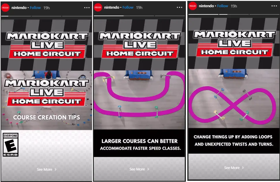
2. Offer freebies
Free is everyone’s favorite word, so feature contests and giveaways prominently as part of your Instagram Stories. Create branded graphics and think outside the literal box. Free trials, consultations and even collaborations with other businesses are part of a good giveaway strategy. If you’re hosting a contest, use a custom hashtag and ask participants to tag you to enter.
3. Polls, polls, polls
Instagram offers quite a few stickers to make stories sing and increase clickability, and poll stickers are one of them. Providing choices makes your followers feel like part of the conversation and boosts audience engagement. You can use polls to gather feedback, highlight a product or just spice up your profile with a little fun for everyone.
Get this Lucidpress Instagram story template HERE.
4. Show off the before and after
You don’t have to download a fancy photo editor to do before and after comparisons in Instagram Stories. Simply superimpose text on images and string them together as part of a peek at a transformation in progress. Before and after highlights can be a great strategy for cosmetic services, photo editing, home improvement projects, product or brand updates and much more.

5. Choose this or that
Give your followers a little customizable content with a fresh take on the “this or that” questionnaire. These templates work as downloadable graphics where followers can circle or cross out choices and repost the completed copy on their own Instagram story. From food to travel to memes, it’s easy to populate this-or-that templates with topics that’ll align to your brand and pique your audience’s interest
Get this Lucidpress Instagram story template HERE.
6. Stage an Instagram takeover
Move over and make room for an Instagram takeover. This Instagram story idea is exactly what it sounds like. In a takeover, your business allows someone to commandeer your account for a short period. A takeover involves allowing employees, influencers, competitors, and even customers to take the wheel. Letting someone else drive can generate clever clips to spice up your Instagram Story ideas and attract new followers.
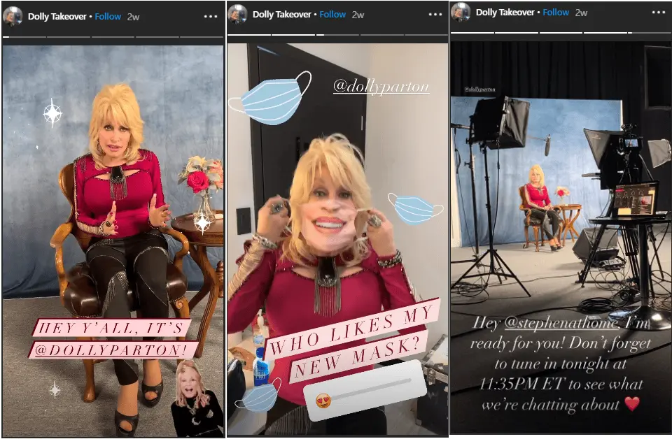
7. Go behind the scenes
There’s nothing more fascinating for brand enthusiasts than seeing how the secret sauce is made. Give them a peek behind the scenes in your Instagram stories with tours, bloopers, reels and exclusive content that lifts the veil between product and producer. Letting your audience see the mess behind the magic lends a uniquely human feel to your social media presence.
8. Interview an employee
Your greatest asset is your employees, so hand over the microphone and let them speak for themselves. Choose an employee who has a compelling personal story or insights that align well with your brand. Then step aside and let employees use Instagram Stories as a platform to educate your followers in their area of expertise.
9. Promote a blog post
Building a following on Instagram is a worthy goal, but most businesses are also looking to boost traffic to a website. Instagram Stories is a solid strategy for promoting posts and directing followers to your blog. Take a few tantalizing snippets from your latest post and pop them into a visually appealing template. Then use the Instagram story swipe-up option or sticker to direct users to your website for more.
Get the Lucidpress Instagram story template HERE.
10. Play bingo
You don’t have to leave the couch (or Instagram, for that matter) to play bingo. Create a quirky, custom take on this traditional game that aligns with your brand. Books, movies, memes, emojis, food and much more are all fair game. Users upload the image you create to their camera roll, use the drawing tools (located in Stories) to mark it up, and repost to their own timeline or story.
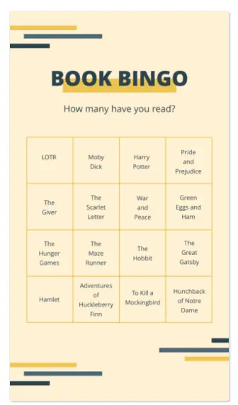
Get the Lucidpress Instagram story template HERE.
11. Solicit suggestions
Not sure what your followers want? Go ahead and ask them. Solicit Instagram story ideas, new products, or just general feedback. If you’re brave, you can encourage followers to connect via direct message with their insights. Once you’ve gathered these fantastic tidbits, don’t let them go to waste. Share them in subsequent Instagram stories so your followers can benefit.
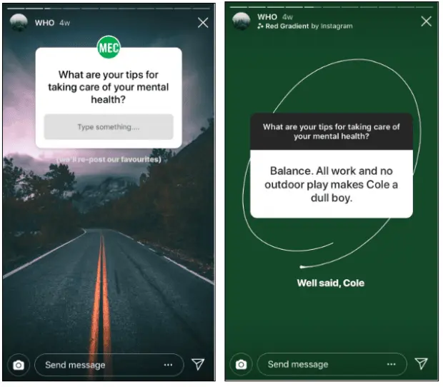
12. Share and link to CSR campaigns
Many companies have chosen to invest in promoting corporate social responsibility campaigns, and your Instagram Stories can be a perfect spot to highlight that work. Once you’ve shared a branded graphic on the campaign or community action you’re supporting, don’t forget to use the Instagram mention sticker to direct followers to where they can learn more or donate.

Get the Lucidpress Instagram story template HERE.
13. Design a shoppable story
Embedding a shopping experience into your Instagram Stories is a surefire way to convert followers into customers. Highlight your product with a little eye candy and include an Instagram sticker to swipe up and take users off-site. Be warned that not every business qualifies for shoppable stickers. Brands must have a business profile and offer a physical product that complies with Instagram’s policies.
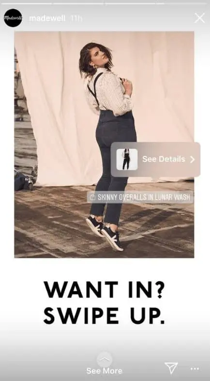
14. Create a quiz
Enough about you. Let’s talk about your followers. Quizzes give your audience a chance to weigh in and discover more not just about themselves but also about your products, services, or brand. Start a story and select the quiz sticker to create a series of questions for your followers to answer. You can customize colors and other elements for a branded effect.
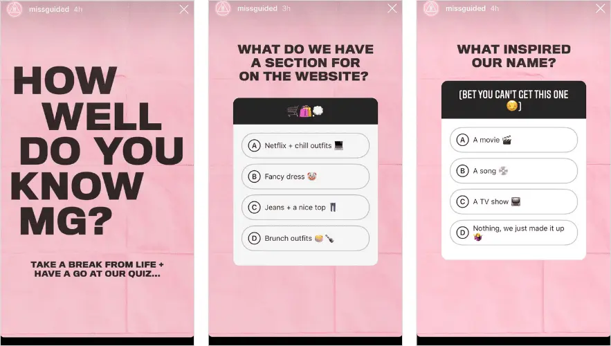
15. Do an unboxing
Unboxing videos aren’t just for YouTube anymore. Watching someone unpack a basket of goodies is profoundly satisfying for viewers, but it’s also a creative way to showcase your products. Even if you don’t offer a physical product, creative Instagram users can partner with affiliates to do an unboxing video.
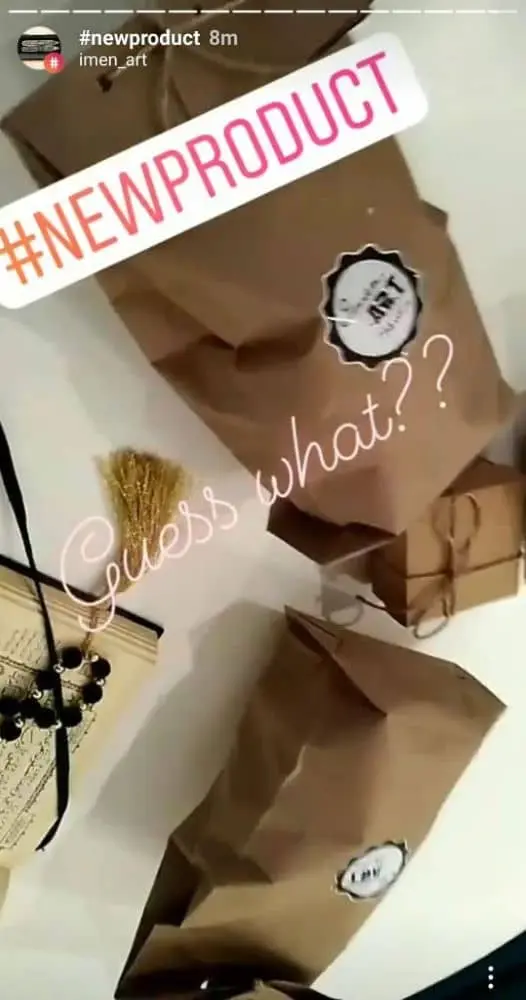
16. Go live
Half the fun of Instagram Stories is that they feel exclusive because they have an expiration date. Going live in your Instagram Stories is a way to directly engage with your audience and keep them checking your social media content daily. Notifications that you’re live go out once you start rolling, but for maximum impact, brands follow a consistent schedule and advertise live sessions in advance.

Get the Lucidpress Instagram story template HERE.
17. Promote a product or service
Finding unique ways to connect with followers on social media is crucial, but at the end of the day, your business exists because you have a product or service that meets a need. Show off your stuff in your Instagram Stories with branded graphics, promotional offers and periodic reminders that you take pride in the work you do.
Get the Lucidpress Instagram story template HERE.
18. Feature a testimonial
Testimonials are powerful social proof, so don’t hesitate to flaunt your glowing reviews. Pick the cream of the crop and pop them up on your Instagram Stories periodically. You can give these testimonials a polished feel or a little signature flair by repurposing branded quote templates.
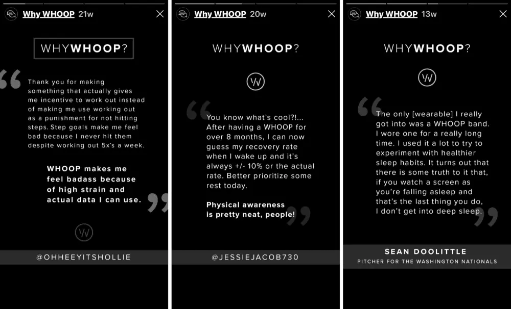
19. Give a sneak peek
Got something great in the can? Start generating buzz with a sneak peek on your Instagram Stories. Whether it’s a new product line, a seasonal promotion or an exciting rebrand or company update, you can start creating some suspense with a teaser. If you don’t have an exact launch date, maintain an aura of mystery by labeling it “coming soon” or “TBA.”
Get the Lucidpress Instagram story template HERE.
20. Count it down
Instagram Stories offers a customizable countdown sticker so you can celebrate no matter what the milestone. Product launches, sales, anniversaries, holidays, giveaways and events are all good fodder for the Instagram story countdown. Followers can also click on the sticker to set up an alert for when the count winds down.
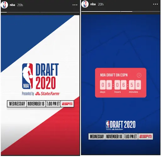
If you’re on autopilot periodically posting photos to your Instagram business profile, you’re missing out on the powerhouse of promotion this social media giant has become.
Learn how to leverage Instagram Stories and generate Instagram story ideas with Lucidpress Instagram story templates.
Infographics are used by companies small and large to educate their audience, build their brands or simply entertain. They’re basically “eye candy” that compiles different data visualization into a whole.
As more and more companies are using infographics to reel in consumers, it’s important to learn how to create one. We’ve pulled together the best do’s and don’ts of infographic design in this comprehensive guide to creating your very own infographic.
Choose a layout to match your topic

There isn’t an exact set of rules for how infographics should look, but they do tend to fall into specific layouts. Picking from the types of infographics is a great starting point as they’re all tried and true. Remember that as you consider each layout, you want to pick one that matches your topic. For instance, if you’re creating an infographic about the top places to live in the US, you’ll most likely want to use a geographic (not a resume) infographic.
Timeline infographic
A timeline infographic is best used when you’re showing the history of something. You can use this infographic to put events in chronological order. Or to outline the steps of a project, how-to and more.
Comparison infographic
This type of design infographic template has a symmetrical layout and is used to compare two different options on the same data point. Use this infographic design idea to compare your product to your competitor’s. Make sure that you don’t just list random facts but choose attributes that both options have.
Roadmap infographic
Use this infographic design if you’re showing data with a start and end point. Unlike the timeline infographic, this one focuses on stages rather than dates.
List infographic
A list infographic is one of the most used infographic templates. It can be used to create a checklist, explain a process, or show the top 10 reasons for x,y and z.
Geographic infographic
If you have a dataset specific to location, a geographic infographic is the best template to go with. You can use a map of the world, country, or even counties in a state.
Numbers-heavy infographic
If you want to tell a story with data, a numbers-heavy infographic is your best bet. You can use graphs and charts to summarize reports, share data that’s insightful, or synthesize data. Creative icons can help these kinds of infographics feel more fun than simple bar graphs.
Article summary infographic
An article summary layout is best for giving a brief overview of an in-depth article or blog post. This layout provides enough space for copy while also using imagery to create visual interest.
Resume infographic
Just as the title infers, a resume layout is meant to highlight an individual’s work experience and professional accomplishments in a visual way. Unlike a traditional resume, a resume infographic can use charts to show experience, a timeline for job experience, and icons to represent each section.
Visual backbone infographic
This kind of infographic centers around a single large image as the backbone of the piece. All points of data will break down one component of the visual. Use this layout to help consumers visualize parts of a whole.
Include these basic infographic elements
To make sure you don’t leave any pertinent information out of your infographic, double-check that you include each of these main elements: headline, explainer, subheads or labels, sections, backbone, explanatory text, CTA and sources. Each of these elements ensures that your infographic isn’t just a cool-looking piece of design but also includes entertaining or insightful information with a clear takeaway.
Headline: Include a brief headline that gets your audience to keep scrolling.
Explainer: This is a quick introductory text that explains what your infographic is about. Since concision is critical, feel free to skip complete sentences.
Subheads and labels: Using subheads or labels for each icon, chart or section can help break up your infographic while also providing a distinct outline.
Sections: Create sections for each idea in your dataset. You can use icons, lines or colors to separate them.
Backbone: No matter what layout you pick, you need a unifying design element to tie your infographic together. This is different from a visual backbone layout.
Explanatory text: Include brief copy to describe the idea for each section. Don’t let the copy take away from the graphic; instead, make sure the copy supports the graphic and not the other way around.
CTA: As with most of your content, include a CTA at the end of your infographic to move your audience to the next step.
Sources: Always cite your sources at the end of your infographic. These are often in small text at the bottom of your layout.
Choose a color palette
Once you have a layout and general outline for your infographic, it’s time to choose a color palette. A color palette can make or break your infographic. The right palette can reinforce the topic, organize information and solidify your brand. You don’t have to stick to your brand’s colors with infographics, but that color palette could be a good starting point.
Another good place to start is checking out the different types of color palettes. The most common color palettes in design are monochromatic, complementary, split complementary, analogous, triadic and tetradic.
Source: https://www.picmonkey.com/blog/create-a-brand-color-palette
Follow these tips for picking the right color palette:
- Use the tools at your disposal: There are several websites out there specially designed to help you pick the right palette. Sites like Adobe Color can help you pair the right colors together, so you don’t unwittingly create an eyesore. These sites let you pick between a monochromatic or tetradic color scheme.
- Pick a three-color palette to make it easy on the eyes: Too many colors can make the infographic overwhelming or interrupt the flow of it. Picking just three colors keeps things simple. Use one color as the background and the other two to break up the sections. Use shades of your three colors if you need to add more colors.
- Make it universal: Pick a palette that fits the theme of the website and is neutral enough for a wide array of visitors. Your infographic will most likely get shared across other websites and social media — with a more neutral and simple color palette, you can guarantee that it won’t look out of place wherever it gets shared. So skip the neon on black, and try to avoid using white as your background.
Here are a couple examples of some great color palettes:
Source: https://blog.graphiq.com/finding-the-right-color-palettes-for-data-visualizations-fcd4e707a283?gi=3a981055db84
Pick your typography
Focus first on titles and headings. You can use a fun, eye-catching font for the title of your infographic with a complementary sans serif or serif font for the rest of the text throughout your design. Try to stick with only two or three fonts total: one for the title (this can be bold and fun), another for the body text that’s easily legible, and if you want, pick another for headers. Remember, your visuals are what people should be focusing on, and a cool font can distract from that.
Additionally, don’t allow typography to become your crutch when you create infographics. Definitely be intentional with the fonts you pick, but don’t always default to flashy typography to show off an important date or number when you can visualize it a different way. Percentages can be visualized as pie charts, numerical values as bar graphs. The best infographic designs rely on icons, headers and dates with minimal explanatory text.
Here a couple infographic design ideas with great typography:


Icon do’s and don’ts
When it’s time to pick which icons to use, follow these do’s and don’ts.
Do:
Use labels
Provide context
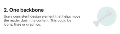
Use icons as anchors
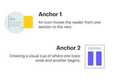
Use background colors

Provide visualizations
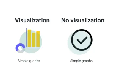
Be mindful of sizing
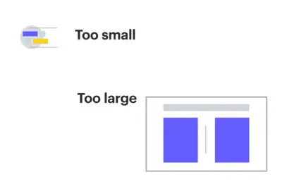
Don’t:
Use random icons
Use multiple styles
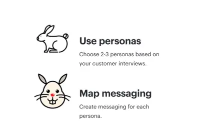
Forget to pair with text
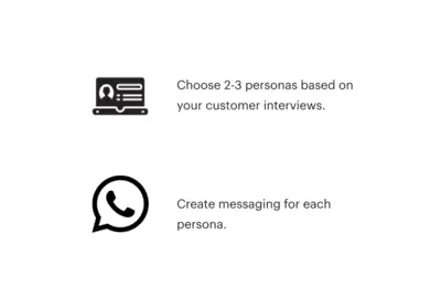
Use random colors
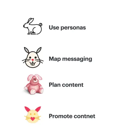
Data visualization best practices
It’s important to understand data visualization best practices as one size doesn’t fit all. And it’s not about simply providing information to the masses. Here are five of the top data-visualization best practices to keep in mind as you learn how to design an infographic:
Emphasize the important points
Direct your reader’s attention through visual cues. This will make it easier to follow the story you’re trying to convey. Our eyes are drawn to symbols that send us important details at a glimpse. To build off of this, make sure that the style or order you show your data in makes sense to your audience.
Make use of color
Color is one of the most useful tools in data visualization. You can effectively communicate important info about your data through different color combinations (e.g., use a monochromatic color palette for sequential data.) Just be sure that your color choices enhance the differences in your data rather than make them more cluttered.
Ensure your data is readable in any format
Remember that your infographic may be viewed on multiple different devices. It’s vital that you create mobile-friendly content.
Keep dashboards and visualizations simple
Content should be snackable. Too much information in one place causes people to click out or just skim by. With a simple design, you can grasp your audience’s attention, pique their interest with the right facts, numbers, graphics, and then get them wanting more, ultimately leading them to follow through with your CTA.
Provide context
Your audience needs to understand the context of your recommendations or shared information. In order to get them to act on something, they need to understand how this information affects them or how they can affect it. “Donate today” or “Click here for more information” are some of the most common CTA’s used, but they won’t be clicked on without the right explanation for why your audience should care.
Infographic design principles
If you’re interested in designing your infographic from start to finish rather than using an infographic maker, here are some basic design principles that will help you create the best infographic no matter your design skill level.
White space
White space is the area that’s free of any design element or text. It gives your content room to breathe, making it easier to consume. Include enough space around headlines and between sections.
Alignment
As you create your design, double-check that all of the main elements align on the same vertical or horizontal axis. Also make sure that the spacing is the same between each section.
Show don’t tell
Your copy should support the visual, not the other way around. Too much text can make the infographic feel heavy and cause your reader to become disinterested. If you can say it visually, do so and ditch the text.
Contrast
Contrast creates visual impact by placing different elements beside each other. If you choose a light background, then have your shapes and icons be in darker, bold colors. You can also create contrast through typography by putting your headers in larger text, followed by the subheader and then your body copy.
Consistency
Consistency is key to keep your design flowing from start to finish. Your icons should be in the same style throughout your entire infographic, headers should be in the same font, and all your body text should be in one font too. Your color palette will also help your infographic remain consistent.
We’re sure that you’ll be able to create stunning infographics whether you just want to share stats on cat videos or optimize your search engine ranking. If you need some help starting your design, try our infographic templates.
Real talk: Trying to find a strong content marketing example is like looking for a needle in a haystack, mostly because there are just so many stinking options. Seriously though — between social media algorithms, walled gardens, SEO, paid ads and everything else under the marketing sun, we’re inevitably served some sort of content marketing experience that’s designed to get our goat and draw us in.
So, how do you decide what counts as “the best content marketing examples?”
:eyebrow wiggle:
>Related: Examples of great marketing initiatives
How we evaluated the general existence of content marketing
The best content marketing tells a story. Well, not just any story, a good story. One replete with emotions, thoughtful cadence and something that ties it all together — good content marketing speaks to you on some level. Which is to say that the best content marketing does these three things:
- Keeps the throughline (or red thread) obvious
- Knows its audience — e.g., where to exceed expectations and where to keep it simple
- Creates a sense of camaraderie
So, without further ado, here are our fave examples of good content marketing:
1. Mailchimp’s original content
Mailchimp, the beloved marketing platform that helps small businesses do everything from email to website building and analytics, is also putting out the best content in the game. The brand is undoubtedly #1 in our book, and whenever the subject of good content comes up, we all inevitably sigh and get big heart eyes over whatever Mailchimp has recently put out.
The brand has not one but two content platforms: Courier, which offers marketing advice from experts and articles about trendy small businesses and Mailchimp Presents, a collection of original podcasts, movies, and video series that “celebrates the entrepreneurial spirit.”
Right away Mailchimp’s red thread is obvious — the brand story, a celebration of entrepreneurship and creativity, is loud and clear. And while the budget involved in this level of production is nothing to sneeze at, money will only get you so far. Mailchimp has perfected the art of taking human stories and turning them into content that’s relevant, interesting and, above all, inspiring.
While we’re gushing, we encourage you to watch one of our favorite pieces, Noodle School: a short documentary about students in Lanzhou, China, learning to make traditional hand-pulled noodles.
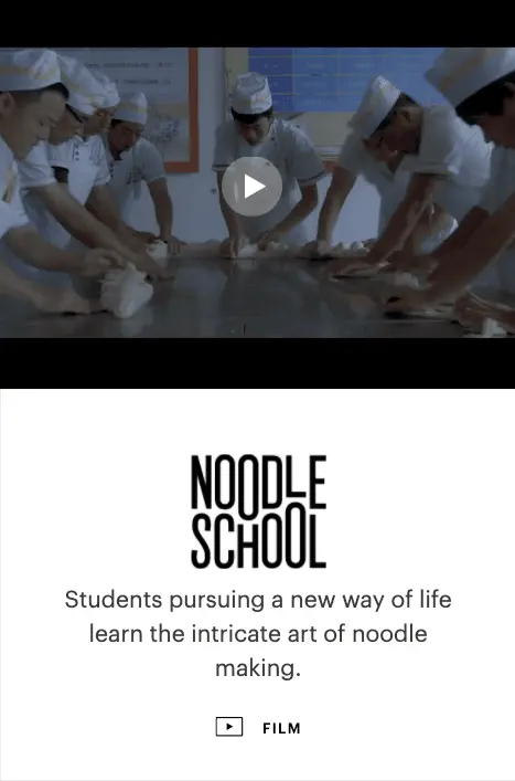
2. Great Jones’s food media
Great Jones has made a name for itself offering high-quality cookware at affordable prices, complete with a jewel-toned aesthetic that sets millennial hearts aflutter. And true to the brand’s hip ethos, its content does not disappoint.
The Great Jones Digest is filled with mouth-watering recipes and interviews with the movers and shakers of the food world. Is it a blog, per se? We’re not sure. Is it a perfect amalgamation of product placement and food-celebrity endorsements wrapped in genuinely good content that rivals large publications like Bon Appétit? Yes.
(The brand also has an extremely well-curated Instagram that does wonders for their marketing.)
There are a few elements at work here, and combined, they pack a powerful punch: content that’s relevant to a culinary-inclined audience (recipes!), trusted endorsements, pleasing design and format, showy but not annoying displays of the product. Yes, it is the whole package, but working even one or two of these tactics into your own content marketing can help move the needle.

Thanks, we’re hungry now.
3. Trello’s straightforward blog
Alas, good content doesn’t have to be the flashy, big-budget crème de la crème. Sometimes it’s as simple as offering a well-written blog post.
The Trello blog, whose content is also served up in a weekly email newsletter, offers uncomplicated articles full of good advice on topics that appeal to the wide-ranging workers of the world. What makes it special? Good-quality writing on topics that we’re genuinely interested in.
With topics including how to manage work anxiety, productivity hacks and mastering work-life balance, Trello’s content will resonate with anyone on the 9-5 grind. The blog also manages to work in plenty of product-focused tutorials for its customers in a way that doesn’t feel pedantic or out of place.
Take note: Spending time to do the simple things well can really elevate your content. A good blog can be small but mighty.
4. Tushy’s customer testimonials

Americans are intensely private about their bodily functions. It’s taboo to talk about poo — likely a result of their Protestant roots — regardless, they aren’t big fans of bidets because, well, bidets clean your bottom region. And that means you poop.
Enter: Tushy.
Tushy is “the modern bidet for people who poop.” Or “the modern bidet that saves your ass, saves your money, saves the planet and saves the world.”
Pretty exciting stuff, eh? Real people, on the john, in real life. Well, kinda. But, how do you get people to actually buy a bidet when a.) we’re afraid of our own b-holes and b.) when we’re afraid of bidets?
- One — Tushy lowered the barrier of entry. Buying and installing a bidet is intimidating. So, Tushy made the installation process ridiculously easy (both writers on this post have installed Tushys in their respective abodes). Plus, traditional bidets aren’t exactly renter-friendly (in the sense that you can’t exactly uninstall your personal, full-size bidet when you move). Tushy, on the other hand, is totally transportable.
- Two — Tushy harnessed the power of social proof to destigmatize talking about our bathroom habits. Because, in a world of information and option overload (and marketing campaigns galore), it’s hard to know who to trust and what information just a total crock of bullsh*t. So instead of leaving you high and dry, they ensure you have unobstructed access to what other Tushy enthusiasts have to say about that bidet life.
Customer testimonials are about as timeless as they come — plus they’re some of the most effective, easiest marketing content you can get. All you have to do is ask for it.
5. Ruffwear’s interactive content and social media
Pets, though more specifically dogs, mean a lot to us — they’re our companions, support animals, entertainment sources and more.
Ruffwear’s “My Dog is My” campaign spotlights the various ways in which dogs contribute and participate in our lives, presenting great opportunities for people to see the product in action, worn by dogs like their own in some way, shape or form.
Ruffwear uses its “My Dog is My” marketing in a variety of ways, however, there are three worth highlighting here:
Ruffwear blog
The Ruffwear blog is a great space to share “My Dog is My” stories, without necessarily needed to have a scoped out marketing campaign, replete with photographers and such.
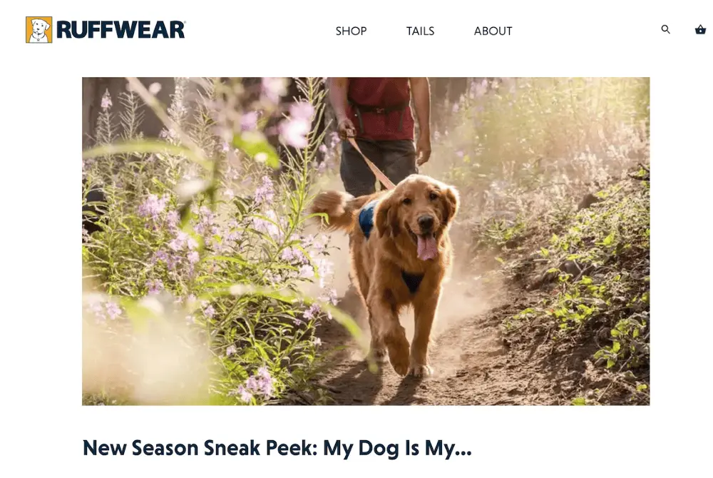
Core homepage
Ruffwear has an incredibly diverse range of customers — as highlighted by the various core homepage content stories related to the “My Dog is My” campaign.
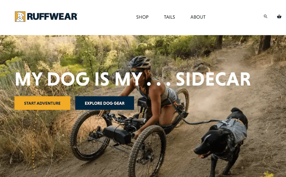
Social proof
Ruffwear leverages customer participation and real-life examples of their product in action with the social media hashtag #mydogismy. Crazy to think that there are already 350K posts of various pups in Ruffwear threads.
If there’s one takeaway to be had from Ruffwear, it’s that you don’t need a giant marketing budget to create effective content — you just need a creative way to encourage your customers to share their stories.
Overall, pups and people are the heart of Ruffwear’s “My Dog is My” content marketing campaign. By encouraging customers to use the hashtag and highlight their pup, Ruffwear effectively creates a community of Ruffwear-lovers and dog-lovers alike.
>Need more info? Check out measuring marketing effectiveness
6. Cricut’s celebrity endorsement
Hey, you, put down the pinking shears and the granny square afghan! You may think you know DIY, but you have no idea. Cricut takes crafting to the next level and blasts open your world of DIY crafting opportunities with its cutting machines.

Celebrity endorsements can go one of two ways — great or poorly. In Cricut’s case, the brand’s endorsement and collaboration from Zooey Deschanel were pretty stinking spiffy.
A key component of successful celebrity endorsements is knowing your audience. Now, there’s something to be said about an ironic celeb collaboration, but again, that content’s effectiveness depends on your audience. So Cricut’s decision to work with Deschanel was a well-informed and smart one. Because not only does Zooey Deschanel stars as the ultra-crafty Jess in “New Girl,” but Deschanel happens to be quite the craft enthusiast in real life.
7. And Bud Light’s celeb highlight we couldn’t resist
At the end of the day, a Bud Light is just a Bud Light. You can’t change it, dress it up or put lipstick on that ole pig. You know exactly what to expect when you’re drinking a Bud Light, aka a BL Smoothie — cold and gold. Anything else would be absurd.
Bud Light manages its customers’ expectations well. Case in point: Bud Light’s use of Post Malone in the 2020 Superbowl ad for Bud Light Seltzer.
Everyone and their cousin is coming out with an alcoholic seltzer, so Bud Light needed a creative way to stand out in the crowd without alienating its current base and most loyal customers.
And, yes, having ample money in your marketing budget is a pretty beautiful thing, but, more importantly, the Bud Light marketing team enlisted assistance from customers for the final verdict — “the marketing team decided it couldn’t decide which of two Bud Light Seltzer ads it should air during the actual game so it’s letting fans vote between one featuring the rapper Post Malone in a convenience store and another of him in bar.”
So how can you use this inspiration and take action? It’s never a bad idea to brainstorm with your team and identify what it is you like about certain campaigns and then see how you can take those principles and apply them to your own brand’s content. Ask what resonates with your audience and what would surprise them, who supports your product, and what you yourself would actually be interested in creating.
For more tips on creating effective content that resonates, take a peek at our free mini-ebook: Brand templating: How creating more effective content that gets results.
Looking for a quick guide to relationship marketing? You’ve come to the right place. If you’ve landed here, you’re most likely hoping for a little extra info on what is relationship marketing and how it can help you start to either generate more leads or get customers coming back.
Below, you’ll find a nifty guide outlining what relationship marketing is, a few pretty awesome relationship marketing examples and some quick and easy strategies to help you get started — beginning with the basics.
What is relationship marketing?
Relationship marketing aims to build and maintain personal connections with your customers leading to more business whether through word-of-mouth promotion or effective content strategy.
Relationship marketing is a part of customer relationship management (CRM), focusing on long-term customer engagement and customer loyalty.
Individual sales and customer acquisition are simply byproducts of a successful relationship marketing strategy. Instead, focus on your customers’ interests and needs and encourage meaningful engagement. This way, you create the necessary relationships to make more sales over an extended period of time.
Additionally, relationship marketing’s ability to keep you in close contact with customers loops you in on how they use your products and services — which should influence any changes you make. Relationship marketing not only helps you measure marketing effectiveness, but it ensures you stay connected with customers, and according to Gallup, fully engaged customers will spend nearly 23% more than the average Joe Schmoe.
Relationship marketing examples
To give you some ideas on how to heat up with your relationship marketing, we’ve highlighted some pretty cool (in our humble opinion) relationship marketing examples. Be sure to pay attention to how these brands took things up a notch and avoided doing the bare minimum.
Moosejaw
Possibly our favorite example of relationship marketing comes from the outdoor apparel company Moosejaw. A customer ordered a hoodie for his girlfriend as a Christmas present, but unfortunately, she broke up with him a few weeks before the holidays. The customer returned the hoodie, asking for a refund and wrote under the reason for return, “girlfriend dumped me.”
A few weeks later, a large package from Moosejaw arrived with a smattering of t-shirts, stickers and a card that read, “We’re sorry your girlfriend broke up with you, we decided to give you a gift.” We can’t imagine a more personalized response in customer service.
Lay’s
Lay’s is a great example of a company that builds customers’ trust in their brand through interactive content. Lay’s annual “Do Us A Flavor” contest asks customers to submit their ideas for new chip flavors. Once the submission window has closed, participants then vote on flavors through social media, with the winning flavor added to Lay’s flavor lineup Oh, and the customer who suggested the winning flavor gets a hefty cash prize.
GE
One strategy for relationship marketing is through content, and GE’s use of content marketing is pretty solid. By conducting extensive research into their customers and what they need — even down to the socioeconomic contexts — GE is able to personalize its content based on specific audiences. For GE, relationship marketing isn’t focused on individual transactions but rather the relationships with customers in each market, therefore setting the stage for valuable marketing investment, especially in countries with lower revenue potential.
BetterCloud
Customer service in itself makes up a huge part of relationship marketing and BetterCloud hits it out of the ballpark with its “proactive support” system flags. By collecting data on how customers use BetterCloud software, along with any errors or struggles they encounter, BetterCloud is able to proactively reach out to affected customers long before a support ticket is submitted.
Zappos
Zappos makes it clear how customers can contact the brand by placing the customer service phone number front and center on their website. When customers call with concerns, representatives do more than simply take care of the problem — they ensure customers feel heard. For instance, one rep has sent baby blankets to parents who had crying children in the background. Another sent flowers to a customer after she tried to return boots bought for her father who passed away before he could wear them. For Zappos, relationship marketing is about reading between the lines and actively listening.
Benefits of customer relationship marketing
Now, these examples are all well and good, but is relationship marketing really worth the time and effort?
Boost in customer retention
Customers who feel that their needs are being met and that they’re also being heard tend to stick around. Going past the basics to keep your customers happy is only ever going to be a lucrative investment.
Increased customer life-time-value
By building a relationship with your customers, you’ll increase not only customer retention rates but also the lifetime value of your customers. Lifetime value measures a customer’s total sales, as well as their loyalty and advocacy of your brand — e.g., customers become brand advocates or ambassadors (influencers) who recommend your products or services to friends, family members or even work colleagues.
Collect and apply feedback
As you collect customer feedback, you wind up creating a data bank to improve your customer marketing in the future. For example, feedback can be incorporated into content marketing to further nurture customer relationships.
Create customer evangelists
Customer evangelists are those customers everyone wants. They regularly purchase from you — recommend your services to friends, family, coworkers, random strangers on the street, offer praise without any financial incentive and so much more. These customers end up being one of your best marketing tools.
Elevated brand trust
If a customer believes in you and trusts you, they’re more likely to forgive mistakes and still stick around. Building a successful relationship marketing campaign to get to this point though is more than just a rewards program, it’s doing that and more.
Types of customer relationship marketing strategies
Achieving effective relationship marketing is pretty simple. In fact, you may already be implementing some of these ideas below. However, we want to highlight how you can utilize these strategies for relationship marketing specifically.
Content marketing
Content marketing generates three times as many leads as paid searches. When used correctly and efficiently, content marketing connects an audience with your brand on an emotional level and equips customers with helpful information, providing value to you and your customer. And by offering useful content regularly, your customers develop a natural interest in your brand.
Customer service
For a moment, forget that you’re the reader — remember a time when you’ve been the customer and needed to contact customer service due to a pressing issue? How important to you was it to get a quick response?
Responding quickly to your customers’ complaints, feedback or questions will show you not only care but that your brand is reliable. Advancements in AI make this a lot easier for businesses with resources like Facebook Messenger bot or ManyChat. Using a pre-programmed chat gives your customers the option of a quick and easy answer (like an FAQ) or to steer them towards the right representative. Add in the aspect of human follow up and you really raise the bar. Customer service is also a great place to generate feedback from customers to aid in content personalization.
Social media
Social media is a treasure trove for customer feedback. Nearly 95% of online adults follow a brand on social media, which can make sifting through customer comments feel daunting, but you surely want to find those golden nuggets! Remember, don’t just use social media as your personal pirate chest. Make sure you’re interacting with customers on social media too. Even something as simple as a “like” or quick response can remind folks that there are real people behind your logo.
Social media is also another opportunity for you to create effective content that strengthens customer relations. For example, if you’re in the B2B sector, keep things professional by focusing on your expertise. Or, if your audience falls within the Millennial age group, you may find using humor goes a long way on just about anything.
Email marketing
Despite what you may hear, email is still an important marketing strategy and shouldn’t be discounted. Emails tend to get more “me-time.” So, while social media can be used to share more “random” pieces of content, emails ideally feature the type of content you want your customers to really notice and focus on (e.g., you launch a new product feature or so forth). Think of emails like the big, creamy Cadbury eggs in a basket full of Easter treats — they’re all yummy to eat, but those eggs are truly satisfying.
Loyalty program
To round out our relationship marketing strategies, let’s talk about loyalty programs. A loyalty program is a real cherry-on-top kind of tactic that \supplements any marketing strategy you currently have in place. It’s a simple way to show customers that you appreciate their business and that you’d love to see them return. A successful customer loyalty program can heighten customer engagement by providing real value. Be sure to outline to your customers how your program works and the benefits included, whether it’s rewarding customers for referrals or racking up points with each purchase made. Offer discounts for feedback and you can even let your rewards programs guide better effective content.
Now that you have an idea of what relationship marketing is, it’s time to establish your own marketing strategy. Know that regardless of which strategy you choose to implement, it’s important to use effective content to draw in your customers and get them coming back for more. But don’t stress if you’re still struggling getting them to engage with your brand, check out our effective content ebook for some great ways to boost your content game.
If you’re working in marketing, you need a content strategy plan. Full stop.
Having a content strategy plan in place is one of the best ways to ensure your content is effective, personalized and organized. It’s possible that you currently have one you’re working with, but is it doing what you really need it to?
If you have a strategy for content creation, it’s wise to periodically give it a once-over to make sure it’s garnering the results you want. So to help you outshine your competition, we’ve outlined content strategy basics, why it’s important and the steps needed to create an effective strategy.
What is content strategy?
A content strategy is a marketing plan that outlines what content you’re going to create and the goals you want it to achieve. Your strategy will include the who, what, where and how of your content so that everyone involved in creating and distributing content is on the same page. A clear content strategy will provide a foundation for all decisions around your content while also providing a means for management and organization of it.
Implementing effective content into your business model can lead to better brand awareness, higher lead generation, strong customer relations and so much more. By creating content, you provide your customers with a content experience that in turn strengthens your rapport and encourages a personalized and meaningful customer experience.
Creating effective content won’t be accomplished in a single day. Whatever resources you end up implementing, focus on content personalization to ensure your content is reaching your audiences in the right way and at the right time.
Oh, and speaking of time — when is the right time to implement a content creation strategy? Generally, always. Your strategy should be an ongoing part of your business, no matter what industry you’re in.
For instance, if you’re in the fashion industry, it’s wise to be present on Instagram. Working in insurance? A blog is a great content channel to utilize since readers often search for topics in your subject area. You may not need to be accessing every content channel, but you should be utilizing the ones that make the most sense for your area of expertise. There will also be times throughout your organization’s lifetime when you hit the gas on your content, like during a rebrand or product/service launch, but there are too many benefits to the customer content experience to not always have it running in some form.
Content strategy as a product
Content impacts so many different aspects of your business, from lead generation to inbound marketing to brand image and beyond. So what would happen if you treat your content strategy as a product instead of a project?
By understanding content as project-based, you limit those involved and even the potential growth it could have. By fitting your content strategy into your business model just as you would any other product or service, you’re setting yourself up for real growth. Flipping your view of content from project to product is simple: consider each channel you post content to as a product, and then go from there as you “build” and “launch” your content product.
Content strategy is for everyone
Everyone in your organization should know what your content marketing strategy is. By offering access to your content strategy, you’ll lower the risk of off-brand creations and duplicate efforts.
When your content strategy is available to all, you also make sure everyone is on the same page and working towards the same goals. However, you don’t need to share absolutely everything with everyone if they’re not stakeholders. A targeted summary will work, and in other situations, you can simply offer content templates.
Of course, you may need to have someone in charge of your content strategy, like a dedicated content strategist. A content strategist will need to be proficient in copywriting, content presentation, delivery, campaign experience, multitasking and organization, content monetization, and traditional leadership skills.
Your content strategist will be the one implementing your content strategy on a day-to-day basis through their work with C-level execs down to junior copywriters. Hiring someone into this position isn’t the only option though. Through proper content management (e.g., editorial calendars, content tools, templates, etc.), everyone promotes your content strategy without requiring one sole person to shoulder the full weight.
Creating a content strategy
A content strategy isn’t one-size-fits-all, and what goes into yours will depend on a few factors. You can create the best content strategy possible for your business by evaluating each of these areas.
Set goals
What’s the point of your content? Why do you want to produce it? Answering this question first will steer the rest of your strategy in the right direction. Before all else, define what you want to accomplish with your content by examining what you stand for and your marketing objectives.
Here are some ideas for goals your content plan may address:
- Building customer loyalty
- Increasing brand awareness
- Supporting customers
- Retaining employees
- Converting leads
- Driving traffic to your site
Your goals will change as your organization grows, so revisit them and assess what needs to change to keep your content plan aligned with your business needs.
Know your target audience
Detail who your content is being produced for and where they’re most likely to consume information. And remember that different types of content can help you reach different audiences. Knowing how each of these groups behaves, their lifestyles, what issues they face and more will guide you towards the right content formats. It’ll also guarantee you’re using the most effective content for that audience.
Do competitive research
Checking in on what your competition is doing can help you see what is working and what isn’t. You may find there’s a gap to fill with something no one else is doing that you believe could work to draw customers in.
Tell your brand story
Your brand story is what makes you unique, and this needs to be highlighted to set you apart from others. Your company probably isn’t the only one out there doing what you’re doing, so why should someone buy from you? What makes you the better option? This is where you need to highlight your strengths and everything that makes you better than the other guys.
Your brand story should influence and guide all of the content you create. For example, at Lucidpress, our brand story focuses on helping businesses put their best foot forward with effective content. All of our content acts as an extension of that, from blog posts about content strategy to advice for creative teams.
Identify content channels
Because content comes in different forms, you’ll need different channels to publish it on. This section will be influenced by your audience, where they spend their time and what formats of content you’ll be using. Here are a few examples of different channels and when they’re best used:
- Homepage: This is your online storefront. What you post here will teach potential customers what your product is and how it benefits them. Your website is best used as a starting point for the buyer’s journey.
- Blog: People seeking information are bound to wind up on a blog. Your blog is an ideal spot for showing off industry knowledge, giving expert advice and offering product tips. You can cast a wide net and appeal to all sorts of people, from current customers to those who’ve never heard of your brand.
- Social media: Social media platforms can be used for paid ads but also for posting your own content on your page. Social media is a great place to show off your brand’s personality and build relationships with current customers.
- Newsletter: Newsletters are beneficial for retaining customers and keeping them engaged with your brand. You can target different audiences to share current news from your industry or upcoming changes or new releases from your product.
- Influencer marketing: Influencers build brand awareness through their word-of-mouth referrals. Influencer endorsements are a great way to drive traffic and generate interest in your brand.
- Pay-per-click ads: Ads are an easy way to get your brand in front of as many audiences as possible. You can use pay-per-click ads on sites your audiences frequent to build brand awareness.
- Forums: Use forums to increase customer loyalty through tech support or even chatting about new ideas. Forums can also be used to generate customer feedback to build customer relations.
- Guest posts: Guest posting can be a useful tactic for building brand awareness, breaking into a new market or getting your product in front of people who haven’t heard of it.
Determine your budget
If you view your content as a product, your current budget is most likely going to change. Just as companies pad traditional production budgets banking on prototypes and trial-and-error periods, it’s a great idea to do the same for your content.
For example, your first content marketing plan may include hosting a regular podcast, but with time you may find this is a flop and need to move on. Will you be prepared to deal with the loss? Or will you continue to maintain something that’s possibly hemorrhaging money? Start with estimates, then determine what you already have at your disposal.
Measure your success
No content creation strategy is complete without a way to measure marketing performance. The best way to measure your performance will be based on your goals. Below are a few ways to determine your metrics.
- Word-of-mouth referrals
- Views, likes, shares and mentions
- Traffic
- Conversions
- Click-to-open rates
- Reduction in support calls or time spent on calls
- Customer retention
- Revenue
Plan your content calendar
A content calendar details what content you’ll be putting out. You can use one big calendar to include all content formats and channels or have individual calendars for each channel (this may help if one channel uses several types of content).
There are several different forms content can take, and which one you use may depend on your topic or area of expertise. Here are the most common types:
- Blog post
- Video
- Social media post
- Infographic
- Whitepapers
- ebooks
- Podcast
- Landing page
- Newsletter
- Case study
Content strategy examples
Your job is to make sure that content conveys the essence of your brand efficiently and effectively. You want your brand not just to be known, but to be memorable.
Here are some proven ways to do just that.
1. Use surveys to tell readers about themselves
There’s a power in data that no amount of convincing copy can match. It’s no wonder, then, that original research is one of the most sought-after forms of content. Compelling data backed by strong market research and insightful analysis is a surefire way to grab an audience’s attention.
Online surveys—via your website, email or social media platforms—are a great way to collect first-hand data from users at little to no cost. By gathering this data, you’re not only laying the foundation for the report you’re building; you’re also getting your users more invested in your brand. Once they tell you things about themselves—what they like and dislike, what they think, what they want—they’re keen to learn more about your brand and whether you can customize products to their liking.
Take subscription retailer JustFab for example. Every customer is quizzed about their style preferences, and a personalized style brochure is created for them based on their inputs.

These personalized recommendations are the secret behind JustFab’s success as a billion-dollar unicorn at a time when other retailers are faltering.
2. Ceaselessly educate your audience
Rewind back to high school. Was English your favorite subject? If so, I’d bet $20 that you remember your favorite English teacher in vivid detail. Replace English with history, chemistry or whatever your favorite subject might’ve been—you get what I’m saying.
When you learn something new and exciting, you’re likely to remember who taught you about it.
Sharing things that your users love to learn about will attract new customers to your brand like heat-seeking missiles.
From YouTube videos to well-researched whitepapers, the form your educational content takes is entirely up to you and your readers. A detailed step-by-step post (with pictures) is my favorite way to quickly learning something new. As an avid iPhone fan, I turn to Apple forums for news and information on all my iDevices. What these niche sites successfully demonstrate is that you don’t have to burn a hole in your pocket to create great content. In fact, you can record your iPhone screen and turn it into a quick video tutorial of your product.
But, it’s not just the format of your content that matters. It’s also the platforms you use to share it on. For example, with the rise of Instagram, it’s easy for me to reach out to my audience with short informational videos that showcase my skills and educate the user.
3. Support a cause you believe in
One thing we know about the millennial generation is that they care deeply about causes that matter to them, and they support brands who support those causes. With millennials now wielding the most purchasing power, it’s a good time to dig deep into your brand’s heart and discover the cause that makes it skip a beat.
Specialty retailer BoxLunch is a wonderful example of a brand that lives by its principles. For every $10 you spend with BoxLunch, the company donates one meal to the charity Feeding America.
Mind you, this is not an exercise to start today and forget a few months from now. Consumers can smell fakes a mile away, and your actions go a long way toward building your online reputation. A positive online reputation is the foundation of a strong brand image, which ultimately improves the ROI generated through branding.
For this reason, make sure you pick a cause that truly means something to your company, so it becomes a long-term investment rather than a quick win.
4. Keep in touch with your followers
Each year, brands spend billions of dollars to stay top-of-mind with their target audiences. After all, mind-share equals wallet-share.
But, the best ways to stay top-of-mind have been evolving. From outdoor media, print & television to their digital counterparts, the way consumers connect with brands is changing.
According to a survey by Adobe, 61% of consumers prefer to connect with brands via email. (The next preferred channel? Direct mail.) Audiences love email for its efficiency and capacity for personalization, which makes it feel like the message was directly meant for them.
Social media can also help you stay connected with followers while crafting a brand image that reflects your values. Asking customers to follow you on social media opens up a free, highly engaging channel that they already spend big blocks of time on. And, it offers several benefits that you definitely don’t want to miss out on.
Source: SproutSocial
Beauty brand Glossier features its users on its social channels as a way to build closer bonds with them.
Not only do they share real users using their products (hello, user-generated content!), they also engage each user on a 1:1 basis, bringing their brand into their users’ intimate social circle.
Dig into content management
It’s smart to have a central hub where your content can be found and used quickly. A content marketing platform or management program can help you keep track of the who, what, where, and when of your pieces.
Set up a system where you can create, manage and measure your content all in one place. One bonus to a management system is the ability to keep your content relevant and on-brand through brand templating. Templatized content allows you to lock down brand elements, guaranteeing that brand logos and colors are used properly and not changed willy-nilly. Templatized content also gives you the option of sharing with everyone in your organization, freeing up valuable time for your designers.
As you create your content strategy, you may experience some hiccups along the way, but don’t get discouraged. It’ll take time to get your content and its strategy to where you want it, but each of these steps will build a foundation that you can revisit at any time. And if you need a few ideas on how to create the best content experience for your readers, check out our content experience ebook for more tips.
Your sales team wants to be off to the races. They want to close deals, make it rain and do the dang thing! But, uhm, question for you: Can you drive a car without gas? Nope. You can certainly try to Flintstone the vehicle, but you won’t get anywhere fast and your poor feet will inevitably tire out. Ultimately, your car needs a fuel source to keep it running.
The same concept applies to your sales team. A car without gas is like a sales team without a content team. Content keeps the proverbial sales car up and running, giving it a sense of direction and purpose. One cannot simply sell a product or service without a content team waiting in the wings, ready to bail a sales rep out of a sticky situation (hello perfect one-pager, we see you) with a prospective customer.
So, without further ado, we bring to you: how to build an out-of-this-world-awesome content team.
What are the most important roles to fill on a content team?
Hiring the right folks for your content marketing team opens up a whole new world of opportunities. And to be frank, here at Lucidpress, we’d venture to say that we’ve cracked the code for hiring the right folks for the right roles. So, these are the content team roles we’d recommend you fill:
- Product marketing manager — A product marketing manager helps create demand for your product or service via messaging and marketing strategies that resonate with your customers. So, as such, they conduct thorough customer research and product positioning.
- Sales enablement manager — A sales enablement manager works with your sales team to develop and polish content ideas gleaned from sales’ interactions with customers, prospects and the industry at-large and thus creates effective sales enablement content and outreach sequences. On smaller teams, you’ll see that a sales enablement manager often falls under the product marketing category as the two go hand-in-hand.
- Inbound marketing manager — An inbound marketing manager helps ensure consistency between marketing and sales content. Ultimately, this individual coordinates the distribution of content across non-sales channels, such as your blog, social media and website.
- Demand generation or ABM manager — A Demand Generation or ABM manager develops the content strategy for demand gen campaigns and works directly with the Account Executives (AEs) to adapt and pivot strategies accordingly.
- Content manager, Art director and/or Template manager — These folks oversee the production of requested content, ensuring synchronicity between sales, marketing and the overall creative or brand experience. From there, these roles add content to the template system. Some content marketing teams choose to have a singular manager to fit this need, whereas others choose to employ two or all three.
- Sales manager — Sales management, as there can be multiple managers if need be, provide input on segmentation and strategic direction, i.e., who goes after what, how and why.
- Account Executives — AE’s are bonafide liaisons. They relay customer or prospect feedback to appropriate teams and help tailor messaging personalization.
Do I need a content committee?
The short answer: Yes, you do.
The long answer: Periodic committee conversations ensure that all teams are on the same page, moving in the same direction and are creating collateral that’s on-brand, engaging and effective. By doing so, you streamline content production, pivot strategically and with ease (instead of sporadically or at someone else’s whim) and build cross-functional rapport.
Representatives from specific departments or roles you’ll involve in your content committee are as follows:
- Product marketing
- Inbound marketing
- Demand gen
- Sales management
- Sales enablement
Once you’ve identified these individual representatives, be sure to meet quarterly to discuss strategic direction, messaging or thematic priorities, any updates to target personas or segmentation. From there, your go-to-market team will take feedback, changes, or new strategies and hit the ground running. We’ll touch more on meeting cadence in a few more paragraphs!
What’s a go-to-market team?
A go-to-market team brings your product to market. We recommend creating three go-to-market teams. Be mindful of the fact that there are special functionalities and values that different teams bring to the table.
Team 1 — Consists of Demand gen and AEs. Team 1 ensures the voice of your customers is heard and executed accordingly.
Team 2 — Consists of Sales enablement and Sales management. Team 2 ensures the voice of sales is represented and heard, and that content is being created accordingly.
Team 3 — Consists of Inbound marketing manager and Content manager. Team 3 ensures the voice of your brand is heard, thus promoting seamless production, accurate brand representation and strategic consistency.
You’ll want these teams to meet every other week to coordinate effectively on ongoing campaigns. So yes, you’ll have more meetings but these meetings will eliminate other meetings and even miscommunications down the road.
How do I facilitate effective content committee meetings?
Process makes perfect content creation— and it empowers you to facilitate effective content meetings. Therefore, you want to have a system in place that keeps content organized. More visibility into how content maps to target segments and personas allows your team to identify soft spots and opportunities to have stronger content creation.
So, during your meetings, be prepared to discuss items such as:
- Content holes that need to be filled
- New segments or personas that need to be targeted
- Adjustments or additions that need to be made to current messaging.
You’ll want to set clear expectations as to who contributes what to the meeting. There’s nothing more inefficient than having contributors repeat work. We recommend creating a meeting scorecard of some sort, with each representative reporting on specific details.
Additionally, be sure to assign or rotate meeting-specific roles and responsibilities accordingly. This will reduce the off chance of “human error” and forgetfulness.
How do I empower my go-to-market teams?
Content creation tends to be a feast or famine type of situation for most go-to-market teams. But, instead of reinventing the wheel each time a content need arises (not to mention clamoring frantically to complete the task), we recommend templatizing content for your go-to-market teams.
Templatized content can be quickly adapted and personalized based on individual campaigns, thus allowing teams to create highly targeted collateral — without having to jump through a ton of hoops. Be sure to establish the various types of frequently used content, and create your templates from there.
That said, you also want to be sure to request periodic feedback on templates, i.e., ask your go-to-market team:
- Do you have the “right” content for the job? (Is this the content you really need?)
- Are you able to customize the content effectively?
- Does it resonate with your audience?
- Does your audience have any feedback about the templates?
By implementing all these various components, you not only keep an open line of communication across teams, but you empower your go-to-market team to suss out leads effectively and ensure that supporting teams can iterate on content and experiment accordingly.
You can’t go anywhere today without being hit with content marketing — and we’re interested in how effective all that content really is. So interested, in fact, that earlier this year we did a survey of professionals in various fields to see how their content is performing and what their attitudes toward content are.
The results, compiled in our Content Effectiveness Report, gave us great insights, as well as a boatload of content marketing statistics to share with the world. Some of these content marketing stats won’t shock you, but others may come as a surprise and get you thinking about how you can improve your own content strategy.
Here are some of the highlights from the report.
Content demand and personalization
One of our top takeaways is that demand for content isn’t going anywhere. Marketers are reliant on content to achieve their goals, but not just any kind of content will do.
People want, and respond best to, personalized content: Meaning content is customized and relevant for them. Unfortunately, not many brands can keep up with the demand.
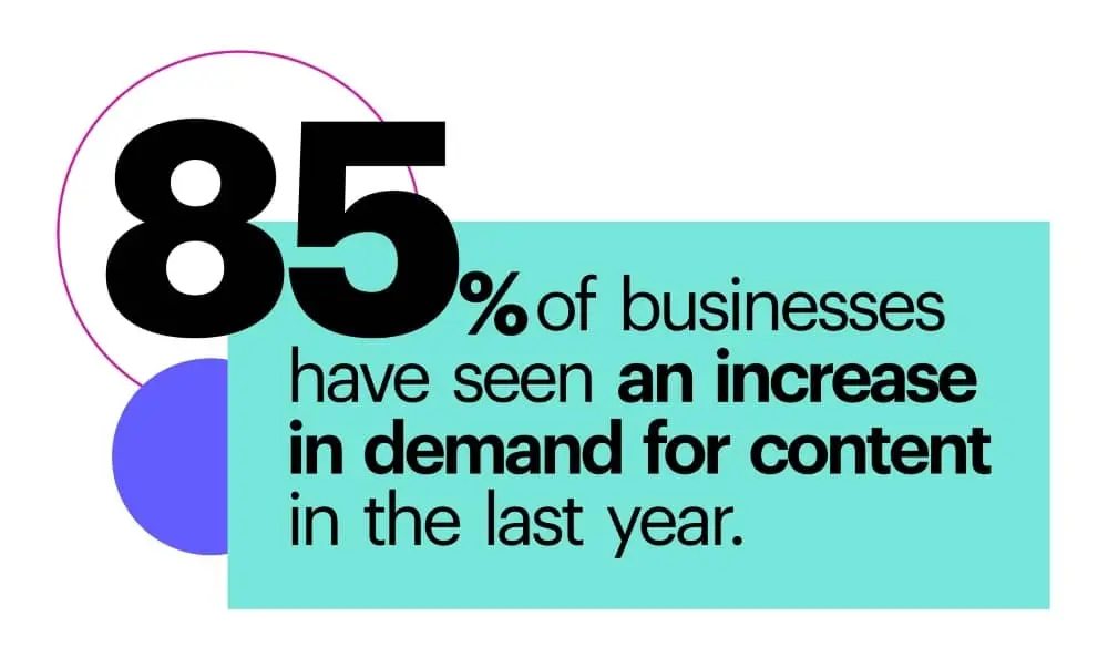
- 85% of businesses have seen an increase in demand for content in the last year.
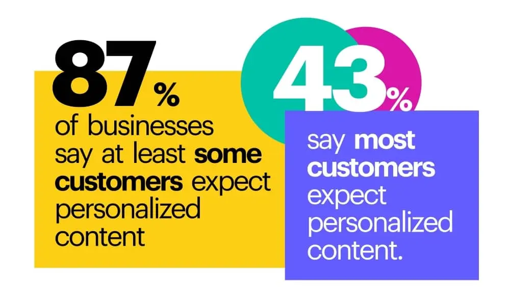
- 87% of businesses say at least some customers expect personalized content, and 43% say most customers expect personalized content.
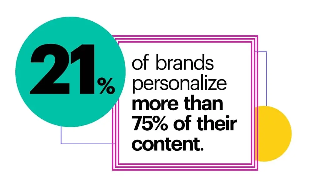
- 21% of brands personalize more than 75% of their content.
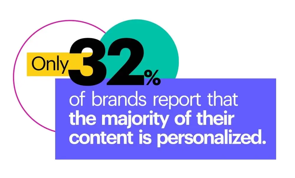
- Only 32% of brands report that the majority of their content is personalized.
Content effectiveness
How and where is content most effective? Most agree that the beginning of the buyer’s journey, in the awareness and consideration stages, is where your content makes the most impact.
It’s widely acknowledged that content can have a major influence on your brand’s success, and most companies believe that their content is relevant and converting customers.
Interestingly, most people think other businesses’ content isn’t relevant, which shows a disconnect between how we perceive ourselves and how others perceive us.
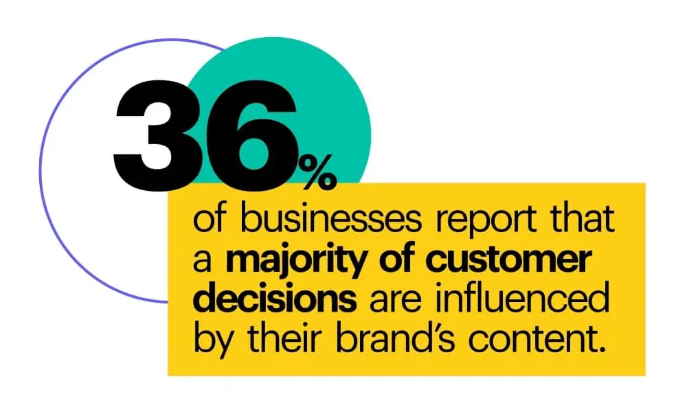
- 36% of businesses report that a majority of customer decisions are influenced by their brand’s content.
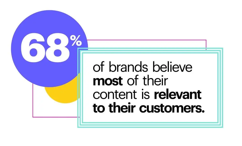
- 68% of brands believe most of their content is relevant to their customers.
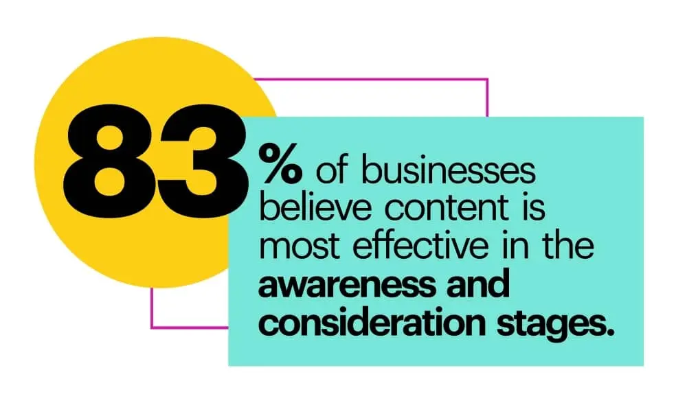
- 83% of businesses believe content is most effective in the awareness and consideration stages.
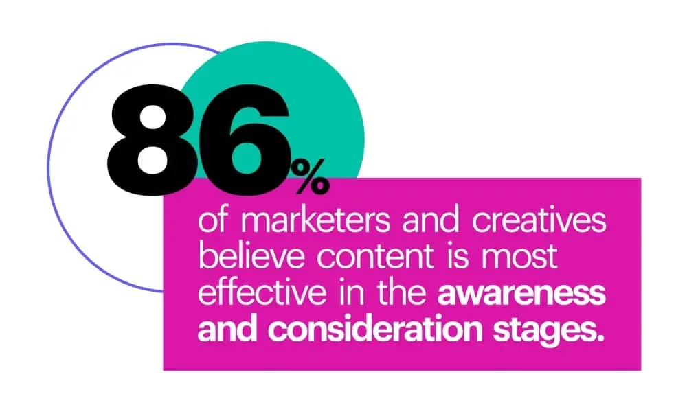
- 86% of marketers and creatives believe content is most effective in the awareness and consideration stages.
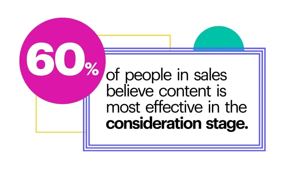
- 60% of people in sales believe content is most effective in the consideration stage.
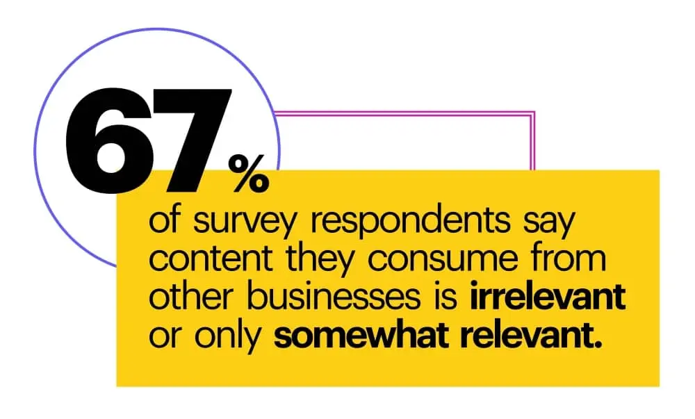
- 67% of survey respondents say content they consume from other businesses is irrelevant or only somewhat relevant.
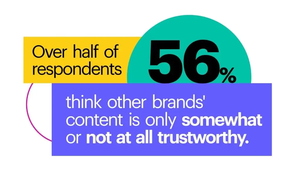
- Over half of respondents (56%) think other brands’ content is only somewhat or not at all trustworthy.
Content ROI
With all the effort we put into creating content, you can’t help but wonder how much that effort is paying off. Your return on investment is definitely something to keep track of, but very few brands do.
Our survey results show that lots of content is being created and going unused. Content use as a metric is also something that often goes unmeasured.
However people are or aren’t tracking their content, survey respondents estimated that content — specifically personalized content — could, on average, increase revenue by a whopping 48%.
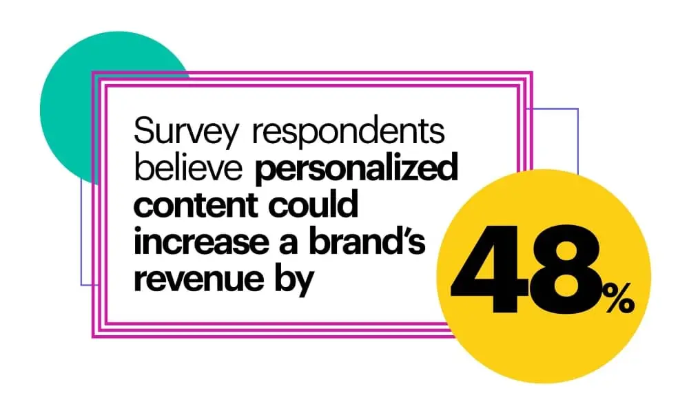
- Survey respondents believe personalized content could increase a brand’s revenue by 48%.
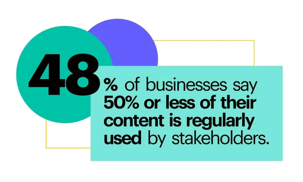
- 48% of businesses say 50% or less of their content is regularly used by stakeholders.
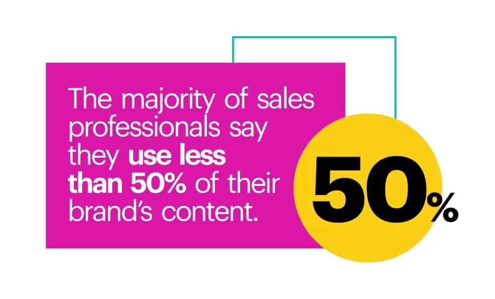
- The majority of sales professionals say they use less than 50% of their brand’s content.
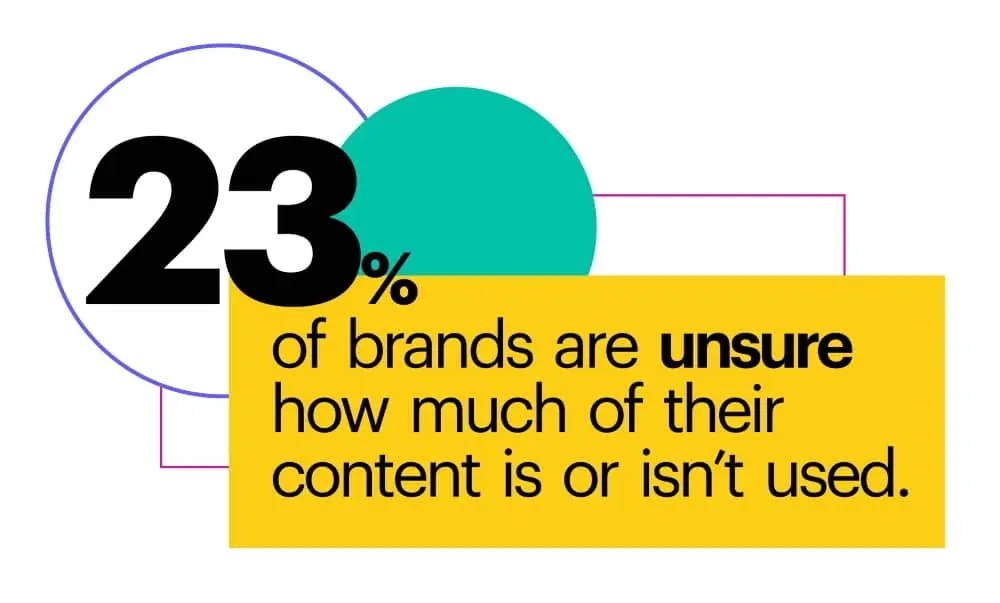
- 23% of brands are unsure how much of their content is or isn’t used.
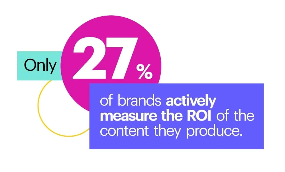
- Only 27% of brands actively measure the ROI of the content they produce.
Content bottlenecks
It’s no secret that it can be hard to get creative requests turned around in a timely manner. Designers are swamped with requests both major and minor, and many brands have turned to templates as a key part of their marketing strategy and a way to mitigate the creation of off-brand content.
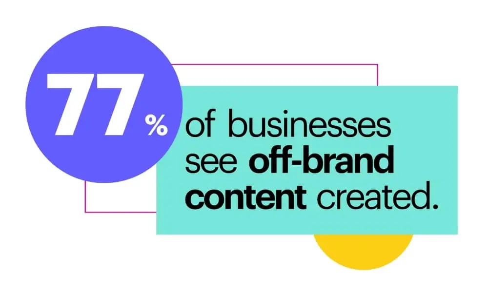
- 77% of businesses see off-brand content created.
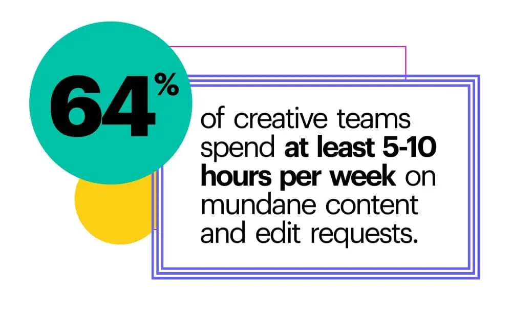
- 64% of creative teams spend at least 5-10 hours per week on mundane content and edit requests.
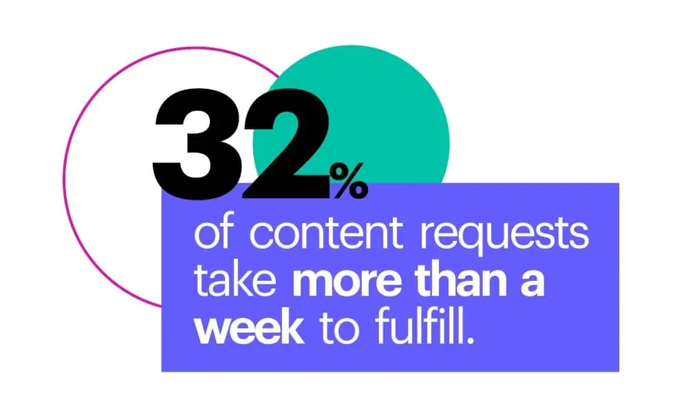
- 32% of content requests take more than a week to fulfill.
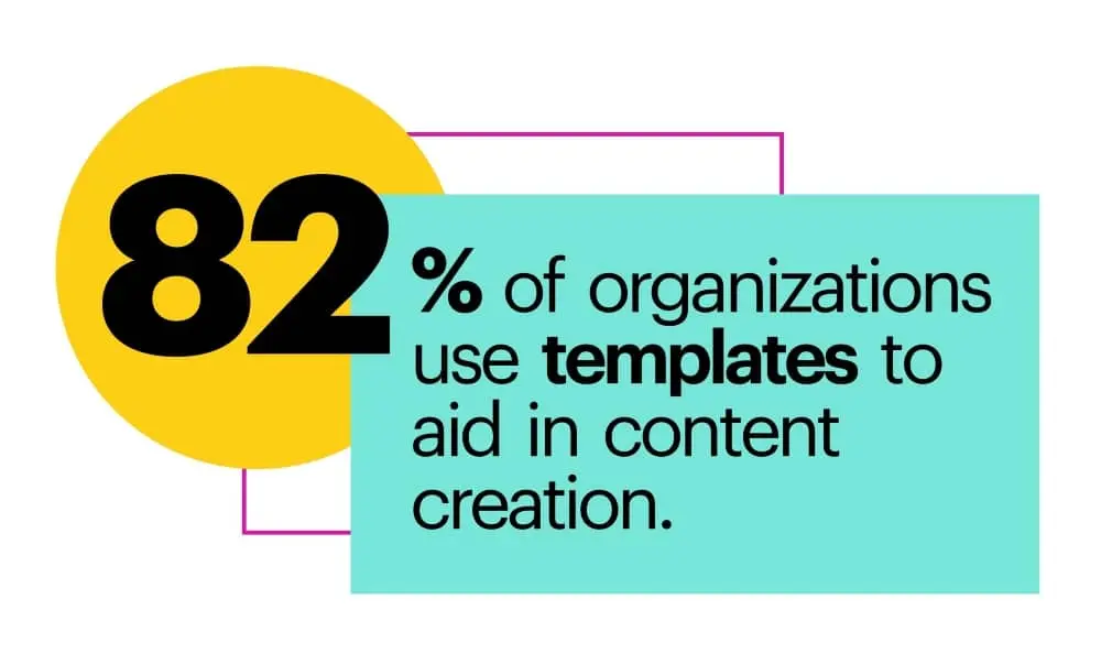
- 82% of organizations use templates to aid in content creation.
If you want more than just the highlights, dive into our full Content Effectiveness Report for all the detailed insights, numbers and content marketing statistics. You’ll find stats broken down by industry, info on what kinds of templates are most popular, and much more detail about how confident brands are about their content.
Qualifying a lead is a multi-step process, and on average, it takes a minimum of six to eight touches. During this time, sales reps evaluate a prospect across four important aspects: budget, authority, need and timeframe (BANT). A prospect who checks all these vital criteria is deemed worthy of persuasion.
Related: 7 types of sales collateral that convert
And this is merely the beginning of the sales process. Once a lead has been qualified, they move through four stages of engagement before being converted into paying customers. These stages are popularly called AIDA: awareness, interest, decision and action. There’s also a fifth step (satisfaction) which happens after the transaction is complete.
Creating awareness, generating interest and building a desire to buy does not come easy. To build a successful sales team, it’s important to not only train your sales team but also equip them with sales enablement content that can trigger the right response from a lead. [![]() ]
]
Identify the assets required
The first step in the process of creating sales enablement content is building a requirements sheet. Salespeople require a unique list of assets at each stage of the sales process. For instance, assets presented during the Awareness stage would mostly deal with information about your business, the founders, investors, products and services, and so on. In the Interest stage, assets mostly deal with product demonstrations. Decision is generated through testimonials and peer reviews that validate your legitimacy and remove any hurdles that prevent your lead from converting.
Types of sales enablement content to consider:
- Explainer videos
- Ebooks
- Webinar recordings
- One-pagers
- Product demos
- White papers
- Case studies
- Customer testimonials
- Blog articles
Once you identify the objectives of each of the different stages of the sales process, building assets to fit your agenda becomes easy.
Create sales enablement content assets
The success of the content creation process is determined by how engaged your customers are during sales outreach. A tool like Lucidpress streamlines the creation of various content assets — like brochures, sales proposals and case studies — with consistent branding. You might also create interactive content like videos and slideshows that are proven to offer high engagement and message retention among viewers.
The question, however, is what kind of content you must create to build better engagement for your brand. Here are a few tips to take note of.
Sales and content marketing need to work together on sales enablement
Sales enablement is a joint effort between the sales and marketing teams. To create the most effective content, marketing needs to be in tune with sales and understand what types of collateral they need most.
Getting together on a regular basis (may we suggest a monthly sync?) to chat about aligning goals will ensure that sales is clear about what they need and that they’re not missing out on any content that’s already available and could be useful for their prospects.
Measure client dropout rate
In any sales process, only a small fraction of the qualified leads you reach out to eventually become paying customers. The rest of the leads drop out at various stages of sales. Identify the dropout rate at each stage of the sales process. The stage where the most clients choose to part ways is the one where your content needs more attention.
You don’t have to use your existing sales enablement content as a benchmark if you don’t want to. In fact, it’s fine to start from scratch to build new content. Hold an internal meeting with all stakeholders (sales, marketing, and product managers) to build a list of features and ideas that could deliver maximum value. This brainstorming session could also include benchmarking your content against the competition’s. This will give your team a good idea of what’s missing and how your content could be made more engaging for prospective customers.
Build a sales enablement content library
The next step is to translate the ideas from your team meetings into actual assets. It’s worth remembering that too much information can clutter your sales deck, so new assets should be organized into a content library instead.
If you plan to use content management or knowledge management tools to handle this, make sure you pick a service that features a “learning path” or curriculum. This will help you organize your content into distinct folders for every stage of the sales cycle, which can be handy during the testing process. As we’ll see in the next steps, it’s vital to experiment with various combinations of content assets and compare the conversion rates.
Make content customizable
If you need to really make the most of your sales enablement content — and who doesn’t? — you’d do well to invest your energy in making templates. Templated content allows anyone to create a customized piece of collateral to meet their specific prospect’s needs.
Instead of a sales rep making a content request from the creative team, they’d simply pull from a library of sales enablement templates that had been designed for this purpose. They’d find a template for a brochure, or whatever piece they need, and then fill in customizable text and image fields to make it personalized for their prospect.
Templated design saves both the sales and marketing teams time, and it can make sure content is as targeted and effective as possible.
Multivariate testing
The next step is to test the effectiveness of your content assets on the conversion rate. The ideal way to do this is to build a handful of different content assets that could be pitched to clients in the same stage of the sales process. For instance, one deck could focus on charts and graphs, while another could use videos and interactive graphics to sell the product.
Make sure that every sales rep pitches at least one client with each of the various assets. Have the performance metrics of the original deck in hand before carrying out this experiment.
At the end of this stage, build an aggregated report of how each of your content assets performed and how they all compare against the original deck.
Secondary multivariate testing
Once you’ve identified the content that performs best from among those tested, the next step is to experiment with more assets of the same kind. For instance, if videos and interactive graphics worked best, then you could work on creating new decks that feature such content. The idea is to find the sweet spot that maximizes engagement and conversion. Once you have a handful of different assets ready, experiment one more time with a new bunch of leads to find the highest performing content deck.
Rinse and repeat
Creating highly engaging sales enablement content is a never-ending process. Once the best performing deck has been identified, the next step would be to look at other stages of the sales cycle where dropout rates are high and repeating the process. Doing this for each of the sales stages will help build a content library that converts higher than ever before.