Like many things worth learning about these days, brand identity is a topic that sometimes gets so misconstrued and complex that the whole thing turns into a big meaningless fugazi.
For some reason, a lot of designers seem to think that making their ideas about brand identity sound more complicated will in turn make them sound like they know their stuff.
In my opinion, that couldn’t be further from the truth.
Related: Branding? Follow this template for creating a brand platform
In the famous words of Albert Einstein: “If you can’t explain it simply, you don’t understand it well enough.”
Sadly, because many businesses have a preconception that brand identity has to be a complex affair, they make it so. But in the ever-changing, fast-paced business world of today, who’s got time for complicated?
Simplicity is key to making good decisions, fast.
So, if we were to sheer away all of the confusing fluff surrounding brand identity, what sort of beast would we be left with underneath?
Welcome to the minimalist guide to brand identity, where all of the confusing and pretentious stuff is thrown out the window and we focus solely on the stuff that really matters.
Let’s dig in.
Rule #1: If it ain’t broke, don’t fix it.
Just take a look at Gap’s rebrand from 2010.
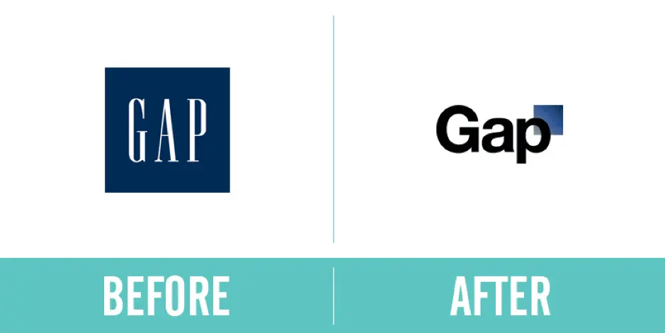
LOOK AT IT!
That change cost them 100 million dollars.
And, they changed it back.
The lesson? If you already have a brand that works, and no compelling reason to change it, leave it as is.
Branding (your brand’s identity) only needs to be changed when the perception of you in the market doesn’t match what you actually do and represent as a business… which leads us into the next rule.
Rule #2: Put your values first.
So, you’ve thought about the point above and decided, “Yes, we actually do need to fix our brand because it doesn’t match who we are.” Fair enough.
But, before you even start to talk about the visual stuff—fonts, colors, imagery and so on—you need to do a little soul-searching to get down on paper the values of your business.
This, in essence, is what a brand’s identity is: the values that the visuals represent. [ ]
Everything about the brand therefore needs to make sense and represent you in some way, so start by answering a few simple questions like:
- What are your business’ values?
- What values do your competitors have that you don’t want to be associated with?
- How do you want people to describe your business, product and service?
Answering those sorts of questions will help direct you in making choices about the visual aspects of the brand.
If you want your brand to be considered tough and macho, for example, you wouldn’t go for a curly, wavy font.
If you want your service to be perceived as simple and to-the-point, you wouldn’t want to go overboard with the imagery.
Once you’ve got those values nailed down, it’s much easier to say whether a visual idea is a good fit for your business.
Rule #3: Simplicity is key.
Sure, you could take a course on branding & design. You could read Pearce’s Theory of Semiotics. You could hire a team of brand consultants to come in with their chihuahuas, fedoras and turmeric lattes to give your brand “pizzazz” and make it pop.
But, why bother when you can keep the process simple?
You’d be amazed at how many companies waste weeks or months—even years in some cases—obsessing over minuscule brand details.
While it’s true that the devil is in the details, it’s also true that branding, just like any other form of art, is incredibly subjective.
Remember that, while you might get into disputes over the finer details internally, as long as the new brand looks good and represents your values, people won’t notice that your font is slightly lighter, slightly bolder, or that you’ve chosen Pool Party Valspar over Filoli Morning Valspar (yes, those are genuine Pantone colors).
In other words, don’t let your own personal ideas of perfection get in the way of progress.
Keep your decision-making system simple, while understanding that people on your team are bound to have a few ideas you don’t, and the process will be both quick and fruitful.
Rule #4: Look at your competitors.
If you want to save time while building a brand identity (and the elements to match), it’s crucial to put together a board of your competitors’ brands, including their logos and value propositions.
Why? Because a lot of businesses rush in, creating a brand they love, only to realize that it looks disappointingly similar to the competition.
Consider zagging where everyone else has zigged. If every brand in your industry is blue, pick another color that will make you more memorable and own that hue instead.
It’s far more powerful to stand out than fit in, so don’t assume that just because everyone else has done something for a reason, you should follow suit.
Looking at competitors early in the process is an easy way to guide your identity and the resulting elements. Other companies will give you insight into exactly which routes to pass by and which ones to explore.
Rule #5: Listen.
I’d strongly recommend using this exercise to build trust with your customers.
Ask them what they think your brand values are to get a picture of the way they see you.
Not only will they love that you got in touch, they’ll feel valued and potentially even become brand advocates.
This is the best and most accurate source of data when revising your brand identity.
Rule #6: Test, tweak and test again.
Once you’ve made your decisions and pushed your new brand identity out there, the key is to test and make sure the changes you hoped would be evident are the ones you actually get.
A soft launch to the same customers you spoke with can be a great way to gauge whether the decisions you’ve made are wise ones.
More often than not, some unexpected reactions and results are likely to occur. A/B testing new messaging & branding on your website and in your communications is a great way to measure whether certain tweaks are working.
When you do launch—especially with changes to messaging—it’s advisable to make incremental changes so you can track exactly what’s worked and what hasn’t. If you push ahead and change everything in one go, you’ll never know which elements are responsible for positive or negative reactions.
Key takeaway
Branding is a huge differentiator. No matter how you approach the subject internally, it’s important to keep a commercial head on your shoulders and realize that the more time & resources you sink into your new brand, the less cost-effective it becomes.
I know that’s a pretty boring thing to say when talking about something as exciting as branding, but many businesses fall into the trap of sinking so much time into brand identity work that the whole project becomes a false economy, costing you way more than it could possibly generate in revenue.
To avoid that pitfall, keep your decision-making process swift, honest, and void of too many personal preferences—and your identity project will be a flying success.
Ready to begin? Learn about the 10 assets you need to effectively manage your brand online in our free ebook.
Physics is to Albert Einstein as branding is to David Brier.
A walking, talking brand himself, David Brier graced our screens three weeks ago for a webinar that divulged the 19 questions every organization should ask before rebranding.
I have to admit, I expected all the cliché questions: Who is our audience? What is our core strength? Yadda, yadda, yadda. But David proved he isn’t a world-renowned rebrand expert for simply stating what I already learned in Marketing 101… he’s world-renowned for asking the kind of questions that require intense (organizational) introspection. Questions that actually make you think.
Intrigued? Watch the full webinar here and read to follow along.
David Brier’s draw can probably be attributed to his three decades of branding experience, but on a personal note, I think the bold, in-your-face personality may have a little something to do with it too. Case in point? “I’ve been compared to a triple-shot espresso.”
His words, not mine!
Now… sit back, relax, and let me take you on a journey through David’s mega-marketing mind as I summarize some of the insights we learned during his webinar. And remember, you can always just watch the recorded webinar in full if you’d rather hear it straight from him.
Why do companies rebrand?
Here’s a shocking fact:
For some reason, we as marketers can forget this minor detail. Entire populations who were once our brand loyalists don’t stay that way forever. They’re replaced by an entirely new generation of new human beings with new opinions and needs. Which means you need new messaging.
In David’s words: “With today’s technology, these changes are happening faster than ever. To stay relevant, sometimes the correct strategy is a rebrand.”
So we embrace the fact that the world constantly changes, we stay relevant, and we resonate with the new generations as they come. Easy, right?
Well, as David points out, companies repeatedly struggle to pull off an effective rebrand.
It’s that wall. No matter how hard you market and how targeted your campaigns are, there still seems to be a disconnect between you and potential customers.
The problem? Clichés.
David explained how certain phrases like “state of the art,” “knowledgable staff,” and “caring customer service” (who talks like that, anyway?) can alienate companies from their audience and be too predictable to hold interest.
More importantly, clichés distract from good branding.
Branding the right way
According to David, the definition of good branding is good differentiating. No surprise there, right? Stand out from the competition and potential customers will notice you more. As David reminds us: “Differentiating is not a luxury. You differentiate if you want to survive.”
You differentiate if you want to survive.
Now that’s a bold statement.
He’s got a point, though. The great thing about David is that he doesn’t make a bold statement without something to back it up. In this case, that something is a slew of real-world examples. Real brands that had real problems until he swooped in and differentiated the heck out of them. I’ll let you discover the intriguing before-and-after brand transformations when you watch webinar in full.
The 19 rebranding questions
The stage has been set. We understand why companies rebrand, what branding is, and why it matters. Now for the hard part—how to actually go through with a rebrand.
It’s about time we dive into the 19 questions, isn’t it?
I’ll cover the first five questions here. If you want the remaining 14, I’ll let you watch David reveal the rest himself.
Rebranding question #1: Why are we doing a rebrand?
Seems like an obvious question, but as David points out, many companies make the mistake of rebranding simply to rebrand—to be “prettier” and to change things up. But rebranding is not worth the time and money if it doesn’t revolve around strategy and relevancy.
Rebranding question #2: What problem are we attempting to solve?
Does your packaging get lost on the shelf? Is your product not valuable to customers once they get it? Figure out the problem you are trying to solve, and let rebranding help fix that problem. If you don’t have a clear objective to your rebrand, rebranding really won’t do you much good.
Rebranding question #3: Has there been a change in the competitive landscape that is impacting your growth potential?
As much as we’d like to think our brand isn’t impacted by the decisions of other brands, it is. No brand exists as an island. You always have to be watching the landscape around you, and be nimble and fluid in response.
Rebranding question #4: Has our customer profile changed?
Yesterday’s innovation becomes today’s normal, and new innovations can drastically change our customer profile. Don’t blindly base your strategy on information that could have been relevant for your audience five years ago but has no place in your brand today.
Rebranding question #5: Are we pigeonholed as something that we (and our customers) have outgrown?
Many times, businesses evolve as they grow. They start out with a certain focus, then shift that focus as time goes on. For example, a 25-year-old dance institution that still used a ballet dancer in their logo admitted to David that ballet now accounted for only 15% of their training. It’s a prime example of a brand pigeonholing themselves by not keeping up with their own evolution and growth in their branding.
As for the last 14 questions, they really are worth reviewing. David’s tips are chock-full of insights that get you to fight for your rebranding strategy—to really have a reason for how and why you’re doing it. A true rebrand should be hard—it should challenge your fundamental beliefs about your organization and spark new ideas of how to better hone in on the core value it provides.
Thinking about a rebrand? If it’s time for a brand intervention, you won’t want to miss our webinar with branding expert David Brier.
A good logo represents the brand positively to the world, which is one reason why there are so many agencies dedicated to designing outstanding logos. Although the names and objectives of many organizations remain unchanged for many years, their logos are often renewed periodically.
Rebranding is sometimes necessary for shaping the future of the company, but you can reap some of the benefits simply by improving your logo design. A redesigned logo goes a long way in attracting and influencing customers. Here are 9 great examples of famous brands who have successfully redesigned their logos.
Related: 8 tips for designing logos that don’t suck
Pizza Hut

Since Pizza Hut’s opening in 1958, its logo has been redesigned many times. From the original mascot Pete holding the words “Pizza” and “Hut” in both hands, the logo has evolved to feature an iconic hut-shaped roof as its main element. With this redesign, Pizza Hut has stamped its signature slanted roof in sauce—to match an upgraded menu with bold sauces and premium ingredients.
Pizza Hut’s renewed logo is simple and classically designed with a minimal color combo of red and white. Developed as a flat design, this red logo still inspires hunger.
MailChimp

This example comes from Jessica Hische, the designer of the revamped MailChimp logo. The redesign looks quite similar to the previous version; there are minor improvements rather than a complete change.
MailChimp’s old and new logos may look alike at first glance, but there’s a difference in typography which makes the new logo cleaner and easier to read. Redesigning your logo doesn’t always mean a total overhaul. In fact, improving the look and feel of an existing logo can preserve and enhance the brand identity you’ve already built.
Firefox
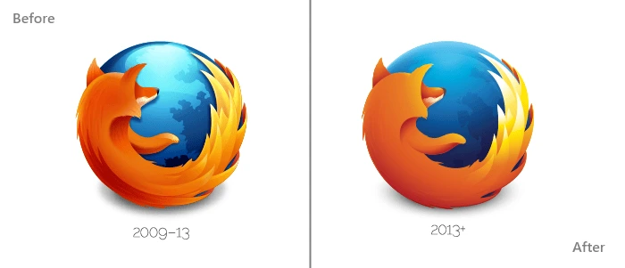
Firefox, the open-source internet browser, uses a logo which has gone through several iterations since 2004—but the imagery and symbolism remain the same. This logo features a dark blue globe (the web) with a bright orange fox speeding around it.
The logo design team at Mozilla have modernized the existing logo by changing several visual elements. The glossy touch on top of the globe has been removed, while the contrast of the fox’s tail has been heightened. It’s a flatter design that’s still as vibrant and fiery as ever.
Mall of America

The launch of the Mall of America’s new logo is a perfect example of rebranding. The largest retail and entertainment complex since 1992, the Mall of America has recently upgraded from its older, nostalgic brand to something new, modern and dynamic.
Before, its logo recalled the American flag with its star shape, color scheme, and waving lines. An old-fashioned serif font proclaimed “MALL OF AMERICA” at the bottom.
In contrast, the revamped logo features a multicolored star made of ribbons, along with the company’s name in a sans-serif font. This represents the changing vision and diversity of the mall, while still retaining its recognizable American star.
Motorola
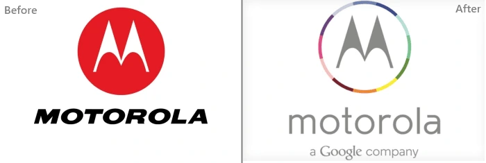
Motorola’s new logo first debuted in Techweek back in 2013. Motorola was acquired by Google, and its redesigned logo represents this merger well. The flat design and letter “M” are common to both versions, but the font has changed and the colors are aligned more closely with Google’s branding. And in case that isn’t clear enough, the tagline “a Google company” is added below the Motorola brand name.
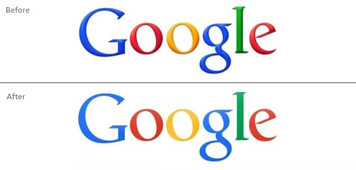
Speaking of Google, its current logo was unveiled in 2015. Its original logo was designed in 1997 and digitized by founder Larry Page. In 1999, further visual elements were integrated into the logo such as an exclamation symbol, enhanced hues, and a background shadow.
Like many of today’s modern logos, the current Google logo is a flat design. There have been minor changes to Google’s logo throughout its journey, but it has always retained its classic serif typography and bold colors.
Tampa Bay Buccaneers
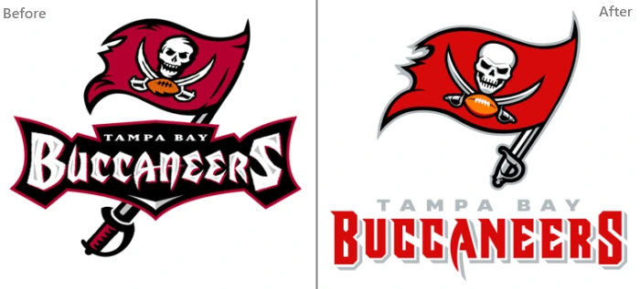
Illustrations can certainly make your logo more visually interesting, but they can also become too complicated. Thus, the recently redesigned logo of the Tampa Bay Buccaneers was simplified to look more polished but still feature the same pirate imagery.
The colors here are smartly used—a brighter, richer red calls attention to the flag, and black outlines the illustration without overpowering it. Redesigning a sports logo can be tricky business because fans are so attached to their team, but this logo retains all the crucial elements of the original, right down to the flag’s sword handle.
eBay

The disordered arrangement of letters in eBay’s logo were the main target of this redesign. eBay’s new logo looks modern, featuring a flat design with no letters overlapping. The colors have been lightened to make them easier on the eyes, as well. In this svelte version, eBay has elevated its brand from the wild early days of internet commerce to a long-standing and trusted online marketplace.

Facebook occasionally launches different logos with new versions of its site. As the most popular social network, Facebook must keep up with its users and reflect the latest design trends—but its identity is always the same.
This new logo, like many of its digital peers, is designed in flat format with the bottom line removed. Also, the “f” now extends all the way to the edge. With its navy blue background and bold letter “f,” Facebook’s rounded square icon is still instantly recognizable across the web.
So there you have it—9 examples of logo redesigns from some of today’s successful brands. Trends like flat design and bright colors can bring new life into an old logo. As the market changes and evolves, these logos will change again, too. But most importantly, they will continue to represent and build a strong, consistent brand identity that resonates with their customers.
Wondering whether it’s time to rebrand your own business or organization? Learn more in our free eBook: How and Why to Rebrand Your Company
To the average person, designing logos seems like a simple task—you just make a small circle or rectangle and put the brand name on it. But of course, it’s not nearly that easy.
Related: 9 excellent logo redesigns for famous brands
To help a brand capture its personality and really stand out takes a lot of careful consideration and design iteration. If you’re new to the field of logo design, here are 8 tips for designing logos that don’t tread on overly well-worn ground.
1. Avoid clichés

Every year, we see innovative trends in logo design. It’s good to keep up with trends and experiment with them for yourself, but don’t fall into the trap of using the same idea over and over.
For a few years, the “hipster” logo was very popular. Featuring a pseudo-vintage look, these logos eschewed simplicity in favor of lots of text and symbols. This look became so ubiquitous that it became a joke within the design community, spawning satirical sites like Hipster Logo Generator.
A current design trend to keep an eye on is gradients. Gradients have been a big no-no for at least two decades, but they’re now enjoying life in the limelight again. You don’t have to look any further than the recent Instagram rebrand to see it in action.
In the long run, it’s a better idea to stick to solid design principles and avoid clichés.
2. Embrace unique design

Originality and uniqueness make it easier to catch a viewer’s eye, and custom lettering is a great way to embody both traits. Additionally, it’s harder to copy than a commonplace font.
The quintessential example of custom lettering is, of course, Coca-Cola’s logo. As one of the world’s oldest and most established brands, Coca-Cola’s logo has stood the test of time and continues to be instantly recognizable.
3. Create a visual double entendre
What’s a visual double entendre? Essentially, it’s a double meaning. If designed in this way, a single logo can give the impression of two different images.
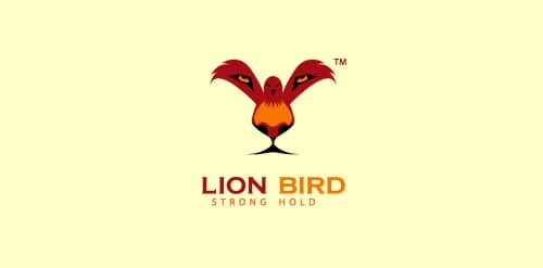
For example, in this logo for Lion Bird, you can see two animals: a bird opening its wings and the face of a lion. Viewers love designs like these because, once they discover the double meaning, they feel like they’re in on a secret.
4. Don’t underestimate color
Color plays an integral role in logo design, and its importance cannot be understated. A brand’s color palette sets the tone for its communications, and people often remember a logo by its colors.

You know these by heart: Home Depot is orange, Target is red, Starbucks is Green, Facebook is blue, UPS is brown, and Apple is white. While colors are shared with countless other brands, these brands have been able to lock down these colors in consumers’ minds.
5. Create a sense of motion

It’s possible to create dynamic logos that invoke a sense of motion without actually moving. The advantage of this over, say, a GIF design is that GIFs aren’t supported in every medium—like print, for example. Creating a sense of motion in a still image will help to preserve the brand message everywhere.
Twitter’s logo is a great example of this. In the past, the bird was sitting down in a passive stance. Now it’s moving upward in flight, reflecting Twitter’s speed and its evolving technology. This tactic works well for brands which have mascots.
6. Keep it simple
In logo design, simplicity is certainly the best policy. Simple, powerful logos are often the winners in the long run. For example, Apple and Nike’s logos are simple but well-known among millions of people.
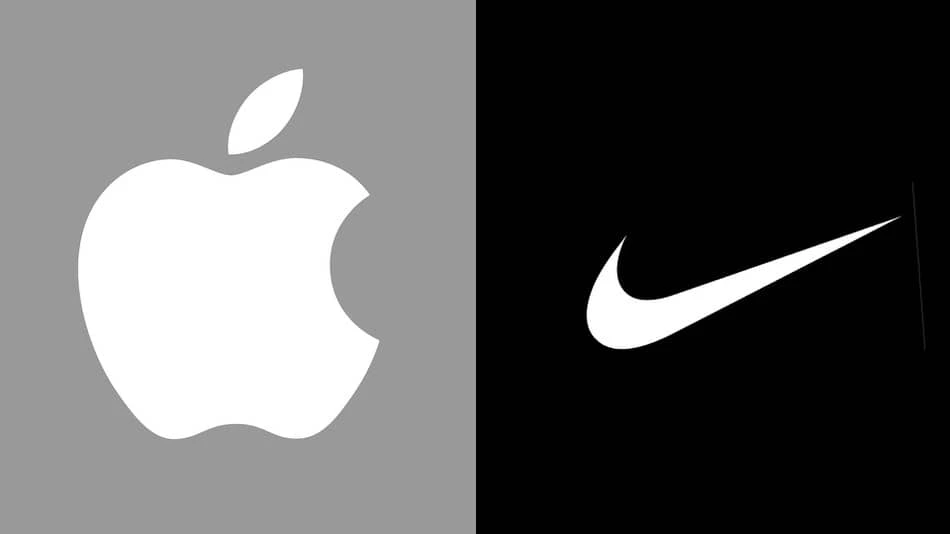
Remember: even though simple design is the goal, it’s still important to be unique. Would Nike still have succeeded with a traditional check mark? Would Apple’s logo still be as compelling without that bite taken out?
7. Remember balance & symmetry

Keeping the previous examples in mind, you can see that balance and symmetry are vital factors in logo design. Look at how Apple’s logo employs proportionate circles along with symmetry to maintain balance and aesthetic quality.
8. Tell the story behind your logo
Every logo has its own story. In some cases, the story is almost as interesting as the logo itself. Either way, storytelling can draw people into your brand, so make it count.
Do you know the story behind Apple’s logo? Ronald Wayne (sometimes called Apple’s third founder) designed a logo in which Isaac Newton sat under a tree with a bright apple shining above his head. A year later, Steve Jobs commissioned another logo. The reason? He thought people might confuse the original image for a tomato. Thus, the apple with a bite was born.
We hope these simple tips offer a peak into the complex world of logo design. By following this advice and avoiding the pitfalls, you should be well on your way to brainstorming a compelling logo for your brand or business.
Learn more: Do you know the 10 essential brand assets for digital success?
Some businesses naturally lend themselves to sharp design. Walk down any street in a hip neighborhood and you’ll see fashion boutiques, cafes and gastropubs displaying beautiful branding. Stylish typography, trendy color palettes—the kind of design that creates an enviable brand image.
Related: Building a local brand—5 essential things to know
When it comes to the service brands of the world—your plumbers, HVAC, pest control, any “man-in-a-van” type of business—design and branding are often an afterthought. The service comes first.
After all, there’s nothing cool about getting your drains snaked or having rat traps set up. Service brands don’t cater to a specific set of people the way a bar or boutique does. They sell a skill that everyone needs, not another form of self-expression. Beyond providing the best service possible, it’s hard to find ways to differentiate yourself from all the other service brands out there.
The result? Barebones websites, a lack of stand-out branding, and an endless supply of boring marketing materials. But it doesn’t have to be this way. In fact, investing in some simple branding & design can help your business stand out from the pack.
Why: The market is crowded
Service businesses, particularly in major urban areas, are incredibly competitive. A search for “plumber” on Yelp in Chicago will yield more than 2,000 results. In New York, that same search turns up over 6,000 results. Local plumbing businesses, nationwide franchise networks, and general service companies are all competing for the same work.
In a market that’s so incredibly competitive, you need a way to stand out from the crowd. When you ask a service brand what makes them unique, and how they’re different from competitors, you tend to get answers like “We’re really knowledgeable and honest with our customers.” Which is probably true. For them and just about everyone else.
That’s a great business model, but it doesn’t captivate the imagination. Before you can display your expertise, you have to get someone’s attention—and tradesmen, not being particularly design-focused, often overlook that the path to new revenue starts with awareness.
If your business has a bland website with sparse information, and you’re driving a white van in a city full of service vans, trucks and dispatch cars… how are you standing out? If you’re mailing brochures to potential clients, what saves that brochure from ending up in the trash?
In order to thrive in these competitive markets, you need to capture that initial attention. Marketing alone isn’t enough—you can drive visits to your website all day, and you can mail a flyer to every homeowner in town. On average, you have 8.25 seconds of their attention. Do you really think someone is going to look at a white-and-blue website that says “We’re trustworthy!” for more than 8 seconds?
Probably not. But then, how do you do it?
How: Color, design & user intent
So now, let’s welcome design back into the picture. We need it to capture the attention of potential customers, to stand out from the 2,000 other plumbing businesses in Chicago. But service brands don’t always have graphic designers—or even the budget to hire one. It’s tough to even know where to start.
Color
- A good starting point for service brands is color. Color has the power to influence user behavior. Often, service brands default to black & blues: simple, safe color choices that don’t stand out. That gives you an opportunity to choose something different.
* Color increases brand recognition by 80%. Some of the most notable service brands employ unique colors as part of their brand. Take Mosquito Joe as an example—the fastest-growing service franchise in the United States. Their bold green & yellow branding extends from their trucks to their uniforms. These eye-catching colors no doubt play a huge role in attracting new customers and franchisees.
Design
- Give your colors the chance to shine with some great design. Aim for a professional appearance, from the website to the trucks to the polo shirts your technicians wear. Every piece of your business should align with your branding to give your customers a consistent experience every time.
* This can sound like a daunting task to a non-designer, but it’s definitely achievable with the right tools. For example, Marq was designed with non-designers in mind, so anyone can quickly create attractive, on-brand content. You can create templates (or use pre-made ones) to publish and print- flyers
- brochures
- business cards
- newsletters
- banners
- social media graphics
- and much more.
User intent
- Finally, consider user intent. Who is your customer base, and what do they care about? What information do they need to make a purchase decision?
- Web accessibility: How easy is it to find the information they need on your website?
- Social proof: Do you provide ratings, testimonials, accreditations?
- Call-to-action: What can you say that persuades them to contact you?
When: Right now
It’s easy to put off projects like updating a website, improving flyers or repainting trucks. But, the sooner you can develop strong branding, the better off you’ll be down the road.
For many service businesses, winter represents downtime, which offers the perfect chance to brush up on your design skills and revamp your brand’s image. Imagine starting the next busy season with the right collateral in place to drive more sales. It’s within your grasp, and easier than you think.
See how Marq makes it easy to create attractive, professional marketing materials—no expert design skills required.
Sometimes, change is a good thing.
A fresh lick of paint can revive a dull living room, a new haircut can boost self-esteem, and a rejuvenated image can bring life back to an outdated brand.
The catch is that, unlike changing your hairstyle, a brand refresh isn’t something to do on a whim because you’re bored or haven’t had a chance to play with your design software in a while. Without a solid strategy, your renovation could turn into a DIY disaster.
Related: 10 best branding & corporate identity design examples
When you’re considering a brand refresh, start by asking a few honest questions:
- Why does the brand need a new image?
- How will a refresh help the business?
- What’s involved in a refresh, and what resources will you need?
Let’s take a look at a few reasons why a brand refresh might be the right choice for your company today.
Is my brand outdated? Separating the dynamite from the dinosaurs
Perhaps the most obvious reason to refresh a brand is that its image has simply outgrown its effectiveness. IBM is a great example of a brand that’s successfully evolved its image to match the changing nature of its product portfolio. By adapting its visual identity and voice throughout the decades, IBM has shown it can stand up against modern competitors.

This IBM logo offers a look back at the brand’s history
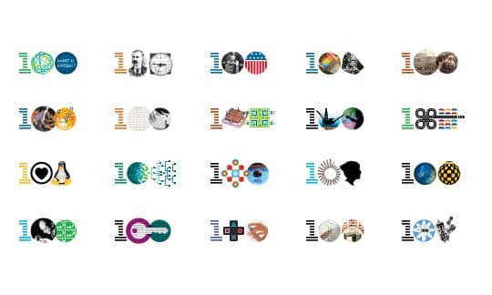
A selection of icons designed for IBM’s centennial
Many enterprises struggle to make changes because an old brand can gradually start to feel like an old pair of shoes-sturdy and comfortable. Unfortunately, you will need to make changes eventually if you want to be seen as an authority in your space, rather than a relic. Here are a few ways to check whether your brand is becoming outdated:
- Is your visual identity fresh and modern? Look at your logo, website, and any other visual media you use to connect with customers.
- When was your branding designed? If your logo is more than 20 years old, it’s probably time to revisit it.
- Is your brand getting the right results? Are you still marketing to the right audiences?
- Does your messaging and positioning accurately reflect your current value proposition and customer pain points?
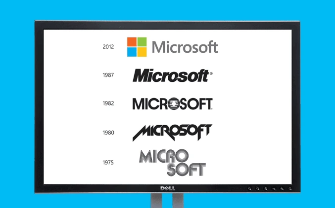
A timeline of Microsoft’s evolving logo design
Refreshing vs. rebranding
It’s easy to confuse a rebrand with a brand refresh, but ultimately, they serve two different purposes. A company rebrand is an extensive endeavor that involves completely removing the basic structure of the brand and starting over. A company typically only pursues this strategy if the current brand identity is confusing, contradictory or misrepresents the core of the company’s mission. A brand refresh, however, involves updating and building upon the brand structure that is already known and loved. Rather than a complete overhaul, it involves an update to visual elements, tweaks to messaging or changes to other differentiators.
5 practical reasons to refresh your brand
A brand is more than just a name and a logo. It’s also your company’s reputation, identity, and public perception. In many cases, companies recognize the need for change but want to preserve the brand’s positive aspects. With that thought in mind, here are 5 reasons you might consider updating the brand rather than undergoing a full rebrand.
1. You aren’t getting enough attention
A great brand doesn’t just generate an image for your company; it gives your customers a reason to sit up and take notice. There are plenty of ways to tell whether your audience has moved on from your message, and the first is that you’ve seen a steady decline in sales.
If people are just as happy with your products as they’ve always been, but you’re not gaining ground in the market, this could be a sign that your brand has lost its selling potential.
Remember, refreshing your brand doesn’t involve turning your identity upside down. Instead, it can be something as simple as redesigning your logo, unrolling a new slogan, or switching to a new color palette. It’s giving your audience something new to chew on while sticking to your brand’s core values. []
The power is completely in your hands.
2. You don’t stand out from the competition any more
Making an impact is hard in today’s saturated online marketplace—and copycats are running wild. Even if you have a great product or service, it won’t be enough if customers can’t distinguish your brand from the other players in your niche. You’ve got to stay ahead of the pack.
If your brand image is starting to feel like a copy-paste job, then you’re going to need new and unique ways to recapture your audience’s interest.
This can be a complex process because it means getting to the bottom of what your company stands for, what it can do today, and how it outshines your competitors. If you can find a way to differentiate yourself, you’ll find it much easier to drive brand awareness and loyalty.
3. Your company has changed
A founder’s initial vision and the company that grows out of it aren’t always one and the same. Sometimes, a brand is born with a particular product in mind—like Starbucks and its signature coffee. Then, as the business continues to grow, it’ll develop new products to better serve its audience.
Over the years, Starbucks has updated its product list to include everything from sandwiches to iced tea. These changes meant that the company had to reimagine the brand’s image based on what they could offer customers in a new marketplace.
As the business evolves, keep an eye on your brand and take note of any constraints that might make it difficult to branch out into new areas.
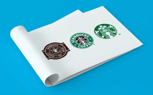
Starbucks has evolved to serve much more than coffee
4. Your message is inconsistent
For most companies, building a brand is about refining ideas and values into a voice and image that they can project to the world. As you can imagine, this is a complicated process that even the best of intentions can belie.
A brand refresh can help to realign your company’s values when they start to lose their way. After all, we know how valuable brand consistency is—not just to your customers’ experience, but also to your bottom line. If you want your brand to become a trusted name, then you’ve got to deliver the same, familiar experience whenever customers interact with you.
5. You want to attract new customers
When a brand is just getting started, it’s often easier to target a small, niche audience. However, as the brand grows, it’ll find opportunities to expand into different areas that offer new sources of revenue.
Sometimes, tapping into a new share of the market requires changing your voice or image so it’s more likely to appeal to a wider range of customers. A brand refresh can help you reimagine what the future looks like for the company.
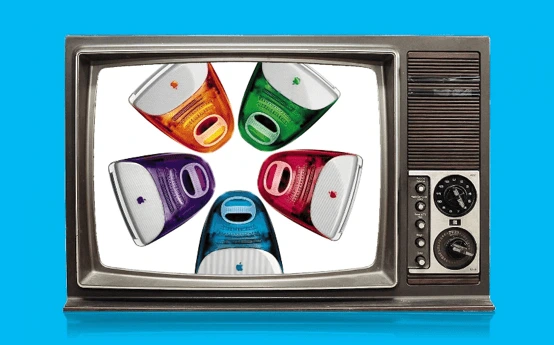
Apple excels at making its brand & products feel fresh. Remember these?
Is it time to refresh your brand?
Ultimately, the decision to refresh your brand can be a difficult one, but it’s worth thinking about when your current image isn’t delivering the results you need.
In severe cases, you might discover that the best way to bring your company back to life is a complete rebrand, where you go back to the drawing board and start fresh. While a rebrand is a more dramatic approach, a refresh allows companies to make tweaks over time that help their brand evolve with the market.
Considering a brand overhaul? Grab a free guide to conducting a rebrand
When you’re fine-tuning your brand, it’s important for everyone in your company to be on-board.
Let’s face it: Keeping your brand consistent is a tricky task—but it’s one that’s almost impossible if your staff aren’t fully educated about the strong brand you’re trying to create.
Related—Brand building 101: An 8-step brand development strategy
But, how can you keep everyone up to speed with the branding guidelines you’ve put together? In the modern age, when teams are becoming increasingly tech-savvy, an old Word document with a bulleted list of brand elements isn’t the way forward.
There’s one not-so-tiny thing that can help: a brand platform.
Here’s how you can create your own brand platform, and a free template to help you get started.
What is a brand platform?
Acting as the overarching document that includes important details about your business, a brand platform typically includes:
- Your mission statement: What are you hoping to accomplish through the products or services you’re offering?
- Your key values: What do you stand for as a company?
- Your brand’s tone of voice: Do you use slang in your communications with customers or stick to industry jargon?
- Your brand personality guidelines: Are you a fun and friendly brand, or do you talk to your customers professionally?
- Your visual branding elements: Which logos, fonts & colors are you using on your website and marketing collateral?
Every company, no matter what industry they’re operating in, should have a brand platform.
Why do I need a brand platform for my business?
It’s all well and good for me to harp on about brand platforms, but you want to know why this document is so important for businesses, right?
Here’s your answer: This central document helps to make sure everyone in your business is on the same page. From sales and marketing teams to creative departments, your business’s brand platform should be accessible by all employees, and clearly understood before undertaking any new marketing strategy or messaging.
This helps to keep your brand consistent—a tactic that has been proven to influence a 23% increase in revenue, on average.
In short: You’d be foolish to neglect it!
The perfect template for creating a brand platform
While brand platforms are critical, creating a document that is well-received by all members of your team isn’t an easy task.
However, we’ve created this brand platform template to provide inspiration for your own development. Simply open the template in Lucidpress and edit each element to match your brand.
Download this free brand platform template.
3 tips for adding your own identity to this template
Now that you’ve got a template to base your brand platform on, use these three tips to add your own identity.
1. Dig deep into your business’s true values
Certain sections of this template require you to dig deep into the core of your brand—including the mission statement and brand personality sections.
So, avoid filling this section of your template with fluff. Remember: A strong brand has a strong reason behind the things they’re doing.
You could gain valuable insights for this section of your brand platform by:
- Interviewing your CEO or founder to discover why the company started, what problem it was created to solve, and what aim it means to accomplish.
- Asking co-workers why they enjoy working at the company.
- Surveying previous customers to unveil which company value prompted them to purchase.
The latter option is fantastic because you’re able to identify which of your branded elements have worked previously. For example, if you notice an overwhelming number of customers purchased because of your company-wide passion against animal testing, don’t miss out by failing to include this in your brand platform. It’s already proven to be effective.
2. Use your brand platform for every type of marketing activity
Planning to launch a Facebook advertising campaign? Looking to use Google Ads to sell more products? Gearing up to attend an industry trade show?
In any of these occasions, your brand platform is critical.
Why? Because a powerful brand is consistent. Think about it: One of the most recognizable brands in the world is Nike. I’ll bet their signature checkmark logo wouldn’t be as iconic if it wasn’t plastered across their sneakers, website and social media profiles.
So, use this consistency concept when doing any type of marketing activity. Encourage all members of staff to refer back to the brand platform when representing your company, and you’ll be on the road to a strong, powerful brand in no time at all.
3. Don’t try to be something you’re not
Did you know that 94% of all consumers are more likely to be loyal to a brand when they commit to transparency? Attempting to be something you’re not isn’t going to sit well with the people you’re working so hard to win over.
Going back to our tip on digging deep into your brand’s true values, pretending to be something you’re not—and fabricating your values to seem more interesting—shouldn’t be part of your brand platform creation process.
Instead, be true to your brand. Marketing to the beat of your own drum is much better than following the crowd.
Final thoughts on creating a brand platform
Are you ready to make a start on your brand platform and experience the benefits of consistent branding?
That’s great, but don’t let your hard work go to waste.
Make sure every member of your team is fully on-board with your brand platform before publishing any marketing materials—including social media posts, online ads or blog posts.
Whether you’re printing out the template and pinning it to your office wall or holding a company-wide meeting to explain each element, your new brand platform won’t be effective if it’s not being taken seriously. Be the champion your brand platform needs, and you’ll see results in no time.
Why talk about sustainability?
You’re probably fed up with the terms “millennial” and “Generation Y,” but they’re still helpful when describing that particular group of consumers.
For example, one trend that keeps popping up is their desire to buy from brands brave enough to set standards of behavior and live by a set of principles.
Related: 5 content tactics to ignite brand engagement with millennials
I’m a millennial, and for the first time this year, I was able to go to my local zero-waste store and buy travel toiletries for my summer vacation. I even paid a lot more for the privilege and left the store with a fuzzy feeling and a huge smile. Does this sound unusual? Trust me—I’m not the only one in my peer group who looks for opportunities like this.
If you’re looking for more reasons to build your brand around sustainability—and examples of brands that are doing just that—read on.
Boosting that bottom line
If you want to show the market that your company is in it for the long haul, having a sustainability strategy is a case of when, not if.
We know that 75% of millennials millennials say sustainability is a shopping priority, more than any other group. [] Yes, we came of age during the Great Recession and aren’t the richest generation (hello Boomers), but we are getting wealthier. And, importantly, we are willing to pay more for things that matter.
The problem with sustainable business practices is the misconception that being good equals less revenue.
Even Forbes agrees that you can earn better returns from investing in good companies. If you’re not positioning your company to look after the planet and its people, you’re already behind. The time is now.
Leading from the front
Do you want your brand to be on the cutting edge, forming relationships with international audiences? Or do you want to be trying to figure out why your quirky social media campaigns aren’t getting the engagement they used to?
The United Nations are fully focused on achieving their Sustainable Development Goals by 2030, and your brand can be part of that through the work of the Global Compact division.
Of course, this is step one in the process. Your brand won’t survive on goodwill alone. It has to produce a steady profit to grow and spread your positive message further.
Step two is telling your story, integrating sustainability into your brand and making sure the entire company is on board and proud of the work you’re all doing.
Telling your “triple bottom line” story
If you’re not familiar with the triple bottom line, it’s the idea that your business should be measuring and reporting not just a financial bottom line, but social and environmental bottom lines, too.
This is how you truly integrate your business with sustainability. There are several ways to get started on this, but some useful resources are:
- B-Corporation. This is a framework any business can pick up and follow. It guides you on best practices for triple-bottom-line business plans, and you get a certification at the end.
- Global Reporting Initiative. The GRI is the go-to resource for sustainability reporting. Using GRI, you can easily figure out what you can report and how to report it.
- Integrated Reporting Council. Integrated reports are becoming increasingly necessary, bringing together financial and non-financial data in one place. It helps your stakeholders get a fuller picture of your company’s performance.
You can use these frameworks that are already created and layer them throughout your business. It’s a time-consuming process to get all of the data in place, but once you have it set up, it’s well-worth the effort.
What’s important to you?
The next part is understanding which issues are important to you and your audience. For smaller brands, your audience will include customers, employees and management teams. For bigger brands, that list might also include governments, local residents and other organizations.
A great place to start with your sustainability efforts is to pick an issue that you all feel strongly about. This will get everyone excited to transition, and while we all know that change can be difficult, successfully launching one project makes it easier to do more.
If you’re thinking of starting a business or just launched one recently, this can still apply to you. Think about your processes as you build them, and ask the question: “Can I repeat this action for the next five years and feel good about it?” If the answer is no, then you have an opportunity to future-proof.
Now that you have an amazing project going on—whether you’re off-setting your carbon output, adding mental health support to your team’s healthcare packages, or engaging your local community in a social development project—it’s time to tell the world.
Using social media
We’re past the point of debating whether social media is relevant. It is. It’s also a fantastic place to tell your brand story in an authentic and engaging way.
The number-one rule here is not to just throw out a few posts about sustainability and expect them to get the engagement they should. Create a new marketing plan with your project at the heart of it, and find ways to tie more of your posts back to sustainability.
The power of Instagram and live-streaming
For Instagram, consider using longer captions. If you have a good reason for a long post, then don’t be afraid. Yes, social media is often about standing out, but that in itself is not a sustainable business practice. If you’re just using pictures of puppies because research shows that puppies get the most likes, then you’ve missed the point of marketing.
Make your social media pages (especially Instagram) reflect your authentic self. Check out @ErinOutdoors or @SophieHellyer, who’ve both attracted loyal communities with their authenticity. Let it showcase the values of your brand so you can attract an audience who cares about those same things.
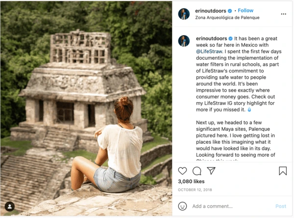
A post shared by Erin Sullivan (@erinoutdoors) on Oct 12, 2018 at 8:00pm PDT
If you have someone who’s particularly good on camera, give them a platform to talk about your project in a live stream. Most social platforms now have a solid live-streaming option. Take advantage and give your audience access to backstage conversations about your brand. Be brave and be there for your community.
Building a community
Having worked in marketing for a long time now, the most common thing I see is a fear to stand up for something important because it might upset some of your customers. You could sell anything to anyone, but that’s not building a brand legacy—that’s trying to make a quick buck.
If you consider community-building to be part of your marketing strategy, then you need to have a positive message. Brands that build positive messaging in their content and communication are the ones that stand out against the negative cycle of mainstream news.
Examples of great sustainable storytelling
There’s nothing like seeing examples that work, so we’ve curated a few samples of brands we absolutely love.
TRIBE — Sports nutrition with a conscience
At Conscious Creatives, we try to encourage physical activity as part of a healthy lifestyle, getting our team healthy through running, cycling, surfing and more. One of our biggest forms of inspiration in this respect is Tribe—a brand dedicated to making sports nutrition products with natural ingredients.
What we love about Tribe is that their marketing plans are based on creating a community. They’re a collection of people who love being outdoors, brought together by sporting events all over the world and a combined effort to rid the world of human trafficking.

A post shared by TRIBE (@the_tribe_way) on Oct 15, 2018 at 12:46pm PDT
Tribe is a community of nutrition experts who care about the world. It just so happens that they also sell nutrition products.
Lewis Pugh — Swimming to save the seas
An example of someone who definitely fits the definition of inspirational is Lewis Pugh: swimmer, speaker and general mind-boggling human being.
He’s just completed The Long Swim, a 560-kilometer effort spanning the length of the English Channel.
Why would a person attempt such a thing? To raise awareness of the sorry state of our oceans. Lewis’s feat is the start of a worldwide campaign that aims to fully protect 30% of our oceans by 2030.
A real-life hero and conservationist, Lewis defies all logic and pushes himself to the limits to earn media coverage of the cause. See this photo of his encounter with a plastic bag during his long swim. He used a powerful image, a long caption and specific instructions to make our oceans cleaner.
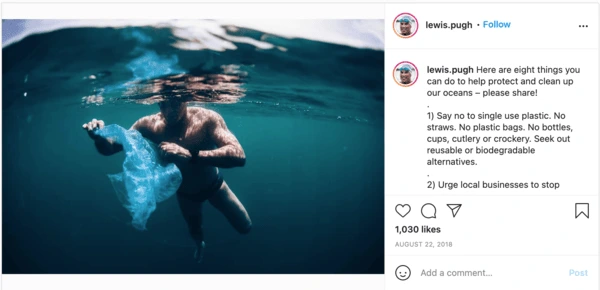
A post shared by Lewis Pugh (@lewis.pugh) on Aug 22, 2018 at 7:19am PDT
That is how sustainable marketing will change the world.
rCUP — Recycling reusable cups
I am proud to share a hometown with these folks. They discovered that only 0.4% of recyclable coffee cups were actually being recycled. So, they set about designing a product made from precisely those cups.
The rCUP is a reusable coffee cup that is affordable, looks great and has some wonderful little design elements that make it really easy to use.
A post shared by rCUP (@rcuponeplanet) on Jul 21, 2018 at 11:32am PDT
Sustainable marketing is so much easier when you’ve got products that make a real difference.
How to get started
If you’re reading this and are equal parts excited and confused, you are not alone. I suggest finding a community of like-minded business folks who are also looking to make more money by doing the right thing.
LinkedIn is a great resource for finding sustainability professionals, and our community is strong in voice. We’re all so proud of the work our peers are doing and the causes that we stand for.
Look into your industry to see which organizations support sustainability. You’ll be surprised to discover wonderful groups ready and willing to help, no matter what stage you’re at. For example, if you work in fashion, the Ethical Fashion Initiative is a wonderful example.
The key, though, is to start.
Don’t be afraid to try. Know you aren’t going to do it perfectly, but also know that simply trying is a great thing. Watch as your community grows and rallies around your brand for years to come.
At the onset of building a business, branding might not seem like the first thing to conceptualize. Establishing the foundations of your brand by creating a brand book could be a tedious process, but its long-term benefits are well worth the effort.
Related: Branding? Follow this template for creating a brand platform
To help you get started, let’s review what a brand book is, what it does, why you should take the time to build one, and how to best go about it.
What is a brand book?
A brand book can also be called a brand bible, a brand style guide or a brand guide, among other similar terms. Essentially, it’s the document that sets distinct guidelines for maintaining brand identity across all aspects of the business.
From designers to marketers to sales teams, a brand book helps align different departments in communicating consistent messaging.
Some of the things included in a brand book are:
- logos
- color palette
- typography
- design system
- imagery
- tone of voice
Why do you need one?
One of the biggest benefits of having a brand book is that it gives the business a framework of consistency and cohesion. This consistency and cohesive messaging serve as great tools for defining your company’s personality—which, when committed to over a period of time, breeds trust. Strong, consistent brands are valuable; we know from our research that consistent brands expect to earn 23% more revenue annually.
When your audience sees that there is consistency in color scheme, tone of voice, and logo usage across all platforms, it delivers a level of professionalism that tells your customers you’re a brand they can trust.
Pros of having a brand book
As pointed out by Mayven, having a detailed brand book establishes the voice and personality of a company, governing virtually every aspect of company communication. From in-house communications to marketing messaging, having a well-made brand book ensures everyone is on the same page, consistently delivering a unified message that’s always on-brand.
Cons of not having a brand book
On the flip side, the inconsistency that easily creeps up when you don’t take the time to create a brand book can confuse and, eventually, alienate your customers.
Imagine a coworker who’s always well put-together: perfectly ironed shirt, neat haircut, clean shoes. Now imagine if, out of nowhere, that same person came to work with unkempt hair, ripped jeans and a neck tattoo. You’ll inevitably feel uncomfortable because it’s just not something you’re used to from that person. Chances are, you’ll be wondering if everything was okay with that coworker or if there’s some inner turmoil going on.
Essentially, the same instinct applies to brands and the way they present themselves to their audiences. You don’t want to confuse your audience with mixed messages.
How to create a brand book: Setting up the brand
Before you create a brand book that guides all aspects of the business, you need to envision what you want the brand to be. This means understanding four key components: the brand’s mission, its vision (which includes core values), target audience and brand persona.
Mission
When you’re crafting your brand mission statement, don’t fall into the trap of stringing together buzzwords that merely result in empty concepts and vague statements. As noted by Branding Strategy Insider, settling for a mission statement of that ilk does little to guide the company or employees toward having and maintaining a competitive edge. On top of that, it doesn’t provide motivation or a daily mission to make each workday matter.
Instead of vague concepts, your mission statement should clearly establish:
- your company’s purpose
- its reason for existing
- the difference it strives to make in the world
Establishing these does a number of things for your business: it immediately helps employees figure out whether they fit what the company wants to be, it creates strong brand differentiation from competition, and it inspires consumer passion and engagement.
Vision
As noted by Goalcast, a strong vision statement will serve as a guiding force for all of your business decisions. It’s a virtual compass that points the company towards where it wants to be and what it wants to become.
To help craft your vision statement, you can ask questions like:
- How big do you want your company to get?
- Do you plan to branch out with products and services not currently offered?
- What kind of legacy do you want your business to leave behind?
Paired together, your mission and vision statements serve as important start and stop points—tools that will guide you as you make strategic business decisions that refine your brand.
Brand persona
Establishing a brand personality is a key element in setting the tone for your brand messaging across all communication channels. Mixed messages make it harder for customers to connect and identify with your brand.
One age-old practice is thinking about what kind of person your brand would be. Do you want your brand to be straightforward and to-the-point? Or would you rather it be playful and witty?
There’s also the old is/is not exercise. This involves listing three to five adjectives that your brand is and three to five adjectives that it is not.
Whatever collection of traits you decide to incorporate into your brand persona, it’s best to turn those into a statement that guides your overall messaging.
Lucidpress—a brand templating platform—uses this:
Lucidpress is the intuitive brand templating platform that empowers anyone to easily create on-brand materials.
In this statement, you can see a number of descriptive branding words:
- intuitive
- empowering
- easily
- on-brand
These traits drive our messaging and many other branding decisions, from how our software should feel to who would benefit from using our platform. Speaking of which…
Target audience
Just as you need to understand your brand, it’s likewise important to understand your target market. What types of people do you want using your products? Which ones do you want to visit your website, consume your content or subscribe to your emails?
To identify your audience, you need to have a solid understanding of what their needs, wants and values are—and how you factor into all of those.
The process of identifying and understanding your target market allows you to narrow down your audience focus. Your messages are always tailored to your audience, and it gives you a clear picture of what you need to be for a specific group of people.
How to create a brand book: Visual guidelines
Logo usage
Coming up with a distinct, identifiable logo is one thing. Ensuring that it remains optimized in different environments is another. This part of your brand book should include all approved versions of your logo and how it will be used in different platforms, from placement to acceptable alterations.
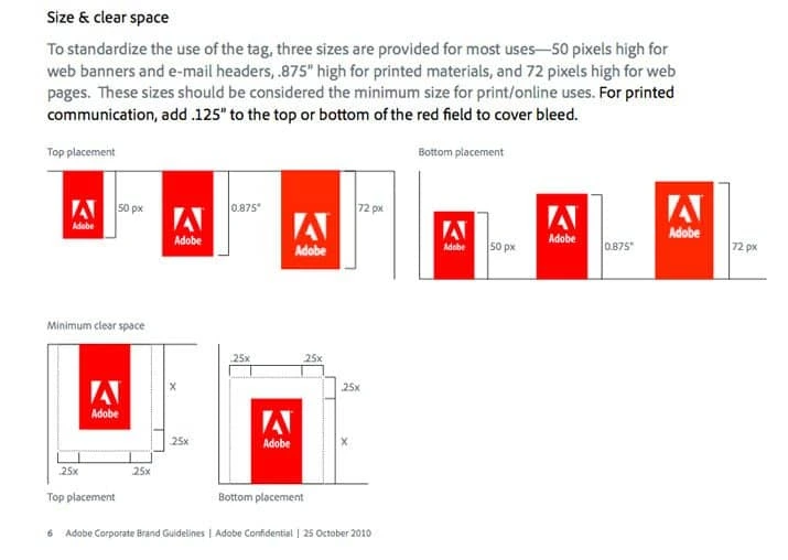
Source: Design Shack
As you can see with Adobe’s brand guidelines, it’s very clear how the logo should be used, including its placement, size and white space.
Color palette
Your brand’s color palette is another element that gives your business a consistent look and feel. Most brands choose four or fewer main colors that don’t stray too far from the hues of their logo. As you can see with Heineken’s color palette, they picked one light color for backgrounds, a darker color for text, a neutral hue, and one that gives design elements a bit of pop.
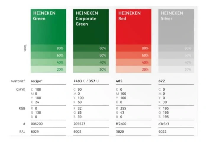
Source: 99designs
And just as it is with your logo, you need to outline how and when each color should be used (Which ones are for text and design elements? Which are for the logo, and which are for backgrounds?). Mayven also points out that you should define the following:
- color names
- color values (CMYK for print, RGB & HEX codes for digital, and PANTONE name & number)
- primary, secondary & alternate colors
Typography
Similarly, there should be a defined font style for both print & digital applications. In your brand book, typography should cover how and when certain fonts are used, which typefaces are acceptable, as well as guidelines for additional styling, size, and use of color.
As pointed out by Mayven, most brands use one or two primary typefaces, a complementary typeface, and substitute typefaces.
Tone of voice
As with all the other elements on this list, your tone of voice needs to be consistent across all communication channels—email, social media, press releases, blog posts, ads, etc. Your voice should be aligned with your brand’s persona, mission, vision, values and target audience.
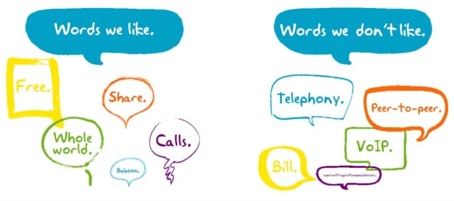
Source: 99designs
You can start by identifying words you like and don’t like to be associated with. Then, decide what type of language fits your brand persona and your target audience. Go back to your list of adjectives describing your brand personality to come up with language that is on-brand.
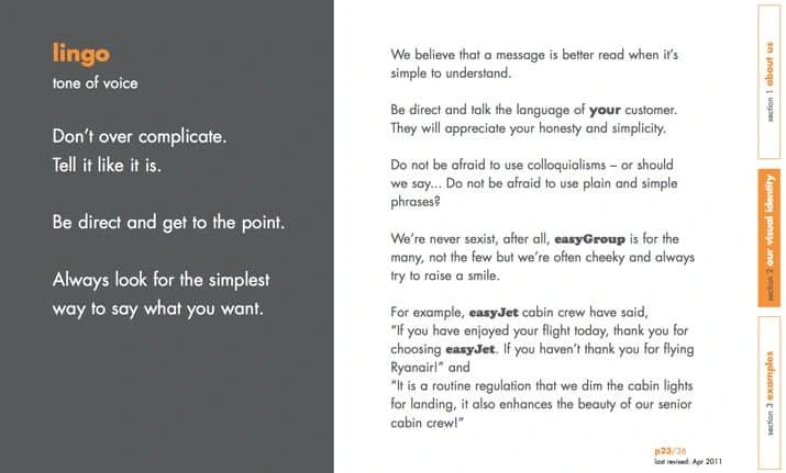
Source: Design Shack
Imagery
Apart from indicating whether you’ll be using photos, illustrations and other types of graphics (as well as when and how you’ll be using them), your brand book should also detail how images will be edited, which colors to place them with, and any other design elements related to image use.
Collect inspiration from successful brands, particularly those that have similar brand messaging as yours. You can also create a mood board with images that convey the feelings you want people to get when they interact with your brand.
Key takeaway
A thoughtfully crafted brand book will bring your business consistency, alignment and cohesion. To avoid confusion, your brand book needs to be detailed, covering all possible bases to ensure everyone’s on the same page. It will give every employee in the company a concrete framework to work with, while still giving them the freedom to do what they do best.
“We need a logo” is a loaded request that designers and creative agencies hear from their clients. High expectations are always involved—that’s a fact. Every client wants a remarkable logo for their brand, and they’re counting on you to create it.
Related: 9 excellent logo redesigns for famous brands
How do you deliver an innovative, impactful design on demand? If you’re running low on creativity, we’re here to fill in for your muse as she turns a blind eye to your deadline. Load up on logo design inspiration from the guidelines and examples below to get those juices flowing again.
Logo design examples for your inspiration
Consulting Logos
Consulting logo idea #1: Accenture
Accenture is one of the biggest management consulting firms. The company offers strategy, consulting, digital, technology and operations services. Their revenue was around $40 billion in 2018, so we could definitely learn some design lessons from them.

Consulting logo idea #2: Capgemini
Capgemini is another consulting giant that can teach us a valuable design lesson.

The key lesson here is that you can build a financial empire… even if your logo isn’t closely related to the services you’re selling.
The Ace of Spades has been present in their logo since its inception, but it has little to do with their business. In fact, it refers to bridge—a card game that the founder of the company, Serge Kampf, enjoys. In bridge, the Ace of Spades is the highest-value card.
Consulting logo idea #3: DLA Piper
If you’re offering legal consulting services, here’s what you can learn from one of the biggest global law firms. (How big? DLA Piper has lawyers in more than 40 countries and over $2 billion in revenue—that’s how big.)
The open-ended shapes represent out-of-the-box thinking. Something you might actually want from a lawyer, right?
If you look at it from a different angle, the logo seems like a talking bubble, which shows they value the art of communication… or that they’re friendly. You decide.
Lucidpress: Click the image to use the template
Use one of our consulting logo templates as inspiration for your own logo. Switch out colors, fonts and texts to create your logo in seconds.

Real estate logos
1. Smith Mountain Homes
First up is this beautiful logo from Smith Mountain Homes.

2. Cabo Cribs
If you’re looking to buy property in Cabo, I’ll bet Cabo Cribs’ logo catches your attention.

3. Williams & Williams
If you’re in the market for a luxury property, you’ll love Williams & Williams’ logo.

Lucidpress: Click the image to use the template
Use one of our real estate logo templates as inspiration for your own logo. Switch out colors, fonts and texts to create your logo in seconds.


Health and fitness logos
1. Heavy Mettle Fitness
When you have too many ideas, just stick to the basics, even if it’s cliché.

Source: GLDesigns
2. Peachy
What’s that number-one thing your audience wants? Point it out, and people will remember you as that gym or that fitness instructor or that nutritionist who can help them get it.

Source: 99designs
3. Necessary Payne
If your ideal audience is into hardcore training, a logo like the one below could be a great strategic move.

Source: Design your way
Lucidpress: Click the image to use the template
Use one of our health and fitness logo templates as inspiration for your own logo. Switch out colors, fonts and texts to create your logo in seconds.


Striking use of color
Powerful colors make a logo vibrant and eye-catching. In recent years, logo design trends favored simple and spirited colors that appeal to new generations of customers.

It’s interesting to see the process behind this logo and Volusion’s brand identity design.

TeleMadrid’s rebranding is another example of a colorful and adaptable logo design.

And Duolingo’s 2019 logo update builds on their playful and energetic brand.
Memorable use of layout
Another way to make your logo unforgettable is to surprise people with an unexpected layout.

This example from Bajo Protección invites a second look with its 3D effect.
The Dutch National Opera & Ballet logo has us peeking from the balcony.
And Moonpig champions creativity by updating their logo to match their surreal name.
Beautiful use of typography
Fonts are another excellent source of inspiration.
Typography can help you balance simplicity and intricacy in logo design. It’s also an essential element for your brand creation process.

Typography was just what Tom Sands needed to make this logo a timeless presence on their acoustic guitars.

Typography can also create a sense of motion, as it does in this example.
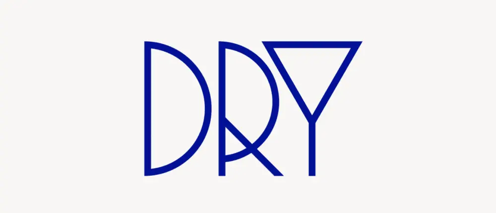
And sometimes, like in the case of UK-based creative agency Dry, fonts are all you need to capture your brand spirit.
Clever use of symbols
The symbols you include in your logo give people a glimpse into the brand’s spirit and generate emotional connectivity.
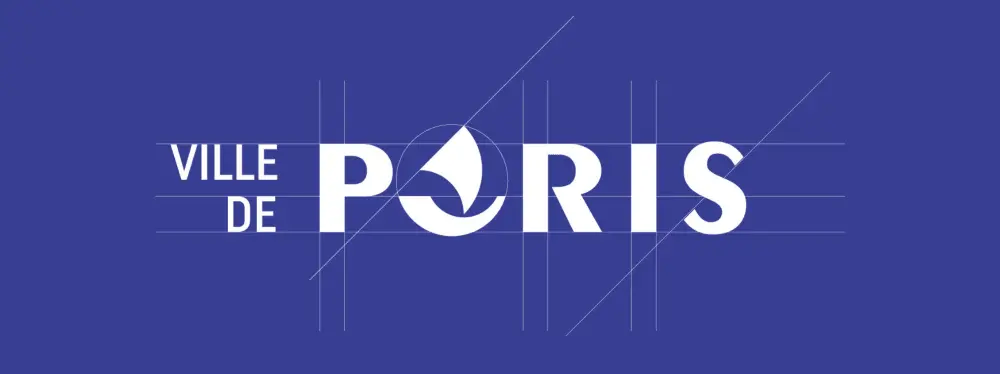
This redesign concept uses the nave ship, a historical symbol of Paris.

Airbnb logo redesign is a great example of mixing various symbols into a memorable logo.

Chairish provides an honest and straightforward testimony of their dedication to their craft.
Creative use of patterns
You can incorporate different patterns into logos while still maintaining brand consistency—and these examples are proof.
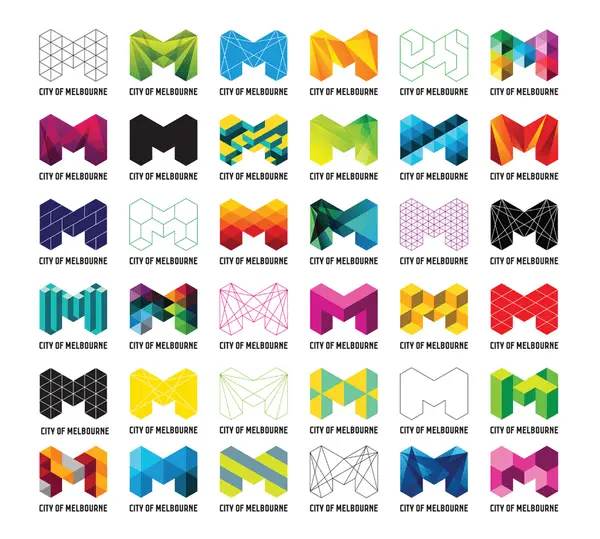
The redesign of Melbourne’s logo provides a playful space for patterns and placements.

The German Historical Museum’s logo uses juxtaposed shapes that can fit well in intricate contexts.
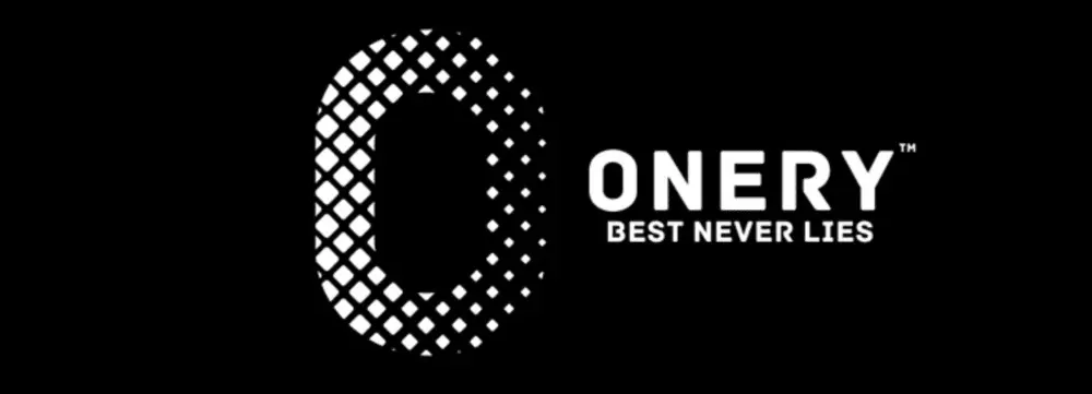
In this example, patterns and negative space convey a message of unity.
Surprising use of negative space
“In the end, creativity isn’t just the things we choose to put in, it’s the things we choose to leave out.”
Austin Kleon
In this quote from his book Steal Like an Artist: 10 Things Nobody Told You About Being Creative, author Austin Kleon captures the inspiration negative space can unleash.
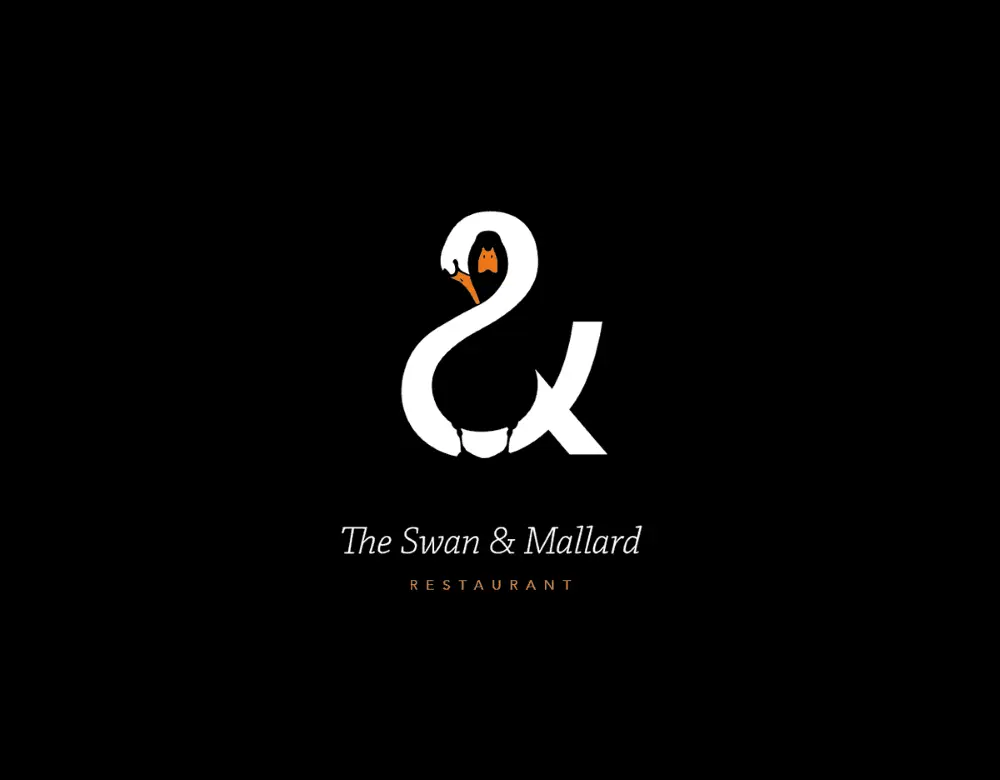
The Swan & Mallard logo challenges you to find the intertwined characters.
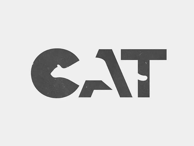
Whether you’re into cats or bears, you can’t help but spot the figures that hide behind this typeface.

This Flight Finder logo creates a sense of motion and pleases the eye with its symmetry.
Surprising use of animation
We live in the golden age of GIFs, and their cultural impact now influences logo design ideas as well. These examples show how you can add animation to a professional logo.
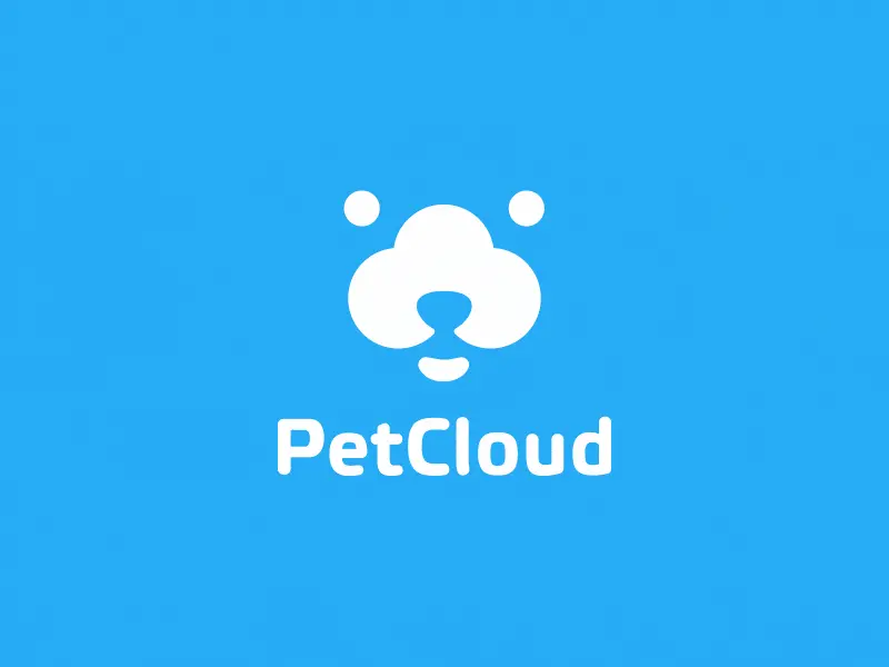
PetCloud’s logo has adorable spelled all over it, wouldn’t you agree?
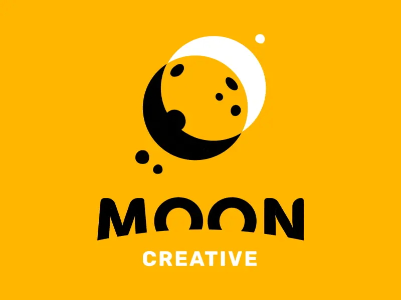
I bet the designer behind this logo knew his clients would be over the moon with its design.
And this creative used animation to deliver his logo design with a bang!
Before you go, remember this
As a designer, you know coming up with cool logo ideas is a complex process. What helps is to lead with a deep understanding of your client’s business and brand values.
It’s equally useful to draw inspiration from diverse sources and experiment with your ideas until you find the right fit. Play with colors, layout, typography & symbols to design the creative, custom logo your client expects.
Once you have it, use the logo to build branding that’s consistent across all channels. Give customers a familiar and reliable presence to count on and build meaning with.
Use this 5-step process to design creative logos
Unfortunately, a clear creative brief for logo makers is a rare occurrence. That’s why designers and agencies explore, select and clarify ideas before proposing anything.
Here’s a secret experienced creatives know: Sometimes you can reach your best ideas by using a systematic approach.
Whether you’re building a brand from scratch or planning a thorough rebranding, this 5-step process can help you come up with cool logo ideas.
1. Understand the customer’s business
The logo is central to a brand’s identity. In fact, the best of them are deeply rooted in the company’s mission. If you’re lucky, your customer has their mission clearly articulated. If not, roll up your sleeves and focus on research.
First, observe and analyze how their customers talk about them.
Explore:
- Testimonials & reviews that highlight their best features (for B2B, try G2Crowd or Clutch; for B2C, try TrustPilot or Google Places)
- Answers to surveys that show how customers feel about the business
- Case studies that reflect their process and results
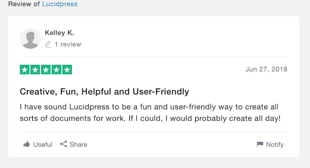
Source: TrustPilot
For brand new businesses, you can look for similar details in their competitors’ activity to give you a starting point.
2. Map out the brand’s values
The best branding relies on a deep understanding of what people want when they buy something.
A custom logo that builds differentiation has to speak to customers’ psychological needs. A powerful design triggers a reaction and influences the choices consumers make when they see it.
Define what the business stands for to ensure your logo design speaks to the brand’s values.
For example, Patagonia strives to “build the best product.” They aim to “use business to protect nature” and do so in a way that’s “not bound by convention.”
Buffer commits to “default to transparency,” “cultivate positivity” and “improve consistently,” among other values.
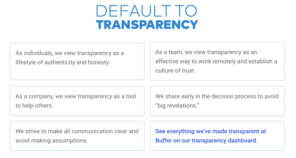
Source: Buffer
Using your customer’s brand values to guide your logo design can be incredibly inspiring.
3. Choose a series of adjectives
Now that you know what the business is all about, you use this information to pin down specifics. Make a list of adjectives that capture the brand personality.
For example, when you think of Patagonia, words like humble, altruistic & adventurous may come to mind. Buffer inspires words such as helpful, calm & dependable.
Examples of adjectives you could use:
- Bold
- Serious
- Rational
- Imaginative
- Idealistic
- Generous
- Clever
- Humorous
- Whimsical
- Luxurious
- Glamorous
- Rugged
- Brave
- Rebellious
- Cooperative
- Edgy
- Gentle
- Playful
- Old-fashioned
- Youthful
Want to go the extra mile? Analyze the vocabulary customers use when they talk about your client and dig up adjectives from it.
Single out associations that point to what makes the company different. Narrow your list down to 3. Now you have the emotional substance that fuels your logo.
4. Collect inspiring ideas
Logo design ideas often come from unexpected sources. Take it from people who faced the same challenges as you do now:
“I use weird sources for inspiration. I look at forms in nature and try to reduce them to basic shapes. I’m always trying to invoke a sense of humanity to a logo.”
Josh Baron, Media Art Director at Sparxoo
Multiply the opportunities for creative inspiration to kick in and increase the chances to get that grand idea. Look for compelling symbols, icons and patterns.
Check out fresh photography from sites that offer free stock images. Peruse design websites like Dribbble, Behance, Designspiration & Dunked.
Even better, browse countless logo examples on Logoed, Logospire, Logo Gallery, Brand New, Logo Moose & Logo Design Love.
Collect fonts & color options to create a mood board. This collage of elements helps define your concept at this stage. Include notes to explain your thought process so you can give your client a consistent overview of your creative direction.

Source: Dribbble
Ask for feedback at this stage. Get input from your client to save you time and energy down the road. For example, knowing which elements your client notices can help you come up with better, more relevant logo design proposals.
Feedback in hand, it’s time to create the best logo you can.
5. Choose & validate the best ideas
Fast forward through dozens of iterations to logo_v27_final_FINAL.indd.
You’ve received feedback, integrated it and designed (what you assume will be) the final version.
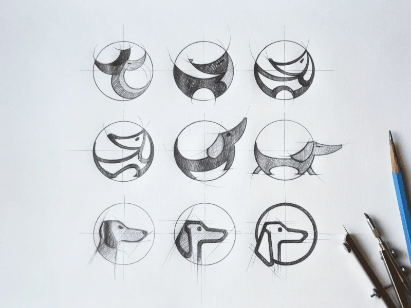
Source: Tubik Studio
Your moment of glory awaits, and so does your deadline.
Use this time constraint to strengthen your creative process. Stop before you get caught up in a never-ending cycle of “I know I can do better.”
Instead, focus on shaping a logo that can outlive design trends. Give people a chance to build meaning into your logo over time.
Here’s what experienced creatives recommend:
“All logos should be four things: simple, memorable, timeless and flexible.”
Cory Schearer, Creative Director at Ferebee Lane
Keep in mind adaptability when you design your client’s logo. Your creation will be used in print, in emails, on social media, on websites and digital advertisements.
Wherever it may be featured, the logo’s role is to get an emotional reaction.
Ready to design your logo? Give us a try.
There’s more to crafting a memorable brand than putting together a quick logo and color palette. Instead of calling it a day there, successful brands take the time to design a well rounded brand identity – one that combines a strong purpose with intentional visual and written elements.
Here, you’ll learn the seven key elements of brand identity design, and how they work together to build a consistent brand your audience will love.
New to the branding game? Let’s go over some important context.
What is brand identity?
A brand is the sum of how a person, product, or business is viewed by its audience and/or customers.
Brand identity is how a business wants to be viewed.
These two ideas often go hand in hand, but can sometimes be at odds, depending on how well a brand is able to cultivate and maintain their brand identity.
If we zoom in a bit, brand identity design includes everything from logos, and typography to colors, packaging, and messaging. Ultimately, the goal here is to create an ecosystem of visual and written elements that complement and reinforce your brand’s ‘why’. Once established, your brand identity can both attract new customers and help your current customers feel at home.
That’s why It’s vital that your brand identity stays consistent. Because they represent and reinforce your brand’s purpose, your brand identity elements need to be clear and consistent wherever they might appear.
Why is brand identity important?
If you were about to interview for a big new job, you wouldn’t show up in sweatpants. You’d want to present yourself as a well put together, competent, and approachable candidate.
The same idea applies to your brand. Your brand identity is the face of your business, and you want to put your best face forward for your audience.
Along with building credibility and trust, a strong and consistent brand design should also give people insight into what your brand is all about. For example, do you use bright, pastel colors to convey a cheerful, playful tone, or do you employ detailed line art in your logo to imply an artisanal level of quality? When you’re thinking about what you want your brand identity design to look like, consider what it will feel like as well.
To give you a better idea of what we mean, take a look at these three brilliant examples of brand identity:
3 examples of strong brand identity design
When you’re designing your own brand identity, there’s no need to start from scratch. Here are just a few examples of great brand identity design to get some inspiration from.
And while it’s important to create something that’s uniquely your own, there’s nothing wrong with taking a note from some of the greats.
Hootsuite
If you look at a lot of tech brands today, you’ll notice that many tend to use similar no-fluff, utilitarian branding principles. While there’s nothing inherently wrong with this, it can become hard to differentiate brands after a while.
We like how Hootsuite’s redesigned logo injects some new color and personality into the social media marketing platform. It’s friendlier, more approachable, and most importantly, more human.
Kodak
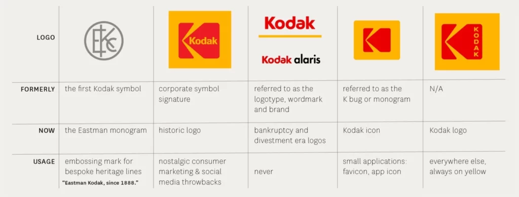
Sometimes, the best rebrands happen when you go back to your roots. In 2006, the company had already eliminated the big red “K” block in favor of a simpler wordmark, but then they decided to reverse the decision. Using a fresh sans-serif font, they were able to create a simple and fresh new take on their logo and typography. It just goes to show that sometimes the smallest of changes can have a big impact.
We love how easy these guidelines make it to view the history of Kodak’s branding, along with the when/how/why to use each design.
Burt’s Bees

In a beauty industry full of incredibly bright, futuristic, or luxurious branding, Burt’s Bees stands out for its humble, down-to-earth aesthetic. With muted colors and thoughtful artwork depicting the brand’s founder, the brand calls back to its purpose – to honor the natural world by creating environmentally-conscious products.
How to build a successful brand identity
Now that we’ve taken a closer look at some great examples of brand identity design, let’s dive into the seven elements you’ll need to build a brand identity your audience will love.
1. Establish a clear purpose and position
The first part of establishing a brand identity is determining your purpose and goals. Brand purpose is the ‘why?’ behind everything you do. Why does my brand exist? Why is my product or service better than the competition? Why does our brand look/feel/communicate the way it does?
According to Arielle Jackson, startup founder, and Google veteran: “Your purpose is how you want to change the world for the better.” Jackson also recommends this diagram as a guide for determining your purpose:
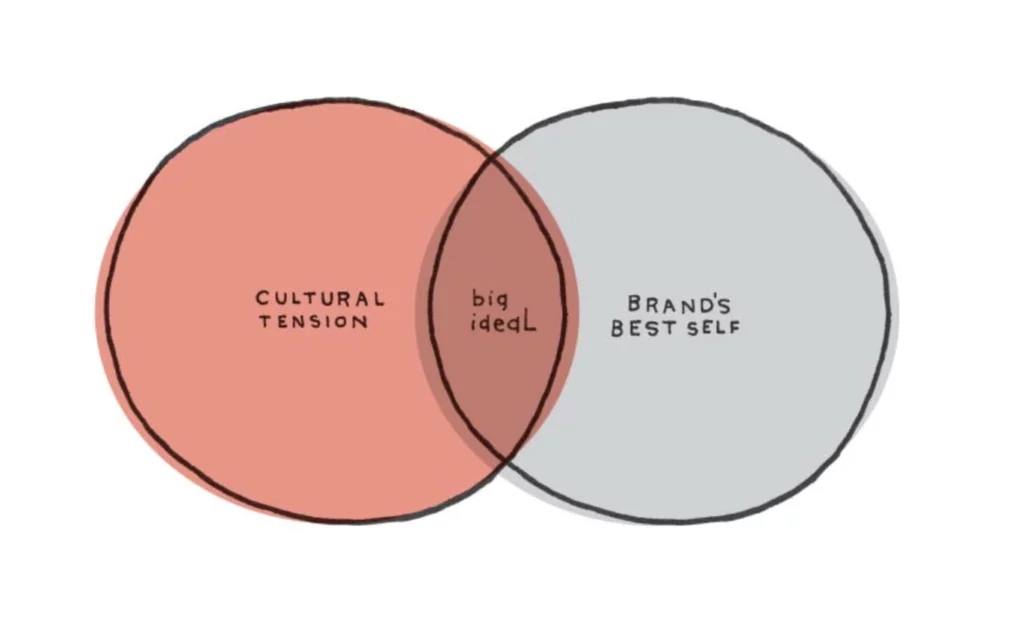
Jackson explains the diagram like this: “In one circle, you have cultural tension. This is what is happening in the world that’s relevant to you. In the other circle is your brand’s best self. This is what your company delivers at its prime,” says Jackson. “The intersection of these two areas is… ‘the big ideal’ — or your purpose.”
For a great example of a succinct, tangible corporate purpose, check out this statement from Apple:
“Apple’s 100,000 employees are dedicated to making the best products on earth, and to leaving the world better than we found it.”
Not too shabby, right?
You’ll also want to spend some time thinking about brand positioning, or the unique value that your brand brings your audience. Think of this as your brand’s ‘elevator pitch’. All the work done here will inform your strategy as you create a logo, decide on a color palette, etc.
Zooming out, brand positioning is the process of making your purpose actionable. By naming your target customer and differentiating yourself from the competition, you’ll lay the groundwork for your brand to accomplish your purpose.
2. Conduct thorough market research
A brand’s purpose and positioning can (and should be) informed, at least in part, by market and customer research. Research is crucial to understand the “cultural tension” described in the previous section. For beginners to market research, there’s a wealth of content online to help get you started.
Oftentimes, one of the best ways to conduct market research is to simply talk to a lot of people. For example, phone interviews allow your teams to have detailed, human-driven discussions with your customers – something that could be helpful if you want to appeal emotionally to your audience.
Beyond phone interviews, online survey tools, like Survey Monkey, are a fast way to gather a lot of information. Don’t forget to look into available government resources too, like this helpful toolkit from the US Small Business Association.
Good market research can also help you determine your main customer personas, a term that is a slightly different concept than “target customers.” Your customer persona(s) go beyond just defining what problem a customer has and gets into the nitty gritty details behind your focus customers’ professional and personal traits. Defining these traits will help you know what kind of personality your brand should have to appeal to customers, which brings us to our next point.
3. Craft a loveable brand personality
“If your brand were a person, what would they be like?” It might be a bit cliché, but this is a smart way to think about brand personality.
If you get your brand’s personality right, it will shine through in every part of your brand identity. Brand personality greatly impacts the voice and tone used in your marketing materials and other communications. Why is this important? Your customers will get mixed messages if your brand’s personality isn’t well established, and they may have trouble connecting emotionally with your brand.
If you’re having a hard time getting started, here’s an exercise to try: Which celebrities or fictional characters best represent your brand? Is there an actor or actress, musician, or public personality that embodies the same traits as your brand? This could be a good starting point for nailing down different aspects of your brand’s personality.
Once you’ve pictured the kind of person your brand would be and listed off a few attributes they have, it’s helpful to think about how your brand will come to life through your voice and tone.
Here is how we defined Marq’s brand personality.
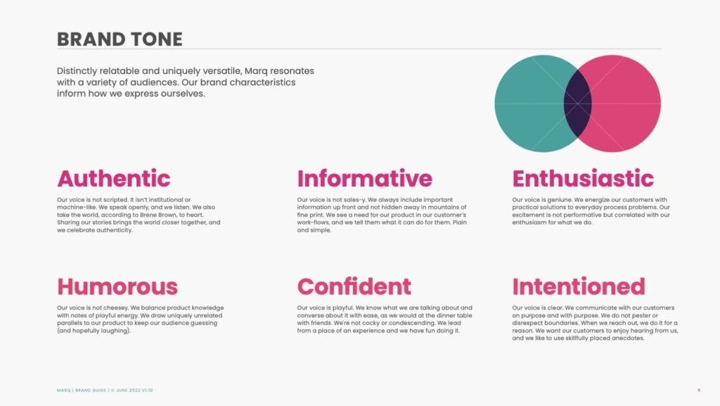
How did we do?
4. Make a memorable logo
Your logo is central to your brand identity design. It’s the piece of your brand identity that most people will be exposed to. It needs to line up with all the other elements of your brand identity and the broader emotional appeal of your brand.
A few guidelines Marq CEO, Owen Fuller suggests on making a logo with an impact:
- Make it memorable. Are there unique elements/colors/etc that make it stand out?
- Make it simple. Can a 3rd grader draw it?
- Make it versatile. Can you apply it across multiple mediums and channels?
- Make it evocative. Does it make you something?
- Make it timeless. Will it work as your brand grows?
For example, we all know this logo:

Disney has built a brand that evokes nostalgia and magic. The playful script oozes creativity and fun, which tracks with the overall brand Disney has established over the decades.
A memorable brand is often the simplest brand. Take a look at the logos of the world’s top 3 brands (according to Kantar):


What do all three have in common? Intentionality in color, design, and simplicity.
Speaking of simplicity, choosing a simple logo makes it easier to apply to different mediums. Whether you’re designing for a product, digital marketing, or print, actively designing with every channel in mind will ensure a successful logo development from the very start.
5. Choose an attractive color palette
Evocative and full of emotional potential, your brand colors are often just as memorable as the logo design. Consider looking into the dynamics of color theory when choosing the palette that best represents your brand.
A lot of color psychology is intuitive, like blue expressing calm and red and yellow expressing passion and energy. Depending on the tint or shade of a color you use, that emotion can be adjusted. A tint is a color mixed with white, making it lighter, and a shade is a color mixed with black, making it darker. A lighter tint of blue conveys tranquility, while a darker shade of blue often conveys trust, an effect that many banks use in their color schemes.
Be aware though that color connotations can differ wildly between cultures. For example, while yellow is often seen as a bright, happy color in the US, it is linked with mourning and death in places like Latin America and Egypt. If your brand plans to do business internationally, it’s important to double check that the colors you want to use don’t have any unintended meanings.
When it comes to creating a workable color palette, designers should select a set of primary and secondary colors to be used for specific purposes. Staying consistent with this palette is key – the more you use it in the same way, the more you’ll be able to build brand equity over time.
A few more considerations on picking a great color scheme:
- Make sure your palette has enough contrast when paired with text. This ensures all your marketing materials are easy to read and accessible. Use this tool to double check your palette.
- Double check that your palette reinforces the emotions you want to evoke. If your brand is all about health and wellbeing, strong colors like burgundy or magenta might be at odds with your intended brand identity design.
6. Pick the right typography
Stressing about finding just the right font may lead others to brand you as a “typography nerd,” but you’ll come out ahead when you pick a font that works in harmony with your logo and colors.
Fonts are powerful. The most famous fonts are recognizable even when taken out of context. You’ll want a single primary typeface to lead your brand design, which should work well with your logo and color palette. It should also, like your logo and color palette, be simple.
Here are a few tips to keep in mind when choosing brand fonts:
- Don’t use overly intricate fonts that are hard to read.
- Provide font guidelines for headlines and body text.
- Don’t use more than two font families on a single document. (If it feels like it’s too much, it’s probably too much)
- Do mix contrasting fonts (such as a serif and a sans-serif).
- Give guidelines on font size and line length in your brand guide.
For example, here are several font pairings that work well together:
7. Leverage on-brand graphics and photography
The final step in creating a brand identity is to build an extended visual language with supporting graphics, design assets, iconography, and photographs.
Take a look at Google’s Visual Assets Guidelines to see how they carefully explain their take on icon design.
They cover a whole range of brand design considerations:
- A reductive (or “flat”) approach
- A preference for geometric shapes
- Icons always face front
- Straight, hard shadows as opposed to curved, soft ones
- Standard background colors
- Icons align to the pixel grid
- Icon padding according to shape
Because of Google’s close attention to their extended visual language, when you see a Google icon, you know it’s a Google icon.
Perusing other brand visual guides can help you get a better idea of what potential visual elements could work for your brand.
Maintaining a brand identity
Once you’ve got the perfect brand elements to work with, it’s time to secure your brand identity together with a comprehensive set of brand guidelines.
Brand guidelines offer an easily accessible playbook to educate your teams on how, when, where, and why to use each of your brand identity elements. With these guidelines, anyone from your company should be able to put your brand to work in a consistent way.
Once you have these guidelines in place, using customizable templates can help save your team valuable time. Instead of creating every piece of marketing collateral from scratch, leveraging custom templates makes it easy to quickly create on-brand materials, even if you’re not a graphic designer.
Key Takeaways
While there’s always the possibility of redesigns and re-evaluation ahead, starting off with a strong, confident brand design and unified brand identity will add clarity and consistency to everything you do. Over time, your unique brand identity will be the one that pops into people’s heads when they have a problem you can solve.
Ready to start building on brand? Sign up for free and explore our brand template library today.
Are you sitting at your desk waiting for that sweet, sweet logo inspiration to strike?
No matter whether you’re a consultant looking to brand your business or a designer looking for new ideas, this article will get you unstuck.
Related: 9 excellent logo redesigns for famous brands
Below, you’ll discover different types of consulting logo ideas from some of the biggest consulting brands in the world.
Whether you’re looking for designs with hidden meanings or something more traditional, the examples below are bound to stir up some creative juices.
Before diving into our pool of inspiration, though, let’s see what makes a good consulting logo and what mistakes you should avoid.
3 golden rules to create a modern consulting logo that stands out
Make sure your logo doesn’t misrepresent your business
The color, the weight of your fonts, the spacing between the letters—everything stirs an emotion.

You have to make sure your logo conveys the right story, the right emotion and the right voice for your brand.
For instance, if you want to be perceived as an expert, you wouldn’t want an overly playful design.
Make sure your logo is clear and not too complicated
Yes, it’s true, your logo should tell a story. But, this doesn’t mean a person should figure it out in the blink of an eye.
Here’s what I mean. If you look carefully at Amazon’s logo, you’ll see an arrow pointing from A to Z. This is because they want to show people that they can find almost any product on their platform.
This story now makes sense because I’ve just told it to you. It only took a few seconds, and a logo which was already effective before now seems even more so. It goes to show that you don’t need to overcomplicate your logo to tell a story.
Make sure your logo doesn’t look old or outdated
What would be your first impression if you saw a consulting logo like this? (Yes, we know Hot Wheels is not particularly known for its consulting prowess, but please bear with us for the sake of example.)

A vintage font combined with a childish design… If this actually were a consulting company, you’d probably think they don’t care about how they look—and maybe they don’t care about their customers either, right? Not great.
Of course, this doesn’t mean you have to update your logo every year just to keep up with the trends. You just have to make sure you’re not hanging on to outdated design elements that were only trendy 20 years ago.
And with that, let’s move on to our round-up of consulting logo ideas.
Consulting logo idea #1: Accenture
Accenture is one of the biggest management consulting firms. The company offers strategy, consulting, digital, technology and operations services. Their revenue was around $40 billion in 2018, so we could definitely learn some design lessons from them.

The sign for “greater than” is placed above the letter t to represent the future—a future where you’ve ascended and grown to be greater (>) than (t) you (u) are (re).
As you can see, your next consulting logo can be clean & simple and still have a deeper message to communicate.
Consulting logo idea #2: Capgemini
Capgemini is another consulting giant that can teach us a valuable design lesson.

The key lesson here is that you can build a financial empire… even if your logo isn’t closely related to the services you’re selling.
The Ace of Spades has been present in their logo since its inception, but it has little to do with their business. In fact, it refers to bridge—a card game that the founder of the company, Serge Kampf, enjoys. In bridge, the Ace of Spades is the highest-value card.
It’s simple, it’s sweet, and it works. The lesson? You don’t necessarily need to hire an expensive designer to create a custom logo that’s meaningful to your brand. There are plenty of free logo makers out there that can help you get started.
Consulting logo idea #3: DLA Piper
If you’re offering legal consulting services, here’s what you can learn from one of the biggest global law firms. (How big? DLA Piper has lawyers in more than 40 countries and over $2 billion in revenue—that’s how big.)

The open-ended shapes represent out-of-the-box thinking. Something you might actually want from a lawyer, right?
If you look at it from a different angle, the logo seems like a talking bubble, which shows they value the art of communication… or that they’re friendly. You decide.
Do you see how the story starts to make sense after you receive more information? And how quickly this story can change, depending on the interpretation?
The point is this: If you’re just starting out and you’re not a giant corporation, don’t fret too much on pinpointing the right story behind your logo. You can refresh the design and infuse more meaning as your brand grows and develops.
Consulting logo idea #4: Deloitte
Deloitte’s revenue was over $40 billion in 2018, and they use one of the most basic design elements in their logo: a dot.

What could we possibly learn from this? Actually, it makes a great point. (Ha!)
Timeless shapes (like the point) and simplicity will never go out of style. You don’t need an overwhelming design that distracts people from getting your message.
Plus, a simple logo will be much easier to integrate in almost any sales collateral or marketing material you develop later.
If you need further proof, just study the logos of some of the biggest brands out there: Nike, Apple, Adidas, Dell, Intel, etc. Enough said.
Consulting logo idea #5: McKinsey & Company
McKinsey & Company is undoubtedly one of the biggest consulting firms you can study and look to for inspiration.

And it can teach you two important lessons.
The first is that you don’t need a fancy or even a creative logo to express professionalism or extensive experience within a field.
In fact, quite the opposite is true. If you study successful companies, you’ll see that most of them refined their logos into simpler, cleaner versions as they matured.
The second lesson here is that even your choice of font can tell a story.
At its core, McKinsey & Company uses a classic custom font because experience, heritage and legacy are what represent them best.
Consulting logo idea #6: L.E.K. Consulting
Want to make your consulting logo stand out while still maintaining a professional, bold look?
Here’s a key takeaway from L.E.K. Consulting, a global company established in 1983.
Their logo stands out because of some basic design elements and principles like composition, contrast and negative space.
For instance, they draw attention to their logo by using the contrast between the negative space in the top-left corner and the logo in the bottom-right corner.
They also give a bold look to the whole design by leveraging one of the most basic elements—the rectangle—all in combination with a deep-colored background.
Consulting logo idea #7: KPMG
If you’re afraid that your consulting logo won’t be perfect right away, don’t fret.
KPMG proves that no design should be set in stone, even if it’s a logo. You can always change it, and there’s no tragedy in doing that. It doesn’t mean you have to lose sales or credibility.
For instance, here’s how many iterations their logo’s had throughout the years:
Source: KPMG
As you can see, these weren’t minor changes—in fact, many were radical redesigns. Even its name changed each time the company got a new partner or the shares were redistributed.
Still, the company is one of the largest professional services companies in the world with over $28 billion in revenue for 2018.
Consulting logo idea #8: FedEx
FedEx isn’t a consulting company, but if you want your consulting logo to be more creative and have a hidden meaning, it’s a good example to follow.
If you look carefully, there’s a hidden arrow that communicates speed and accuracy to those in-the-know.

Of course, now the question is, how do you come up with such clever ideas?
It’s simple. It all starts with your unique value proposition, the core message you want to communicate.
Find out that one thing, that most important thing that makes people want to do business with you. Then, incorporate it in your design.
Consulting logo idea #9: Sony Vaio
Sometimes, the hidden meaning in a logo can come from the product itself.
Here’s a clever logo idea from Sony Vaio. Even though it’s not a consulting company, it’s worth mentioning because they managed to create such a simple logo with a hidden meaning behind it. Take a look:
Consulting logo idea #10: Eighty20
If you’re looking for creative consulting logo ideas, Eighty20 is probably one of the best examples you can use for inspiration.
Eighty20 is a business consulting company that uses big data to inform its market research, then they use these insights to help marketers and companies better sell their services.
Their brand is a combination of geeky and creative, and they express that well in their logo. How? Each of the horizontal lines represents a binary sequence. The blue squares represent 1s, and the grey squares represent 0s.
In binary sequence, the top row is 1010000, while the bottom one is 0010100. If you transform these numbers from binary to decimal, it reads… you guessed it: 80 and 20. Pretty clever, right?
Before designing your next consulting logo, do this
There are thousands of logo design ideas out there. The problem is, the more you see, the harder it is to choose one.
Here’s a method professional designers use to come up with great ideas quickly (and easily decide on the right one).
First, stop looking for ideas. Then, define the core message you want to communicate.
Are you fast and precise? Do you offer a complete range of services? Do you have the most innovative solutions or the most comprehensive research? Are you affordable for SMBs, or do you only serve large enterprises?
Only after you define your core message should you start looking for inspiration. Don’t worry—we’ll be right here when you come back.
Ready to start exploring your new brand identity? Try creating a few logo variations in Lucidpress, using your brand colors.
Not sure how your next fitness logo should look and want a few examples to get your imagination’s wheels in motion?
Maybe you want to see some design ideas from well-known brands in the fitness industry. Or, perhaps you’re looking for creative logo ideas that stand out from the crowd.
Related: Best logo design ideas for your inspiration
No matter whether you’re a fitness consultant, own a gym or have any other fitness business, by the end of this article, you’ll have plenty of ideas to get you started.
But, first, let’s see what makes a good fitness logo and what mistakes you should avoid.
3 fundamental rules to create a fitness logo people will remember
1. Make sure your logo doesn’t communicate the wrong message
Every aspect of your future fitness logo will evoke an emotion, from the colors to the fonts and shapes you choose.
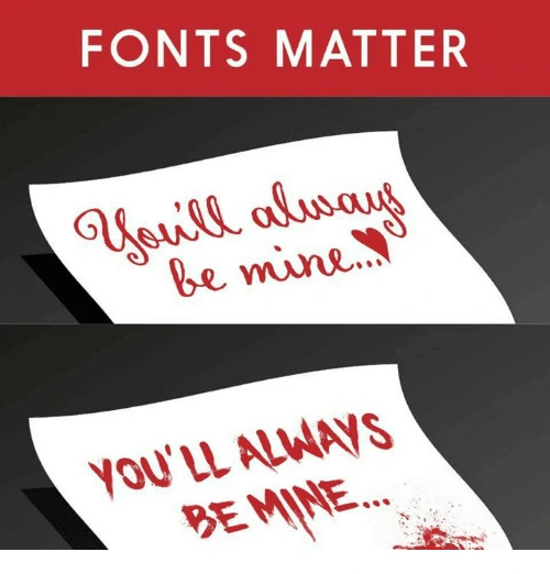
This is why you have to be careful about the first impression your visual identity makes.
For instance, a dark, sober color isn’t something you might want for a fitness logo if you’re also helping people keep a balanced, fresh and healthy diet.
2. Keep your logo simple and clean
Ideally, your logo should tell a story. Maybe the origins or the philosophy of your brand. Or, maybe just your unique selling proposition.
This doesn’t mean you have to overcrowd your logo with all kinds of elements in order for people to get your message. When you try to convey too much in a single logo, it comes overly complex and difficult to recognize and replicate.

3. Avoid using outdated design trends
Imagine someone hands you a business card with a logo that looks like this:

What’s your first impression? Other than nostalgia, probably not a good one, right?
Of course, you don’t have to update your logo every time a new design trend comes along. Just make sure your logo doesn’t look like it’s stuck in the ’90s.
These are three critical aspects you should take into account when creating a logo. Now, let’s dive into our pool of fitness logo ideas and see what you can learn from each one of them.
Fitness logo design ideas for your inspiration
When you have too many ideas, just stick to the basics, even if it’s cliché
Sometimes we spend too much time brainstorming and browsing through thousands of logo ideas just to find that “perfect one.”
And, too often, the result is a complicated design that few will remember.
When this is the case, it’s better to stick to something classic that anyone can recognize as a fitness business.
Plus, you have the advantage that most free logo makers have these elements in their gallery so you won’t have to customize your design too much.
Source: GLDesigns
If you want to be compelling, point out something your audience wants
What’s that number-one thing your audience wants? Point it out, and people will remember you as that gym or that fitness instructor or that nutritionist who can help them get it.
Notice how, in a second, you know this fitness business can help you just by looking at their logo. Then, note how it brings us nicely to our next point…
Source: 99designs
Make sure your fitness logo doesn’t drive away parts of your audience
Let’s say you’re a fitness trainer, and you chose the logo below to represent your business.
Source: Design your way
It’s great for people who are looking for hardcore training. But, there are lots of people who just want to stay in shape. Your logo might tell them that you’re not a good fit for them.
Of course, if your ideal audience is into hardcore training, this could be a great strategic move. What’s important is for you to think through these considerations before you make your final decision. For example, take a look at our next point.
Make sure your logo isn’t limiting future expansion of your fitness business
Let’s say that you start out as a yoga fitness trainer, but you plan to grow your business beyond the yoga niche.

Unless you go through a complete rebranding, your logo will limit the growth of your business.
When you’re looking for design inspiration for your logo, make sure you also take into account any future plans. If you can spot them now, ahead of time, you’ll save yourself an expensive and time-consuming rebrand in the future.
Use a well-known symbol
Sometimes keeping a logo simple and clean can be most effective at showing what your brand is about.

Source: Lucidpress
Incorporate a top benefit into a classic fitness logo design
In logo design, it’s efficient to incorporate an element that people can easily recognize, such as a gear or muscles if you’re in the fitness business.
But, these elements are also a bit overused, and you might want something more creative for your logo.
Well, why not incorporate additional benefits that your brand has to offer—such as good music, for example. Now people have two reasons to choose you over the competition instead of one.
Source: Design your way
Your fitness logo doesn’t necessarily have to be related to fitness
Apple’s logo has nothing to do with phones. Nike’s logo doesn’t represent shoes, clothes or sports gear. Subway doesn’t have a sandwich in their logo.
Your fitness logo doesn’t have to be related to muscles, fit bodies or any kind of elements related to sports. It could be something as simple as two shapes that convey motion.

Source: Design your way
Use a color combination that stands out
Even if you don’t have a super creative logo layered with hidden meaning, you can still stand out from the crowd by using a powerful color combination.
Take Google, for example, or FedEx. Or, this fitness logo below.
Source: Logojoy
Think about all the different ways you’ll use your logo
A highly detailed concept might look great on a large banner.

Source: 99designs
But, how would this logo look on a small business card? Would it be as effective?
Suddenly, all those details become so small that people can’t recognize them.
Before you finalize your logo design, make sure you test it in all the different scenarios you know you’re going to use it.
Try to include a special meaning behind your logo
Let’s review a classic example for this one. FedEx uses negative space to hide an arrow that subliminally conveys speed and accuracy.
Source: Pixellogo
You, too, can use different elements in a clever way to give your logo a double meaning. For instance, here’s a clever way to incorporate the infinity symbol as a yoga fitness instructor.

Source: BrandCrowd
Incorporate a sense of motion
As a species, we seem wired to detect motion, thanks to our neural underpinnings.
And since motion is a key aspect of your business, why not include it in your fitness logo? A dynamic design attracts attention and motivates people to get more active.

Source: Design your way
Before you create your next fitness logo, do this
If you want your next logo to be something creative or to have a special meaning, you first have to understand your brand’s identity. What is the most important message you want your business to communicate?
Only after you answer this crucial question can you start looking for ideas for your next fitness logo. Otherwise, you might find some good inspiration, but it won’t represent your business. So, take your time and do your research—then try out a few ideas.
Ready to start exploring your new brand identity? Try creating a few logo variations in Lucidpress, using your brand colors.
You likely already know that a logo is an important part of any business’s branding. Not only does it make your modern real estate company stand out from the competition, but a solid logo can attract and win over new customers. That’s what we’re always aiming for, right?
Related: Real estate branding—a comprehensive guide
But, it’s tricky to design a custom logo for your real estate firm. You’ll need to think about the colors, fonts and shapes you’re using—not to mention arranging each individual element to create an impressive design.
So, we collected eight of the best real estate logos to help inspire your own.
What makes a good real estate logo?
The logo you’re creating for your real estate agency is one of the first things you’ll need to nail. But before we share some of our favorite modern real estate logos, let’s chat about what makes a logo so great.
A strong logo usually is:
- bold
- unique
- easy to understand
Yet above all, the logo you’re creating for your real estate company needs to be on-brand. There’s no use in having a bright and colorful logo if your website, social media channels and letterheads are black and white.
Your audience won’t understand it, and you won’t see the 23% average revenue increase that businesses with consistent branding experience.
(Remember, that’s the aim of a logo: to make your business stand out.)
8 awesome real estate logos to inspire your own
You don’t have to start from scratch when you’re creating your own real estate logo. Take a look at these examples, pick out the ideas or concepts you like, and find a way to work them into your custom logo.
However, we’re coming at you with a word of warning: Please don’t directly copy these logo examples. The best logos are unique, innovative and stand out from the crowd, so take these ideas and try to put your own spin on them.
1. Smith Mountain Homes
First up is this beautiful logo from Smith Mountain Homes.
You can quickly understand the type of homes they sell, right? And it’s not just because the word “mountain” features in the brand name; they’ve used graphics to signal the type of property they sell.
Granted, the design and font choices are simple—but that’s often the best way to create a memorable logo.

2. Cabo Cribs
If you’re looking to buy property in Cabo, I’ll bet Cabo Cribs’ logo catches your attention.
Similar to the real estate logo above, this design is simplistic, but it doesn’t scrimp on the essentials of a good logo. It’s easy to understand, elegant, and has a small graphic that makes it obvious they’re selling homes.
3. Williams & Williams
If you’re in the market for a luxury property, you’ll love Williams & Williams’ logo.
Take one glance at this logo and tell me what you interpret. It’s gold-themed, has elegant writing, and shows palm trees with the properties they’re managing. It ticks one huge element of a great logo: It’s perfectly on-brand for their commercial real estate company.

4. Compass
Who said a logo had to contain words?
Think of the world’s most recognizable logos. McDonald’s, Nike or Adidas will likely make their way onto that list—and none of them have a brand name in their logo.
Real estate firm Compass looks like they’ve drawn inspiration from those huge brands with their word-free logo. Although you can’t clearly see they’re selling properties, it’s a great way to make their audience stop and pay attention. After all, what are realtors for if not providing their clients with valuable guidance and direction?

5. Blue Key Property Management
I’ve included this logo concept for Blue Key Property Management here purely because it’s so simple, yet so effective.
You might’ve seen by now that many real estate logos contain property-related graphics. But instead of taking the standard route of a house, this firm opted to use keys—a factor that helps them stand out from the competition.
6. Delicious Real Estate
A simple—yet effective—way to build your real estate logo is to think about your buyer personas and their pain points. What are they looking for when they’re purchasing or renting a home from your firm?
It seems like Delicious Real Estate think it’s a reasonably-sized home. That’s why they’ve portrayed the situation their customers are usually stuck in through their logo.
7. Crown Real Estate
Remember how we mentioned real estate logos should be simple and easy to understand? Take a look at Crown Real Estate’s logo, which does exactly that while using simplistic fonts, a black-and-white color scheme, and a basic crown icon to match their brand name.
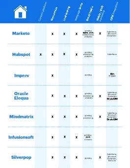
8. Live Dubai
The final logo on our list comes from Live Dubai.
Much like the other real estate logos we’ve listed, this one is simple. But, what we really love about this design is the way lettering is used to create an interesting logo that’s totally unique to their brand name.
This gives them two options: use the graphic & text together as their logo or crop the image just to use the lettered graphic.
How to create your own real estate logo
Feeling inspired and ready to start designing a new logo for your real estate company?
You don’t have to hire an expensive graphic designer to create a custom logo design. There are thousands of templates you can customize, making a DIY logo the best way to create a professional brand for your real estate business—even if you’re on a tight budget.
However, if you do have some cash to splash on a fancy real estate agency logo, hiring a graphic designer is a great way to make sure your logo is unique. …Just make sure they’re sticking with your brand guidelines.
Key takeaways
As you can see, there are tons of incredible real estate logos that can inspire your own.
Remember, the most effective logos are unique, bold and easy to understand. And while each real estate logo design we’ve listed here ticks those boxes, you’ll need to add your own spin to each design when you’re creating your own.
Ready to start exploring your new brand identity? Try creating a few logo variations in Lucidpress, using your brand colors.
Someone who cares.
When it comes down to life essentials, that’s all us humans need besides food, water, and shelter.
Our need for connection is wired into our brain because our own survival depends on it. As a result, we respond to and connect with other people who satisfy this fundamental need of ours.
Related: Brand archetypes — Which of these 12 brand archetypes fit your brand?
There’s a big opportunity for brands to differentiate themselves not by being “the best” or “the first”, but the ones who care the most.
Is your company’s mission driven by the desire to help and support others?
If this your dominant characteristic, consider embracing the caregiver brand archetype. As the examples below reveal, there’s a lot you can achieve by growing into this narrative.
Does your brand fit the caregiver archetype?
As customers, we have an inevitable tendency to personify brands. This goes to show just how strong our need for emotional connection is.
If your brand personality already favors building relationships instead of coldly communicating product features, then you are already on track to become a caregiver.
Specifically, the characteristics of the caregiver archetype include:
- Sustained focus on the customers’ needs that’s visible throughout the company
- A proclivity for volunteering time, energy, and resources to assisting customers
- The ability to notice when someone needs help and the ability to provide it
- A responsible and benevolent way of conducting business
- A constructive approach to community involvement
- A track record of dependability and being supportive of others.
Traditionally, these traits have been associated with NGOs, but there are several commercial brands that are true caregivers too.
In recent years, an increasing number of companies have grown based on these exact features. This strong foundation allowed them to develop a strong, recognizable brand with clarity and confidence.
The caregiver archetype examples below show exactly how they achieved this.
Truthful brand positioning has a ripple effect
We long for loving, secure relationships not only with people, but with other entities we interact. The more we depend on a company — for our water, safe travels or most sensitive data, the more we need to be able to trust it.
Organisations that embrace the caregiver archetype inspire trust due to their brand mission to help, protect, and care for others in ways they cannot do so themselves.
For example, Johnson & Johnson articulate mission clearly on their about page: “130 Years of Caring”.
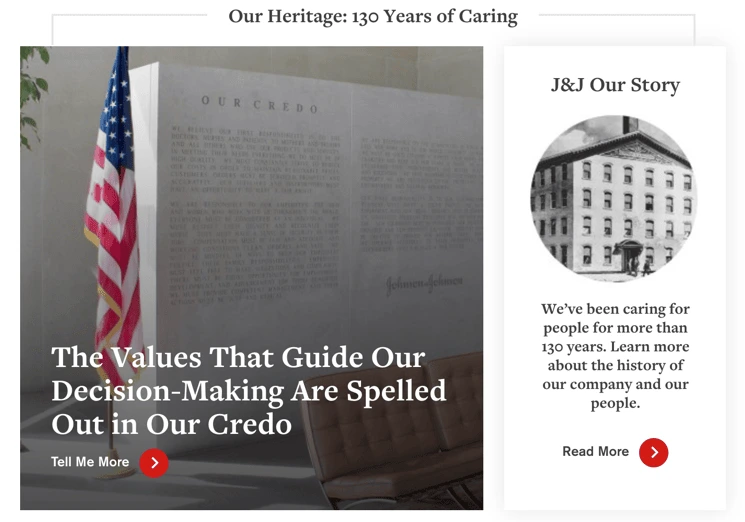
In 2018, Johnson’s Baby (no affiliation with J&J) launched a campaign called “Choose gentle” that states their commitment to a similar idea:
“We believe in the immense, transformative power of gentle. Gentle is something the world can’t ever have too much of. #ChooseGentle”
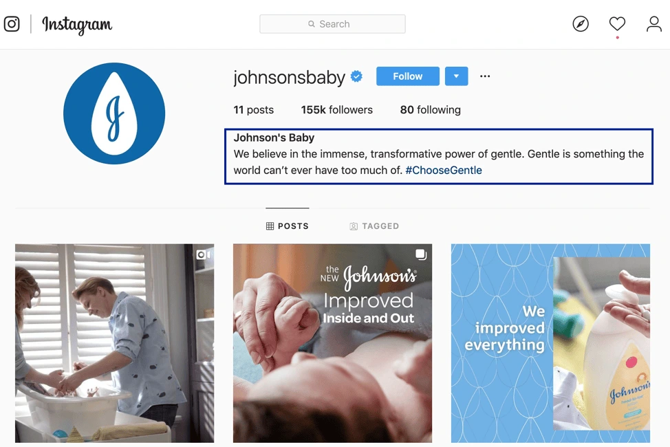
P&G taps into similar values to articulate their mission:
“We will provide branded products and services of superior quality and value that improve the lives of the world’s consumers, now and for generations to come.”
Another brand from the same industry, Honest, tells their story along the same lines:
“Our story began with a simple desire: to make the right choices for our families. We were parents in search of safe options, but unsure of where to turn. We needed one brand that we could go to for trusted products and information. And when we couldn’t find what we were looking for — and realized we weren’t alone — the idea for Honest was born.”
As you can notice, brands that fit the caregiver archetype seek to inspire others to act on the same nurturing tendencies. They do so by acting on their brand values and operating from a posture of:
- Generosity
- Humility
- Empathy
- Compassion
- Trust
- Kindness
- Openness
- Optimism
- Transparency
- Integrity
NGOs are the best equipped to harness the power of this brand archetype in a significant, impactful way.
Unicef’s USP — “For every child” — speaks to their dedication of working to improve the wellbeing of children around the world.
“We campaign for a world where human rights are enjoyed by all” states Amnesty International, pointing to the bigger picture and inspiring others to join their pursuit.
The Bill & Melinda Gates Foundation has a similar position dedicated to selfless service:
“All Lives Have Equal Valuewe are impatient optimists working to reduce inequity”
For a caregiving brand, the core strategy is to do things for others. This can mean facilitating shared experiences or aligning people around common ideals. Also, this brand archetype excels at creating a feeling of belonging to something greater than oneself.
In this context, you can also achieve more clarity by assign a role for your brand to play in the market or in the community. You can be:
- An altruist
- A nurturer
- An advocate
- A helper
- A supporter
- Or even a mentor.
Developing your caregiver features can prove especially powerful for new brands seeking to build a recognizable personality. It can be equally helpful to companies trying to break out of their industry and reach a wider audience.
Being a constantly nurturing, supportive company creates a strong, consistent brand that customers are excited to endorse. That’s because these characteristics appeal to the universal values deeply embedded into our humanity.
Caregiver brands are good for everyone
When your company embodies the caregiver archetype, it:
- Fosters authentic connections between the brand and its customers and partners
- Builds loyalty among customers, reducing churn, and cultivating a constant interest in your products and services
- Empowers vocal advocates that carry your message forward and generates word-of-mouth promotion
- Lowers your cost of acquisition based on empathy and affinity for your brand
- Creates long-term value by helping people make better choices and care about others.
To achieve these goals, pay attention to your brand voice. The caregiver is usually considerate, thoughtful, kind, positive, calm, and supportive. Can you identify these features in your communication?
Next, evaluate your visual identity. Do your color scheme, font choices, and layouts create experiences that reflect kindness and gentle understanding?
For example, Headspace — “Your guide to health and happiness” — breathes positivity into their users’ lives through their website, app, and all channels they use for communication.

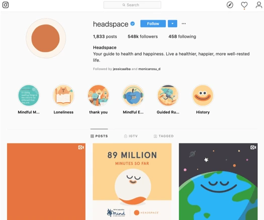
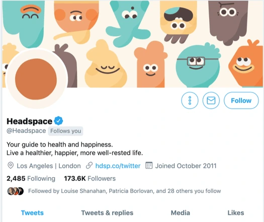
As you can see, their branding is remarkably consistent, albeit adapted to each channel’s specific communication style.
Another equally captivating example is Wistia, whose brand positioning empowers their customers to thrive: “Create, host, share, and measure your videos like the human you are. ?”.
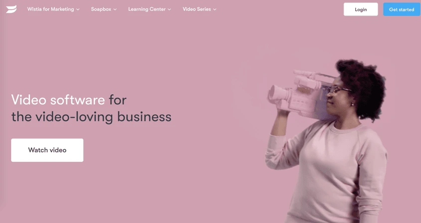
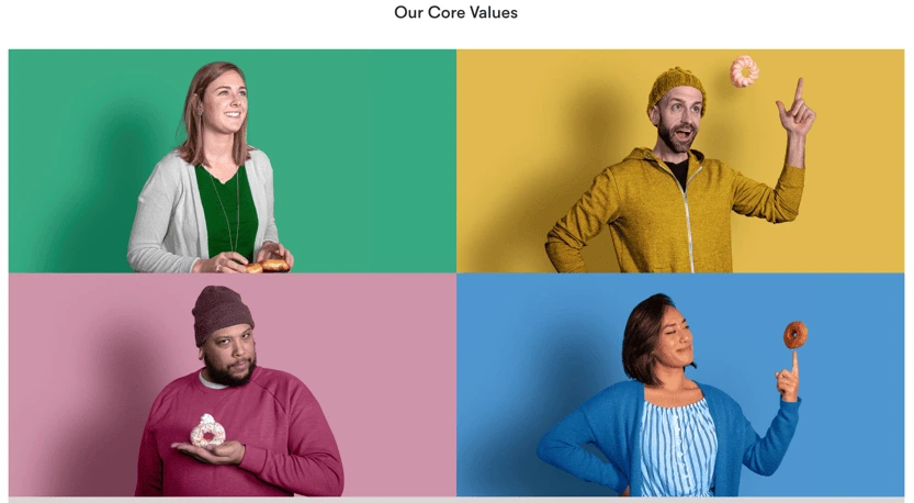
Their branding is colorful but in a gentle, inviting way that combines feelings of calm and excitement in a way that feels healthy and balanced.
Wistia has also been recognized for their exceptional customer service which goes to strengthen their brand’s focus on helping others succeed.
Loyal followers will amplify your mission
Being a caregiver brand gives your customers a competitive advantage that’s associated with a powerful positive message.
Whether through shows kindness or empowering people to care for themselves, you will most likely attract people who value connection.
Those who have a lot of responsibility will naturally gravitate towards your brand as their tendency to look after other people is stronger.
If you make these customers feel loved, safe, taken care of, they will soon become thankful for your support. Nurturing that feeling of “we’re in this together” can lead to them becoming strong advocates for your mission who carry your message to their own circles of influence.
For example, The Salvation Army is top of mind for those who want to extend a helping hand to people across the world. When it comes to donations, they are also the first to come to mind.
Volvo launched in early 2019 the E.V.A. initiative which entailed sharing over 40 years of their own safety research so other car manufacturers can provide an equal level of safety for both men and women (who are at a disadvantage).
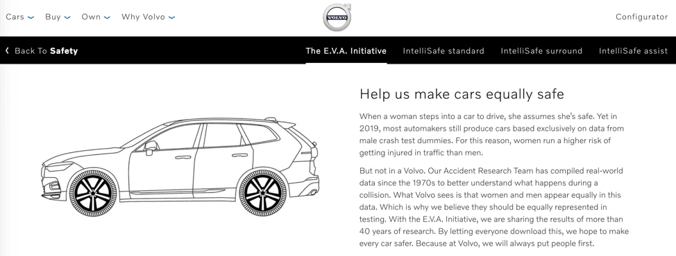
To make it easier for your followers to share your call to action, make sure you provide them with up to date, eye-catching brand assets they can use on their own channels.
Visuals always work best, especially when you combine them with a clear and compelling message. AVAAZ does a great job at this:
Ready to embrace the caregiver brand archetype and make the most of your resources to help others?
Start by unifying your communication around a clear set of values that will guide your strategy. Choose the role you want your brand to play in your community. Give it a voice, using words, visual assets, text and/or audio, and start attracting more loyal customers and supporters.
Strengthening your relationship with them puts you on a growth path that greatly benefits from the compound effect these acts of kindness have on everyone’s lives.
Is it time to update or refresh your brand’s identity? Learn more in our free ebook: How and why to rebrand your company
The main goal of your brand, as it is of any brand, is to make a profit and perhaps change some lives in the process.
But what if we said that every brand – whether intentional or not – has an underlying brand personality? And that this personality, sometimes referred to as a brand archetype, can actually be used to build deeper connections and drive more sales?
Related: Brand archetypes — Which of these 12 brand archetypes fit your brand?
In this post, we’ll discuss the concept of brand archetypes. We’ll then highlight one archetype in particular – the magician.
Finally, we’ll show you how Lucidpress can help you to maintain a consistent brand personality across all of your campaigns and platforms. Let’s begin!
Why your brand archetype matters
The personality traits and characteristics of the magician archetype are well and good, but what does this matter to your brand?
It helps if you think of your brand as your company’s personality.
How do you want customers, potential customers, investors, and competitors to see you?
This is where the brand archetype comes in.
Humans like to connect with other humans. An archetype, then, helps your brand to appear more human. And this connection can lead to deeper, more fulfilling relationships.
Even further, this humanness can lead to more sales and higher profits.
The magician brand archetype
As the name suggests, the magician archetype is mysterious and somewhat elusive. They’re also incredibly persuasive and driven by the need to make positive change.
The magician archetype is far from the only one that exists, though. There are twelve brand archetypes in total. They are the:
1. Caregiver.
2. Creator.
3. Entertainer.
4. Explorer.
5. Girl/guy next door.
6. Hero.
7. Innocent.
8. Lover.
9. Magician.
10. Maverick.
11. Royalty.
12. Sage.
And while we’d love to dig deep into each one, we’ll be focusing on just one of these today: the magician.
A brand with the magician archetype is one that has lofty goals, but that also has the power and drive to attain those goals.
There are those who may say that the magician can even be a manipulator, but as with all things, balance is key.
Are you in need of brand inspiration? Let’s take a look at just three of popular brands with the magician archetype.
Example: Tesla
When you think of mystery and innovation, which brand comes to mind? For us, it’s Tesla.
Tesla is the American automotive and energy company owned by Elon Musk. Their goal? To change the world.
In fact, innovation and positive change seems to drive everything they do.
From mock-ups of their next vehicle model to their Instagram feed, Tesla is all about making an impact.
Example: Disney
When it comes to creating magical moments, who does it better than Disney?
Whether you’re watching their movies, cruising the seven seas on their liners, or strolling through their parks and chatting with your favorite characters come to life — Disney makes the impossible, possible.
Example: Red Bull
The owner of Red Bull doesn’t have plans to go to Mars (that we know of, anyway!), and they don’t own and operate the happiest place on Earth. But where Red Bull gets it right is in it’s lofty approach to brand marketing.
The brand’s slogan is simple, but explicit: “Red Bull gives you wings!”
In essence, they claim their drink is the magic potion that will help you to achieve your goals and even make a dream come true.
Which businesses would benefit from the archetype
You may have aggressive goals, and perhaps you even hope to change the world. But that’s not all it takes to become a standout brand that falls under the magician archetype.
Just as with the other archetypes, there are those that would benefit more from this angle. They include brands that:
- Create/promote a transformative experience.
- Offers clarity and knowledge.
- Design and sell contemporary, new-age products.
- Have a spiritual or conciousness-expanding angle.
That’s not to say that you can’t incorporate bits of the magician archetype into your overall brand strategy. But this is definitely not an archetype for the weak at heart!
How Lucidpress can help you to design your brand
A consistent brand design is crucial, but also difficult to achieve in reality.
That’s where Lucidpress can help.
Lucidpress is an online print and digital software program that helps you achieve your brand goals. How? Well, one way is with our brand management software.
As a brand templating platform, Lucidpress is a great way to help your marketing team stay on brand and generate the exact marketing content you need.
First and foremost, Lucidpress offers you one centralized location to store and manage all of your digital brand files. From anywhere in the world, your team members can access anything they need.
But Lucidpress is also a secure place to store your brand assets, including logos, fonts, and templates.
With Lucidpress, you don’t have to worry about finding the latest version of a logo on your computer, or uploading your brand-approved font for each digital design task. Just upload them once, and you’re all set!
And finally, Lucidpress enables you to design and distribute your branded content across numerous channels.
The drag-and-drop editor makes it easy to build brand templates, and you can then share with your team – or the world – with just a few clicks.
So, what are you waiting for? It’s time to bring your brand to life with the help of Lucidpress.
When you think about Coca-Cola, what pops into your head — is it the taste? The fizziness? The dark caramel color? Maybe you think of a classic ad. If you’re like me, it’s the vivid red-and-white logo adorning the label.
Related: Is your brand outdated? When to do a brand refresh
When you think of all of these things, you’re thinking of Coca-Cola’s brand as a whole. If lots of different Coke-related images popped into your head just now, then Coca-Cola’s marketing team has done its job.
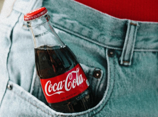
Too many people think branding begins with choosing a name and ends with picking a logo — but it’s much more than that. It affects everything.
So, when a company wants to rebrand, it’s not about just changing the logo. It’s also about changing goals, messaging, tone, voice, style and anything else that contributes to your image. It can be a tricky thing to get right, because ultimately, you can’t control what people think. But a well thought-out and defined brand is the backbone of many successful companies.
If there’s so much to it, why would anyone dream of rebranding? When is rebranding the best option?
Well, you could have gotten it wrong the first time. Many businesses overlook branding when they’re starting out and later find they need to rethink it. For some, they need to appeal to a broader audience. Others need to change tack when they decide to expand into other markets.
Long-established companies aren’t immune to the need to rebrand, either. It might be necessary after an acquisition or merger. Changing industries, attitudes and new competitors can also ignite the need for a fresh image. When a company needs to reposition or rejuvenate itself, rebranding makes sense.
Deeper issues, like an antiquated image or a negative reputation, can spur a rebrand. Sometimes, it can even come down to involvement in a damaging public scandal.
When you face challenges like these, you have two options. You can cling to the old branding that you had, or you can put together a rebranding strategy and work towards a new image.
Whatever the reason, make sure you have a strong case for the rebrand. Though there’s a lot to it, rebranding is part of the life cycle for many growing companies. Very few of us wear the same clothes now as we did in high school — so why wouldn’t a brand evolve as well?
Reasons to do a rebrand:
- You need to completely reposition your brand
- You merged with another company
- You significantly changed your product offerings
- You have a negative reputation
Reasons to do a brand refresh instead:
- You want to attract a new audience
- Your messaging is inconsistent
- Your company has evolved
- You don’t stand out from competitors
Considering the points above, it may be that you don’t need to go through an entire rebrand: Your current brand may just need some polish, also known as a brand refresh. A refresh is a much lighter version of a rebrand, and though they both entail a lot of the same work, a refresh simply updates your current brand instead of making the sweeping changes that a rebrand does.
If you’re still not sure if rebranding is right for your company, check out our rebranding questionnaire.
Rebranding strategy
Rebranding a company doesn’t happen overnight. You need a solid rebranding strategy, testing and approval, and then you need to roll it out internally before your big debut with your customers.
Here’s our advice on the five steps to follow to get rebranding strategies right.
1. Research before you rebrand
Before making any changes, you’ve got to do research to find out how your brand can improve. What do people like about your brand? How can it connect with modern consumers? There are endless questions to ask when building a new identity. The more knowledge you have, the more effective your rebranding strategy will be.
During this process, find out what attracted customers to your brand initially … or why they went to a competitor instead. Figure out the problems you need to address with the rebrand.
Coca-Cola once decided to rebrand, but its New Coke campaign flopped. Coca-Cola didn’t have any issues with its product’s taste or image, but it decided to change both. The result wasn’t an energized image but confused loyal customers. So, make sure to do your research.
Burberry’s rebranding strategy is a great example of how to strike this balance. After a century-and-a-half of success, Burberry’s image started to suffer when — through no efforts of its own — the brand became associated with gang wear and fashion for older generations. Thanks to this double punch, clubs in the U.K. wouldn’t allow entry to anyone wearing the brand’s iconic plaid.

Faced with this unsavory situation, Burberry decided to rebrand, but it did its research first. The company hired an anthropologist to rediscover its roots so that Burberry could highlight its heritage in a way that would appeal to younger audiences (while also disassociating its name from gang wear).
2. Set out clear goals
From your research, you’ll know what’s wrong, and this should help you figure out what you want to achieve. Burberry needed to disassociate its brand from gangs and build a modern youthful image.
Knowing it needed to appeal to younger audiences, the label added more modern styles to its line and recruited well-known celebrities like Emma Watson to promote them. This led to a boost in sales and an image readjustment for the brand, which once again became a luxury name.
There’s no point rebranding a business if all you change is the name. When it became The Shack, RadioShack did exactly this. The business wanted to stem the flow of losses, but a name change just didn’t cut it. Maybe if it had gotten to the root of the problem and set out more strategic goals, the brand wouldn’t continue to close its doors.
With thorough research and clear goals, your rebranding strategy will be well-informed and should make an impact.
3. Get all company stakeholders on-board
To get customers on-board with a rebrand, you’ll need to get all stakeholders involved first. Your employees are the main touchpoint between your brand and the outside world, so they need to understand the importance of your new brand. You want to make sure what they say and do is in keeping with your new image.
The CEO who led Burberry’s turnaround, Angela Ahrendts, knew there was a problem when she saw that none of the company’s managers wore the brand. How can expect your customers to love your brand when your own staff doesn’t?
If your rebranding strategy aims to address a bad rep for customer care, you’ll have to invest in training and resources to deliver better customer experiences. In situations like these, it can be a good idea to rebrand internally first.
When setting out a rebranding strategy for a client in the financial sector, consultants Spyglass Creative decided to do just this. To convince the board of management of the importance of stellar customer service, waiters with silver platters served lunch to the members and introduced the idea of “sterling service.” With a clear view of the vision for the rebrand, they supported the new approach.
4. Have a process planned out
Once you’ve got stakeholders on your side and know exactly what needs to be achieved, you can put together a plan of action. In the case of Burberry, the company was active on many fronts. It introduced new designs and bought back licenses for its classic plaid pattern, so it could protect the brand’s image and make it exclusive once again. The company also created a brand story, which it told through videos and in-store displays.
Your rebranding strategy might require you to take up social media. Or, it could impact the networks you already advertise on.
Prior to 2010, Old Spice was seen as a retro brand for older men. While its reputation was sound, it simply didn’t appeal to younger audiences. It decided to change this.
The brand set up a YouTube channel and posted dozens of fun, humorous videos featuring actor and former athlete Isaiah Mustafa.
The rebrand was a massive success, opening up the traditional product to a new demographic by making the most of new trends. Old Spice did its research, rebranded for sensible reasons and set out clear goals.
5. Build trust for your new brand
Once you’ve rebranded, don’t slip backwards. Familiarize your audience with your new brand personality by staying consistent and building trust around it.
If you have a new name or logo, don’t leave a trace of the old one around. Create new brand guidelines and make it easy for staff to implement them. A brand templating platform like Lucidpress can help by making brand assets easily accessible during the content creation process. When any files are updated, everyone will automatically have access to them, too.
Use your new brand in all your communications to build awareness of it. Use a link shortener like Rebrandly to create branded links for your emails and social media posts. This will build brand visibility and trust. Content marketing and native advertising can also build familiarity and trust in your new image. Be consistent with your new tone, and don’t flip-flop between your old brand and the new one.
Branding is an important company asset, and it can leave a lasting image in consumers’ minds. Make sure your rebranding strategy sticks, because it can rejuvenate a business and even turn it around when the chips are down.
How to rebrand a company
Follow these steps and plan how to successfully rebrand your business.
1. Define your audience
If your audience is 70-year-old retirees, you probably don’t want to alienate them with something that feels so modern it’s out of their reach. The same goes for a millennial audience. If you’re rebranding, it might be because you’re redefining your niche and ideal customer. Make sure your branding speaks as much to that ideal audience as your sales copy does.
2. Stay true to your mission
A rebrand should be a makeover, not a botched surgery. Before you begin, go over your mission and value statements. Come up with an idea of where you are now and where you want to go — without losing sight of who you are and what your customers have come to love. Project your mission and personality in your new branding so you feel like a refreshed company, not an unrecognizable one. If you’re having trouble finding your brand’s voice, try this tool.
3. Rethink your name
Name is the first and most recognizable brand element. Rebranding doesn’t always involve a name change, but it can be a powerful strategy — especially if the company is looking for a fresh start. Did you know that the infamous Philip Morris company changed its name to Altria to disassociate itself from bad press and controversy? Considering how a number of journalists reported on the obvious change, it’s hard to say whether it was successful, but only time will tell.
One more thing to consider is the possibility of alienating or losing older clients with a name change. A fresh start is a double-edged sword, so make sure you’re ready to give up your established legacy in favor of a new brand identity.
4. Revamp your tagline
Slogans and taglines often go hand-in-hand with a brand’s name. Usually, a tagline is a catchy sentence that summarizes your business and is easy to remember. If you decide to change your name, you should do the same with your tagline — especially if the business has changed. Over the years, FedEx has had several long and unmemorable taglines, so it changed to “Relax, It’s FedEx” in 2004 and “The World on Time” in 2009, both of which are simple and effective.
Rebuild your brand identity
Your brand identity is how you present your company to the world. It’s everything that customers recognize your brand for, from visual style to voice and personality. Be sure to include these key elements of brand identity in your rebranding strategy.
Logo
Since people are visual thinkers, updating your logo is the easiest way to demonstrate change to your audience. As for the logo design, you have to follow (and subvert) trends if you want to appear fresh. But, be careful with it. You don’t want to drift too far away from the original logo unless you’re trying to conceal your past. You want people to acknowledge the change but also recognize the company’s continuity.
Color palette
Color psychology is real — and different colors make people feel different things, so consider how you want your brand to make people feel. Blue is a calming color, pink is soft and romantic, black is bold and sophisticated, etc.
It’s best to go for a simple color palette with no more than 3 primary colors. You can also choose secondary colors to create your brand palette. You’ll be experimenting with tint, shade and saturation to get the look and feel of your brand just right.
Typography
Typography is truly an art, and choosing the right fonts for your brand can help you stand out and be easily recognizable. Just like colors, font styles can make people feel a certain way. You want to find a pair of complementary fonts that reflect your brand’s personality, whether that’s modern and youthful, bold and innovative, or however else you’d describe your brand. You’ll need to consider things like font size, kerning and line height, readability and licensing requirements.
Shapes and imagery
Along with colors and fonts, your other visual assets communicate who you are to your customers. Again, think about what visuals will communicate your brand’s identity, personality and feeling. Is your brand angular, rounded, flat, soft, natural, futuristic? Are you using animations, photographs, GIFs, videos? All design elements come into play here and there’s a lot to explore.
Brand guidelines
Once you have your new brand identity outlined, the best thing you can do for your rebranding efforts is create a clear and easy-to-access set of brand guidelines. This will ensure that your team can reference the new guidelines and keep your rebrand looking consistent. Without full compliance from your internal teams, it can be hard to have a successful rebrand.
Tips and tricks for a successful rebrand launch
1. Know your limit — err, budget
Creating content, running tests and paying for ads all costs money. Around 10-20% of your annual marketing budget can be spent just on rebranding efforts. Developing a well-designed content calendar will help identify where most of your money will be spent and give you an idea of when you’ll need to be prepared for these expenses.
2. Testing: 1, 2, 3
Taking the time to run tests on your content will help to solidify your marketing strategy. It’s not always a guarantee that a rebranding effort is going to be successful. The best way to prevent a failed rebranding is to test your assets before releasing them to the public. Study groups and A/B testing can uncover and strengthen any weak points in your rebranding strategy.
3. Demand consistency
Branding should be synonymous with “consistent messaging.” When you rebrand, you need to go back through every webpage, design element and evergreen brochure to update it with your fresh look, tone and feel. Don’t dilute your new branding by confusing it with the old. Get everything polished in one fell swoop. Brand consistency was important before the rebrand, and it’s even more important now. Consistency establishes company-client trust, which leads to higher revenues.
A platform like Lucidpress can be a huge help in your rebranding and consistency efforts. It gives a central place to put all your brand assets and files, providing easy access for anyone who needs them. You can put all your new colors and logos in the brand assets hub, so when people are creating content, there’s no chance of them using an old logo or font, etc.
You can create a template library with all of your rebranded and updated materials, so spanking-new content is right at everyone’s fingertips. Plus, when you decide to refresh your brand again down the road, all the content will be in one easy-to-update location. A centralized platform for branded content creation will make it easier to roll out your rebrand to internal teams, so can ensure that everyone’s up to speed before your public debut.