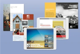
In some ways, making a magazine today is easier than ever. The internet puts free information at everyone’s fingertips, all instantly available through mobile devices. What’s more, every person online has the opportunity to create high-quality content if they so choose. From free magazine templates to stock image libraries, there are more options than ever. Still, there’s more to making a successful magazine than simply putting images and text together. In this step by step guide, we’ll explain how to make a magazine that will not only showcase your brand in the best light, but keep your audience hooked.
How to make a magazine in 16 steps
In this resource, we’ll walk you through the work that happens before, during and after production. The first stage is brainstorming, followed by creation and collaboration, and finally, distribution. There’s a lot to cover (no pun intended), so let’s dive in.
Before production: Brainstorming
1. Developing your business plan
Before you write a single word for your magazine, you’ll want to sit down and create a game plan. This includes your mission (the reason why your magazine should exist), your overall goals, and how you’ll attain them.
Here are some of the most important questions to consider
- What is the concept or focus of your magazine? This should be brief and concise, like an elevator pitch. For example, take a look at this copy from TIME’s “About” page:
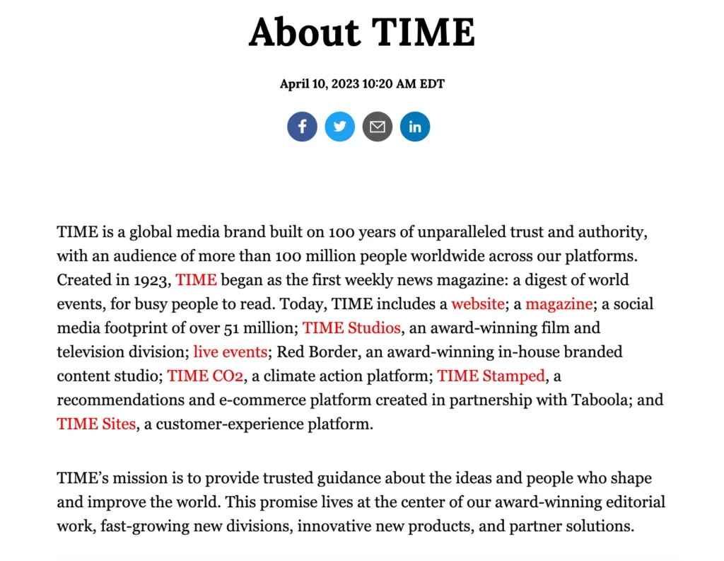
While their brand has ballooned over the past 100 years, their commitment to “unparalleled trust and authority” remains the cornerstone of the TIME brand today. And while your aspirations might not be as grand as TIME Magazine, it’s important to nail down the ‘why’ behind your publication.
- Which topics will you cover, and in what depth? You can’t have a magazine without a subject. Think about your area of expertise and the audience you’re aiming for. Whether you’re putting together a catalog showcasing handmade jewelry, or a glossy magazine with lush photography for your state’s tourism board, you need a clear, unifying topic.
- Consider your tone & voice—there is a big difference between The New Yorker and OK! Magazine. Consider your ideal audience and what they might resonate with. Also consider your topic. A university magazine might have more leeway to be less formal than say, a science publication.
- Will your magazine by physical or digital (or both)? While the thought of holding something physical in your hands may sound appealing, consider the cost of printing a physical magazine. Even if you’re a well-established brand, the vast majority of your audience will have access to the internet and will be able to easily access a digital magazine. Again, consider your audience, the purpose of your publication, and how much you’ll willing to invest in it.
Pros of physical magazines:
- Ability to add full page advertisements and inserts
- Limited stock could make your publication more valuable
- Tactile reading experience
Cons of physical magazines:
- High upfront cost
- Bigger carbon footprint
- Readership is limited to how many copies printed
Pros of digital magazines:
- Free or low-cost
- Accessible to a wider audience
- Can include immersive elements such as scrolling text or video
Cons of digital magazines:
- Less advertising potential
- More competition
Here are a few more questions to ask yourself:
- Who is the primary audience? Your magazine should speak to others, not just yourself. It’s also important that your audience has a “continuing need” for your content, so they’ll want to subscribe and read more. Think about your audience’s lifestyle, and cater to the issues and ideas they care about.
- What’s your title? Once you’ve thought about these other questions in depth, it’s time to start brainstorming titles. Our advice? Keep it short, simple, and relevant to your purpose/topic.
- How will the first issue be funded? Many magazines earn profit by selling advertising, but it can be hard to attract advertisers at first. Depending on your situation, we might suggest using personal capital to fund the first issue—raised by saving money, seeking investments, or crowdfunding.
2. Research the landscape
There are a lot of magazines out there (both online and in print). Spend some time exploring some publications that you’d like to emulate, and get an idea of any potential competition. This will give you a better idea of what’s already being covered and how you can differentiate your publication. Taking stock of your competition can also reveal any gaps and opportunities that are currently not being met in the market, which you can use to your advantage as you develop your concept.
Now’s also the time to dive deeper into your target audience. Are most publications in your niche print or digital? Consider the ways you can add more value for your intended readers.
If you’re interested in making a digital magazine, we recommend adding keyword analysis to your competitive research. Working with an SEO tool will help you find out what keywords and topics your competitors are ranking for, and can reveal gaps you can take advantage of in your own content.
3. Build your team
A magazine isn’t something you should undertake alone. Building a trustworthy team and dividing your workload will help you create faster, better results – with much less risk of burnout. The stronger your team, the stronger your magazine will be. Here are a few staff roles you might want to consider.
- Writers — Magazines are driven by great content, so of course you’ll need great writers to make it work. Depenging on the size and scope of your magazine, you might opt to keep things in-house or reach out to freelancers to submit pitches. Either way, be clear with writers about your editorial expectations and whether you’re offering any compensation for their work.
- Editor — At the end of the line, there should be one pair of eyes to give each piece of content the final yay or nay. A head editor ensures consistency and quality by reinforcing your editorial standards. This includes tone of voice, grammar, mechanics, and even the reach and scope of each article. When you have a strong editor at the helm, the finished magazine will be polished and cohesive.
- Sales manager — If your magazine will feature advertisements, a sales manager is indispensable. This person will serve as the point-of-contact for advertisers who will pay for space in your magazine. Having one person available to address their questions and concerns will help you build a better relationship with them, leading to higher, more sustainable profits.
- Marketing manager — Your magazine needs advertising too! A marketing manager will work to get attention for your magazine, making sure it’s present in all the right places. For example, If you’re launching a magazine in print, you’ll need distributors in bookstores, newsstands, and other public places. If you’re launching online, there are many channels for you to explore, from search engine ads to social media. Part of this person’s responsibilities will be deciding which distributors and channels are best for your magazine, and then creating materials like press kits and promotional content to support them.
- Publication manager — This is someone who gets down to the nitty-gritty of publication. This person will help you choose a printing partner who meets your needs, both in terms of quality and budget. What will the paper cost? How do the colors look? Are there any errors in the finished product? A publication manager will focus on these seemingly minor details that, in reality, make a huge difference when you’re creating a magazine.
- Partnerships / groups — These are helpful connections who aren’t necessarily part of your team, but can steer you in the right direction. Partnering with relevant brands that share a similar audience to you can bring more exposure. Additionally, you can find groups made up of local or indie magazines online to share advice and opportunities with one another.
During production: Creation & collaboration
Here’s where we get to the exciting stuff. Don’t get us wrong – this can be a very hectic time, but it’s where the real magic happens. If you’re inspired to make your own magazine, you’re likely familiar with the following steps—but let’s review them anyway.
4. Designing your masthead
Your magazine’s ‘brand’ is defined by its masthead. Think of Time, Vogue, and National Geographic, all publications with iconic, recognizeable mastheads. These publications use serif fonts. On the flip side, magazines like Billboard, GQ, and Glamour use sans serif fonts. Consistently using the same typeface issue after issue builds a consistent brand, while your designers can play with the color of the text to match the cover image.
5. Writing articles
Finally, time to create articles and stories for your magazine. Depending on your concept, this might mean a few different things: fiction or non-fiction, short stories, journalistic articles, how-to guides, reviews, or even a blend of all of the above. This step encompasses the writing process, from conception to pitch, and from researching to drafting.
When you’re planning each issue, you’ll also want to choose an attention-grabbing cover article. This is the ‘main event’, and will often be the story or feature readers are most excited about.
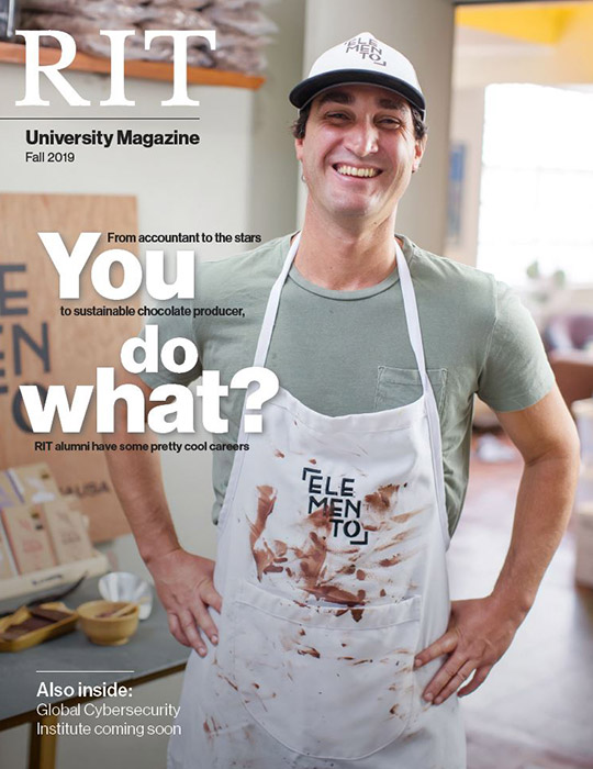
Take this cover story from the Rochester Institute of Technology’s campus magazine for example. “You do what?” is an attention-grabbing headline for this inside look into some of the most interesting careers RIT alums have – a cover story most students and parents would be very interested in reading.
Once you’ve written all of your articles for an issue, don’t forget to add a table of contents so readers can easily find what they’re looking for.
6. Editing
It’s not uncommon for articles to undergo more than one round of revisions. Far more than just catching style and grammar mistakes, editing will help the writer focus and elevate their writing. Editors can help with fact-checking as well. Together, writers and editors cooperate to make an article the best it can be.
7. Proofreading
After an article has been written and edited, careful proofreading is required to ensure quality and accuracy. Any typos or errors that made their way through the writing process will be squashed here. Unlike editing, proofreading is not an evaluation of the article’s style, tone, organization or effectiveness. The focus is solely on finding and eliminating errors, so the finished product reads professionally. The person who proofreads might very well be the editor too, but these are still two separate stages of production.
8. Graphic Design
The way we enjoy magazines is different from how we consume a book or a newspaper. Although each of these publications provides information, magazines in particular are known for being visual. From elegantly gorgeous to colorfully flashy, magazine design runs the gamut.
In the name of consistency, you’ll want to decide early on whether you want your graphic/cover design to lean more toward imagery or information – or a blend of both as pictured here.
Your graphic designer is just as responsible for your magazine’s tone and feel as your writers are—if not more so. It’s important for your graphics to match your words. Browse these magazine design templates for some inspiration.
9. Photography
Stock photos are okay here and there, but they’re no substitute for custom photography. Rather than searching for pictures to match your vision (and potentially settling for less), a photographer can work with you to capture the pictures you really want. Color, lighting, subject, quality… All of these photo elements contribute to the reader’s perception of your brand. After all, that’s why they say a picture is worth a thousand words. (Or, at least, it’s why we say it.)
10. Build out your back page
If you’re including advertisements in your magazine, a back page is a must. Among wide-circulation magazines, the back page is often a full-page advertisement – one that companies pay a lot of money to be featured in. When you’re designing each issue, don’t forget to leave room for this important page.
11. Make a prototype
Just like with any product, you can’t mass produce until you have a definitive, finalized version. All of the content, words and images must be firmly locked into place with no errors or further changes. Holding your first finished prototype (whether in your hand or on a tablet) is a proud moment. Savor it! You’ve put in a lot of work to get here, and there’s still work to be done. You are now ready to start sharing your magazine with the world.
12. Digitize
Regardless of where/how you’ve designed your magazine, you want to triple check that your digital file is ready to distribute. Different publishers and reading apps have their own standards in terms of file type, size, quality and so on. Make sure you’ve researched and complied with those standards in order to prevent delays.
After production: Distribution
13. Find a printer
Your printing partner is a critical ally on your way to distribution. If you’re only hosting your magazine online, well, you’re off the hook on this one. But if you intend to share hard copies of your magazine locally, regionally, or even nationally, you need a printer you can trust to deliver satisfactory results every time. Do your research, ask around, and interview printing partners until you feel confident that your pick is a good match.
When you’re considering printing, keep these things in mind:
- Paper quality — Magazines should be on glossy paper for the best image quality. Consult with a professional printer about the right weight and size for your project.
- Layout — Because of the nature of magazines, you will need to double check to ensure that your pages will be laid out as expected.
- Full-bleed — You can add a bleed to your document so there are no blank edges on your pages. A bleed is similar to a wider margin which is then trimmed in the printing process.
14. Establish your online presence
Perhaps more than any other step, this is paramount to launching a successful online magazine. Your online presence can take many forms, from a website to a blog to social media channels, and maybe even all of the above. What’s important here is building a community of people hungry for your content. Find out where your target audience ‘lives’ online, and make sure they can find you.
A few specific ways to drive more traffic:
- Use SEO best practices in your blog and social media to help more people find you
- Join industry or community groups on social media and share your articles
- Offer free print editions at industry trade shows or events
15. Decide whether to paywall
This is a tricky question in today’s publishing world. If you paywall all of your content, it might be hard to attract new readers. But, you can’t give it all away for free either. Striking the right balance between paid and free content might look different for every publication, so experiment to see what works for you. A good place to start is sharing free content and article excerpts on your blog but charging a flat price or subscription for each magazine issue.
16. Build a community around content
Your readers can (and should be) be your best brand advocates. When you foster a strong community on your blog, forum, or social media pages, it gives readers a shared sense of belonging. Discussions are far more interesting when readers get involved, and they can provide you with inspiration and direction. Beyond the pages of your magazine, there are many opportunities to get creative here. For example, you could start a branded YouTube channel to share vlogs and other video content.
Congratulations!
After months of work, you’ve finished the process of making a magazine, and you’re on the track to sustainable growth and success. Once you get to this point, there’s only one thing to do… Get started on the next issue!
Making a magazine, simplified
Want to start your own magazine? Marq will streamline the design process for your whole team. With our intuitive drag-and-drop interface, you can select from gorgeous templates and customize with fonts, colors, shapes, images and more. Invite others to collaborate in real time, and when you’re done, export in a variety of print-ready formats. Explore our templates and start growing your brand today.
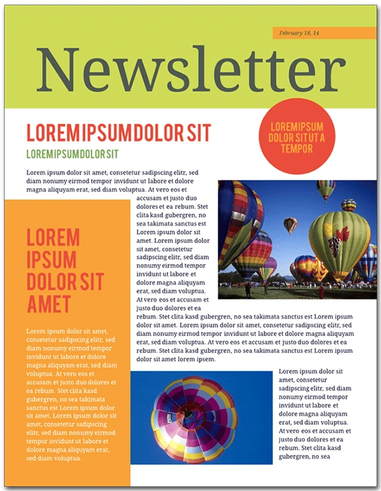
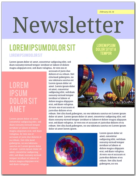
Ever wondered how to improve your school or company newsletter? Follow these steps to take your mailing from “Meh” to “Wow!” To follow along and create a newsletter of your own, open the Citrus Splash employee newsletter template in Lucidpress—you can see the demo features right in the editor.
Newsletters are published on a recurring basis to keep readers in the loop. The details of a newsletter will depend on its audience. Above all, newsletters should be informative and add value for readers. Print newsletters focus on text content and are typically letter size (8 ½” × 11”). Email newsletters can vary in layout and size, but should be viewable from both the email message and in a browser.
Open this template in Lucidpress to follow along!
Related: 13 best newsletter design ideas to inspire you
How to create a newsletter
1. Produce good content
Make sure your content is engaging and useful. Don’t add fluff to your writing for its own sake. Before you use design software like Lucidpress, check to see that your pieces are copyedited, your photos are chosen, and your articles’ lengths are set.
This newsletter template is five pages: long enough to include a solid lineup of articles and photographs, but not so long as to be overwhelming.
2. Establish branding
Think about how you will create a consistent brand. Every aspect of your newsletter will reflect upon your corporate or academic culture and identity. Choose a succinct title, incorporate your business’s font (if you have one), and replicate your brand’s color scheme with Lucidpress’ color picker.
To place your logo onto the canvas in Lucidpress, drag the Image icon from the Content bar. From here, you can upload a .PNG file with your company icon.
3. Brevity is the soul of wit
It’s important to have a strong opening article. This will often be a message from the principal or director, or a highlight of the most exciting feature in a product. Newsletter articles should be a page or less, with carefully placed images that visually break up the text. Splitting your articles into columns gives your content a suitably “newsy” feel.
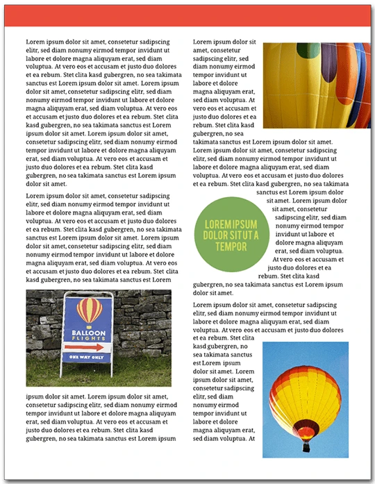
On the bottom of page 3, there is a call-out box with a colored background. There are several ways you could use this section of the template for your own content. It could be a mini-article, a call for donations or a caption for the photo above.
4. Be informative without being too salesy
Newsletters should provide value for their readers. If you used this template for a school, the audience should be able to tell what’s going on for alumni. Avoid too much of the hard sell; consumers are best persuaded with interesting content, not aggressive marketing.
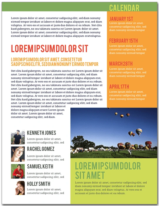
On page 5 of the template, you’ll see an event calendar. To replace the preset dates with your own, double-click the text to edit.
5. Add photos and graphics
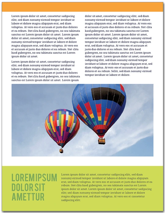
This newsletter is tied together by the images of brightly colored hot air balloons. Graphics like these provide visual consistency and make the newsletter fun to look at. A wall of unbroken text is not enjoyable to read, and it will not engage your audience as much as having well-placed images which complement your articles.
In the template, double-click an image to replace it with your own. This will bring up the Image Manager. From here, you can import images from your computer, Facebook, Dropbox or Google Drive.
6. Optimize your text formatting
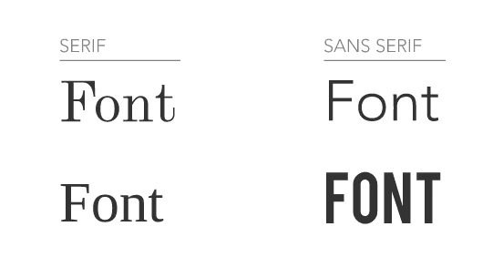
Having consistent formatting is essential to your newsletter’s success. Limit the number of colors and fonts—less is more when it comes to readability. In general, use dark text against a light background. Standard usage calls for serif typefaces for the body of your articles, and sans serif typeface for captions, callout boxes and sidebars.
To change the font in Lucidpress, double-click text to select it, then choose a different typeface from the Properties bar. To change the font of every text element at once, press Ctrl+A. The font you choose reflects your brand: aim for consistency over eccentricity. A clean, modern design will earn your audience’s trust more than curlicues and Wingdings.
7. Use interactivity in Lucidpress
Lucidpress makes collaborating on a newsletter simple and straightforward. In Comment mode, your colleagues can weigh in on the content and design of your documents. You can use Lucidpress to invite feedback without the inconvenience of saving multiple drafts—it all happens in the cloud. The following video illustrates how:
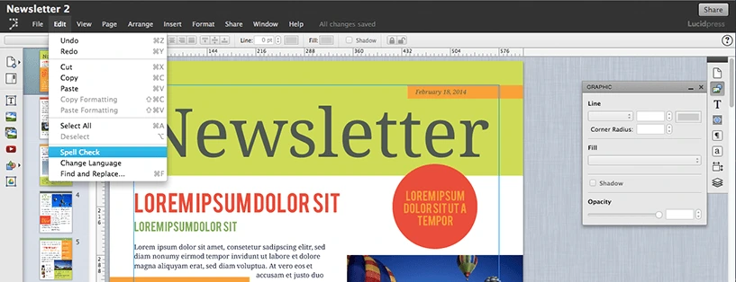
8. Proofread your newsletter
Newsletters are text-heavy documents, and a grasp of spelling and grammar conventions will serve you well. Taking a few minutes to proofread your writing will pay big dividends in reader satisfaction.
In Lucidpress, select your text, choose Edit from the Menu bar, and choose spell check. You can also conduct a find-and-replace search for those times when you forget “i before e except after c.”
9. Be reliable and consistent
Decide how often you are going to send out your newsletter. This will affect the newsletter’s length, event calendar, and expected features.
Think ahead to the season your audience will receive your newsletter. If you are sending a winter holiday-themed mailing, you have to start designing weeks in advance. The same template can have a very different mood with different color schemes. Try using red and green for December, blue and white for midwinter, pastels for spring, and jewel tones for fall.
Newsletters are both popular and useful. They extend your brand’s presence, inform and entertain readers, and show off your expertise to the world.
Ready to wow your audience with beautifully designed newsletters? Lucidpress will help you send the right message.
From its roots in the Middle Ages, layout design has evolved significantly. What was once the provenance of monasteries spread to the office, and later, personal computers. The overarching goals of publishers haven’t changed, though—to find an audience and communicate an important message. However, the nuts and bolts of desktop publishing are undergoing a revolution on par with the changes precipitated by Gutenberg. When planning your business’s layout design strategy, will you be ahead of the curve?
Related: How visual stimulation improves client retention
Illuminated manuscripts
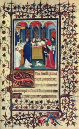
Early examples of beautiful page layouts can be found in medieval illuminated manuscripts. The work process of the manuscript creators sounds remarkably modern: they would plan the overall layout of the page, including the ornately decorated drop capital and the decorative border, then they would draw straight lines on the parchment or vellum where the text would go. The medieval publishers showed specialization in splitting the duties of the rubricators (who filled in the red text), illuminators (the illustrators—forerunners of today’s graphic designers), and other scribes and artists. By the late Middle Ages, commercial scriptoria in cities were competing with the small-shop cloisters and monasteries.
From the story of illuminated manuscripts we can see the importance of advance planning in thoughtful layout design, and the inevitability of commercialization and mass production.
Gutenberg printing press
If you’ve ever looked for a public-domain book, you are probably familiar with Project Gutenberg. How did the Gutenberg printing press change layout design? By using movable type to expedite the printing process, a single press could produce thousands of pages per day, as opposed to a few hand-drawn copies.
During the post-Gutenberg era, some of the personalization of book layouts was lost. The use of two columns of justified text looks very modern. It lacks some of the opulent artistic qualities of the illuminated manuscript page. This era can be thought of the moment when word processing and layout design split into two distinct fields. This is still reflected in specialized programs, some aimed at text-based projects, and some more specifically aimed at visual layout design.

Pre-computer layout design
If you’ve watched a show set in the 1960s or 1970s, you know that “copy and paste” were once anything but metaphors. Before desktop publishing software, art directors, publishers, and printers physically designed their documents. Writers and journalists used typewriters, which evolved to electric typewriters, then standalone word processors. Many of the conventions of layout design were established during this period. The standardization of templates influenced the look of today’s books, newspapers, and magazines, even though they’re often consumed on different platforms.
Mid-century layout design shows that competing mediums for design can coexist. While this era saw innovation in design tools, traditional artists and printers were still part of the media landscape.
Computer desktop publishing
Thirty years ago, the arrival of “What You See Is What You Get” (also known as WYSIWYG) displays radically changed layout design. Arguably, this led to an initial decline in quality: without the ability to control kerning, letter-spacing, or font selection, the printed outputs from programs like Type Processor One or PageMaker were primitive, at best.
With each improvement in screen displays, processing memory, and style sheets, desktop publishing became a disruptive threat to traditional layout design. The swift evolution of WYSIWYG editors demonstrates the necessity of taking upstarts seriously—but of course, that’s easier to see in hindsight!
Proprietary layout software
Around the year 2000, the big names in desktop publishing—InDesign, Scribus, OpenOffice, Publisher, and Pages—rolled out their products. These are still major players in the professional market.
The quality of the output increased dramatically in this time period. As personal computers evolved to their now-familiar form, designers could control the digital page to look like the printed page.
Cloud-based layout design software
In the second decade of the new millennium, desktop publishing underwent another seismic shift. Rather than only license-based options, layout design software began a transition to the cloud. Some of the major players stopped offering their products à la carte, switching to a subscription model. Many print magazines and newspapers ceased publication, either shutting down or becoming web-only.
As internet connections became faster, browsers more reliable, and memory capacity increased, creators and consumers expected to be able to do more, to do it more quickly, and to do it better. As email became dominated by web platforms, word processing went to the browser (for example, with Google Docs), and tablets and smartphones introduced an explosion of apps, desktop publishing went to the cloud, as well.
Lucidpress is one of those sleek, cloud-based desktop publishing tools. With an easy-to-understand interface, auto-saving and web publishing, and deep integration with the applications that are a part of modern business workflows (Google Docs, Dropbox, and even Facebook), it’s bringing layout design out of the sphere of specialists. You no longer need an advanced degree to create high-quality print and digital publications—nor do you have to break the bank on your design software suite.
The future of desktop publishing
It won’t be long until the notion of your layout design being tied to a single “desktop” will be as quaint as the idea of a monk cloistered away with his vellum, or a magazine made with actual glue. More designers use laptops, tablets, and cloud-based products than ever before. This space is opening up to the public.
Since the software-as-a-service (SaaS) landscape is changing so quickly, it’s worth re-evaluating your business’s needs. What documents do you need to design to connect with your customers? How many resources are you willing to expend on desktop publishing software? Do you need the ability to share and collaborate with your team? Are you creating brochures, letterheads, flyers, reports or eBooks to be distributed?
Create striking visual content in minutes with our easy-to-use desktop publishing software. Get started for free today!
Despite how ubiquitous digital marketing has become, print collateral can still play an incredibly valuable role in your brand marketing stratgy. Businesses large and small can benefit from this versatile medium, from empowering sales teams at trade shows, to generating awareness through direct mail campaigns.
Still, brochures often get a bad rap for being lifeless, boring, and unengaging – a problem that can stem from bad design, ineffective messaging, and low budget. To help you avoid those common pitfalls, we’re going to take a deep dive into the ins-and-outs of effective brochure design. In this guide, you’ll learn how to design a brochure that people will actually want to look at.
When to use a brochure vs. other print marketing
If you can’t decide whether your brand would be best served by a brochure, or other printed material like a flyer or poster, we suggest looking to your buyer journey for some guidance. Flyers are great for attracting attention, building awareness, and sharing a short message. Brochures, on the other hand, tend to be far more effective down the road, when a prospect is in the information-gathering stage. Brochures offer you a chance to share more detailed information about your brand, products, and services.
Here just a few instances where a brochure can be helpful:
Marketing — Brochures can easily be included in direct marketing campaign, or handed out at trade shows or conferences.
Food service — Restaurants can create catering and to-go brochures for patrons to save for later.
PR — Public relations managers can include brochures in press releases and media kits, so the news media can craft better, more accurate stories about a company.
Sales — Salespeople can hand out brochures to business associates, partners, and potential clients after a demo or presentation.
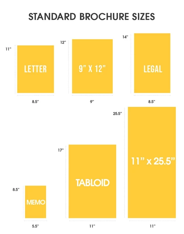
Standard brochure sizes and layouts
The first step in designing a brochure is choosing the right size. When thinking about brochure size, think about portability, foldability, and how much written or visual information you want to include.
Below are the most common brochure sizes businesses use.
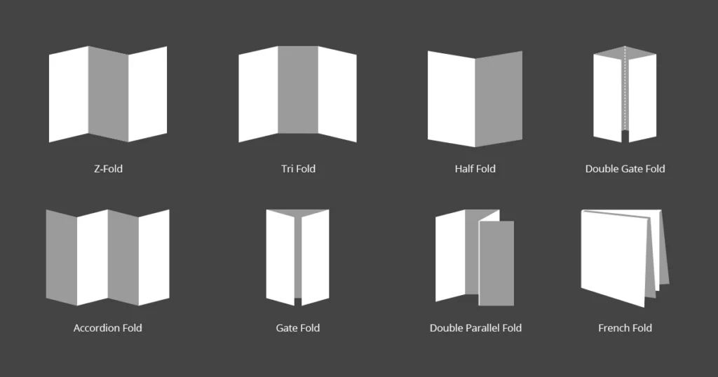
Once you’ve settled on a size, it’s time to think about the layout you’d like to use. From simple bi-folds to creative spiral folds, your choice of layout determines how readers will interact with and move through your brochure.
While there are many different creative brochure layout options to choose from, here are just a few of the most common brochure folds.
Now that you’ve chosen your size and layout, let’s talk about what to put in your brochure.
How to design an effective brochure in 5 steps
Create an outline
Before you start designing anything, you’ll need a detailed plan of attack. While brochures can vary in content and length, most follow a standard format.
- The front panel displays your headline and logo.
- The inner panels make a case for your product/service using
- The final panel contains your contact info and a call-to-action.
Identifying your target audience will help you build out an appropriate outline and flow to your brochure – and will inform your brochure’s tone, language content, and CTA.
Make note of where your target audience is in the buying cycle. Don’t waste space detailing the history of your organization if your readers have done business with you before.
Nail down these essential elements
Now it’s time to dive into the fun stuff. Like we mentioned before, every brochure is different, but all should include these 5 critical elements.
An eye-catching cover and headline – This is the first (or only!) chance your brochure has to give a strong impression, so make it count. A high quality, relevant image combined with a brief, easily legible headline will provide your reader with a strong understanding of what your brochure is about.
A compelling offer – Details aside, what you’re really providing with a brochure is opportunity. No matter what your product or service is, your brochure needs to offer just enough to make readers want to know more.
Valuable information – Brochures offer limited space to communicate your message, so prioritizing which information to include is key. The best rules of copywriting apply here: be clear, be concise, and tell a good story that makes your reader the hero.
A strong call to action – You can build a beautiful, convincing brochure that makes your audience feel exactly the way you want to… but it’s useless if you don’t set them up with a next step. A strong CTA will prompt your readers to call, visit, or connect with you in some way.
Detailed contact information – This goes hand-in-hand with your call to action. Not everyone will make a move right away. In fact, many people hold onto brochures to reference later, when the time is right. Make connecting with you easy by putting your contact info on the back.
Consider adding extra information & resources
Got extra room in your brochure and want to make a bigger impact? Think about adding extra information and resources for your readers. Consider where they might be in the buyer journey, and tailor these extra resources to meet any questions or hesitations they may have.
Some possible extra resources include:
- Answers to FAQ
- How-to guides
- Customer testimonials
- Product specs
- Pricing charts
- Pros and cons
Proofread & check for important details
No matter how much effort you put into your messaging and design, one small error or inconsistency can kill your credibility.
Before you send your brochure off to the printers, proofread everything (and proofread again). We also suggest making sure the tone of your brochure matches the rest of your brand messaging. Unlike informational brochures (which may take the third-person point-of-view), sales brochures usually use the second-person to build rapport with the reader.
Refer to your brand style guide for how to handle things like numerals, dates and titles in the text.
Test run your prints
The last thing you want is to waste time and money printing hundreds of brochures only to realize that the sizing is off, or your imagery is grainy. Do a small test run to verify that the finished product meets your expectations.
5 brochure templates to get you started
Don’t want to have to design a brochure from the ground up? Try customizing a brochure template instead. Here are just a few of our favorites here at Marq.
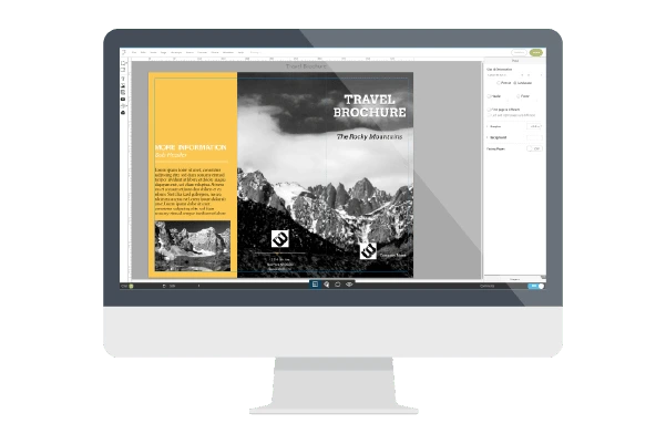
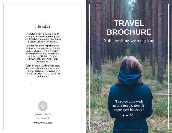
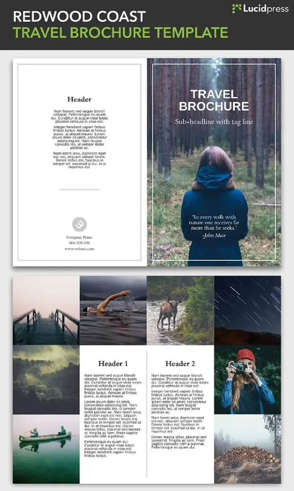
Redwood Coast Travel Brochure Template
This bi-fold brochure template has ample space to showcase immersive photography, with just enough space to introduce readers to your brand.
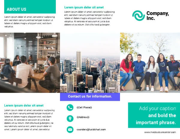
Visual trifold company brochure template
A traditional trifold layout makes it easy to describe your business while creating a compelling cover design.
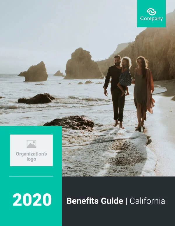
Health insurance company brochure template
Need to include detailed data and comparisons? This template is perfect. And with Marq’s data automation, you can auto-populate your own data by connecting your template to a Google Sheet.
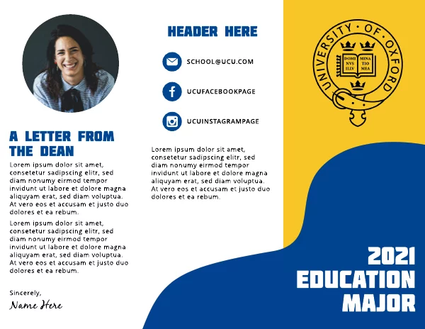
Wavy Shape College Tri-Fold Brochure Template
Update your marketing with a fun, fully customizeable brochure layout. Simply update colors, fonts and images to match your brand.
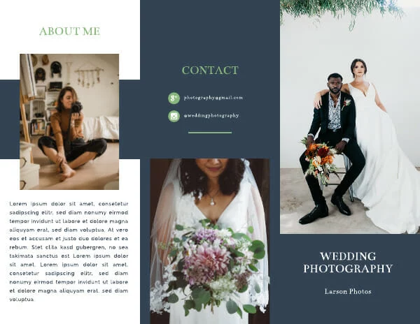
Navy Blue Wedding Photographer Brochure Template
Have a visual-first business? This template offers plenty space to showcase your photography, art, or graphic design.
Want to design your own beautiful brochure online? Marq makes it easy. With our intuitive drag-and-drop online brochure maker, just choose a template and customize it to fit your brand.
When I was first hired at Lucidpress, I was asked to handle nearly all of our content writing, including the monthly email newsletter. It was a terrifying prospect. Most marketers know that email is a specialized skillset, and it’s easy to screw something up. But not only have we avoided major newsletter snafus, I’ve been able to cut down my time creating a newsletter from one workday… to one hour. That’s a time savings of about 800%, and the newsletters look (and read) better than ever.
Related: How to make a newsletter in 9 steps
So, how did I streamline my process? Here’s how to write a newsletter in three easy steps.
1. Do your homework
I hate starting newsletters from scratch, so I always do research beforehand. If you’re at a larger company, attend important meetings and take notes a few weeks before you start writing. If you’re running a one-man shop, make notes throughout the month. You’ll want to record things like:
- Improvements or updates to your product
- Business initiatives, like a push for more customer feedback
- Random thoughts and ideas like “Are there any upcoming holidays we can capitalize on?” or “Should we start a referral marketing program?”
Always write down a point-of-contact’s name next to your notes so you know who to seek out for more details. As for the third point, you may not use all the random ideas that pop up, but before long, you’ll have a working list of future email campaigns to test.
2. Clarify your goals
Develop a clear goal, and make sure it’s displayed front-and-center in your newsletter. You might be trying to:
- Publicize new features or offerings
- Increase traffic to a store or website
- Boost sales with a newsletter discount or promotion
- Capture customer feedback on your product
- Get subscribers to tell their friends about you
- Remind customers what your product does
- Make an emotional connection with your audience
In all likelihood, you’re trying to do several of these at once. Pick the most important one, and make sure it’s represented at the very start of your newsletter. It should also be presented (in a compelling way) in your subject line. The other major points will fall into place and can often be accomplished without text (think strategically placed links, images and calls-to-action).
3. Make it pretty (and repeatable)
Now that you have notes and a clear goal, you can easily write the text of your newsletter. The most important step here is to format your text for maximum readability. You’ll also want a nice-looking layout that communicates your company’s professionalism. Here are my tips for making it happen in under an hour:
Distribution
Ask yourself where your audience is, then decide on your method of distribution. You can go old-school with a printed newsletter or distribute your content digitally; the latter is more common nowadays. Lucidpress’s company newsletter templates allow you to quickly build a professional-looking newsletter, then print or share with a URL. All of our templates can be customized to make school newsletter templates, Christmas newsletter templates and more.
You can push out the link via social media or a website, but remember that you’ll still want to use a dedicated email service to email it. That way, you don’t have to handle subscribes/unsubscribes, CAN-SPAM compliance, and other time-sucking aspects of email management. I’ve had good experiences with MailChimp and Hubspot, but there are many others to choose from.
Here’s how a Lucidpress newsletter looks when you embed it in MailChimp. Pretty snazzy, right? We generate the code for you—just copy and paste it in.
If you’d rather build a newsletter with HTML than embed a Lucidpress newsletter, pick an email service that offers prebuilt layouts. If you can’t do that, enlist the help of a professional web developer to create a few plug-and-play templates.
Text formatting
Lead with items that have the broadest appeal to your audience.
Keep it short, unless you have a good reason to do otherwise. My newsletters rarely exceed 400 words and are usually closer to 200.
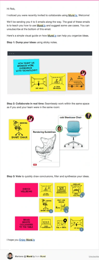
This email from MURAL is a great example of how to use text sparingly to get your point across. The copy is brief and easy to read, while the images are carefully positioned to support the text. It all adds up to a highly consumable newsletter.
Design
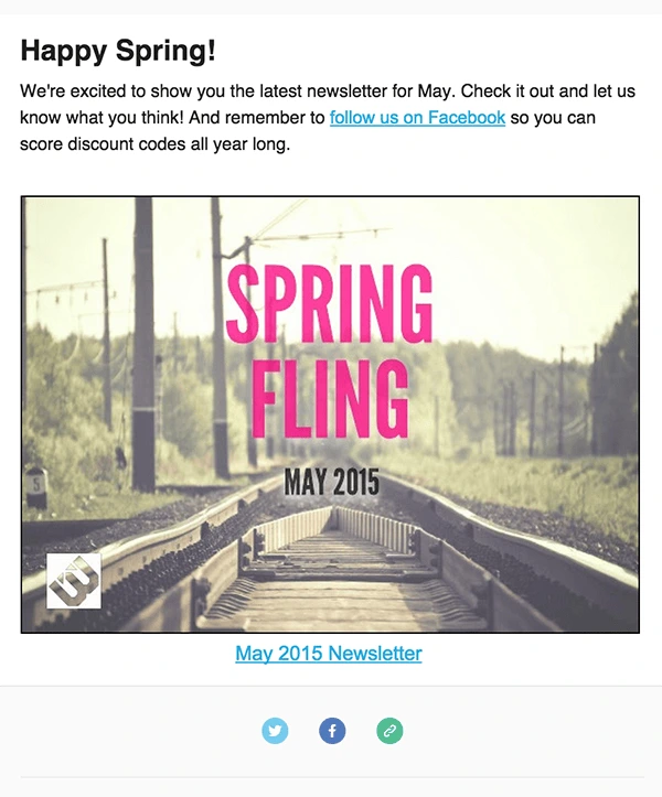
Break up the text with relevant images, buttons and links. Use enough negative space to let all of your design elements breathe. This example from Litographs shows how striking a clean, roomy design can be.
And that’s all, folks: how to write a newsletter in less time than ever before. We’d love to hear your own tips for maximizing effectiveness in marketing—just leave them in the comments.
Ready to make your own newsletter? These free newsletter templates are a great starting point.
“Good artists copy, great artists steal.”
Steve Jobs
When you’re stuck on something, the best thing to do is to step away and look around. Often, the greatest inspiration comes from the world surrounding us. A great designer, like a great artist, will take in the best of what they see to make something new and unique.
Related: 17 flyer design ideas for your inspiration
Keep reading to see 21 examples of brochure ideas you’re welcome to steal from. You can browse to spark some ideas, or you can edit a template to fit your creative vision of the brand you’re representing. All of these brochure and pamphlet designs are available with a Lucidpress account.
The other thing that’s exciting about these brochure templates is that they can be used for digital or print. Digital publishing opens up exciting new possibilities like scrolling text, links within the brochure, embedded video, and widespread distribution. For example, La Presse, the oldest French newspaper in North America, used digital publishing in Lucidpress to revolutionize the newspaper industry. Enjoy, and check out the end of the post for more design resources.
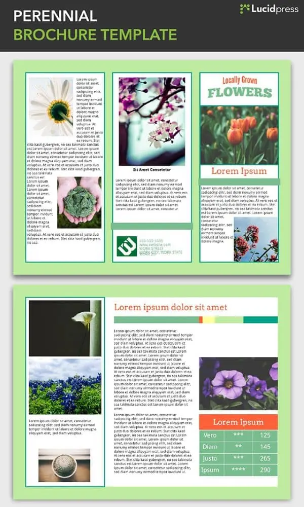
1. Perennial Brochure Template
A fit for more than just floral applications, the Perennial brochure is perfect for organizations with a cheerful, springtime brand, or for any outdoor events held when the sun is shining.
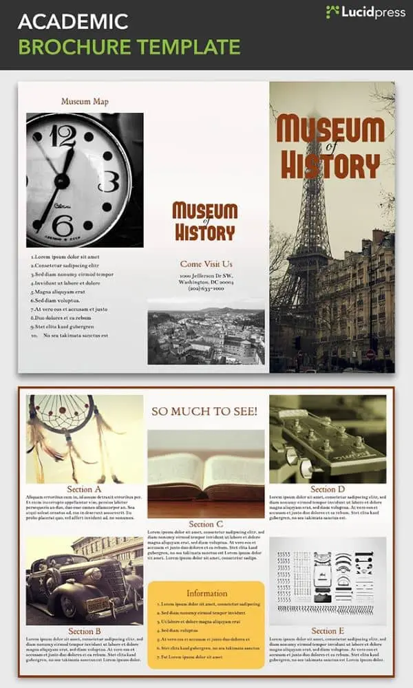
2. Academic Brochure Template
Museums, historical landmarks, and city tour organizations can use the Academic brochure to bring their unique features to life. The Academic uses a tri-fold design and a section-based layout to highlight the different sites and items of interest that visitors or tourists will want to see during their stay.
3. Redwood Coast Travel Brochure Template
This bi-fold brochure template has ample space dedicated to photographs of the travel destination. Readers will be quickly transported there by the immersive images. The image-based cover is intriguing but not overwhelming, adding just the right touch to this beautiful design.
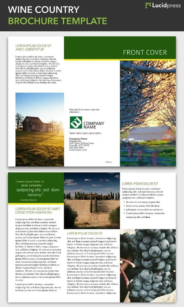
4. Wine Country Brochure Template
This tri-fold brochure template is particularly well-suited for agricultural or rural-oriented organizations, including wineries, family farms, and agricultural nonprofits. The elegant, clean design evokes the simple beauty of the countryside.
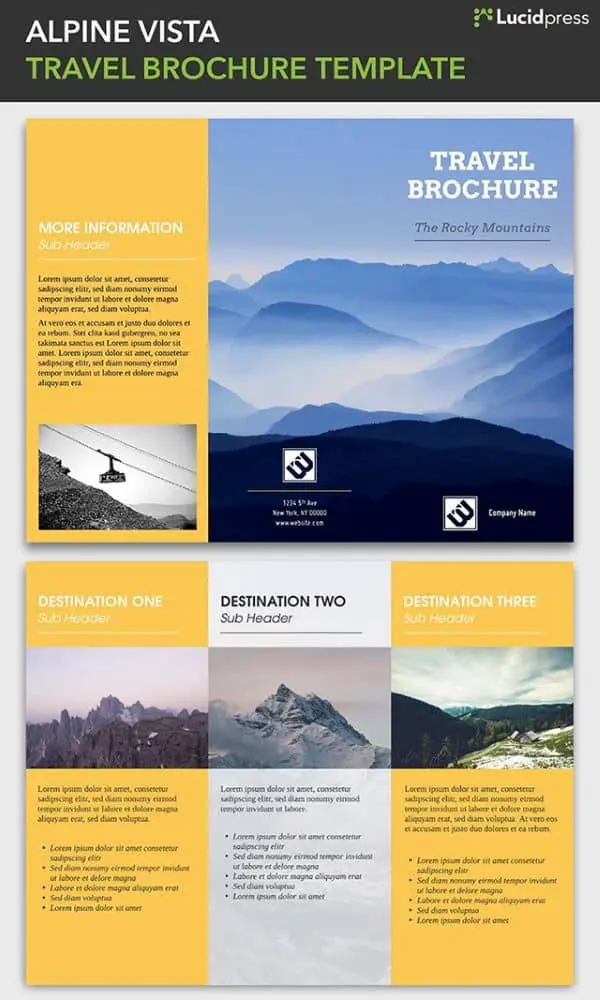
5. Alpine Vista Travel Brochure Template
The Alpine Vista brochure has an adventurous tone perfect for companies promoting mountain sports and expeditions. A stunning photograph leads out on the cover while a yellow color scheme injects a positive, exciting energy. Also, the three divisions for different destinations makes the most of the tri-fold layout.
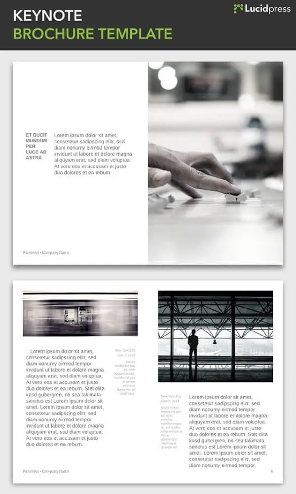
6. Keynote Brochure Template
The Keynote is stylish and modern, embracing minimalist design that can be adapted to a range of industries and organizations. This template can be customized to be longer or shorter, depending on your needs. This bi-fold design lends itself well to a creative mind looking to try something new.
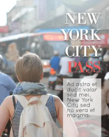
7. Passport Brochure Template
Another booklet-style brochure, the Passport balances modern sensibilities with just the right dose of playfulness, calling to mind a day spent exploring hidden wonders on New York City streets. This design separates the text and the images, giving each an opportunity to stand on their own while remaining cohesive.
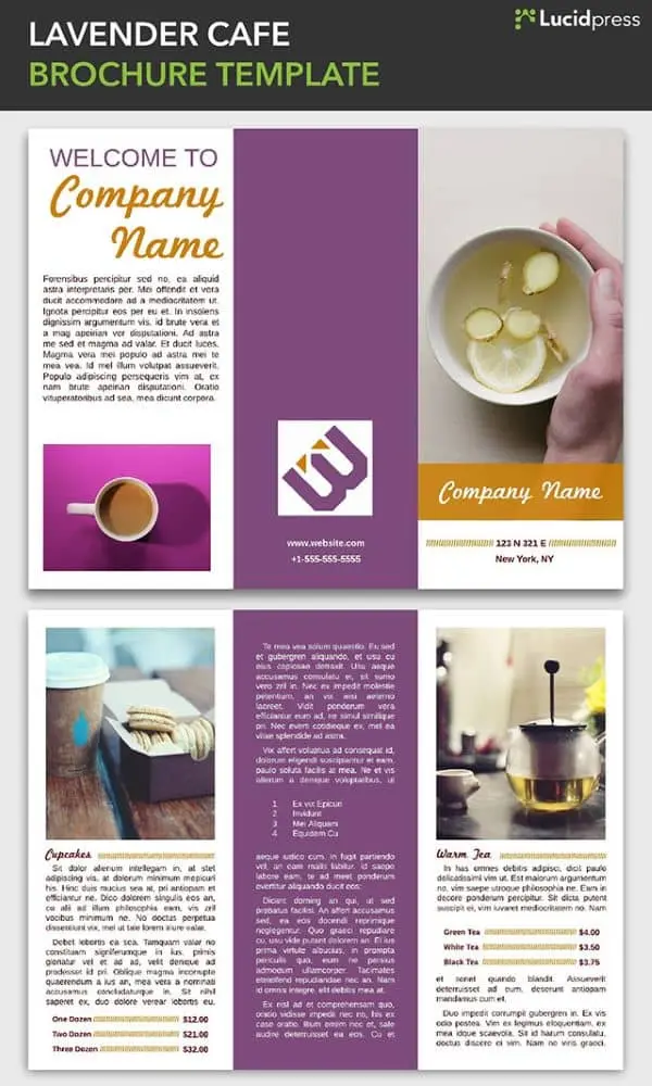
8. Lavender Cafe Brochure Template
This tri-fold brochure design has elements that work in harmony with the tri-fold format to create distinct sections, each with a unique layout that keeps things interesting. It works well in a restaurant application, as shown here, but could be adapted to any business.
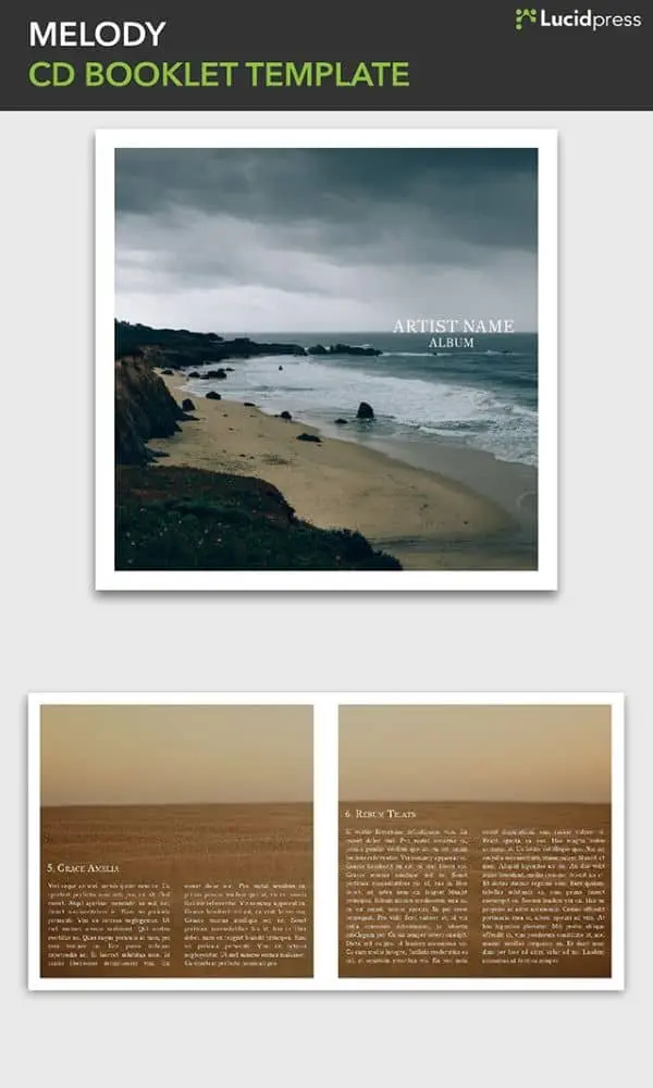
9. Melody CD Booklet Template
If you’re creating an album booklet for yourself or a client, this template provides a good foundation. It can also be a springboard for out-of-the-box brochure design ideas. The image-centric, booklet-style design is a sleek, artistic format that could give your brand a professional edge.
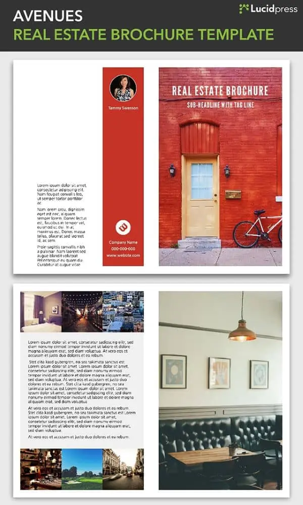
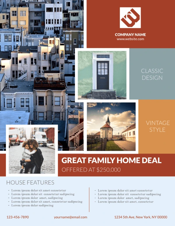
10. Avenues Real Estate Brochure Template
Real estate brochures are an industry standard, so you need yours to stand out. Plenty of space for images of the property as well as for your engaging descriptions makes this template a powerful tool in your real estate marketing arsenal.
11. Visual tri-fold Brochure Template
This visual brochure template uses large photos through the middle of of each page and mixes regular text with bold to highlight important phrases.
12. Brisk Pamphlet Template
The Brisk pamphlet template, ideal for both long-form and short-form applications, has a modern, edgy feel. At the same time, it’s clean and professional, giving your brand room to breath. Who says business can’t be stylish?

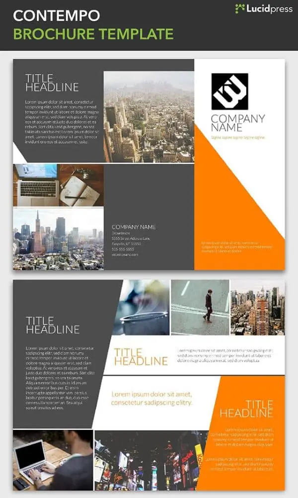
13. Contempo Brochure Template
Clean lines and compelling angles define the Contempo brochure. Assert your unique brand of corporate culture with a spin-off of this design. Or insert your brand colors and use it as-is for a progressive, well-groomed brochure.
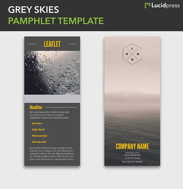
14. Grey Skies Pamphlet Template
Sometimes just a little bit of text is all you need. The image is king in this leaflet design, letting you give a visual summary of your brand’s core ideals. First impressions are important, and this design leaves them intrigued and wanting more.
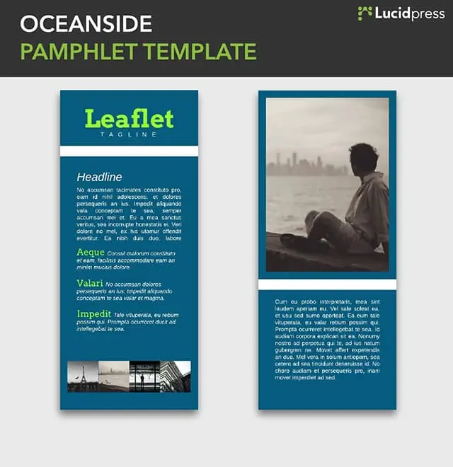
15. Oceanside Pamphlet Template
The Oceanside pamphlet template is still short and sweet, but gives you a little more room to write than Grey Skies, if that’s what the situation calls for.
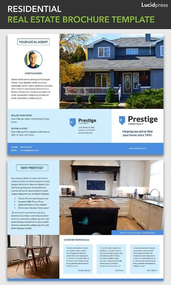
16. Residential Real Estate Brochure Template
The Residential real estate template has a warm, inviting tone that also feels very fresh and current. The way the text wraps around the images resembles a tour around a property, with the realtor pointing out the highlights to prospective buyers.
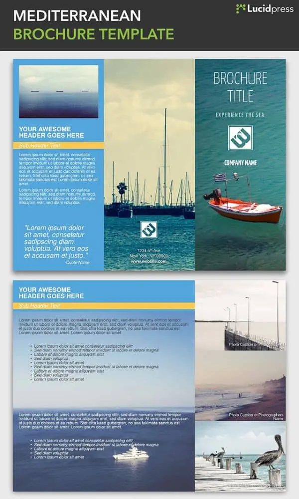
17. Mediterranean Brochure Template
Beautiful images make up the bulk of this brochure template, giving it an immersive and open feel. Blue tones and ocean-themed photographs call to mind the gentle lull of lapping waves and warm sand. Using the design of your brochure to create a distinct feel can solidify your brand for a customer before they even read a word of copy.
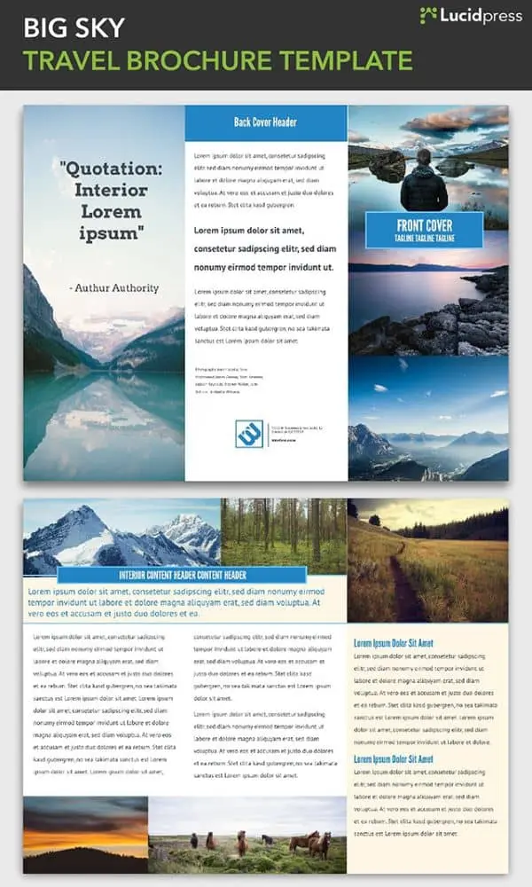
18. Big Sky Travel Brochure Template
The Big Sky travel brochure template is highly adaptable, with a blend of elements that are easily customized to match the look and feel of the destination. The front cover has space for three photos, immediately showing the diversity of the locale, and the layout of the text makes the most of the space without looking cluttered.
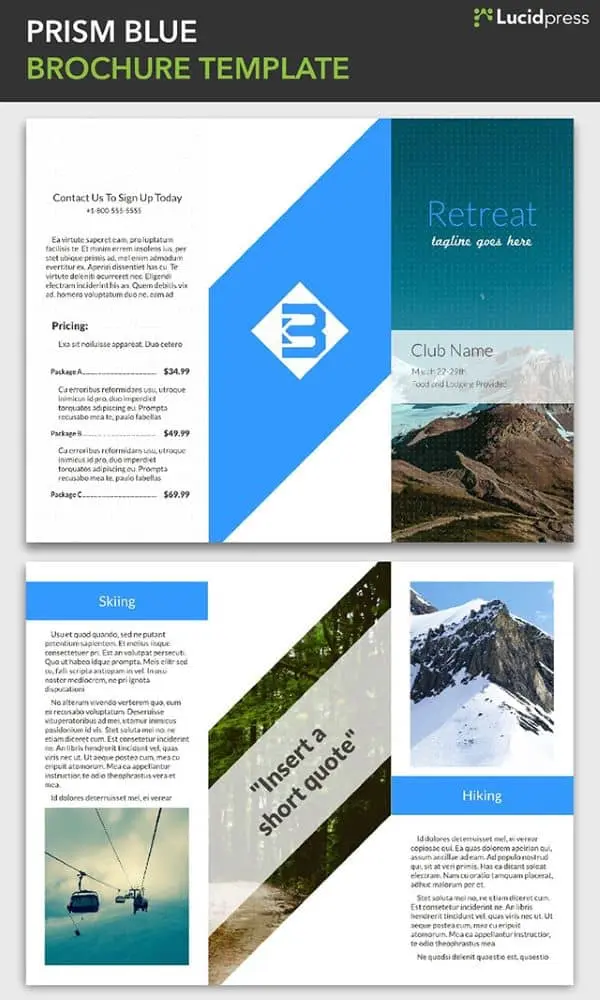
19. Prism Brochure Template
The pronounced angles of the Prism brochure template match the mountain resort imagery it riffs on. This template is excellent for relaxing spas and massage centers, tour companies and ski resorts, or for internal company announcements like an upcoming retreat.
20. Golden Gate Travel Brochure Template
This template captures the diverse personalities of America’s favorite state (according to me). There’s the crashing surf, the vibrant city, quiet vineyards, and the intriguing fog of San Francisco. The main image on the cover sets the tone, while supporting images show the range of the featured destination.
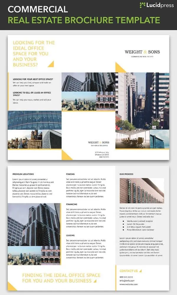
21. Commercial Real Estate Brochure Template
A subtle triangle theme in the Commercial brochure pulls the design together, with the three points of the triangle echoing the tri-fold style of the brochure. There’s plenty of space for text, but the layout is well-spaced and clean. The highly professional look of the Commercial brochure is perfect for real estate and corporate use.
Now that you have some inspiration, or maybe picked out a template to use, a few design resources might be helpful. The first thing to consider is making sure the brochure you create is consistent with the brand you’re designing it for. The color scheme, photos, and font choices will all contribute.
If you’re wondering where you can find high-quality photos for your brochure, check out this post with tips for finding royalty-free images that aren’t corny stock photos.
Now go make something great.
In the age of nearly free digital marketing resources, any funds spent on print advertising should be allocated with care. In other words, there is no reason to settle for a second-rate print job when you can achieve print perfection.
Related: Why print will never die: Print vs. digital collateral
When you ensure each of these 5 elements are handled with precise attention to detail, the result will be a perfect print job you can distribute with pride.
Let’s get started!
Color consistency
One of the most difficult elements of print production to perfect is color matching. You will pay more for 4-color CMYK (cyan, magenta, yellow, key/black) printing than you will for black-and-white, so you should expect your completed color print job to mirror the exact colors of your brand, logo and ad design.
The best way to ensure an identical color match is to use the Pantone matching system (PMS for short). You can use Pantone swatches in two ways: for spot color printing or by inputting the RGB and HTML Pantone swatch numbers to color-match an on-screen design.
Paper type
The type of paper you choose for a print job will influence the success of the end result. No two paper samples are alike, and everything from the “whiteness” of the white to the texture to the weight can affect how your print job comes out.
Some papers produce a cleaner fold than others. Certain papers types are longer-lasting, while others hold accurate colors better. Heavier weight papers can convey a more luxurious, opulent message. The brightness and type of finish (matte, gloss, etc.) may make the message easier or more challenging to read.
For business card printing, consider using a UV coating that applies a clear-coat to the paper to help protect it against damages from frequent handling.
For products that will be left outdoors, use a more durable material than paper. Coroplast, a lightweight plastic board, is frequently used for a-frame printing because it can withstand all weather types.
Formatting
Formatting refers to whether or not your print job is delivered to the printer in a format that will perfectly translate at print time. In short, you want to be sure your designer delivers a “print-ready” file in PDF format that is at least 300 dpi with trim, crop and bleed marks noted. Also, the print ready file should adhere to any specific requirements of the printer type you will be using.
Without the correct file formatting, and a test print to confirm all looks as it should, you run a high risk of having to redo your job. Formatting is what ensures the design you want is the design you get at print time.
Layout
For any print job, you probably know from the start what information the finished piece must contain. Some common must-haves: website URL, contact information, company name & logo, and descriptions of products or services.
The word “layout” refers to where and how these required items are placed, as well as what space is left for items that may come later (such as a customer mailing address or postal meter stamp). Scrutinizing the layout for font size and readability, visual impact, clarity and orientation (portrait or landscape) is key for ensuring the end print job is suited to your needs.
Printing partner
Finally, your completed print job is likely to be only as good as the printing partner you choose to work with. You want to select a printing partner that can provide either an electronic or hard copy test proof for your approval.
Search for a printing partner who isn’t satisfied until you are, who has clear policies about when a re-print can be requested. Finally, you want to select a printing partner with an excellent reputation for delivering quality print results.
Translating an artistic vision from mind to screen to paper can be difficult, but with all 5 of these elements securely in place, you will see a tremendous difference in your printed materials.
Ready to design your own print ideas? Lucidpress makes it easy to create beautifully branded content in a matter of minutes.
Almost everyone has made a flyer before, whether for a personal event like a block party or a professional event like a company picnic. As a follow-up to our most recent post about magazines, we decided to put together this list of 17 flyer layout design ideas. If you want your flyer to stand out, ditch the boring old Word document and get inspired from these flyer ideas!
1. Bistro Restaurant Menu
Can a restaurant menu really be a flyer? You bet! Not everyone needs to read your full menu, unless they’re already sitting at a table. If you make a simplified, one-page version of your menu, you can print them out and keep them near the door for curious passersby. Then they can take them home as a handy reminder to return later! It’s the perfect way to advertise, tantalize, and stay top-of-mind.
2. Block Party Flyer
Aha, there’s that block party we were talking about in the intro. Long autumn evenings are the perfect time to gather the neighborhood for a barbecue or potluck. A great-looking flyer will show them that, yes, this is a party worth attending. Or, hey, what about a street dance party? Talent show? The possibilities are endless and—given your dad’s amateur “jazz guitar” skills—endlessly entertaining.
3. Bungalow Real Estate Flyer
Flyers have many professional purposes, too. For example, this real estate flyer makes it easy to showcase what’s on the market. With multiple places for photos, it’s easy to see how this design can be used for a single property (with photos of different rooms) or multiple properties (with photos of the outside). This flyer also includes contact details along the bottom, so interested buyers know how to get in touch.
4. Cobalt Cafe Restaurant Flyer
Now here’s one idea to stand out—a horizontal layout. Neatly divided into four colored segments, this design uses shapes to create visual interest. The circular photo frames are great for showcasing menu items, or items that are part of a theme. For example, if you were hosting a game night, the items pictured could include dice, game pieces, and cards. Layouts are versatile, so you don’t have to stick to whatever the template’s called. Let yourself be creative!
5. Cosmopolitan Business Flyer
With flyers, you tend to see two design choices. Either the flyer offers very little in terms of visual interest, or the content is lost in a sea of imagery. This is a pleasing balance of the two, where the upper half of the page is dedicated to rich photography while the bottom is reserved for bold copy. When you pass by this flyer on the street or in the hall, you definitely won’t miss the point. It’s a striking layout that’s easy to design and customize.
6. Cut Glass Digital Corporate Flyer
As a design element, color can be used to great impact, but it’s often underused in flyers. What’s so unique about this design is the way a sash of vibrant blue cuts across the monochrome page, drawing the eye down along with it. To take advantage of its pull, the bulk of the copy is positioned over the blue hue. When done correctly (i.e. high contrast images, spare use of color), this layout can be very effective.
7. DJ Club Flyer
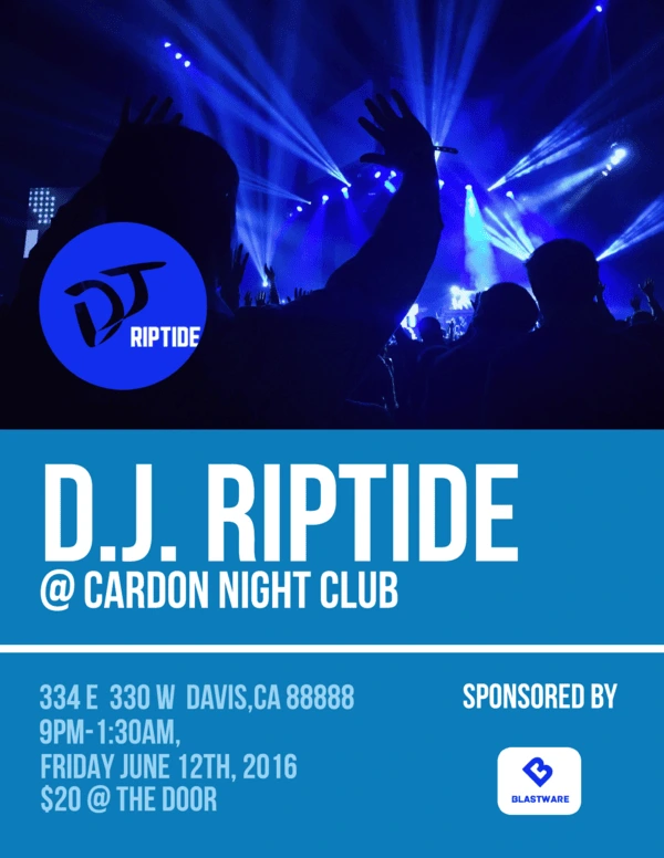
Club events are one of the most popular use cases for flyers. Surely you’ve seen them plastered around town, on college campuses, or on the walls of your favorite music shops. It’s a quick and easy way to spread the word, but because there are so many, these flyers have to be competitive. Big fonts, recognizable names, and captivating images can give your flyer an edge, so don’t be afraid to experiment.
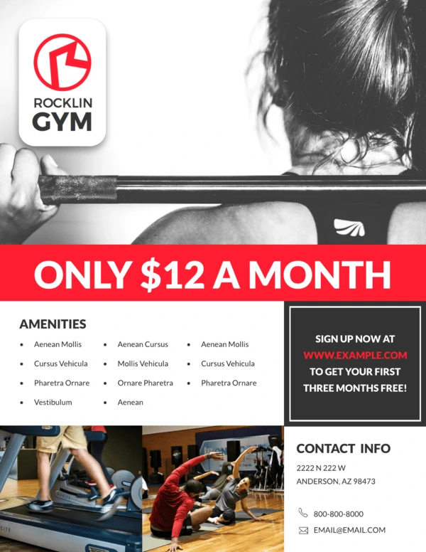
8. Gym Fitness Flyer
If you’re running a subscription-based business, it’s critical to draw people in with compelling advertising. This flyer layout contains several persuasive elements that you can use to punch up your design. For example, a big “hero” image has the power of suggestion. Red is a power color that attracts the eye, so it’s smart to put a bold headline over it. This one emphasizes affordability, with a coupon just below it to sweeten the deal even further. Add bullet points and contact details, and you’ve got a solid single-page flyer layout.
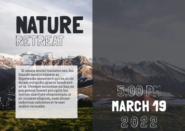
9. Nature Retreat Business Flyer
Sometimes the imagery matters more than the text. In those situations, a horizontal layout offers ample space for pretty photography, like landscapes and nature shots. This design takes advantage of transparent text to include needed details without detracting from the background. Depending on the image you’re using, elements can be moved around to accommodate it.
10. Night Life Club Flyer
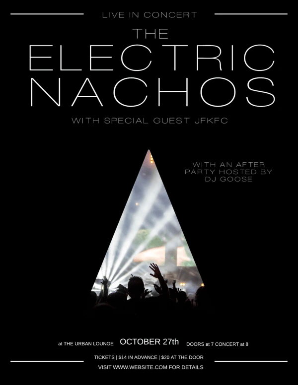
Concerts are another type of event that depend on flyers to attract an audience. The design will really depend on which artist or band is playing, since they each have their own style. But for a clean, chic layout that works for almost anyone, try out this design. We chose a triangle here, but if you open the template, you’ll find that other shapes work great, too. Each one provides a different vibe, so play around until you find one that you like!
11. Origami Banner Event Flyer
It might seem difficult to create the illusion of depth on a one-page flyer, but it certainly can be done. This layout uses a couple of visual tricks to make it happen. First, the background is an image of rolling hills, giving the viewer a familiar sense of perspective. Next, the content boxes have an added flourish: a darkened, shadowed triangle. It looks as though the content is floating on folded pieces of paper!
12. Reflections Product Flyer
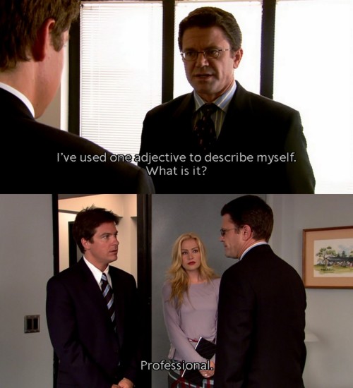
Maybe you don’t want your flyer to be whimsical. Or fanciful, or fantastical, or any other flimflam. Maybe, like the lawyer Wayne Jarvis of Arrested Development, you describe yourself with only one adjective. Well, in that case, your flyer needs to match. This design is official and confident in its authority—but also rendered in warm grays to keep it from being too coldly corporate. If you need to communicate essential information, this flyer design can’t be ignored.
13. Simple Educational Flyer
Flyers have their place in education, too. For students, this usually means firing up Microsoft Word and struggling to create a project that doesn’t look either boring or terrible. No more! A simple, elegant design like this is easy to fill out in minutes, and it prints out like a dream. Just goes to show that flyer layouts don’t have to be complex to be attractive.
14. Simple Promotional Flyer
Short, sweet, and to the point—that’s how you might describe this flyer layout. If it reminds you of online advertisements, there’s actually a good reason for that. Unlike most flyer layouts you’ve seen before, this one is digital, hence the callout button daring you to click it. A digital flyer layout like this can be embedded on a page or used in email campaigns to help customers find your latest sales and promotions.

15. Standard Advertising Flyer
This flyer layout design is about halfway between the last flyer and a full brochure. So if a brochure would be too much, but you still want to give them a better lay of the land, this feature-packed layout might be the perfect solution. Because of the smaller font sizes, it’s not a good choice for a hanging flyer, as people will pass right by it without gleaning any details. But from person to person, especially in a sales environment, it provides valuable info with a closer human touch.
16. Swiss Alps Company Flyer
What’s one good way to create a distinctive, interesting flyer design? Don’t think of it merely in terms of what it’s for—like a company event flyer, for instance. Instead, pick a theme inspired by world culture, and incorporate its most recognizable elements into your layout design. This retro flyer borrows colors, fonts and symbols from the Swiss to promote a yearning for travel and nostalgia. Now that company ski trip looks a lot more alluring, doesn’t it?
17. Travel Real Estate Flyer
How can you include a wealth of information on your flyer without overwhelming the design? This layout offers some great ideas. The top half of the page features a nice, big photo. The bottom half is split into neat boxes that tell you everything you need to know. It would’ve been easy to accidentally clutter up the page, but the shapes and spacing give it plenty of room to breathe.
And that’s our round-up! See any ideas you like? Hopefully, these examples can give you a quick burst of inspiration, so before you know it, you’ll have a gorgeous flyer that you can’t wait to share.
Ready to design a new flyer? Give yourself a leg up, with our free flyer templates & layouts. See you there!
You’ve got a great idea for a flyer: a new business service, a store’s grand opening, an upcoming concert, open house or event. And you’ve got Lucidpress to make designing your flyer a snap. Now all you need… is an audience. Welcome to Flyering 101, where you’ll learn how to nail (no pun intended) your flyer distribution.
Related: 17 flyer layout design ideas for your inspiration
According to our research, here are the top six issues to consider before distributing your flyers.
1. Consider your message.
Certain messages are better suited for flyers than others. Most of them can be grouped under the same umbrella—that is, most flyers are announcements. Maybe you’re trying to drum up interest for a new business or invite people to a local festival.
There are lots of occasions which call for an easy, low-cost form of direct marketing. Is your flyer ready for primetime? Make sure you’re completely satisfied with every aspect of your flyer, from content to design. Because once you print out hundreds or thousands of copies, there’s no going back.
2. Consider your timing.
Allow me to state the obvious for a moment: flyers are made of paper. They’re not incredibly durable, and they don’t tend to last very long. If you’re hanging flyers outside, their lifespan could be substantially shortened by the elements. Before you get out the staple gun, check your local weather forecast for rain, snow, and heavy winds. If harsh weather is on the horizon, you might have to adjust your plans.
While we’re on the subject, take holidays into account as well. Around certain ones, like Halloween and Christmas, your flyer will be competing with a lot of decorations. Space might not be as readily available as it was before. That doesn’t mean you shouldn’t advertise around a holiday—especially if your message is seasonal or topical—but you should still take note.
3. Consider your audience.
Who should read your flyer? Is it of general interest, or does it address a specialized audience? It’s important to consider this before you start flyering. It’s one thing to hand them out to people. It’s another thing to hand them to the right people.
Distributing flyers to random strangers who pass you on the street might not be as effective as targeting a specific audience. In fact, in many cases, you might as well be putting your flyers in the trash. But once you understand who your audience really should be, you can put together a smarter distribution plan.
4. Consider your distribution method.
How are your flyers getting to your intended audience? You have a few choices. The most popular methods are:
- Hanging the flyers in public/community areas.
- Handing the flyers to people directly.
- Keeping a stack of flyers in a high-traffic area.
- Delivering the flyers door-to-door (or car-to-car).
The method you choose will have critical ramifications on your distribution plan. For example, how many flyers will you need to accomplish your goal? How long will it take to get rid of them all?
No matter where you’re flyering, make sure you get the right permissions. Not all places that are open to the public are open to flyering as well. Parks have maintenance staff. Neighborhoods have soliciting policies. Storefronts and cafés have managers. Schools have approval forms.
Don’t give up hope, though. Many times, you can chat with property owners to determine whether they’re open to flyering. If you see shops with flyers already out front, that’s a good sign. Many places, like college campuses and laundromats, have corkboards especially for flyers and local ads. Take a look around, and don’t be afraid to ask!
5. Consider your distribution team.
If you’re hanging or handing out flyers all by your lonesome, it’s going to be a long ride. Flyering moves much faster in a team. Fortunately, you can call on your support network for help. If you’re announcing a new store, employees can help. If it’s a party or a concert, you can recruit family and friends. If it’s a club or organization, it shouldn’t be hard to find volunteers.
The lower the quantity, the easier it will be to get all those flyers out into the world. However, if your back’s against the wall, you still have options. If you don’t have the time—and no one else seems to, either—give a flyering agency a call.
There are specialized businesses out there who take care of the entire distribution process, from start to finish. They can help you create a smart plan that targets your audience in a timely fashion. Some even offer GPS tracking so you can watch in real-time. Just keep in mind that you can’t control how the staff does its job, so choose your agency partner carefully.
6. Target your distribution.
Finally, take a good hard look at your distribution plan and make sure you’ve accounted for all the steps up to this point. Now that you have all the basics in line, you can make some advanced adjustments. Targeting your distribution is the final consideration that will have a major effect on your success, and there are two ways to do it.
- Geographic targeting. If you run a local business, you can target specific areas who are more likely to benefit from your services. You can choose the zip codes, cities, streets, or even neighborhoods to flyer. Take into account the topography and landscape of these areas. Some terrain will be harder to cover than others, such as hills or neighborhoods where houses are far apart.
- Demographic targeting. If you’re announcing a new location for your business, you might target loyal customers who you know will be interested. Or if your flyer addresses a specific need, like babysitting or landscaping, you might be selective about who gets a flyer. The idea is to give flyers only to the people who actually benefit from your message, so your flyer has a higher chance of success.
Flyering may be a cheap way to advertise, but that doesn’t mean you want to throw your money away. With these six considerations accounted for, you can craft a smart flyer distribution plan that helps you achieve your business or personal goals.
In today’s digitized, inter-connected world, it’s all too easy to send a text or an email to someone and forget about it. Whether it’s an e-card for Mom’s birthday or a PDF brochure for a prospective client, digital content is incredibly efficient and convenient. But as any library lover will tell you, there’s just no replacement for the printed word.
Related: Not everything is online—How print materials can raise brand awareness.
Here at Lucidpress, we offer our own Print & Ship service, so users can create unique designs and bring them to life through print. We’re talking cards, business cards, flyers, documents, brochures, you name it. Ordering gorgeous, high-quality prints is a feature that more of our users requested than any other—and we’re here to deliver (pun very much intended).
Not sure about the value of print in a digital world? Here’s a few reasons why we believe print will never die.
Scarcity
Now that so many things are shared digitally, print stands out. Well-placed printed materials can grab attention for your business, so they’re a boon to your marketing. And because printing is more expensive, printed materials carry more authority and credibility than they did before, because someone took the effort to produce them.
Ever hear of “supply and demand”? Digitized content eliminates the supply and demand curve, because supply is infinite. But with printed content, the curve still stands. Printed items are tangible and maintain their scarcity. Certain printed items, like concert and movie posters, can even become collectibles because they evoke strong memories of a certain time and place. Can’t do that with a PDF.
Beauty

No matter how popular eBooks get, there is always a stalwart bunch who refuse to get rid of their old books. Why? One possibility is this: books and printed materials have physical beauty that can be appreciated again and again over time. Book-binding itself can be described as an art, one which has evolved and developed a rich history. We know how important aesthetics are—just take a look at our previous blog post about book covers.
The point is, printed materials like books have varied appearances and styles. Digital materials are often homogenized down to black text on a white screen. And while that is useful and efficient for conveying information, the appreciation of unique physical beauty is lost.
Sentimentality
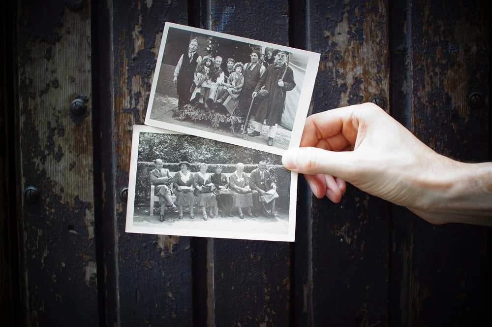
How many photos are saved on your phone or hard drive? When I last checked, mine had over 3,000 (and counting). But when was the last time I sat down and flipped through all those photos? Hardly ever.
Photos in particular are a record of permanence, a memory you can hang in your home or office. I may not glance at the pictures on my phone very often, but I pass by the picture of my nephew hanging on my wall every day. And each time I see it, my heart fills with joy. Certain photos deserve to be printed and cherished in scrapbooks, frames, lockets and wallets.
Printed materials are a powerful reminder of something concrete. Following the same principle as photos, you can create strong impressions by providing printed materials for your business. If you’re at a trade show, for example, it’s far more impactful to hand someone a brochure than to give them a link to a landing page.
Practicality

Wait, but didn’t I say digital materials are the more convenient choice? Sure. But that doesn’t mean print is lacking in practical benefits. Here are a few reasons you might choose print over digital:
- Many find print easier to read, especially for long periods of time, so as to avoid eye strain.
- Readers are less likely to skim a printed document than a digital one.
- Printed materials feel more inviting and immediately engaging than files which have to be opened first.
- As unscientific as it sounds, print simply feels better to humans because it uses more of our senses to create a stronger memory. (Think “old book smell.”)
Digital might have its advantages, but one thing is clear: print is not now, or ever, really going away. Its purpose and value might shift over time, but today, it makes more sense than ever to print what matters most. Whether you’re sharing a photo postcard for the holidays or business cards at a trade show, Lucidpress can help you bring your ideas into the real world.
Ready to design your own print ideas? Lucidpress makes it easy to create beautifully branded content in a matter of minutes.
So. You’re designing a flyer.
Where do you begin? The endless array of images, backgrounds, catchy headlines and clip art (bad idea) at your disposal can be overwhelming. Consider starting with your backdrop: the ever-so-necessary but hard-to-design flyer background.
If you’re an Adobe Illustrator master, you’ll probably just design one of your own. But if you’re like the rest of us, you might have more luck using finger paint on a canvas than trying to figure out the intricacies of Illustrator.
Related: 10 creative ways to make a flyer that stands out
The simple solution? Grab a background that someone else has already designed, and grab it for free. Lucky for you, I’ve already gone through the work of putting together a list of the best resources for free flyer backgrounds. So read on, and download away.
Option 1: Microstock photography
Microstock sites include not only a variety of photos, but vector images that work great for flyer-type projects. Since microstock sites accept work from amateur artists and photographers, the prices are typically lower if not completely free. They’re all royalty-free, and a perfect resource for small businesses or DIY designers to grab icons and other illustrations in addition to abstract backgrounds.
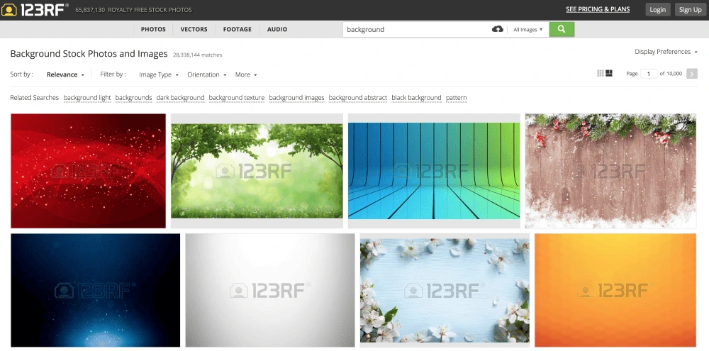
Microstock sites, such as 123RF, give you access to literally thousands of background images and options.
Resources for free microstock photography:
You may have heard of popular sites such as iStock and ShutterStock, which are also great, but their free options are extremely limited.
Option 2: Textures
If you’re looking for more earthy, organic flyer backgrounds, there are plenty of free resources that include everything from grungy charcoal to dirty concrete to polished wood. Basically, whatever floats your background boat. Take a look below for a few amazing options.
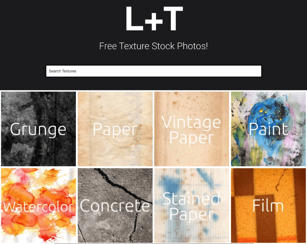
Lost and Taken is a free stock photo site with an especially gorgeous variety of textures.
Free textured flyer backgrounds:
Check out some more great texture options here.
Option 3: Stock photography
If you’re leaning towards a more photo-based background, stock photography is your best bet. Photos don’t always work well as the background to a text-based flyer. But throw on a semi-transparent black or white layer to make your text stand out a little more and a photo can really bring your flyer to life.
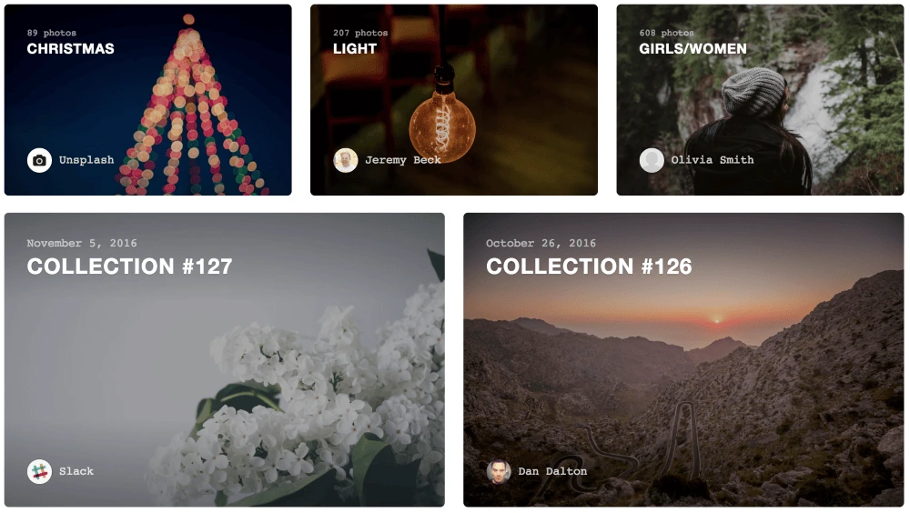
Unsplash is a collection of beautiful stock photos that are free of copyright restrictions.
Free stock photography:
Check out this list for more free stock photo options.
Option 4: Photo & art communities
Flickr and DeviantArt are two of the most popular open communities for uploading images. This means millions of photos and images at your disposal. Keep in mind, not all the backgrounds you find on these resources may be open for use. On Flickr, for example, you’ll want to look for these icons to indicate how you are allowed to use the image.
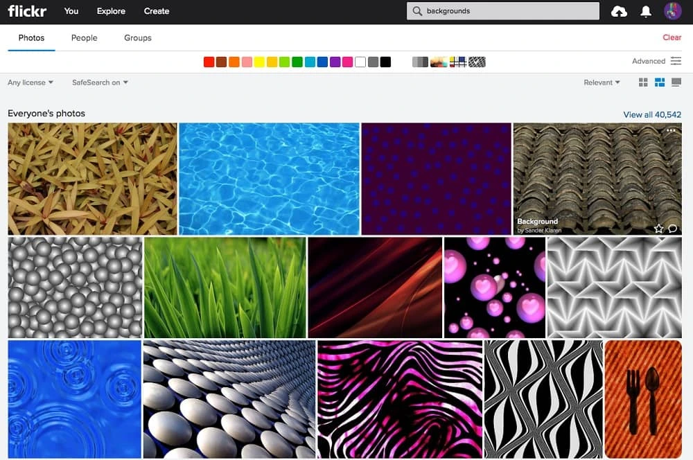
Home to 13 billion photos, you can’t go wrong with Flickr.
Next: Insert your new background into a template
While you’re out searching for flyer backgrounds, why not look for a template too? Once you’ve found the perfect background for your flyer, you can streamline your design process by using a drag-and-drop flyer maker, such as Lucidpress.
Lucidpress provides ready-to-go flyer templates that are easy to adjust and customize according to your needs. You simply choose a template, upload your background, tweak the text, and you’re ready to send it to the printer. If only life was always this easy, right?
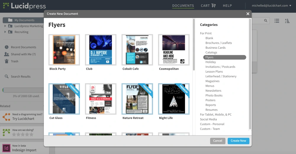
A few examples of pre-designed templates you can use to create your flyer on Lucidpress.
Ready to insert your new flyer background into a beautiful template?
Here’s a bummer statistic: 88% of people will throw away your business card within a week of receiving it. In fact, it is likely easier for them to just Google your name or business to find your contact info when they need you. But that’s okay, because exchanging business cards offers so much more than a way for people to contact you when they need your services.
Whether you’re at a job fair, trade show, or any other networking situation, your primary goal should be for people to remember you and your brand. With this higher goal in mind, here are 3 reasons why business cards still matter.
Related: 4 tips to prevent business card blunders
1. They help you create the right first impression.
In any networking situation, you typically get one shot to make a great impression.
“A business card can, if one chooses, provide more than just contact information through graphics, mottos, type face, or other visual content,” said Keith McHugh of Painted Rock Enterprises. “This additional content could elicit emotions or a message that helps you stand out from the crowd.”
2. They present your brand as trustworthy and credible.
Building new relationships with potential clients, vendors, or employers requires you to break through any walls that they might have built up. A polished business card is one way you can build up enough trust to break down those walls.
“Not having a card makes you look like a brand new, one-person company that works out of the home and can’t afford $25 for business cards,” says Perryn Olson, marketing director at My IT. “Prospective clients do not want to gamble with an unproven vendor.”
3. They’re still an effective direct marketing tool.
Here’s how the e-commerce platform Shopify defines direct marketing:
“…a promotional method that involves presenting information about your company, product, or service to your target customer without the use of an advertising middleman. It is a targeted form of marketing that presents information of potential interest to a consumer that has been determined to be a likely buyer.”
There is nothing more direct than giving a potential client a handshake and a business card.
In fact, Mark Aselstine, owner of Uncorked Ventures, describes a recent situation where his business card drove tangible revenue:
“I definitely go back and forth if they’re worth it, but I think they do help bring in sales, often in unexpected ways. As an example, I had a corporate client reorder a series of wine club memberships for holiday gifts this year, despite having the person who used to be responsible for the order leave the company. At first, I thought they had access to her email, but it turns out they found my business card in her desk after she left the company and looked up our history in their accounting software.
For me, there are times when I need to source a case or two of wine and I look through the stack of business cards to choose someone to buy something from.
In any case, as much as people want to talk about how antiquated business cards seem at times, they still do help drive sales, but often in unexpected ways!”
Ready to give your business cards a fresh look? Design your own for free right here in Lucidpress.
30 awesome business card examples to inspire you
Now that we know why it’s important to create a memorable business card, here are 30 creative business card ideas you can use for inspiration when creating business cards.
Creative business cards
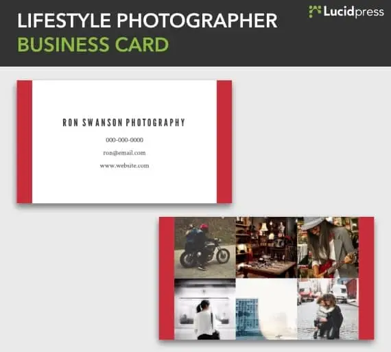
Source: Lucidpress
Warm pastel creative business card

Source: Lucidpress
Bold impressions business card
Source: Lucidpress
Surf creative business card
Source: Lucidpress
Character creative business card
Source: Manriquez
Simple business cards
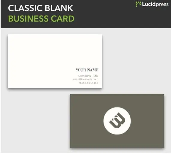
Source: Lucidpress
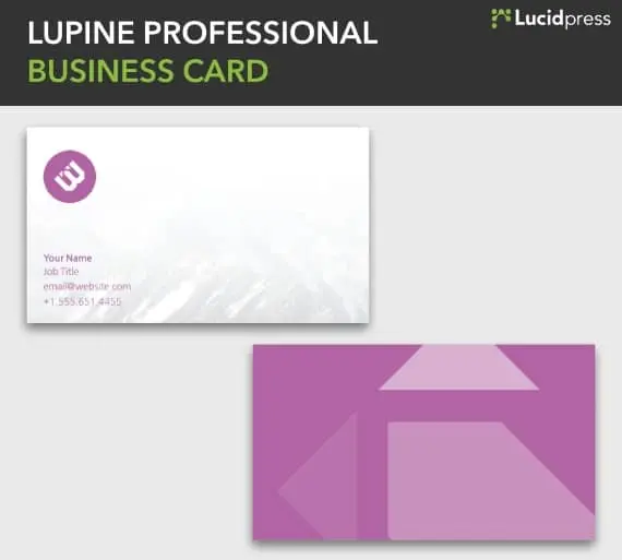
Source: Lucidpress
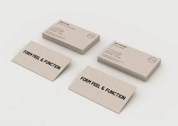
Source: Emanuele Cecini
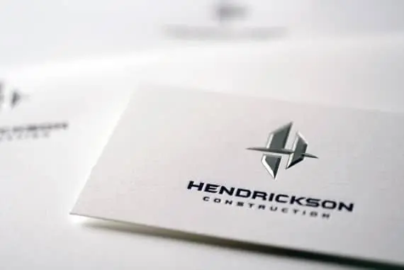
Source: DK Design Studio
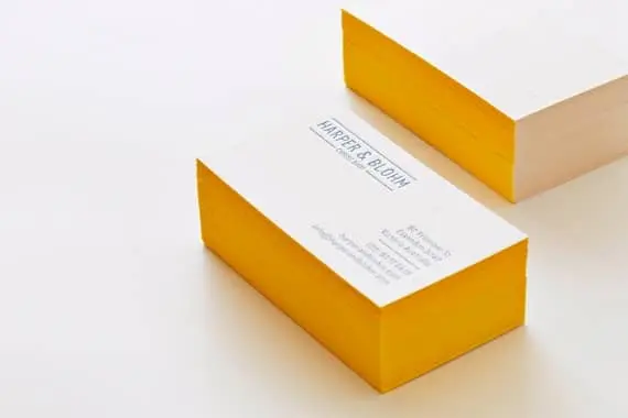
Source: Erica Boucher
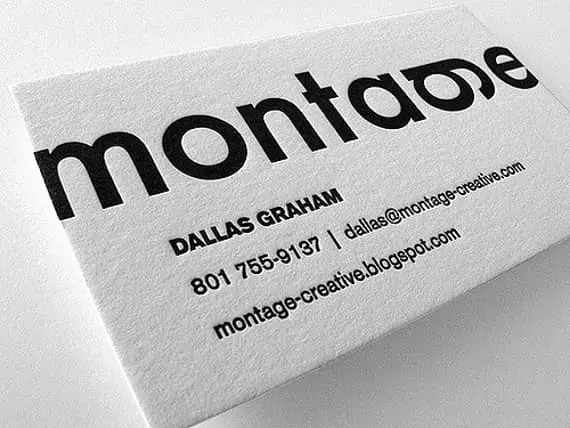
Source: The Mandate Press
Black business cards
Source: Lucidpress

Source: Lucidpress
Source: Nathan Riley
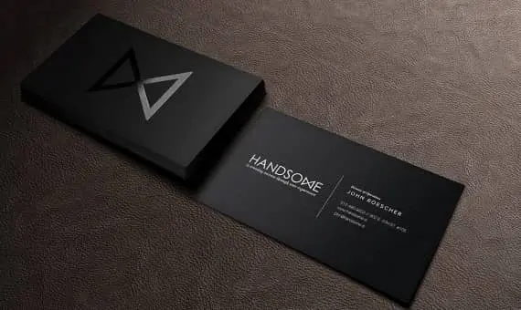
Source: Handsome
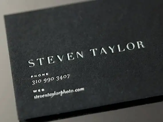
Source: Danny Jones
Double-sided business cards
Source: Lucidpress
Source: Perconte
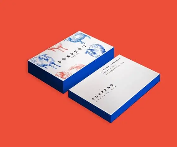
Source: Claudia Argueta
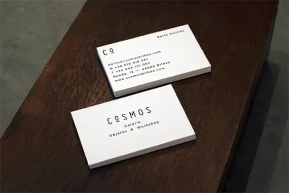
Source: Mark Brooks
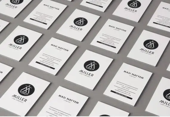
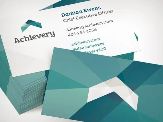
Source: Mike Camera
Vertical business cards
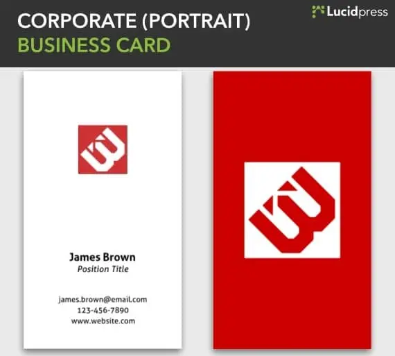
Source: Lucidpress
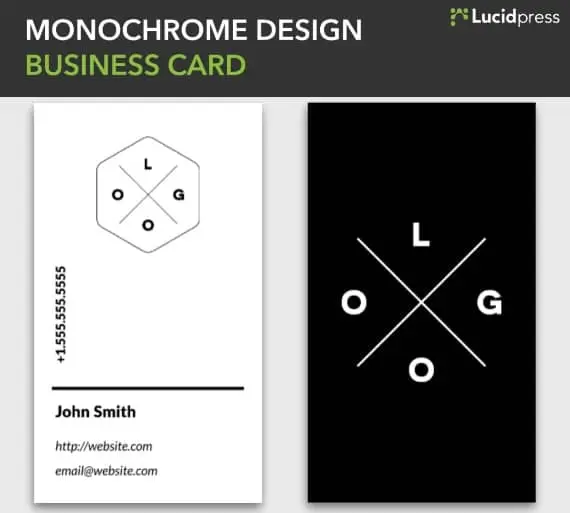
Source: Lucidpress
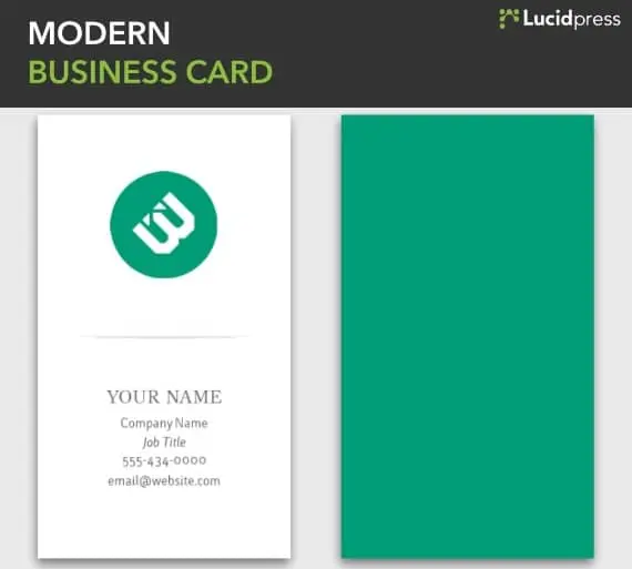
Source: Lucidpress
Source: Lagoo
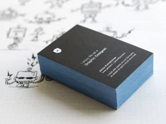
Source: Janne Koivistoinen
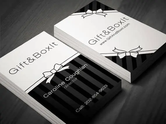
Source: Martina Obertová
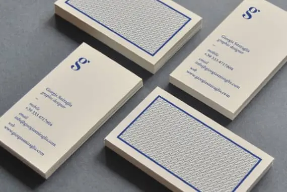
Source: Giorgia Smiraglia
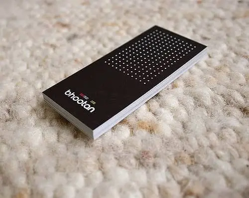
Source: Vik Design
Feeling inspired? You can design and order your brand new business cards right here in Lucidpress.
It’s been more than 10 years since eBooks became a bread-and-butter strategy for generating leads. So why isn’t every business making eBooks today? I’d wager that it’s because they don’t know how easy they are to make.
If you haven’t made a branded eBook before or in a long time, I wanted to share 9 reasons why you should seriously consider creating more eBooks for your business.
But first, let’s get some context.
In the marketing sense, eBooks (or electronic books) are informative, text-based documents presented in a digital format. They most often take the form of a PDF with 10 to 20 pages and resemble highly detailed blog posts.
EBooks burst onto the marketing scene in the early 2000s. Unlike major publishers who converted traditional books into digital formats to increase book sales, marketers had the idea to offer free eBooks in exchange for contact information. A new lead-gen tactic was born.
The secret sauce behind eBooks has everything to do with the marketer offering something of true value to the customer before the sales pitch or call-to-action. It’s like Costco’s buffet of free samples, or a 30-day free trial of Netflix.
In short, consumers crave value. If you want their business and their loyalty, you have to prove your value before they buy. So the question is, out of the panoply of digital marketing tactics, why should you invest your time and resources into eBooks?
Without further ado, here are 9 reasons why you should create more eBooks for your business.
1. Expand your upper-funnel with high-quality leads
EBooks are perfect for increasing the volume and quality of leads. Why? People are more willing to give up their contact info when they get something valuable in return. And if you’ve written it wisely, your eBook will also teach them how your product or service solves their pain point.
2. Increase your credibility
Consumers are constantly comparing you to the competition. Just like a best-selling author, multiple eBooks make you look like the thought leader in your field. And, as you write more eBooks, you’ll be forced to research and think critically, making you even more of an expert.
3. Return on your investment
In relation to the value you get out of them, eBooks are very easy to make—especially if you start with an eBook template. And once they are on your website, they can generate leads forever. Unlike other forms of content marketing like social media and most blog posts, eBooks retain their value long after they’re published.
4. If you have a blog, the hardest part is already over
Figuring out a subject for an eBook can be frustrating, but there’s an easy trick to it. Start with your most popular blog post, then dive deeper and add more detail to it. Or, consolidate a handful of similar blog posts into a comprehensive guide. There are lots of ways to repurpose and update your content for an eBook-reading audience.
5. Give your branding a boost
Most people won’t hesitate to read a 10-page eBook if it’s on a topic they already care about. This interest represents a perfect opportunity for you to give them a 5-minute sermon on your brand doctrine. This might not lead to a purchase straight away, but it plants an acorn of awareness that you can nurture with future marketing efforts.
6. Stand out from the crowd
If you’re a small or medium-sized business, your competitors are probably not writing eBooks, which means you can tap into that audience with first-mover advantages. It’s an open door leading to more market share. Beat them to it.
7. Engage your target audience
You already have their email. An eBook offers the perfect opportunity to start a conversation and get feedback. For example, you could create a survey and write an eBook about your discoveries and insights from the results. You could also interview current customers and quote them in the eBook.
8. Easily measure success
When each eBook is optimized with call-to-action links and has its own landing page, it’s easy to measure the impact on your business. Since content marketing ROI can often be hard to pin down, this can provide a valuable metric of success.
9. Making an eBook is easier than it sounds
If you have a blog and a good design tool, you are well on your way to making an eBook. Since people have short attention spans, err on the side of less text per page and use lots of great imagery to convey your message. Unsplash is a great place to find free images to fill out your pages.
Now that you know why it’s important to create more eBooks, it’s time to get started. Dive into the template selection in Lucidpress to get a head-start on your next lead-generating masterpiece.
Try Lucidpress today to create professional, compelling eBooks for your brand—no expert knowledge required.
When done well, flyers can be an incredibly effective (and inexpensive) way to promote your business, no matter your size. In fact, 89% of folks remember receiving a flyer, more than any other form of advertising. What’s more, 45% hold onto the flyers they receive for future reference.
Still, while flyer distribution is one of the most widely used marketing strategies, simply copy and pasting something together isn’t enough to stand out in today’s busy marketplace. If you want to grab people’s attention long enough for them to actually read your flyer and then act on it, you’ll need to be intentional in your messaging, design, and distribution.
Below you’ll find our comprehensive guide to flyering. From how to design a flyer for maximum impact to tips on distribution, we’ll help you create the perfect piece of print marketing for your business.
How to design an incredible flier
1. Create an attention-grabbing focal point
What’s the first thing that you want people to notice? Intentionally designing your flyer around a singular focal point will catch people’s eye and make sure your message comes across loud and clear.
Using unique, professional imagery, bold colors, and easy-to-ready fonts will help you stick the landing.
For example, we love how this Cinco de Mayo flyer immediately draws your attention in with a beautifully drawn taco that conveniently tells you exactly what the flyer is about. Fun colors + a casual, handwritten lettering style make this super easy on the eyes and a joy to read.
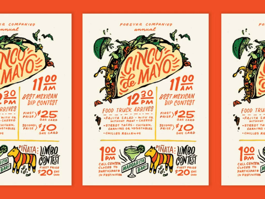
2. Speak to your target audience
Who’s your target audience, and how do you want them to respond to your flyer? For example, you might want them to stop by your shop, visit your website, or call for more information.
Knowing your target audience will help you craft messaging that appeals directly to them.
The goals of this flyer’s messaging and design are clear:
- To highlight the event is one night only, so people should act now to buy tickets/mark their calendars
- To catch the attention of film and poster enthusiasts
- To establish legitmacy by including the names of well-known print artists who will be featured
3. Focus on the benefits
It’s not enough to grab your customer’s attention. You need them to stick around so you can convey your whole message. Keep them interested by rewarding their attention. Answer their main question, “What’s in it for me?”
4. Keep the content simple
When it comes to creating flyers that stand out, less is more. Remember that you only have a couple seconds to capture the attention of your potential customers, and only one or two more seconds to hook them in with your product. That’s why you need to be straight-to-the-point content when describing what your product/service/event is, its benefits and other important details.
This funky design let’s people know exactly what kind of guitar lessons are being offered, what level they’re for, and how to get in contact.
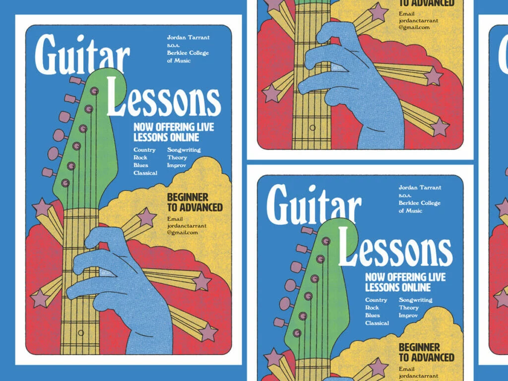
5. Include a call-to-action
After conveying your message, tell readers exactly what to do next, whether that’s to order now, call now, visit your website, etc. Get them excited about what they’ve learned on your flyer.
Be clear how you want them to interact with you by including important details about your business, like your website, contact info, location and more.
6. Print in high quality
Another vital element to creating attention-grabbing flyers is the final print. A quality print finish can be just as important as everything else you put on your flyer. Using a glossy finish and quality paper for your flyer creates a great first impression and can reflect the same quality of your products or services. Need a printer? Marq delivers high-quality prints of any design you create in our software.
7. Consider the impact of folds
Different folded finishes can create a unique impact and lasting impression. F Adding folds to your flyer will not only make it stand out but can also guide your audience through your intended information flow. Just remember to plan how you’re printing your flyer before you start with the design.
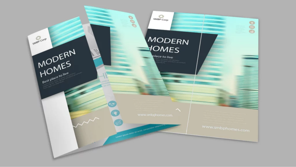
How to nail flyer distribution
Now that you’ve learned how to design a flyer, we want to make sure that flyer gets as much attention as possible. Design is only ‘half the battle’ so to speak – nailing your distribution strategy is key.
Here’s how to make sure your flyers get the attention they deserve:
1. Consider your timing.
We might be stating the obvious here, but flyers aren’t known for being particularly durable. If you’re hanging flyers outside, their lifespan could be substantially shortened by the elements. Before you get out the staple gun, check your local weather forecast for rain, snow, and heavy winds. If harsh weather is on the horizon, you might have to adjust your plans.
While we’re on the subject, take holidays into account as well. Around certain ones, like Halloween and Christmas, your flyer will be competing with a lot of decorations. Space might not be as readily available as it was before. That doesn’t mean you shouldn’t advertise around a holiday—especially if your message is seasonal or topical—but you should still take note.
2. Consider your distribution method.
How are your flyers getting to your intended audience? You have a few choices. The most popular methods are:
- Hanging the flyers in public/community areas.
- Handing the flyers to people directly.
- Keeping a stack of flyers in a high-traffic area.
- Delivering the flyers door-to-door (or car-to-car).
The method you choose will have critical ramifications on your distribution plan. For example, how many flyers will you need to accomplish your goal? How long will it take to get rid of them all?
No matter where you’re flyering, make sure you get the right permissions. Not all places that are open to the public are open to flyering as well. Parks have maintenance staff. Neighborhoods have soliciting policies. Storefronts and cafés have managers. Schools have approval forms.
Don’t give up hope, though. Many times, you can chat with property owners to determine whether they’re open to flyering. If you see shops with flyers already out front, that’s a good sign. Many places, like college campuses and laundromats, have corkboards especially for flyers and local ads. Take a look around, and don’t be afraid to ask!
3. Build your distribution team.
If you’re hanging or handing out flyers all by your lonesome, it’s going to be a long ride. Flyering moves much faster in a team. Fortunately, you can call on your support network for help. If you’re announcing a new store, employees can help. If it’s a party or a concert, you can recruit family and friends. If it’s a club or organization, it shouldn’t be hard to find volunteers.
The lower the quantity, the easier it will be to get all those flyers out into the world. However, if your back’s against the wall, you still have options. If you don’t have the time—and no one else seems to, either—give a flyering agency a call.
There are specialized businesses out there who take care of the entire distribution process, from start to finish. They can help you create a smart plan that targets your audience in a timely fashion. Some even offer GPS tracking so you can watch in real-time. Just keep in mind that you can’t control how the staff does its job, so choose your agency partner carefully.
4. Target your distribution.
Finally, take a good hard look at your distribution plan and make sure you’ve accounted for all the steps up to this point. Now that you have all the basics in line, you can make some advanced adjustments. Targeting your distribution is the final consideration that will have a major effect on your success, and there are two ways to do it.
- Geographic targeting. If you run a local business, you can target specific areas who are more likely to benefit from your services. You can choose the zip codes, cities, streets, or even neighborhoods to flyer. Take into account the topography and landscape of these areas. Some terrain will be harder to cover than others, such as hills or neighborhoods where houses are far apart.
- Demographic targeting. If you’re announcing a new location for your business, you might target loyal customers who you know will be interested. Or if your flyer addresses a specific need, like babysitting or landscaping, you might be selective about who gets a flyer. The idea is to give flyers only to the people who actually benefit from your message, so your flyer has a higher chance of success.
Key takeaways
No matter your level of experience, flyers can be a powerful tool to grow awareness around your brand or business. Just make sure to follow these tips and you’ll be set.
Check out our extensive library of flyer templates and get started designing yours today!
Stationery—including letterheads, envelopes, labels and business cards—can be a useful addition to your company’s branding strategy. Even with the widespread use of email and other electronic means of communication, old-fashioned stationery still has its place in your business. However, the design of your stationery is just as important as the information you’re delivering.
Related: 30 creative business card ideas & designs to help yours stand out
Whether you’re sending out a company-wide memo, bringing your business card to a networking event, or just delivering a friendly letter to a client, your stationery should represent your brand clearly and appropriately. We’ve put together a list of four concepts to remember as you design your stationery.
1. Keep it simple
While it can be tempting to bring all desired elements into one design, this can overwhelm the recipient and may even downplay your template’s branding. Instead, you want to keep your stationery clean and simple. Remember, its task is to support your content, not overshadow it.
What exactly does this mean?
- Keep typography styles minimal. A maximum of two is recommended.
- Keep colors minimal. A maximum of three is recommended.
- Incorporate white space where possible. This will break up the content while giving your design a clean, professional look.
Overall, keep in mind that your stationery design shouldn’t overtake the content; it should complement it.
2. Incorporate your brand
From color schemes and typography to your logo and other imagery, your stationery should represent your brand in all aspects. Of course, you shouldn’t feel obligated to incorporate your brand elements in any particular way.
With many different stationery items (like letterheads, business cards and labels), you have many inclusion options. For example, you can make your company’s logo the background image of your business card while also using it on your letterhead as the break between your business information and content.
3. Use the best software
The software you use to design your stationery is just as important as the design itself.
Photoshop and InDesign are great, but they’re also costly and overwhelming for the initiated. Fortunately, Lucidpress offers its own alternative design software. The free, intuitive editor makes it easy to create your own designs (or edit any pre-designed templates from the gallery). You can even upload your brand’s fonts, images and logos, as well as other elements.
4. Organization matters
Last but not least, the organization of your stationery can make or break your design. After all, you want your stationery to be beautiful, but also functional and legible.
- Use a hierarchical ordering. This means using headings and font elements (such as bold and italic).
- Use typography and colors to distinguish sections. To support your stationery’s organization, use branded elements to further break up the ordering.
- Choose legible colors and typography. Bold colors and easy-to-read font styles are important if you want to deliver your message clearly.
To further distinguish your content, you should keep obvious branding separate. Keep a distance between your logo, imagery and business information. This will keep the focus on the content but also make it possible for your information to be noticed.
As you’ll see below, Lucidpress’s pre-designed templates fall in line with all of the above advice. From classic and traditional to sleek and modern, you have plenty of choices for your company’s stationery.
Are you ready to bring your own stationery ideas to life? Create your own design in the Lucidpress editor, or use one of our professional, pre-made templates to get started!
12 creative stationery design ideas to give you inspiration
Now that you know the mechanics of creating effective and beautiful stationery, here are a few online designs to inspire your creations.
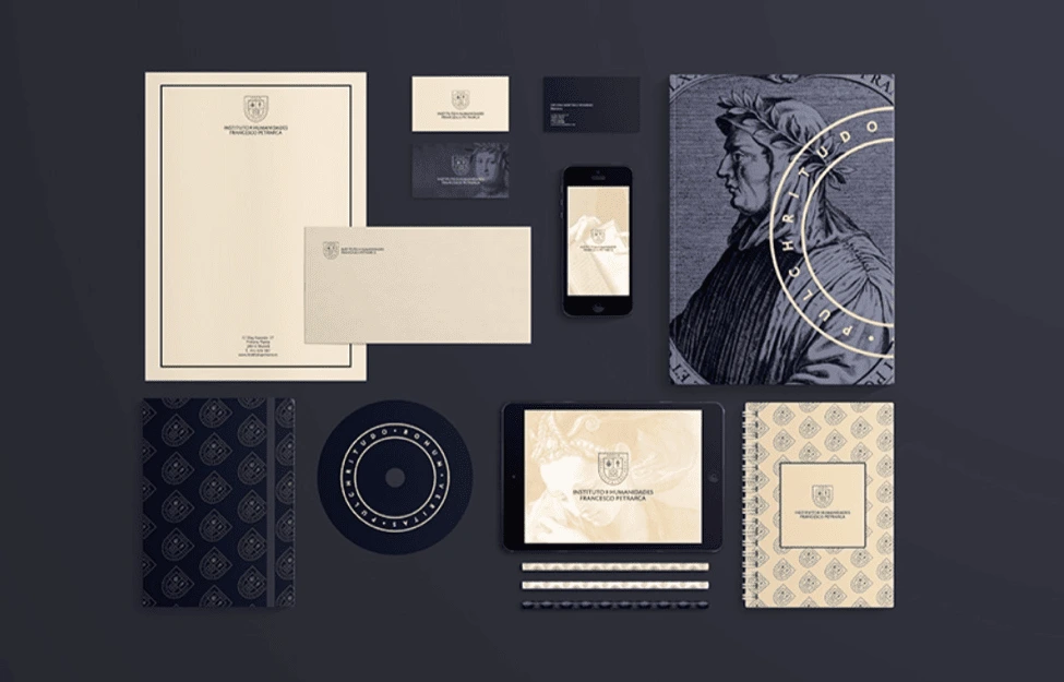
Source: Ana V. Francés
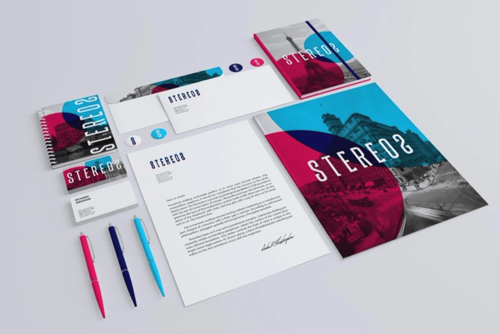
Source: Itembridge Design & Development
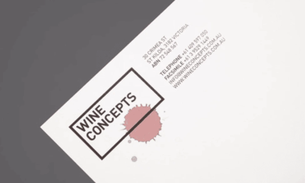
Source: Hunt & Co.
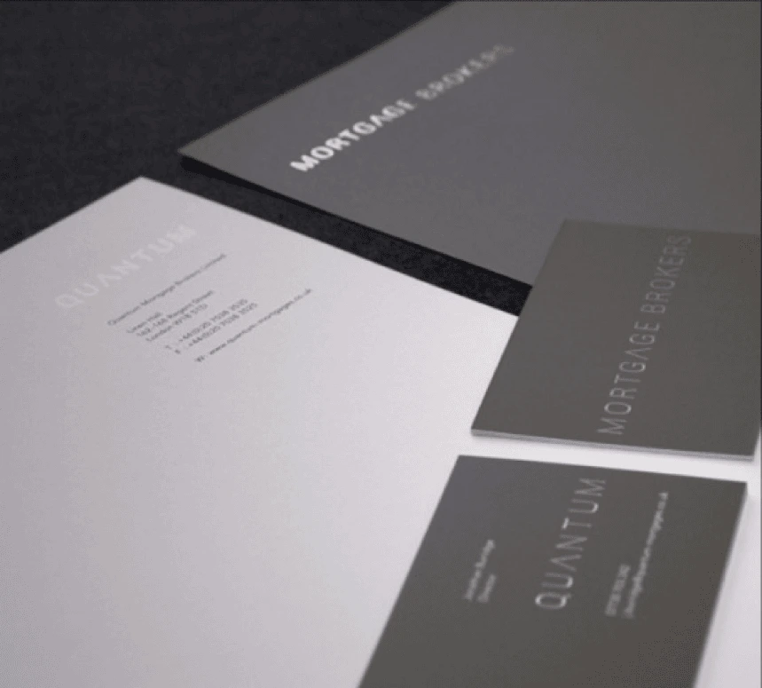
Source: Tim Jarvis
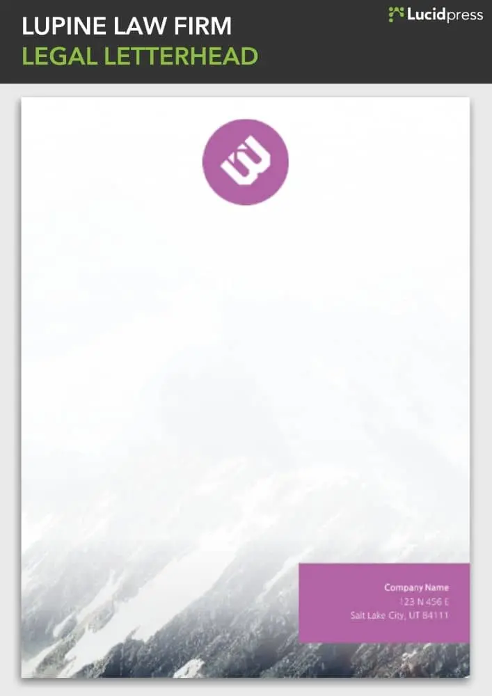
Source: Lucidpress
Source: Tom Cavenau
Source: Gloria Villa
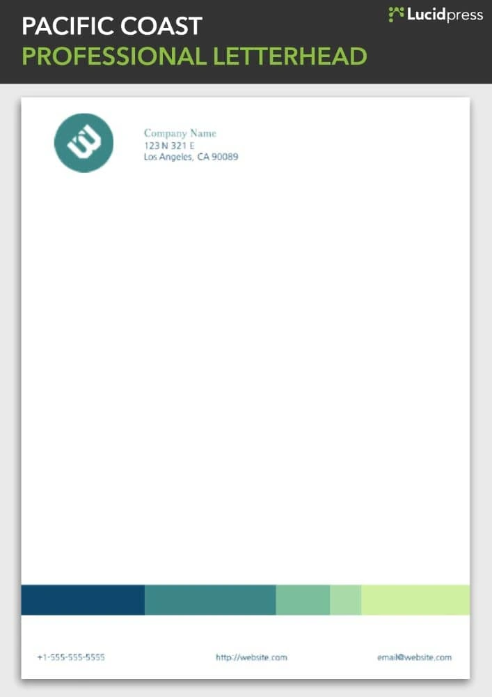
Source: Lucidpress

Source: Islam Yossry
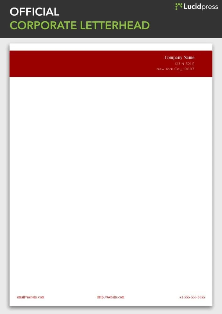
Source: Lucidpress
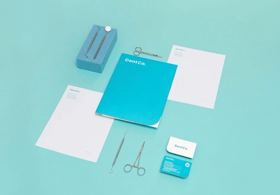
Source: The Branding People
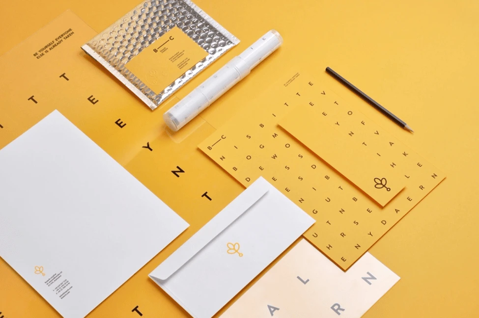
Source: Noeeko Studio & Michal Sycz
Are you feeling inspired and ready to take on your own stationery design project? Feel free to use the Lucidpress templates within this post, or create your own stationery with the help of Lucidpress’s interactive editor.
Ready to bring your own stationery project to life? Create your own design in Lucidpress, or start with one of these free letterhead templates!
Back in older days, your name, address and contact details at the top-right of your client correspondence constituted a letterhead. Today, letterheads have become a visual art, delivering a first impression of who you are, what you do, and why you do it.
Take a flight of fancy and imagine your letterhead as sort of a haiku for your brand. For instance, are you a fast-moving tech startup or a dependable financial services provider? Are you a freelance nature photographer, or do you sell vintage clothing online? Your letterhead should creatively reflect that brand identity.
Related: The 7 key elements of brand identity design
Today, letterhead is no longer just a printed heading on stationery; it’s the look and feel of the entire page. Sometimes letterheads are, as we’ll see, really “letterfooters”—and they’re just one element of your brand stationery, from business cards to envelopes.
3 keys to designing great letterhead
The keys to making a great letterhead are:
- A well-designed logo. In the examples below, you’ll notice how a strong logo makes each letterhead design compelling and unique.
- Solid brand framework. Your design should reflect who you are, not who your designer is. From colors to layout design, your brand personality should be evident in every element.
- Document consistency. Keep your marketing materials consistent. Your templates should be tamper-proof to prevent logo stretching, rogue fonts and clashing colors.
Before we present our visual smorgasbord of design ideas, let’s review some quick tips on how to preserve brand consistency while creating letterhead, and how Lucidpress can help you simplify the process.
Already know what you want and don’t want to be sidetracked by other designs? Dive in right here with Lucidpress’s free online letterhead maker.
14 creative examples that’ll change how you think about letterhead
Fill up that white space
If a stark white page feels too plain, adding a background image can provide some much-needed visual interest. Just make sure your design contains enough contrast so the text remains easy to read.

Source: Lucidpress
Color me beautiful
Color can breathe new life into most simple free templates you can download on the internet. And no, you don’t really need to worry about web-safe colors these days.
Source: Lucidpress
Zebra crossing
On a printing budget? You don’t need to go into the red (ha) with black-and-white designs. In Lucidpress, it’s easy to create layers with elements. In this example, the logo (top layer) would live on top of the background (bottom layer) so it’s easy to drag & drop your logo anywhere on the page.
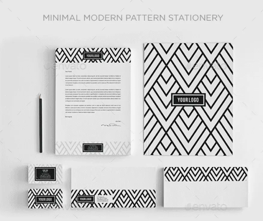
Source: Envato
Moving elements
The letterhead design police will not penalize you for moving the position of your contact details, or of anything else. It’s your party, so dance how you want to!
Source: CIPMANN
The spirit of the season
Why stick to the same letterhead all year ’round when you can get a little fun and festive around the holidays? Bring a smile to your recipients’ faces with a taste of the unexpected.
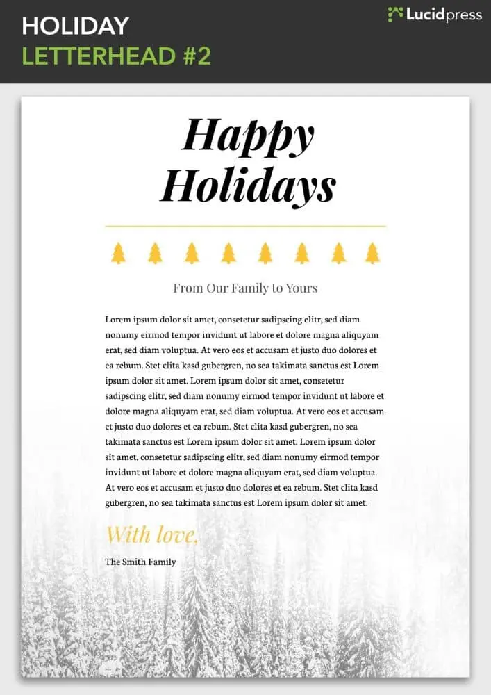
Source: Lucidpress
A picture says a thousand words
Don’t have a logo yet? All is not lost. Use free graphics and images to visually describe your products and services until you have a custom-made logo of your own.
Source: Vistaprint
Fortune 500
Be inspired by the greats of graphic design. Turns out you don’t have to be a big brand to look like one.
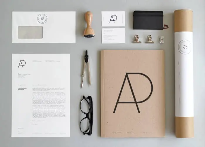
Source: YAGWYD
Turn branding on its head
The significance of lines and shapes in logo design make it both an art and a science. When done correctly, your brand can deliver surprising style while still being completely recognizable.
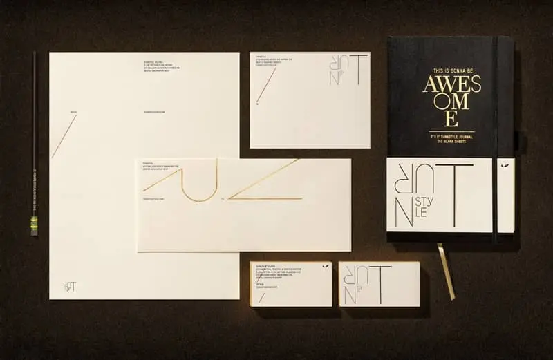
Source: Turnstyle
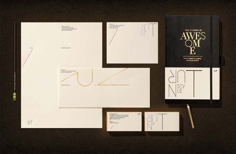
Stylish & eye-catching
Nearly 93% of people say a product’s visual components are the most influential factor in making their purchasing decisions. Use this to your advantage with a striking color palette and close attention to detail.
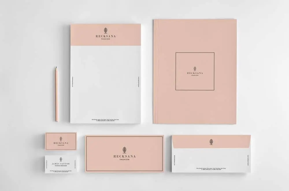
Source: Graphicsegg
A complete visual identity
When you design your logo, make sure it fits on all your marketing collateral, from brochures to business cards. Don’t be afraid to play around with your color palette to create a diverse and visually interesting library of templates.
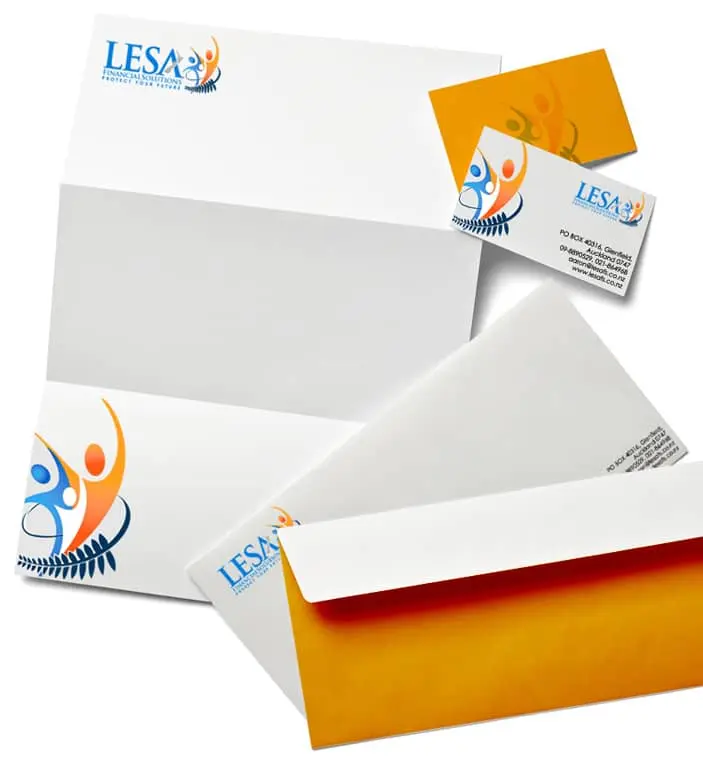
Source: Logo Design India
Contemporary & artistic
Beautiful photography can elevate your brand identity from sufficient to stunning. Why not splurge on a professional photo session to make your letterhead truly one-of-a-kind?
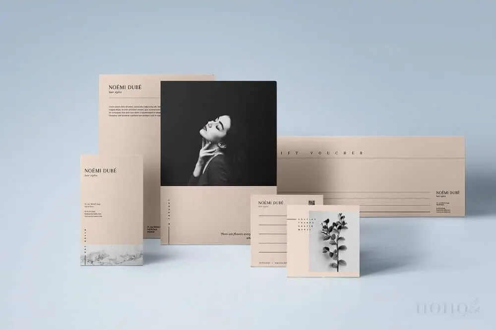
Source: Nonola
Modern & funky
Your imagery should use a theme, but it doesn’t always have to be precise—just recognizably your brand. Play around with how and where you place your design elements to create different templates.
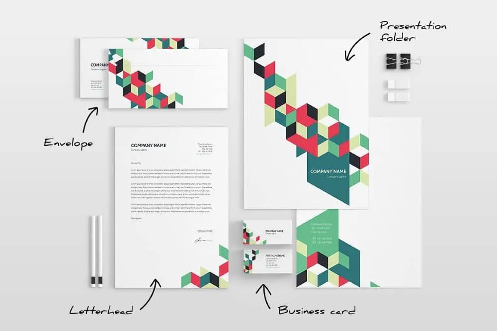
Source: ID Vision Studio
Keeping it simple
Letterhead doesn’t have to be fancy or ornate. If you find most designs too distracting, take it back to basics with a clean and simple letterhead like this one.
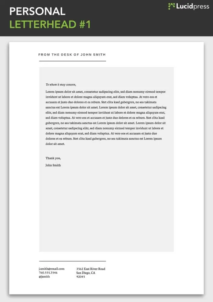
Source: Lucidpress
Small business savvy
This letterhead, unusually but effectively, includes important information about the business—including its opening hours. It’s a great way to remind local clients when and where to find you.
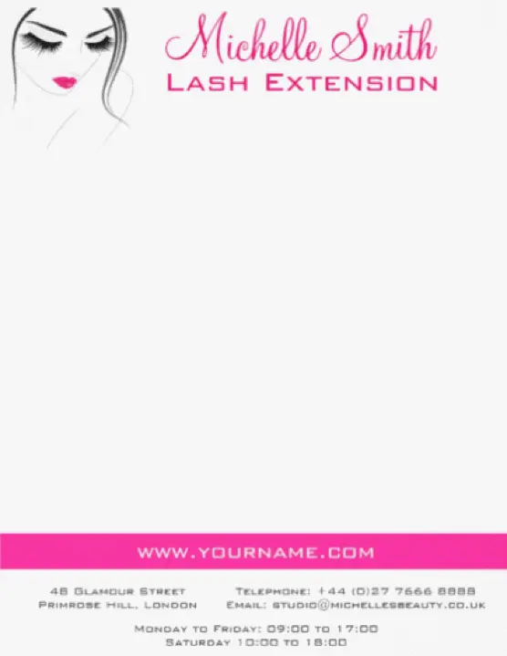
Source: Colorshop
Answering the 5 W’s
An effective letterhead serves as your calling card—both business communication and brand identity design rolled into one. Here are some questions you should consider before you start designing.
Who? Who are the targets of your correspondence—e.g. new clients, colleagues, investors—and what information needs to be included? (Read more on how to imagine your target audience here.)
What? On the internet, many brands omit contact details and opt to use contact forms instead. If you don’t want customers to phone you directly, it might be easier to include a website link or QR code to a contact form in your letterhead design. In Lucidpress, it’s easy to add links via shapes, images and text.
When? For what occasions will you use this stationery? For example, is it for sending out debt collection notices or to announce the winners of a competition? In the first instance, a bright, cheery letterhead could understandably get on customers’ nerves—the message will be clear that this is a standard form letter sent without a moment’s thought about who it’s going to and why. Additionally, how do you intend to distribute your correspondence: in digital, print or both? Lucidpress supports both RGB (ideal for digital) and CMYK (optimal for print) color profiles. This is key to making sure your brand colors appear consistent across the board.
Where? Two questions here: Where do you store your business collateral, and who is allowed to change it? Lucidpress uses advanced template locking so you have the flexibility of adapting your designs when necessary but limiting the privilege to admin users. You can also lock down important elements like logos, fonts & sizes. That way, you can give edit access to whoever needs it—like sales agents—safe in the knowledge that they can update the text without altering or ruining the brand assets.
Why? One of the first mistakes brands make while designing letterhead is including redundant information. Invariably, your stationery will be used for different purposes. For instance, it’s unnecessary to include your company’s address on internal memos. And if you have international clients, you may want to design a letterhead that accommodates more than one language—or even design letterheads for each one. Lucidpress supports the full gamut of branded collateral, from letterheads to business cards and brochures to newsletters. Simply clone your template and update it any way you like. For more ideas, the University of Waterloo provides some great examples of how to customize a letterhead for different uses.
Wrapping up
Follow these tips and, with a little inspiration, you should end up with a beautifully professional letterhead that represents your brand. Graphically challenged or on a deadline? If you’re really stuck, simply grab one of our professional, easy-to-use letterhead examples. Our designers have crafted these letterhead templates with care and expertise, so you don’t have to start from scratch. Just add your logo and text details, select your brand colors, and make any other edits you desire with intuitive drag-and-drop tools. It really is that easy to design a new letterhead that you’ll love!
Ready to bring your own letterhead project to life? Create your own design in Lucidpress, or start with one of these 7 free templates!
Poster design has come a long way since the 1880s, changing in style for different eras and often strongly influenced by political or social events of the day. Posters have become a powerful and popular medium for advertising (sometimes referred to as street or guerilla marketing).
Let’s take a look at some of the creative poster templates from our Lucidpress poster collection and how you can use them effectively to convey your unique message and reach your targeted customer base.
Choosing a design
We admit it’s not always easy to choose a design, so to help you make up your mind, we’ve assigned two keywords to each poster. These keywords capture the mood of the poster and what it’s ideally suited for. We’ve also identified “niche” posters, such as real estate or restaurants. Still, remember: Lucidpress templates are fully customizable. If you wish to use our restaurant poster to promote your software business, go right ahead. You can easily change the tone by using different color schemes or fonts.
The ins and outs of poster design
Poster design — like colors, shapes, lines and patterns — plays a central role in creating memorable content. All poster templates here were inspired by different combinations of these key elements.
99Designs succinctly illustrates the six core elements of great design. Some tips:
- Lines — The Golden Ratio is a number calculated by dividing a line into two parts so that the longer part divided by the smaller part is equal to the whole length divided by the longer part. (Phew.) It’s a golden rule for pleasing design.
- Color — Try to use your brand colors in all business collateral. Use a color picker to get the shades right. Color is an integral element for professional business designs.
- Shapes — Shapes and images are central to any design, and Lucidpress makes working with them easy and intuitive. Custom shapes can be used to great effect in fun, trendy and modern designs.
- Textures — Use the Lucidpress image editor to texturize your images and poster background. Texture is a core element of whimsical and innovative designs.
- Framing — Frames and borders help to focus a viewer’s attention. Use them to structure your layout and content, and to layer design elements. Layering adds depth to posters and is a key element of sophisticated, cosmopolitan and luxury designs.
- Type — Don’t forget: Fonts used for educational and research project designs should never be distracting to the reader. In Lucidpress, users can upload custom fonts.
Getting started only requires an internet connection — which you clearly already have. Imagine a blank wall. To decorate it, head over to our free online poster maker. Bring your ideas to life!
Blue and pink empowering poster template
Make someone’s day sparkle — try adding more shapes and sparkles
Click on the image to see the template
From motivational quotes to inside jokes, the blue and pink empowering poster template is bound to uplift a special someone’s day. The simple execution of this poster’s creative design lends equal parts positivity and inspiration.
Delivery and curbside pickup poster template
Allowing only three customers in the store at a time? Customize based on your needs
Click on the image to see the template
An ideal poster design for storefronts and buildings whose occupancy limit has been impacted by the pandemic, changes in fire regulations or construction, this poster empowers you to communicate clearly and easily.
Campaign poster template
Keep copy simple to avoid distracting the reader
Click on the image to see this template
Make your campaign’s purpose loud and clear with this patriotic campaign poster template. Change up the layout design by swapping out the flag for an illustration, or insert different colors instead of using blue.
University poster template
Pick a background image that reflects the event

Click on the image to see this template
An excellent choice for schools and alternative education platforms, this poster design assures your org’s message will stand out. Bold colors make your advertisement feel loud and clear — swap out your organization’s logo for the provided one.
Nature quote poster template
Too moody for your vibes? Brighten things up by overlaying shapes and color

Click on the image to see this template
Whether you’re looking to meditate, motivate or inspire, the nature quote poster is here to do it all. Customize the graphic design with your own photo or use a stock image to change things up.
Coming home movie poster template
Make the text pop with a border or shape
Click on the image to see this template
Quick, somebody grab the popcorn! And don’t forget the sour gummies! Shhhh!!! It’s time to cozy up and get ready for the character arc, story development and more with the Coming home movie poster template.
Duo campaign poster template
Keep your tagline simple
Click on the image to see this template
Give them a reason to try and name a more dynamic duo with the Duo campaign poster template. Showcase your running mate, as well as upcoming town hall events or speaking sessions. Don’t forget to include your campaign’s motto!
Orange & blue passion quote poster template
Don’t stop at one version — make a few till you get it just right
Click on the image to see this template
Equal parts jazzy and simple, the orange and blue passion quote poster template keeps the eye centered on your quote of choice. Be sure to include or note who originally said the quote. Everyone appreciates credit where credit is due.
Blue soccer game day poster template
Be sure to include important details — like event times and such
Click on the image to see the template
Get your fans ready to rumble with the Blue soccer game day poster template. Use the colored overlay to highlight your school or team’s colors — plus you can swap out the image to feature one of your very own athletes!
Student council campaign poster template
Limit CTA usage to one — get folks out and votin’
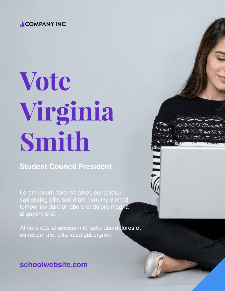
Click on the image to see this template
Make an impact on your school experience with the Student council campaign poster template. Swap out the stock image for a candid, congenial photo — and be sure to include a little bit about yourself and your campaign initiatives.
One day movie poster
Use the image and icons to tell a story
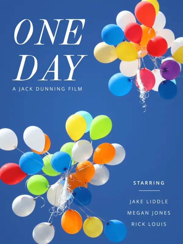
Click on the image to see this template
Lean into your zany, mad scientist side and use an abstract image to tell a story about your movie. The font is completely customizable, as well as the copy and text box placement. Wherever this template inspiration takes you, may it be nothing short of magical.
Blue and green track schedule poster template
Create a visual timeline aid to help keep folks informed
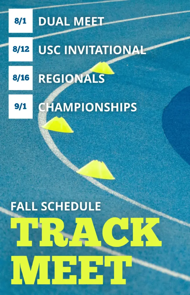
Click on the image to see this template
Keep your school and sports teams on track to win (ayyy, see what we did there?) with the blue and green track schedule poster template. Customize the colors however you see fit, and swap out dates for any upcoming events, like the homecoming match or what have you.
Forests research poster template
Let your content do the talking
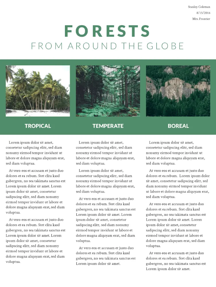
Click on the image to see this template
Created with research and educational projects in mind, this poster provides ample space and graphic design opportunities for images and content in a structured, brochure-like design. The slideshow is both modern and practical, and you can easily add or duplicate pages. The beauty of a one-page template is that your design remains consistent.
Western wanted poster template
Get what you want while paying homage to the original poster

Click on the image to see this template.
Our designers created this poster design tongue-in-cheek. It’s eye-catching and memorable with an instantly recognizable theme. Have excessive quantities of stationery gone missing at work? This is a fun and subtle way to draw attention to outlaw behavior in the office or at home.
Standard advertising poster template
Swap out the red placeholder with your brand’s color palette
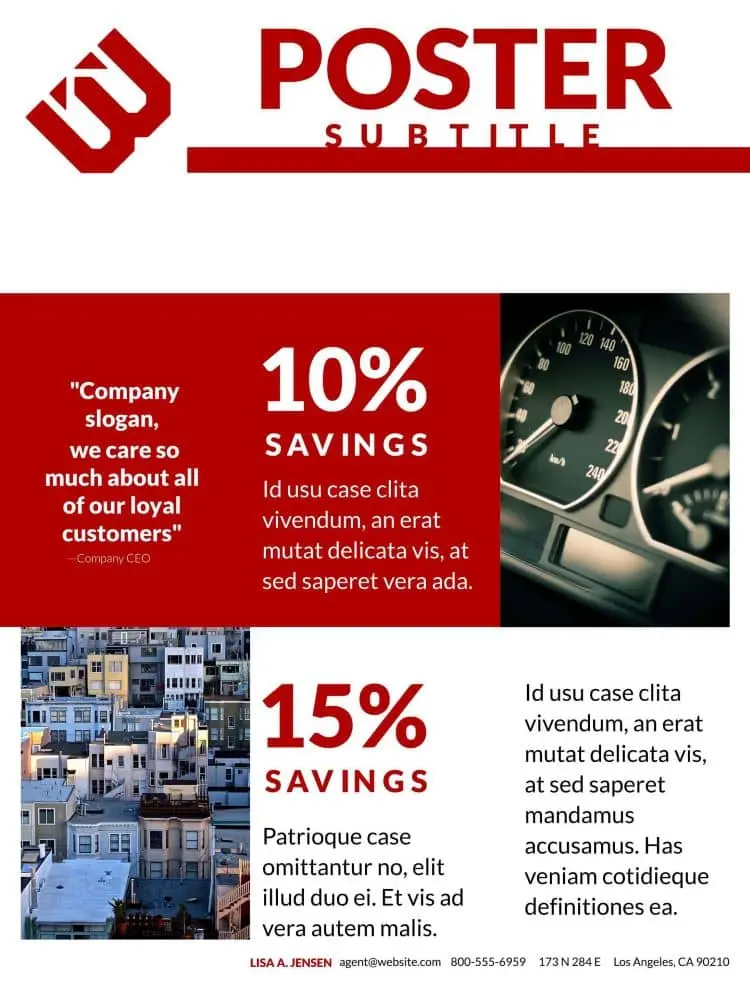
Click on the image to see this template.
This 3-page poster design is perfect for marketing your business at trade shows and exhibitions, or it can be used for an online catalog to advertise special offers. The format is deliberately simple so as not to distract from the content and to make it easy to update if you have regular campaigns.
Motivational quote poster template
Use an action verb for maximum inspiration
Click on the image to see this template.
Motivational quotes and typography are powerful tools to inspire innovative thinking and promote a sense of well-being. Psychologist and motivation expert Jonathan Fader, PhD, says well-structured messages that use strong imagery and appeal to our aspirational nature can be powerful in changing our thought patterns and behavior.
Heartland business poster template
Don’t have quite the right photo for the event? That’s okay — try Unsplash!
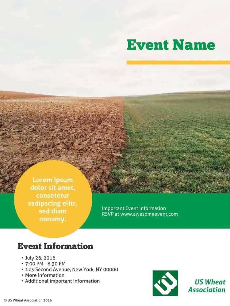
Click on the image to see this template.
This business poster design template provides a surprising and unusual variety of content placeholders so you can sneak in a wealth of information. The placeholder and graphic design space demand your customers’ attention, and the longer they’re looking at your poster, the more likely they’ll absorb your message.
Homegrown event poster template
Keep your colors simple — avoid using discordant color combinations like purple and green
Click on the image to see this template.
We call it Homegrown because this poster design has multiple layers, just like a home-baked pie. If you really want to stand out from the crowd, putting a bit of effort into creating a layered poster will help you to demonstrate the depth and originality of your company’s vision.
Ecosystem scientific poster template
Avoid large walls of text — use illustrations or graphic design to break up walls of copy
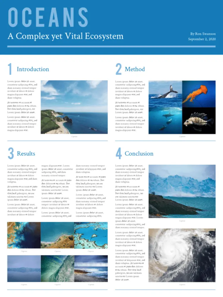
Click on the image to see this template.
Blue is the new green — and this eco-theme disrupts the traditional color mold quite innovatively. This huge 36″ x 48″ poster gives you the physical space to cover even the most complex research projects without having to resort to smaller fonts or cropped images.
Weekend away photo poster template
Start simple with an easy-to-read font and play around from there
Click on the image to see this template.
This trendy poster design showcases your professional photographs, however, your message still takes center stage. It’s ideal for travel and tourism businesses, for exhibitions, and for luxury brands to announce corporate events and exhibit their products. The Weekend Away is a great example of design layering.
Swiss Alps travel poster template
Want to make a bold statement? Use a vivid, contrasting color for your font

Click on the image to see this template.
Contemporary and bold, this poster paints a strong message. It’s a single-focus design, and you should customize it with your own bold background photograph and daringly creative fonts. The unusual text layout makes it a unique and original choice for technology startups and entrepreneurs.
Nature retreat poster template
Don’t love the included typography? That’s ok, customize with your brand’s font
Click on the image to see this template.
Inspired by the layout of quality print magazine covers, Nature Retreat is eminently versatile. Our customers have used it in projects as diverse as publishing upcoming event information and showcasing their portfolios, and for school projects. The style is informal and slightly whimsical.
Origami banner event poster template
Concise and clear, make the most of this simple layout design
Click on the image to see this template.
Origami is the Japanese art of folding paper into decorative shapes and figures, dating back to the 1880s. This template combines traditional origami with a fresh, modern look to create a perfectly structured design ideal for formal and professional corporate posters.
Block party poster template
Use colors, be it bright or soft, to communicate the vibe of the party

Click on the image to see this template.
Everyone likes a party. Its vibrant graphic design and no-nonsense block layout works well for invitations and holiday events. It’s a one-pager, easy to modify and with placeholders for the “who-what-when-where-why” information. The blocks and frame design are reminiscent of the calling cards of yesteryear.
Night life poster template
Juice up the tone with an abstract illustration for your background
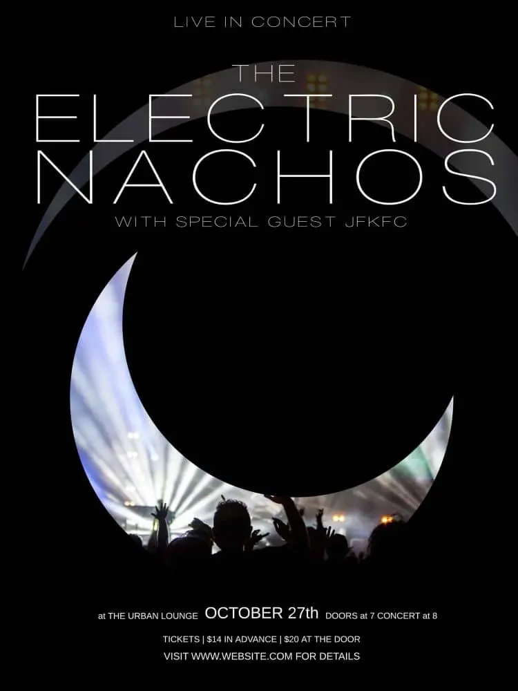
Click on the image to see this template.
Evocative of torn classic denim and multi-layered dresses, this poster design and typography ushers in a new trend of visually captivating posters that challenge design rules — you could even say that we wouldn’t be surprised to see it in the MOMA one day. Light and dark are juxtaposed to evoke excitement and anticipation.
Real estate poster template
Highlight the diversity and variety of your selling history through various images
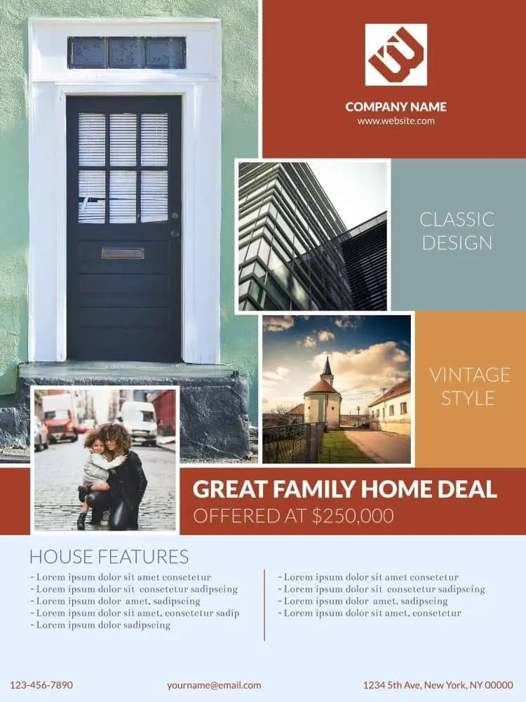
Click on the image to see this template.
Arguably the most versatile and stylish template in the Lucidpress collection, this block design is ultra-bold and is anything but lacking in the design inspiration department Rather than simply invite, the poster compels customers to attend a home viewing. We’ve incorporated vintage and trendy elements both formal and informal… and the result rocks.
Cobalt café poster template
Avoid using stock photos if you’re looking to highlight a unique restaurant
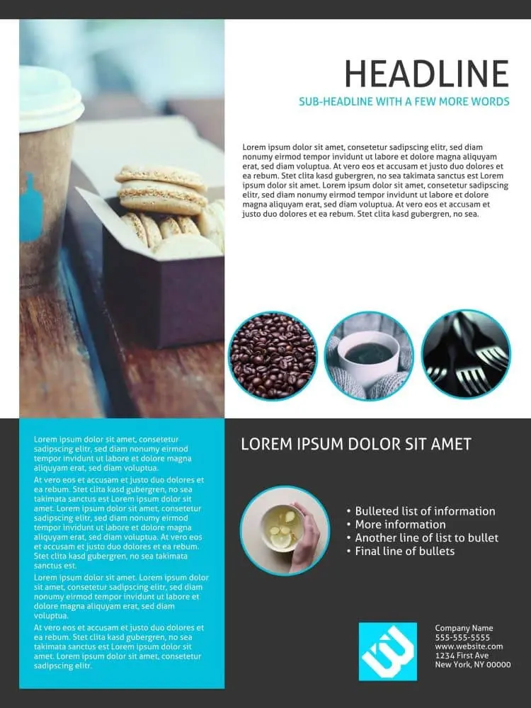
Click on the image to see this template.
When it comes to real estate, location is everything. And when it comes to food, presentation is everything. The design for this creative poster mimics those used for magazine food pages, arousing your taste, visual and smell senses. The Cobalt is warm, welcoming and very practical.
Cut glass marketing poster template
Use this template to communicate official corporate events
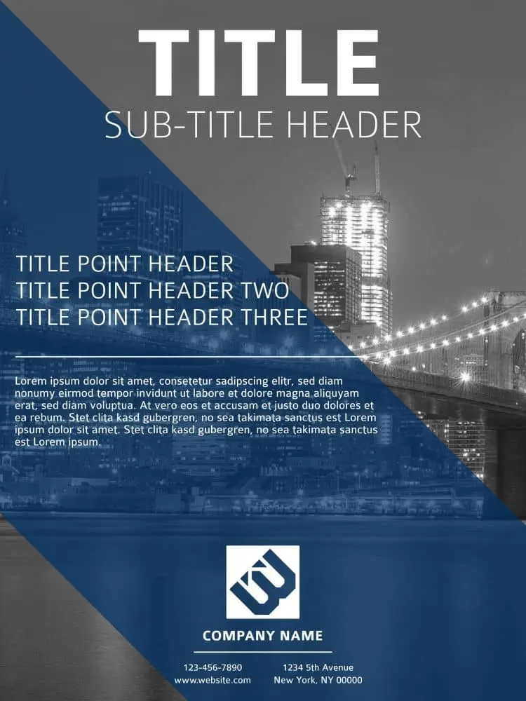
Click on the image to see this template.
Cut Glass presents a sharp graphic design look and feel, perfect for technology startups and real estate innovators. Diagonal lines are more striking than horizontal or vertical ones. As explained by Vanseo Design: “Their kinetic energy and apparent movement create tension and excitement.” Use this template boldly and aggressively.
Cosmopolitan business poster template
Swap out the included stock photo for a snap of your city or HQ
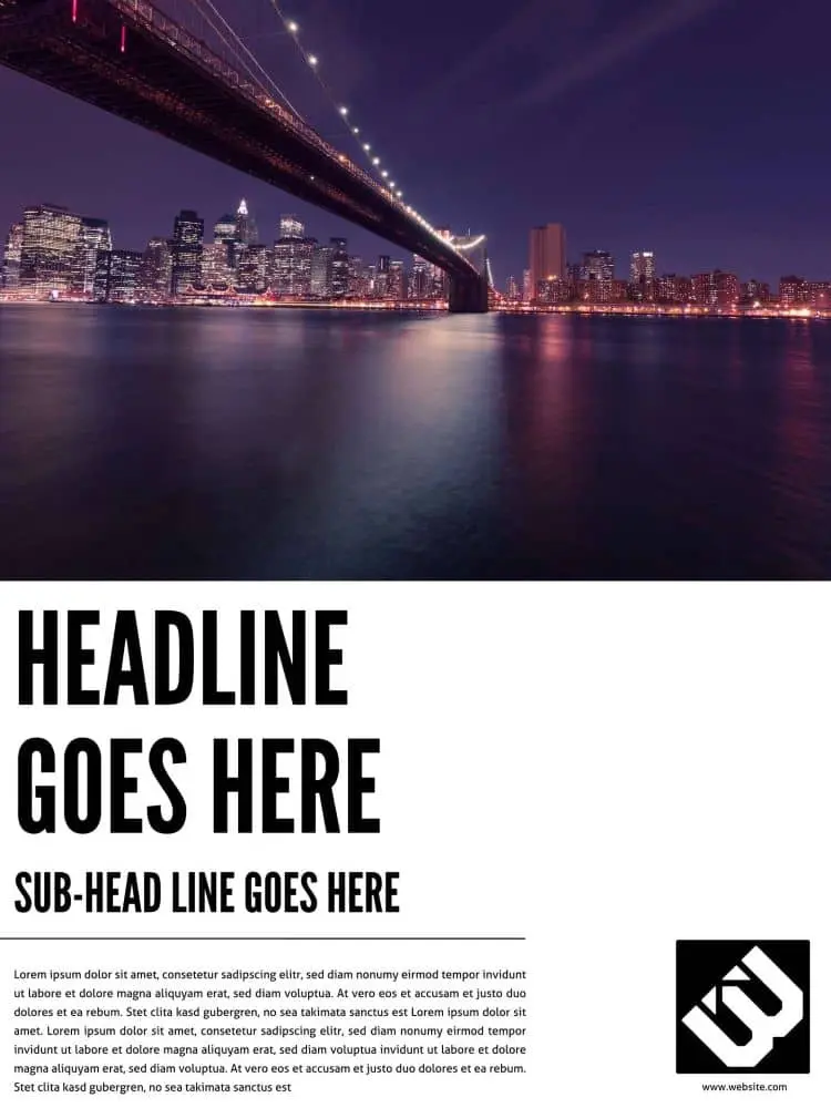
Click on the image to see this template.
Cosmopolitan means cultured, suave, polished and refined… an image you may want to cultivate, particularly if you have an international, sophisticated client base. The hallmarks of cosmopolitan design include the avoidance of “fluff,” subtlety, attention to detail, intricacy and cohesiveness. Would these graphic design and marketing tactics serve your brand, too?
Reflections company poster template
Have official health comms that need relaying to employees? Look no further
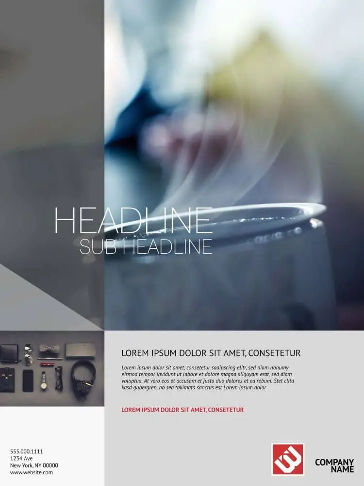
Click on the image to see this template.
The creative inspiration for this design was the subtle reflection of images in water, clouds and shadows, conveying the impression of depth and intelligence. This poster would work particularly well for a beauty technologist, health spa or clinic, or even a luxury brand.
Poster design with Lucidpress is simple thanks to our user-friendly, intuitive interface. It gives you all the functionality of traditional desktop publishing software—but without the learning curve needed when using professional packages. Now it’s time for you to grab one of our free poster templates and get creative.
Feeling inspired? You can design and order your brand new poster right here in Lucidpress.
Choosing the right newsletter design isn’t easy. There’s a seemingly infinite number of designs out there, each with their own strengths and weaknesses. (And in many cases, more weaknesses than strengths.) Finding the right colors, shapes, text formats and image placements can take up a huge amount of time.
But with these professionally designed newsletter templates, all you need to worry about is customizing. The designs are already in place, suggested color palettes chosen, and even some images added (though adding your own is recommended).
Related: How to make a newsletter in 9 steps
Newsletter design tips
There’s a few principles to keep in mind as you concoct your newsletter, even if you start with a pre-existing template. Though, in the end, you’ll have a fantastic-looking newsletter in less time than it will take to find a template from Microsoft Word or Publisher. Your readers will thank you. Also, it’s worth noting that we’ve organized this blog post based on newsletter type — i.e., newsletters for schools, businesses, holidays, digital and more.
Consider the layout type
As in — do you want your newsletter to be: fixed, fluid, responsive or adaptive? To avoid overwhelming you with information (and empowering you to learn on your own terms), we recommend checking out UX Alpaca’s article on layout types.
Grab attention with a header
Let your header do the talking for you. Your header should do one of two things (or both): First, it should draw the reader in. Copy can be witty and sharp, or directly address a pain point you know they have. Either way, you need to grab their attention and endeavor them to keep reading. Without telling them to keep reading. 2.) You need to say something. There’s an approach to copywriting that can be best summarized as “Say it straight, then say it great.” But whatever you do, it has to say something of substance.
Let your body copy do the ‘splainin
Remember: Your header doesn’t have to carry the weight of your newsletter — body copy can come in with the assist. The body copy is where important information should live. How you choose to present that is up to you, but keep in mind that big walls of words can be overwhelming for readers, so we recommend keeping the information as scannable as possible.
Add relevant links where it’s appropriate
The devil is in the details, right? Be sure to include links to webinars, listings, school flyers and more. If you want people to show up, you gotta give them a reason to show up! Or whatever.
Newsletters for schools
Skyline High classroom newsletter template
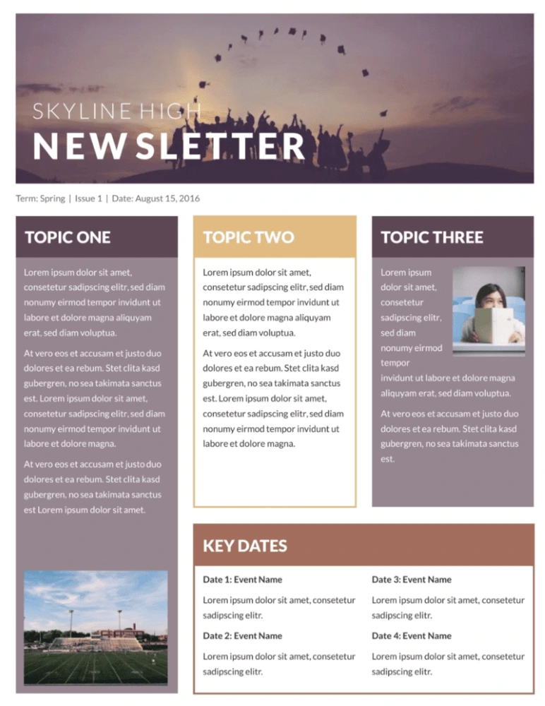
This classroom newsletter template stands out from the rest with muted colors, an inspiring header image, and lots of room to share your message. Whether you’re simply giving updates on what’s happening or sharing important news about conferences, exams or standardized testing, your message will come across loud and clear.
Blossoms school newsletter template
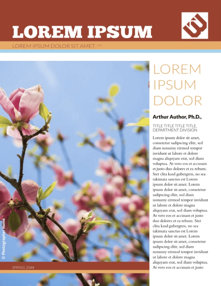
Flowers are perfect for school newsletters: they imply growth, potential, purpose, and they lend a positive, happy feeling to everything. Just add your school’s logo, the content of your newsletter and a few custom images, and you have a newsletter that parents will want to read.
Newsletters for business
City events newsletter template
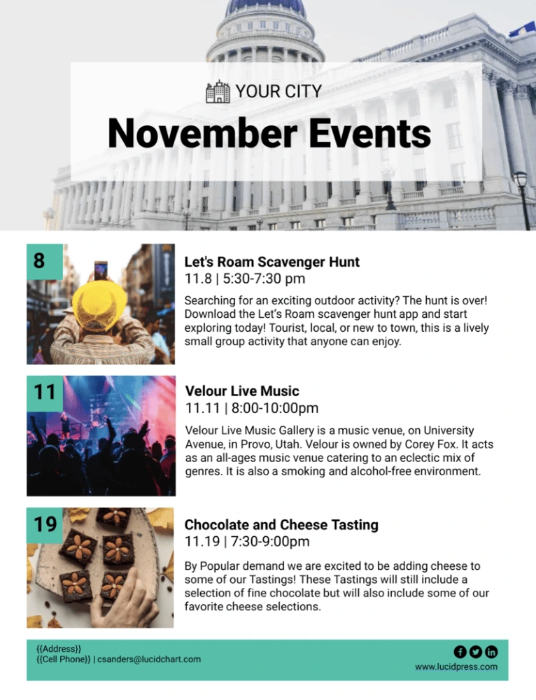
Keep your community apprised of upcoming events — both virtual or in-person — with the city events newsletter template. Insert photos from previous events (as well as your own city hall building or town committee) — or use stock images if you need to — and leverage the ample writing space to communicate with others about changes in local regulations, upcoming town halls and more.
Polaroid real estate newsletter template
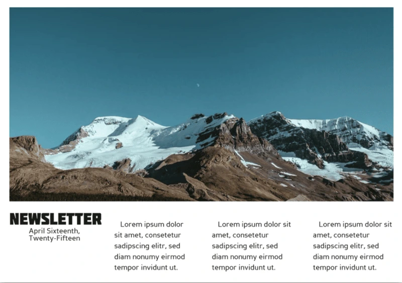
Real estate is all about pictures, and this newsletter template captures that feeling perfectly. The iconic rectangular format gives you tons of room to show off your best properties, and choosing a scrollable digital format allows for all the text you need to describe it. Optional blocks of color help your newsletter stand out from the rest, too.
Merge financial business newsletter template
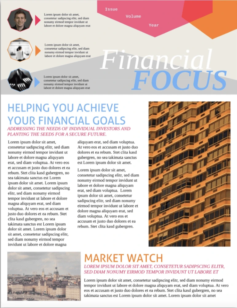
The time of boring business newsletters is over. Modern companies need to grab readers’ attention with bold colors, interesting shapes and arresting images. This financial business newsletter design has all of those ingredients in spades. The newspaper-style columns let you share different stories or ideas, and the header is great for recurring newsletters with featured authors.
Black Widow company newsletter template
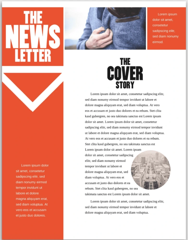
Company newsletters are often bright and airy or monochromatic and, well… boring. But this template finds a balance with bold red accents, striking blocks of black, and plenty of whitespace to make reading easy. Add images to spice things up a bit, and you have yourself a professional — but unique — newsletter template.
Citrus Splash employee newsletter template
Employee newsletters have a reputation for being rather boring—and that starts with the template. Don’t settle for bland colors and cheesy iconography! This template is full of bright colors that immediately set a positive tone for your newsletter. Whether you’re in a tropical climate or a temperate one, your employees’ days will be brightened by it.
Angles company newsletter template
There’s something dynamic about angles in bold colors—and this newsletter template takes full advantage. A combination of bright and calm tones adds even more energy to the template. If your company is pushing forward, the vitality in this template will fit it perfectly. Plenty of room for images and multiple text sections make it as useful as it is engaging.
Bold business newsletter template
Business newsletters are so often really boring, but with big attention-grabbing text, this template will help you grab your readers’ attention. It’s not all flash, though—there’s plenty of room for the headlines and text you need to share important information with customers, colleagues, shareholders, and anyone else interested in your business.
Corporate business newsletter template
We know that not every company wants lots of bright colors in their newsletter template. But that doesn’t mean it has to be boring. This template uses a cool, muted palette to maintain a professional look. The professional design, room for images, and well-laid-out pages ensure that your newsletter shares information effectively while maintaining the tone you’re looking for.
Holiday newsletters
Holiday Christmas newsletter template
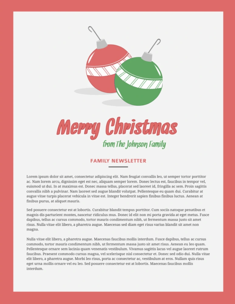
There are tons of Christmas newsletter designs out there, but most of them look the same: full of too many snowflakes, baubles and presents. They’re distracting and, frankly, a bit tacky. This Christmas newsletter keeps things simple with seasonal colors, clean layouts, and just a few ornaments.
Photo Christmas newsletter template
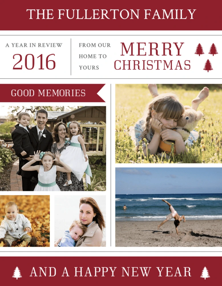
Spread some holiday cheer with the photo Christmas newsletter template. Just pop any of the year’s recent photo sessions (both impromptu and professional) into the layout, and be prepared to warm friends’ and families’ hearts from afar.
Digital and email newsletters
Restaurant email newsletter template
The restaurant email newsletter template is :chef’s kiss: — Highlight your restaurant and the staff that make everything possible with this easy-to-customize template. You can easily communicate any upcoming closures, events or changes in menu. Or you can simply give folks a mouth-watering reason to come back with a coupon or friendly reminder about your hours.
Conference email newsletter template
When it comes to attending conferences, attendees need you to get straight to the point — there’s no need for fancy, floral language or walls of text. Give the people what they need with the conference email newsletter template. The simplicity of this newsletter empowers you to cut to the chase, therefore keeping the agenda and end goals clear and concise.
Real estate email newsletter template
Need an easy way to keep clients, brokers and fellow agents up-to-date with the fast-moving market? Look no further than the real estate email newsletter template. Customize the images based on the MLS listing, along with any noteworthy callouts in the copy sections.
Data email newsletter template
Highlight important wins, transformations in ROI or dips in sales performance with the data email newsletter template. Whatever numerical information you need to present, this newsletter helps you compile the information in an orderly and easy-to-digest format. And if you need to send the newsletter out monthly, all you have to do is make a copy of the doc and you’re off to the races!
Business email newsletter template
Regardless of what arena or industry you’re in, keep your business top of mind with the business email newsletter template. Whether you’re looking to periodically update board members, customers or even fellow colleagues, this easy-to-customize newsletter template.
Terra Cotta digital newsletter template
Digital newsletter designs don’t have the same requirements as print ones—they can be more image-based, use different colors, even include scrolling effects. This template allows for a wide variety of designs, all of which capitalize on ample space for powerful images. Combined with clear text and the ability to add your own images and videos, you can share any information you want in a clear, visually appealing package.
Orbital digital newsletter template
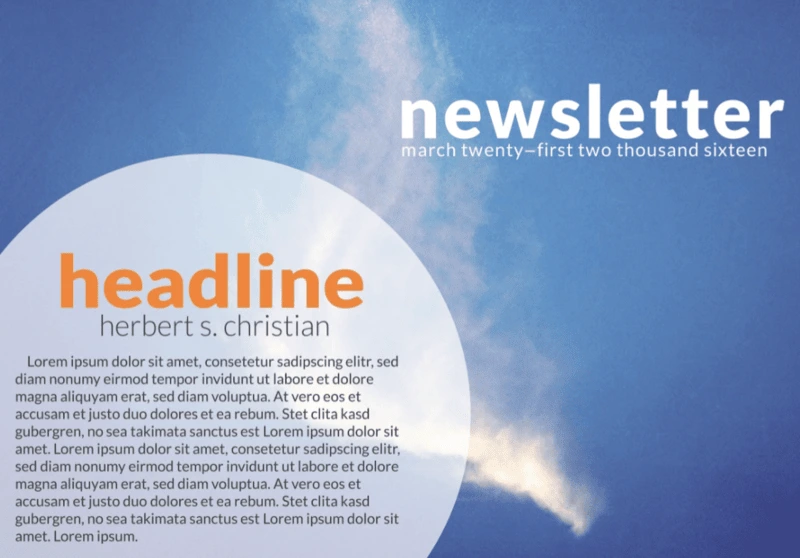
This template is all about creating the right feel with a big, powerful image. Whether you use one of our images or upload your own, you’ll be setting the tone for your entire newsletter. It could be inspirational, topical, or just an image that speaks to you. And because this digital template has room for scrolling text, you can include as much information as you want. That makes it one of the most flexible and versatile templates out there.
Textual e-newsletter template
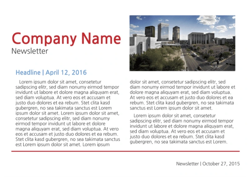
It’s easy to get carried away with images, photos, links, and other distracting things when you’re building an e-newsletter. It’s important to remember that your main goal is to share information in an easy-to-read manner. The clear fonts and white background of this template let you do that without over-complicating things. Sometimes simple really is better.
Be a memorable point of contact
A newsletter is an important point of contact. Whether you’re designing one for a school, a business, another type of organization, or just for your family and friends, you want it to reflect your message. These designs give you a wide variety of looks to do just that
So, what are you waiting for? Find a template that fits the feeling you’re going for, customize it in a few minutes with your own photos and colors, and get your message out there in style.
Ready to wow your audience with beautifully designed newsletters? Lucidpress will help you send the right message.
What is a research poster?
A scientific research poster (or conference poster) is a tool that researchers use to present information in a structured way.
It may be used instead of a talk and can often prove more effective, particularly in a situation where a researcher doesn’t feel confident presenting in front of large audiences.
Related: 18 cool and creative poster design ideas
One of the key advantages to using a scientific research poster is that it allows the researcher to interact with their audience in a one-on-one or small group setting. This gives the researcher plenty of opportunities to measure the reaction to their findings and listen to important feedback from their audience.
That audience might consist of colleagues within the same field, fellow scientists in a different field, or members of the public who have no background in conducting or analyzing scientific research. It’s crucial that the researcher tailors the information within their poster to suit the intended readers’ level of ability.
While a scientific research poster may be primarily used within a conference setting, where the researcher is on hand to elaborate and discuss their method and findings, the poster should also be able to stand alone. It might be left on display following the event, so it needs to include all the relevant information that a reader could be looking for.
What to include in your scientific research poster
To meet the expectations of your audience and provide them with thorough but concise insight into your work, your scientific research poster should include:
- A heading
- An introduction
- Your research method
- The results
- Your recommendations/conclusion
- Your name
- Your contact details
- Funding acknowledgements
- Institutional affiliation
You should also prepare:
- A short verbal explanation of your research
- Handouts that accompany the poster
Design tips for your scientific research poster
Now that you have a good understanding of what a scientific research poster is and what it should include, it’s time to look at how to design one that’s appealing and effective.
Your scientific research poster should be a simplified version of your full research paper. But, rather than just cutting and pasting sections of text from your paper, you should carefully consider how best to present the information in a visually appealing way.
Your poster should be attractive and attention-grabbing, but you also need to ensure that it’s easy to read and follow.
Try to focus on just two or three major points, and limit the word count. Leave plenty of white space, and use charts and visuals wherever possible.
Here are our top tips and tricks for designing an effective scientific research poster that stands out:
1. Catch their attention with a big headline
It’s important that you stand out among your rival researchers if you want to arouse interest in your work. To catch the attention of passers-by, use a large, bold font and leave plenty of white space around your heading. Choose a heading that highlights the most interesting aspect of your research.
2. Keep it simple with a plain background
When a document contains too much clutter, it can cause confusion and distract us from where we should be focusing our attention. Use dark type on a light, plain background, and your scientific research poster will be easy to read.

Here’s an example of a poster with dark text on a light background.
3. Use no more than three colors
Too many colors can wreak havoc on our eyes. The rule of three is simple to follow, and it produces stunning results. It’s simple: pick one key color, then pick two other complementary colors. As long as you don’t put three strong colors together, you can’t really go wrong.
4. Choose easy-to-read fonts
Fonts like Georgia, Helvetica, Open Sans and Verdana are all popular choices for print materials. Try running a test print of your poster and looking at it from a few steps away. If you can’t read the text, try a larger size or a simpler, bolder typeface.
5. Use small blocks of text
Your scientific research poster should tell an engaging story, but it’s essential that you keep it brief. Long rambling paragraphs and big clumps of data won’t make anyone happy, especially not when they’re standing in a crowded conference room. Use short sentences and paragraphs, and keep your text blocks small. If you need to, you can go into more detail in the handout and the short verbal explanation you prepare for the event.

Here’s an example of a poster with small blocks of text.
6. Add simple data displays and visuals
Any scientific research poster that’s worth its salt will contain photos, visuals and charts that present the data in an appealing way. Many of us are visual learners, and it is these details—the graphics—that will really help your reader understand and appreciate your work. Ensure all graphics are a high resolution and are captioned with a brief explanation.
Make it simple with Lucidpress
To get started designing your scientific research poster now, sign up for a free account with Lucidpress. Our drag-and-drop editor makes it simple for anyone to customize our free, professionally designed templates or create their very own design from scratch.
As if that wasn’t enough, our cloud-based storage makes collaborating easier than ever before. You can forget the hassle of sending PowerPoint, InDesign or Illustrator files back and forth—with Lucidpress, your team can make updates in real-time and you’ll each have access to the latest version at all times. Once you’re done, you can download your poster in print-ready files or order a glossy print version directly from Lucidpress.
You’ve already worked hard on your research. Let us simplify the design process.
Feeling inspired? You can design and order your brand new poster right here in Lucidpress.
Email marketing is a huge sales driver for e-commerce companies. Social media is also a great tool, but those sites measure their users in the millions while email providers measure theirs in the billions.
According to a study by The Radicati Group, there are approximately 3.8 billion email users worldwide. That’s more than the estimated 2.77 billion from all social media outlets combined, according to Statista in 2017.
Related: 11 things to consider before your next email campaign
Because so many considerations go into a good email marketing campaign, there are plenty of opportunities for things to go wrong. Fortunately, there are tools available that make the heady world of email marketing far less complicated. Here’s a round-up of our 8 favorites—and let’s start with the one closest to home.
1. Lucidpress
When you’re getting started with e-commerce, one of the hardest parts of email marketing is finding a template that works well. Unless you’re particularly artistic, it’s hard to envision a good format that’s both practical and visually appealing. That’s where Lucidpress comes in with a line of free newsletter templates.
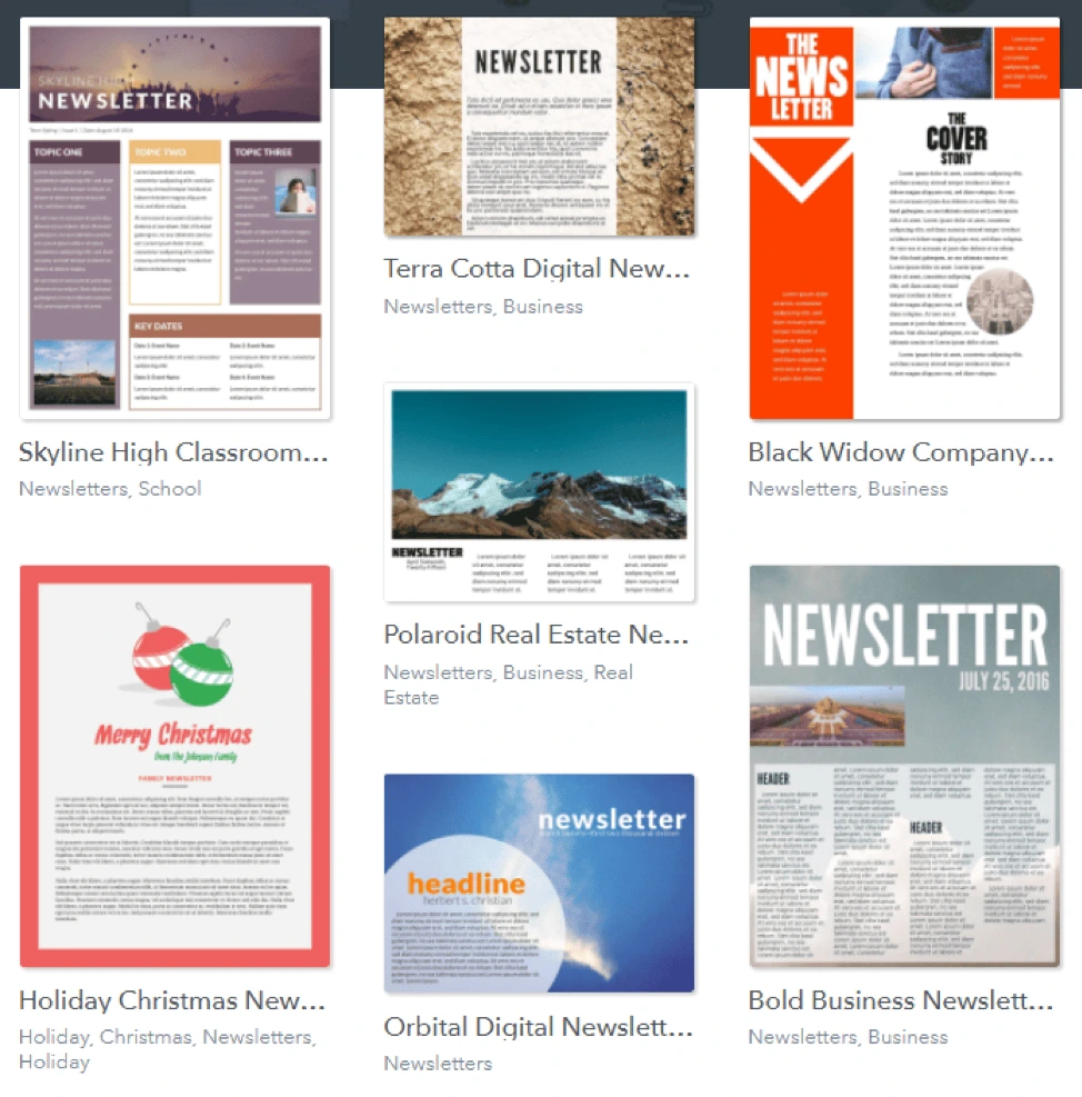
Not only does Lucidpress provide plenty of newsletter ideas for your inspiration, but it takes very little time to get started. Its drag-and-drop design platform is dead easy to use, and you have a variety of options for sharing your newsletter: downloading it, embedding it, or generating its HTML code. And because it’s free, new e-commerce companies can save the time it would take to come up with their own style—and the money they might have spent for the same service.
2. Constant Contact
Constant Contact effectively organizes and personalizes the emails you send out to customers. If you look at their website, you’ll see examples of email messages for welcomes, birthdays and membership anniversaries.
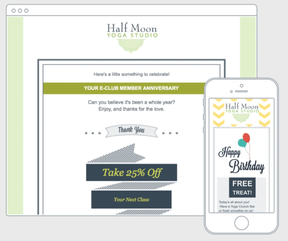
You can track the success of your emails in real time, seeing just how many people are clicking through your links and taking action because of your email.
3. The Hemingway App
Having the right format, fonts and style is crucial to a good email campaign, but in the scramble to get all that right, it’s easy to overlook the actual words that will be in the email. The Hemingway App is there to make sure your writing is concise and easy to understand.
Being clear and concise is not always easy. As a brand marketer, you know your products in and out, including niche vocabulary. And while some customers will appreciate the jargon, others won’t. Instead, they’ll be confused or disengaged when reading your emails. Hemingway helps you write email copy that anyone will easily understand.
4. MailChimp
MailChimp bills itself as the “world’s largest marketing automation platform.” Using it, you can mix and match different aspects to essentially create your own email templates.
It has more than just templates, though. There are also automation tools that the service uses to “welcome, re-engage and follow up” with customers. Having said that, it’s a fierce competitor to Constant Contact, so you’ll have to compare them both to decide if one is right for you.
5. AWeber
Alongside automated emails and responses, AWeber has a feature that triggers certain emails based on which links subscribers click on. Generally, you’ll trigger emails for everyone, but for some, when they look into the promotions you send out, AWeber can help you automate follow-ups.
Like many others, personalization is a big priority on this email marketing platform. Putting in people’s actual names (instead of something generic like “Valued Customer”) and tweaking emails to reflect personal preferences are the little extra touches that make these tools worth the money.
6. GetResponse
Automation is a huge time-saver, and that’s where GetResponse puts its focus. To them, automation isn’t just about sending mass emails. There’s a whole world of communication built on how to respond to emails and when to send them.
Every customer is different, and people are more likely to engage with emails at different times. GetResponse can track these things for each person and send them emails at the best time for them.

One of the keys to effective marketing is knowing your audience. It’s little details like these that can make a small but notable difference in how well your email campaigns do. If they don’t seem to be working, a simple tweak in timing might make the difference.
7. Answer the Public
This is a unique tool that can help you generate newsletter ideas surrounding your product. Basically, what this website does is show you the kind of questions people ask search engines.
For instance, I typed in “boots” and got this:
Answer the Public gives you the most popular questions about a topic—things your potential customers might be curious about. One way to use this information is to craft email subject lines that allude to one of these questions, then answer the question inside. This will make them far more likely to click on links and engage with your emails.
8. Litmus
Besides the common email automation features, Litmus offers spam testing. Getting your email caught in a spam filter essentially wastes all the time and effort you spent getting customers to sign up and subscribe, as well as the time and money spent crafting the email itself.
Litmus’ spam testing goes through your email and checks for anything that will trigger spam filters, so your email is ready to send out—as seen in this preview on their website.
Don’t let your emails get caught on the wrong side of the spam filter. People aren’t going to search through their spam folder to find your newsletters; they’ll likely forget they even subscribed to your content.
Key takeaway
We hope these tools give you guidance on how to effortlessly navigate through the world of email marketing. Email is essential for marketing consistency and commitment, which are some of the most important principles of persuasion marketing.
Ready to wow your audience with beautifully designed newsletters? Lucidpress will help you send the right message.
As you’re building your brand with new ideas and projects, you might not always have access to an in-house designer to assist with all your creative needs. Leaving you, someone with less creative experience, to face the perils of graphic design alone.
Okay, okay, it’s not (usually) that dramatic.
Related: 3 design tips to make your flyers stand out
But to those of us who aren’t used to creating aesthetically pleasing or practical designs, creating a line of marketing labels or flyers can be a daunting task.
These 5 design tips go out to the non-creatives of the world. You, too, can make beautifully branded designs if you start with this advice.
1. Seek & gather inspiration

Source: Etsy shop banner template
One critical element of good design is starting with a strong idea of what you want to create. But without much creative experience, you might be at a loss for where to begin.
Start by visiting some of your favorite brands’ websites or artists’ portfolios and look for designs that stand out to you. Save a few examples that catch your attention (in the creative biz, we call this a “swipe file”). Try to gather different styles to begin learning how to differentiate between them.
Once you’ve gathered a good number of examples, open that folder up and review your selections. Pay special attention to the following aspects of design:
- The color palette
- The fonts used
- The placement of various elements
You’ll begin to see that all design can be broken down into a number of basic elements. As you start to build your own designs, focus on these elements one at a time to create a cohesive finished product.
2. Use negative space correctly

Source: Large promotional banner template
Have you heard of negative space?
Negative space is the area of a design where things are simply left blank or unfilled. Not every inch of the flyer or booklet you’re making needs to be covered with visuals—and in fact, that makes the design look too busy.
Instead, use negative space to your advantage. By leaving certain areas blank, you ensure the eye will be drawn to the most important information.
There are a few easy-to-identify areas where you can intentionally make unique shapes or words within negative space:
- Between letters of the alphabet (like the Fedex logo)
- Within letters of the alphabet (like this logo for Shift)
- Writing a word with negative space on top of an image or logo
- Using a negative space logo on top of a colored section
Using negative space can be tricky but effective. Why? Because our minds search for messages in everything, even in blank space. By using negative space deliberately, you’ll stimulate the viewer’s mind and capture their interest.
3. Limit your fonts
Source: Block party flyer template
When beginners get into design, they’re likely to be amazed and overwhelmed by the sheer number of fonts available. From pre-programmed fonts to free-use fonts that can be found online, there are literally thousands of options… and that can lead to some design disasters.
Beginners and non-creatives have been known to use five, six, or even more fonts within a single project. While it can be fun to choose these fonts, the end result will usually be messy.
Follow these guidelines to keep the fonts clean and classy:
- Limit font types to 2 or 3 typefaces per project.
- Try to choose typefaces within similar font families for smooth transitions.
- Don’t change fonts in the middle of a piece of text.
- Make important information the largest and most eye-catching.
4. Consider your color palette
Source: Contempo modern brochure template
Choosing the right color scheme is an essential part of design. Colors have strong psychological effects on the viewer, so you want to be sure that your colors send the right message and match your brand palette.
Think about common color associations that people’s minds make:
- Red: energy, boldness, love, excitement
- Pink: romance, soft, appreciation
- Orange: warm, young, enthusiastic
- Brown: rugged, simple, serious
- Yellow: happy, warm, friendly
- Green: healing, safety, growth
- Blue: dependable, trustworthy, loyal, calm
- Purple: luxury, mystery, sophistication
- Black: elegance, distinction, tradition
Now that you see the reactions different colors can evoke, let’s see how you can inspire those feelings with your color palette.
- Create a mood board of photos that represent your brand’s personality. Once you have a large collection, find six colors that appear regularly in those photos.
- Try out different tones, shades and variations of these colors until you find a balance between them.
- Check out pre-existing color palettes to see if any of them line up with your colors.
There are more concepts that can help you finalize your color palette—such as monochromatic, analogous and complementary—but most non-creatives probably won’t need to get into the weeds quite this much.
Instead, it’s time to move forward with what you’ve already created.
If you’re using a design template, you have access to a range of color options. These pre-selected color palettes are well-balanced and specially created for those designs, so copying them can make your project simpler. You can also choose a color scheme that matches previous in-house designs.
5. Creatively challenged? Don’t worry
Source: Cosmopolitan business poster template
Even with these design tips, those of us who are creatively challenged may still struggle to create a design we feel confident in.
And that’s okay! There are ways to keep it simple and still create a great design.
Lucidpress offers hundreds of templates for various types of marketing materials, and they already include font selections, color palettes, and all of the design aspects covered above without you having to think about it. Better yet, each of these elements is customizable, so you can quickly and easily adjust templates to match your ideas.
Want to browse our free template gallery? Lucidpress has over 1000 professionally designed templates for business, education, personal projects & more.
In some ways, starting a magazine today is easier than ever. But in others, it can be more difficult. All of this is due to the internet. The web puts free information at everyone’s fingertips, instantly available through mobile devices, which has transformed the magazine industry. It also gives every person online the opportunity to create high quality content and express themselves to a wide audience.
Related: 5 ways to monetize your online magazine
In this beginner’s guide, we will discuss how to start a magazine online. The guide is broken into three stages, outlining the work that happens before, during and after production. The first stage is brainstorming, followed by creation and collaboration, and finally, distribution. There’s a lot to cover (no pun intended), so let’s dive in.
Ready to start producing your magazine? Dive in right here with Lucidpress’s free online magazine maker.
Before production: Brainstorming
1. Develop your business plan
Before writing a single word for your magazine, sit down to develop a business plan. This includes your mission (the reason why your magazine should exist), your goals, and how to attain them.
Important questions to consider in your plan:
- What is the concept or focus of your magazine? This should be brief and concise, like an elevator pitch. For example, take a look at this copy from TIME magazine’s “About” page:
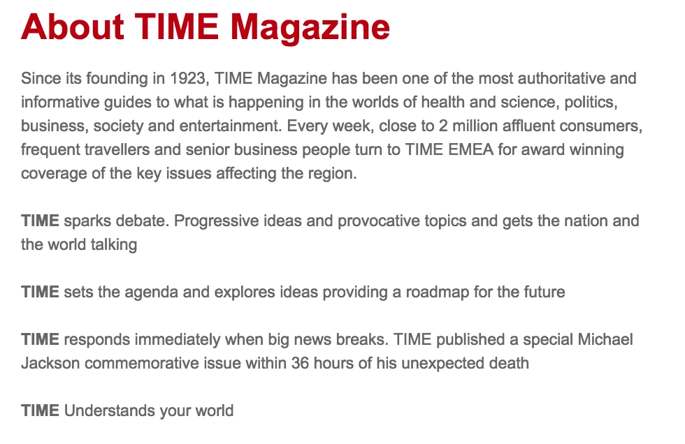
- Which topics will you cover, and in what depth? Consider your tone & voice—there is a big difference between The New Yorker and OK! Magazine, and you should be consistent.
- Who is the primary audience? Remember, your magazine should speak to others, not just yourself. It’s also important that your audience has a “continuing need” for your content, so they’ll want to subscribe and read more. Think about your audience’s lifestyle, and cater to the issues and ideas they care about.
- How will the first issue be funded? Many magazines earn profit by selling advertising, but it can be hard to attract advertisers at first. Some suggest using personal capital to fund the first issue—raised by saving money, seeking investments, or leveraging the power of crowdfunding.
2. Research the landscape
There are lots of magazines out there already, both digital and in print. Now is the time for you to spend some time at the newsstand (or in your reading app of choice) to evaluate the competition. This will give you a better idea of what’s already being covered and how you can differentiate your publication. It can also reveal gaps and opportunities that are currently not being met in the market, which you can use to your advantage as you develop your magazine concept.
3. Build your team
A magazine is a heady endeavor, one that you shouldn’t undertake alone. Build your team and divide your workload in order to prevent burnout and deliver faster, better results. Your magazine will be stronger for it. Here are a few staff roles you might want to consider.
- Writers — Magazines are driven by great content, so of course you’ll need great writers to make it work. Maybe you keep it in-house with a few trusted authors, or maybe you reach out to freelancers to submit pitches. Either way, be clear with writers about your editorial expectations and whether you’re offering any compensation for their work.
- Editor — At the end of the line, there should be one pair of eyes to give each piece of content the final yay or nay. The head editor ensures consistency and quality by reinforcing your editorial standards. This includes tone of voice, grammar, mechanics, and even the reach and scope of each article. When you have a strong editor at the helm, the finished magazine will be polished and cohesive.
- Sales manager — If your magazine will feature advertisements, a sales manager is indispensable. This person will serve as the point-of-contact for advertisers who will pay for space in your magazine. Having one person available to address their questions and concerns will help you build a better relationship with them, which in turn will lead to higher, more sustainable profits.
- Marketing manager — Your magazine needs advertising, too! A marketing manager will work to get attention for your magazine, making sure it’s present in all the right places. For example…If you’re launching a magazine in print, you’ll need distributors in bookstores, newsstands, and other public places. If you’re launching online, there are many channels for you to explore, from search engine ads to social media. Part of this person’s responsibilities will be deciding which distributors and channels are best for your magazine, and then creating materials (press kits, promotional content, etc.) to support them.
- Publication manager — Here is someone who gets down to the nitty-gritty of publication. This person will help you choose a printing partner who meets your needs, both in terms of quality and budget. What will the paper cost? How do the colors look? Are there any errors in the finished product? A publication manager will focus on these seemingly minor details that, in reality, make a huge difference.
- Partnerships / groups — These are helpful connections who aren’t necessarily part of your team, but can steer you in the right direction. Partnering with relevant brands can bring more exposure to your magazine, as they share their audience with you. Certain groups made up of local or indie magazines exist to share advice and opportunities with one another, harnessing power in numbers. Take a look around in your community and introduce yourself.
During production: Creation & collaboration
Now it’s time to start creating content and collaborating with your team. This can be a very hectic time, but it’s where the magic happens. If you’re inspired to publish your own magazine, you’re likely familiar with the following steps—but let’s review them anyway.
4. Writing
Finally, time to create articles for your magazine. Depending on its concept, this might mean a few different things: fiction or non-fiction, short stories, journalistic articles, how-to guides, reviews, or even a blend of all of the above. This step encompasses the writing process, from conception to pitch, and from researching to drafting.
5. Editing
It’s not uncommon for articles to undergo more than one round of revisions. Far more than just catching style and grammar mistakes, editing will help the writer focus and elevate their writing. Editors can help with fact-checking as well. Together, writers and editors cooperate to make an article the best it can be.
6. Proofreading
After an article has been written and edited, careful proofreading is required to ensure quality and accuracy. Any typos or errors that made their way through the writing process will be squashed here. Unlike editing, proofreading is not an evaluation of the article’s style, tone, organization or effectiveness. The focus is solely on finding and eliminating errors, so the finished product reads professionally. The person who proofreads might very well be the editor too, but these are still two separate stages of production.
7. Graphic design
The way we enjoy magazines is different from how we consume a book or a newspaper. Although each of these publications provides information, magazines in particular are known for being visual. From elegantly gorgeous to colorfully flashy, magazine design runs the gamut. Your graphic designer is just as responsible for your magazine’s tone and feel as your writers are—if not more so. It’s important for your graphics to match your words. Remember, magazines are less about the information and more about the lifestyle. Browse these magazine design templates for some inspiration.
8. Photography
Stock photos are okay here and there, but they’re no substitute for custom photography. Rather than searching for pictures to match your vision (and often, settling for less), a photographer can work with you to capture the pictures you really want. Color, lighting, subject, quality… All of these photo elements contribute to the reader’s perception of your brand. After all, that’s why they say a picture is worth a thousand words. (Or, at least, it’s why we say it.)
9. Make a prototype
Just like with any product, you can’t mass produce until you have a definitive, finalized version. All of the content, words and images are firmly locked into place with no errors or further changes. Holding your first finished prototype (whether in your hand or on a tablet) is a proud moment. Savor it! You’ve put in a lot of work to get here, and there’s still work to be done. You are now ready to start sharing your magazine with the world.
10. Digitize
You probably created your magazine using computer design software, but that doesn’t mean your file is ready to distribute. Different publishers and reading apps have their own standards in terms of file type, size, quality and so on. Make sure you’ve researched and complied with those standards in order to prevent delays.
After production: Distribution
11. Find a printer
Your printing partner is a critical ally on your way to distribution. If you’re only hosting your magazine online, well, you’re off the hook on this one. But if you intend to share hard copies of your magazine locally, regionally, or even nationally… you need a printer you can trust to deliver satisfactory results every time. Do your research, ask around, and interview printing partners until you feel confident that your pick is a good match.
12. Establish your online presence
Perhaps more than any other step, this is paramount to launching a successful online magazine. Your online presence can take many forms, from a website to a blog to social media channels, and maybe even all of the above. What’s important here is building a community of people hungry for your content. People who share the lifestyle and values of your magazine, so they’ll appreciate its message. Find out where those people are online, and make sure they can find you.
13. Decide whether to paywall
This is a tricky question in today’s publishing world. If you paywall all of your content, it might be hard to attract new readers. But, you can’t give it all away for free, either. Striking the right balance between paid and free content might look different for every publication, so experiment to see what works for you. A good place to start is sharing free content and article excerpts on your blog but charging a flat price or subscription for each magazine issue.
14. Build a community around content
Your readers can (and should be) be your best brand advocates. When you foster a strong community on your blog, forum, or social media pages, it gives readers a shared sense of belonging. Discussions are far more interesting when readers get involved, and they can provide you with inspiration and direction. Think about how you can use various types of content to delight your audience. Beyond the pages of your magazine, there are many opportunities. For example, you could start a branded YouTube channel to share vlogs and other video content.
15. Congratulations!
After months of work, you have started an online magazine, and you’re on the track to sustainable growth and success. Once you get to this point, there’s only one thing to do… Get started on the next issue.
Ready to begin?
Want to start your own magazine online? Lucidpress will streamline the design process for your whole team. With our intuitive drag-and-drop interface, you can select from gorgeous templates and customize with fonts, colors, shapes, images and more. Invite others to collaborate in real time, and when you’re done, export in a variety of print-ready formats.
Inspired to create your own digital magazine? These free magazine templates are a great starting point.
If it seems like new Starbucks locations are popping up faster than weeds in your backyard, there’s a sound reason behind it. Successful franchises rapidly expand their reach because they begin with an effective business plan and focus on growth.
Related: Franchise development—what you need to know
Creating a business plan is the necessary first step for any business owners who want to bring a franchise into a new market. Well-crafted franchise business plans are the equivalent of an elevator pitch. Business owners can use them to convince others to invest the capital they need to hit the ground running. Lenders also require a business plan before they will sign off on any loans to a prospective franchise owner.
Creating your franchise business plan
A typical business plan includes four main sections. You can touch on these sections in an executive summary, then break down the details in each individual section. Each section functions like a signpost on the roadmap you’re drawing for your new business to reach its goals. Here’s an overview of those four sections and what they should include.
Business description
The purpose for this section is basically self-explanatory. It offers basic and essential information on the franchise itself. For example, it describes the products and services your business offers. You can also identify your customers and how your business will help them.
You should evaluate the market where you wish to set up shop and include information about it in this section. This includes an analysis of your direct competitors, identifiable challenges or risks that come with doing business in that market, and a breakdown of your target demographic. Discuss how you will approach and manage each of these factors within your business operations.
Management
Your business plan needs to detail your company’s management structure and any related core values or philosophies. Which positions will be responsible for managing day-to-day operations? Who will fill these positions? What qualifications and skills are required for each position? How will you hire and train the necessary personnel? What salaries and benefits will you offer to these employees?
Discuss the individuals who will be filling management and leadership roles on your team. Explain—in depth—what makes those particular individuals qualified to succeed in those roles. Franchising is only as successful as the management team doing the work behind the scenes, and the people reading your business plan will look over this section carefully.
Marketing
A new business can only succeed if it uses the right formula to reach potential customers and turn them into real customers. This is where your marketing plan comes into play. Your business plan should detail how you will reach customers and convince them to walk through your door.
Doing thorough market analysis is critical in this part of your overall planning. You need to identify your customers, assess their needs, and determine how your business will fulfill those needs. How will this data shape your pricing? What is your potential market share? Outline how you will market your business to reach that target demographic.
Financial projections
It takes a significant investment of capital to get any business off the ground, and franchises are no exception. Investors and lenders will be most concerned about turning a profit. They don’t want to sink funding into a business that will end up folding like a paper airplane at the first sign of trouble.
Your plan should outline a realistic budget that includes both startup costs and operating costs. These financial projections should cover your cash-on-hand, franchise purchasing fees, startup costs and operational costs. The budget should cover operational costs over a three- to six-month period.
Discuss how much capital you’ll need to cover these costs until your business turns a profit. You also need to demonstrate the accounting and inventory control systems your franchise will use. Include income statements, cash flow projections, and data sheets to project how your business will do once it opens its doors. Financial projections should be conservative and take into account as many variables as possible.
Getting to work
There are many great resources available to help you structure your business plan so that it conveys the message you intend with confidence. Franchise business plan templates can help you see what works best and how to put your vision into the right words. You can pick from assorted stock images, fonts, colors and other design elements to make it visually appealing and reflect your franchise’s brand voice.
If you’re not a professional designer, Lucidpress can help you start out on the right foot. We offer plenty of templates suited to meet your business document needs. Our intuitive online editor makes it easy to design traditional printed documents or embrace the virtual realm with interactive digital documents. Check out our template gallery for a dose of inspiration, then sign up for a free Lucidpress account to take one for a test drive.
Your brand matters. If you’re ready to build your franchise brand into a consistent, compelling force that drives your business, this guide will show you how to get started.
Despite the prominence of digital marketing, print collateral still has an important role to play in a balanced marketing strategy. A professionally produced brochure suggests a high budget and an established reputation.
Related: How to make a stunning travel brochure
Not only that, but brochures are versatile marketing tools. You can distribute them at trade shows, put them in brochure racks, send them via direct mail, and even publish them on your company website.
(They’re also very portable. Many people would prefer to grab a brochure and read it at their convenience rather than engage with a salesperson.)
Most brochures are just a few hundred words in length, so you don’t have a lot of space to get your message across. It’s important to make every word count. Here are eight tips for writing a brochure that signals professionalism and competence — and spurs your readers to action.
1. ) Create an outline or plan of attack
Brochures vary in content and length, but most follow a standard format.
- The front panel displays the company logo and headline.
- The inner panels make a case for the product/service using supporting facts and details.
- The final panel contains contact info and a call-to-action.
Please note: At the end of this post, we’ve included a cheat sheet of content types you can put in your inner panels.
Before you start writing, identify your target persona for the brochure including age, gender, location, role, income, interests and challenges.
This information will guide the tone, language and content of your brochure. It’ll also help you choose a call-to-action that appeals to your readers. For instance, an offer for a free white paper would likely be of interest to an executive, whereas a mobile app download would be more fitting for a college student.
Make note of where your target audience is in the buying cycle. Don’t waste space going on about the history of your organization if your readers have done business with you before.
Also consider the level of understanding your prospects already have about the topic. Are they experts, novices or somewhere in between? Keeping this in mind will help you avoid alienating readers by talking down to them or confusing them.
2.) Write a compelling headline
Your headline will determine whether a prospect picks up and reads your brochure or tosses it aside.
Avoid using headlines that don’t tell the reader anything about the contents of the brochure — for example, “Make a Good Impression.” What does this mean, who are you making a good impression on? And for what purpose?
You can provoke a reader’s curiosity without being vague. These example headlines spark interest while also telling readers exactly what they’ll get from reading the brochure:
- Scared of the Dentist? Learn How Sedation Dentistry Can Help
- The Ultimate College Prep Checklist: A Four-Year Plan for High School Freshmen
- 4 Reasons to Think Again Before Buying a Foreclosed Home
Don’t be afraid to use “power” words like free, quick, easy, results, exclusive, proven, etc. What they lack in originality, they make up for ineffectiveness.
3.) Be concise and use plain language
Your brochure should focus on one product or service. A trifold brochure only has space for about 350-450 words, so keep words, sentences and paragraphs short. Edit ruthlessly and include only the most relevant information, leaving room for white space and images.
Big walls of unbroken text look intimidating to readers, so use subheads liberally. Try not to put more than a couple of paragraphs in a row without introducing something else to break up the monotony, such as a subhead, bullet-point list or image.
With the help of Lucidpress’s online drag-and-drop editor, you can quickly design a professional-looking brochure with elements like callouts, pull quotes and tables.
4.) Limit the copy to 1-2 typefaces
The typefaces you choose should be easy to read and consistent with your branding. Often, if the subhead copy is in a serif face, the body copy will use a sans-serif face, and vice versa. There are some great free tools available to help you select a complementary font pairing.
Select font size, spacing and color with readability in mind so your prospects don’t have to work to read the brochure.
5.) Give readers a reason to keep your brochure
If you can, include a handy reference of some kind in your brochure to dissuade readers from throwing it away—for example:
- a map of a town marked with top attractions
- a “normal body weight” chart based on the reader’s height
- a list of program-specific student scholarships
- a cheat sheet for first-time homebuyers in a specific city
Also, consider printing the brochure on a high-quality glossy paper to boost its perceived value.
6. Include next steps or a call-to-action
The goal of your sales brochure should be to persuade your readers to take a specific action.
This call-to-action is usually placed on the last panel of the brochure, along with the contact info. To boost response rates, offer an incentive, such as a promo code or free product.
The following are some example actions you might want your readers to take:
- Sign up to your email list for a free white paper
- Visit your website to make a purchase or sign up for a program
- Call to book a free consultation
- Scan a QR code to download an app
- Enter for a chance to win
- Visit your store for an upcoming sale
7.) Proofread your brochure
No matter how much effort you put into your messaging and design, errors and inconsistencies in your printed literature can kill your credibility.
Verify that the tone of your brochure matches the rest of your brand messaging. Unlike informational brochures (which may take the third-person point-of-view), sales brochures usually use the second-person to build rapport with the reader.
Refer to your brand style guide for how to handle things like numerals, dates and titles in the text. If you don’t have a brand style guide, use an established style reference like AP Stylebook. And of course, look everything over for correct spelling, punctuation and grammar.
8.) Double-check for important details
Before the brochure goes to print, check that your logo and contact information are present and error-free. Also look for details you may have forgotten to include, such as:
- Purchasing info—how to place an order, accepted payment types, guarantees, warranties, refunds, shipping, etc.
- Visitor info—accessibility for people with disabilities, hours of operation, seasonal times, admission rates, group sizes, pets, directions, etc.
- Legal info—copyrights, trademarks, registration marks, disclaimers, etc.
You can also create branded templates for your brochures so you don’t miss anything important when you start a new project — Lucidpress handles printing as well.
Bonus: What should I put in my brochure?
For inspiration, here’s a cheat sheet of content types often found in sales brochures:
- Descriptions of products, services, exhibits or attractions
- Features and benefits
- Product specs
- Pricing charts
- Pros and cons
- Itinerary (e.g. winery tours)
- Narrative (e.g. history of a winery)
- How a product works
- How a service is delivered
- How to do something
- Checklists and questionnaires
- Images, illustrations, charts, graphs and maps
- Frequently asked questions
- Company blurb
- Social proof: case studies, testimonials or media quotes, client list, executive bios, etc.
Experiment with a few of these items and see where it takes you. You might be surprised at how quickly you run out of space!
What are you waiting for? Try your hand at design with any of our design templates.
Everybody loves a good poster. From colorful movie posters to out-of-the-box wood cut prints and more, there’s something about this versatile medium that always grabs our attention. Still, creating a memorable design can be challenging. Unlike a magazine or flyer, you’ve got much less wiggle room to include information, and your graphic elements need to immediately capture someone’s eye. With the right understanding of design principles though, designing an incredible poster for your brand or business can be a breeze.
Working on your own graphic design poster? Take a look through this quick guide to explore our top tips and advice on designing a fluid, unified, and memorable poster.
6 essential elements of graphic design posters
Typography
One of the most important but often overlooked aspects of poster design is font usage. Whether loose and flowy or strict and rigid, your choice of font can go a long way in relaying your poster’s message.
While it may be tempting to pick multiple creative fonts, ideally, you want to choose two or three total fonts for your design. Fonts used for titles should be a display typeface (either creative or sans serif fonts), while fonts used for text should be serif fonts because they are designed for readability. Your chosen fonts should be different enough to be easily distinguishable from one another, but also similar enough to convey a unified design.
We like how this graphic design poster incorporates two main fonts – one to immediately grab your attention, and one to convey more detailed information.
Balanced
The second element of graphic poster design to consider is balance. Balance in graphic design is exactly what it sounds like – how unified and cohesive something looks. When designs are unbalanced, they feel off, and can be uncomfortable or confusing for your audience.
In general, there are two different ways to create balance: through symmetry and asymmetry.
Symmetric layouts
In a symmetrically balanced layout, similar design elements are aligned in an equal way on either side of the vertical axis. This often results in a mirror-image effect, making it a great layout for a formal or static look. If you’re designing graphic posters for formal events, art gallery viewings, or informative gatherings, a symmetrical approach might be just right.
Asymmetric layouts
In an asymmetric layout, balance is achieved with an unequal arrangement of elements. Often, with the asymmetric layout, there could be a large object on one side balanced by a small object on the opposite side.
In general, these designs are more difficult and complex because the visual weight of each element and its arrangement need to be carefully considered. Asymmetric designs appear more casual than symmetric layouts and create excellent posters for rock concerts, museums and personal services.
Below are three excellent examples of asymmetrically balanced graphic design posters.
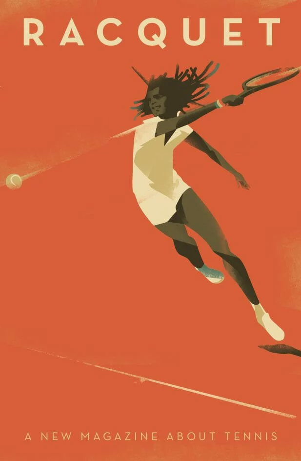
Color
Color is incredibly powerful, not only in conveying meaning but creating a cohesive look and feel to your graphic design poster. No matter who your audience is, color can be universally appreciated and used to communicate a variety of things. Learn more about color theory and color meanings here. When deciding which colors to use, consider how they will look together. Harmonious color schemes are based on balance, and can help tie your poster together. Below are a few different types of harmonious color palettes:
- Monochromatic palettes are limited to tints and shades of a single color
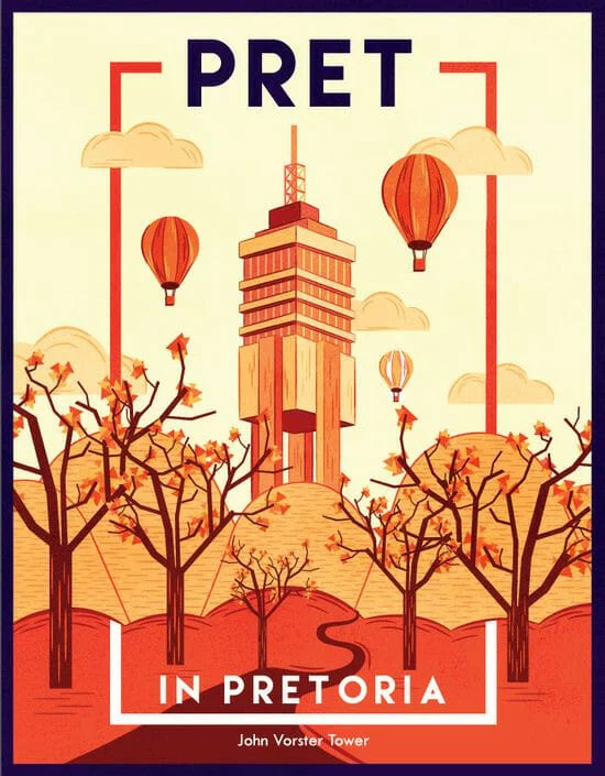
- Complementary colors color palettes include colors that are opposite to each other on the color wheel, such as red and green, or blue and orange. These color pairings can often look intense or bold.
- Split complementary colors occur when hues in a color scheme are equidistant from one another on the color wheel. For example, green, red-orange, and red-purple.
- Analogous color combinations
Contrast
Like balance, contrast is an essential element in creating a memorable, easy-to-look at poster. To create contrast, place two elements in opposing ways. This helps draw the eye and create a focal point within your design.
The elements you can use to create contrast include shapes, colors, lines, size and negative space. In the image below, you can see how the juxtaposition of distinct colors makes certain elements stand out.
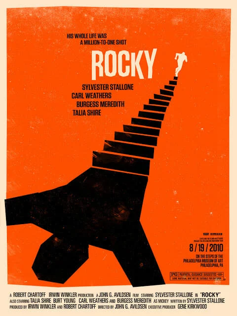
Poster design hierarchy
In addition to contrast, utilizing visual hierarchy in your poster design can also create a focal point. Visual hierarchy is the arrangement or presentation of elements in a way that implies importance. Put simply, it provides an intuitive direction for your eyes to move from most important information to least important information.
Here are a couple of ways to create hierarchy in your design:
- Alignment
- Size and scale
- Color and contrast
- Leading lines
- Negative space
- Repetition
- Proximity
Here’s a great example of a poster using the size, scale, and color/contrast of its typography to create a sense of visual hierarchy.
Shapes in poster design
A seemingly basic element, shapes have the power to help create a path for your eyes to follow as they scan a poster. When used intentionally, shapes can also give emphasis to the most important information in the poster. For example, designers often place text in front of squares or rectangles to draw attention.
Shapes can also alter the mood of your design. Softer shapes with curves, circles and organic lines can create a more fluid and relaxed mood.
Take the easy, breezy, flowing lines of this St. Tropez poster, for example:
Triangles, squares and other geometric shapes with sharp edges, on the other hand, are often associated with more serious, elevated, or masculine ideas.
5 graphic design poster templates to help inspire you
University poster template
With a bold color palette and a clear place for your call-to-action, this poster template makes a great choice for universities and educational centers. Just swap out your logo and choose a picture that best represents your school.
Duo campaign poster
Great for speaking engagements, local government, or other events, this template makes it easy to grab attention quickly with its asymmetric design.
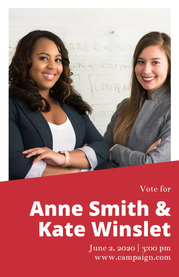
Nature retreat poster
Inspired by the layout of print magazine covers, this informal, slightly whimsical poster template is super versatile – especially when it comes to drumming up hype for events.

Into the unknown movie poster
Sometimes the best way to make an impact isn’t through your messaging. If you’ve got a beautiful piece of art or photography you want to showcase, this is the poster template for you.
Cobalt café e-poster
Great for highlighting visual businesses like restaurants and real estate, this balanced poster template makes it easy to highlight your unique brand imagery and provide detailed information for readers.

Ready to design your own poster? Explore our full free template library here.
We’ve all heard “Don’t judge a book by its cover,” but I suspect we’ve all been guilty of it at some point.
A quality book cover design is your chance to make a positive first impression. Although first impressions aren’t everything, a bad one is hard to overcome. You could string together some of the most impactful and moving words ever combined in history only to see them fade away because the book cover looks like amateur hour.
Related: Why brand quality counts — Judging a book by its cover
The book industry is growing more competitive and more digital. Ebooks now make up 30% of all book sales.
Instead of taking several minutes to find a good book by casually strolling through the library perusing book titles, readers now scroll through the internet’s webpages in seconds. With vats of information competing for everyone’s attention, visual clues can help viewers identify superior content.
As we go over these 10 ideas to design the best book cover, feel free to jot down a few of your own observations to inspire your own design.
1. Set the tone with your design
Source: TIME
The verdant design of The Giving Tree by Shel Silverstein reflects the simplicity of a children’s book and depicts the dependent nature of a child. Instantly, you understand the themes explored in the book and feel an emotional connection with both characters.
Source: Behance
“Little Spines,” an anthology of creative writing by students at RMIT University, uses the image of a single tree in two different seasons to depict a story of change — revealing the poetic theme of the book.
2. Speak to your audience’s emotions
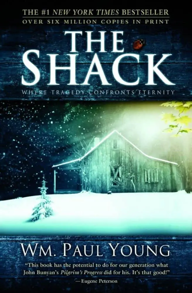
Source: WTTW
The Shack by William Paul Young is a good example of using design to appeal to one’s emotions. The conflicts of sorrow and hope, fear and faith are illustrated in the sunshine cutting through the snow and darkness.
3. Create a focal point
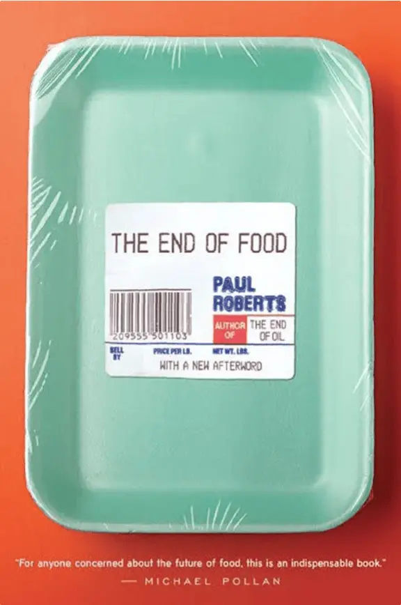
Source: Amazon
On the cover of The End of Food by Paul Roberts, the use of white space helps the reader focus. The white tag on the product packaging draws attention to the title which, after reading, the image effectively illustrates.
4. Use custom photography
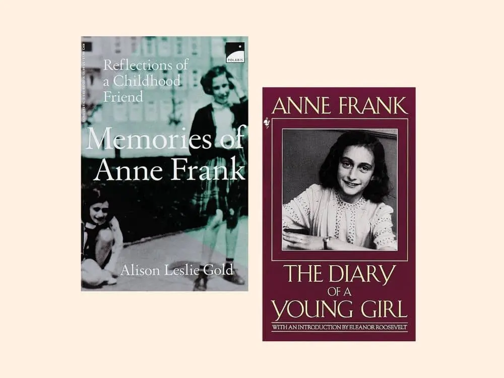
Source: Barnes & Noble
In The Diary of Anne Frank, photographs of the young author help the reader relate and empathize with her on a more intimate level. This is why custom photography is highly effective for biographies and documentaries. It is also helpful if you are trying to build personal recognition.
5. Your design should function as a thumbnail, too
Source: Brandon Hill Design
Given the digital nature of book shopping these days, it pays to create a book design that makes a great thumbnail. On Making the Climb by John C. Bowling, a brown shoe print is easy to identify and will be recognizable even as a small image.
6. Include reviews & awards in the design
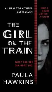
Source: Books & Books
Working awards and reviews into the design of your book cover helps establish credibility to the reader. As humans, readers are social creatures, and testimonials from literary authorities provide enticing and trustworthy social proof. You can see this principle demonstrated elegantly on the cover of The Girl on the Train by Paula Hawkins.
7. Use imagery to spark imagination
Source: Paul J. Bartlett Art
On this modernized cover of The Wonderful Wizard of Oz by L. Frank Baum, images of a tin pipe hat, feline eyes, a girl’s face and a burlap necktie allude to the main characters in the book. The green tint hints to the Emerald City. This is a good way to weave your narrative into the cover design without giving too much away.
8. Let typography take center-stage
Source: Barnes & Noble
Here, on the cover of The Shallows by Nicholas Carr, the words are the imagery and help expand on what the author wants to communicate. By utilizing typography, the design is kept simple, not distracting the flow of the reader’s eye from one design element to the next.
9. Figure/ground Gestalt principle
Source: Pinterest
Things get interesting when the foreground and background contain two distinct images, as shown on this cover of Peter and the Wolf. Impressively, this creative use of negative space doesn’t distract from the main focal point.
10. Keep colors simple
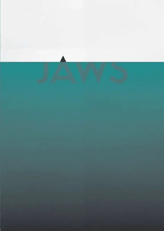
Source: Pinterest
On this cover of JAWS, blue and black are the only colors used. The dark shading of the blue makes it identifiable as the ocean against a white background. The darker tip of the letter A reveals a shark fin breaching the surface of the water.
Key takeaways
An effective book cover is both planned out and meaningful. It’s a billboard on the highway directing readers to your pages. Your book cover’s role as a marketer is important and shouldn’t be treated like an afterthought. Use these tips to design a book cover you’ll be proud to share. You can start by customizing a book cover template in our gallery.
Ready to design your own book cover? Customize one of our professional book cover templates online for free.
There are so many things that job hunters think about when it comes to their resume. These are usually the obvious things, such as making sure they’ve listed all their previous jobs and any suitable skills or experience that they might have. Anything that’s going to set them apart from other applicants will no doubt go straight on the resume. However, there is one part of a resume that not too many people think about: the font.
Related: How to make a resume employers will notice
Even though you might not realize it, the font you use on your resume will give the reader an insight into the type of employee you are. For instance, using a fairly childish font could really put someone off inviting you in for an interview. Ideally, you need to go with a font that’s professional, clear and easy to read.
When there isn’t much difference between the top candidates for a job, an employer might make their final decision based on smaller details, such as a resume’s font choices. Are you ready to think about the best fonts to use on your resume? Here are some of our favorites.
Serif fonts
A serif font is one that features small strokes and extra features on the letters. In some cases, these are known as Roman fonts. Here are a few of the best serif fonts to use on your resume.
Garamond
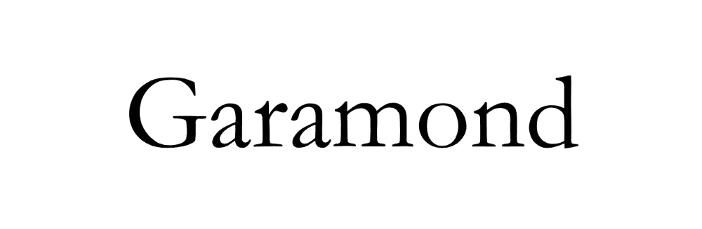
Do you prefer an old-style or more traditional font? If so, then you might want to choose Garamond for your resume. The font is named after a famous 16th-century French typeface designer called Claude Garamont. Many people working on their academic resumes tend to go for this style as it looks sophisticated.
Cambria
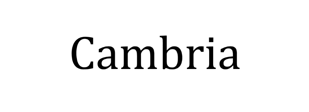
Another serif font, Cambria is very popular — and there’s a good chance you’ve already heard of this one. It features on Microsoft Word, so you might already be using this for your resume without even realizing it. It was designed in 2004, and since then, it has only been gaining in popularity thanks to its clear letters that are always easy to read (even when printed very small). Even though this font isn’t all that old, it’s still considered to be quite traditional and is favored by older job applicants who are applying for mature roles that demand a lot of experience.
Didot
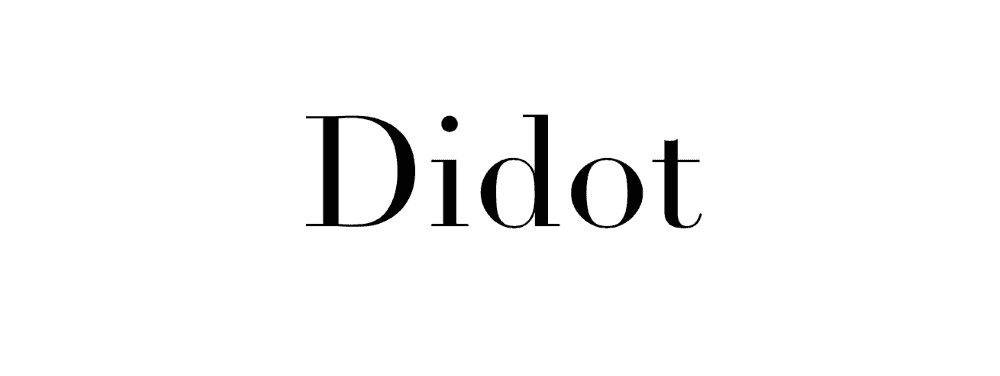
If you’re applying for a role in the creative industry, then you will no doubt want to go for a font that is both easy to read but also shows off your personality and creative flair. Didot is just the typeface for you. This font’s debut was a long time coming, as it was developed between 1784 and 1811. Once perfected, though, it became a staple with creative brands, individuals and organizations. One thing to bear in mind, though, is that this might not be the best font choice if you’re going to print it out small, as some of the serifs might not be all that visible.
Georgia
One final serif font that you might want to consider is Georgia. This is another very traditional font, and many people like to use it as an alternative to the overused Times New Roman. Georgia is really spacious and readable, so it will certainly help a recruiter skim through your resume.
Sans-serif fonts
If you would rather not use a font that features unnecessary flourishes, then you might prefer these sans-serif ones. They don’t feature any extra features at the end of the letter strokes, which makes them a popular choice for digital job-seekers & hiring managers.
Arial

A font that you most likely have already heard of and used is Arial. The lines in all of the letters are always clean whenever you use Arial. This will make your resume look very readable indeed, and there won’t be an issue whether someone is reading it on-screen or on paper. One thing to bear in mind, though, is that it’s very widely used. In fact, some people think that it’s a boring font choice because of how widespread it is these days.
Calibri

Calibri is, once again, another very popular font that you might have already used in various Word docs. In fact, this font is so common that it has now replaced Times New Roman as Microsoft Word’s default font. It is one of the most easy-to-read sans-serif fonts, so your words will be very clear to anyone who scans your resume. It looks great on computer screens and will also look very attractive when printed out.
Helvetica
Helvetica is a font that is quite well-respected in the design world. It’s regarded as a very contemporary font, and it’s one that many typographers & designers choose for their own work. In fact, you might be able to spot it in a few big-name brand logos. (For example, it features in the Lufthansa and Panasonic branding.) As it is widely regarded as a professional design font, it would be a good choice for your creative resume.
Trebuchet MS
If you know that your resume won’t be printed out after you email it to the recruiter, then you could always go with Trebuchet MS. This font was specifically designed to look great on a computer screen. It looks very modern, and some people say that it has a nice texture to it. It’s a great option if you want a font that’s clean and will give your resume a modern edge.
Key takeaway
Did you realize there were so many excellent, readable fonts to choose from for your resume? This is only the tip of the iceberg. Now that you know some of the best fonts to use, your design choices can really make a difference in your next job application.
Now that you know how to make a resume, you can customize & print your own. Pick out a free template to get started.
So you’re wondering how to how to design a brochure that will impress. Dealing in the medium of brochures is a tricky thing, because they’re all just one step away from the garbage. But don’t worry, this post will show you how to make a great-looking brochure that’s not destined for the recycling bin. You’ll learn how to master the 2 most important components of brochure design: the copy and the photos.
For a brochure to be a success, your copy and images should be an integral part of the design, not just an addition. The finished product should also be consistent with your brand. Let’s jump in.
Related: How to make a travel brochure that looks stunning
Brochures are a powerful sales tool and have been around for decades. Today, anyone can make their own. But what is a brochure, really? Let’s review standard layouts, sizes, folding options, and suggested brochure content.
What is a brochure?
A brochure is a folded document that presents information in a segmented, easy-to-digest way. Brochures are similar to other printed documents, but with key differences. Like pamphlets, they are informational, but brochures are designed to advertise a particular brand, product or service. Unlike flyers and posters, brochures are folded into sections, so they can retain their size but present more information.
In previous decades, making a brochure was far more complicated, requiring long lead time and cross-departmental cooperation to bring together photography, hand-drawn elements, and typography. A design would go through several physical drafts before the final version was painstakingly created. Changes weren’t easy to implement, either. Today, one person can create a brochure from scratch using modern design software, and the brochure can easily be tweaked and edited to perfection.
When to use a brochure
It’s not uncommon to wonder when it’s appropriate to use a brochure rather than another format, like a flyer. The answer lies in the **buyer’s journey**. Flyers are great for attracting attention, building awareness, and sharing a short message. But brochures are far more effective down the road, when a prospect is gathering the information needed to make a wise purchasing decision. Brochures provide more information about a company, its products and its services, at a deeper level than a flyer can. For that reason, they’ve remained an essential marketing tool for many companies and organizations. Here are 12 excellent examples of when to use a brochure. There are many, many more, but these will give you an idea of the possibilities. +
Direct marketing — Brochures can easily be included in a marketing campaign like direct mail.
Financial — Banks can provide brochures in the lobby to explain their account options, loans, and other money-related services.
Food service — Restaurants can create catering and to-go brochures that patrons save for later. The best ones will include a full or simplified menu, along with contact information.
Healthcare — Doctors and hospitals can introduce themselves to a new community with a brochure explaining their services. Brochures are also handy for patient education on a variety of illnesses and other health concerns.
Marketing — Marketers can hand out brochures to interested visitors at trade shows and expos.
Offices — Offices with heavy foot traffic can provide brochures about their services in the waiting room. Visitors can read them while they’re waiting, and the staff won’t have to spend as much time explaining their services to each person.
Personal care — Spas and salons can use brochures to list all of the different services they provide, as well as their prices.
Politics — Politicians can use brochures to inform voters about their platforms and stances on important community issues.
PR — Public relations managers can include brochures in press releases and media kits, so the news media can craft better, more accurate stories about a company.
Retail — Stores with heavy foot traffic can provide brochures at the front of the store. A brochure of popular product highlights is far less expensive to produce than an entire printed catalog.
Sales — Salespeople can hand out brochures to business associates, partners, and potential clients after a demo or presentation.
Travel — Airlines and travel agencies can use brochures to advertise exotic destinations and affordable vacation packages.
Standard brochure sizes
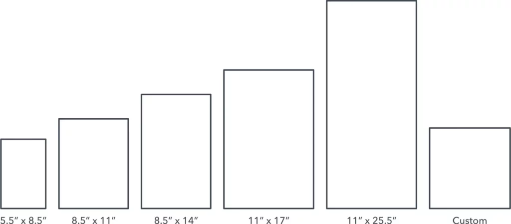
5.5″ x 8.5″ Often called a half-fold, bi-fold, or statement. This layout is created by folding an 11″ by 17″ sheet neatly in half, so that it opens and closes like a book. Commonly used for menus and event programs. If you fold it in half again, you can create a quarter fold brochure with 8 miniature panels.
8.5″ x 11″ You’ve likely seen many brochures of this size, since businesses often use them as sales and marketing pieces. This is the most popular size because it can be folded into several useful configurations that fit easily in an envelope. A tri-fold creates 6 long panels, and we’ll discuss the different tri-fold layouts in the next section.
8.5″ x 14″ Slightly larger than its predecessor, this size also makes for great tri-fold brochures. More space means more folding options, such as double gate or parallel folds. In fact, a double parallel fold creates a slender brochure that has become a staple in tourist information racks.
11″ x 17″ Larger brochure sizes are most helpful as visual aids. This size is often used for amusement parks or other tourist attractions, because there’s enough room for a map. It’s a great size for showcasing travel destinations as well.
11″ x 25.5″ The largest standard brochure size. What it lacks in portability, it makes up for with visual impact. Brands who depend on gorgeous, detailed photography benefit from the extra space. For example, real estate agents can show off their properties with full-color photos of a house and its rooms.
Custom If you’re hoping to make something unique, you can always talk to your printing partner about custom sizes. Just be prepared to discuss pricing, because custom printing will be more expensive than sticking to the standard. For some creative inspiration, check out this Pinterest board of unique brochure designs.
Popular brochure layouts
Bi-fold
The simplest brochure layout is a bi-fold, where a single sheet of paper is folded in half. This results in 4 consecutive panels that can be read from left to right like a magazine. The vertical layout is more popular, but a bi-fold can be oriented horizontally, too.

Tri-fold
The most popular layout is the tri-fold, a single sheet of paper folded into thirds. Tri-folds are versatile, giving you multiple folding options. Even though they each contain 6 panels, how you fold the paper will determine which panels end up where.
- C-fold — A C-fold resembles the letter C when open. When closed, one third of the paper is nested between the others, like a spiral.
- Z-fold — A Z-fold resembles the letter Z, opening and closing like an accordion.
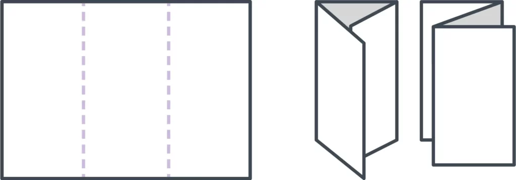
French fold
A French fold is created by folding a sheet of paper vertically and then horizontally. This separates the paper into quarters, resulting in 8 panels overall. With a French fold, your brochure is small and portable, but it expands to the size of a flyer or poster. If you want to present a large design across multiple panels, this fold can be very effective.
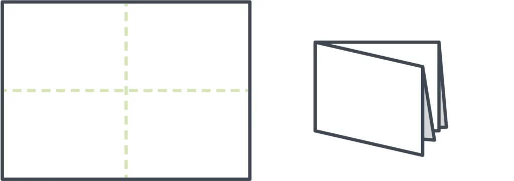
Gate fold
Sometimes called a window fold. Though this is technically a tri-fold, it does not result in 6 equal-sized panels. Instead, the right and left sides of the paper fold in to meet in the middle. This makes the center panel twice as large, creating more space for visual design inside the brochure.

Double gate fold
To make a double gate fold, follow the steps above to create a gate fold brochure. Then fold it in half again, vertically. This creates a central fold down the center panel, resulting in a slender brochure that can fit more easily into envelopes and other narrow spaces.
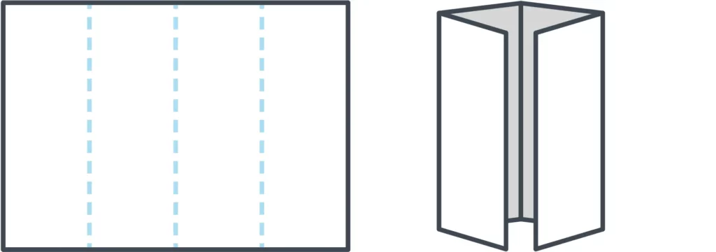
Double parallel fold
A double parallel fold requires two vertical folds. Take a sheet of paper and fold it in half, then fold it in half again. That way, half of the sheet is nested within the other. In the end, you’ll have 8 panels. Depending on the size of the paper, the resulting brochure might be narrower than a typical tri-fold, or it could be roughly similar in size but with the addition of 2 panels.
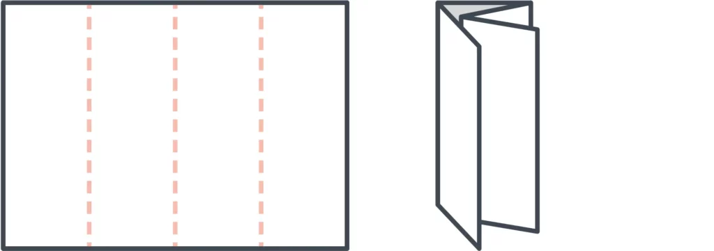
Spiral fold
Lastly, our standard set concludes with the spiral fold. It’s similar to a C-fold, but with more panels—typically 8 in total. The spiral effect is achieved by folding each panel inward so that they nest inside one another. Because of this, the inner panels should be slightly smaller than the outer panels, so that the brochure lays flat when folded.

Designing for your fold
If you’ve chosen a layout but are unsure how to design it, try folding a blank sheet of paper and numbering each panel. That will make it easier for you to keep track of where each panel goes while you’re designing onscreen. It’s a handy reference tool!
Templates
Templates are the brochure maker’s best-kept secret. It doesn’t make sense to start from scratch every time you need to create a new brochure, especially when many software tools provide free brochure templates designed by professionals. If you have no idea what you want your brochure to look like, templates can provide inspiration and samples to work with. If you already have a vision, the right template can save you loads of time. For examples, take a look at our gallery of free brochure templates.
Essential brochure elements
Because brochures are most often used in advertising, it’s important to consider what your brochure should inspire the audience to do. Like many marketing materials, a good brochure will be visually interesting, tell an engaging story, and prompt the reader to take a certain action—like purchasing a vacation package, for example.
When you layout your brochure, make sure the following elements are well represented.
1. An alluring cover
This is the first (or only!) chance your brochure has to give a strong impression, so make it count. The cover is a promise, so it should reflect what’s inside. A high quality, relevant image combined with a brief, easily legible headline will provide your reader with a strong understanding of what your brochure is about.
2. A compelling offer
Details aside, what you’re really providing with a brochure is opportunity. It shows the reader a whole new world of possibilities to improve their life. No matter what your product or service is, whether it’s catering plans for a wedding or security alarm systems for an office building, your brochure needs to offer just enough to make readers want to know more.
3. Valuable information
Brochures offer limited space to communicate your message, so prioritizing which information to include is critical. Dedicate space to the features and (more importantly) benefits of your offering, and consider other details like prices, dates and times, if applicable. The best rules of copywriting apply here: be clear, be concise, and tell a good story that makes your reader the hero.
4. A strong call to action
You can build a beautiful, convincing brochure that makes your audience feel exactly the way you want to… but it’s useless if you don’t provide the next step. A strong call to action will prompt the reader to call, visit, or connect with you in some way, so that the relationship can proceed further. Sometimes this means making a purchase, but not always, so think about what you want your audience to do after reading your brochure—and direct them accordingly.
5. Detailed contact information
Goes hand-in-hand with your call to action. Not everyone will make a move right away. In fact, many people hold onto brochures to reference later, when the time is right. Don’t make them search for ways to get in touch with you. Make it easy by putting your name, phone number, email/web address, and physical location on the back. Some companies even put a simplified map to help people find them. That might be a little old-fashioned in the age of GPS, so you could include an interactive QR code or other helpful tidbit instead.
Other ideas to consider
The 5 elements listed up there? Those are the basics. If you really want to knock it out of the park, here are some tried-and-true brochure sections that you might not have considered before.
Answers to FAQ
It’s likely that your readers share similar concerns, resulting in frequently asked questions. Save time and overcome objections early by including a FAQ section in your brochure. Don’t dive too deep; a brochure should be brief and present your brand in its best light. But for concerns that can be quickly and easily resolved, a helpful FAQ section is worth its weight in gold.
How-to guides
Knowledge is power, which is why information is valuable. Sharing helpful information with your audience builds trust, and a how-to guide is a great example. Empower readers to spot or solve a problem on their own by breaking down the process, step by step. It could be instructions on how to test your product, but it doesn’t have to be.
For example, if you’re a pest control company, you could offer tips on how to identify the presence of certain insects or rodents. If you’re a photographer, you could include tips on how to dress for an outdoor photo session. Take a few moments to brainstorm about your brand, and an idea will likely present itself.
Testimonials
No one can speak to how your brand improves lives the way your customers can. They know because they’ve experienced it firsthand in a way you cannot. That’s why we, as consumers, trust friends, family, and online reviews more than any slick sales proposal. Including testimonials in your brochure adds a layer of humanity and credibility that can reassure your readers that they’re making the right choice.
How to make a brochure
Here are the basic steps involved in creating a brochure. If you’re ready to learn more, we have a longer, detailed article that covers each step in depth. Visit our guide on how to make a brochure to learn more.
- Consider your layout / size. Before you can start designing, you have to decide how big or small you want your brochure to be, as well as how it should be folded.
- Write compelling copy. Brochures don’t offer a lot of space, so each word should be purposeful. Make your message consistent, easy to read and easy to understand.
- Provide visual interest. Illustrate your message with visual elements, including high quality photos, that make your brochure more interesting to the reader.
- Choose your colors. Color is closely tied to emotion. Using colors effectively in your brochure will enhance your message and emphasize specific points.
- Test-run the print version. Before you print (or order) hundreds of copies, it’s critical to test-run it first. Verify that the finished product meets your expectations.
Want to design beautiful brochures online? Lucidpress makes it easy. With our intuitive drag-and-drop online brochure maker, you can select a template and customize it with fonts, colors, shapes, images and more. It only takes minutes to create a high quality brochure that you’ll be proud to print and share.
The copy
Words. We throw them around every day, but how often do you carefully consider what you’re saying? When it comes to brochures, word choice is paramount. Remember that your objective is to entertain, persuade, and inform. Here’s how you do it:
1. Check your grammar and spelling
Read your work twice, then have someone else look it over. A misspelling or grammatical mistake can slay your professionalism and doom your brochure to the open jaws of the trash can.
2. Make evergreen content
You don’t want to create a quality brochure only to make a new one next year because the content is out of date. In copywriting, a principal objective is to make sure your content is evergreen. This means that your content will (theoretically) always be relevant. So, you might want to avoid including references to upcoming holidays or this year’s Super Bowl winners.
3. Be international
Your copy will potentially be read by people from many countries and cultures. Every culture has idioms and colloquial expressions that may not transfer well. For example, if you talk about killing two birds with one stone to someone who speaks English as a second language, they might call the animal cruelty hotline.

Of course, using colloquial or idiomatic language can humanize your brand and keep things lighthearted. It becomes a problem when you use so much culture-specific language that your writing is unintelligible to someone who has a different background. Knowing your audience will help you strike the right tone.
4. Know your brand and stick to it
Every line you write should align with the larger brand experience of your organization. This creates a consistent experience for your customers—and helps potential customers know what to expect. Just like we speak differently in different social settings, the copy in your brochure should adjust to your brand.
Yelp’s Eat24, an online food delivery service, has settled nicely into a brand that really works for them. The tone is playful and lighthearted; for an example, check out this messaging from the Eat24 website:
This copy is clever and it also matches the overall feel of Eat24’s site. The humorous, slightly sarcastic branding of Eat24 could work for your brand, but you also might need to take a different approach. Imagine if you saw an ad from your bank that said, “We’ll watch your money for you. Probably.” Customers would be confused and concerned, so again, know what’s acceptable to your audience.
For more examples of standout copy, check out this post from Hubspot’s marketing blog.
The photos
Just like your copy, the photographs in your brochure send a message. You’ll want to make sure that message is professional and interesting. Before we get any further, I think I need to make one thing very clear:
Beware of stock photography.
Millions of Americans struggle with stock photography every year. You know it when you see it—models with unnatural facial expressions, dressed in stereotypical clothing, all bathed in lighting that even a moth wouldn’t fly toward.
Just thinking about it makes me shutter (get it?), and I don’t want you to feel the same pain. Luckily, there are alternatives. What follows is a list of my favorite sites for free images that aren’t awful (in no particular order).
1. Unsplash

I find myself visiting this site most often. I think the images are gorgeous, and they’re always very high quality. All the images are free, and no attribution is necessary. It’s a pretty great deal, and you also don’t have to sign up for anything to download the image.
2. Pixabay

Pixabay has a ton of images on their site, and, like Unsplash, there is no attribution required. There is a pretty diverse range of photos on Pixabay, though the quality does vary. You can find some great stuff though!
3. Stocksnap.io

Again, no attribution required here, and there’s a great selection of high-quality images. Many of the images are comparable to Unsplash, and sometimes the two overlap a bit. Stocksnap.io has definitely come in handy for me.
4. Flickr

Flickr has a lot of great stuff, you just have to be aware that not all of it is free for commercial use. You can filter your searches to only include photos that are open to commercial use and modifications, and you’ll usually have to credit the image to the original creator and link back to the source, just as I did on the photo above.
There are a few more options out there, but those are a good place to start. Fantastic photos will draw your brochure readers in and stay their trash-tossing hand.
Ready to get started? Choose one of our free brochure templates and dive in!
Thanks to the internet, it’s easier than ever design a beautiful digital or print magazine. No matter your niche, there are plenty of layouts and brand templates that can help get you started. In this resource, we’ll take you through some of our favorite magazine design and layout ideas to help you put your own special touch on your creation.
How to design a magazine layout
There are four core graphic design principles that will ultimately help guide your magazine layout design.
- Hierarchy — How people read or consume the information, i.e., what’s most important? What are the key takeaways here? And how do you showcase that? You want this information to be visible right out the gate.
- Purpose — Why should your audience care about reading this? What’s the point of your magazine? Is it something that needs to be communicated visually or through words?
- Readability — How easy is your magazine to read and understand? Are you pairing poetry with images, or are you articulating EOY program goals for a non-profit? Either way, your choice in communication and end goal needs to be clear.
- Balance —Chaos can be art, but it’s not always beautiful or helpful when it comes to graphic design. You want to strike a balance between cluttered and sparse.
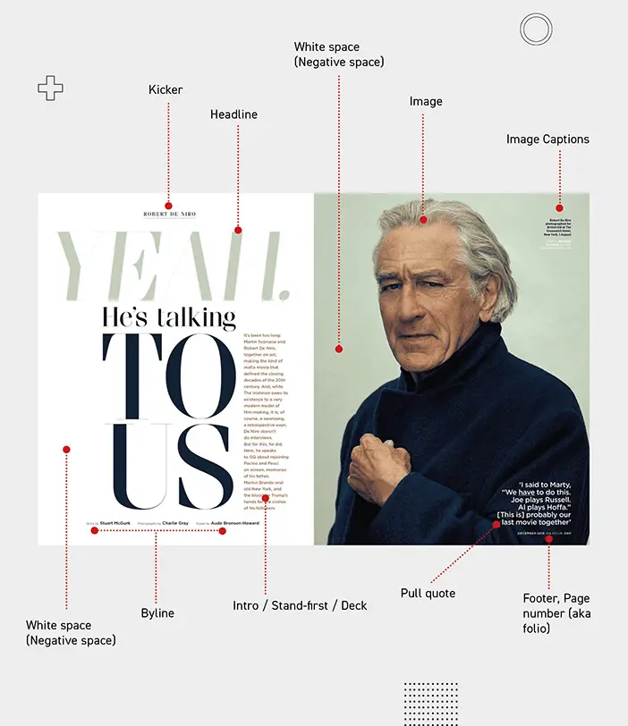
Image from Yes I’m a Designer, by Kevin Fay
In the image above, you’ll see various callouts for certain design elements — keep in mind, each of the design elements serve a specific purpose, whether it’s to help break up a wall of text, or illustrate a point with images.
Now, let’s dive into some more magazine design and layout examples!
Magazine design inspiration
If you want to create a sharp, eye-catching magazine that balances important information about your brand with spot-on graphic design, we’ve got plenty of inspiration for you.
1. Adventure Digital Magazine
If your magazine features immersive photography, your magazine design and layout should give more weight to imagery than words. The layout of this Adventure digital magazine template will help you put your photos front and center while balancing them with sections of text. And, as a digital magazine, this template gives you the bonus option of scrolling text, meaning you can include long-form content without taking space away from imagery.
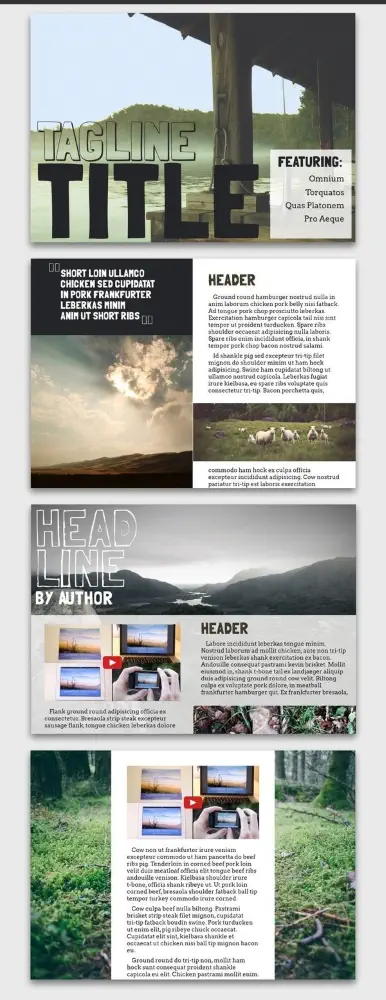
2. Aficionado e-Magazine
Traditional publications tend to avoid using a horizontal magazine layout because it can be unwieldy to (physically) hold. But as tablets and e-readers become more common, we’ve noticed that designers are revisiting the concept. This Aficionado e-magazine template is a great jumping-off point for magazine design inspiration, and offers some great ideas for orienting pages horizontally. For instance — the columns alone offer a variety of graphic design capabilities:
- Split the page in half
- Be weighted more towards one side
- Skipped altogether in favor of rich photography and breathable white space
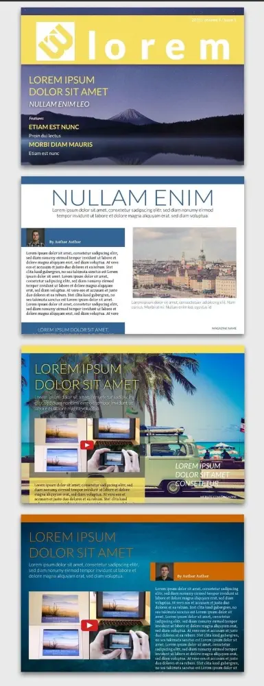
3. Azure Magazine
What’s great about the Azure magazine design and layout is how well it lends itself to color customization. Thanks to its blocky columns and bold fonts, it would be easy to read with a variety of color combos (but don’t forget to choose high contrast colors for text and backgrounds). For brands with strong, recognizeable color palettes, it’s an excellent candidate.
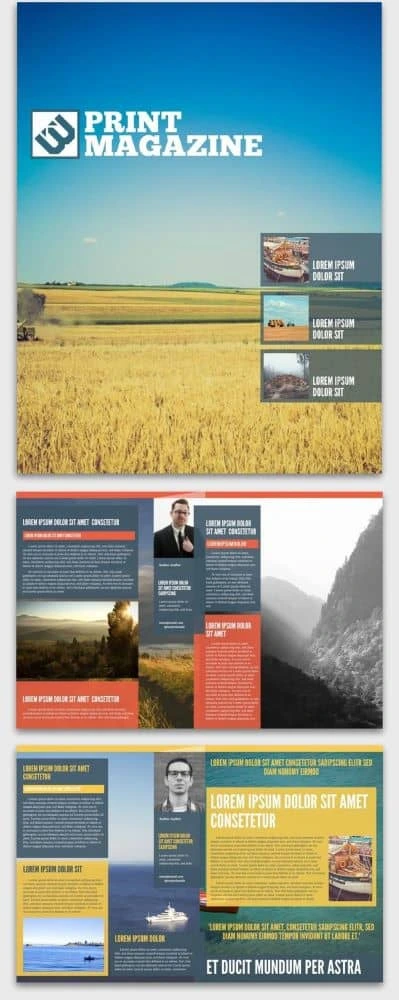
4. Connoisseur Food Magazine
What stands out in the Connoisseur food magazine layout is its use of colorful sectioning. You can customize just about anything — from a single column surrounded by photography to three narrow columns side-by-side. Plus, this layout works vertically or horizontally, so you get multiple options in one delicious template.
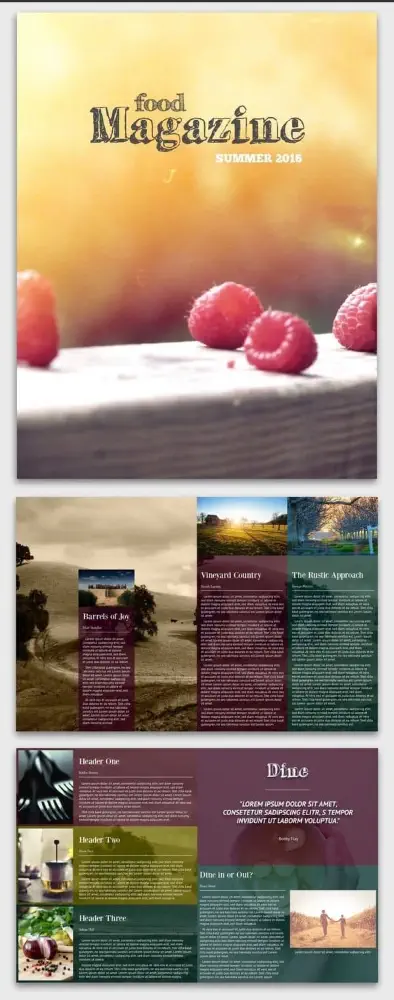
5. Introspective Digital Magazine
Never underestimate the power of the “less is more” design approach. The Introspective magazine design makes the most of negative space and contrast to leave a strong impression. And because it’s digital, scrolling text and rich media (like video) can be included.
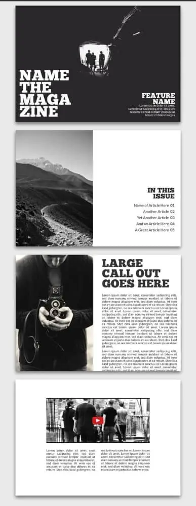
6. Money Fake Magazine Cover
Have you ever wondered what it feels like to be on the cover of a magazine? The Money fake magazine design and layout template gives you the perfect chance to do so! We all know the formula: a large portrait situated front and center with a masthead underneath, surrounded by intriguing teasers for the articles inside. This template even includes little details like date and issue number, as well as a UPC code at the bottom.
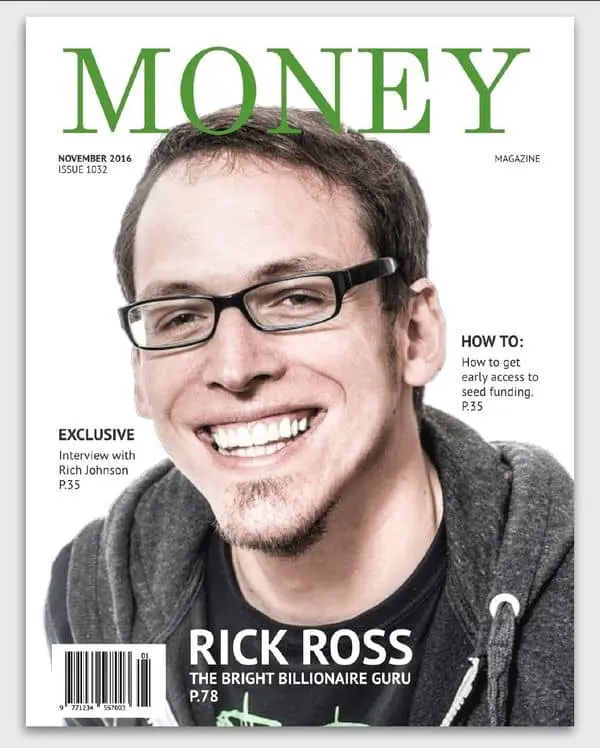
7. New Yorker Business Magazine
The New Yorker business magazine layout is primarily black and white, but it adds a pop of vibrant red for powerful emphasis. Its thin font and art-deco touches set it apart from the monochrome intensity of the Introspective layout in #5. Note the expansive cushions of white space, especially in the single-column layout, which features scrolling text with a single quote spotlighted on either side.
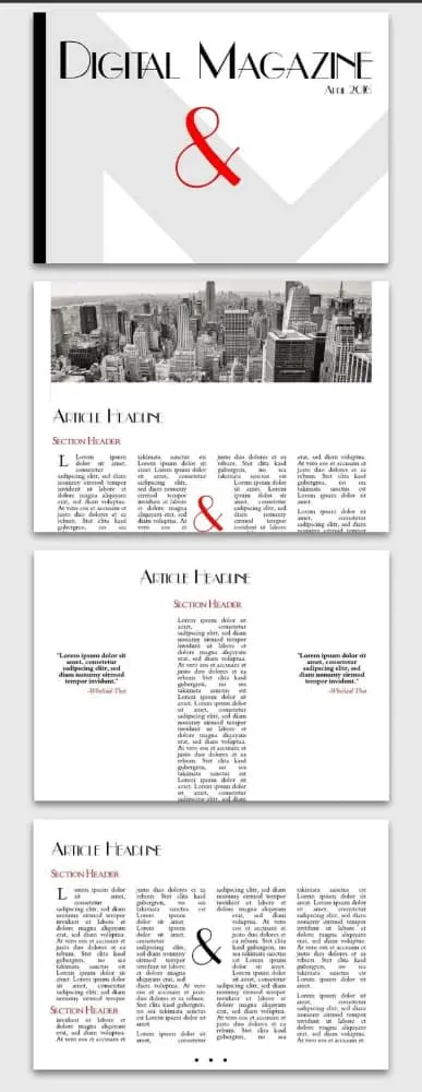
8. On the Road Magazine
There are several things to love about the On the Road magazine template. First, the white border offers the option to frame your content in a somewhat nostalgic way. Or, if that’s not to your taste, check out how one page cuts two photos together with no border at all. With plenty of choices, there’s enough here to spark anyone’s imagination.
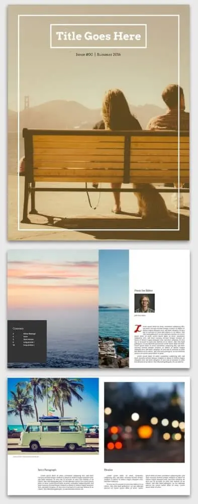
9. Open Air Online Magazine
True to its name, the Open air online magazine layout leaves plenty of room for airy background photos. Adding transparency to the content blocks and bringing them in from the margins a little bit provides a cool sense of depth. It’s a neat visual trick that works especially well with scrolling columns, a design advantage unique to digital magazine layouts.
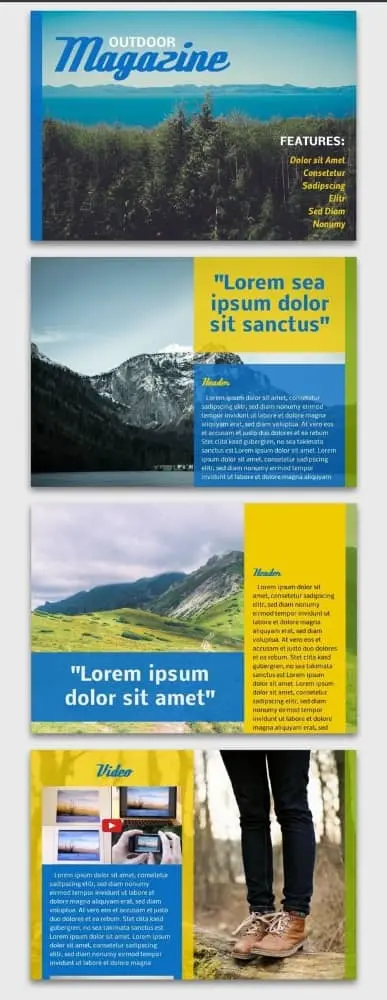
10. Seasons Digital Magazine
Who says digital layouts have to look amateur? With this template, it’s easy to craft elegant, sophisticated content that still feels like it belongs on a screen. The juxtaposition of serif copy with sans-serif headlines creates a stylistic identity that’s both traditional and modern — a comfortable in-between place for those of us who grew up with the rise of the internet.
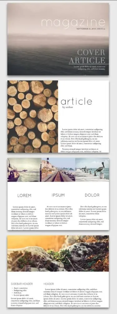
11. Showcase Travel Magazine
The Showcase travel magazine design and layout is designed for readability above all else. There’s a clear division between pages dedicated to photography and pages dedicated to copy. For a travel magazine, this is a wise choice, helping create immersive visual and narrative stories.
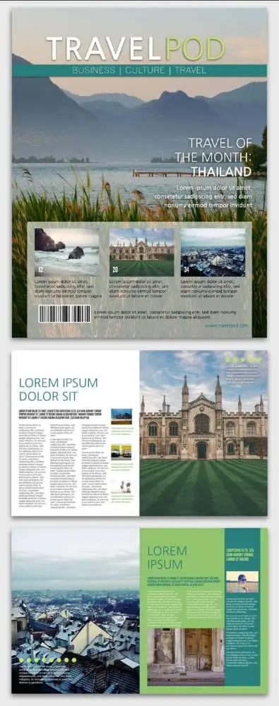
12. Trendsetter Fashion Magazine
Like in art, sometimes the best designs are those that purposefully ignore the rules. A look at the Trendsetter fashion magazine layout illustrates several possibilities here. If your magazine explores the avant-garde, it’s worth considering how unique font and color choices can convey your brand’s unique position.
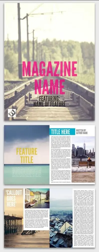
13. Tropic Magazine Cover
Sometimes, following a familiar formula is the perfect way to entice readers in. This Tropic magazine cover exemplifies a typical layout in a simple and well-balanced way. It’s easy to succumb to clutter (looking at you every website from 1999), but this layout uses a minimal design that still includes the necessities — the title, the headlining article, two featured pieces and photography.
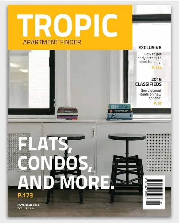
14. Urban Print Magazine
Like a newspaper, the Urban print magazine layout divides itself into many columns, presenting dense and information-rich content for readers to scan or consume at their own pace. If you’ve struggled with creating readable layouts that feature multiple columns, this layout offers a wealth of examples.
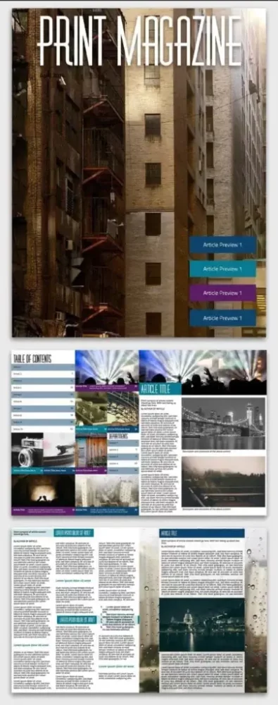
15. Simple car magazine
This simple and clean car magazine template provides the perfect cover layout to show off a classic car. When you’ve got eye candy like this, minimalism can make the most visual impact.
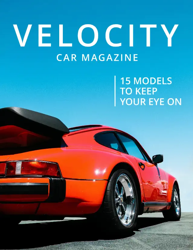
16. Science magazine
When you need a data-forward approach for your magazine layout, our free science magazine template will get the job done. A clean and clear layout leaves plenty of space for long articles and in-depth figures.
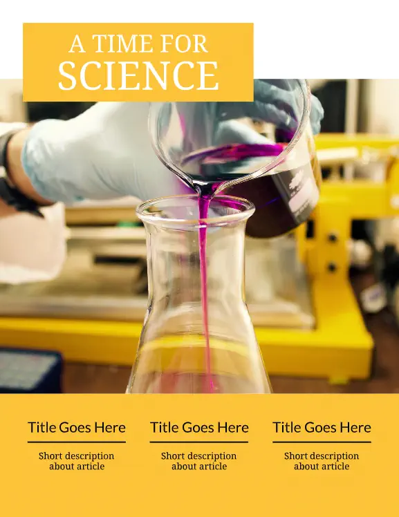
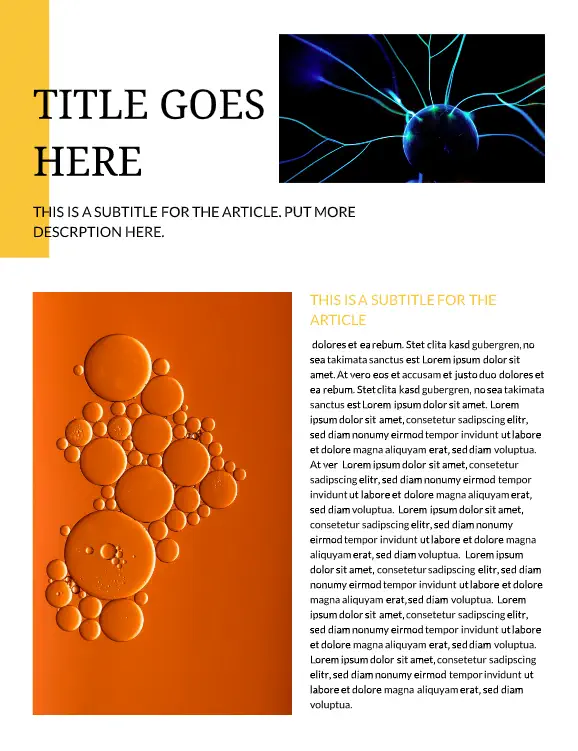
17. Bridal magazine
A simple magazine layout combined with classic photography lets your brand’s wedding inspiration shine. With subdued colors, inspirational photos, and plenty of room for copy, this multi-page wedding mag template has everything you need.
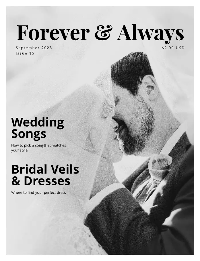
18. University magazine
Keep students, faculty, and alumni up to date on everything new at your school with this bold and classic magazine layout design. Need to run school news, announcements, and ads? You can pack it all into this straightforward template.

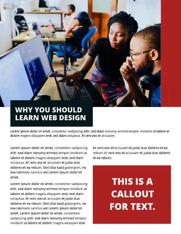
19. Food magazine
Images do all the talking in this elegantly designed food magazine layout. There’s ample room to highlight your brand’s culinary creations, with clean text callouts doing the supporting work.
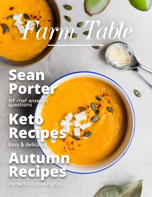
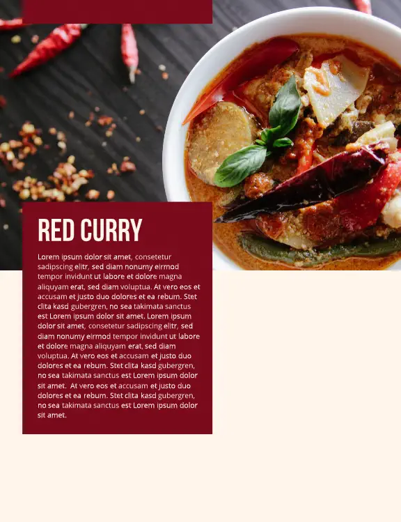
20. Minimal fashion magazine
If you need a clean and simple fashion magazine layout design, this template will help you show off your company’s looks without any of the visual clutter.
21. Dessert magazine
Put your ‘mmm’-worthy creations front and center with this brightly colored desert magazine layout. Close-up photos and fun fonts create a mouth-watering magazine template.
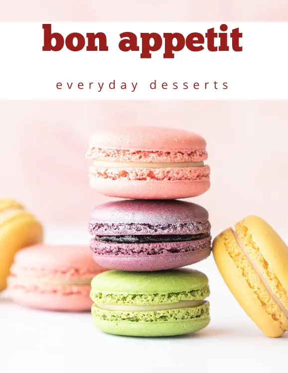
22. Teen magazine cover
A bright photo collage creates a teen magazine cover layout that’s bound to catch plenty of eyes. With bold graphics and a Y2K nostalgic touch, this design offers a familiar but fresh take on the genre.
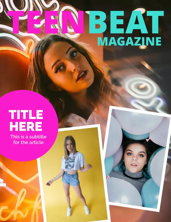
23. Men’s fashion magazine
This men’s fashion magazine layout doesn’t shy away from the details. A well-defined balance between images and copy helps your brand show its best side.
24. Fake Vogue cover
When only a fake Vogue cover will do, try this template. Pop in your preferred photo and let the classic magazine cover template do the rest.
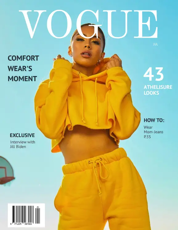
25. Wedding magazine
It’s easy to get lost in the details of this dreamy bridal magazine layout. Soft colors juxtaposed against calming sections of text let your customers peruse beautiful wedding inspo at their leisure.
26. Elementary school magazine
Easily toss your school updates into this bright, fun elementary magazine layout. A balanced combination of photos and longer and shorter sections for text ensures readers of all ages can easily navigate your school news.
27. Seasons magazine
Want to show off your brand’s appreciation for the natural world? Give this Seasons physical magazine template a chance. Showcase nature in all her glory with beautiful, detailed photos and unobtrusive spaces for immersive articles.
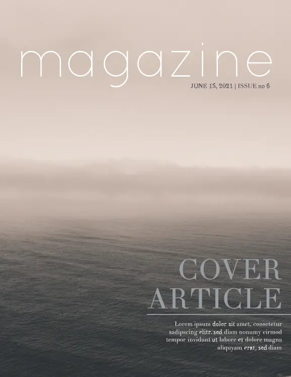
28. Art school magazine
Bold sans-serif headings and bright colors showcase your art school offerings in this educational magazine layout. There’s plenty of room for the nitty-gritty details, along with space for larger text call outs and lifestyle photography.

29. Surf magazine cover
Your action shot goes front-and-center in our surf magazine cover layout. A color-blocked section for your title and clear sans-serif headlines round out this tried-and-true cover design.
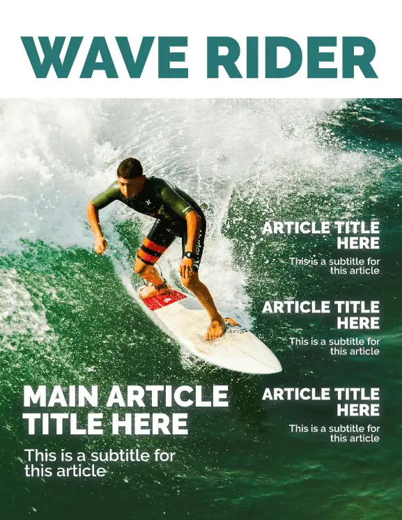
30. Performance car magazine
When you need to show off what a beautiful piece of machinery can do, this performance car magazine layout is a go-to. With lots of space for ads, articles, and glamor shots, the simple, masculine layout gets the job done.
Creating your own magazine design and layout can feel like an intimidating task, but with templates like these, it becomes a breeze. Don’t be afraid to mix and match elements from more than one template to create something truly unique!
Ready to start designing your own magazine? Get a head start in our gallery for free magazine templates & layouts.
Even if you’re not in the fashion industry, your small business might be the perfect candidate for a lookbook. Lookbooks are just what they sound like: collections of photographs that draw the eye and showcase products in sumptuous detail.
But with the advent of fashion digital lookbooks, your audience can do more than look. This post will show you how to create a lookbook that can be shared anywhere, from your website to your Facebook page. Plus, you’ll be able to boost sales by linking readers directly to a website or online store.
Related: What makes good design & why it matters
How to make a lookbook
- Step 1. Source several quality photographs
- Step 2. Combine photos and design elements
- Step 3. Put your lookbook to work with links and videos
- Step 4. Publish your lookbook and spread the word
What is a lookbook?A lookbook is a compilation of photographs that showcase a designer’s collection. They’re frequently used to market a line of clothing and show how to style the pieces.
Are lookbooks a good fit for my business?
Before we get started, I want to address a question that many of you are asking.
Should I really make a lookbook?
The answer, of course, is yes. Because a lookbook is nothing more than a catalog, or in a broader sense, an advertisement. So if you sell something that people can either touch or experience, lookbooks are a good fit.
People can touch things like apparel and accessories, jewelry, beauty products, baked goods, crafts, pottery ware, tools and furniture. And what people can experience is an even broader category: housekeeping, catering, plays, museum exhibits, festivals and more.
1. Source several quality photographs
It’s critical to have great photos that highlight your product or service. A good rule of thumb is to have at least two photos for each page of the fashion lookbook. This is one area you shouldn’t skimp on—good product photos will serve you well for years to come. So either book a professional photographer or follow these tips on how to capture your own lookbook photos, which I’ve summarized below.
- Choose a clean, neutral backdrop.
- Position the product in good light and clear focus.
- Draw inspiration from style sites like Lookbook.nu, Trendtation, and even Reddit.
- Iron out all the details, from polishing your leather goods to touching up the model’s lipstick.
If your fashion lookbook includes models:
- Make sure their poses look natural.
- Position them so your product is front and center.

2. Combine photos and design elements
Once you have enough images, upload them to Lucidpress. It’s a free service for creating print and digital documents. Just sign up for a free Lucidpress account, click +Document, and choose from a blank canvas or a pre-made template. I recommend choosing from the digital magazine category.
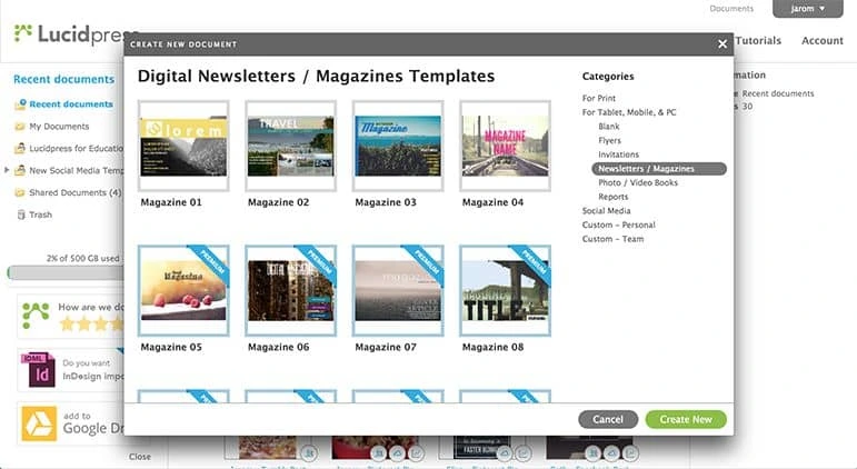
To upload your first image, click the image icon from the left-hand toolbox. You’ll notice that the panel on the right side—the context pane—has all sorts of image editing options. Play around until your photo looks just right.
I’m going to build a lookbook for my (imaginary) bridal shop, so the first image will show off my new dress collection.
Now it’s time to add design elements. Even if you’re not a professional designer, Lucidpress makes it easy. Just drag and drop shapes from the dock, customize them with the context pane, and add text as the finishing touch.
To add more pages, click Add Page from the dock.
Remember, no need to add flashy design elements—the photos will speak for themselves. With a few geometric elements and carefully chosen fonts, this lookbook manages to set an elegant mood. Click Preview at any time to see the lookbook through your customers’ eyes.
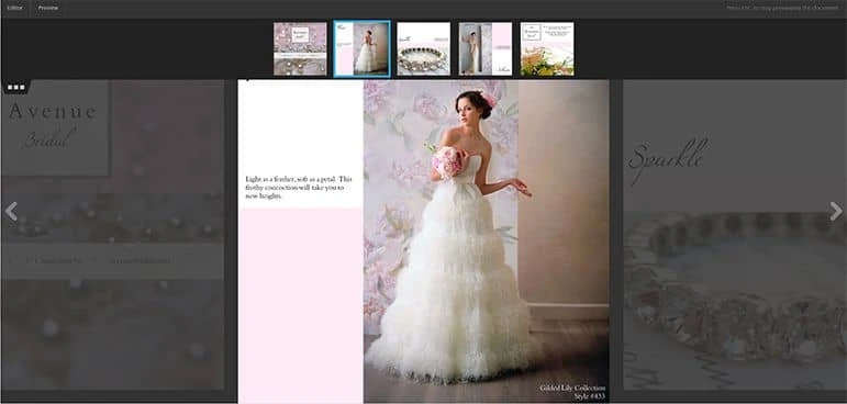
3. Put your lookbook to work with links and videos
It’s important to capture leads as soon as your viewers are intrigued, so be sure to add relevant URLs. For example:
- This lookbook includes a call to action that prompts readers to schedule a free consultation.
- I’ve made every product photo clickable, so readers are directed to that exact item in my online store.
- And I’ve added a video that emphasizes our personal service and industry know-how.
Each of these actions boosts engagement and increases the likelihood that lookbook readers will become customers.
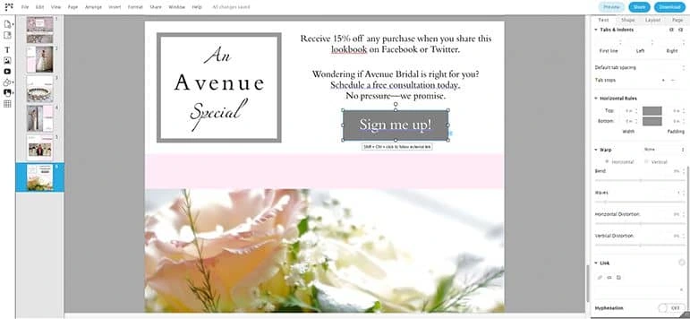
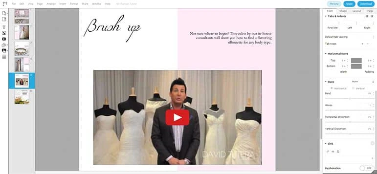
4. Publish your lookbook and spread the word
To publish the finished product to the internet, click Share, then choose On the web. Make sure you check the box that allows you to include social sharing icons. This makes it easy for viewers to share your lookbook with all of their followers. If you haven’t titled the lookbook yet, you’ll be prompted to name it now. Choose a title that will capture your audience’s attention and persuade them to click.
This option will create a digital presentation of your lookbook, accessible through a URL link.
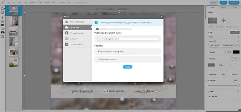
Are you looking for more publishing options? You’re in luck!
- Download > PDF will create a PDF with searchable text, which might be important for your viewers or for your SEO efforts.
- Download > PNG (or JPG) will generate static images, which are great for sharing on Pinterest. You can even link the image to your digital lookbook (instructions above).
- Share > With Collaborators will enable others to edit your draft. Don’t worry—you decide who’s invited and what they’re allowed to do.
- Share > In Email will give you code to insert in your email client. When you send the email, a clickable thumbnail is displayed.
- Share > On Your Website also gives you a snippet of code. Add it to your website and an embedded version of the lookbook pops up. See below for an example.
And there you have it: a stunning digital lookbook that can be shared anywhere, any time. We’d love to hear how you use lookbooks for your brand—share in the comments.
Create your own digital lookbook today with a free template in Lucidpress.
Lookbook examples for your inspiration
Looking for the perfect inspiration for your lookbook? Check out the gorgeous examples below. Want to use one as a template? Simply click on the link beneath the viewer.
Boutique lookbook
The product is the star in this lookbook example with full-page images and small sections of supporting copy. The letter from the owner personalizes the lookbook, and the images are a mix of style combinations, product closeups and glimpses of the boutique itself.
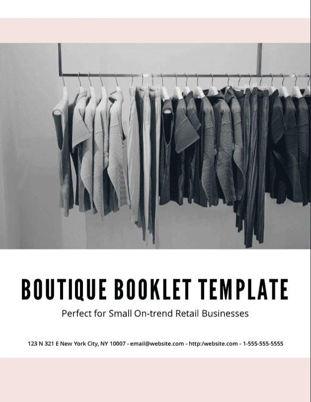
Modern portfolio lookbook
This lookbook is a great example of an interior design lookbook. Stunning photography captures the possibilities of what a home or office could look like. The portrait of the owner helps connect the reader to the owner and build trust. A brief listing of services and pricing at the end provides a nice call to action for the reader.
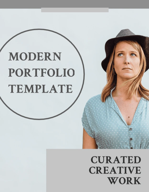
Slate graphic portfolio template
Photography lookbook
A lookbook is a great way to curate and display samples of your photography. This lookbook captures the essence of the photographer’s style beautifully with photo collages, simple color hues and a modern font. By combining human faces with still objects the photographer showcases their diverse skill set.
Femme fatale portfolio template