Despite how ubiquitous digital marketing has become, print collateral can still play an incredibly valuable role in your brand marketing stratgy. Businesses large and small can benefit from this versatile medium, from empowering sales teams at trade shows, to generating awareness through direct mail campaigns.
Still, brochures often get a bad rap for being lifeless, boring, and unengaging – a problem that can stem from bad design, ineffective messaging, and low budget. To help you avoid those common pitfalls, we’re going to take a deep dive into the ins-and-outs of effective brochure design. In this guide, you’ll learn how to design a brochure that people will actually want to look at.
When to use a brochure vs. other print marketing
If you can’t decide whether your brand would be best served by a brochure, or other printed material like a flyer or poster, we suggest looking to your buyer journey for some guidance. Flyers are great for attracting attention, building awareness, and sharing a short message. Brochures, on the other hand, tend to be far more effective down the road, when a prospect is in the information-gathering stage. Brochures offer you a chance to share more detailed information about your brand, products, and services.
Here just a few instances where a brochure can be helpful:
Marketing — Brochures can easily be included in direct marketing campaign, or handed out at trade shows or conferences.
Food service — Restaurants can create catering and to-go brochures for patrons to save for later.
PR — Public relations managers can include brochures in press releases and media kits, so the news media can craft better, more accurate stories about a company.
Sales — Salespeople can hand out brochures to business associates, partners, and potential clients after a demo or presentation.
Standard brochure sizes and layouts
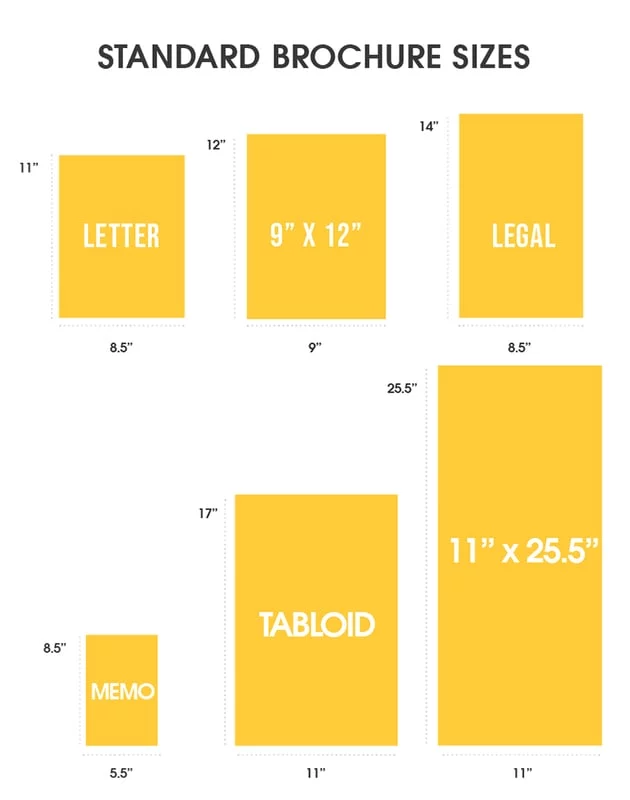
The first step in designing a brochure is choosing the right size. When thinking about brochure size, think about portability, foldability, and how much written or visual information you want to include.
Below are the most common brochure sizes businesses use.
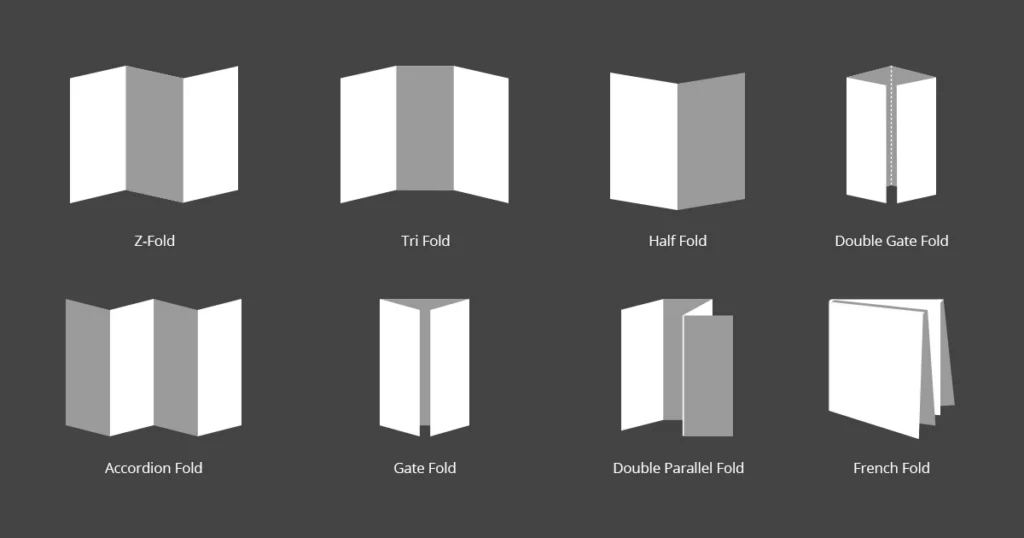
Once you’ve settled on a size, it’s time to think about the layout you’d like to use. From simple bi-folds to creative spiral folds, your choice of layout determines how readers will interact with and move through your brochure.
While there are many different creative brochure layout options to choose from, here are just a few of the most common brochure folds.
Now that you’ve chosen your size and layout, let’s talk about what to put in your brochure.
How to design an effective brochure in 5 steps
Create an outline
Before you start designing anything, you’ll need a detailed plan of attack. While brochures can vary in content and length, most follow a standard format.
- The front panel displays your headline and logo.
- The inner panels make a case for your product/service using
- The final panel contains your contact info and a call-to-action.
Identifying your target audience will help you build out an appropriate outline and flow to your brochure – and will inform your brochure’s tone, language content, and CTA.
Make note of where your target audience is in the buying cycle. Don’t waste space detailing the history of your organization if your readers have done business with you before.
Nail down these essential elements
Now it’s time to dive into the fun stuff. Like we mentioned before, every brochure is different, but all should include these 5 critical elements.
An eye-catching cover and headline – This is the first (or only!) chance your brochure has to give a strong impression, so make it count. A high quality, relevant image combined with a brief, easily legible headline will provide your reader with a strong understanding of what your brochure is about.
A compelling offer – Details aside, what you’re really providing with a brochure is opportunity. No matter what your product or service is, your brochure needs to offer just enough to make readers want to know more.
Valuable information – Brochures offer limited space to communicate your message, so prioritizing which information to include is key. The best rules of copywriting apply here: be clear, be concise, and tell a good story that makes your reader the hero.
A strong call to action – You can build a beautiful, convincing brochure that makes your audience feel exactly the way you want to… but it’s useless if you don’t set them up with a next step. A strong CTA will prompt your readers to call, visit, or connect with you in some way.
Detailed contact information – This goes hand-in-hand with your call to action. Not everyone will make a move right away. In fact, many people hold onto brochures to reference later, when the time is right. Make connecting with you easy by putting your contact info on the back.
Consider adding extra information & resources
Got extra room in your brochure and want to make a bigger impact? Think about adding extra information and resources for your readers. Consider where they might be in the buyer journey, and tailor these extra resources to meet any questions or hesitations they may have.
Some possible extra resources include:
- Answers to FAQ
- How-to guides
- Customer testimonials
- Product specs
- Pricing charts
- Pros and cons
Proofread & check for important details
No matter how much effort you put into your messaging and design, one small error or inconsistency can kill your credibility.
Before you send your brochure off to the printers, proofread everything (and proofread again). We also suggest making sure the tone of your brochure matches the rest of your brand messaging. Unlike informational brochures (which may take the third-person point-of-view), sales brochures usually use the second-person to build rapport with the reader.
Refer to your brand style guide for how to handle things like numerals, dates and titles in the text.
Test run your prints
The last thing you want is to waste time and money printing hundreds of brochures only to realize that the sizing is off, or your imagery is grainy. Do a small test run to verify that the finished product meets your expectations.
5 brochure templates to get you started
Don’t want to have to design a brochure from the ground up? Try customizing a brochure template instead. Here are just a few of our favorites here at Marq.
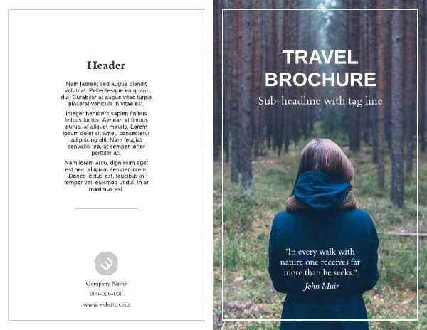
Redwood Coast Travel Brochure Template
This bi-fold brochure template has ample space to showcase immersive photography, with just enough space to introduce readers to your brand.
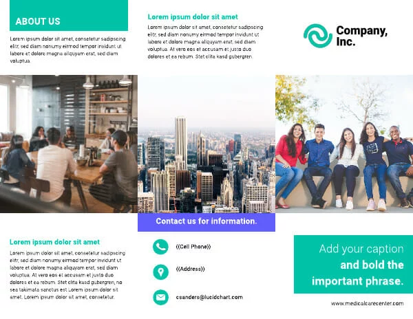
Visual trifold company brochure template
A traditional trifold layout makes it easy to describe your business while creating a compelling cover design.
Health insurance company brochure template
Need to include detailed data and comparisons? This template is perfect. And with Marq’s data automation, you can auto-populate your own data by connecting your template to a Google Sheet.

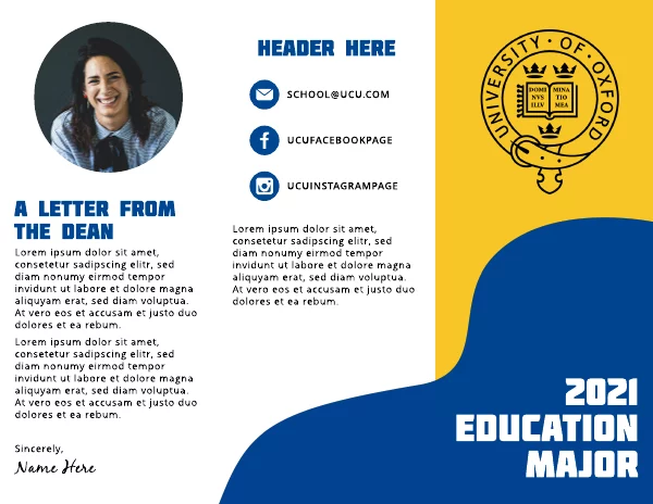
Wavy Shape College Tri-Fold Brochure Template
Update your marketing with a fun, fully customizeable brochure layout. Simply update colors, fonts and images to match your brand.
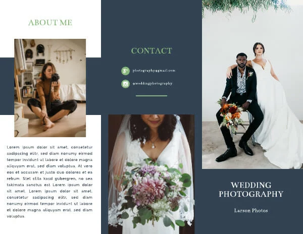
Navy Blue Wedding Photographer Brochure Template
Have a visual-first business? This template offers plenty space to showcase your photography, art, or graphic design.
Want to design your own beautiful brochure online? Marq makes it easy. With our intuitive drag-and-drop online brochure maker, just choose a template and customize it to fit your brand.
“Good artists copy, great artists steal.”
Steve Jobs
When you’re stuck on something, the best thing to do is to step away and look around. Often, the greatest inspiration comes from the world surrounding us. A great designer, like a great artist, will take in the best of what they see to make something new and unique.
Related: 17 flyer design ideas for your inspiration
Keep reading to see 21 examples of brochure ideas you’re welcome to steal from. You can browse to spark some ideas, or you can edit a template to fit your creative vision of the brand you’re representing. All of these brochure and pamphlet designs are available with a Lucidpress account.
The other thing that’s exciting about these brochure templates is that they can be used for digital or print. Digital publishing opens up exciting new possibilities like scrolling text, links within the brochure, embedded video, and widespread distribution. For example, La Presse, the oldest French newspaper in North America, used digital publishing in Lucidpress to revolutionize the newspaper industry. Enjoy, and check out the end of the post for more design resources.
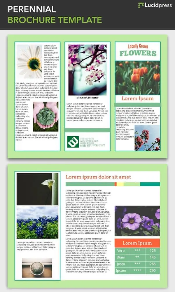
1. Perennial Brochure Template
A fit for more than just floral applications, the Perennial brochure is perfect for organizations with a cheerful, springtime brand, or for any outdoor events held when the sun is shining.
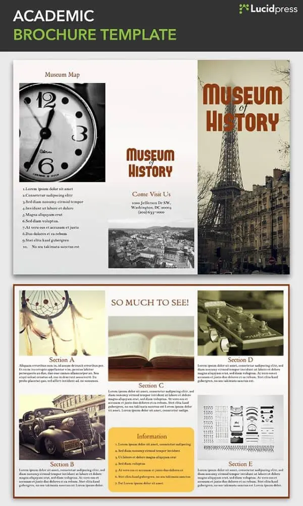
2. Academic Brochure Template
Museums, historical landmarks, and city tour organizations can use the Academic brochure to bring their unique features to life. The Academic uses a tri-fold design and a section-based layout to highlight the different sites and items of interest that visitors or tourists will want to see during their stay.
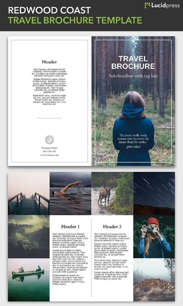
3. Redwood Coast Travel Brochure Template
This bi-fold brochure template has ample space dedicated to photographs of the travel destination. Readers will be quickly transported there by the immersive images. The image-based cover is intriguing but not overwhelming, adding just the right touch to this beautiful design.
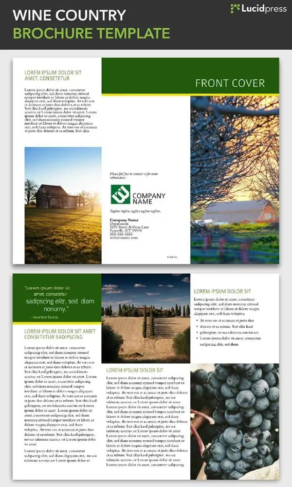
4. Wine Country Brochure Template
This tri-fold brochure template is particularly well-suited for agricultural or rural-oriented organizations, including wineries, family farms, and agricultural nonprofits. The elegant, clean design evokes the simple beauty of the countryside.
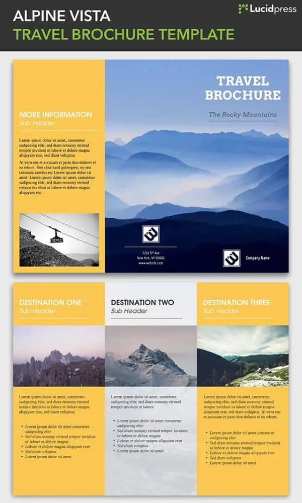
5. Alpine Vista Travel Brochure Template
The Alpine Vista brochure has an adventurous tone perfect for companies promoting mountain sports and expeditions. A stunning photograph leads out on the cover while a yellow color scheme injects a positive, exciting energy. Also, the three divisions for different destinations makes the most of the tri-fold layout.
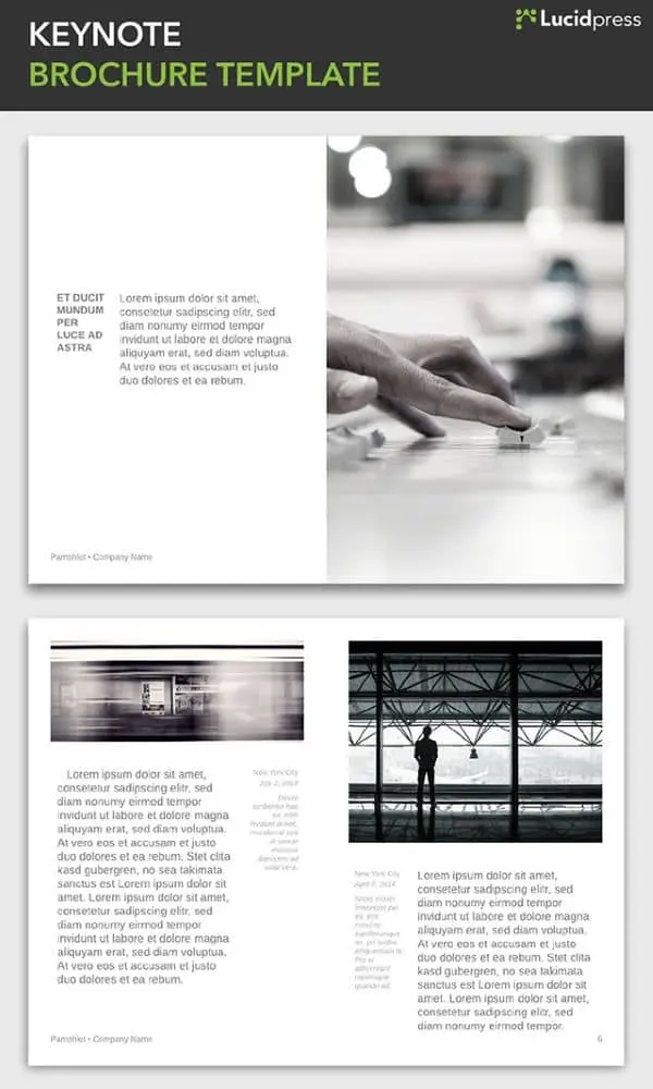
6. Keynote Brochure Template
The Keynote is stylish and modern, embracing minimalist design that can be adapted to a range of industries and organizations. This template can be customized to be longer or shorter, depending on your needs. This bi-fold design lends itself well to a creative mind looking to try something new.
7. Passport Brochure Template
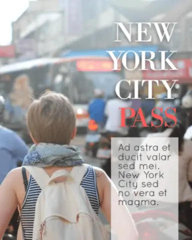
Another booklet-style brochure, the Passport balances modern sensibilities with just the right dose of playfulness, calling to mind a day spent exploring hidden wonders on New York City streets. This design separates the text and the images, giving each an opportunity to stand on their own while remaining cohesive.
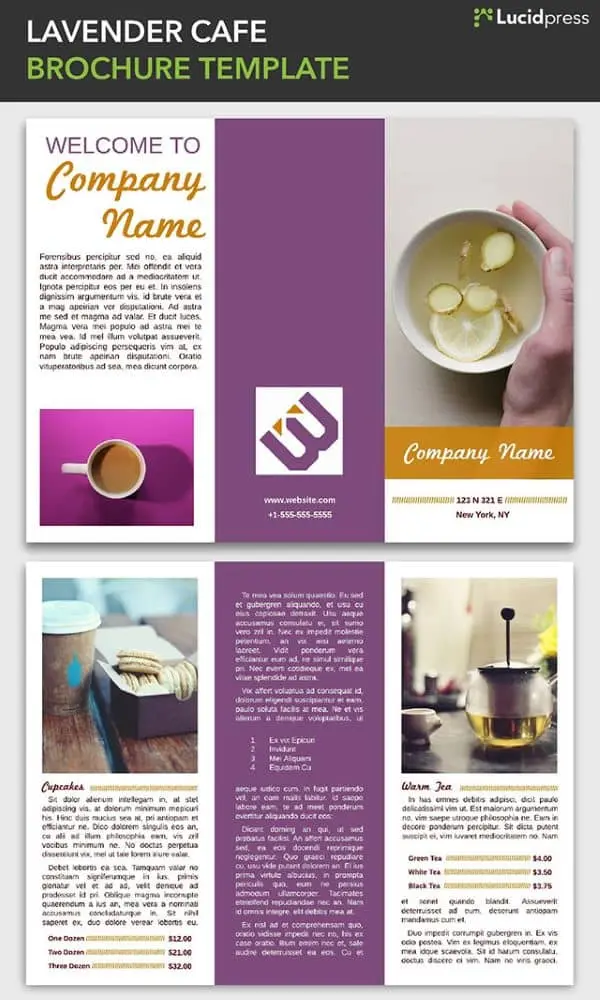
8. Lavender Cafe Brochure Template
This tri-fold brochure design has elements that work in harmony with the tri-fold format to create distinct sections, each with a unique layout that keeps things interesting. It works well in a restaurant application, as shown here, but could be adapted to any business.
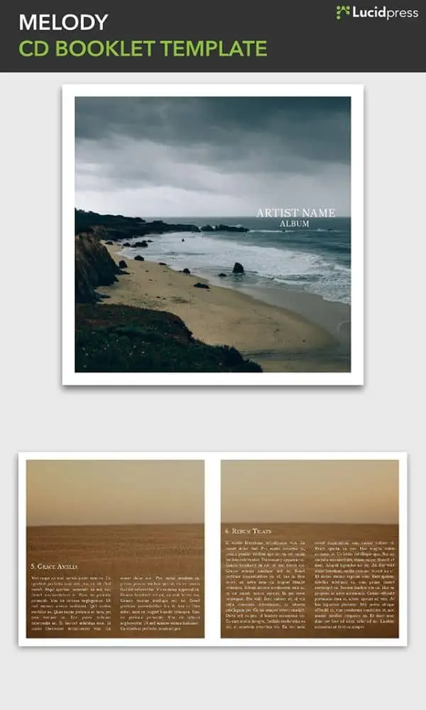
9. Melody CD Booklet Template
If you’re creating an album booklet for yourself or a client, this template provides a good foundation. It can also be a springboard for out-of-the-box brochure design ideas. The image-centric, booklet-style design is a sleek, artistic format that could give your brand a professional edge.
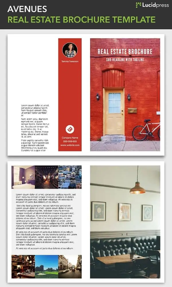
10. Avenues Real Estate Brochure Template
Real estate brochures are an industry standard, so you need yours to stand out. Plenty of space for images of the property as well as for your engaging descriptions makes this template a powerful tool in your real estate marketing arsenal.
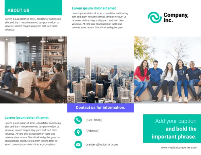
11. Visual tri-fold Brochure Template
This visual brochure template uses large photos through the middle of of each page and mixes regular text with bold to highlight important phrases.
12. Brisk Pamphlet Template
The Brisk pamphlet template, ideal for both long-form and short-form applications, has a modern, edgy feel. At the same time, it’s clean and professional, giving your brand room to breath. Who says business can’t be stylish?

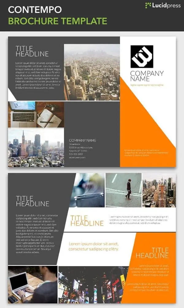
13. Contempo Brochure Template
Clean lines and compelling angles define the Contempo brochure. Assert your unique brand of corporate culture with a spin-off of this design. Or insert your brand colors and use it as-is for a progressive, well-groomed brochure.
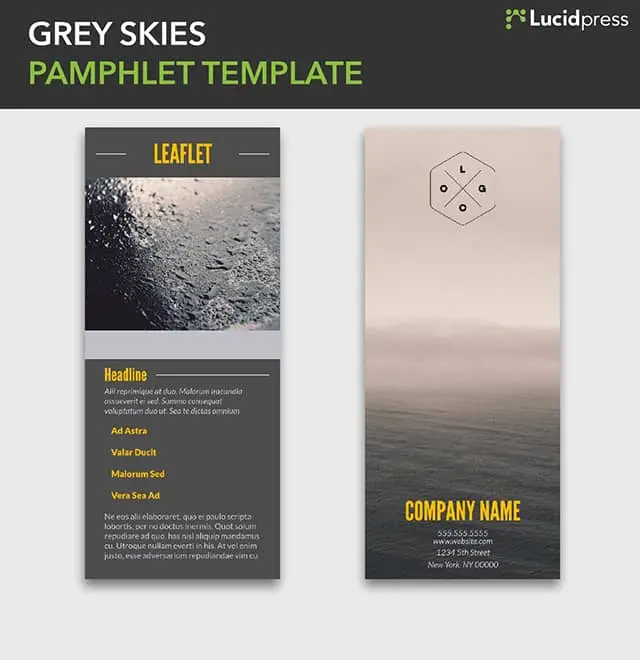
14. Grey Skies Pamphlet Template
Sometimes just a little bit of text is all you need. The image is king in this leaflet design, letting you give a visual summary of your brand’s core ideals. First impressions are important, and this design leaves them intrigued and wanting more.
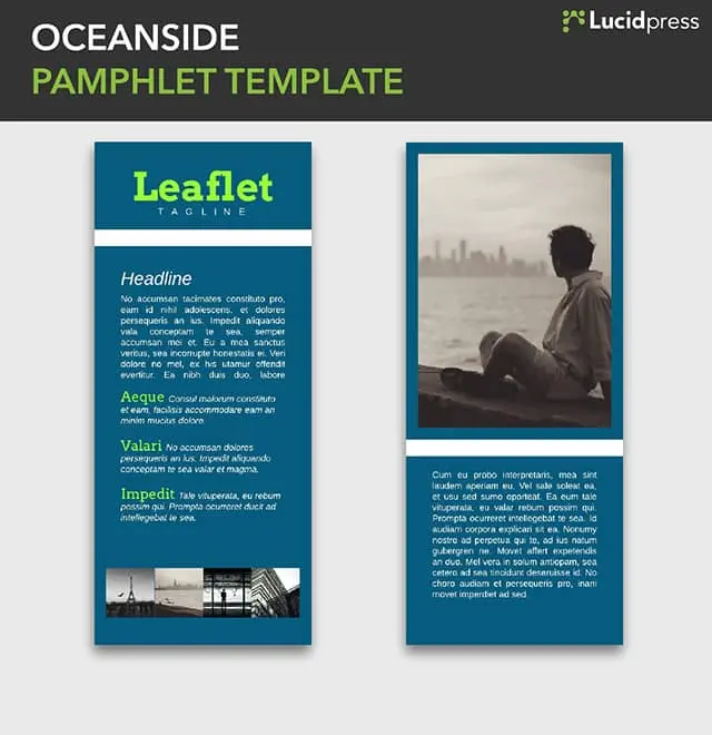
15. Oceanside Pamphlet Template
The Oceanside pamphlet template is still short and sweet, but gives you a little more room to write than Grey Skies, if that’s what the situation calls for.
16. Residential Real Estate Brochure Template
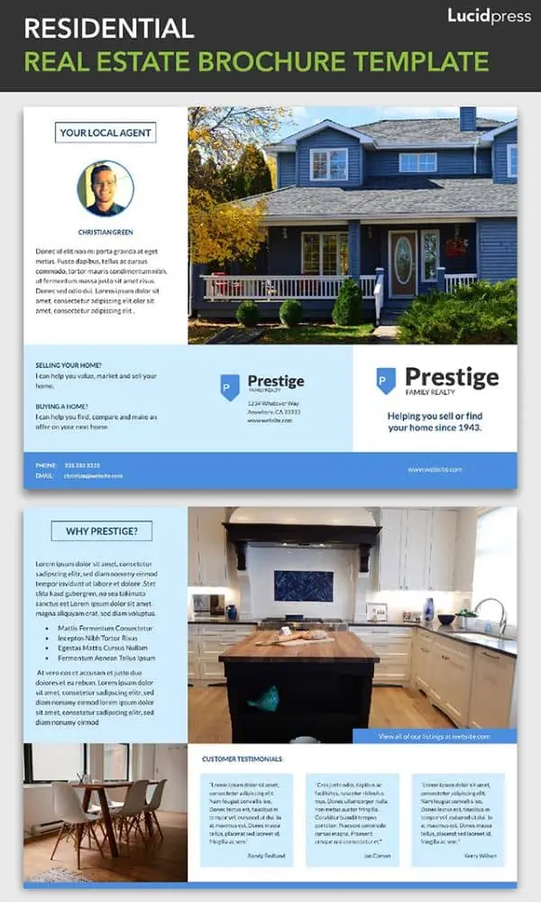
The Residential real estate template has a warm, inviting tone that also feels very fresh and current. The way the text wraps around the images resembles a tour around a property, with the realtor pointing out the highlights to prospective buyers.
17. Mediterranean Brochure Template
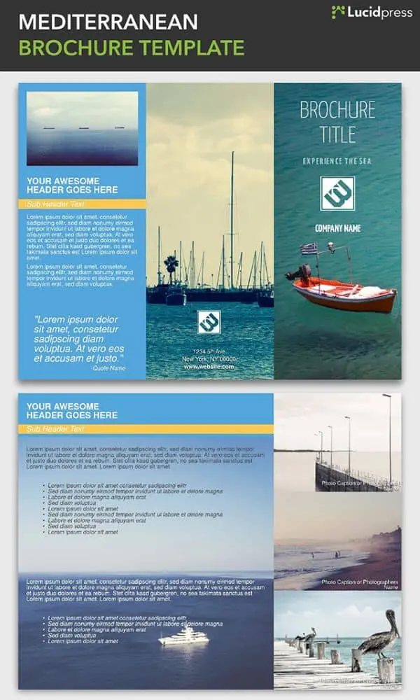
Beautiful images make up the bulk of this brochure template, giving it an immersive and open feel. Blue tones and ocean-themed photographs call to mind the gentle lull of lapping waves and warm sand. Using the design of your brochure to create a distinct feel can solidify your brand for a customer before they even read a word of copy.
18. Big Sky Travel Brochure Template
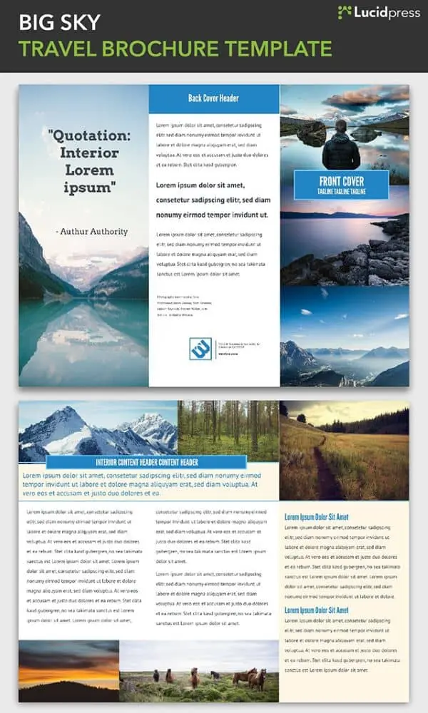
The Big Sky travel brochure template is highly adaptable, with a blend of elements that are easily customized to match the look and feel of the destination. The front cover has space for three photos, immediately showing the diversity of the locale, and the layout of the text makes the most of the space without looking cluttered.
19. Prism Brochure Template
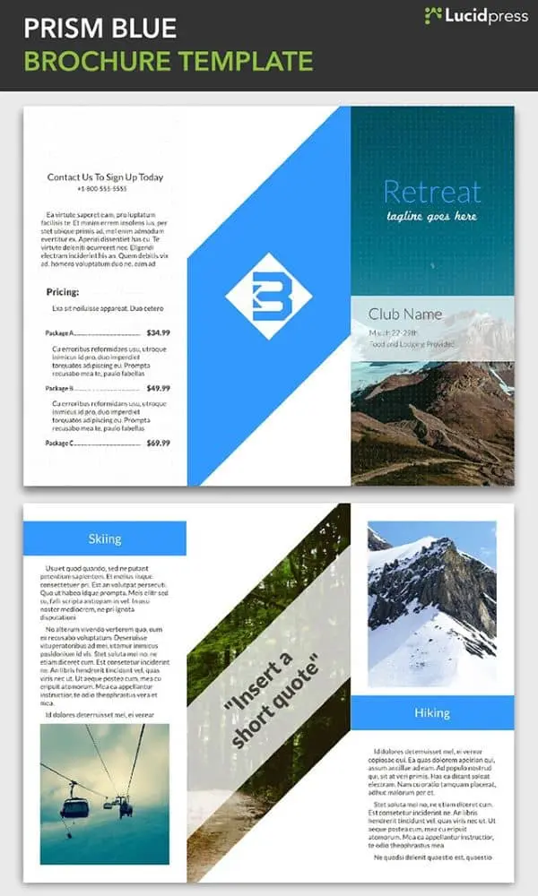
The pronounced angles of the Prism brochure template match the mountain resort imagery it riffs on. This template is excellent for relaxing spas and massage centers, tour companies and ski resorts, or for internal company announcements like an upcoming retreat.
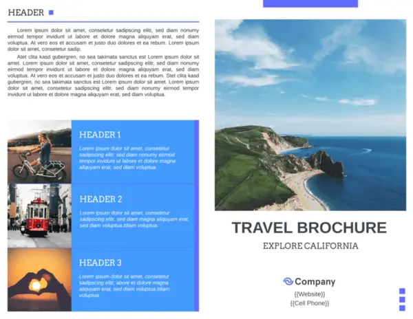
20. Golden Gate Travel Brochure Template
This template captures the diverse personalities of America’s favorite state (according to me). There’s the crashing surf, the vibrant city, quiet vineyards, and the intriguing fog of San Francisco. The main image on the cover sets the tone, while supporting images show the range of the featured destination.
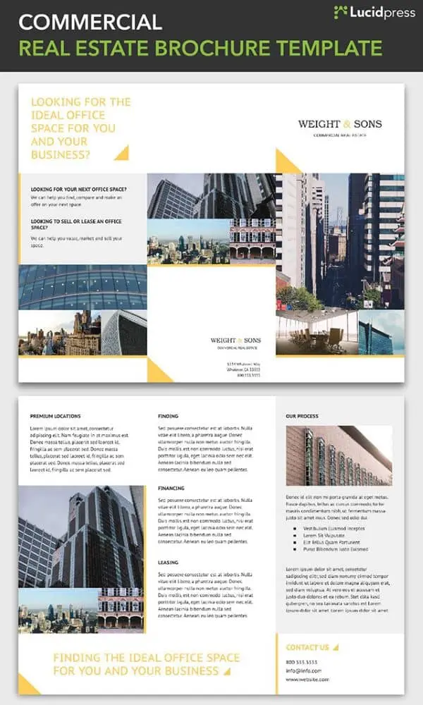
21. Commercial Real Estate Brochure Template
A subtle triangle theme in the Commercial brochure pulls the design together, with the three points of the triangle echoing the tri-fold style of the brochure. There’s plenty of space for text, but the layout is well-spaced and clean. The highly professional look of the Commercial brochure is perfect for real estate and corporate use.
Now that you have some inspiration, or maybe picked out a template to use, a few design resources might be helpful. The first thing to consider is making sure the brochure you create is consistent with the brand you’re designing it for. The color scheme, photos, and font choices will all contribute.
If you’re wondering where you can find high-quality photos for your brochure, check out this post with tips for finding royalty-free images that aren’t corny stock photos.
Now go make something great.
Despite the prominence of digital marketing, print collateral still has an important role to play in a balanced marketing strategy. A professionally produced brochure suggests a high budget and an established reputation.
Related: How to make a stunning travel brochure
Not only that, but brochures are versatile marketing tools. You can distribute them at trade shows, put them in brochure racks, send them via direct mail, and even publish them on your company website.
(They’re also very portable. Many people would prefer to grab a brochure and read it at their convenience rather than engage with a salesperson.)
Most brochures are just a few hundred words in length, so you don’t have a lot of space to get your message across. It’s important to make every word count. Here are eight tips for writing a brochure that signals professionalism and competence — and spurs your readers to action.
1. ) Create an outline or plan of attack
Brochures vary in content and length, but most follow a standard format.
- The front panel displays the company logo and headline.
- The inner panels make a case for the product/service using supporting facts and details.
- The final panel contains contact info and a call-to-action.
Please note: At the end of this post, we’ve included a cheat sheet of content types you can put in your inner panels.
Before you start writing, identify your target persona for the brochure including age, gender, location, role, income, interests and challenges.
This information will guide the tone, language and content of your brochure. It’ll also help you choose a call-to-action that appeals to your readers. For instance, an offer for a free white paper would likely be of interest to an executive, whereas a mobile app download would be more fitting for a college student.
Make note of where your target audience is in the buying cycle. Don’t waste space going on about the history of your organization if your readers have done business with you before.
Also consider the level of understanding your prospects already have about the topic. Are they experts, novices or somewhere in between? Keeping this in mind will help you avoid alienating readers by talking down to them or confusing them.
2.) Write a compelling headline
Your headline will determine whether a prospect picks up and reads your brochure or tosses it aside.
Avoid using headlines that don’t tell the reader anything about the contents of the brochure — for example, “Make a Good Impression.” What does this mean, who are you making a good impression on? And for what purpose?
You can provoke a reader’s curiosity without being vague. These example headlines spark interest while also telling readers exactly what they’ll get from reading the brochure:
- Scared of the Dentist? Learn How Sedation Dentistry Can Help
- The Ultimate College Prep Checklist: A Four-Year Plan for High School Freshmen
- 4 Reasons to Think Again Before Buying a Foreclosed Home
Don’t be afraid to use “power” words like free, quick, easy, results, exclusive, proven, etc. What they lack in originality, they make up for ineffectiveness.
3.) Be concise and use plain language
Your brochure should focus on one product or service. A trifold brochure only has space for about 350-450 words, so keep words, sentences and paragraphs short. Edit ruthlessly and include only the most relevant information, leaving room for white space and images.
Big walls of unbroken text look intimidating to readers, so use subheads liberally. Try not to put more than a couple of paragraphs in a row without introducing something else to break up the monotony, such as a subhead, bullet-point list or image.
With the help of Lucidpress’s online drag-and-drop editor, you can quickly design a professional-looking brochure with elements like callouts, pull quotes and tables.
4.) Limit the copy to 1-2 typefaces
The typefaces you choose should be easy to read and consistent with your branding. Often, if the subhead copy is in a serif face, the body copy will use a sans-serif face, and vice versa. There are some great free tools available to help you select a complementary font pairing.
Select font size, spacing and color with readability in mind so your prospects don’t have to work to read the brochure.
5.) Give readers a reason to keep your brochure
If you can, include a handy reference of some kind in your brochure to dissuade readers from throwing it away—for example:
- a map of a town marked with top attractions
- a “normal body weight” chart based on the reader’s height
- a list of program-specific student scholarships
- a cheat sheet for first-time homebuyers in a specific city
Also, consider printing the brochure on a high-quality glossy paper to boost its perceived value.
6. Include next steps or a call-to-action
The goal of your sales brochure should be to persuade your readers to take a specific action.
This call-to-action is usually placed on the last panel of the brochure, along with the contact info. To boost response rates, offer an incentive, such as a promo code or free product.
The following are some example actions you might want your readers to take:
- Sign up to your email list for a free white paper
- Visit your website to make a purchase or sign up for a program
- Call to book a free consultation
- Scan a QR code to download an app
- Enter for a chance to win
- Visit your store for an upcoming sale
7.) Proofread your brochure
No matter how much effort you put into your messaging and design, errors and inconsistencies in your printed literature can kill your credibility.
Verify that the tone of your brochure matches the rest of your brand messaging. Unlike informational brochures (which may take the third-person point-of-view), sales brochures usually use the second-person to build rapport with the reader.
Refer to your brand style guide for how to handle things like numerals, dates and titles in the text. If you don’t have a brand style guide, use an established style reference like AP Stylebook. And of course, look everything over for correct spelling, punctuation and grammar.
8.) Double-check for important details
Before the brochure goes to print, check that your logo and contact information are present and error-free. Also look for details you may have forgotten to include, such as:
- Purchasing info—how to place an order, accepted payment types, guarantees, warranties, refunds, shipping, etc.
- Visitor info—accessibility for people with disabilities, hours of operation, seasonal times, admission rates, group sizes, pets, directions, etc.
- Legal info—copyrights, trademarks, registration marks, disclaimers, etc.
You can also create branded templates for your brochures so you don’t miss anything important when you start a new project — Lucidpress handles printing as well.
Bonus: What should I put in my brochure?
For inspiration, here’s a cheat sheet of content types often found in sales brochures:
- Descriptions of products, services, exhibits or attractions
- Features and benefits
- Product specs
- Pricing charts
- Pros and cons
- Itinerary (e.g. winery tours)
- Narrative (e.g. history of a winery)
- How a product works
- How a service is delivered
- How to do something
- Checklists and questionnaires
- Images, illustrations, charts, graphs and maps
- Frequently asked questions
- Company blurb
- Social proof: case studies, testimonials or media quotes, client list, executive bios, etc.
Experiment with a few of these items and see where it takes you. You might be surprised at how quickly you run out of space!
What are you waiting for? Try your hand at design with any of our design templates.
So you’re wondering how to how to design a brochure that will impress. Dealing in the medium of brochures is a tricky thing, because they’re all just one step away from the garbage. But don’t worry, this post will show you how to make a great-looking brochure that’s not destined for the recycling bin. You’ll learn how to master the 2 most important components of brochure design: the copy and the photos.
For a brochure to be a success, your copy and images should be an integral part of the design, not just an addition. The finished product should also be consistent with your brand. Let’s jump in.
Related: How to make a travel brochure that looks stunning
Brochures are a powerful sales tool and have been around for decades. Today, anyone can make their own. But what is a brochure, really? Let’s review standard layouts, sizes, folding options, and suggested brochure content.
What is a brochure?
A brochure is a folded document that presents information in a segmented, easy-to-digest way. Brochures are similar to other printed documents, but with key differences. Like pamphlets, they are informational, but brochures are designed to advertise a particular brand, product or service. Unlike flyers and posters, brochures are folded into sections, so they can retain their size but present more information.
In previous decades, making a brochure was far more complicated, requiring long lead time and cross-departmental cooperation to bring together photography, hand-drawn elements, and typography. A design would go through several physical drafts before the final version was painstakingly created. Changes weren’t easy to implement, either. Today, one person can create a brochure from scratch using modern design software, and the brochure can easily be tweaked and edited to perfection.
When to use a brochure
It’s not uncommon to wonder when it’s appropriate to use a brochure rather than another format, like a flyer. The answer lies in the **buyer’s journey**. Flyers are great for attracting attention, building awareness, and sharing a short message. But brochures are far more effective down the road, when a prospect is gathering the information needed to make a wise purchasing decision. Brochures provide more information about a company, its products and its services, at a deeper level than a flyer can. For that reason, they’ve remained an essential marketing tool for many companies and organizations. Here are 12 excellent examples of when to use a brochure. There are many, many more, but these will give you an idea of the possibilities. +
Direct marketing — Brochures can easily be included in a marketing campaign like direct mail.
Financial — Banks can provide brochures in the lobby to explain their account options, loans, and other money-related services.
Food service — Restaurants can create catering and to-go brochures that patrons save for later. The best ones will include a full or simplified menu, along with contact information.
Healthcare — Doctors and hospitals can introduce themselves to a new community with a brochure explaining their services. Brochures are also handy for patient education on a variety of illnesses and other health concerns.
Marketing — Marketers can hand out brochures to interested visitors at trade shows and expos.
Offices — Offices with heavy foot traffic can provide brochures about their services in the waiting room. Visitors can read them while they’re waiting, and the staff won’t have to spend as much time explaining their services to each person.
Personal care — Spas and salons can use brochures to list all of the different services they provide, as well as their prices.
Politics — Politicians can use brochures to inform voters about their platforms and stances on important community issues.
PR — Public relations managers can include brochures in press releases and media kits, so the news media can craft better, more accurate stories about a company.
Retail — Stores with heavy foot traffic can provide brochures at the front of the store. A brochure of popular product highlights is far less expensive to produce than an entire printed catalog.
Sales — Salespeople can hand out brochures to business associates, partners, and potential clients after a demo or presentation.
Travel — Airlines and travel agencies can use brochures to advertise exotic destinations and affordable vacation packages.
Standard brochure sizes
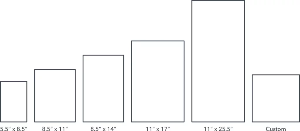
5.5″ x 8.5″ Often called a half-fold, bi-fold, or statement. This layout is created by folding an 11″ by 17″ sheet neatly in half, so that it opens and closes like a book. Commonly used for menus and event programs. If you fold it in half again, you can create a quarter fold brochure with 8 miniature panels.
8.5″ x 11″ You’ve likely seen many brochures of this size, since businesses often use them as sales and marketing pieces. This is the most popular size because it can be folded into several useful configurations that fit easily in an envelope. A tri-fold creates 6 long panels, and we’ll discuss the different tri-fold layouts in the next section.
8.5″ x 14″ Slightly larger than its predecessor, this size also makes for great tri-fold brochures. More space means more folding options, such as double gate or parallel folds. In fact, a double parallel fold creates a slender brochure that has become a staple in tourist information racks.
11″ x 17″ Larger brochure sizes are most helpful as visual aids. This size is often used for amusement parks or other tourist attractions, because there’s enough room for a map. It’s a great size for showcasing travel destinations as well.
11″ x 25.5″ The largest standard brochure size. What it lacks in portability, it makes up for with visual impact. Brands who depend on gorgeous, detailed photography benefit from the extra space. For example, real estate agents can show off their properties with full-color photos of a house and its rooms.
Custom If you’re hoping to make something unique, you can always talk to your printing partner about custom sizes. Just be prepared to discuss pricing, because custom printing will be more expensive than sticking to the standard. For some creative inspiration, check out this Pinterest board of unique brochure designs.
Popular brochure layouts
Bi-fold
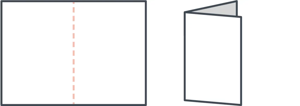
The simplest brochure layout is a bi-fold, where a single sheet of paper is folded in half. This results in 4 consecutive panels that can be read from left to right like a magazine. The vertical layout is more popular, but a bi-fold can be oriented horizontally, too.
Tri-fold
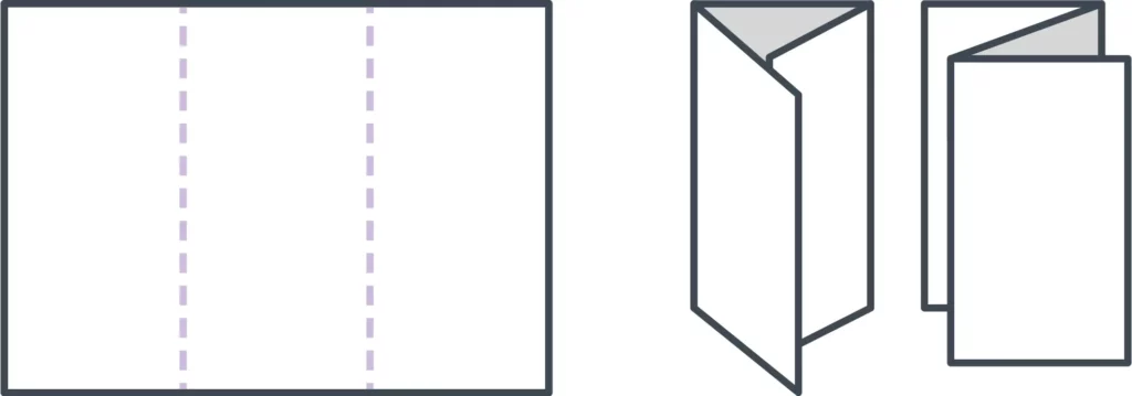
The most popular layout is the tri-fold, a single sheet of paper folded into thirds. Tri-folds are versatile, giving you multiple folding options. Even though they each contain 6 panels, how you fold the paper will determine which panels end up where.
- C-fold — A C-fold resembles the letter C when open. When closed, one third of the paper is nested between the others, like a spiral.
- Z-fold — A Z-fold resembles the letter Z, opening and closing like an accordion.
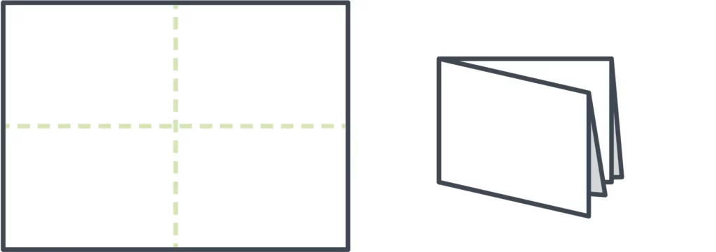
French fold
A French fold is created by folding a sheet of paper vertically and then horizontally. This separates the paper into quarters, resulting in 8 panels overall. With a French fold, your brochure is small and portable, but it expands to the size of a flyer or poster. If you want to present a large design across multiple panels, this fold can be very effective.
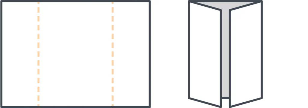
Gate fold
Sometimes called a window fold. Though this is technically a tri-fold, it does not result in 6 equal-sized panels. Instead, the right and left sides of the paper fold in to meet in the middle. This makes the center panel twice as large, creating more space for visual design inside the brochure.
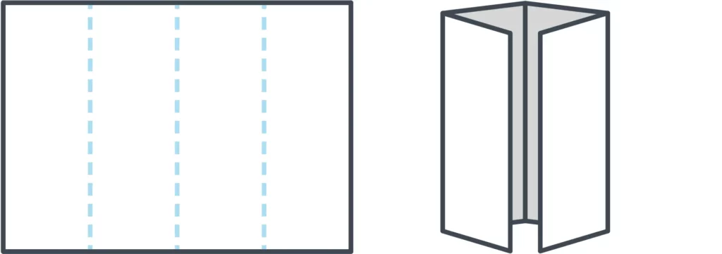
Double gate fold
To make a double gate fold, follow the steps above to create a gate fold brochure. Then fold it in half again, vertically. This creates a central fold down the center panel, resulting in a slender brochure that can fit more easily into envelopes and other narrow spaces.
Double parallel fold
A double parallel fold requires two vertical folds. Take a sheet of paper and fold it in half, then fold it in half again. That way, half of the sheet is nested within the other. In the end, you’ll have 8 panels. Depending on the size of the paper, the resulting brochure might be narrower than a typical tri-fold, or it could be roughly similar in size but with the addition of 2 panels.
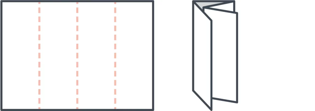
Spiral fold
Lastly, our standard set concludes with the spiral fold. It’s similar to a C-fold, but with more panels—typically 8 in total. The spiral effect is achieved by folding each panel inward so that they nest inside one another. Because of this, the inner panels should be slightly smaller than the outer panels, so that the brochure lays flat when folded.
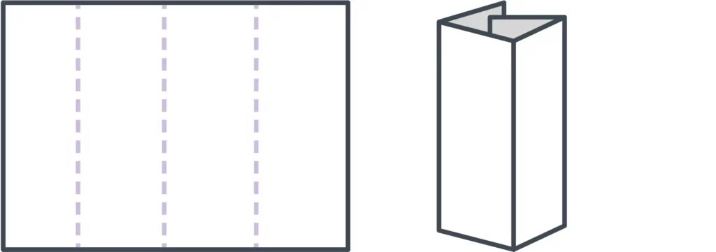
Designing for your fold
If you’ve chosen a layout but are unsure how to design it, try folding a blank sheet of paper and numbering each panel. That will make it easier for you to keep track of where each panel goes while you’re designing onscreen. It’s a handy reference tool!
Templates
Templates are the brochure maker’s best-kept secret. It doesn’t make sense to start from scratch every time you need to create a new brochure, especially when many software tools provide free brochure templates designed by professionals. If you have no idea what you want your brochure to look like, templates can provide inspiration and samples to work with. If you already have a vision, the right template can save you loads of time. For examples, take a look at our gallery of free brochure templates.
Essential brochure elements
Because brochures are most often used in advertising, it’s important to consider what your brochure should inspire the audience to do. Like many marketing materials, a good brochure will be visually interesting, tell an engaging story, and prompt the reader to take a certain action—like purchasing a vacation package, for example.
When you layout your brochure, make sure the following elements are well represented.
1. An alluring cover
This is the first (or only!) chance your brochure has to give a strong impression, so make it count. The cover is a promise, so it should reflect what’s inside. A high quality, relevant image combined with a brief, easily legible headline will provide your reader with a strong understanding of what your brochure is about.
2. A compelling offer
Details aside, what you’re really providing with a brochure is opportunity. It shows the reader a whole new world of possibilities to improve their life. No matter what your product or service is, whether it’s catering plans for a wedding or security alarm systems for an office building, your brochure needs to offer just enough to make readers want to know more.
3. Valuable information
Brochures offer limited space to communicate your message, so prioritizing which information to include is critical. Dedicate space to the features and (more importantly) benefits of your offering, and consider other details like prices, dates and times, if applicable. The best rules of copywriting apply here: be clear, be concise, and tell a good story that makes your reader the hero.
4. A strong call to action
You can build a beautiful, convincing brochure that makes your audience feel exactly the way you want to… but it’s useless if you don’t provide the next step. A strong call to action will prompt the reader to call, visit, or connect with you in some way, so that the relationship can proceed further. Sometimes this means making a purchase, but not always, so think about what you want your audience to do after reading your brochure—and direct them accordingly.
5. Detailed contact information
Goes hand-in-hand with your call to action. Not everyone will make a move right away. In fact, many people hold onto brochures to reference later, when the time is right. Don’t make them search for ways to get in touch with you. Make it easy by putting your name, phone number, email/web address, and physical location on the back. Some companies even put a simplified map to help people find them. That might be a little old-fashioned in the age of GPS, so you could include an interactive QR code or other helpful tidbit instead.
Other ideas to consider
The 5 elements listed up there? Those are the basics. If you really want to knock it out of the park, here are some tried-and-true brochure sections that you might not have considered before.
Answers to FAQ
It’s likely that your readers share similar concerns, resulting in frequently asked questions. Save time and overcome objections early by including a FAQ section in your brochure. Don’t dive too deep; a brochure should be brief and present your brand in its best light. But for concerns that can be quickly and easily resolved, a helpful FAQ section is worth its weight in gold.
How-to guides
Knowledge is power, which is why information is valuable. Sharing helpful information with your audience builds trust, and a how-to guide is a great example. Empower readers to spot or solve a problem on their own by breaking down the process, step by step. It could be instructions on how to test your product, but it doesn’t have to be.
For example, if you’re a pest control company, you could offer tips on how to identify the presence of certain insects or rodents. If you’re a photographer, you could include tips on how to dress for an outdoor photo session. Take a few moments to brainstorm about your brand, and an idea will likely present itself.
Testimonials
No one can speak to how your brand improves lives the way your customers can. They know because they’ve experienced it firsthand in a way you cannot. That’s why we, as consumers, trust friends, family, and online reviews more than any slick sales proposal. Including testimonials in your brochure adds a layer of humanity and credibility that can reassure your readers that they’re making the right choice.
How to make a brochure
Here are the basic steps involved in creating a brochure. If you’re ready to learn more, we have a longer, detailed article that covers each step in depth. Visit our guide on how to make a brochure to learn more.
- Consider your layout / size. Before you can start designing, you have to decide how big or small you want your brochure to be, as well as how it should be folded.
- Write compelling copy. Brochures don’t offer a lot of space, so each word should be purposeful. Make your message consistent, easy to read and easy to understand.
- Provide visual interest. Illustrate your message with visual elements, including high quality photos, that make your brochure more interesting to the reader.
- Choose your colors. Color is closely tied to emotion. Using colors effectively in your brochure will enhance your message and emphasize specific points.
- Test-run the print version. Before you print (or order) hundreds of copies, it’s critical to test-run it first. Verify that the finished product meets your expectations.
Want to design beautiful brochures online? Lucidpress makes it easy. With our intuitive drag-and-drop online brochure maker, you can select a template and customize it with fonts, colors, shapes, images and more. It only takes minutes to create a high quality brochure that you’ll be proud to print and share.
The copy
Words. We throw them around every day, but how often do you carefully consider what you’re saying? When it comes to brochures, word choice is paramount. Remember that your objective is to entertain, persuade, and inform. Here’s how you do it:
1. Check your grammar and spelling
Read your work twice, then have someone else look it over. A misspelling or grammatical mistake can slay your professionalism and doom your brochure to the open jaws of the trash can.
2. Make evergreen content
You don’t want to create a quality brochure only to make a new one next year because the content is out of date. In copywriting, a principal objective is to make sure your content is evergreen. This means that your content will (theoretically) always be relevant. So, you might want to avoid including references to upcoming holidays or this year’s Super Bowl winners.
3. Be international
Your copy will potentially be read by people from many countries and cultures. Every culture has idioms and colloquial expressions that may not transfer well. For example, if you talk about killing two birds with one stone to someone who speaks English as a second language, they might call the animal cruelty hotline.
Of course, using colloquial or idiomatic language can humanize your brand and keep things lighthearted. It becomes a problem when you use so much culture-specific language that your writing is unintelligible to someone who has a different background. Knowing your audience will help you strike the right tone.
4. Know your brand and stick to it
Every line you write should align with the larger brand experience of your organization. This creates a consistent experience for your customers—and helps potential customers know what to expect. Just like we speak differently in different social settings, the copy in your brochure should adjust to your brand.
Yelp’s Eat24, an online food delivery service, has settled nicely into a brand that really works for them. The tone is playful and lighthearted; for an example, check out this messaging from the Eat24 website:

This copy is clever and it also matches the overall feel of Eat24’s site. The humorous, slightly sarcastic branding of Eat24 could work for your brand, but you also might need to take a different approach. Imagine if you saw an ad from your bank that said, “We’ll watch your money for you. Probably.” Customers would be confused and concerned, so again, know what’s acceptable to your audience.
For more examples of standout copy, check out this post from Hubspot’s marketing blog.
The photos
Just like your copy, the photographs in your brochure send a message. You’ll want to make sure that message is professional and interesting. Before we get any further, I think I need to make one thing very clear:
Beware of stock photography.
Millions of Americans struggle with stock photography every year. You know it when you see it—models with unnatural facial expressions, dressed in stereotypical clothing, all bathed in lighting that even a moth wouldn’t fly toward.
Just thinking about it makes me shutter (get it?), and I don’t want you to feel the same pain. Luckily, there are alternatives. What follows is a list of my favorite sites for free images that aren’t awful (in no particular order).
1. Unsplash

I find myself visiting this site most often. I think the images are gorgeous, and they’re always very high quality. All the images are free, and no attribution is necessary. It’s a pretty great deal, and you also don’t have to sign up for anything to download the image.
2. Pixabay

Pixabay has a ton of images on their site, and, like Unsplash, there is no attribution required. There is a pretty diverse range of photos on Pixabay, though the quality does vary. You can find some great stuff though!
3. Stocksnap.io

Again, no attribution required here, and there’s a great selection of high-quality images. Many of the images are comparable to Unsplash, and sometimes the two overlap a bit. Stocksnap.io has definitely come in handy for me.
4. Flickr

Flickr has a lot of great stuff, you just have to be aware that not all of it is free for commercial use. You can filter your searches to only include photos that are open to commercial use and modifications, and you’ll usually have to credit the image to the original creator and link back to the source, just as I did on the photo above.
There are a few more options out there, but those are a good place to start. Fantastic photos will draw your brochure readers in and stay their trash-tossing hand.
Ready to get started? Choose one of our free brochure templates and dive in!
Patient engagement is touted in both healthcare marketing plans and clinical settings as a strategy to produce better health outcomes and, ultimately, a better patient experience. But a close inspection of the intersection of marketing strategies and patient engagement shows that in many healthcare settings, the effort to become patient-centric has not produced effective patient engagement.
Let’s take a closer look at what patient engagement means, why it matters, and how to create patient engagement strategies that connect to better outcomes, reduced costs, and more fulfilling experiences for both patients and clinicians.
What is patient engagement?
Patient engagement is defined as a patient actively engaged in their own healthcare decision-making. At its best, patient engagement is a partnership between patients and clinicians in which they share information, foster healthy behaviors, and craft treatment plans to manage conditions and produce desired health outcomes.
Patient engagement should not be confused with patient satisfaction. While engaging patients in their own care may lead to better satisfaction with the patient experience, the two terms are not interchangeable.
Why patient engagement strategies in healthcare matter
Studies have consistently shown that patients who are actively engaged in the management of their own care and treatment plans achieve better health outcomes. Patients benefit from responsive providers who are willing to engage in the kinds of ongoing dialogues that foster trust and transparency in the healthcare decision-making process.
This kind of relationship-building and communication can be hard to come by in clinical settings for a variety of reasons. In a 2017 survey, 555 healthcare leaders and clinicians cited an inability of the healthcare team to invest time as the largest obstacle to integrating patient engagement strategies into care delivery plans.
5 tips for fostering patient engagement in healthcare
Helping patients become more involved in their own care reaps benefits for everyone involved, including healthcare professionals. Here are five ways to foster patient engagement throughout the patient journey.
Educate patients for better health outcomes
Educating patients can take many forms and extend far beyond the traditional pamphlets providers send home after a visit to the clinic. Consider expanding patient education initiatives to include more detailed information about prescriptions and dosages, newsletters on healthy habits, and reminders regarding overdue preventative screenings and tests. Studies have also shown that accessible communication is the key to successful engagement, so avoid medical jargon in patient educational materials.
Invest in the relationship between clinicians and patients
A 2019 study found that other than a scheduled visit, 70% of respondents had not heard from their primary care provider in the last two years. It’s difficult to build a relationship or foster trust without communication, and healthcare settings are no exception. Clinicians need to be aware that patients may hesitate to reach out for fear of seeming troublesome or difficult, so checking in periodically can reassure patients and help concerns surface.
Better patient engagement is about empowering the patient experience
It can be easy to get patient engagement and the patient experience confused. In fact, the two are closely related. Empowering patients to make their own decisions throughout the healthcare journey can have a profound impact on the patient experience. Every step in the journey, from making an appointment to following up on aftercare, is a chance for a clinician and the rest of the healthcare team to provide the best possible resources and encourage patients. After all, every patient is a critical stakeholder invested in their own health outcomes. As stakeholders, patients should be kept fully informed about their healthcare “investment” and given every chance to help it be successful.
Personalize healthcare experiences with custom content
Encouraging patient engagement can come off as formulaic. Often patients may just take that aftercare or at-home treatment pamphlet they’ve seen five times before and toss it in the trash. That’s why healthcare marketing materials and patient education digital assets need to focus on effective, customizable content. Forms that can be personalized to include notes from the appointment, information about integrating treatment into a busy lifestyle, or advice about overlapping conditions create personalized content that won’t end up in the dustbin.
Use technology and telehealth tools to drive patient engagement
Patients and providers have more tools than ever to connect and communicate. Electronic health records, telehealth tools, and patient billing portals allow patients to coordinate their own care. By encouraging patients to leverage the online tools and technology at their disposal, health professionals can foster greater levels of engagement. Multiple studies confirm the ability to coordinate treatment between healthcare teams remotely and the use of telemedicine tools to monitor outcomes can have far-reaching benefits for both patients and clinicians.