Infographics are used by companies small and large to educate their audience, build their brands or simply entertain. They’re basically “eye candy” that compiles different data visualization into a whole.
As more and more companies are using infographics to reel in consumers, it’s important to learn how to create one. We’ve pulled together the best do’s and don’ts of infographic design in this comprehensive guide to creating your very own infographic.
Choose a layout to match your topic
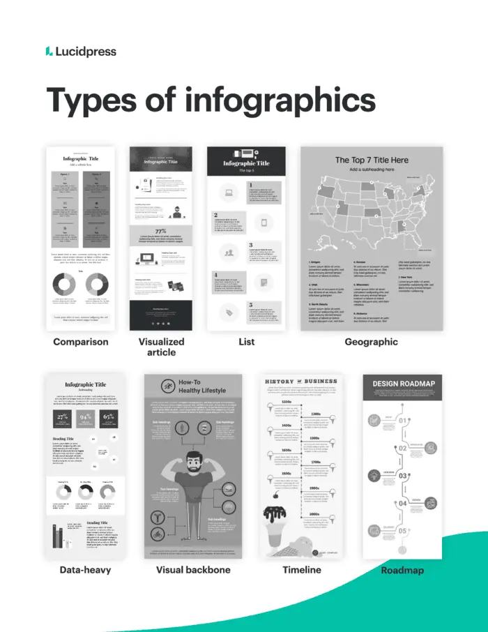
There isn’t an exact set of rules for how infographics should look, but they do tend to fall into specific layouts. Picking from the types of infographics is a great starting point as they’re all tried and true. Remember that as you consider each layout, you want to pick one that matches your topic. For instance, if you’re creating an infographic about the top places to live in the US, you’ll most likely want to use a geographic (not a resume) infographic.
Timeline infographic
A timeline infographic is best used when you’re showing the history of something. You can use this infographic to put events in chronological order. Or to outline the steps of a project, how-to and more.
Comparison infographic
This type of design infographic template has a symmetrical layout and is used to compare two different options on the same data point. Use this infographic design idea to compare your product to your competitor’s. Make sure that you don’t just list random facts but choose attributes that both options have.
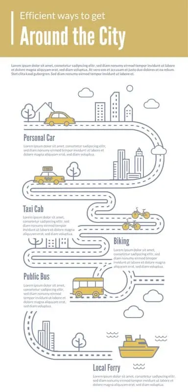
Roadmap infographic
Use this infographic design if you’re showing data with a start and end point. Unlike the timeline infographic, this one focuses on stages rather than dates.
List infographic
A list infographic is one of the most used infographic templates. It can be used to create a checklist, explain a process, or show the top 10 reasons for x,y and z.
Geographic infographic
If you have a dataset specific to location, a geographic infographic is the best template to go with. You can use a map of the world, country, or even counties in a state.
Numbers-heavy infographic
If you want to tell a story with data, a numbers-heavy infographic is your best bet. You can use graphs and charts to summarize reports, share data that’s insightful, or synthesize data. Creative icons can help these kinds of infographics feel more fun than simple bar graphs.
Article summary infographic
An article summary layout is best for giving a brief overview of an in-depth article or blog post. This layout provides enough space for copy while also using imagery to create visual interest.
Resume infographic
Just as the title infers, a resume layout is meant to highlight an individual’s work experience and professional accomplishments in a visual way. Unlike a traditional resume, a resume infographic can use charts to show experience, a timeline for job experience, and icons to represent each section.
Visual backbone infographic
This kind of infographic centers around a single large image as the backbone of the piece. All points of data will break down one component of the visual. Use this layout to help consumers visualize parts of a whole.
Include these basic infographic elements
To make sure you don’t leave any pertinent information out of your infographic, double-check that you include each of these main elements: headline, explainer, subheads or labels, sections, backbone, explanatory text, CTA and sources. Each of these elements ensures that your infographic isn’t just a cool-looking piece of design but also includes entertaining or insightful information with a clear takeaway.
Headline: Include a brief headline that gets your audience to keep scrolling.
Explainer: This is a quick introductory text that explains what your infographic is about. Since concision is critical, feel free to skip complete sentences.
Subheads and labels: Using subheads or labels for each icon, chart or section can help break up your infographic while also providing a distinct outline.
Sections: Create sections for each idea in your dataset. You can use icons, lines or colors to separate them.
Backbone: No matter what layout you pick, you need a unifying design element to tie your infographic together. This is different from a visual backbone layout.
Explanatory text: Include brief copy to describe the idea for each section. Don’t let the copy take away from the graphic; instead, make sure the copy supports the graphic and not the other way around.
CTA: As with most of your content, include a CTA at the end of your infographic to move your audience to the next step.
Sources: Always cite your sources at the end of your infographic. These are often in small text at the bottom of your layout.
Choose a color palette
Once you have a layout and general outline for your infographic, it’s time to choose a color palette. A color palette can make or break your infographic. The right palette can reinforce the topic, organize information and solidify your brand. You don’t have to stick to your brand’s colors with infographics, but that color palette could be a good starting point.
Another good place to start is checking out the different types of color palettes. The most common color palettes in design are monochromatic, complementary, split complementary, analogous, triadic and tetradic.
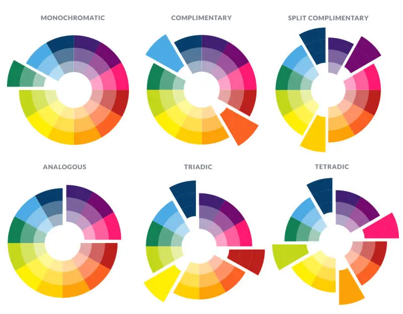
Source: https://www.picmonkey.com/blog/create-a-brand-color-palette
Follow these tips for picking the right color palette:
- Use the tools at your disposal: There are several websites out there specially designed to help you pick the right palette. Sites like Adobe Color can help you pair the right colors together, so you don’t unwittingly create an eyesore. These sites let you pick between a monochromatic or tetradic color scheme.
- Pick a three-color palette to make it easy on the eyes: Too many colors can make the infographic overwhelming or interrupt the flow of it. Picking just three colors keeps things simple. Use one color as the background and the other two to break up the sections. Use shades of your three colors if you need to add more colors.
- Make it universal: Pick a palette that fits the theme of the website and is neutral enough for a wide array of visitors. Your infographic will most likely get shared across other websites and social media — with a more neutral and simple color palette, you can guarantee that it won’t look out of place wherever it gets shared. So skip the neon on black, and try to avoid using white as your background.
Here are a couple examples of some great color palettes:
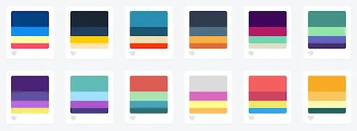
Source: https://blog.graphiq.com/finding-the-right-color-palettes-for-data-visualizations-fcd4e707a283?gi=3a981055db84
Pick your typography
Focus first on titles and headings. You can use a fun, eye-catching font for the title of your infographic with a complementary sans serif or serif font for the rest of the text throughout your design. Try to stick with only two or three fonts total: one for the title (this can be bold and fun), another for the body text that’s easily legible, and if you want, pick another for headers. Remember, your visuals are what people should be focusing on, and a cool font can distract from that.
Additionally, don’t allow typography to become your crutch when you create infographics. Definitely be intentional with the fonts you pick, but don’t always default to flashy typography to show off an important date or number when you can visualize it a different way. Percentages can be visualized as pie charts, numerical values as bar graphs. The best infographic designs rely on icons, headers and dates with minimal explanatory text.
Here a couple infographic design ideas with great typography:

Icon do’s and don’ts
When it’s time to pick which icons to use, follow these do’s and don’ts.
Do:
Use labels
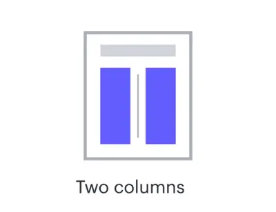
Provide context

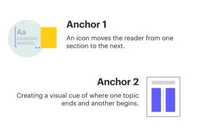
Use icons as anchors
Use background colors

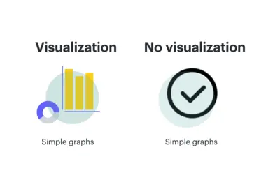
Provide visualizations
Be mindful of sizing
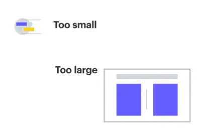
Don’t:
Use random icons

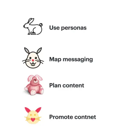
Use multiple styles
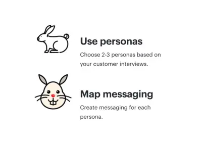
Forget to pair with text
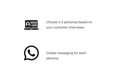
Use random colors
Data visualization best practices
It’s important to understand data visualization best practices as one size doesn’t fit all. And it’s not about simply providing information to the masses. Here are five of the top data-visualization best practices to keep in mind as you learn how to design an infographic:
Emphasize the important points
Direct your reader’s attention through visual cues. This will make it easier to follow the story you’re trying to convey. Our eyes are drawn to symbols that send us important details at a glimpse. To build off of this, make sure that the style or order you show your data in makes sense to your audience.
Make use of color
Color is one of the most useful tools in data visualization. You can effectively communicate important info about your data through different color combinations (e.g., use a monochromatic color palette for sequential data.) Just be sure that your color choices enhance the differences in your data rather than make them more cluttered.
Ensure your data is readable in any format
Remember that your infographic may be viewed on multiple different devices. It’s vital that you create mobile-friendly content.
Keep dashboards and visualizations simple
Content should be snackable. Too much information in one place causes people to click out or just skim by. With a simple design, you can grasp your audience’s attention, pique their interest with the right facts, numbers, graphics, and then get them wanting more, ultimately leading them to follow through with your CTA.
Provide context
Your audience needs to understand the context of your recommendations or shared information. In order to get them to act on something, they need to understand how this information affects them or how they can affect it. “Donate today” or “Click here for more information” are some of the most common CTA’s used, but they won’t be clicked on without the right explanation for why your audience should care.
Infographic design principles
If you’re interested in designing your infographic from start to finish rather than using an infographic maker, here are some basic design principles that will help you create the best infographic no matter your design skill level.
White space
White space is the area that’s free of any design element or text. It gives your content room to breathe, making it easier to consume. Include enough space around headlines and between sections.
Alignment
As you create your design, double-check that all of the main elements align on the same vertical or horizontal axis. Also make sure that the spacing is the same between each section.
Show don’t tell
Your copy should support the visual, not the other way around. Too much text can make the infographic feel heavy and cause your reader to become disinterested. If you can say it visually, do so and ditch the text.
Contrast
Contrast creates visual impact by placing different elements beside each other. If you choose a light background, then have your shapes and icons be in darker, bold colors. You can also create contrast through typography by putting your headers in larger text, followed by the subheader and then your body copy.
Consistency
Consistency is key to keep your design flowing from start to finish. Your icons should be in the same style throughout your entire infographic, headers should be in the same font, and all your body text should be in one font too. Your color palette will also help your infographic remain consistent.
We’re sure that you’ll be able to create stunning infographics whether you just want to share stats on cat videos or optimize your search engine ranking. If you need some help starting your design, try our infographic templates.
