The 5 Design Basics for Making a Magazine Ad
Today, most companies prefer the ease and lower costs of digital marketing as a substitute for regular print marketing. But while social media and digital advertising might now be the default, print advertising can still be an incredibly effective way to reach your target market.
Studies show that nearly 80% of consumers act on messaging they’ve seen in magazine ads, compared to just 45% of consumers who act on online advertisements. There’s a huge opportunity for influence here. In fact, 82% of consumers trust print ads the most when making a purchase decision.
When used in conjunction with digital marketing tactics, print marketing strategies like placing magazine ads can make your campaigns even more effective. In this guide, we’ll walk you through how to design and make a magazine ad that will help get your business in front of the right audiences.
How to design a magazine ad
There’s a lot that goes into creating a successful magazine ad, and it’s easy to feel like the best magazine ads are difficult to design. From understanding who you’re trying to reach to choosing the right publication, there’s plenty of strategy at play here.
In this blog though, we’re zooming into the design process. To help your page ad stand out on the page, we’ve assembled some basic graphic design principles that will give you the foundation you need to begin.
First off, one of the most basic (but most important) principles of good ad design:
Use color to your advantage
Take a look at a color wheel. When designing your magazine ad, you’ll want to not only choose colors that represent your brand, but colors that provide good contrast. If you’re having trouble, consider using complementary colors – these work well together and can be found opposite each other on the color wheel.
But don’t be afraid to get creative with other color palette options as well, as pictured below.

To mix up your color scheme, you can use different hues, shades and tones of the colors you’ve already chosen.
Check out this great example of using complementary colors (blue-green and red-orange) to make this Colgate brand’s ad pop.

When choosing your palette, don’t forget to consider the psychology of color as well. For example, yellow is often seen as cheerful and playful, while grey and black can signify luxury or utility.
Be careful when using bold, bright or loud colors on your print ad. It’s easy for the focus of your main message to be lost in a see of loud colors if you’re not intentional. You can use bold color for accenting or to make a certain message or image stand out in your graphic design, but use it sparingly. For example, pay attention to how Nike uses the color red to draw attention to its signature ‘swoosh’ in this graphic design example:

Create a sense of balance
While your design doesn’t have to be a perfect mirror-image on both sides, it should have some sense of balance that creates unity and ties your whole design together. An easy way to create balance is to use the rule of thirds. Basically, this means that if you divide your image into thirds, you should center your main focal point on the outer vertical line and center it on the horizontal lines. This makes your photo more dynamic and interesting to look at. For example, check out how this ad centers its main subject – the couple – on the horizontal lines.

If you’re having a hard time finding the right way to balance your design, try viewing your layout under a grid. This will help you create an underlying unity and structure for your design.
Use the right font
You’ll want to make sure your font and font size are consistent with your other marketing materials. Additionally, make sure your font is applied consistently throughout your magazine ad design.
Typically, sans serif fonts are used for headings, while serif fonts are used for body text. Here are a few examples of popular font pairings:

Using sans serif versus serif fonts can provide contrast between your heading and your paragraph type. You can also contrast type by using different:
- Colors
- Sizes
- Structures
- Thickness of the font
- Typeface
- Weights
Just remember as we mentioned before, it’s not a good idea to use a different font than you use in your other marketing materials. Sticking with the same (or a similar) font will build brand consistency over time, helping people remember your brand.
Apply the Gestalt principle
The Gestalt principle argues that the human eye sees objects in their entirety before perceiving their individual parts. You can use this principle to help you make a better design. There are five parts that make up the Gestalt principle:
- Figure/Ground: Similar elements (figure) are contrasted with dissimilar elements (ground) to give the impression of a whole. Oftentimes, you’ll see this principle applied in movie poster design:

- Similarity: When objects look similar to each other, people perceive them as a group or a pattern and see them as belonging together, even if they’re not close together in a design.

- Closure: Our brain will see patterns and fill in the blanks, even when certain information is missing. This ‘triangle’ is a great example – it’s not actually there, but our eyes fill in the missing pieces.

- Proximity: When elements are close together, people will perceive them as a group. A woman and young boy posed together create a scene of a mother and son, and covey a sense of safety.

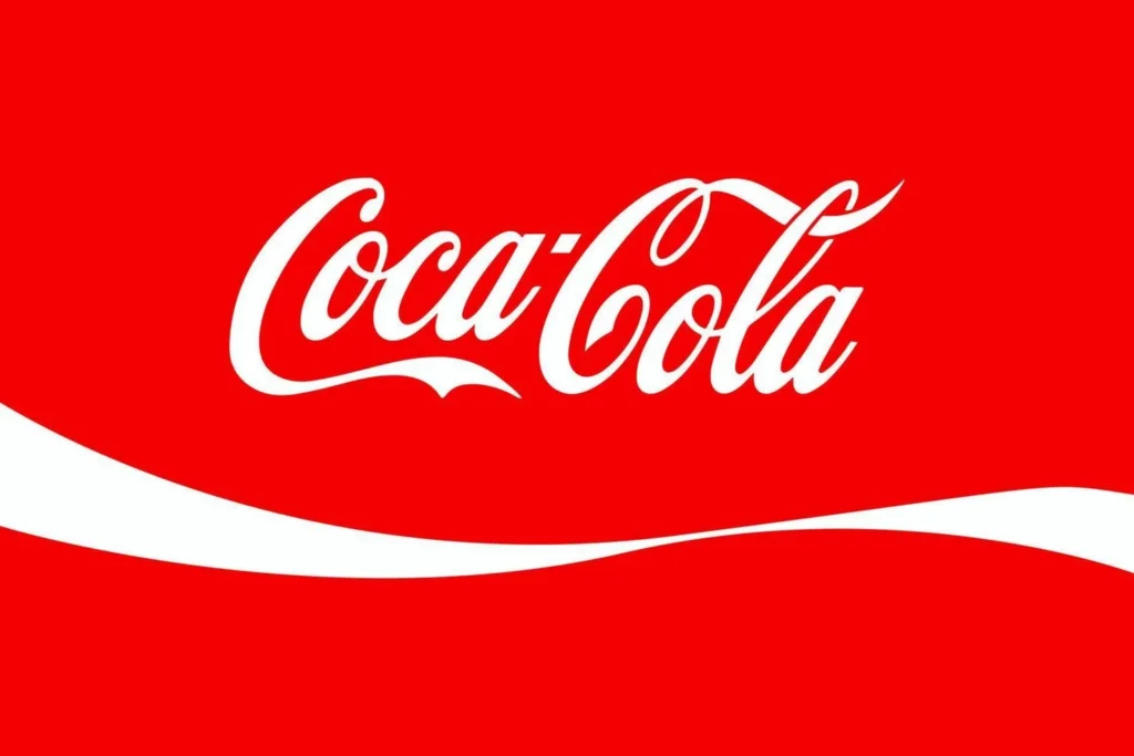
- Continuation: Using direction to move the eye from one object to another. The Coca-Cola logo is a master example of this principle in action. Our eye’s naturally follow the curvature of the ‘C’, creating a sense of movement and dynamism.
Use signs and symbols that are significant to your consumers
Are there any symbols that carry a significant meaning to your customers? You can use them to help your consumers create quick associations within your magazine ad.
For example, seeing a “stop” sign automatically creates a subconscious signal to stop and pay attention.
More best practices for making a magazine ad
Here are a couple other general tips for creating a great magazine ad design
Write a good headline
It should go without saying, but writing a powerful headline takes time. Don’t just go with the first one you come up with. Take the time to craft a headline that catches the reader’s attention and draws them in.
Use powerful images
What do you want your images to convey? Intentionally choosing your imagery can help your message make that much more of an impact. Also, don’t forget to make sure your images look professional and aren’t pixelated.
Use engaging copy
Keep it simple. You can let the images do most of the talking here, and chances are, there won’t be a lot of room for copy. Be concise, point out a problem, then identify your solution to that problem.
Proper logo use
Your logo will need to be included somewhere, but don’t make the mistake of making it the most important thing on the page. If possible, let it become part of the overall design. And, don’t hide your logo away in the copy — give it some space so it stands out.
Include a call-to-action
Ask yourself what you want your readers to do because of your ad. Include a call-to-action at the end of your copy that encourages them to take action and gives them the resources to do so. For example, if you want people to engage with you on social media, include a branded hashtag they can use to tag your company with.
Well-designed print ad campaign examples
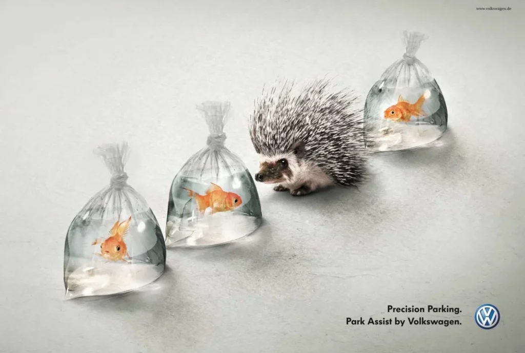
Here are a few recent favorites we’ve come across – can you identity the design principles they use?


Key takeaways
Print is a classic form of marketing that we don’t ever think will go out of style. These five basic design principles and best practices will help give you all the foundation you need to get started on your magazine ad design. Want even more of a head start in graphic design? Check out Marq’s free library of templates, or begin designing your own magazine with prebuilt design elements today.
