Free Bar Graph Maker
Quickly create and distribute a stunning bar graph with the Marq brand templating platform. With a powerfully intuitive editor, it’s never been easier to impress your audience… and yourself.
Haven’t signed up yet?
Give us a try.
 Sign up with Google
By signing up you agree to our Terms of Service and Privacy Policy

Smart bar graph templates — smarter you.
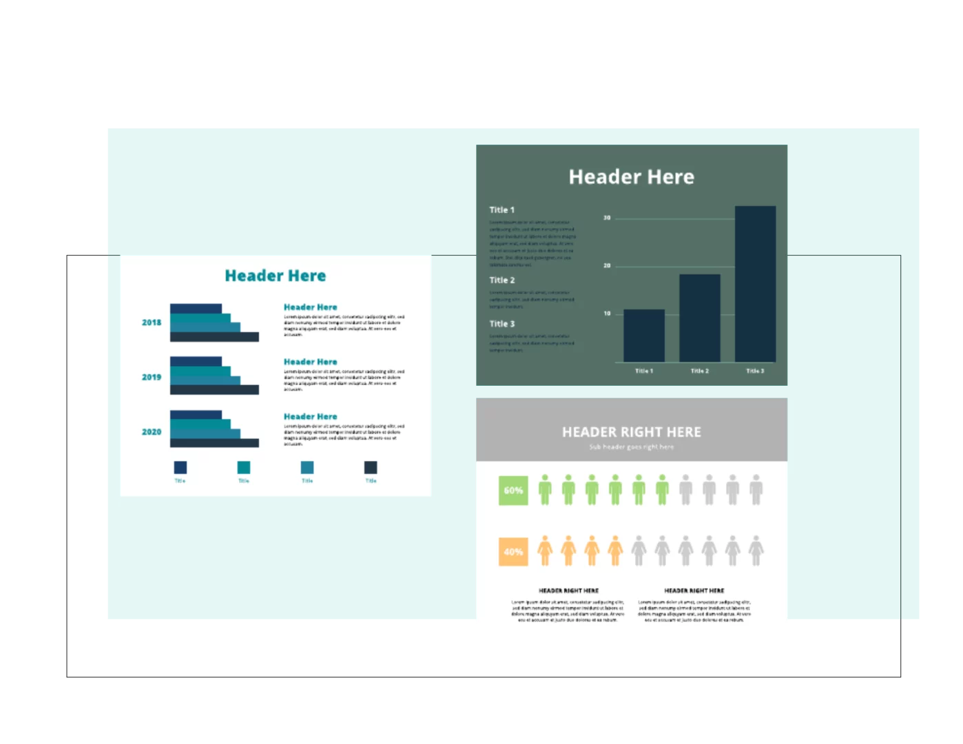
Not a professional designer? No problem. Choose from one of our hundreds of templates to get you started creating a professional bar graph. Customize the template by hand or unlock the power of Smart Brand Assets. Upload your brand’s colors, font and logo to access a collection of templates customized to your brand.
Create Stunning Bar Graphs
Use Marq to design captivating bar graphs. Customize colors, labels, and data points to visualize your information effectively.
Words you’ll never hear again:
“How do I visualize my data?”
“Where can I build better on brand bar graphs for my presentation?”
“This bar graph can’t be put into my presentation”
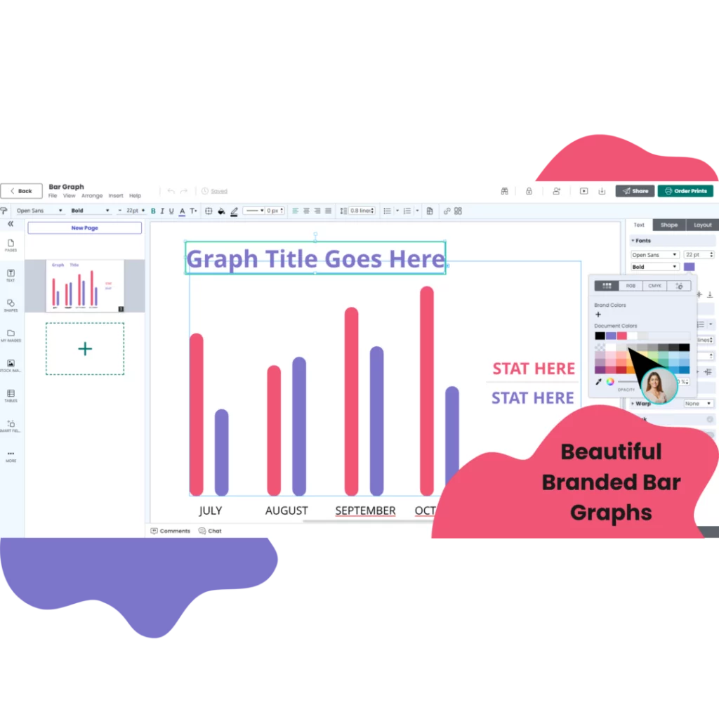
Easy bar graph design
Quickly create a bar graph or other data visualization with our intuitive, drag-and-drop editor.

Grow your brand
Eliminate the risk of team members accidentally stretching, moving, discoloring (you get the point) your brand assets by locking down fonts, images, logos, position, and more.
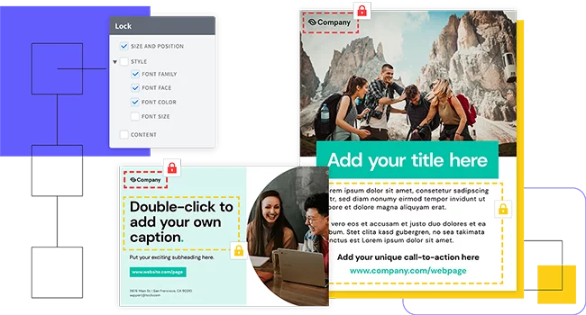
Empower your team
Share centralized and custom-made templates and assets across your team.
Share anywhere
Share the completed bar chart in a presentation, infographic or social media post or download and print.

Customize Your Bar Graphs
Explore the wide variety of styling options available in our bar graph maker. Our intuitive interface lets you templatize with your brand guidelines quickly and see instant visualizations that are easy to change. Try:
Interactive Features
Try adding tooltips, animations, and click-to-zoom functionality to engage your audience with your data.
Styles and Layouts
Explore the variety of styling options available in Marq’s bar graph maker. Adjust fonts, borders, backgrounds, and more to match your brand or presentation.
Export and Share Your Graphs
Once your bar graph is ready, put it directly into a Marq presentation or export it in various formats. Share your graphs online, embed them in presentations, or download them for print and digital use

Why choose our bar graph maker?
Whether you’re a team of one or a team of five, our brand templating platform makes it easy to create bar graphs and other charts.
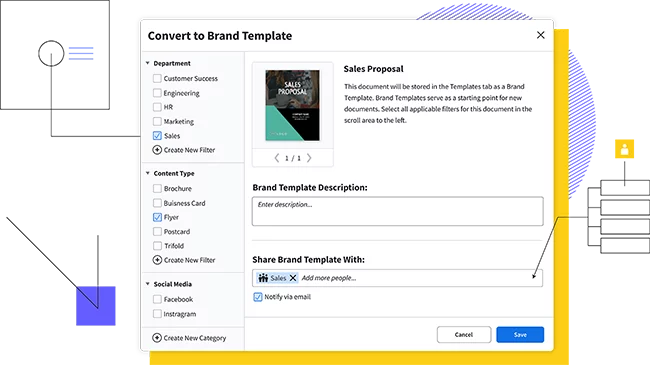
Store and download custom brand assets (like logos, colors and fonts) into our asset hub for fast access.
Smart Fields auto-populate information and images in your templates, so you don’t have to chase down information.
Access thousands of free stock photos or icons in the Marq editor or easily import your own from Dropbox or Facebook. Use our Indesign Import feature to import existing InDesign files and convert them to Marq templates
How to make a bar graph
Start by searching Marq’s large template library for “bar graph”. Browse through and select a bar graph template that fits needs like; general design and layout. Double click on the selected bar graph template and select “create document”.
Determine your x-axis and y-axis. Typically one axis will be a category and the other axis will be a data value. Adjust the bars in the bar chart to match the values in your data set.
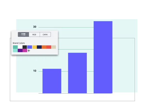
Update the colors of the bar graph to match your brand. Use a single color for the entire chart or try adding a second color to make a particular category stand out.
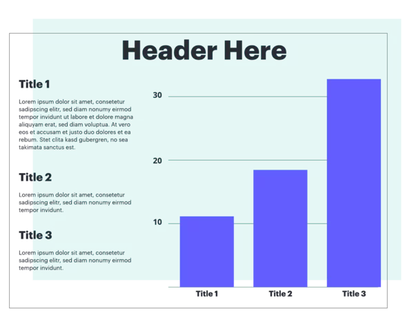
Add a title, data labels and other context to the chart.
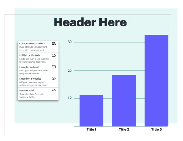
Add your visually stunning bar graph to a Marq templated presentation or download the final bar graph in multiple format types to embed it in a presentation or infographic or print or share the chart on social media.
Create a bar graph today
Create all of your on-brand
collateral in Marq

Free Bar Graph Maker FAQs
A bar chart is a diagram that shows comparisons using rectangular shapes.
Bar charts are best used for categorical comparisons. Use line graphs to show changes over time and pie charts to show parts of a whole. Create any type of graph you need with our free graph maker.
Absolutely! Marq’s bar graph maker is completely free to use. We believe in providing accessible and powerful design tools to help you visualize your data without any cost barriers.
Yes, indeed! Marq’s bar graph maker offers a wide range of customization options. You can choose from various bar styles, colors, labels, and fonts to ensure your bar graphs align perfectly with your branding or design preferences.
Not at all. Marq’s bar graph maker is designed with simplicity in mind. You don’t need any prior design experience to create professional-looking bar graphs. Our user-friendly interface and intuitive controls make the process smooth for users of all skill levels.
Sharing and exporting your bar graphs is a breeze with Marq. Once you’ve designed your bar graph, you can easily save it in various formats, such as PNG or JPEG. You can also share your creations directly from Marq or download them for use in presentations, reports, or on your website.