A good logo represents the brand positively to the world, which is one reason why there are so many agencies dedicated to designing outstanding logos. Although the names and objectives of many organizations remain unchanged for many years, their logos are often renewed periodically.
Rebranding is sometimes necessary for shaping the future of the company, but you can reap some of the benefits simply by improving your logo design. A redesigned logo goes a long way in attracting and influencing customers. Here are 9 great examples of famous brands who have successfully redesigned their logos.
Related: 8 tips for designing logos that don’t suck
Pizza Hut

Since Pizza Hut’s opening in 1958, its logo has been redesigned many times. From the original mascot Pete holding the words “Pizza” and “Hut” in both hands, the logo has evolved to feature an iconic hut-shaped roof as its main element. With this redesign, Pizza Hut has stamped its signature slanted roof in sauce—to match an upgraded menu with bold sauces and premium ingredients.
Pizza Hut’s renewed logo is simple and classically designed with a minimal color combo of red and white. Developed as a flat design, this red logo still inspires hunger.
MailChimp

This example comes from Jessica Hische, the designer of the revamped MailChimp logo. The redesign looks quite similar to the previous version; there are minor improvements rather than a complete change.
MailChimp’s old and new logos may look alike at first glance, but there’s a difference in typography which makes the new logo cleaner and easier to read. Redesigning your logo doesn’t always mean a total overhaul. In fact, improving the look and feel of an existing logo can preserve and enhance the brand identity you’ve already built.
Firefox
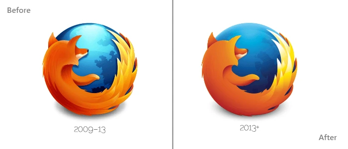
Firefox, the open-source internet browser, uses a logo which has gone through several iterations since 2004—but the imagery and symbolism remain the same. This logo features a dark blue globe (the web) with a bright orange fox speeding around it.
The logo design team at Mozilla have modernized the existing logo by changing several visual elements. The glossy touch on top of the globe has been removed, while the contrast of the fox’s tail has been heightened. It’s a flatter design that’s still as vibrant and fiery as ever.
Mall of America

The launch of the Mall of America’s new logo is a perfect example of rebranding. The largest retail and entertainment complex since 1992, the Mall of America has recently upgraded from its older, nostalgic brand to something new, modern and dynamic.
Before, its logo recalled the American flag with its star shape, color scheme, and waving lines. An old-fashioned serif font proclaimed “MALL OF AMERICA” at the bottom.
In contrast, the revamped logo features a multicolored star made of ribbons, along with the company’s name in a sans-serif font. This represents the changing vision and diversity of the mall, while still retaining its recognizable American star.
Motorola
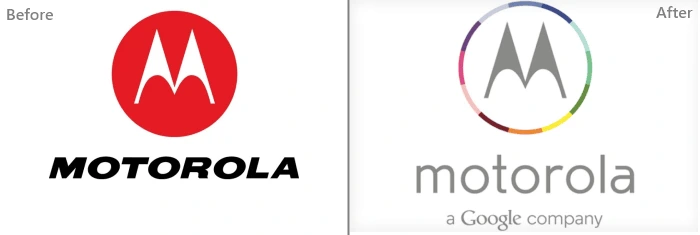
Motorola’s new logo first debuted in Techweek back in 2013. Motorola was acquired by Google, and its redesigned logo represents this merger well. The flat design and letter “M” are common to both versions, but the font has changed and the colors are aligned more closely with Google’s branding. And in case that isn’t clear enough, the tagline “a Google company” is added below the Motorola brand name.
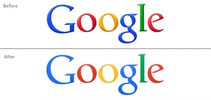
Speaking of Google, its current logo was unveiled in 2015. Its original logo was designed in 1997 and digitized by founder Larry Page. In 1999, further visual elements were integrated into the logo such as an exclamation symbol, enhanced hues, and a background shadow.
Like many of today’s modern logos, the current Google logo is a flat design. There have been minor changes to Google’s logo throughout its journey, but it has always retained its classic serif typography and bold colors.
Tampa Bay Buccaneers
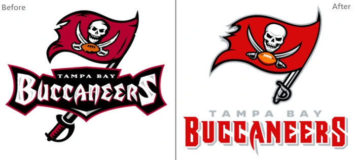
Illustrations can certainly make your logo more visually interesting, but they can also become too complicated. Thus, the recently redesigned logo of the Tampa Bay Buccaneers was simplified to look more polished but still feature the same pirate imagery.
The colors here are smartly used—a brighter, richer red calls attention to the flag, and black outlines the illustration without overpowering it. Redesigning a sports logo can be tricky business because fans are so attached to their team, but this logo retains all the crucial elements of the original, right down to the flag’s sword handle.
eBay

The disordered arrangement of letters in eBay’s logo were the main target of this redesign. eBay’s new logo looks modern, featuring a flat design with no letters overlapping. The colors have been lightened to make them easier on the eyes, as well. In this svelte version, eBay has elevated its brand from the wild early days of internet commerce to a long-standing and trusted online marketplace.

Facebook occasionally launches different logos with new versions of its site. As the most popular social network, Facebook must keep up with its users and reflect the latest design trends—but its identity is always the same.
This new logo, like many of its digital peers, is designed in flat format with the bottom line removed. Also, the “f” now extends all the way to the edge. With its navy blue background and bold letter “f,” Facebook’s rounded square icon is still instantly recognizable across the web.
So there you have it—9 examples of logo redesigns from some of today’s successful brands. Trends like flat design and bright colors can bring new life into an old logo. As the market changes and evolves, these logos will change again, too. But most importantly, they will continue to represent and build a strong, consistent brand identity that resonates with their customers.
Wondering whether it’s time to rebrand your own business or organization? Learn more in our free eBook: How and Why to Rebrand Your Company
What makes the design world exciting is that there’s never a dull moment. Design is continually evolving with new trends, and these trends often dominate the scene for a time. We’re in the middle of 2017, and already, there have been several logo design trends enjoying their share of popularity.
As we know, a logo is critical to your branding regardless of business type, products or services. It is the first thing that catches the attention of your target audience and establishes a strong business persona.
Related: Learn the 10 essential brand assets for digital success
Keeping track of these trends is enough to make anyone’s head spin. Well, we took a dive into the subject so you don’t have to. Today we present you with what we believe are the 5 most popular logo design trends in 2017.
1. Minimalism
“Through simplicity comes great beauty.” It is often the simplest of logo designs that catches attention. Perhaps this is why flat design is currently dominating the business world. Its popularity has been spurred by the likes of PayPal, Airbnb, Foursquare and Netflix. Minimalist logo designs are purpose-driven, easy to remember, and can be identified at a glance. No matter what trends come and go, a minimalist logo design has timeless appeal.
Example: Nike
Can it get more minimal than the classic Nike swoosh? The logo design for this popular sports brand is simple, iconic, and anyone can understand the message behind it.

2. Negative space
Negative space refers to the space in or around an object that is creatively used to form another shape within the logo design. Logos with negative space are popular because they encourage the audience to pay attention and discover the hidden clue. A logo with negative space can be cleverly designed, witty, and come with a deeper message.
Example: FedEx
The FedEx logo was created in 1994. Since then, it has won around 40 design awards and been ranked as one of the best logos in the last 35 years.
If you take a closer look at the space between the E and the X, you will see a tiny arrow hidden within it. This arrow symbolizes FedEx’s fast speed coupled with accuracy.
There is significance in the color choices, too. To creatively separate the whole of FedEx from its individual services, they use different colors for “Ex.” For example, the orange Ex stands for “Express,” while the red Ex is for freight. FedEx has managed to pack a whole lot of information in its simple, clean logo.
3. GIF (moving logo)
GIF logo design features animated images that are continuously moving. This kind of logo design is like a hybrid between static images and video. It’s caught on recently because they offer a whole new way to capture a viewer’s attention.
Thanks to social media sites like Twitter and Tumblr, GIFs are enjoying a new heyday of popularity. Including tiny animations in the logo design is fun and can be done fairly quickly.
Example: Giant Owl
The logo of Giant Owl (a London-based production company) features two giant, owl-like eyes that illustrate the company’s name and resemble digital tape spools. The logo is further brought to life by animating the eyes, which grabs a viewer’s attention because the movement is so unexpected.
4. Letter-stacking
Letter-stacking is a technique designers use to place long phrases and text without spreading across a large area. Logos can include vertical or horizontal inscriptions along with complimentary graphic elements—a great visual combination. Letter-stacking logos are compelling: spending a few extra seconds to unravel what it says results in increased memorability.
Example: Oakland Museum
The Oakland Museum of California created a logo which playfully arranges the letters of its lengthy name into three sections and emphasizes its initials. Letter-stacking logos are a great option for incorporating long, verbose business names.
5. Hand-drawn style
Despite the name, hand-drawn logos are not technically drawn by hand—rather, they give the impression of a free-form sketch. These logos offer a retro sense of charm and connect with audiences on a personal level. The warm, down-to-earth appeal that hand-drawn logos offer is sometimes hard to achieve with a purely digital design.
Example: The Fitness Lab
In this case, a hand-drawn logo design perfectly expresses the fun, quirky and casual vibe the brand is aiming for. Your business logo doesn’t always have to feature pristine digital design—a cheery doodle or sketch can be a great starting point (like this version!).
Wrapping up
Your logo is possibly the most significant branding tool in your arsenal, so make sure you have a strong one. These logo design trends will help you stay on top of the game even as they keep evolving.
Learn more: Do you know the 10 essential brand assets for digital success?
To the average person, designing logos seems like a simple task—you just make a small circle or rectangle and put the brand name on it. But of course, it’s not nearly that easy.
Related: 9 excellent logo redesigns for famous brands
To help a brand capture its personality and really stand out takes a lot of careful consideration and design iteration. If you’re new to the field of logo design, here are 8 tips for designing logos that don’t tread on overly well-worn ground.
1. Avoid clichés
Every year, we see innovative trends in logo design. It’s good to keep up with trends and experiment with them for yourself, but don’t fall into the trap of using the same idea over and over.
For a few years, the “hipster” logo was very popular. Featuring a pseudo-vintage look, these logos eschewed simplicity in favor of lots of text and symbols. This look became so ubiquitous that it became a joke within the design community, spawning satirical sites like Hipster Logo Generator.
A current design trend to keep an eye on is gradients. Gradients have been a big no-no for at least two decades, but they’re now enjoying life in the limelight again. You don’t have to look any further than the recent Instagram rebrand to see it in action.
In the long run, it’s a better idea to stick to solid design principles and avoid clichés.
2. Embrace unique design

Originality and uniqueness make it easier to catch a viewer’s eye, and custom lettering is a great way to embody both traits. Additionally, it’s harder to copy than a commonplace font.
The quintessential example of custom lettering is, of course, Coca-Cola’s logo. As one of the world’s oldest and most established brands, Coca-Cola’s logo has stood the test of time and continues to be instantly recognizable.
3. Create a visual double entendre
What’s a visual double entendre? Essentially, it’s a double meaning. If designed in this way, a single logo can give the impression of two different images.
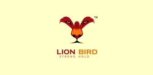
For example, in this logo for Lion Bird, you can see two animals: a bird opening its wings and the face of a lion. Viewers love designs like these because, once they discover the double meaning, they feel like they’re in on a secret.
4. Don’t underestimate color
Color plays an integral role in logo design, and its importance cannot be understated. A brand’s color palette sets the tone for its communications, and people often remember a logo by its colors.

You know these by heart: Home Depot is orange, Target is red, Starbucks is Green, Facebook is blue, UPS is brown, and Apple is white. While colors are shared with countless other brands, these brands have been able to lock down these colors in consumers’ minds.
5. Create a sense of motion
It’s possible to create dynamic logos that invoke a sense of motion without actually moving. The advantage of this over, say, a GIF design is that GIFs aren’t supported in every medium—like print, for example. Creating a sense of motion in a still image will help to preserve the brand message everywhere.
Twitter’s logo is a great example of this. In the past, the bird was sitting down in a passive stance. Now it’s moving upward in flight, reflecting Twitter’s speed and its evolving technology. This tactic works well for brands which have mascots.
6. Keep it simple
In logo design, simplicity is certainly the best policy. Simple, powerful logos are often the winners in the long run. For example, Apple and Nike’s logos are simple but well-known among millions of people.
Remember: even though simple design is the goal, it’s still important to be unique. Would Nike still have succeeded with a traditional check mark? Would Apple’s logo still be as compelling without that bite taken out?
7. Remember balance & symmetry
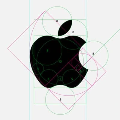
Keeping the previous examples in mind, you can see that balance and symmetry are vital factors in logo design. Look at how Apple’s logo employs proportionate circles along with symmetry to maintain balance and aesthetic quality.
8. Tell the story behind your logo
Every logo has its own story. In some cases, the story is almost as interesting as the logo itself. Either way, storytelling can draw people into your brand, so make it count.
Do you know the story behind Apple’s logo? Ronald Wayne (sometimes called Apple’s third founder) designed a logo in which Isaac Newton sat under a tree with a bright apple shining above his head. A year later, Steve Jobs commissioned another logo. The reason? He thought people might confuse the original image for a tomato. Thus, the apple with a bite was born.
We hope these simple tips offer a peak into the complex world of logo design. By following this advice and avoiding the pitfalls, you should be well on your way to brainstorming a compelling logo for your brand or business.
Learn more: Do you know the 10 essential brand assets for digital success?
Studies show that the average consumer is exposed to up to 10,000 brand messages a day.
To break through the noise, your brand image should be powerful and to the point, like an elevator pitch—an quick and accurate expression of your key values, unique benefits and mission. Delivering it successfully has never been easy, especially if you work with tech brands, which can often be hard to describe succinctly.
Does this sound scary? Probably. Should that be motivating? Surely!
Related: Tech marketing best practices
So what does a tech company brand consist of? What are the steps tech companies take to create a brand that reflects their values and appeals to their target audience?
We talked to 5 experts—startup founders, marketers and designers—about the answers to these questions and about their own brand-building experiences.
Here are the questions we asked:
- How did you come up with the idea of the logo?
- Why did you choose the colors you’re using now?
- What is the key message you wanted this design to convey?
- What are the general impressions and associations you think users get from the brand?
- What advice would you give to a startup working on their own branding?
- How do the current logo, design and tagline reflect the core values of your company?
Here are the insights they shared.
Markus Pirker, co-founder of Userbrain
Userbrain is a subscription-based tool that helps website owners, designers and developers improve their products by providing first-hand feedback from real users.
Before starting work on our logo, we made sure the whole team was aligned with our core values and beliefs. I don’t think you can create something as important as your brand image starting with the details like color choice—you have to work from inside out to create something authentic.
In the process of fine-tuning our core values, mission and vision, we decided to lead with the promise of effortless, ongoing user testing. This inspired the design and served as a baseline to assess the quality of different logo suggestions.
We went through a couple iterations before we decided to go with the current logo. Past suggestions used additional elements, and we tried to narrow everything down to a very simple logo which could be used across different platforms without substantial alterations.
User testing is often regarded as a tool for experts only, which it really isn’t. If you get the basics right, testing your own product with other people will always deliver valuable insights.
There are already several user testing services out there using subtle colors and an enterprise-like look in their branding. As a startup, you always have to fight for attention, so we wanted to stand out by using bright colors.
The Userbrain iOS app icon
We used two different color palettes and paired the main colors of our logo with shiny, vibrant colors like orange and violet.
The vision of Userbrain is to help people build better products by bringing them closer to their users. This is something we wanted to reflect in our logo, with the two circles depicting users and customers blending together.
As in sports, continuity in testing your products is the secret ingredient of user testing. We really wanted to embed the idea of ongoing user testing in our branding.
We ran a couple of user tests on our marketing site to learn more about how people reacted to our branding and service in general.
We had several people mention that it was fun navigating around our site, and they captured the basic idea of our service within a couple of seconds, so I guess we got the basics right here.
However, our branding is always adapting to the new needs—I think that perfect branding is something that evolves over time—you can’t get everything right with the very first version.
Maybe this sounds a little counterproductive, but I’d advise startups not to worry too much too early about their own branding. Startups should focus their early efforts on getting something really minimal yet valuable out in front of people.
This is not meant as an excuse for bad design, but if your product provides value to people and is a clever solution to a real problem they face every day, they will overlook your crappy logo.

The old, quite simple, Userbrain logo
The Userbrain logo has been the word “Userbrain” written in Open sans and uppercase for the first year and a half, and we’ve had customers sign up with no branding at all.
The promise of our service is effortless and ongoing user testing. I think that our team did a great job communicating this idea in a simple yet effective logo.
Tim Sae Koo, CEO at TINT
TINT is a content marketing platform that allows brands to source authentic community content from social media, new and review sites, then integrate it dynamically into any digital channel.

TINT’s logo is a powerful symbol that was designed back in 2012. It represents the connections between brands and their audiences. The intersecting lines resemble customer touchpoints and the circle that surrounds these connections represents our product, implying that these connections are the center of our product.
Warm red is our primary color. It’s meant to signify clearness and power—our brand essence.
The key message is meant to signify that we speak less and say more with design. We use simple and clear design that allows us to speak from the heart. We are direct, consistent, compelling and inviting. We are grateful. We are compassionate.
Start with why you started the company, and translate it into a physical manifestation via logo and branding. The logo reflects our personalities, which stood as the baseline for creating our core company values.
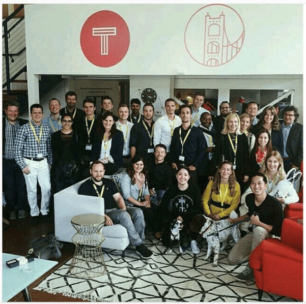
Hayley Snow, Marketing Project Manager at ContentCal
ContentCal is a simple tool to create, plan and publish compelling social media content.
Our logo was born from one of ContentCal’s core components: the approval flow UI. This UI consists of multiple dots on an axis, one for each step of the approval flow.
We started playing around with the concept of dots in a line in all different ways, then started to realize the potential in the idea. With some tweaks to its form, the graphic could morph into a line chart, process circle or share icon.
The flexibility of its form won over our team in an internal design critique. We developed the logo further to give it the form of a system, and after multiple iterations, the new ContentCal logo was born.
There are four brand colors used in our logo. The original UI colors in the ContentCal product were blue and “zing blue” (a very bright cyan), so these became two of the four colors used. We then added green and red, which are the ‘approve’ and ‘deny’ action colors within the product. So the logo looks like a system, and the colors are the ones used in that system.
Our logo doesn’t have a strong key message other than for it to represent our core values and to feel at home in the tech startup world.
General feedback has been that the logo works well in its environment, it feels associated with digital technology, which is definitely what we wanted to achieve. We also have great feedback about our logo being used at a large scale—for example, in exhibition spaces.
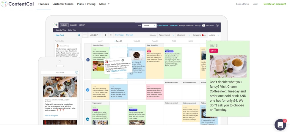
My advice to a young startup would be to stay agile with your branding. Branding in tech startups is predominantly used online now, so there are more opportunities to tweak and adapt over time. I also would suggest not worrying too much about brand guidelines at an early stage. Your company should constantly be adapting and growing, and so should your branding.
We’ve made many incremental improvements to the branding both on our website and in printed documents. It’s always adapting, and I think this is the best approach.
Our core values are Flexible, Dynamic, Together and Consistent. Our whole brand is built around these values. As we grow, staying true to this will become more and more important.
Nick Kamyshan, CEO at Chanty
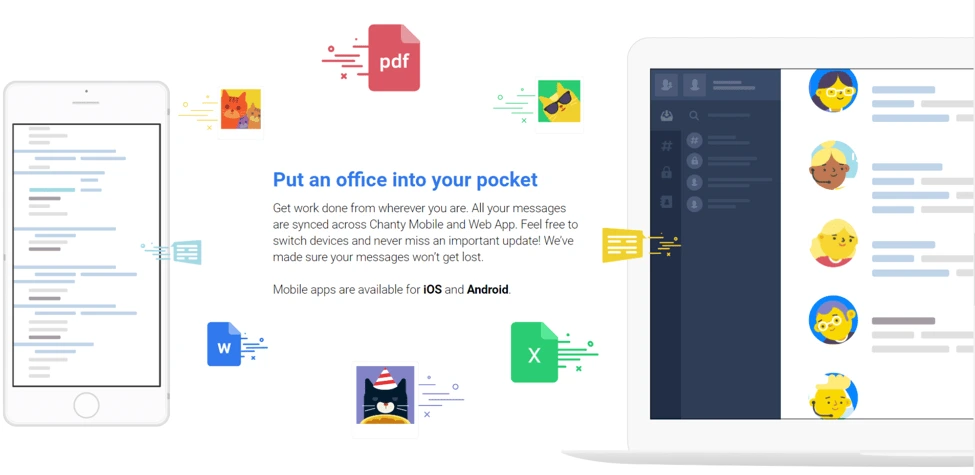
Chanty is a fast and simple AI-powered business messenger designed to increase team productivity.
The idea was to make a dead simple symbol which clearly shows the letter “C” for Chanty and a dot in the middle to emphasize a human being in the center of information flow.
We decided to go for a high-quality logo and hired top-ten Dribble logo designers. After several months of their work and multiple iterations, our tests showed that none of the logo designs satisfied our target audience. Our founder and product owner was extremely frustrated with the low-quality results and came up with our current logo while on a plane.
We’ve tested a lot of color schemes, and it turned out that the color combination we chose is the most attractive to our target audience. It also has the highest conversion rate. I should highlight, however, that this color scheme is mostly used for marketing resources at Chanty, not for the software product.
Laconic is the exact word to describe the look and feel we’ve worked so hard to achieve. We believe that things should be simple. On top of that, laconic crystal clear designs are easy to remember.
Experiment until you die or succeed. Find out which colors really work for your target audience by constantly testing different color schemes via various marketing channels (e.g. launching ad campaigns in Facebook).
Listen a lot. But don’t listen even more. Make discovery a part of your workflow. The more informed you are, the more confident you become.
Be unique, develop your own style, and go in a different direction than your competitors when it comes to branding.
Ksenia Levoshko, UI/UX Designer at Daxx
Daxx is a nearshore staffing company that helps companies hire talented developers.
Tech company branding is more than just the logo or color scheme on a website. The product or service a company sells is the foundational element upon which all branding is built. As your company’s offerings evolve, so should your branding.
The product I worked on consisted of several parts: a wearable device (bracelet or ring), an app, and a web portal. The wearable collected data on vital signs then transferred it to the app, which sent notifications motivating people to take action and pay attention to their health.
The primary objective of the project was quite ambitious: We needed to inspire users to change their behavior. As it turned out, the strongest motivator was the user’s desire for tangible, positive change and the use of personalized data.
That’s why we made a U-turn from a fear-based approach to a new, engaging one. We made it into a game, where at the beginning you see your current health state and set custom goals.
We used points to track users’ success and implemented badges and stickers as gamification elements. Each badge or sticker marked a small achievement that greatly motivated users and helped maintain their enthusiasm.
If you want to ask your audience about something, you have to give them something first. Early on, we asked our users for personal medical data and gave nothing in return. Now, we clearly explain why it’s necessary and how it’s going to change their lives for the better.
Understanding a user’s motivation is crucial. Once you realize what your users need, you can help change their behavior.
Key takeaways
Tech branding is not limited to logo design and a color scheme. Branding also includes the way a company communicates its values and mission, internal company culture, and customer relationships.
In an age of information overload, companies do their best to communicate brand messages as clearly as possible. This includes visual representation: as we saw, most experts prioritize simplicity—minimizing clutter and leaving only the key, nuclear elements that convey their message. Then, they make sure it’s 100% authentic and reflects their ideas and goals.
The experts also agree that designing brand elements is just the beginning of a long path—finalizing and polishing them requires a lot of experimenting and user testing. The branding process is never really complete. As a business evolves over time, the brand image should stay aligned by adapting to changing market requirements and business needs.
Want to know more about how to build your brand? Download our free ebook on how to build a brand in 2020.
“We need a logo” is a loaded request that designers and creative agencies hear from their clients. High expectations are always involved—that’s a fact. Every client wants a remarkable logo for their brand, and they’re counting on you to create it.
Related: 9 excellent logo redesigns for famous brands
How do you deliver an innovative, impactful design on demand? If you’re running low on creativity, we’re here to fill in for your muse as she turns a blind eye to your deadline. Load up on logo design inspiration from the guidelines and examples below to get those juices flowing again.
Logo design examples for your inspiration
Consulting Logos
Consulting logo idea #1: Accenture
Accenture is one of the biggest management consulting firms. The company offers strategy, consulting, digital, technology and operations services. Their revenue was around $40 billion in 2018, so we could definitely learn some design lessons from them.

Consulting logo idea #2: Capgemini
Capgemini is another consulting giant that can teach us a valuable design lesson.

The key lesson here is that you can build a financial empire… even if your logo isn’t closely related to the services you’re selling.
The Ace of Spades has been present in their logo since its inception, but it has little to do with their business. In fact, it refers to bridge—a card game that the founder of the company, Serge Kampf, enjoys. In bridge, the Ace of Spades is the highest-value card.
Consulting logo idea #3: DLA Piper
If you’re offering legal consulting services, here’s what you can learn from one of the biggest global law firms. (How big? DLA Piper has lawyers in more than 40 countries and over $2 billion in revenue—that’s how big.)
The open-ended shapes represent out-of-the-box thinking. Something you might actually want from a lawyer, right?
If you look at it from a different angle, the logo seems like a talking bubble, which shows they value the art of communication… or that they’re friendly. You decide.
Lucidpress: Click the image to use the template
Use one of our consulting logo templates as inspiration for your own logo. Switch out colors, fonts and texts to create your logo in seconds.

Real estate logos
1. Smith Mountain Homes
First up is this beautiful logo from Smith Mountain Homes.

2. Cabo Cribs
If you’re looking to buy property in Cabo, I’ll bet Cabo Cribs’ logo catches your attention.

3. Williams & Williams
If you’re in the market for a luxury property, you’ll love Williams & Williams’ logo.

Lucidpress: Click the image to use the template
Use one of our real estate logo templates as inspiration for your own logo. Switch out colors, fonts and texts to create your logo in seconds.
Health and fitness logos
1. Heavy Mettle Fitness
When you have too many ideas, just stick to the basics, even if it’s cliché.

Source: GLDesigns
2. Peachy
What’s that number-one thing your audience wants? Point it out, and people will remember you as that gym or that fitness instructor or that nutritionist who can help them get it.

Source: 99designs
3. Necessary Payne
If your ideal audience is into hardcore training, a logo like the one below could be a great strategic move.

Source: Design your way
Lucidpress: Click the image to use the template
Use one of our health and fitness logo templates as inspiration for your own logo. Switch out colors, fonts and texts to create your logo in seconds.

Striking use of color
Powerful colors make a logo vibrant and eye-catching. In recent years, logo design trends favored simple and spirited colors that appeal to new generations of customers.

It’s interesting to see the process behind this logo and Volusion’s brand identity design.

TeleMadrid’s rebranding is another example of a colorful and adaptable logo design.

And Duolingo’s 2019 logo update builds on their playful and energetic brand.
Memorable use of layout
Another way to make your logo unforgettable is to surprise people with an unexpected layout.

This example from Bajo Protección invites a second look with its 3D effect.
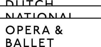
The Dutch National Opera & Ballet logo has us peeking from the balcony.
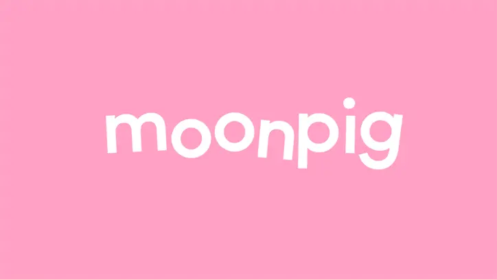
And Moonpig champions creativity by updating their logo to match their surreal name.
Beautiful use of typography
Fonts are another excellent source of inspiration.
Typography can help you balance simplicity and intricacy in logo design. It’s also an essential element for your brand creation process.
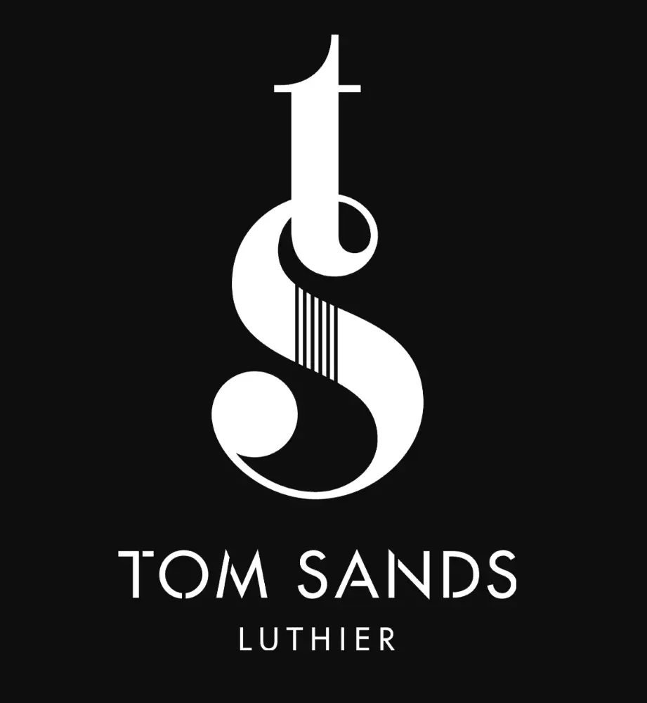
Typography was just what Tom Sands needed to make this logo a timeless presence on their acoustic guitars.

Typography can also create a sense of motion, as it does in this example.
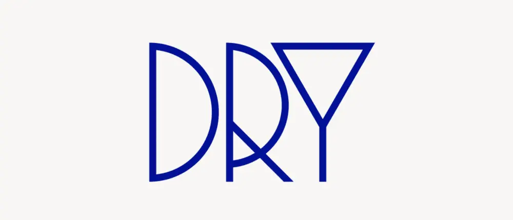
And sometimes, like in the case of UK-based creative agency Dry, fonts are all you need to capture your brand spirit.
Clever use of symbols
The symbols you include in your logo give people a glimpse into the brand’s spirit and generate emotional connectivity.
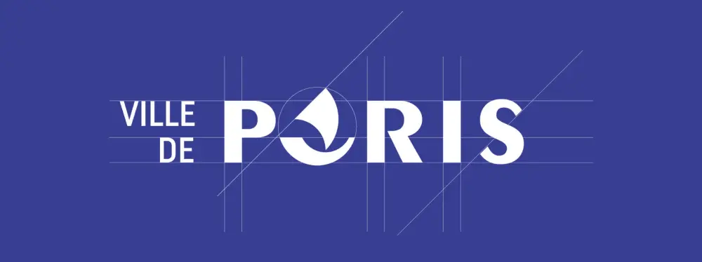
This redesign concept uses the nave ship, a historical symbol of Paris.

Airbnb logo redesign is a great example of mixing various symbols into a memorable logo.

Chairish provides an honest and straightforward testimony of their dedication to their craft.
Creative use of patterns
You can incorporate different patterns into logos while still maintaining brand consistency—and these examples are proof.
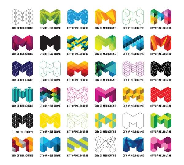
The redesign of Melbourne’s logo provides a playful space for patterns and placements.
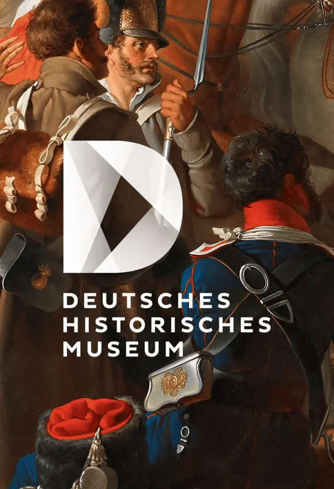
The German Historical Museum’s logo uses juxtaposed shapes that can fit well in intricate contexts.
In this example, patterns and negative space convey a message of unity.
Surprising use of negative space
“In the end, creativity isn’t just the things we choose to put in, it’s the things we choose to leave out.”
Austin Kleon
In this quote from his book Steal Like an Artist: 10 Things Nobody Told You About Being Creative, author Austin Kleon captures the inspiration negative space can unleash.
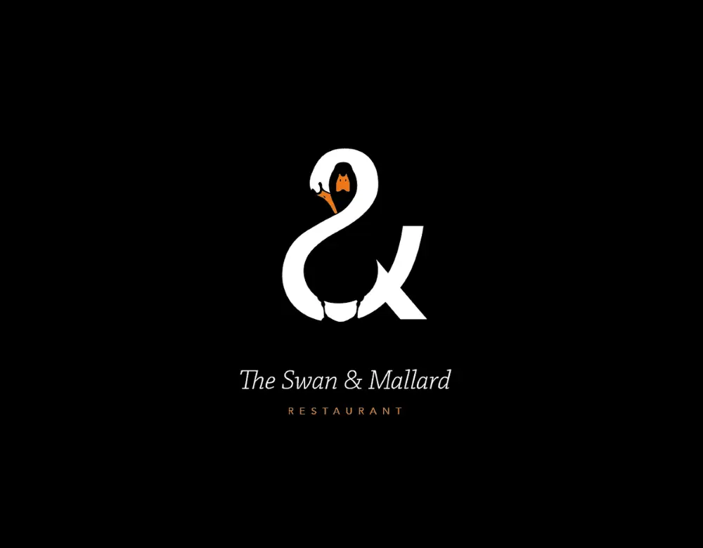
The Swan & Mallard logo challenges you to find the intertwined characters.
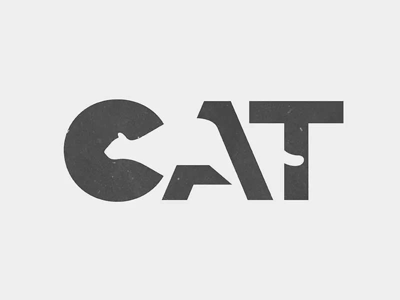
Whether you’re into cats or bears, you can’t help but spot the figures that hide behind this typeface.

This Flight Finder logo creates a sense of motion and pleases the eye with its symmetry.
Surprising use of animation
We live in the golden age of GIFs, and their cultural impact now influences logo design ideas as well. These examples show how you can add animation to a professional logo.
PetCloud’s logo has adorable spelled all over it, wouldn’t you agree?
I bet the designer behind this logo knew his clients would be over the moon with its design.
And this creative used animation to deliver his logo design with a bang!
Before you go, remember this
As a designer, you know coming up with cool logo ideas is a complex process. What helps is to lead with a deep understanding of your client’s business and brand values.
It’s equally useful to draw inspiration from diverse sources and experiment with your ideas until you find the right fit. Play with colors, layout, typography & symbols to design the creative, custom logo your client expects.
Once you have it, use the logo to build branding that’s consistent across all channels. Give customers a familiar and reliable presence to count on and build meaning with.
Use this 5-step process to design creative logos
Unfortunately, a clear creative brief for logo makers is a rare occurrence. That’s why designers and agencies explore, select and clarify ideas before proposing anything.
Here’s a secret experienced creatives know: Sometimes you can reach your best ideas by using a systematic approach.
Whether you’re building a brand from scratch or planning a thorough rebranding, this 5-step process can help you come up with cool logo ideas.
1. Understand the customer’s business
The logo is central to a brand’s identity. In fact, the best of them are deeply rooted in the company’s mission. If you’re lucky, your customer has their mission clearly articulated. If not, roll up your sleeves and focus on research.
First, observe and analyze how their customers talk about them.
Explore:
- Testimonials & reviews that highlight their best features (for B2B, try G2Crowd or Clutch; for B2C, try TrustPilot or Google Places)
- Answers to surveys that show how customers feel about the business
- Case studies that reflect their process and results
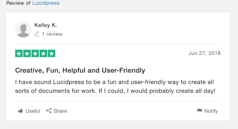
Source: TrustPilot
For brand new businesses, you can look for similar details in their competitors’ activity to give you a starting point.
2. Map out the brand’s values
The best branding relies on a deep understanding of what people want when they buy something.
A custom logo that builds differentiation has to speak to customers’ psychological needs. A powerful design triggers a reaction and influences the choices consumers make when they see it.
Define what the business stands for to ensure your logo design speaks to the brand’s values.
For example, Patagonia strives to “build the best product.” They aim to “use business to protect nature” and do so in a way that’s “not bound by convention.”
Buffer commits to “default to transparency,” “cultivate positivity” and “improve consistently,” among other values.
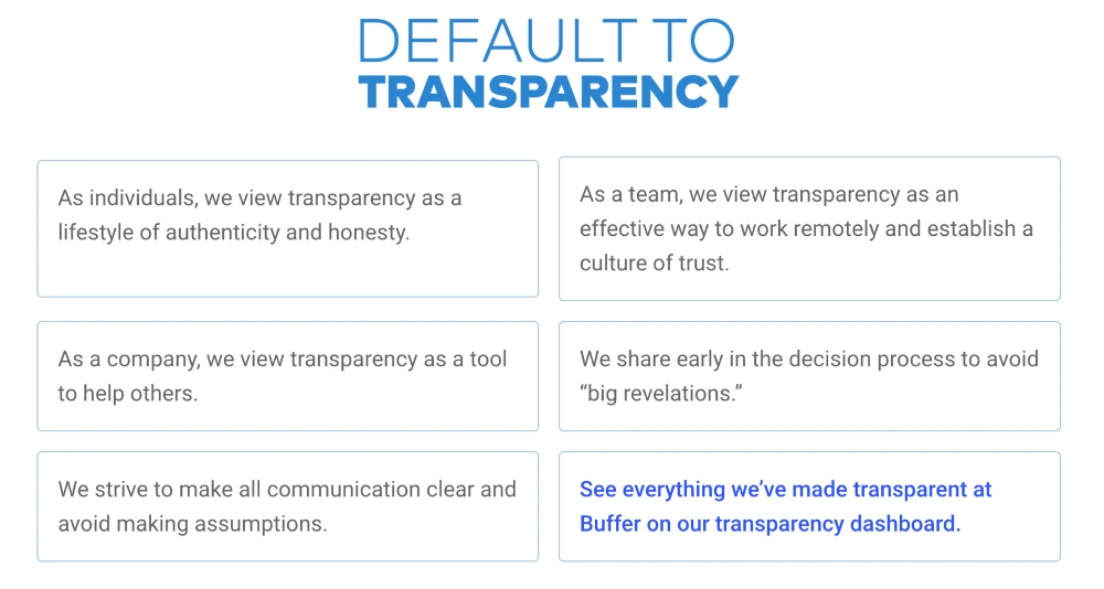
Source: Buffer
Using your customer’s brand values to guide your logo design can be incredibly inspiring.
3. Choose a series of adjectives
Now that you know what the business is all about, you use this information to pin down specifics. Make a list of adjectives that capture the brand personality.
For example, when you think of Patagonia, words like humble, altruistic & adventurous may come to mind. Buffer inspires words such as helpful, calm & dependable.
Examples of adjectives you could use:
- Bold
- Serious
- Rational
- Imaginative
- Idealistic
- Generous
- Clever
- Humorous
- Whimsical
- Luxurious
- Glamorous
- Rugged
- Brave
- Rebellious
- Cooperative
- Edgy
- Gentle
- Playful
- Old-fashioned
- Youthful
Want to go the extra mile? Analyze the vocabulary customers use when they talk about your client and dig up adjectives from it.
Single out associations that point to what makes the company different. Narrow your list down to 3. Now you have the emotional substance that fuels your logo.
4. Collect inspiring ideas
Logo design ideas often come from unexpected sources. Take it from people who faced the same challenges as you do now:
“I use weird sources for inspiration. I look at forms in nature and try to reduce them to basic shapes. I’m always trying to invoke a sense of humanity to a logo.”
Josh Baron, Media Art Director at Sparxoo
Multiply the opportunities for creative inspiration to kick in and increase the chances to get that grand idea. Look for compelling symbols, icons and patterns.
Check out fresh photography from sites that offer free stock images. Peruse design websites like Dribbble, Behance, Designspiration & Dunked.
Even better, browse countless logo examples on Logoed, Logospire, Logo Gallery, Brand New, Logo Moose & Logo Design Love.
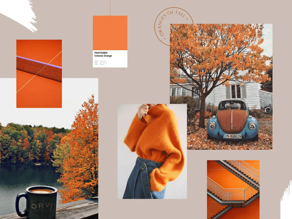
Collect fonts & color options to create a mood board. This collage of elements helps define your concept at this stage. Include notes to explain your thought process so you can give your client a consistent overview of your creative direction.
Source: Dribbble
Ask for feedback at this stage. Get input from your client to save you time and energy down the road. For example, knowing which elements your client notices can help you come up with better, more relevant logo design proposals.
Feedback in hand, it’s time to create the best logo you can.
5. Choose & validate the best ideas
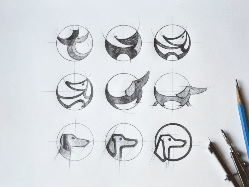
Fast forward through dozens of iterations to logo_v27_final_FINAL.indd.
You’ve received feedback, integrated it and designed (what you assume will be) the final version.
Source: Tubik Studio
Your moment of glory awaits, and so does your deadline.
Use this time constraint to strengthen your creative process. Stop before you get caught up in a never-ending cycle of “I know I can do better.”
Instead, focus on shaping a logo that can outlive design trends. Give people a chance to build meaning into your logo over time.
Here’s what experienced creatives recommend:
“All logos should be four things: simple, memorable, timeless and flexible.”
Cory Schearer, Creative Director at Ferebee Lane
Keep in mind adaptability when you design your client’s logo. Your creation will be used in print, in emails, on social media, on websites and digital advertisements.
Wherever it may be featured, the logo’s role is to get an emotional reaction.
Ready to design your logo? Give us a try.
Are you sitting at your desk waiting for that sweet, sweet logo inspiration to strike?
No matter whether you’re a consultant looking to brand your business or a designer looking for new ideas, this article will get you unstuck.
Related: 9 excellent logo redesigns for famous brands
Below, you’ll discover different types of consulting logo ideas from some of the biggest consulting brands in the world.
Whether you’re looking for designs with hidden meanings or something more traditional, the examples below are bound to stir up some creative juices.
Before diving into our pool of inspiration, though, let’s see what makes a good consulting logo and what mistakes you should avoid.
3 golden rules to create a modern consulting logo that stands out
Make sure your logo doesn’t misrepresent your business
The color, the weight of your fonts, the spacing between the letters—everything stirs an emotion.

You have to make sure your logo conveys the right story, the right emotion and the right voice for your brand.
For instance, if you want to be perceived as an expert, you wouldn’t want an overly playful design.
Make sure your logo is clear and not too complicated
Yes, it’s true, your logo should tell a story. But, this doesn’t mean a person should figure it out in the blink of an eye.
Here’s what I mean. If you look carefully at Amazon’s logo, you’ll see an arrow pointing from A to Z. This is because they want to show people that they can find almost any product on their platform.
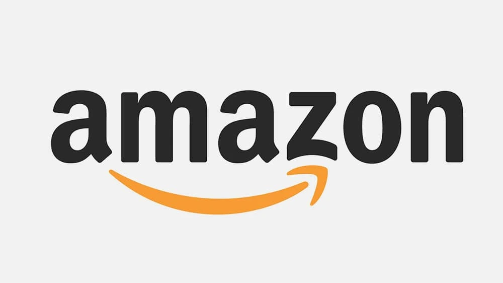
This story now makes sense because I’ve just told it to you. It only took a few seconds, and a logo which was already effective before now seems even more so. It goes to show that you don’t need to overcomplicate your logo to tell a story.
Make sure your logo doesn’t look old or outdated
What would be your first impression if you saw a consulting logo like this? (Yes, we know Hot Wheels is not particularly known for its consulting prowess, but please bear with us for the sake of example.)

A vintage font combined with a childish design… If this actually were a consulting company, you’d probably think they don’t care about how they look—and maybe they don’t care about their customers either, right? Not great.
Of course, this doesn’t mean you have to update your logo every year just to keep up with the trends. You just have to make sure you’re not hanging on to outdated design elements that were only trendy 20 years ago.
And with that, let’s move on to our round-up of consulting logo ideas.
Consulting logo idea #1: Accenture
Accenture is one of the biggest management consulting firms. The company offers strategy, consulting, digital, technology and operations services. Their revenue was around $40 billion in 2018, so we could definitely learn some design lessons from them.

The sign for “greater than” is placed above the letter t to represent the future—a future where you’ve ascended and grown to be greater (>) than (t) you (u) are (re).
As you can see, your next consulting logo can be clean & simple and still have a deeper message to communicate.
Consulting logo idea #2: Capgemini
Capgemini is another consulting giant that can teach us a valuable design lesson.

The key lesson here is that you can build a financial empire… even if your logo isn’t closely related to the services you’re selling.
The Ace of Spades has been present in their logo since its inception, but it has little to do with their business. In fact, it refers to bridge—a card game that the founder of the company, Serge Kampf, enjoys. In bridge, the Ace of Spades is the highest-value card.
It’s simple, it’s sweet, and it works. The lesson? You don’t necessarily need to hire an expensive designer to create a custom logo that’s meaningful to your brand. There are plenty of free logo makers out there that can help you get started.
Consulting logo idea #3: DLA Piper
If you’re offering legal consulting services, here’s what you can learn from one of the biggest global law firms. (How big? DLA Piper has lawyers in more than 40 countries and over $2 billion in revenue—that’s how big.)

The open-ended shapes represent out-of-the-box thinking. Something you might actually want from a lawyer, right?
If you look at it from a different angle, the logo seems like a talking bubble, which shows they value the art of communication… or that they’re friendly. You decide.
Do you see how the story starts to make sense after you receive more information? And how quickly this story can change, depending on the interpretation?
The point is this: If you’re just starting out and you’re not a giant corporation, don’t fret too much on pinpointing the right story behind your logo. You can refresh the design and infuse more meaning as your brand grows and develops.
Consulting logo idea #4: Deloitte
Deloitte’s revenue was over $40 billion in 2018, and they use one of the most basic design elements in their logo: a dot.

What could we possibly learn from this? Actually, it makes a great point. (Ha!)
Timeless shapes (like the point) and simplicity will never go out of style. You don’t need an overwhelming design that distracts people from getting your message.
Plus, a simple logo will be much easier to integrate in almost any sales collateral or marketing material you develop later.
If you need further proof, just study the logos of some of the biggest brands out there: Nike, Apple, Adidas, Dell, Intel, etc. Enough said.
Consulting logo idea #5: McKinsey & Company
McKinsey & Company is undoubtedly one of the biggest consulting firms you can study and look to for inspiration.

And it can teach you two important lessons.
The first is that you don’t need a fancy or even a creative logo to express professionalism or extensive experience within a field.
In fact, quite the opposite is true. If you study successful companies, you’ll see that most of them refined their logos into simpler, cleaner versions as they matured.
The second lesson here is that even your choice of font can tell a story.
At its core, McKinsey & Company uses a classic custom font because experience, heritage and legacy are what represent them best.
Consulting logo idea #6: L.E.K. Consulting
Want to make your consulting logo stand out while still maintaining a professional, bold look?
Here’s a key takeaway from L.E.K. Consulting, a global company established in 1983.
Their logo stands out because of some basic design elements and principles like composition, contrast and negative space.
For instance, they draw attention to their logo by using the contrast between the negative space in the top-left corner and the logo in the bottom-right corner.
They also give a bold look to the whole design by leveraging one of the most basic elements—the rectangle—all in combination with a deep-colored background.
Consulting logo idea #7: KPMG
If you’re afraid that your consulting logo won’t be perfect right away, don’t fret.
KPMG proves that no design should be set in stone, even if it’s a logo. You can always change it, and there’s no tragedy in doing that. It doesn’t mean you have to lose sales or credibility.
For instance, here’s how many iterations their logo’s had throughout the years:
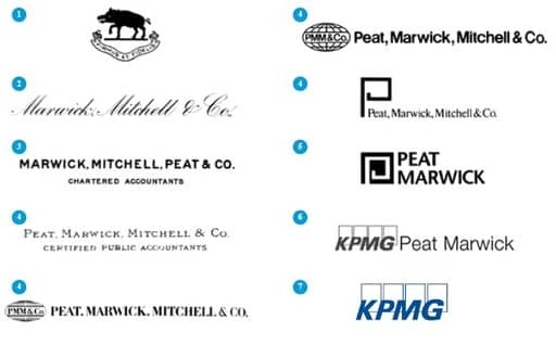
Source: KPMG
As you can see, these weren’t minor changes—in fact, many were radical redesigns. Even its name changed each time the company got a new partner or the shares were redistributed.
Still, the company is one of the largest professional services companies in the world with over $28 billion in revenue for 2018.
Consulting logo idea #8: FedEx
FedEx isn’t a consulting company, but if you want your consulting logo to be more creative and have a hidden meaning, it’s a good example to follow.
If you look carefully, there’s a hidden arrow that communicates speed and accuracy to those in-the-know.

Of course, now the question is, how do you come up with such clever ideas?
It’s simple. It all starts with your unique value proposition, the core message you want to communicate.
Find out that one thing, that most important thing that makes people want to do business with you. Then, incorporate it in your design.
Consulting logo idea #9: Sony Vaio
Sometimes, the hidden meaning in a logo can come from the product itself.
Here’s a clever logo idea from Sony Vaio. Even though it’s not a consulting company, it’s worth mentioning because they managed to create such a simple logo with a hidden meaning behind it. Take a look:
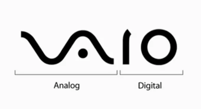
Consulting logo idea #10: Eighty20
If you’re looking for creative consulting logo ideas, Eighty20 is probably one of the best examples you can use for inspiration.
Eighty20 is a business consulting company that uses big data to inform its market research, then they use these insights to help marketers and companies better sell their services.
Their brand is a combination of geeky and creative, and they express that well in their logo. How? Each of the horizontal lines represents a binary sequence. The blue squares represent 1s, and the grey squares represent 0s.
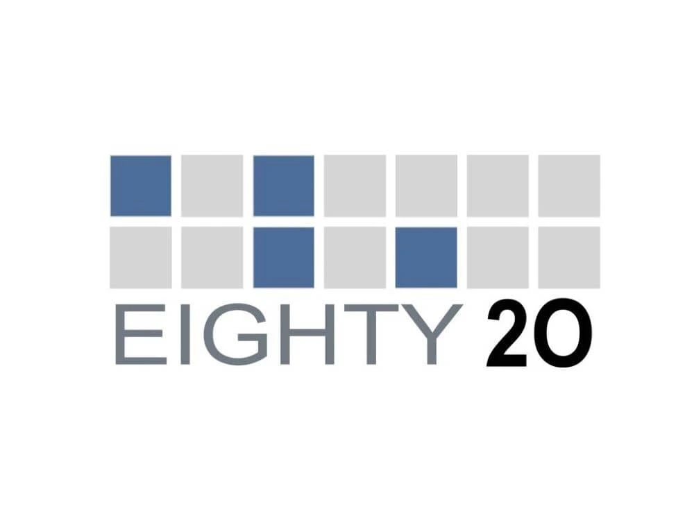
In binary sequence, the top row is 1010000, while the bottom one is 0010100. If you transform these numbers from binary to decimal, it reads… you guessed it: 80 and 20. Pretty clever, right?
Before designing your next consulting logo, do this
There are thousands of logo design ideas out there. The problem is, the more you see, the harder it is to choose one.
Here’s a method professional designers use to come up with great ideas quickly (and easily decide on the right one).
First, stop looking for ideas. Then, define the core message you want to communicate.
Are you fast and precise? Do you offer a complete range of services? Do you have the most innovative solutions or the most comprehensive research? Are you affordable for SMBs, or do you only serve large enterprises?
Only after you define your core message should you start looking for inspiration. Don’t worry—we’ll be right here when you come back.
Ready to start exploring your new brand identity? Try creating a few logo variations in Lucidpress, using your brand colors.
Not sure how your next fitness logo should look and want a few examples to get your imagination’s wheels in motion?
Maybe you want to see some design ideas from well-known brands in the fitness industry. Or, perhaps you’re looking for creative logo ideas that stand out from the crowd.
Related: Best logo design ideas for your inspiration
No matter whether you’re a fitness consultant, own a gym or have any other fitness business, by the end of this article, you’ll have plenty of ideas to get you started.
But, first, let’s see what makes a good fitness logo and what mistakes you should avoid.
3 fundamental rules to create a fitness logo people will remember
1. Make sure your logo doesn’t communicate the wrong message
Every aspect of your future fitness logo will evoke an emotion, from the colors to the fonts and shapes you choose.
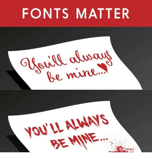
This is why you have to be careful about the first impression your visual identity makes.
For instance, a dark, sober color isn’t something you might want for a fitness logo if you’re also helping people keep a balanced, fresh and healthy diet.
2. Keep your logo simple and clean
Ideally, your logo should tell a story. Maybe the origins or the philosophy of your brand. Or, maybe just your unique selling proposition.
This doesn’t mean you have to overcrowd your logo with all kinds of elements in order for people to get your message. When you try to convey too much in a single logo, it comes overly complex and difficult to recognize and replicate.
3. Avoid using outdated design trends
Imagine someone hands you a business card with a logo that looks like this:
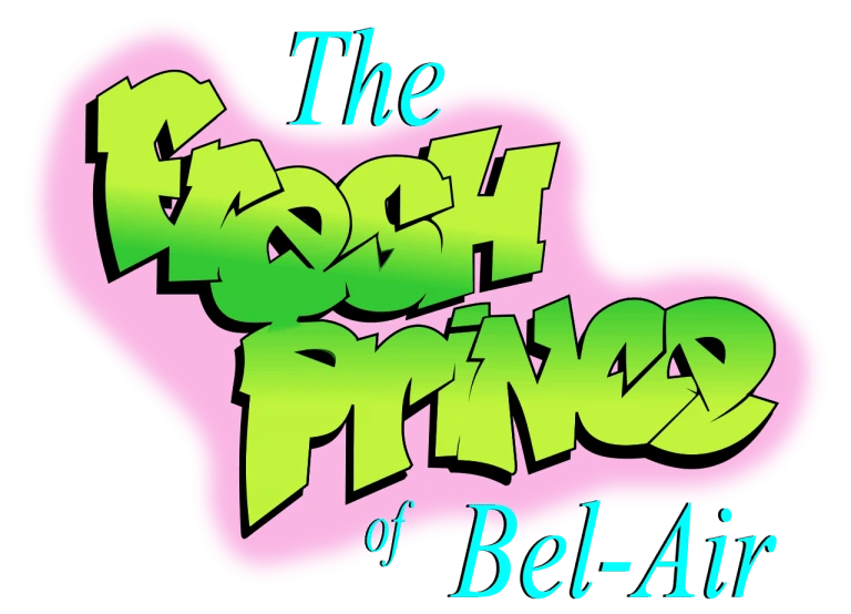
What’s your first impression? Other than nostalgia, probably not a good one, right?
Of course, you don’t have to update your logo every time a new design trend comes along. Just make sure your logo doesn’t look like it’s stuck in the ’90s.
These are three critical aspects you should take into account when creating a logo. Now, let’s dive into our pool of fitness logo ideas and see what you can learn from each one of them.
Fitness logo design ideas for your inspiration
When you have too many ideas, just stick to the basics, even if it’s cliché
Sometimes we spend too much time brainstorming and browsing through thousands of logo ideas just to find that “perfect one.”
And, too often, the result is a complicated design that few will remember.
When this is the case, it’s better to stick to something classic that anyone can recognize as a fitness business.
Plus, you have the advantage that most free logo makers have these elements in their gallery so you won’t have to customize your design too much.
Source: GLDesigns
If you want to be compelling, point out something your audience wants
What’s that number-one thing your audience wants? Point it out, and people will remember you as that gym or that fitness instructor or that nutritionist who can help them get it.
Notice how, in a second, you know this fitness business can help you just by looking at their logo. Then, note how it brings us nicely to our next point…
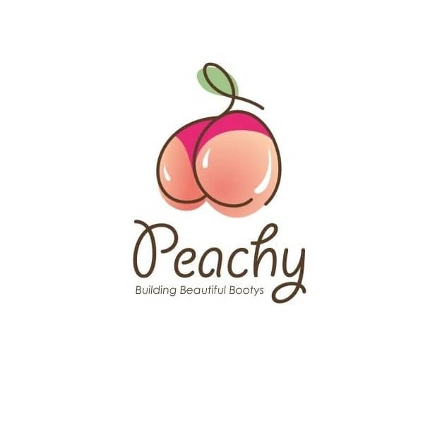
Source: 99designs
Make sure your fitness logo doesn’t drive away parts of your audience
Let’s say you’re a fitness trainer, and you chose the logo below to represent your business.
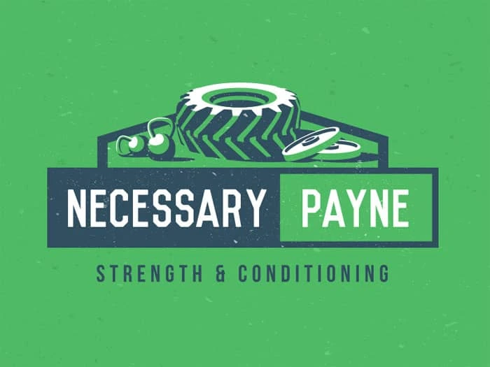
Source: Design your way
It’s great for people who are looking for hardcore training. But, there are lots of people who just want to stay in shape. Your logo might tell them that you’re not a good fit for them.
Of course, if your ideal audience is into hardcore training, this could be a great strategic move. What’s important is for you to think through these considerations before you make your final decision. For example, take a look at our next point.
Make sure your logo isn’t limiting future expansion of your fitness business
Let’s say that you start out as a yoga fitness trainer, but you plan to grow your business beyond the yoga niche.
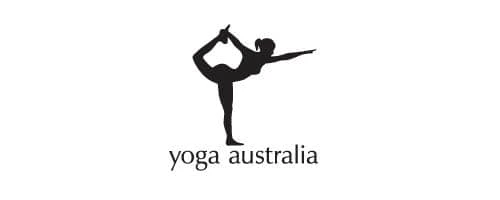
Unless you go through a complete rebranding, your logo will limit the growth of your business.
When you’re looking for design inspiration for your logo, make sure you also take into account any future plans. If you can spot them now, ahead of time, you’ll save yourself an expensive and time-consuming rebrand in the future.
Use a well-known symbol
Sometimes keeping a logo simple and clean can be most effective at showing what your brand is about.

Source: Lucidpress
Incorporate a top benefit into a classic fitness logo design
In logo design, it’s efficient to incorporate an element that people can easily recognize, such as a gear or muscles if you’re in the fitness business.
But, these elements are also a bit overused, and you might want something more creative for your logo.
Well, why not incorporate additional benefits that your brand has to offer—such as good music, for example. Now people have two reasons to choose you over the competition instead of one.
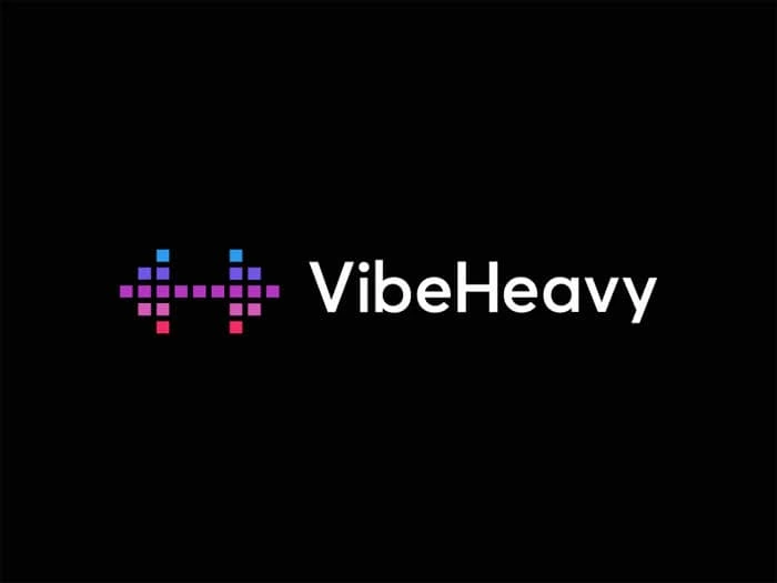
Source: Design your way
Your fitness logo doesn’t necessarily have to be related to fitness
Apple’s logo has nothing to do with phones. Nike’s logo doesn’t represent shoes, clothes or sports gear. Subway doesn’t have a sandwich in their logo.
Your fitness logo doesn’t have to be related to muscles, fit bodies or any kind of elements related to sports. It could be something as simple as two shapes that convey motion.

Source: Design your way
Use a color combination that stands out
Even if you don’t have a super creative logo layered with hidden meaning, you can still stand out from the crowd by using a powerful color combination.
Take Google, for example, or FedEx. Or, this fitness logo below.
Source: Logojoy
Think about all the different ways you’ll use your logo
A highly detailed concept might look great on a large banner.

Source: 99designs
But, how would this logo look on a small business card? Would it be as effective?
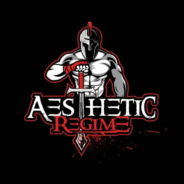
Suddenly, all those details become so small that people can’t recognize them.
Before you finalize your logo design, make sure you test it in all the different scenarios you know you’re going to use it.
Try to include a special meaning behind your logo
Let’s review a classic example for this one. FedEx uses negative space to hide an arrow that subliminally conveys speed and accuracy.
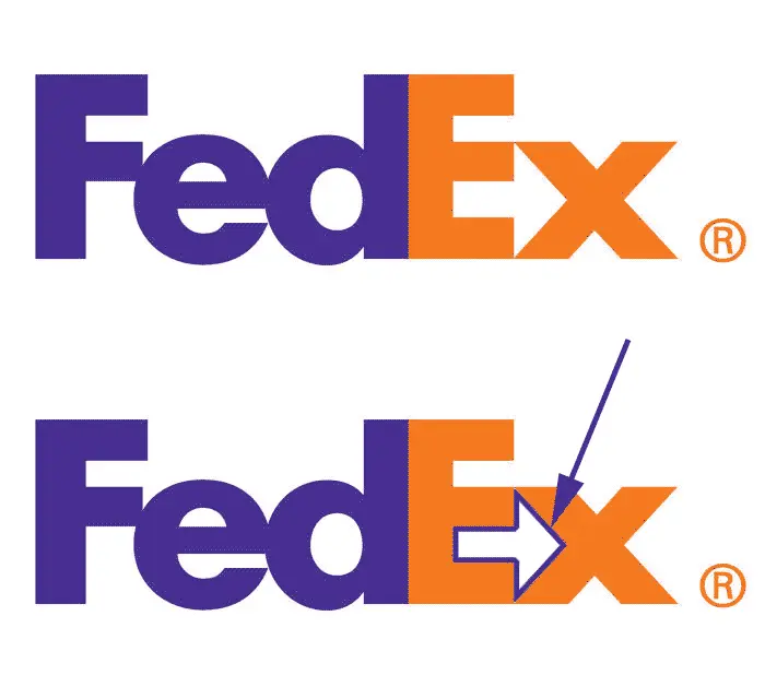
Source: Pixellogo
You, too, can use different elements in a clever way to give your logo a double meaning. For instance, here’s a clever way to incorporate the infinity symbol as a yoga fitness instructor.
Source: BrandCrowd
Incorporate a sense of motion
As a species, we seem wired to detect motion, thanks to our neural underpinnings.
And since motion is a key aspect of your business, why not include it in your fitness logo? A dynamic design attracts attention and motivates people to get more active.
Source: Design your way
Before you create your next fitness logo, do this
If you want your next logo to be something creative or to have a special meaning, you first have to understand your brand’s identity. What is the most important message you want your business to communicate?
Only after you answer this crucial question can you start looking for ideas for your next fitness logo. Otherwise, you might find some good inspiration, but it won’t represent your business. So, take your time and do your research—then try out a few ideas.
Ready to start exploring your new brand identity? Try creating a few logo variations in Lucidpress, using your brand colors.
You likely already know that a logo is an important part of any business’s branding. Not only does it make your modern real estate company stand out from the competition, but a solid logo can attract and win over new customers. That’s what we’re always aiming for, right?
Related: Real estate branding—a comprehensive guide
But, it’s tricky to design a custom logo for your real estate firm. You’ll need to think about the colors, fonts and shapes you’re using—not to mention arranging each individual element to create an impressive design.
So, we collected eight of the best real estate logos to help inspire your own.
What makes a good real estate logo?
The logo you’re creating for your real estate agency is one of the first things you’ll need to nail. But before we share some of our favorite modern real estate logos, let’s chat about what makes a logo so great.
A strong logo usually is:
- bold
- unique
- easy to understand
Yet above all, the logo you’re creating for your real estate company needs to be on-brand. There’s no use in having a bright and colorful logo if your website, social media channels and letterheads are black and white.
Your audience won’t understand it, and you won’t see the 23% average revenue increase that businesses with consistent branding experience.
(Remember, that’s the aim of a logo: to make your business stand out.)
8 awesome real estate logos to inspire your own
You don’t have to start from scratch when you’re creating your own real estate logo. Take a look at these examples, pick out the ideas or concepts you like, and find a way to work them into your custom logo.
However, we’re coming at you with a word of warning: Please don’t directly copy these logo examples. The best logos are unique, innovative and stand out from the crowd, so take these ideas and try to put your own spin on them.
1. Smith Mountain Homes
First up is this beautiful logo from Smith Mountain Homes.
You can quickly understand the type of homes they sell, right? And it’s not just because the word “mountain” features in the brand name; they’ve used graphics to signal the type of property they sell.
Granted, the design and font choices are simple—but that’s often the best way to create a memorable logo.

2. Cabo Cribs
If you’re looking to buy property in Cabo, I’ll bet Cabo Cribs’ logo catches your attention.
Similar to the real estate logo above, this design is simplistic, but it doesn’t scrimp on the essentials of a good logo. It’s easy to understand, elegant, and has a small graphic that makes it obvious they’re selling homes.
3. Williams & Williams
If you’re in the market for a luxury property, you’ll love Williams & Williams’ logo.
Take one glance at this logo and tell me what you interpret. It’s gold-themed, has elegant writing, and shows palm trees with the properties they’re managing. It ticks one huge element of a great logo: It’s perfectly on-brand for their commercial real estate company.

4. Compass
Who said a logo had to contain words?
Think of the world’s most recognizable logos. McDonald’s, Nike or Adidas will likely make their way onto that list—and none of them have a brand name in their logo.
Real estate firm Compass looks like they’ve drawn inspiration from those huge brands with their word-free logo. Although you can’t clearly see they’re selling properties, it’s a great way to make their audience stop and pay attention. After all, what are realtors for if not providing their clients with valuable guidance and direction?
5. Blue Key Property Management
I’ve included this logo concept for Blue Key Property Management here purely because it’s so simple, yet so effective.
You might’ve seen by now that many real estate logos contain property-related graphics. But instead of taking the standard route of a house, this firm opted to use keys—a factor that helps them stand out from the competition.
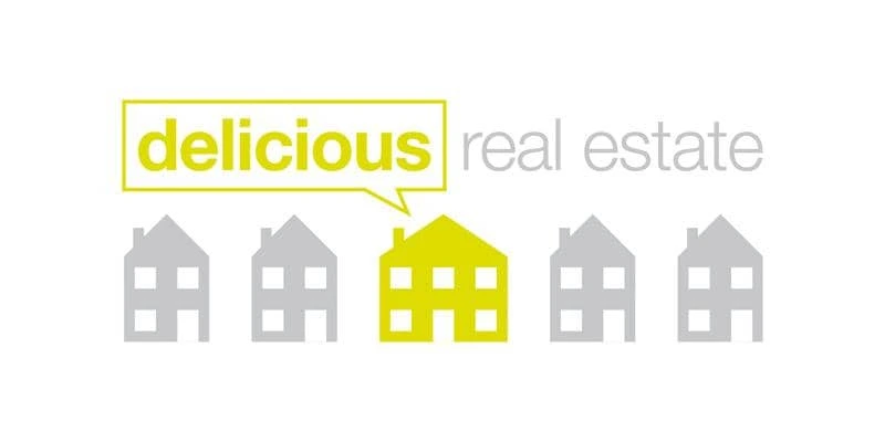
6. Delicious Real Estate
A simple—yet effective—way to build your real estate logo is to think about your buyer personas and their pain points. What are they looking for when they’re purchasing or renting a home from your firm?
It seems like Delicious Real Estate think it’s a reasonably-sized home. That’s why they’ve portrayed the situation their customers are usually stuck in through their logo.
7. Crown Real Estate
Remember how we mentioned real estate logos should be simple and easy to understand? Take a look at Crown Real Estate’s logo, which does exactly that while using simplistic fonts, a black-and-white color scheme, and a basic crown icon to match their brand name.
8. Live Dubai
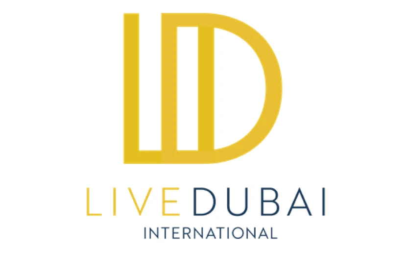
The final logo on our list comes from Live Dubai.
Much like the other real estate logos we’ve listed, this one is simple. But, what we really love about this design is the way lettering is used to create an interesting logo that’s totally unique to their brand name.
This gives them two options: use the graphic & text together as their logo or crop the image just to use the lettered graphic.
How to create your own real estate logo
Feeling inspired and ready to start designing a new logo for your real estate company?
You don’t have to hire an expensive graphic designer to create a custom logo design. There are thousands of templates you can customize, making a DIY logo the best way to create a professional brand for your real estate business—even if you’re on a tight budget.
However, if you do have some cash to splash on a fancy real estate agency logo, hiring a graphic designer is a great way to make sure your logo is unique. …Just make sure they’re sticking with your brand guidelines.
Key takeaways
As you can see, there are tons of incredible real estate logos that can inspire your own.
Remember, the most effective logos are unique, bold and easy to understand. And while each real estate logo design we’ve listed here ticks those boxes, you’ll need to add your own spin to each design when you’re creating your own.
Ready to start exploring your new brand identity? Try creating a few logo variations in Lucidpress, using your brand colors.
Color is a big part of our world.
The colors we surround ourselves with can impact our mood, change our energy levels, invoke memories, and even influence our decisions. As you can imagine, color is a powerful player in people’s perceptions of your brand as well.
A blog post on Elle & Co. says 60% of people decide whether they’re attracted to a message based on the color alone — and color reinforces brand recognition by up to 80%.
Point is, color makes a big impact on customers.
This is why Google has reportedly tested 41 different shades of blue in its logo to see which blue performed best. The winning color, according to dozens of charts and graphs, was not too green and not too red.
“It’s interesting to see how you can change the way that people respond to the Web in ways that are not intuitive,” Google executive Marissa Meyer explained.
Color branding is about your customers
Many brands have a signature color (or colors) that makes them easily recognizable.
In many cases, it would be odd to see their logo in a different color. Can you imagine McDonald’s golden arches in a bright purple instead? What if Starbucks’ logo wasn’t green & white, Pepsi’s logo wasn’t blue & red, and Target’s wasn’t red all around?
When we see that bubblegum-pink writing, we know it’s Barbie — and when we see the tiny blue f, we know it’s Facebook.
But, it’s not just the logo. As an article on SpellBrand suggests, there are many ways to incorporate color into your branding:
- advertising
- business cards
- employee uniforms
- interior design at retail locations (and in the office)
- letterhead
- marketing materials
- product packaging
- signage
- social media graphics
- website
According to Aprimo, marketing activities should focus on customers to create positive experiences each time they interact with your brand. Color will be part of those interactions, so deciding which color to use often comes down to who your customers are.
Emma Foley, design lead at Clique Studios, says, “As much as you might want them to, everyone is not going to be your audience. So, if you focus in and build a strong community of people you want to talk to, you can do a lot with using color as the first interaction with those people.”
For example, color has the power to make your website stand out among similar websites.
“One of your website visitors might think, ‘They are using this hot pink in a world of traditional blue and that’s really interesting. I want to learn more about this company’,” Emma explains.
She says there are really two schools of thought about how companies should manage color: 1) this is our brand color so we have to use it or 2) play around with colors because the rest of the brand is strong.
Before deciding which color makes sense for your brand, it’s important to take a step back and think about what colors mean.
What is color psychology?
Simply put, color psychology is the study of colors and their impact on human behavior. Sometimes color can influence unexpected things like our sense of taste. According to Neil Patel, “Color is 85% of the reason you purchased a specific product.” Sounds like good enough reason to implement a couple color psychology tricks into your own branding efforts.
However, keep in mind that our feelings about certain colors are personal and depend on both life experience and culture. For example, while the color white is used in the Western world to represent purity & innocence, in Eastern countries white is a symbol of death & mourning.
Types of colors and their impact on human behavior
The color wheel features two types of colors: warm tones & cool tones. Warm colors include red, orange & yellow and are associated with energy, passion & creativity. These tones are great for adding life to your designs. Cold colors include green, purple & blue and have a calming, soothing effect on people. (This is why you never see flashy colors in hospitals and waiting rooms.)
There’s another type of color which isn’t represented on the traditional color wheel: neutral tones. Neutral tones include white, grey & brown. In design, these colors are mostly used for backgrounds. To make those colors stand out more, you can add texture to your artwork.
Color psychology in branding
The concept of branding is based on the belief that colors (and other design choices) can evoke specific reactions & feelings. Despite the ubiquitous use of color in marketing, there’s not enough research to back up every assumption. However, over the years, marketers & designers have identified patterns that appear to influence customers’ purchase decisions.
If chosen correctly, your color palette can influence how customers feel about your brand.
Red

Source: Unsplash
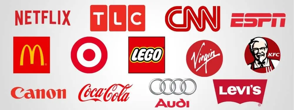
The color red is associated with intensity, emotion, and a sense of urgency. It can invoke feelings of active energy, passion, trust, love, intensity, aggression, excitement and appetite.
McDonald’s uses red to provoke the appetite and a feeling of urgency. (Good move for a fast-food chain.)
Made in Lucidpress
Brands that use red: McDonald’s, Audi, Coca-Cola, CNN, Lego, Canon, KFC, TLC, ESPN, Target, Levi’s, Virgin and Netflix.
Blue

Source: Unsplash
While there are many shades of blue that mean different things, blue is generally associated with depth and stability. It’s associated with conservative judgment, confidence, truth, order and understanding.
Invoking feelings of peacefulness & reliability, blue is the favorite color of tech & finance companies. For example, look at Facebook and Twitter. Those two companies use different shades of blue to portray trustworthiness & authority.
Made in Lucidpress
Brands that use blue: United Airlines, Chase Bank, Dell, Ford, General Electric, Twitter, Oreo, Lowe’s, AT&T and Samsung.
Yellow

Source: Unsplash
Yellow is a bright & vivid color associated with positive energy, sunshine and freshness. It can make people feel alive, energetic, cheerful and optimistic. In branding, yellow tends to grab attention as a very bright color that stands out. Snapchat uses yellow to appeal to younger generations and make their experience light & fun.
Made in Lucidpress
Brands that use yellow: Subway, Shell, Post-it, Lay’s, Denny’s, Hertz and Snapchat.
Beige & ivory
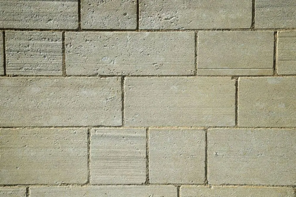
Source: Unsplash
While it’s not used too often, beige and ivory can invoke a feeling of simplicity, calm and pleasant stability.
Tilemark is a great example of a brand that uses beige & ivory.
Source: Tilemark
Gray

Source: Unsplash
Gray is associated with security, reliability, dignity, practicality, conservative judgment, calm and intelligence.
Made in Lucidpress
Brands that use gray: Wikipedia, Swarovski, Lexus and Nissan.
Green

Source: Unsplash
The color green is associated with the harmony of nature, the environment and renewal. When looking at green, people often feel calm, relaxed, trusting, peaceful, hopeful and healthy.
Green is all about nature and is used by bio-friendly, organic and sustainable brands. If you want to portray your services as environmentally safe, green is your color of choice.
Made in Lucidpress
Brands that use green: Holiday Inn, Starbucks, Animal Planet, Spotify, Land Rover, John Deere, Tropicana, Tic Tac and Hulu.
Purple

Source: Unsplash
Purple is symbolic of luxury, royalty, glamour, power, nostalgia, romance, introspection, nobility, spirituality and wisdom. It also stimulates creativity and problem-solving.
For centuries, purple has been the color of royalty. (Before the modern age, purple dyes and fabrics were both expensive and rare.) With its history, it’s not surprising that companies use purple to portray their brands as expensive & luxurious.
Made in Lucidpress
Brands that use purple: Yahoo, Marketo, FedEx, Syfy, Taco Bell, Purplebricks, Purple, Hallmark and Wonka.
Orange

Source: Unsplash
The color orange is associated with happiness, sunshine, citrus and the tropics. Orange is a playful color that makes people feel enthusiastic, creative and determined. It stimulates mental activity and supports energy, vibrancy and warmth.
Orange can be also associated with fire, combining the warmth of red with the happy brilliance of yellow. Orange tends to communicate energy & optimism. Usually, orange is associated with youth and creativity. If you want to look adventurous & competitive, orange is your color!
Made in Lucidpress
Brands that use orange: The Home Depot, Nickelodeon, Firefox, Izze, Amazon, Fanta, Payless and Harley Davidson.
White

Source: Unsplash
White symbolizes cleanliness, peace, innocence, youth, simplicity, purity and safety. As a reminder that colors mean different things in different cultures, it’s interesting to note that white carries connotations of death and mourning in many Asian cultures.
Made in Lucidpress
Brands that use white: The North Face, Tesla and Vans.
Black

Source: Unsplash
Black symbolizes luxury and the mystery of the night. It’s bold, serious, powerful, elegant, wealthy, stylish and sophisticated.
Like red, black can convey both positive & negative emotions. It can invoke associations of power & minimalism, or on the other hand, it can portray something dangerous or gloomy. Depending on the context, its meaning can differ. In branding, however, black usually comes across as exclusive & luxurious.
Made in Lucidpress
Brands that use black: Chanel, Nike, Adidas, Louis Vuitton, Prada, Puma and Lamborghini.
Pink

Source: Unsplash
Pink symbolizes love, romance, tenderness, caring, sweetness, warmth and youthful fun.
Made in Lucidpress
Brands that use pink: Barbie, Baskin Robbins, T-Mobile, Lyft, LG and PINK.
Brown

Source: Unsplash
Brown is associated with the earth, reliability, support, dependability, the outdoors, simplicity, endurance and support.
Made in Lucidpress
Brands that use brown: UPS, Hershey’s, M&Ms, Gloria Jean’s Coffee and Cracker Barrel.
Key takeaway
While color has the power to affect people’s moods, choosing your brand colors shouldn’t be based on emotional response alone. As Emma Foley of Clinique says, “There’s so much more that goes into a brand than a logo and color.” Once you understand your brand’s customers and values, you can create a brand color palette that speaks to them.