The internet is teeming with sites vying for attention, and a poor first impression could very well be your last. It’s a fine line one walks when it comes to nailing that website design. Some get it right; many don’t. From the layout and navigation to the colors and fonts, everything has something to say about the brand behind the scenes.
Related: 8 best practices of high-converting websites
Some studies suggest that it only takes 50 milliseconds for a user to decide whether your website is appealing enough. With such a short amount of time, your website needs to wow them fast and leave a strong impression.
Let’s delve deeper into three areas—design, user experience and content—that can make an impact on your viewer, to give you insight into what your website says about your brand.
Driven by design
With dwindling attention spans and fast-changing loyalties, the design of your website plays a huge role in holding the attention of fast-moving visitors and encouraging interaction.
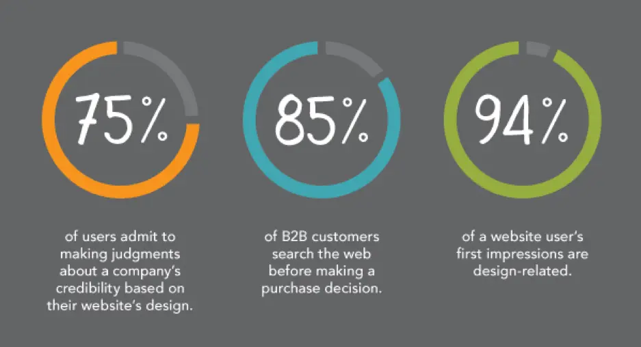
Source: Kinesis
Organizations spend top dollar to help their websites stand out amongst the noise. With special emphasis on digital marketing strategy, a great website design will help you grab your consumer’s attention.
Traits of a well-designed website
Visual appeal, but for the right audience
Looks matter.
In fact, 38% of users will stop browsing your website if they don’t find it attractive enough. So, a visually appealing website is half the job done. But remember—you are not trying to appeal to everybody.
Good design addresses the target audience with a brand personality users want to engage with. Check out this website, Crypton. It’s designed ideally for a tech-savvy audience.

Source: Crypton
Parallax scrolling heightens the user engagement here, but you don’t have to include parallax functionality on every website. Research your buyer personas and use design elements, functions and colors that make your target audience feel right at home.
Your above-the-fold section should do the job
A Nielsen study says the majority of your website visitors will spend 80% of their time above the fold. That’s the section you see without scrolling—call it the opening screen.
The best websites explain what they do in this opening screen. A general practice is to use a headline (think your company’s tagline or mission statement), followed with a brief subtitle text describing your services or products. Top it off with a CTA button to direct visitors toward the next stage in your conversion funnel.
Airbnb does this brilliantly; the headline is the CTA. While there’s no subtitle text, their call-to-action is strengthened by a slideshow of awesome travel photos. Just beneath the headline, a search bar is intuitively placed. The example text in the search bar encourages interaction.
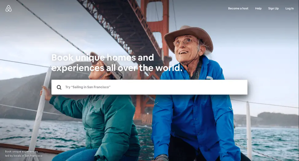
Source: Airbnb
Your design might be ineffective if:
- Your colors are wrong. For example, you’re targeting B2B consumers with a color theme that appeals more to B2C consumers.
* Your site has no visual hierarchy. This confuses the visitor, resulting in missed opportunities and eventual sales.
The design approach you take depends on many factors. Location, age brackets, and target groups will certainly affect how your website should look. Having said that, these factors should be the starting points for your design. A well-designed website that considers all these factors will set you apart from the crowd.
User experience counts
Today, it’s all about experiences. You could have a brilliant product or service, but if your website fails to deliver an enjoyable user experience, all that will be for nothing. It all comes down to how you make your customers feel.
The kind of experience users have, good or bad, will stay with them for a long time, even after the browser window is closed. A well-thought-out homepage or landing page with content that resonates will go a long way towards creating a great user experience.
Let’s see what your website’s UX has to say about you.
Good user experience:
- With good UX, your website tells the world that you think clearly about the end user. See Crunchbase’s website; its UI is done beautifully. There’s the search bar on top if you want to explore specific results, or you can click the menu on the left side to browse sections that interest you.

Source: Crunchbase
- Clean, intuitive user interface shows that you have a clear purpose.
* Got a 404 page built? Small things like this send out signals that you don’t skimp on your efforts to deliver an optimized experience.
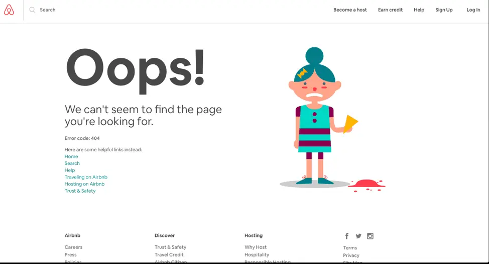
Source: Airbnb
Poor user experience:
- Your website doesn’t respond well to mobile or other screen sizes. This will send a bad message about the lack of strategy and planning behind its setup.
* Too many calls-to-action on one page show a lack of purpose for what your website aims to achieve.
User experience can make or break your website. To stay ahead of the game, it’s important to take feedback from your visitors. Incorporating that feedback will give your users a sense of gratification and improve future visitors’ experience.
Content will make it all work
Content might be the most important aspect of any website. Well-written content will bring you new traffic and repeat visits.
These days, content isn’t limited to the stuff you read. There’s now an increased demand for visual content. Animations, infographics and GIFs tell stories and illustrate data like never before. Compelling content with clear calls-to-action will eventually drive your users toward conversion.
Take a look at how the quality of your content reflects your brand’s personality.
Characteristics of good content:
- Great headlines and a call-to-action above the fold—nice. Videos on the landing page to engage fast-moving visitors—even better. This shows that you want users to get the best, most relevant material quickly without wasting their time.We especially love HubSpot for its content. The blog is fabulous, and there are explainer videos on all their landing pages, plus a video testimonial section. In short, almost every aspect of content necessary to build trust and conversion is present.
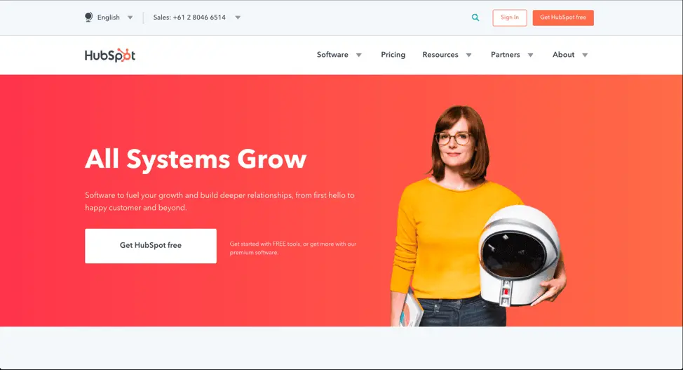
Source: HubSpot
- Use the language and verbal style your target audience speaks in. This shows that you’ve spent time thinking about and curating the content your target audience would appreciate.
* A blog should offer well-researched pieces that add value to your consumer’s decision journey. It will drive home the point that your content strategy cares more about the readers than ranking. This helps build trust and thought leadership.
Characteristics of poor content:
- Grammatical errors or typos on your site. Careless content informs your users that quality doesn’t matter to you. If you can’t pay attention to your content, who’s to say your product, services or customer support will be any better?
* Articles published just for the sake of traffic. If your content doesn’t target your audience or speak to a niche, it will be difficult for audiences to determine who your site is really for.
* Generic content that doesn’t offer anything valuable or new. This demonstrates a lack of research and understanding. The users goes away thinking you don’t really care about their needs.
Key takeaway
With so many sites competing for dollars and attention, it’s more important than ever to offer the user an exceptional experience. By breaking down your website into these three areas of design, user experience and content, you can evaluate how well each one contributes to your brand’s success. Conversely, you can also isolate areas that aren’t working and try new ways to engage your audience. When all of these areas represent your brand authentically and consistently, you will enjoy higher traffic, conversions and customer satisfaction.
Want to learn more about building & managing a brand? Check out our free eBook: Managing your brand in the cloud.
First it was smartphones, quickly followed by tablets and now smartwatches. The move towards mobile devices is quickening, and marketers are following suit. In 2016, they spent $101 billion on mobile internet ads worldwide, $40 billion in the U.S. alone. From 2013 to 2019, there will be an estimated tenfold increase in mobile advertising spending.
Related: 10 digital trends that are transforming marketing in 2018
So how can your brand benefit from mobile spending? And how can you make sure that your mobile customers keep coming back?
Here are some ways marketers are using mobile to increase brand loyalty and cash in on mobile success.
Mobile pay creates loyal customers
No, mobile pay is not the leading form of payment. Not yet. But things are heading in that direction. In 2014, mobile pay accounted for $4 billion of in-store purchases. By 2019, it’s expected to increase to $34 billion. Though still lagging way behind plastic with only 13% of smartphone owners having used it to make a purchase, that number will rise. Especially since marketers for companies such as Android and Samsung are starting to offer incentives like loyalty cards for customers who use their mobile pay platforms.
Retailers like Starbucks and Dunkin’ Donuts offer mobile pay through their apps and reward customers who use it. The Starbucks mobile pay program via its app has been so successful that over 21% of all U.S. Starbucks store purchases come from it. There’s an expectation that in a few short years, the app payments will account for 50% of business.
Richard Crone, CEO of mobile-strategy company Crone Consulting LLC said the Starbucks mobile pay app was “the most successful launch of a new payment type in history.” Marketers, take note.
You can improve customer targeting with mobile ads
Mobile is on the cutting edge of marketing technology. Where else can you seamlessly integrate geofencing, purchase preferences and history, and social media interaction with your brand? Mobile lets you isolate essential customer information to offer the most personalized and targeted marketing in history.
Mark Ghermezian of Appboy says about the future of mobile marketing:
“Brands must understand how to strategically connect with customers on a personal basis and encourage engagement, based on customer behavior, to transform them into long-lasting users. Mobile marketing automation will allow companies to collect and use data in a more actionable way and deliver personalized and timely messages to their customers.”
Companies who effectively harness mobile tools create stronger relationships with their customers by anticipating their needs, stimulating their desires, and rewarding them with exclusive offers and promotions.
Customers like to shop on mobile devices
Consumers interact with brands through their smartphones in a number of ways. They look up brick-and-mortar store locations, search for coupons and make purchases. Anna Bager, senior vice president of mobile and video at the IAB (Interactive Advertising Bureau) says:
“Pressing the ‘buy’ button on mobile devices is now a regular occurrence the world over. […] Marketers and media agencies need to fully embrace smartphones and tablets as a critical pathway for all shopping activities and increase investment if they want to build meaningful relationships with mobile consumers, driving them from discovery to purchase.”
The fact is that customers like to shop on their mobiles. In a study involving mobile users in 19 different countries, 80% said they had a positive experience with mobile shopping. Also, consumers engage more proactively with mobile apps than with traditional forms of advertising. The ability to take advantage of deals and shop at their own convenience are key factors in mobile shopping’s popularity.
Mobile apps increase your brand frequency
Mobile apps not only incorporate all of the above principals, but they also effectively increase a customer’s exposure to your brand. Americans spend on average 4.7 hours a day looking at their smartphones. Factoring in sleep, that means that people are spending about a third of their day on mobile. If your brand is on their device, they’re being exposed to it constantly.
The marketing term “effective frequency” suggests that the more frequently a consumer is exposed to your brand, the higher their intent to purchase becomes. When you adopt a mobile marketing strategy, you’re exponentially increasing your brand’s visibility.
Dick Stroud, Managing Director at 20plus30 said it best when he remarked, “At the birth of the web, companies aimed to get their website bookmarked. Marketers should be in a race to get their apps on the home screen of consumers’ smart devices.”
Ignoring mobile is a big risk.
As the trend towards personalization and targeting through mobile increases, customers are changing their expectations of interactions with brands. 54% of consumers say that a poor mobile app experience would make it less likely for them to patronize that business again, and 27% of consumers say that it would give them a negative view of the brand’s products.
Marketers ignore the mobile trend at their peril. It was estimated that the UK retail industry loses a potential 6.6 billion GBP due to lack of investment in mobile. Jamie Turner of 60SecondMarketer warns: “If you’re not using mobile marketing to attract new customers to your business, don’t worry—your competitors are already using it and are getting those customers instead.”
An investment in mobile marketing is an investment in brand loyalty. Even fringe technologies like mobile pay are on the rise and some early adopters have already seen great success in using it to increase customer loyalty. Your mobile presence has a great deal to do with consumer perception of your brand. Bottom line: use mobile or lose customers.
When it comes to design, effective typography has become a necessity—not only because the text reflects your content, but also because it adds to the look and feel of what your users consume, while also dictating how they consume it. In the context of user experience (UX), good typography has everything to do with how long a user is willing to interact with your service or webpage plus their attitude towards it.
Related: 10 best branding & corporate identity design examples
The subject of typography is broad, involving many different techniques and methods, but that doesn’t change the fact that it should be treated like a priority. Luckily, even knowing a little bit about typography can drastically improve UX, which makes it an investment with immediate pay-off.
The purpose of typography
Think about your favorite brands. What do they have in common? Strong brands consistently work with a selected font style that appears in everything they produce (a result of having great brand guidelines). Typography helps brands build a personality, stand out and be memorable. [![]() ]
]
Take the Nike logo, for example: the bold block text, combined with the slant to the right, gives the impression of strength and movement—making it perfect for a sports apparel company. Imagine how much the impact would be lessened if it used light, lowercase letters.
It’s best to think of typography as a handshake: it’s the first impression you make, which makes it even more important if you’re running a website for a small business or brand.
Before users read through your text, they visually register it first. Is the text too small or too large? Are the lines too close or too far from each other? Do your color choices impact readability? Is everything written in big unwelcoming blocks?
The bottom line is that it must be easy to read, or users will choose not to read it at all. For web designers, creating a successful and comfortable UX means choosing the appropriate typography for your content.
Give users what they want
When trying to create a positive UX, it’s important to understand how users think. Through different studies and surveys it was found that, on the average webpage, users will only read 50% of the context and move on—and a lot of them don’t even scroll down. According to information gathered by Conversionxl.com, post length doesn’t always matter… but how pleasing it is to the eye does.
The Gestalt Principle of Perception states that we have a tendency to organize visual elements depending on things like similarity, closure and proximity, and these things carry over to our reading behaviors. You can work this to your advantage by creating a clear hierarchy and using bigger fonts (called headers and subheaders) to separate portions of text. You should also keep in mind that emphasis (such as italics, bold and underline) should be used sparingly to retain its effect.
Delivering the right message the right way
Beyond visual appeal and impact, good typography can be used to your advantage. Often, new brands and websites can earn positive reactions from users by providing attractive, easy-to-read text. The reason for this is both simple and logical: it’s a sign of credibility and expertise, which users then associate with the brand presenting the message.
There are a few basic rules to sending a clear message via typography. The first is to keep it simple by using as few font styles as possible. Most webpages and designs only need two font faces; using more runs the risk of looking too cluttered or busy. It is also worth noting that, despite the thousands of free fonts found on the Internet, many websites pay for fonts with proper kerning, spacing and style variations. This makes it easier to use the same font face to evoke different feelings and reactions.
Typography is a lot like a picture: it speaks for itself. The color of your text will clue in users to what they can expect (like how red can be alarming but blue can be calming). Font faces tell users how to approach the text. Think about why script fonts are popular for party invitations, or how fonts that look handwritten feel more personal.
Improving readability and legibility
Since effective typography goes hand-in-hand with great UX, you should also know how to keep users’ interest in your message all the way through. That’s where readability and legibility come in. To keep your text visually pleasing and functional at the same time, here are a few basic guidelines.
- Don’t use small font sizes. Books use small font sizes because you hold them close to your face. Because computer screens are farther from our eyes, we need bigger text to compensate for the distance.
- Instead of using more fonts, you can use the fonts that you are already using in different weights, sizes or styles for creative contrasts.
- Make sure that the color of the text and the background are high-contrast. Just like font faces, colored text should be kept to a minimum.
- Set the text spacing to 1.5 to let it breathe. This helps users read faster and understand the text better.
- For blocks of text, use serif fonts (like Times New Roman, Georgia or Garamond) and sans serif fonts (like Arial or Helvetica) for titles and headers.
- Strategically plan the arrangement of your text by using alignment and hierarchy to keep your webpage clean and organized—and users glued to what’s important.
Typography tools and further learning
Today, typography can be a casual hobby for some and a full-blown art for others. Wherever you place yourself on the spectrum, there are easy ways to learn more. For instance, there are many tools that can help you apply what you know to ease UX on your website.
Once you’re more comfortable with your knowledge, it’s time to experiment and have fun with it. Websites like @font-face, Adobe Typekit and Typotheque can help you get started, but don’t be afraid to do some exploring.
Integrating typography into UX is more than just using presentable text. It’s often the difference between comfort and disinterest in your users—and the thin line between failed and successful conversion in your marketing.
Learn more: Do you know the 10 essential brand assets for digital success?
A well-designed website is a valuable investment that will generate revenue for your business—but 38% of people say they won’t explore a site if they find it unattractive. If your website hasn’t been updated in a while, your web design could unintentionally be hurting your business by turning people away at the door.
If it’s time to refresh your website, we’ve put together a list of 10 website design best practices and coupled them with the do’s and don’ts of great web design. Follow these best practices as you update your site.
1. Target audience
- Don’t ignore the users
Always keep your target audience in mind. Your point-of-view, as a professional, might be very different from that of the user. Pretend you’re visiting your website with fresh eyes. Walk through the user’s journey as they explore different pages. Focusing on this experience will help you create a user-friendly website.
Good design addresses the target audience with a brand personality users want to engage with. Check out this website, Crypton. It’s designed ideally for a tech-savvy audience.

Source: Crypton
Parallax scrolling heightens the user engagement here, but you don’t have to include parallax functionality on every website. Research your buyer personas and use design elements, functions and colors that make your target audience feel right at home.
- Do optimize for search
Websites that don’t rank well on Google and other search engines have very little chance of breaking through the noise. As you update your website and add new pages, make sure you’re following the most recent SEO guidelines. Your page titles, meta descriptions, and content are all important players in driving better search signals.
2. Layout
- Don’t create a cluttered layout
Have you seen websites that look like rows of boxes—all different sizes and arranged haphazardly? Would you spend more than two seconds sorting through it? Probably not. That’s because cluttered websites are visually confusing; the viewer doesn’t know where to direct their attention. A well-organized layout, on the other hand, guides the viewer where you want them to go.
- Do create a focal point
So, where do you want your visitors to go? It depends on the purpose of your website. An e-commerce site will drive visitors to purchase, while a SaaS site might drive visitors towards a demo or a free trial. Whatever purpose your website serves, make it the focal point of your homepage.
- Do use catchy headlines and call-to-action
The first things that attract a visitor’s attention when she lands on your homepage are the headline and call-to-action. Not the contact info, articles or product specs, but these two elements. For this reason, the more action-oriented your headline and CTA are, the higher your chances of success rise.
CTAs are designed to incite an immediate response from a customer. That’s why clear, concise CTAs are more effective. One software company reported that their site’s conversion rate increased by 106% after it got a makeover that included a clear, direct call-to-action.
3. Color scheme
- Don’t use all the colors
Using too many colors will make your website design clash. Colors have strong psychological impact, and they will affect a viewer’s opinion of your brand. If you’re unsure how many colors to use, the rule of thumb says your design should not use more than three colors. If you’re working with a brand palette, you might be able to use more, as long as you balance them well.
- Do use color combos that enhance your content
Your website’s colors should reflect the brand, complement the content, and visually delight viewers. [![]() ] Avoid selecting random colors just based on what you like. Instead, think about the brand and its users. If you have a primary color but don’t know how to make color schemes, you can use an automatic color scheme generator to help fill out your palette.
] Avoid selecting random colors just based on what you like. Instead, think about the brand and its users. If you have a primary color but don’t know how to make color schemes, you can use an automatic color scheme generator to help fill out your palette.
4. Text placement
- Don’t fill the page with long paragraphs
Just like the layout, you don’t want the design to be cluttered with text. If you have long-form content on the website, create a clean, spacious design that divides the content into readable chunks. You can do that by adding ample white space, using images, and creating proper flow.
- Do make it easily scannable
If your pages are easy to scan, you have a better chance of luring readers to the bottom. Attention spans are short online, but if you can make your content easy to absorb, readers will get more value from it. In addition to high-quality writing, use headings, bullets, quotes and blocks to emphasize the essentials.
- Do establish trust & credibility
Potential customers are less likely to enter their contact information or make a purchase if they suspect that your website is not secure or trustworthy. Communicate your trustworthiness by featuring customer testimonials, case studies, reviews, security badges and your privacy policy. Make sure your contact information is easy to find so visitors know they can reach you. All of these signals will help you establish trust and credibility as a reputable brand.
- Do communicate your value proposition
Use compelling language to convince and show readers how your brand will add value to their lives or resolve their problems. What benefits can customers expect to enjoy by making a purchase or signing up for your service? What features make your products better than what your competitors offer? If you can excite your visitors with your value proposition, you will see your conversion rates improve.
5. Search & navigation
- Don’t make it hard for users to find what they need
Everything on your website should be easily searchable. Whether it’s the sign-up form, the “About Us” page, or your contact information, readers should not have to spend more than a few seconds finding it. To make things even easier, include a search box so people can find things that don’t align with the page’s primary focus.
- Do set up proper navigation
If your site requires users to sign up, use colors to make the navigation simple. For instance, if your navigation headers are blue, make your sign-up button green or some other color. Organize your content into categories that users can browse if they like. You can also organize content on various hub pages.
With good UX, your website tells the world that you think clearly about the end user. See Crunchbase’s website; its UI is done beautifully. There’s the search bar on top if you want to explore specific results, or you can click the menu on the left side to browse sections that interest you.
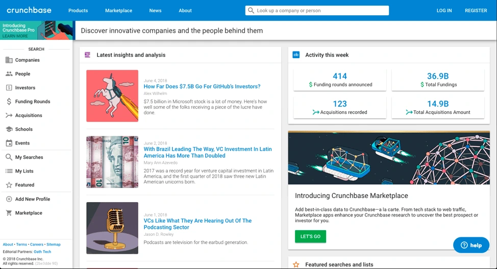
Source: Crunchbase
6. Fonts
- Don’t use too many fonts
A website that uses five different fonts loses users in seconds because it takes too much effort to read. Too many fonts on the screen can make a website look chaotic and unprofessional. The ideal number of fonts is three: one for main headings, another for sub-headings, and the third for the body text.
- Do select the right font sizes
Font size has a huge impact on legibility. It’s important that they’re neither too big (taking up half the page) nor too small (uncomfortable to read). The sizes of your fonts should reflect the importance of each element. For example, section titles and taglines are more significant than the body text, so they’re bigger. This helps readers scan the content, too.
7. Images
- Don’t use too many images
Too many images will crowd out your message, so use them sparingly and impactfully. Remember, search engines can’t read images very well, so don’t rely on them to convey text. If you’re using a background image, keep it under 1 MB. Large images slow down your site’s loading time.
- Do make it visually attractive
People think visually, which is why images are so effective. Feel free to use images in your web design, but find ones that are visually attractive, high resolution and not pixelated. Make sure the images you use reflect your brand’s personality. Don’t forget that you can also use textures and gradients to add visual appeal.
8. Mobile compatibility
- Don’t forget to optimize for mobile
57% of mobile users won’t recommend a website that’s not optimized for mobile. More people are browsing and shopping on mobile devices, and they expect websites to provide great mobile experiences. Invest in responsive or mobile-first design so you don’t miss customers during crucial moments.
- Do test for functionality
It’s not enough for your website to look good on mobile—it needs to be fully functional as well. Give your mobile users the tools to get things done, such as product search, store locators, service details, and more. If you can seize these opportunities, you won’t lose customers who are searching on the go.
- Don’t compromise on speed
People are not patient, and slow-loading webpages will almost certainly lead to a higher bounce rate. If your page takes longer than five seconds to load, it’ll frustrate your visitors and give them a reason to search elsewhere. To increase the loading speed of your webpages, consider removing any nonessentials, such as videos or large images that take extra time to load. Compressing images will also reduce loading time. Finally, utilize browser caching for storing cached versions of static resources to speed up your pages significantly.
9. Conventional vs. unique design
- Don’t ignore the power of convention
People are used to certain structures and formats on the web. This familiarity makes it easier for the brain to absorb content and make decisions. Your visitors shouldn’t have to be detectives to figure out who you are and what you offer. The power of traditional web design is that users will understand what your website is about with a single glance.
Your above-the-fold section should do the job
A Nielsen study says the majority of your website visitors will spend 80% of their time above the fold. That’s the section you see without scrolling—call it the opening screen.
The best websites explain what they do in this opening screen. A general practice is to use a headline (think your company’s tagline or mission statement), followed with a brief subtitle text describing your services or products. Top it off with a CTA button to direct visitors toward the next stage in your conversion funnel.
Airbnb does this brilliantly; the headline is the CTA. While there’s no subtitle text, their call-to-action is strengthened by a slideshow of awesome travel photos. Just beneath the headline, a search bar is intuitively placed. The example text in the search bar encourages interaction.

Source: Airbnb
- Do use floating menus
It’s very frustrating for users to have to move all the way to the top or bottom of a page to navigate the site. What many websites have now are floating menus: menus that move along the top or side of the screen as you scroll, making navigation a lot easier.
AMD, a giant in the computer hardware business, uses floating “share” buttons that visitors can use to share the content they find interesting across a variety of social sites like Twitter and Facebook. This helped AMD drive a whopping 3600% increase in social sharing, as more and more people found and shared their pages.
- Do be creative & unique
Still, you do want your brand to stand out from the crowd. Be creative, and use elements that make your site unique without disrupting the flow of information. Whether you experiment with moving images, video, or other design elements, try different things and monitor the results. You might be surprised what works.
10. Test it out
- Don’t forget to take it for a test drive
Once you’re done designing the site, test it to make sure everything is working correctly. Use multiple devices to navigate your website and see if it’s doing what it’s supposed to do. A user’s experience can vary depending on device type, internet browser, and location. Try to recreate different scenarios so you can catch any bugs or performance issues before they do.
- Do think like a CEO
A successful web designer needs to think like a CEO as well as an artist. This will help you view the website with business strategy in mind. Critical evaluation will give you a site that looks good, is user-friendly, and helps the business reach its goals.
Ready to design? Try Lucidpress today to create professional, compelling graphics for your brand’s website.
Open source learning. A global economy. Shifting demographics. These are just a few realities impacting your college recruitment strategy.
According to the National Student Clearing House Research Center, Spring 2018 college enrollment across U.S. campuses was down from the previous year. University and college recruiters have shifted to overdrive in response.
Related: How to improve higher ed student retention
Some focus on radio ads, alumni referrals and online recruiting fairs. Others build interest on social media and at live events.
Regardless of the outreach method, one thing is clear: In today’s higher education landscape, recruiters must be increasingly creative and strategic to attract new students.
A varied college recruitment strategy
“The times, they are a-changin’,” sang Bob Dylan. Want to keep up? Pay attention to your audience.
Today’s students don’t want a cookie-cutter version of their parent’s university experience. They’re also not impressed by (pun alert) old-school marketing tactics.
Instead, create a varied strategy that will reach your top prospects on multiple channels. Essentially, you want to provide engaging information that helps your college sell itself.
Use multi-channel enrollment marketing
Most colleges and universities know their target demographic well, and they market to basically the same audience year after year.
However, success also depends on reaching new targets via a multi-channel approach:
- Website — a branded, responsive hub that’s easy to navigate and engaging to use
- Blog or vlog — where interested prospects go for bite-size information
- Social media — critical online outreach, both locally and internationally
- Email campaigns — important tactic for lead generation and nurture
- Direct mail — still relevant and effective marketing for certain audiences
- Phone calls — an effective, if time-intensive, method for personal outreach
- Brand ambassadors — relatable outreach by faculty, students & alumni
- Parent outreach — critical influencers of your target audience
- Campus visit days — highly successful recruiting events, up close and personal
- High school visits — successful outreach that meets students where they are
- College fairs — key events that can market your institution both off and online
- International markets — a growing segment of your target audience
Now, for a few of the most helpful enrollment marketing strategies…
Recruiting college students online
It’s no surprise that most prospective students live online, particularly on mobile technology.
So, today’s recruiting strategies must be mobile-friendly. End of story.
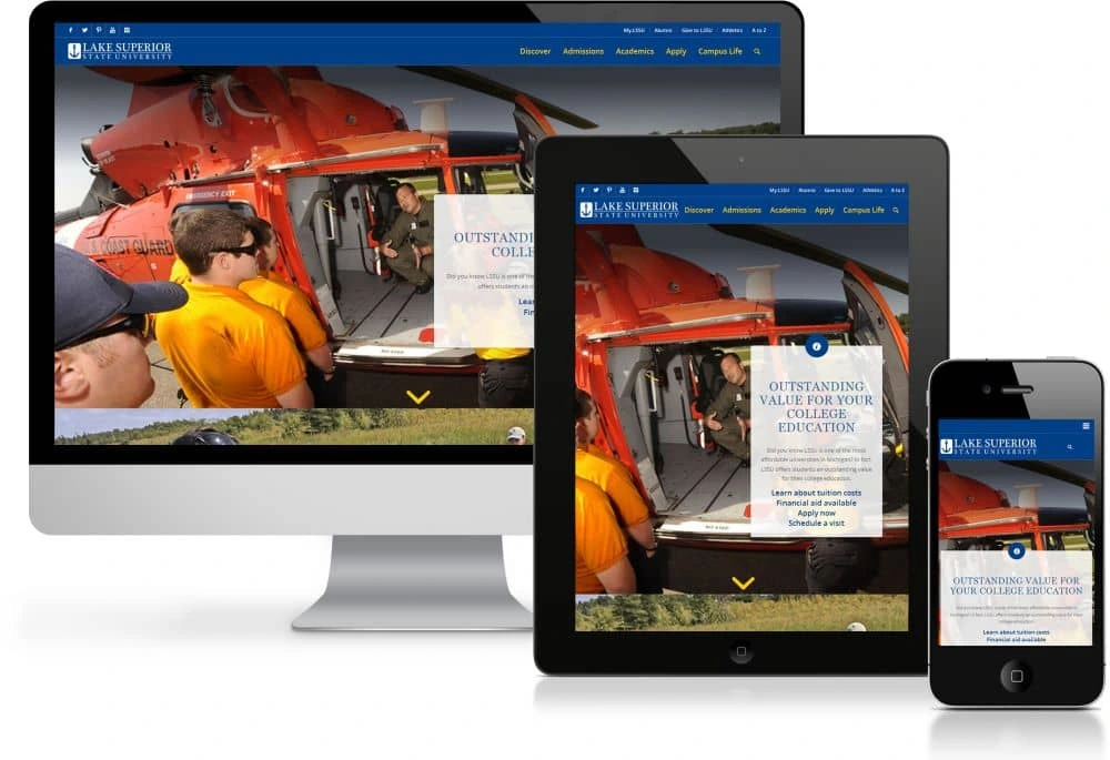
Source: Lake Superior State University
Responsive web design is no longer optional. But, you’ll stand out even more by offering mobile-friendly instruction and interactive pages.
For instance, students are wondering what they’ll learn on your campus. Why not show them instead of tell them?
Continuing education is common enough. But, standout institutions are experimenting with AR, game-based platforms and social learning models. Just one interactive feature on your site can put you ahead of the curve.
Even without all the technological bells and whistles, you can still provide value to new recruits.
Offer valuable resources
Don’t just throw a bunch of content on your website and call it good. Instead, create a user-friendly path that puts visitors at ease.
Which resources are clicked on the most? These might include:
- A catchy, above-the-fold video
- A listing of popular majors
- Programs and career opportunities
- Student and alumni testimonials
- Admissions deadlines
- Financial aid information
- Data-rich infographics
Simplify the application process
Of course, what you don’t include on your homepage can be equally important.
Generally, anything that simplifies your navigation and motivates would-be students to apply online is a good thing. Often, it means including more white space in your webpage design.
Face it—applying for college can be a daunting task even for the initiated. So, a user-friendly interface is essential.
Why not include a pithy video tutorial or a colorful step-by-step checklist to make the application process less painful?
Also, non-traditional students (e.g. adult learners, international students) generally want to know about credit transfers, flexible course listings, and financial aid options.
Build your blog
Most colleges today have a blog. What about your college?
More importantly, does your blog cover the topics your prospects care about most?
Boston University’s blog regularly shares pithy thoughts and videos by faculty members.
Likewise, Cornell University publishes “life on the hill” posts that help wannabes sample current students’ daily academic routines.
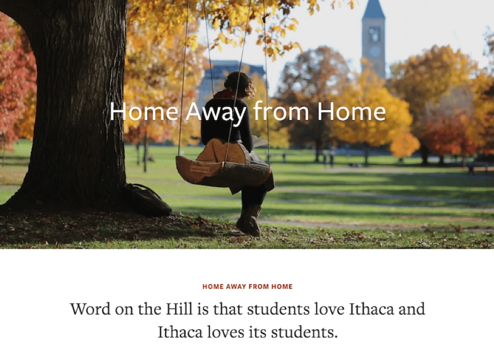
Source: Cornell
Your blog might also feature guest posts by alumni, video tours, listings of popular courses, and user-generated content.
And of course, the most popular blog posts should factor into your upcoming email campaigns.
Direct interaction with prospective students
As you can see, a successful recruiting strategy contains many moving parts. But, personal interactions (phone calls, campus visiting days, etc.) are still the most powerful of these.
According to Hanover Research:
“Despite increased digital activity, a recent survey found that the most effective marketing strategies for universities are nevertheless events‐based and involve direct interaction with potential students.”
After all, sometimes it really is about your newly upgraded facilities, swanky campus and student perks.
Most prospects who’ve gotten this far already know about your tuition costs, financial aid options, and faculty-to-student ratio. A successful campus visit just helps close the deal.
International student recruitment
Quick—what’s the Chinese version of Twitter?
If you’re recruiting students from China, you already know the answer to this question. (It’s Weibo, by the way.)

Source: Statista
As you can see, international student recruitment is alive and well at American colleges and universities.
As discussed earlier, your website needs to be user friendly and easy to navigate. This is particularly important if you’re appealing to international students.
Your site should help this target demographic understand the advantages of studying in America—and at your institution specifically.
Simple videos and infographics can also help smooth potential cultural barriers.
Do you already feature international students in your recruiting videos? If not, now’s the time to help them share their story—in their language.
As appropriate, include video links in your email campaigns. Share these on international social media channels.
Your website should also include pages dedicated to the specific needs of international students and recruits.
Source: Cornell
Reduce educational jargon
Higher education is adrift in educational jargon, which can be painful even to American-born students.
All those acronyms can be excruciating to international applicants. Whenever possible, cut them out and use a simpler description.
In the end, remember: Every positive interaction with a brand depends on clear communication.
Key takeaways
Now that you’re familiar with what it takes to build a successful recruiting strategy, let’s wrap things up by considering the real-life example of Western Colorado University. WCU’s creative team struggled to manage their recruiting strategy and materials, as they were too busy trying to keep their head above water.
Read Western Colorado University’s full case study here to learn how they dealt with their recruiting and marketing problem.
Is your school delivering a strong, consistent message with its brand marketing? Learn more in our free ebook: Branding in student recruitment
Interactive marketing is a customer-oriented approach to marketing that engages the user and requires their participation. The most popular forms of interactive marketing content are polls, surveys, quizzes and games. This type of content can help you drive awareness, engage your audience, generate high-converting leads, convert to sales, or nurture brand loyalty.
Let’s take a look at the four types of interactive content that are most likely to bring you results.
Polls & surveys
Polls and surveys are probably the simplest and oldest form of interactive marketing. They’re a great way to get in touch with your audience, but despite their simplicity, you can use them in several different ways to help you build a genuine connection with your followers.
The easiest and most straightforward way to use polls and surveys is to ask your audience or customers for opinions about your product, service or content.
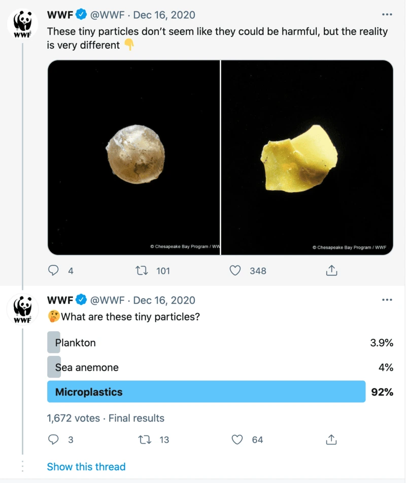
Source: Twitter
For example, many content creators run regular polls to inform their content creation strategy.
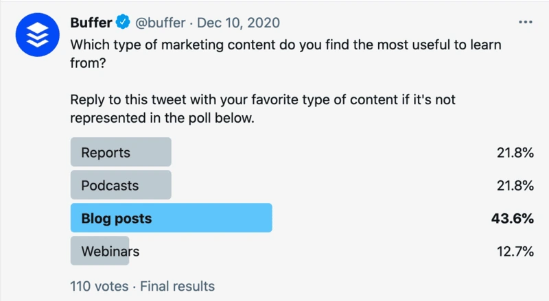
Source: Twitter
While many marketers use polls as part of their content creation process, it doesn’t have to be the only way to engage with your audience or customers.
You can use polls to obtain relevant statistics from your industry and later turn them into a valuable source of unique content that will boost your authority in the business field.
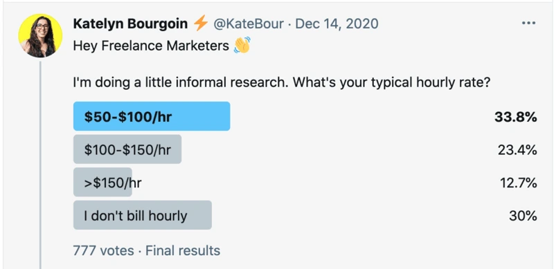
Source: Twitter
Of course, polls don’t have to be all work and no play — if your brand relies on aligning with your customer’s lifestyle, values and interests, you can always use entertaining content to nurture friendly relationships.
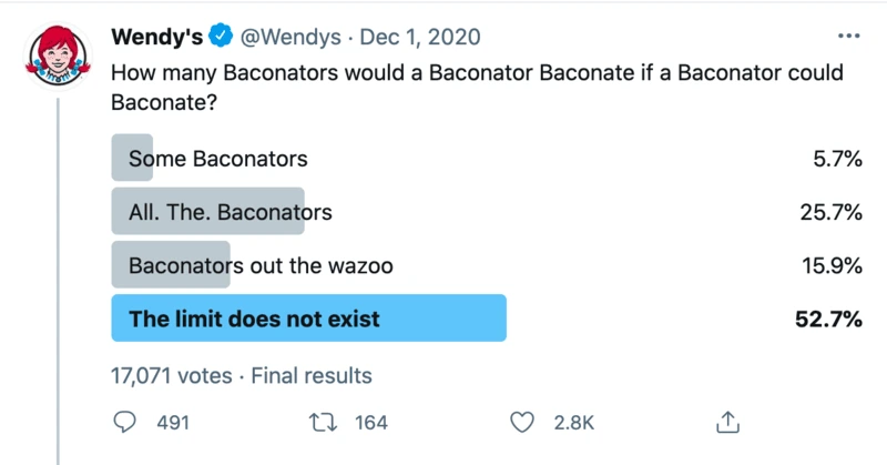
Source: Twitter
If you have any doubts on whether polls draw engagement, you can see the number of votes, likes and retweets in each screenshot. Even though the likes and retweets are often low, the number of people who voted in the polls is much higher, showing that polls really do engage your followers.
Incorporating polls in your content marketing strategy is pretty much a breeze — polls are a regular feature on both Facebook and Twitter, and it only takes a few clicks to create them.
Contests
Another well-known marketing strategy that still delivers amazing results is the gamification of various contests and challenges.
In terms of content marketing, challenges and photo/video contests are a great way to gather user-generated content that can later be used or repurposed for brand development.
Unless you’ve been living under a rock, you probably remember the famous ALS “Ice Bucket” challenge that managed to raise awareness about a rare neuron disease, engage 17 million participants, and collect $115 million in donations that led to a breakthrough in determining the cause of ALS.

Actors Henry Cavill & Amy Adams do the ALS challenge. Source: YouTube
The ALS awareness campaign challenged people to dump a bucket of ice over their head (or have another person do it to them). Then, participants nominated the next participant — the only way to opt-out of getting showered with ice was to donate money to the ALS Association.
Similarly, you can challenge your audience to a little photo or video contest with a unique hashtag on social media in exchange for a fitting reward. Of course, whatever the topic of the contest is, it has to align with your brand values and product. There’s not much point in organizing a photo challenge depicting the wonders of nature if you’re selling used car parts — but there are plenty of other challenges that would fit splendidly.
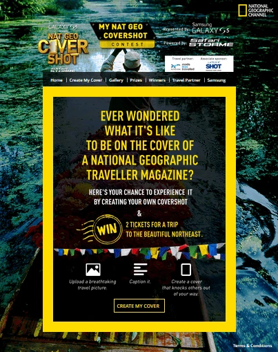
Source: National Geographic
In the end, your contest should neither be too easy nor too difficult. You want people to put some time into connecting with you in exchange for a prize or benefit that seems attainable and worthy of the work it requires. You don’t want to frustrate people or make them feel cheated.
A good challenge will bring out people’s natural curiosity and competitive spirit. The better you are at that, the greater your chances of going viral. If your contest is engaging, people will be eager to share it.
Quizzes
You’ve probably procrastinated by doing dozens of absurd quizzes with titles like “Tell us your favorite One Direction member and we’ll tell you which garlic bread you are.” Apart from being addictive and fun, quizzes can also be a great way to boost your content marketing and sell more. How?
Quizzes have high completion and click-to-conversion rates. They satisfy our need for introspection, self-confirmation, recognition and belonging — making them super clickable, convincing and shareable (qualities you definitely want in your marketing content).
For example, you can capture people’s attention by running a quiz on your website or social media, promising they’ll discover something about themselves (ideally, something relevant to your brand). The results they get can direct them towards a landing page or collect their email address in exchange.
But, don’t think that quizzes are only good for retailers and entertainment websites. This type of interactive content is also a great way to reach out to business clients. By identifying the unique challenges of your B2B buyers, you can create quizzes that offer them practical, customized solutions in the form of quiz results.
Interactive websites
Interactive websites engage and inspire your potential customers to explore content in a way regular blog posts don’t. Take, for example, this piece of sponsored content in The Washington Post.
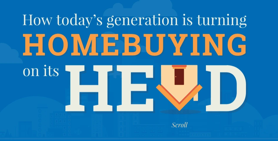
Source: The Washington Post
The National Association of Realtors published an article with the goal of reaching their target market of first-time homebuyers. As the younger generation is more cautious and skeptical about purchasing real estate, realtor marketers knew they had to step up their game.
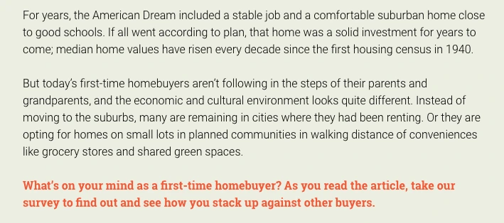
Source: The Washington Post
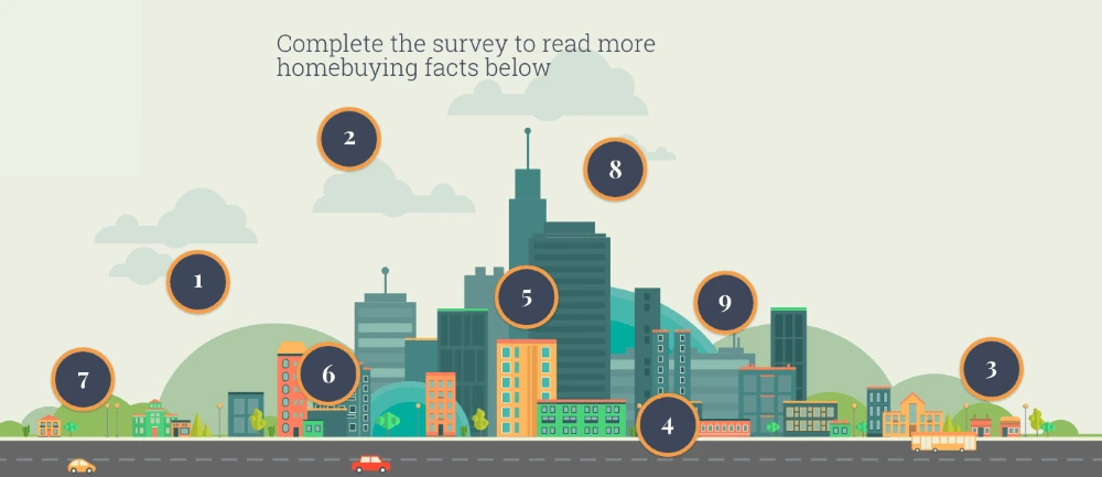
And the article itself does feel like a game, constantly requiring the reader’s attention and interaction. (For example, there’s an interactive infographic.) Content sections are intertwined with relevant survey questions about personal experiences, opinions and expectations.
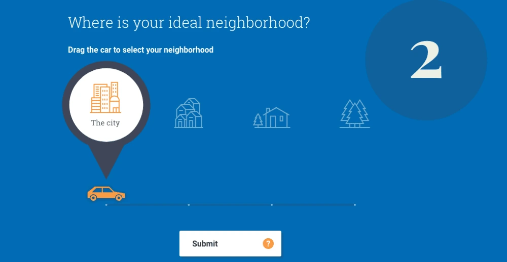
Source: The Washington Post
Apart from reaching a skeptical audience with content that responds to their common complaints and questions, the survey was also a way to help realtors gather data about their ideal customer.
Source: The Washington Post
While interactive websites require extra work and time in development, that investment pays off. Try it on yourself — even if you’re not a first-time home buyer, did you feel compelled to check out the article anyway? Exactly. A great interactive website encourages visitors to explore, click and read(!) your content.
Key takeaway
As the digital sphere grows more personalized, interactive content is becoming the norm. Software developers are keeping up, providing marketers with tools that turn interactive content creation from a daunting task into a 10-minute routine.
If you decide to dedicate more time and resources to this type of content marketing, keep in mind the reward: more pageviews and more conversions. Why not give it a try?
Finding a solution to replace Adobe Spark’s free suite of tools can be challenging. Adobe Creative Cloud Express (formerly Adobe Spark) offers a wide variety of features, so it can be tricky to find a one-size-fits-all solution without sacrificing functionality. The best way to identify an alternative to Adobe Spark is to clarify your needs and target a few tools that excel at meeting them.
When searching for an Adobe Spark alternative, keep in mind that you’ll be trying to replace the following three components:
- Adobe Creative Cloud Express (formerly Adobe Spark): Whether you use the browser-based web or the mobile app, Spark lets you create and customize social media graphics, web stories, and videos.
- Adobe Spark Page: As a mobile iOS app in the Adobe Spark suite, Spark Page makes creating templatized web pages and slide shows easy, although it has limited e-commerce functionality.
- Adobe Spark Video: Another mobile iOS app, Adobe Spark Video focuses on basic video editing with options to create social media content, ads, and more. Because Adobe Spark video defaults to support 30-second video clips, it can be tricky to produce longer projects in the app.
The basic features of Adobe’s Creative Cloud Express are free, but premium templates, images, branding features, and basic asset management require a premium monthly subscription. While Adobe’s suite of tools probably sounds like a sweet deal, there are some caveats. Users report limited choices available in the free tier of templates. You should also be aware that Adobe watermarks can’t be removed from designs created in the free version, making it of limited use to businesses.
With this functionality and these limitations in mind, let’s focus on some Adobe Spark alternatives that have some of the same features and might be better suited for your professional or personal content creation needs.
8 best Adobe Spark alternatives
After exploring the wide array of options out there, we’ve zeroed in on eight of the best Adobe Spark alternatives. Included below this section are also suggestions for more sophisticated web page and video editing tools to replace the features offered through Adobe Spark Page and Adobe Spark Video.
1. Lucidpress
Adobe Creative Cloud Express dips its toes into a lot of things, but that can make for a chaotic user experience. For professional creatives, Lucidpress may be a better solution because it offers a streamlined experience that focuses on lockable templates and incorporating branding elements into customized social media content. You’ll also get access to plenty of digital marketing templates that Adobe Spark may be lacking, such as ebooks, magazines, catalogs, brochures, and other print and digital assets.
Lucidpress may be a little light on some specialized streaming or web page templates, but it does provide a basic video and photo editing tool as well as video templates. Pricing starts at free and scales up to paid monthly subscriptions for premium tools, templates, and support.
Best for: Business or enterprise users
Pricing: Free, Pro ($10), Team ($12), or Business monthly subscription
2. Canva
Canva is a popular Adobe Spark alternative that shines as a platform for individual content creators and casual users. Easy to navigate with a drag-and-drop photo editor, Canva makes some templates, fonts, and design elements available for free while premium content lives behind the paywall. Canva also makes a basic video editor available alongside YouTube and other video templates.
One significant downside to Canva is that most of the functions that secure consistent branding elements and other business features are only available through the more expensive enterprise subscription.
Best for: Casual users
Pricing: Free, Pro ($12.99), or Enterprise ($30.00) monthly subscription
3. Snappa
Snappa is another alternative to Adobe Spark that is well-suited for social media managers and those who need to create content quickly and easily for multiple platforms. Lots of stock images, templates, and design elements allow users to build out customized content, resize it, and then share directly to social channels.
While Snappa may be easy to use, it does have drawbacks. There aren’t many templates for business or video content, and there’s limited ability to create infographics or slide presentations. Snappa does have a free tier as well as two paid subscriptions that offer pro or team access.
Best for: Social media managers or professional bloggers
Pricing: Free, Pro ($10), or Team ($20) monthly subscription
4. Placeit
If you’re marketing a product line, Placeit’s free mockups, designs, video templates, and logos might be a better Adobe Spark alternative for your needs. They specialize in creating product-focused digital and print assets as well as mockups for branded merchandise. There are also resources for streaming templates, YouTube channel banners, and even logo design tools.
Placeit does provide some basic video and photo editing capabilities, but if you don’t need product mockups, you may find the monthly cost has less value for small creative teams.
Best for: Merchandise mockup or product marketing
Pricing: Free or Unlimited ($14.95) monthly subscription
5. DesignCap
Looking for an Adobe Spark alternative best suited to creating data-heavy social media content? DesignCap may be for you. On the surface, this graphic design software leans into creating promotional content like fliers, posters, and social media posts. But dig a little deeper and you’ll find templates to support infographics, presentations, and even learning modules.
DesignCap has quite a few templates, a stock photo library, and some photo editing tools, but they don’t support video content creation. However, if video isn’t your primary medium, DesignCap’s bargain basement pricing may win you over.
Best for: Educators or non-profits
Pricing: Free, Basic ($4.99), or Plus ($5.99) monthly subscription
6. Wepik
This free alternative to Adobe Spark proves customizable templates don’t have to cost you. Wepik focuses on social media templates for Instagram stories and Facebook or Twitter headers. The online editor also supports a resume builder and a few other scattered features like a photo collage and meme maker.
As you might expect from something offered for free, the template choices are pretty limited. But if you’re an infrequent creator of templatized social and branded content, Wepik will do in a pinch. And if you use it frequently, you can opt to support the development team with a donation.
Best for: Just the basics, please
Pricing: Free
7. VistaCreate (formerly Crello)
Not a graphic designer? VistaCreate doesn’t mind. This alternative to Adobe Spark houses lots of flavors for templatized content plus the capacity to create and edit videos. VistaCreate also allows you to remove backgrounds from photos, convert videos to gifs, and even create animations.
VistaCreate does offer some free functionality, but most of the tools for branding, resizing content, and creative asset management require a paid pro subscription.
Best for: Small teams or entrepreneurs
Pricing: Free or Pro ($10) monthly subscription
8. PosterMyWall
PosterMyWall doesn’t do everything, but what it does do, it does well. This Adobe Spark alternative is one of the few on our list that centers video content and animation with an emphasis on design templates for events and promotions.
PosterMyWall provides a free and premium version to users, but if you need to work with HD and 4K videos, you’ll have to opt for the Premium Plus subscription.
Best for: Event promoters and coordinators
Pricing: Free, Premium ($9.95), or Premium Plus ($29.95) monthly subscription
Adobe Spark Video Alternatives
If the ability to edit and produce high-quality videos for social media is important to you, these alternatives to Adobe Spark video are worth investigating. While the video editing tools in both Adobe Spark and some of the alternatives listed above can handle the basics, the following video editors provide more robust video tools.
Vimeo Create
While anyone can use Vimeo Create’s short video maker, many of their layouts are designed with business goals in mind. You can use the video presets or create something from scratch in a matter of minutes and then export it into Dropbox, Google Photos, and more.
Vimeo Create does offer a free 30-day trial, but after that, you’ll have to buy into a monthly subscription. The cost of a subscription rises dramatically once you opt for a business account, especially one that supports unlimited live streaming.
Best for: Businesses
Pricing: Plus ($7), Pro ($20), Business ($50), or Premium ($75) monthly subscription
WeVideo
If you’re on a budget but still want a video editor that can handle professional projects, WeVideo is a good alternative to Adobe Spark video. Even beginners will quickly get the hang of WeVideo’s interface, and there are a wide variety of video templates as well as a stock library of footage.
In theory, WeVideo has a free tier, but it only provides the ability to publish a measly five minutes of video per month. The upper-tier paid subscriptions offer unlimited publish time and cloud storage, so those subscriptions will be of value if you produce longer video projects.
Best for: Entrepreneurs or social media content creators
Pricing: Free, Power ($4.99), Unlimited ($7.99), Professional ($19.99), or Business ($36.99) monthly subscription
iMovie
Apple’s video editor is a popular choice because it’s user-friendly and widely available on iPhone and Mac devices, but it’s geared towards personal and not professional use. It’s best confined to short, simple projects because it doesn’t allow much customization. The best part about iMovie is, of course, everyone’s favorite word — free.
Best for: Casual or personal use
Pricing: Free
Adobe Spark Page alternatives
Because creating a web page is a bit more specialized, not all Adobe Spark alternatives include this function. As a unique feature, Adobe Spark Page can be helpful for businesses looking to design sites that showcase their products, but it misses the mark on e-commerce solutions. Below are a few alternatives to Adobe Spark Page that might better meet your business needs.
Wix
With pre-designed layouts and lots of free templates, Wix is a favorite with beginners who want access to web hosting, logo makers, SEO tools, and more. If you intend to open an e-commerce shop, it’s recommended to head over to Wix eCommerce website builder instead for features better suited to hosting a shop online. The starter plan is free, but you’ll need to upgrade if you want to get tools that support your business site.
Best for: Bloggers
Pricing: Free or paid premium/e-commerce subscriptions
WordPress
WordPress dominates the website building market and stands up well as an alternative to Adobe Spark Page. Once used almost exclusively by bloggers, it now handles all types of websites, including e-commerce. The advantage to WordPress is that while there are themes and a whole suite of plugins, everything is highly customizable as long as you know a bit of coding. WordPress is free, although there are several subscription options for users who want more or need e-commerce solutions.
Best for: Customizable solutions
Pricing: Free and paid premium/business subscriptions
Squarespace
If you place a premium on aesthetics, Squarespace is the web page builder for you. This Adobe Spark Page alternative offers templates that maximize white space for a clean, modern style. Squarespace has a bit of a learning curve, but the results definitely pay off for professionals who are willing to spend the time. While you might fall in love with the look of Squarespace sites, keep in mind subscriptions can get pricey, so it’s not for casual users.
Best for: Business
Pricing: Personal ($16), Business ($26), Basic Commerce ($30), Advanced Commerce ($46)
For those looking for alternatives to Adobe Spark that offer the same features, there are a plethora of choices out there, ranging from free to premium and professional to beginner’s solutions. Take advantage of free trials and features to try on each of the alternatives we’ve recommended for size and see what suits you and your team best.