Why did you start your business? We’re pretty sure it wasn’t because you wanted to sell one product every blue moon, or because you don’t care about the services you provide.
Let’s be honest: We all want to make a difference, and we want to be recognized for delivering exceptional experiences. Without a positive reputation built on genuine feedback from satisfied customers, you can wave goodbye to local or worldwide recognition.
Related: 5 tips for building your brand with product & packaging design
You’ve probably noticed that bigger brands tend to have this nailed down. You see that red-and-white logo and instantly recognize Coca-Cola, or that blue background and yellow text belonging to IKEA. Even those multi-million-dollar brands had to start from somewhere. How on earth do you create something memorable—something that a customer will recognize and trust right away?
One answer is product packaging. Packaging is the first thing someone will notice on a shelf or when they receive a delivery to their home. The more they relate to it, the more likely it is that they’ll purchase or recommend it to others.
However, before you reach stardom, there are several ways to increase the chance of getting noticed. From the way you speak about your brand to how you package your products, here’s how to tell a memorable brand story.
Colors draw in the customer
Without color, the canvas is blank. A customer won’t look twice at your product if it doesn’t stand out to them in the first place.
Think about what feelings you want someone to get from your product. Should it make them feel like having fun, like a quirky craft beer? Should it make them feel cared for, like a health-related product? Make a list of how you want your product to make customers feel, and find ways to translate that to your packaging.
It can be easy to match colors with feelings: calming blues, bright yellows, passionate reds. A customer could be drawn to a certain color, depending on what they’re looking for. Colors can help you convey your brand identity, as well.
Who is your audience?
As with any form of marketing, keeping your audience in mind throughout the process is a must. Who will buy your product, and what product packaging will appeal most to that particular audience? Think about colors, shapes, sizes—even the wording on each individual product’s package.
Customers often read the text on a product to reinforce their purchasing decisions in their minds. [![]() ] For example, younger audiences prefer brighter, eye-catching colors with quirky shapes and blocky fonts. Older audiences who purchase luxury products prefer colors like black and gold, combined with elegant fonts and sophisticated language. It’s all about knowing who you’re selling to. Once you do, the rest will come far more easily.
] For example, younger audiences prefer brighter, eye-catching colors with quirky shapes and blocky fonts. Older audiences who purchase luxury products prefer colors like black and gold, combined with elegant fonts and sophisticated language. It’s all about knowing who you’re selling to. Once you do, the rest will come far more easily.
Delivery boxes
No matter the size of your business, it’s not only important to have great product packaging on the shelves. When a customer makes a purchase online, they should feel the same excitement for their delivery as they do for the product in the box.
Depending on the size of your business, you might need to batch-order boxes for delivering your products. Businesses often need extra help to meet customer demand. BCS box-making machinery can help to create quality, durable boxing that makes an impact.
Consider sprucing up your boxes with custom-branded stamps, tape and delivery labels—as well as adding extra protection for your product inside each box. Think about padding, branded freebies, and money-off coupons as ways to encourage repeat purchases from your customers.
Logos & graphics
If you’re not including your logo and other branded imagery on your products, how do you expect a customer to know it’s you? When people see a familiar logo, they know almost instantly whether they trust that business enough to buy the product.
Graphics, although not always brand-specific, can often make or break your product packaging. If you’re selling healthy products, you’re more likely to succeed with a green, leafy design. Think about what works, and use a bit of common sense to gauge how you want the product to come across.
Product blurbs
Your brand story is important. So important, in fact, that many businesses make space on their product packaging to write a little about how their business started. Other companies write about their values, such as Lush and their natural, eco-friendly approach.
You can probably think of a few other examples of brands who do this well—which means they’re doing things the right way. The care and effort you take here will pay off when customers remember your story and take it to heart. Shoppers will appreciate an attractive design with an inspiring blurb more than one with a cut-and-dry description. Don’t forget that it’s often the packaging of a product that sells it, not just what’s inside.
Key takeaway
Customers need to recognize your products before building trust and loyalty in your brand. Find your brand’s voice and tell its story—your product packaging depends on it.
From its roots in the Middle Ages, layout design has evolved significantly. What was once the provenance of monasteries spread to the office, and later, personal computers. The overarching goals of publishers haven’t changed, though—to find an audience and communicate an important message. However, the nuts and bolts of desktop publishing are undergoing a revolution on par with the changes precipitated by Gutenberg. When planning your business’s layout design strategy, will you be ahead of the curve?
Related: How visual stimulation improves client retention
Illuminated manuscripts
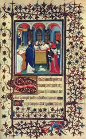
Early examples of beautiful page layouts can be found in medieval illuminated manuscripts. The work process of the manuscript creators sounds remarkably modern: they would plan the overall layout of the page, including the ornately decorated drop capital and the decorative border, then they would draw straight lines on the parchment or vellum where the text would go. The medieval publishers showed specialization in splitting the duties of the rubricators (who filled in the red text), illuminators (the illustrators—forerunners of today’s graphic designers), and other scribes and artists. By the late Middle Ages, commercial scriptoria in cities were competing with the small-shop cloisters and monasteries.
From the story of illuminated manuscripts we can see the importance of advance planning in thoughtful layout design, and the inevitability of commercialization and mass production.
Gutenberg printing press
If you’ve ever looked for a public-domain book, you are probably familiar with Project Gutenberg. How did the Gutenberg printing press change layout design? By using movable type to expedite the printing process, a single press could produce thousands of pages per day, as opposed to a few hand-drawn copies.
During the post-Gutenberg era, some of the personalization of book layouts was lost. The use of two columns of justified text looks very modern. It lacks some of the opulent artistic qualities of the illuminated manuscript page. This era can be thought of the moment when word processing and layout design split into two distinct fields. This is still reflected in specialized programs, some aimed at text-based projects, and some more specifically aimed at visual layout design.

Pre-computer layout design
If you’ve watched a show set in the 1960s or 1970s, you know that “copy and paste” were once anything but metaphors. Before desktop publishing software, art directors, publishers, and printers physically designed their documents. Writers and journalists used typewriters, which evolved to electric typewriters, then standalone word processors. Many of the conventions of layout design were established during this period. The standardization of templates influenced the look of today’s books, newspapers, and magazines, even though they’re often consumed on different platforms.
Mid-century layout design shows that competing mediums for design can coexist. While this era saw innovation in design tools, traditional artists and printers were still part of the media landscape.
Computer desktop publishing
Thirty years ago, the arrival of “What You See Is What You Get” (also known as WYSIWYG) displays radically changed layout design. Arguably, this led to an initial decline in quality: without the ability to control kerning, letter-spacing, or font selection, the printed outputs from programs like Type Processor One or PageMaker were primitive, at best.
With each improvement in screen displays, processing memory, and style sheets, desktop publishing became a disruptive threat to traditional layout design. The swift evolution of WYSIWYG editors demonstrates the necessity of taking upstarts seriously—but of course, that’s easier to see in hindsight!
Proprietary layout software
Around the year 2000, the big names in desktop publishing—InDesign, Scribus, OpenOffice, Publisher, and Pages—rolled out their products. These are still major players in the professional market.
The quality of the output increased dramatically in this time period. As personal computers evolved to their now-familiar form, designers could control the digital page to look like the printed page.
Cloud-based layout design software
In the second decade of the new millennium, desktop publishing underwent another seismic shift. Rather than only license-based options, layout design software began a transition to the cloud. Some of the major players stopped offering their products à la carte, switching to a subscription model. Many print magazines and newspapers ceased publication, either shutting down or becoming web-only.
As internet connections became faster, browsers more reliable, and memory capacity increased, creators and consumers expected to be able to do more, to do it more quickly, and to do it better. As email became dominated by web platforms, word processing went to the browser (for example, with Google Docs), and tablets and smartphones introduced an explosion of apps, desktop publishing went to the cloud, as well.
Lucidpress is one of those sleek, cloud-based desktop publishing tools. With an easy-to-understand interface, auto-saving and web publishing, and deep integration with the applications that are a part of modern business workflows (Google Docs, Dropbox, and even Facebook), it’s bringing layout design out of the sphere of specialists. You no longer need an advanced degree to create high-quality print and digital publications—nor do you have to break the bank on your design software suite.
The future of desktop publishing
It won’t be long until the notion of your layout design being tied to a single “desktop” will be as quaint as the idea of a monk cloistered away with his vellum, or a magazine made with actual glue. More designers use laptops, tablets, and cloud-based products than ever before. This space is opening up to the public.
Since the software-as-a-service (SaaS) landscape is changing so quickly, it’s worth re-evaluating your business’s needs. What documents do you need to design to connect with your customers? How many resources are you willing to expend on desktop publishing software? Do you need the ability to share and collaborate with your team? Are you creating brochures, letterheads, flyers, reports or eBooks to be distributed?
Create striking visual content in minutes with our easy-to-use desktop publishing software. Get started for free today!
In the age of nearly free digital marketing resources, any funds spent on print advertising should be allocated with care. In other words, there is no reason to settle for a second-rate print job when you can achieve print perfection.
Related: Why print will never die: Print vs. digital collateral
When you ensure each of these 5 elements are handled with precise attention to detail, the result will be a perfect print job you can distribute with pride.
Let’s get started!
Color consistency
One of the most difficult elements of print production to perfect is color matching. You will pay more for 4-color CMYK (cyan, magenta, yellow, key/black) printing than you will for black-and-white, so you should expect your completed color print job to mirror the exact colors of your brand, logo and ad design.
The best way to ensure an identical color match is to use the Pantone matching system (PMS for short). You can use Pantone swatches in two ways: for spot color printing or by inputting the RGB and HTML Pantone swatch numbers to color-match an on-screen design.
Paper type
The type of paper you choose for a print job will influence the success of the end result. No two paper samples are alike, and everything from the “whiteness” of the white to the texture to the weight can affect how your print job comes out.
Some papers produce a cleaner fold than others. Certain papers types are longer-lasting, while others hold accurate colors better. Heavier weight papers can convey a more luxurious, opulent message. The brightness and type of finish (matte, gloss, etc.) may make the message easier or more challenging to read.
For business card printing, consider using a UV coating that applies a clear-coat to the paper to help protect it against damages from frequent handling.
For products that will be left outdoors, use a more durable material than paper. Coroplast, a lightweight plastic board, is frequently used for a-frame printing because it can withstand all weather types.
Formatting
Formatting refers to whether or not your print job is delivered to the printer in a format that will perfectly translate at print time. In short, you want to be sure your designer delivers a “print-ready” file in PDF format that is at least 300 dpi with trim, crop and bleed marks noted. Also, the print ready file should adhere to any specific requirements of the printer type you will be using.
Without the correct file formatting, and a test print to confirm all looks as it should, you run a high risk of having to redo your job. Formatting is what ensures the design you want is the design you get at print time.
Layout
For any print job, you probably know from the start what information the finished piece must contain. Some common must-haves: website URL, contact information, company name & logo, and descriptions of products or services.
The word “layout” refers to where and how these required items are placed, as well as what space is left for items that may come later (such as a customer mailing address or postal meter stamp). Scrutinizing the layout for font size and readability, visual impact, clarity and orientation (portrait or landscape) is key for ensuring the end print job is suited to your needs.
Printing partner
Finally, your completed print job is likely to be only as good as the printing partner you choose to work with. You want to select a printing partner that can provide either an electronic or hard copy test proof for your approval.
Search for a printing partner who isn’t satisfied until you are, who has clear policies about when a re-print can be requested. Finally, you want to select a printing partner with an excellent reputation for delivering quality print results.
Translating an artistic vision from mind to screen to paper can be difficult, but with all 5 of these elements securely in place, you will see a tremendous difference in your printed materials.
Ready to design your own print ideas? Lucidpress makes it easy to create beautifully branded content in a matter of minutes.
You’ve got a great idea for a flyer: a new business service, a store’s grand opening, an upcoming concert, open house or event. And you’ve got Lucidpress to make designing your flyer a snap. Now all you need… is an audience. Welcome to Flyering 101, where you’ll learn how to nail (no pun intended) your flyer distribution.
Related: 17 flyer layout design ideas for your inspiration
According to our research, here are the top six issues to consider before distributing your flyers.
1. Consider your message.
Certain messages are better suited for flyers than others. Most of them can be grouped under the same umbrella—that is, most flyers are announcements. Maybe you’re trying to drum up interest for a new business or invite people to a local festival.
There are lots of occasions which call for an easy, low-cost form of direct marketing. Is your flyer ready for primetime? Make sure you’re completely satisfied with every aspect of your flyer, from content to design. Because once you print out hundreds or thousands of copies, there’s no going back.
2. Consider your timing.
Allow me to state the obvious for a moment: flyers are made of paper. They’re not incredibly durable, and they don’t tend to last very long. If you’re hanging flyers outside, their lifespan could be substantially shortened by the elements. Before you get out the staple gun, check your local weather forecast for rain, snow, and heavy winds. If harsh weather is on the horizon, you might have to adjust your plans.
While we’re on the subject, take holidays into account as well. Around certain ones, like Halloween and Christmas, your flyer will be competing with a lot of decorations. Space might not be as readily available as it was before. That doesn’t mean you shouldn’t advertise around a holiday—especially if your message is seasonal or topical—but you should still take note.
3. Consider your audience.
Who should read your flyer? Is it of general interest, or does it address a specialized audience? It’s important to consider this before you start flyering. It’s one thing to hand them out to people. It’s another thing to hand them to the right people.
Distributing flyers to random strangers who pass you on the street might not be as effective as targeting a specific audience. In fact, in many cases, you might as well be putting your flyers in the trash. But once you understand who your audience really should be, you can put together a smarter distribution plan.
4. Consider your distribution method.
How are your flyers getting to your intended audience? You have a few choices. The most popular methods are:
- Hanging the flyers in public/community areas.
- Handing the flyers to people directly.
- Keeping a stack of flyers in a high-traffic area.
- Delivering the flyers door-to-door (or car-to-car).
The method you choose will have critical ramifications on your distribution plan. For example, how many flyers will you need to accomplish your goal? How long will it take to get rid of them all?
No matter where you’re flyering, make sure you get the right permissions. Not all places that are open to the public are open to flyering as well. Parks have maintenance staff. Neighborhoods have soliciting policies. Storefronts and cafés have managers. Schools have approval forms.
Don’t give up hope, though. Many times, you can chat with property owners to determine whether they’re open to flyering. If you see shops with flyers already out front, that’s a good sign. Many places, like college campuses and laundromats, have corkboards especially for flyers and local ads. Take a look around, and don’t be afraid to ask!
5. Consider your distribution team.
If you’re hanging or handing out flyers all by your lonesome, it’s going to be a long ride. Flyering moves much faster in a team. Fortunately, you can call on your support network for help. If you’re announcing a new store, employees can help. If it’s a party or a concert, you can recruit family and friends. If it’s a club or organization, it shouldn’t be hard to find volunteers.
The lower the quantity, the easier it will be to get all those flyers out into the world. However, if your back’s against the wall, you still have options. If you don’t have the time—and no one else seems to, either—give a flyering agency a call.
There are specialized businesses out there who take care of the entire distribution process, from start to finish. They can help you create a smart plan that targets your audience in a timely fashion. Some even offer GPS tracking so you can watch in real-time. Just keep in mind that you can’t control how the staff does its job, so choose your agency partner carefully.
6. Target your distribution.
Finally, take a good hard look at your distribution plan and make sure you’ve accounted for all the steps up to this point. Now that you have all the basics in line, you can make some advanced adjustments. Targeting your distribution is the final consideration that will have a major effect on your success, and there are two ways to do it.
- Geographic targeting. If you run a local business, you can target specific areas who are more likely to benefit from your services. You can choose the zip codes, cities, streets, or even neighborhoods to flyer. Take into account the topography and landscape of these areas. Some terrain will be harder to cover than others, such as hills or neighborhoods where houses are far apart.
- Demographic targeting. If you’re announcing a new location for your business, you might target loyal customers who you know will be interested. Or if your flyer addresses a specific need, like babysitting or landscaping, you might be selective about who gets a flyer. The idea is to give flyers only to the people who actually benefit from your message, so your flyer has a higher chance of success.
Flyering may be a cheap way to advertise, but that doesn’t mean you want to throw your money away. With these six considerations accounted for, you can craft a smart flyer distribution plan that helps you achieve your business or personal goals.
In today’s digitized, inter-connected world, it’s all too easy to send a text or an email to someone and forget about it. Whether it’s an e-card for Mom’s birthday or a PDF brochure for a prospective client, digital content is incredibly efficient and convenient. But as any library lover will tell you, there’s just no replacement for the printed word.
Related: Not everything is online—How print materials can raise brand awareness.
Here at Lucidpress, we offer our own Print & Ship service, so users can create unique designs and bring them to life through print. We’re talking cards, business cards, flyers, documents, brochures, you name it. Ordering gorgeous, high-quality prints is a feature that more of our users requested than any other—and we’re here to deliver (pun very much intended).
Not sure about the value of print in a digital world? Here’s a few reasons why we believe print will never die.
Scarcity
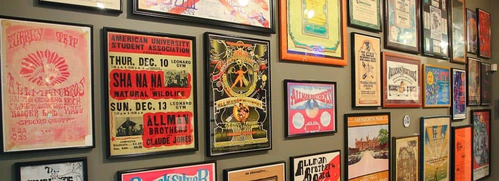
Now that so many things are shared digitally, print stands out. Well-placed printed materials can grab attention for your business, so they’re a boon to your marketing. And because printing is more expensive, printed materials carry more authority and credibility than they did before, because someone took the effort to produce them.
Ever hear of “supply and demand”? Digitized content eliminates the supply and demand curve, because supply is infinite. But with printed content, the curve still stands. Printed items are tangible and maintain their scarcity. Certain printed items, like concert and movie posters, can even become collectibles because they evoke strong memories of a certain time and place. Can’t do that with a PDF.
Beauty

No matter how popular eBooks get, there is always a stalwart bunch who refuse to get rid of their old books. Why? One possibility is this: books and printed materials have physical beauty that can be appreciated again and again over time. Book-binding itself can be described as an art, one which has evolved and developed a rich history. We know how important aesthetics are—just take a look at our previous blog post about book covers.
The point is, printed materials like books have varied appearances and styles. Digital materials are often homogenized down to black text on a white screen. And while that is useful and efficient for conveying information, the appreciation of unique physical beauty is lost.
Sentimentality
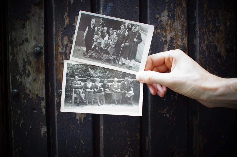
How many photos are saved on your phone or hard drive? When I last checked, mine had over 3,000 (and counting). But when was the last time I sat down and flipped through all those photos? Hardly ever.
Photos in particular are a record of permanence, a memory you can hang in your home or office. I may not glance at the pictures on my phone very often, but I pass by the picture of my nephew hanging on my wall every day. And each time I see it, my heart fills with joy. Certain photos deserve to be printed and cherished in scrapbooks, frames, lockets and wallets.
Printed materials are a powerful reminder of something concrete. Following the same principle as photos, you can create strong impressions by providing printed materials for your business. If you’re at a trade show, for example, it’s far more impactful to hand someone a brochure than to give them a link to a landing page.
Practicality

Wait, but didn’t I say digital materials are the more convenient choice? Sure. But that doesn’t mean print is lacking in practical benefits. Here are a few reasons you might choose print over digital:
- Many find print easier to read, especially for long periods of time, so as to avoid eye strain.
- Readers are less likely to skim a printed document than a digital one.
- Printed materials feel more inviting and immediately engaging than files which have to be opened first.
- As unscientific as it sounds, print simply feels better to humans because it uses more of our senses to create a stronger memory. (Think “old book smell.”)
Digital might have its advantages, but one thing is clear: print is not now, or ever, really going away. Its purpose and value might shift over time, but today, it makes more sense than ever to print what matters most. Whether you’re sharing a photo postcard for the holidays or business cards at a trade show, Lucidpress can help you bring your ideas into the real world.
Ready to design your own print ideas? Lucidpress makes it easy to create beautifully branded content in a matter of minutes.
Poster design has come a long way since the 1880s, changing in style for different eras and often strongly influenced by political or social events of the day. Posters have become a powerful and popular medium for advertising (sometimes referred to as street or guerilla marketing).
Let’s take a look at some of the creative poster templates from our Lucidpress poster collection and how you can use them effectively to convey your unique message and reach your targeted customer base.
Choosing a design
We admit it’s not always easy to choose a design, so to help you make up your mind, we’ve assigned two keywords to each poster. These keywords capture the mood of the poster and what it’s ideally suited for. We’ve also identified “niche” posters, such as real estate or restaurants. Still, remember: Lucidpress templates are fully customizable. If you wish to use our restaurant poster to promote your software business, go right ahead. You can easily change the tone by using different color schemes or fonts.
The ins and outs of poster design
Poster design — like colors, shapes, lines and patterns — plays a central role in creating memorable content. All poster templates here were inspired by different combinations of these key elements.
99Designs succinctly illustrates the six core elements of great design. Some tips:
- Lines — The Golden Ratio is a number calculated by dividing a line into two parts so that the longer part divided by the smaller part is equal to the whole length divided by the longer part. (Phew.) It’s a golden rule for pleasing design.
- Color — Try to use your brand colors in all business collateral. Use a color picker to get the shades right. Color is an integral element for professional business designs.
- Shapes — Shapes and images are central to any design, and Lucidpress makes working with them easy and intuitive. Custom shapes can be used to great effect in fun, trendy and modern designs.
- Textures — Use the Lucidpress image editor to texturize your images and poster background. Texture is a core element of whimsical and innovative designs.
- Framing — Frames and borders help to focus a viewer’s attention. Use them to structure your layout and content, and to layer design elements. Layering adds depth to posters and is a key element of sophisticated, cosmopolitan and luxury designs.
- Type — Don’t forget: Fonts used for educational and research project designs should never be distracting to the reader. In Lucidpress, users can upload custom fonts.
Getting started only requires an internet connection — which you clearly already have. Imagine a blank wall. To decorate it, head over to our free online poster maker. Bring your ideas to life!
Blue and pink empowering poster template
Make someone’s day sparkle — try adding more shapes and sparkles
Click on the image to see the template
From motivational quotes to inside jokes, the blue and pink empowering poster template is bound to uplift a special someone’s day. The simple execution of this poster’s creative design lends equal parts positivity and inspiration.
Delivery and curbside pickup poster template
Allowing only three customers in the store at a time? Customize based on your needs
Click on the image to see the template
An ideal poster design for storefronts and buildings whose occupancy limit has been impacted by the pandemic, changes in fire regulations or construction, this poster empowers you to communicate clearly and easily.
Campaign poster template
Keep copy simple to avoid distracting the reader
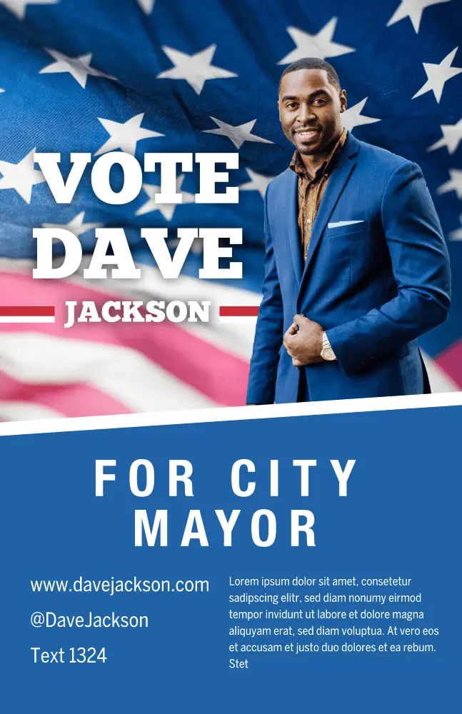
Click on the image to see this template
Make your campaign’s purpose loud and clear with this patriotic campaign poster template. Change up the layout design by swapping out the flag for an illustration, or insert different colors instead of using blue.
University poster template
Pick a background image that reflects the event

Click on the image to see this template
An excellent choice for schools and alternative education platforms, this poster design assures your org’s message will stand out. Bold colors make your advertisement feel loud and clear — swap out your organization’s logo for the provided one.
Nature quote poster template
Too moody for your vibes? Brighten things up by overlaying shapes and color

Click on the image to see this template
Whether you’re looking to meditate, motivate or inspire, the nature quote poster is here to do it all. Customize the graphic design with your own photo or use a stock image to change things up.
Coming home movie poster template
Make the text pop with a border or shape
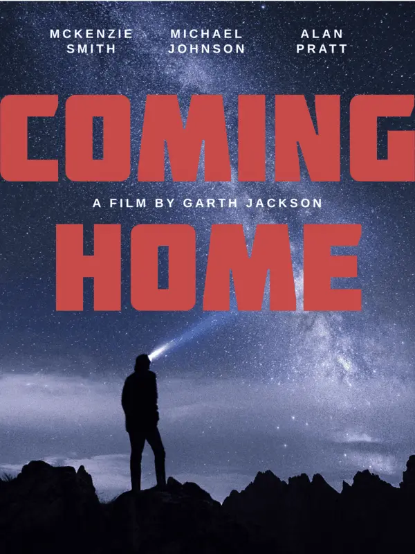
Click on the image to see this template
Quick, somebody grab the popcorn! And don’t forget the sour gummies! Shhhh!!! It’s time to cozy up and get ready for the character arc, story development and more with the Coming home movie poster template.
Duo campaign poster template
Keep your tagline simple
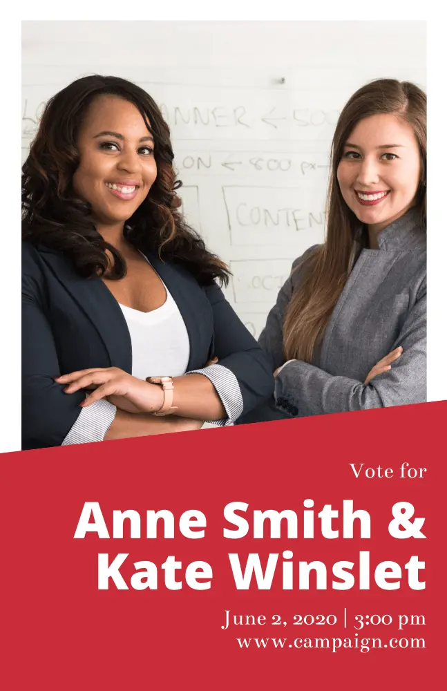
Click on the image to see this template
Give them a reason to try and name a more dynamic duo with the Duo campaign poster template. Showcase your running mate, as well as upcoming town hall events or speaking sessions. Don’t forget to include your campaign’s motto!
Orange & blue passion quote poster template
Don’t stop at one version — make a few till you get it just right
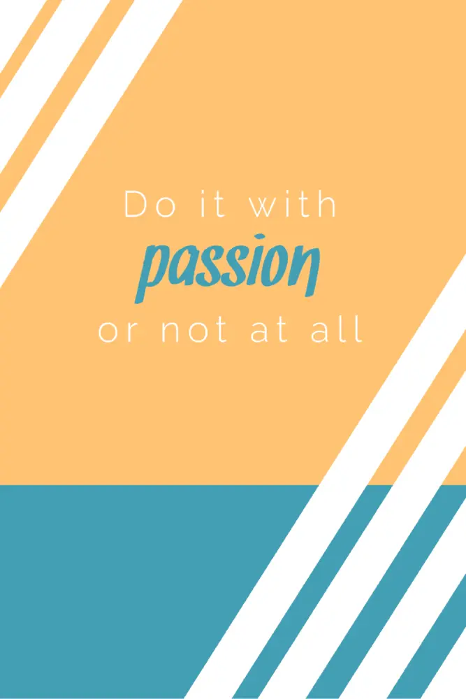
Click on the image to see this template
Equal parts jazzy and simple, the orange and blue passion quote poster template keeps the eye centered on your quote of choice. Be sure to include or note who originally said the quote. Everyone appreciates credit where credit is due.
Blue soccer game day poster template
Be sure to include important details — like event times and such
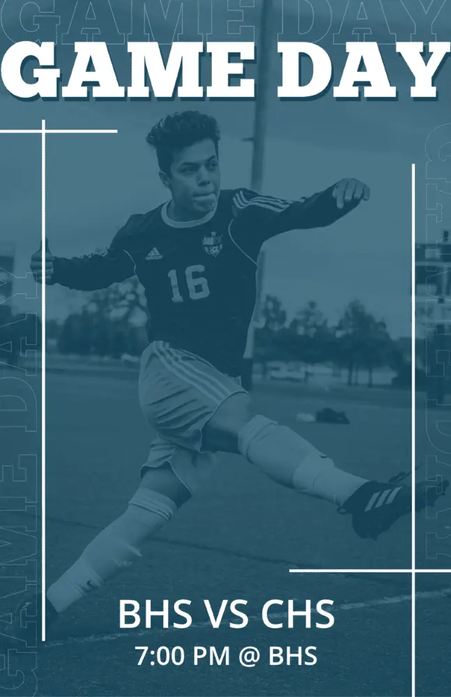
Click on the image to see the template
Get your fans ready to rumble with the Blue soccer game day poster template. Use the colored overlay to highlight your school or team’s colors — plus you can swap out the image to feature one of your very own athletes!
Student council campaign poster template
Limit CTA usage to one — get folks out and votin’
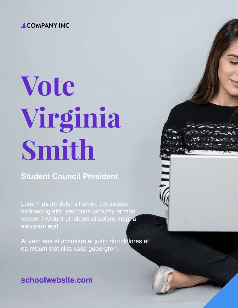
Click on the image to see this template
Make an impact on your school experience with the Student council campaign poster template. Swap out the stock image for a candid, congenial photo — and be sure to include a little bit about yourself and your campaign initiatives.
One day movie poster
Use the image and icons to tell a story
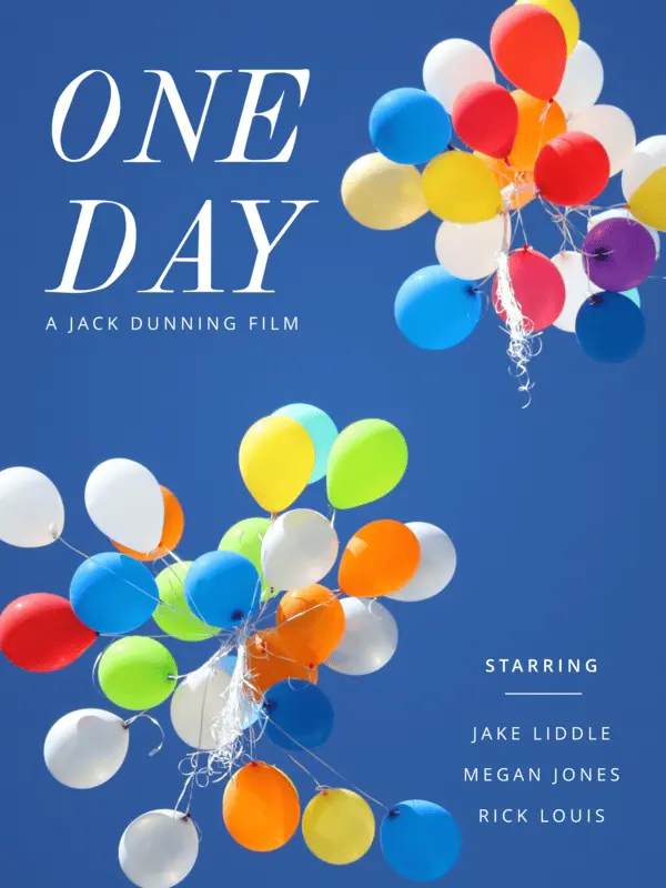
Click on the image to see this template
Lean into your zany, mad scientist side and use an abstract image to tell a story about your movie. The font is completely customizable, as well as the copy and text box placement. Wherever this template inspiration takes you, may it be nothing short of magical.
Blue and green track schedule poster template
Create a visual timeline aid to help keep folks informed
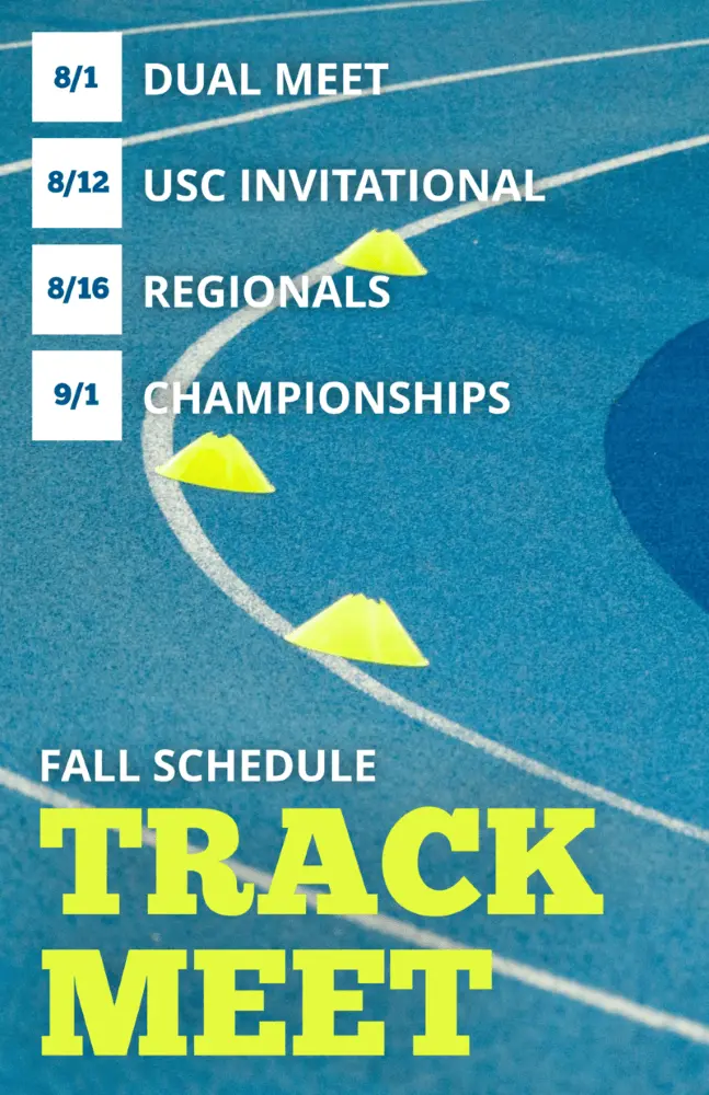
Click on the image to see this template
Keep your school and sports teams on track to win (ayyy, see what we did there?) with the blue and green track schedule poster template. Customize the colors however you see fit, and swap out dates for any upcoming events, like the homecoming match or what have you.
Forests research poster template
Let your content do the talking
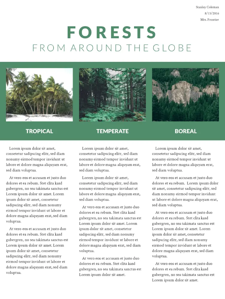
Click on the image to see this template
Created with research and educational projects in mind, this poster provides ample space and graphic design opportunities for images and content in a structured, brochure-like design. The slideshow is both modern and practical, and you can easily add or duplicate pages. The beauty of a one-page template is that your design remains consistent.
Western wanted poster template
Get what you want while paying homage to the original poster

Click on the image to see this template.
Our designers created this poster design tongue-in-cheek. It’s eye-catching and memorable with an instantly recognizable theme. Have excessive quantities of stationery gone missing at work? This is a fun and subtle way to draw attention to outlaw behavior in the office or at home.
Standard advertising poster template
Swap out the red placeholder with your brand’s color palette
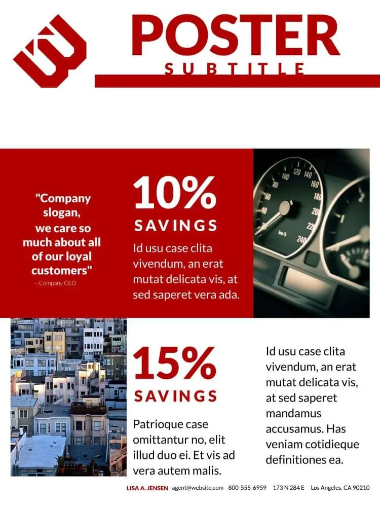
Click on the image to see this template.
This 3-page poster design is perfect for marketing your business at trade shows and exhibitions, or it can be used for an online catalog to advertise special offers. The format is deliberately simple so as not to distract from the content and to make it easy to update if you have regular campaigns.
Motivational quote poster template
Use an action verb for maximum inspiration
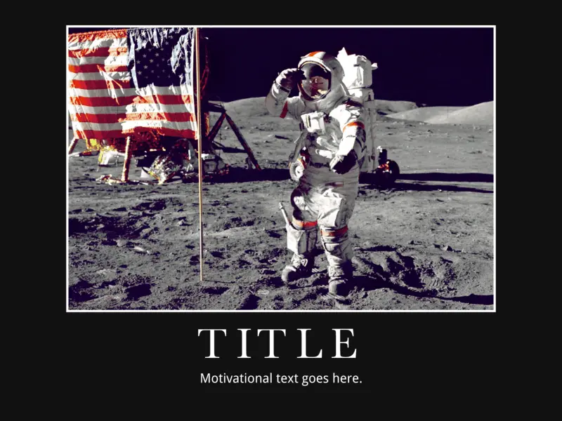
Click on the image to see this template.
Motivational quotes and typography are powerful tools to inspire innovative thinking and promote a sense of well-being. Psychologist and motivation expert Jonathan Fader, PhD, says well-structured messages that use strong imagery and appeal to our aspirational nature can be powerful in changing our thought patterns and behavior.
Heartland business poster template
Don’t have quite the right photo for the event? That’s okay — try Unsplash!
Click on the image to see this template.
This business poster design template provides a surprising and unusual variety of content placeholders so you can sneak in a wealth of information. The placeholder and graphic design space demand your customers’ attention, and the longer they’re looking at your poster, the more likely they’ll absorb your message.
Homegrown event poster template
Keep your colors simple — avoid using discordant color combinations like purple and green
Click on the image to see this template.
We call it Homegrown because this poster design has multiple layers, just like a home-baked pie. If you really want to stand out from the crowd, putting a bit of effort into creating a layered poster will help you to demonstrate the depth and originality of your company’s vision.
Ecosystem scientific poster template
Avoid large walls of text — use illustrations or graphic design to break up walls of copy
Click on the image to see this template.
Blue is the new green — and this eco-theme disrupts the traditional color mold quite innovatively. This huge 36″ x 48″ poster gives you the physical space to cover even the most complex research projects without having to resort to smaller fonts or cropped images.
Weekend away photo poster template
Start simple with an easy-to-read font and play around from there
Click on the image to see this template.
This trendy poster design showcases your professional photographs, however, your message still takes center stage. It’s ideal for travel and tourism businesses, for exhibitions, and for luxury brands to announce corporate events and exhibit their products. The Weekend Away is a great example of design layering.
Swiss Alps travel poster template
Want to make a bold statement? Use a vivid, contrasting color for your font

Click on the image to see this template.
Contemporary and bold, this poster paints a strong message. It’s a single-focus design, and you should customize it with your own bold background photograph and daringly creative fonts. The unusual text layout makes it a unique and original choice for technology startups and entrepreneurs.
Nature retreat poster template
Don’t love the included typography? That’s ok, customize with your brand’s font
Click on the image to see this template.
Inspired by the layout of quality print magazine covers, Nature Retreat is eminently versatile. Our customers have used it in projects as diverse as publishing upcoming event information and showcasing their portfolios, and for school projects. The style is informal and slightly whimsical.
Origami banner event poster template
Concise and clear, make the most of this simple layout design
Click on the image to see this template.
Origami is the Japanese art of folding paper into decorative shapes and figures, dating back to the 1880s. This template combines traditional origami with a fresh, modern look to create a perfectly structured design ideal for formal and professional corporate posters.
Block party poster template
Use colors, be it bright or soft, to communicate the vibe of the party

Click on the image to see this template.
Everyone likes a party. Its vibrant graphic design and no-nonsense block layout works well for invitations and holiday events. It’s a one-pager, easy to modify and with placeholders for the “who-what-when-where-why” information. The blocks and frame design are reminiscent of the calling cards of yesteryear.
Night life poster template
Juice up the tone with an abstract illustration for your background
Click on the image to see this template.
Evocative of torn classic denim and multi-layered dresses, this poster design and typography ushers in a new trend of visually captivating posters that challenge design rules — you could even say that we wouldn’t be surprised to see it in the MOMA one day. Light and dark are juxtaposed to evoke excitement and anticipation.
Real estate poster template
Highlight the diversity and variety of your selling history through various images
Click on the image to see this template.
Arguably the most versatile and stylish template in the Lucidpress collection, this block design is ultra-bold and is anything but lacking in the design inspiration department Rather than simply invite, the poster compels customers to attend a home viewing. We’ve incorporated vintage and trendy elements both formal and informal… and the result rocks.
Cobalt café poster template
Avoid using stock photos if you’re looking to highlight a unique restaurant
Click on the image to see this template.
When it comes to real estate, location is everything. And when it comes to food, presentation is everything. The design for this creative poster mimics those used for magazine food pages, arousing your taste, visual and smell senses. The Cobalt is warm, welcoming and very practical.
Cut glass marketing poster template
Use this template to communicate official corporate events
Click on the image to see this template.
Cut Glass presents a sharp graphic design look and feel, perfect for technology startups and real estate innovators. Diagonal lines are more striking than horizontal or vertical ones. As explained by Vanseo Design: “Their kinetic energy and apparent movement create tension and excitement.” Use this template boldly and aggressively.
Cosmopolitan business poster template
Swap out the included stock photo for a snap of your city or HQ
Click on the image to see this template.
Cosmopolitan means cultured, suave, polished and refined… an image you may want to cultivate, particularly if you have an international, sophisticated client base. The hallmarks of cosmopolitan design include the avoidance of “fluff,” subtlety, attention to detail, intricacy and cohesiveness. Would these graphic design and marketing tactics serve your brand, too?
Reflections company poster template
Have official health comms that need relaying to employees? Look no further
Click on the image to see this template.
The creative inspiration for this design was the subtle reflection of images in water, clouds and shadows, conveying the impression of depth and intelligence. This poster would work particularly well for a beauty technologist, health spa or clinic, or even a luxury brand.
Poster design with Lucidpress is simple thanks to our user-friendly, intuitive interface. It gives you all the functionality of traditional desktop publishing software—but without the learning curve needed when using professional packages. Now it’s time for you to grab one of our free poster templates and get creative.
Feeling inspired? You can design and order your brand new poster right here in Lucidpress.
Gaming is a big part of Lucidpress’s product & engineering culture. Strategic, long-term planning… tactical attacks and counter-attacks… working together to save the world from a pandemic… What’s not to love? The biggest challenge is figuring out how to play board games and still get all our work done. Here are a few things we’ve learned about playing (and working) hard as a team.
Related: How to lock in your team’s productivity
Async FTW
Everyone has variable schedules, so we’ve found that playing asynchronously over several days (maybe even weeks) makes it easier to fit with busy schedules. It also eliminates the painful effects of analysis paralysis. No more waiting for players’ min-maxing, spreadsheet-drafting minds to formulate that winning move; they can crunch the numbers without wasting other players’ time.
Here are some tips to keep in mind if you’d like to try out asynchronous gaming in the office:
- Pick board games with longer turns that aren’t dependent on other players. Examples: Terra Mystica, Caverna
- Shorter-turn games are probably more difficult and disruptive to play asynchronously in the office.
- In some cases, it might be better to have multiple short, synchronous sessions across several days or weeks instead of an asynchronous session. Examples: Ethnos, Ticket to Ride and Carcassonne
- Have a stuffed animal or other object as a turn marker. Put it on the desk of the person whose turn is next.
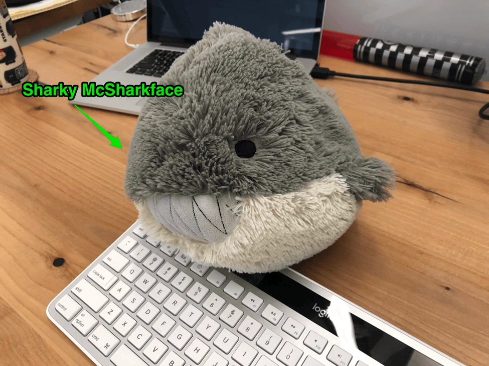
Sharky, one of our beloved turn markers
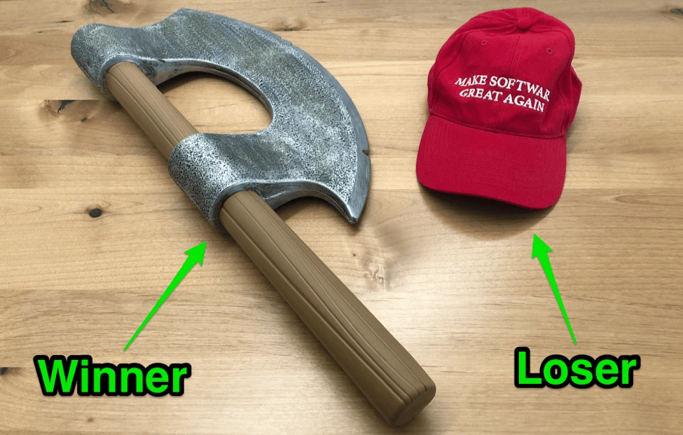
Celebrate winning (and losing)
We have traveling trophies for winners and losers in our competitive games. Bragging rights = great. Bragging rights + battle axe = amazing. On the losing side, our “Make Software Great Again” cap provides more than enough motivation—everyone fights not to be last. Hugely.
Motivation comes in many forms.

Another teams’ loser prize. Maybe the hat isn’t so bad, after all…
Co-op gaming goodness
By far, co-op games are the most-played games in the office. There are some good reasons for this:
- All for one… Co-op games unite the players against the game. Great for team-building.
- Flexible gameplay. If one of your teammates is too busy, you can play for them. Once they’re available, you can catch them up on your joint progress.
- Pandemic Legacy 1 & 2. Just get these games. Their immersive narrative and unique twists on the classic Pandemic mechanisms have enthralled our team.
- Other popular co-op games include Castle Panic, Orleans (co-op scenario), Escape and Secret Hitler (a social deduction game, but there is team-based cooperation going on).
Final thoughts
“Play is the highest form of research.”
Albert Einstein
“The enjoyment of problem-solving seems to be an evolved survival mechanism. People who enjoy solving problems are going to solve more problems, and probably get better at solving problems, and be more likely to survive.”
Jesse Schell, The Art of Game Design: A Book of Lenses
“The creation of something new is not accomplished by the intellect but by the play instinct.”
Carl Jung
Further reading:
- 6 great board games for team-building
- Why team-building is the most important investment you’ll make
- Need for recreational activities for employees, especially in the startup sector
BONUS: Creating a board game in Lucidpress
Did you know you can design your very own game boards in Lucidpress? Imagine how delighted we were to receive this tweet last year:
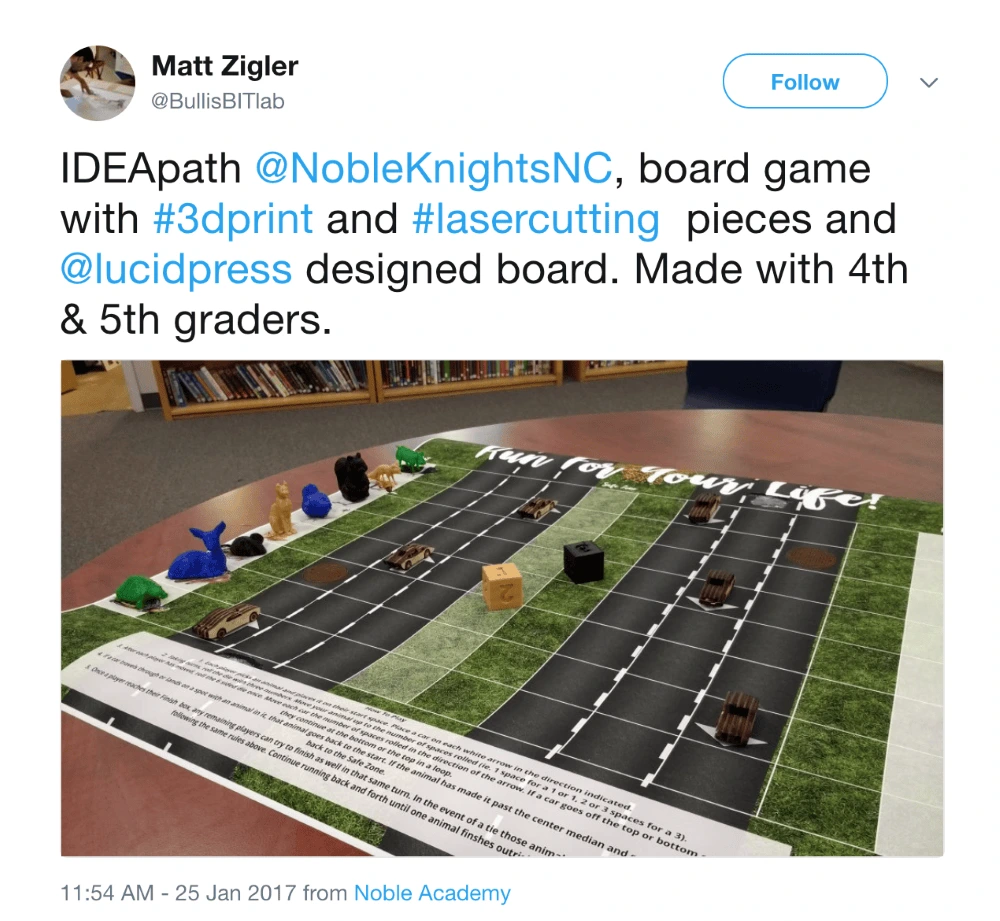
Source: Twitter
This innovative teacher led his classes of 4th and 5th graders to brainstorm and create their own board game, from concept to rules of play. You can see evidence of their awesome teamwork in this post describing the creation process.
If you want to design your own game board, we recommend starting with a poster-sized canvas. From there, you can pull in shapes and text boxes to create the ultimate custom game board.
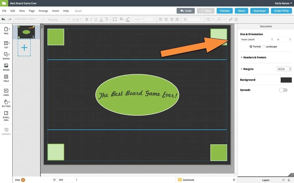
Here we’ve thrown together the humble beginnings of a game board, with an arrow pointing to the document size option.
There’s no limit to what you can create. Once you’re done, you can download your board in high-resolution, print-ready file formats (such as PDF). Or, to make it even easier, you can order printed versions directly from the Lucidpress editor. It’ll look great printed on our 18″ x 24″ glossy EPSON photo paper, and it’ll only cost you a few bucks.
Want to design your own board game? Jump into Lucidpress and play around with shapes, lines, colors, fonts & more.
Here’s the thing: the in-person experience isn’t dead. And furthermore, direct mail marketing isn’t dead. It’s an audacious statement for sure. But like the in-person shopping experience, direct mail marketing is just different. It’s not the norm anymore. But that’s what makes it all the more unique and effective.
That said, there’s no doubting that online marketing has taken the world by storm. Not only is online video consumption reigning supreme over traditional TV viewership, but it seems the world has gone mad for — and forgot about — the value still held in offline marketing.
Direct mail marketing happens to be an excellent example of offline marketing. Think of direct mail marketing as you would letters, postcards and brochures landing right in the mailbox of your ideal customer. That’s pretty spiffy!
What is direct mail? Direct mail is a form of direct marketing where promotional materials are sent to prospective customers in the mail.
Related: Building a local brand—5 essential things to know
Your mailbox — you know, the metal one with your address on it — has a bad reputation. Meanwhile, your email delivers discount codes for your favorite shops and other exciting tidbits of information. But that IRL-mailbox space is filled with bills, junk mail, earwigs and who-knows-what-else, right?
Sometimes, but not always.
While you’re certainly bound to receive bills, junk mail and find the occasional earwig in your mailbox, you can also count on uncovering letters from family members or collateral that’s seemingly custom-fit for your needs. It’s almost as if those ads you’ve been seeing all over social media popped up in your mailbox, which is pretty cool, right? That’s what direct mail marketing has the capacity to do.
So, what can direct mail marketing offer that online marketing can’t?
Direct mail marketing gives customers a tactile, interactive experience that they (perhaps unknowingly) crave and miss when they get a coupon emailed to them or when they are bombarded with an ad on social media.
But direct mail marketing doesn’t stop there — it delivers three other noteworthy factors.
Direct mail marketing is easy to understand
One reason direct mail marketing is more effective is because it’s easier to understand. One study found it takes 21% less cognitive effort to process, meaning your audience (or prospective customer) don’t have to invest time or extra brainpower into your postcard, mailer or any other type of direct mail marketing campaign.
The success of any marketing campaign — whether it be direct mail marketing or an online campaign— is contingent on whether or not it resonates with your customers. Because, if your target audience is finding the content difficult to understand, or if they feel confused or lost at any point in the content journey (or hile reading the collateral), your campaign is unlikely to meet success objectives.
Direct mail marketing feels more memorable
Forgive us for being a tad melancholic, but, there’s something incredibly heartening about receiving a letter or a package in the mail. It feels very human — as if there’s another person on the other end of the care package or neatly tucked behind the envelope. Someone had to go to the effort to writing said letter or find knick knacks to stuff into a box. You remember mail — along with the person who sent it and why they sent it along.
Plus, studies show that millennials who spend more time with a physical ad in hand have a stronger emotional response to the marketing campaign, lending a stronger overall memory of the ad. Who knows, you could be on the list of the next generation’s most-loved advertising campaigns by optimizing your use of direct mail.
Direct mail marketing has stronger response rate
Direct mail has a better response rate than email marketing, with 4.4% of campaigns receiving a response when delivered through the mail, compared to just 0.12% online. [![]() ]
]
For example, for content (in a campaign) that’s delivered to 1,000 people, 43 more people will interact with your direct mail than your emails.
As in, you’re missing out if you push your entire marketing budget into email — especially when direct mail can be more cost-effective.
The Do’s and Don’ts of direct mail marketing
Want to stand out from the crowd and make sure you pull off a marketing campaign that drives a high ROI? Here are three tips.
DO proof your stuff
Typos or misspelled names are a surefireway to undermine your authority or make a customer doubt what you have to bring to the table. Proofread your stuff before sending it out. And make sure you get the customer’s name right.
DO have fun — Get creative
Get creative with you direct mail marketing campaigns! Don’t just fire off a boring letter that could get mixed up with a prospective customer’s bills. You want to create something memorable — something that familiar or maybe even something nobody has seen before. Don’t be afraid to throw a proverbial party in their mailbox!
You can do this by sending:
- Foldable origami
- Customized postcard designs
- Interactive letters, where your audience needs to do something to reveal a message
A fantastic example of creative direct mail marketing comes from the team behind World Water Day’s campaign. Their aim was to raise awareness about the event, but they opted to create a direct mail with words that only became visible when soaked in water.
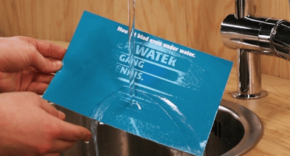
Not only did this direct mail campaign explain World Water Day’s campaign aim creatively, it also became an interactive piece of content. Interactive content has been proven to generate 2x more conversions than the alternative. That’s pretty genius, right?
Lucidpress: Click the image to use the template
Use one of our direct mail templates as inspiration for your own direct mail piece. Switch out colors, fonts and texts to create your direct mail postcard or flyer in seconds.
Browse all direct mail templates


DO emotionally engage customers
The second way to ensure your direct mail marketing campaign is a success is to make your audience feel something — any type of emotion. After all, there’s such a wide range of them. Emotion has been the marketer’s secret weapon for years. Various studies show that people rely on emotions, not just logical information or data, to make buying decisions.
Feelings of anger, disgust, affirmation and fear often top the list of emotions that work well in advertising.
A fantastic example of this comes from the Natural History Museum. In an attempt to educate local people about the danger of animal extinction, they sent an eraser to their audience with a quote about the topic.
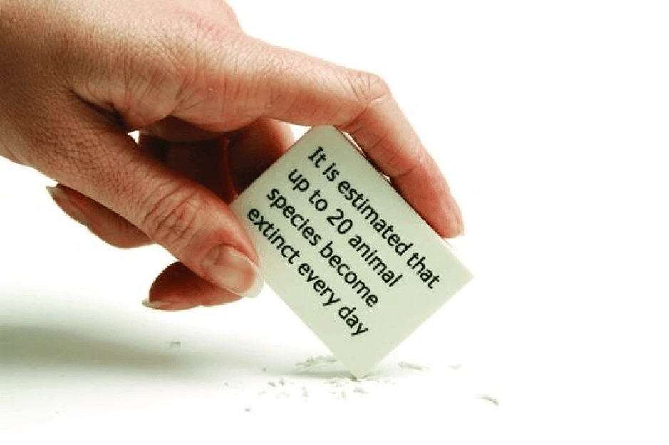
Because their audience could see a visual representation of extinction in their daily lives, it made them stop to think about how serious it is… and want to act.
Pick an emotion and drive it home through your next direct mail campaign. You’ll soon see the impact emotion has on marketing—but the victories will be for your own brand.
DO put your own spin on it
For the most part, mailboxes aren’t fun environments. Bills, bank statements and lonely newspapers often clog up the mailbox marketing route. But, you can stand out by making your direct mail marketing campaign a little unique.
A fantastic way to achieve a little uniqueness is through juxtaposition. Can you think of a smart, innovative way to show how powerful your offering is by comparing it to something completely different?
Let’s take this direct mail campaign for example. Created by the theatre team behind a local performance of Macbeth, they wanted people to visit their show. Instead of online marketing, they exploited their direct mail opportunity and found a way to stand out in a mailbox.
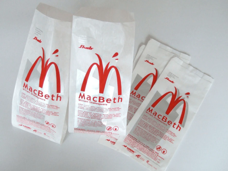
You’d probably never compare a Shakespeare play to a fast food joint, right? But that’s part of the reason why it works.
The juxtaposition of both elements makes you take a second take at the direct mail rather than toss it in the trash. This type of content experience (within direct mail marketing) is bound to make an impact on an audience, one who possibly has an interest in both but would never expect them to be paired together.
All in all, direct marketing provides you or your creative team with untold opportunities to lean into the creative, get weird and try new things. Plus direct mail marketing allows you to access new customers or get a feel for a prospective audience who might otherwise pass up your product or services.
DON’T skip doing the proverbial “leg day”
Leg day for direct mailing entails defining your audience and running some tests before you send out the direct mailers. Now, neither task needs to be a heavy lift. Defining your audience can be as simple as knowing who your product is best suited for and tailoring where and what neighborhoods you send the direct mail to based on this information.
Additionally, try sending a few flyers or direct mailers out to a small segment of your target audience. Make sure to include trackable tests, like a QR code or a custom URL (which we’ll touch on more momentarily).
DON’T forget to set goals for the campaign
Consider the following questions. As in, are you looking to drive brand awareness or boost sales of a particular product? Are you looking to assess brand awareness, and if so, how will you measure success or failture? Alternatively, if you want to increase sales, what is the target revenue or fiscal marker for your campaign? Specific goals will give you a benchmark to measure (and brag about) the campaign’s success, and it will help you drive improvement based on the results.
DON’T ignore the importance of a CTA
Simply put: You need a way to measure your goals and attribute which-sales-to-what-campaign-directive. Well, a CTA can help with that. Start by creating a custom URL to include in your direct mailer. This custom URL will empower you to track visits and sales from the website location, allowing you to attribute conversion and ROI to your direct mail campaign.
DON’T spam your customers
Inundating your customers with a lot of direct mail, emails and more is not the best way to get their attention. Sure, you’ll be top of mind, but it’ll be because you’re irritating them — not inspiring them or addressing a pain point. You don’t want to undermine the relationship you’ve worked so hard to build with them, so be mindful of who-you-send-what-where-and-when.
You’ve got mail — Lucidpress mail
If you couldn’t tell already, we’re big fans of direct mail. Now, the exciting part about Lucidpress is that we don’t just empower anyone to create compelling, effective content — we also make it easy to conduct a direct mail marketing campaign.
Choose from any of our direct mail marketing templates to customize and edit. Or, alternatively, if you’re feeling brave, you have the option to design your own. Then, all you’ll need to do is:
- Upload a .CSV file containing the details of people you’d like to target,
- OR use radial search to select a local delivery area.
Once selected, press the proverbial “go” button and use the direct mail marketing integration to send your mail directly within a matter of days. There’s no need to stop at your local post office with oodles of mail, thus, taking the stress out of building a direct mail marketing campaign.
As you can see, direct mail isn’t an old-school marketing technique that should’ve stayed in the 00’s. These tips, along with our new features, could be the combination you need to build a direct marketing campaign that drives excellent results for your business.
Learn more about the direct mail features in Lucidpress, and give it a test drive.
Bonus: Direct mail infographic
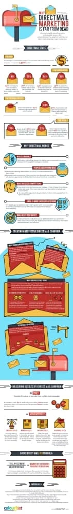
Craving more data? Check out this illustrative infographic about direct mail from our friends at Colourfast.
Direct marketing can be extremely effective for businesses focused on serving specific geographic areas. By sending letters, flyers, and other marketing materials straight to prospects’ homes or workplaces, you can generate business in a cost-effective manner.
Related: Direct mail: Does it still work?
Direct marketing (also known as direct response) is an umbrella term that includes email, online display ads, paid search, and direct mail. The common denominators are 1) they target specific people and 2) they ask for some type of action.
The requested action could be anything from giving you a call or redeeming a coupon to scheduling a free consultation or starting a trial membership. The possibilities are limited only by the marketer’s imagination.
In this post, we’ll focus mostly on the time-tested technique of direct mail, which remains very profitable for realtors, gym owners, franchisees, and other businesses focused on serving local communities.
How can you measure your performance?
Let’s discuss the key metrics of direct marketing campaigns. Understanding these is the first step to ensuring that your strategies are always improving.
Direct mail open rate
When most people get their mail for the day, the first thing they do is separate the “junk” pile from the stuff that deserves their attention. Getting our messages into the stuff-to-open pile is the first hurdle direct mailers must clear.
How often does this happen?
Unfortunately, because we aren’t in prospects’ homes or offices with them, this is a difficult metric to track. Paper mail is a different animal than an email campaign, for instance, because email marketing software allows us to track how often our messages are opened and clicked.
It’s unlikely you’ll know what your direct mail open rate is. That said, prospects can’t respond to a message they haven’t read, so we want to do everything we can to increase it. That’s why seasoned marketers test different variations of the same direct mail package. Seemingly subtle details—like the envelope color or the font of your prospect’s address—can make a significant impact.
By sending out two versions of the same marketing message (a process called A/B testing), you can track which version performs best. After enough testing, the winning version becomes the “control,” which you can test against newer variations. This ensures that you’re constantly optimizing your direct mail packages to get opened as much as possible.
Let’s say you’re a realtor looking to build your client base in a new neighborhood. You decide to send out 500 letters introducing yourself and asking for interested recipients to give you a call. Your message is the same in every letter, but the envelopes are different. 250 are white. The other 250 are yellow.
You get 13 calls from the white group, but only 6 from the yellow: a statistically significant result. We don’t know for sure how many people opened the envelopes, but because the response was so much higher with the white group, we can assume it’s the better option moving forward. Next campaign you might test it against another color, like light blue.
Direct mail response rate
The response rate measures how many prospects follow up after seeing your messages.
A response isn’t necessarily the same thing as a sale. It often will be if you’re selling inexpensive impulse items, like a pizza store owner mailing out coupons. In those cases, responding (using the coupon) is the same thing as becoming a customer. But that isn’t always the case with more expensive products (like real estate), when people might respond before they’re ready to buy.
How do you measure this?
The challenge becomes figuring out which prospects responded due to your direct mail as opposed to other marketing channels. Here are just a few strategies you could use to track response rates:
- Call tracking. Assign unique phone numbers to specific direct mail campaigns, so when prospects follow up you can see where they came from.
- Coupon or discount codes. You’ve probably seen these in your own mailbox. Local businesses often create special coupons for direct mail campaigns. When prospects redeem them, it’s easy for the business owner to track their success.
- Exclusive offers. You could create special offers exclusive for direct mail recipients, so you know they couldn’t have discovered them anywhere else.
- Personalized URLs. A tech-savvy way to track responses is to have direct mail recipients follow links to unique landing pages you’ve created for the campaign.
- Just ask. Businesses often ask new customers how they heard about them, collecting responses via informal surveys.
Don’t worry if your response rate seems low. In 2017, the Data & Marketing Association’s Response Rate Report found that the average response rates sent to houses was about 5.1%. The same report revealed that oversized envelopes had the highest response rates, probably because they stand out from the pile.
Imagine you own a hamburger restaurant. You decide to send out coupons to promote your new curly fries. You send out 2,500 coupons, and 175 people end up redeeming them. What’s your response rate?
The formula is simple. All you have to do is divide the responses by the total pieces sent. In our burger example that turns out to be 7%—a great response!
ROI
Direct marketing can be extremely profitable, but there are certainly still costs involved. Everything from accessing mailing lists and databases to printing services, postage and the paper itself—these things add up.
Your marketing budget is limited. Tracking your results will ensure you’re allocating every penny where it’s most effective.
That’s where ROI comes in. This acronym, which stands for “return on investment,” assesses the revenue your campaign brings in relative to its cost. It’s probably the most important metric to pay attention to because you can compare it with the results from other marketing efforts.
Say you’re a gym owner offering a great deal for a new membership. You spend $6,000 on your direct mail campaign, which results in $7,800 of new business. You want to know your ROI.
The formula to calculate ROI is as follows: (revenue – campaign cost) / campaign cost. So, in our example, we get (7800 – 6000) / 6000, a very respectable 30%.
Your turn
Although many small business owners are overlooking direct marketing in 2019, it remains a viable strategy for businesses targeting local areas. You might use email, direct mail, pay-per-click, or all of the above.
Understanding the key metrics will help you see how well your campaigns are paying off. Continuing to track them while you experiment with messaging will ensure they’re as profitable as possible.
Learn more about the direct mail marketing service in Lucidpress, and give it a test drive.
Direct mail is not dead or in a cryogenic freeze. It has not joined the video cassette or the typewriter as an obsolete relic. Even here in the digital age, implementing a traditional direct mail campaign can still be a highly effective tool in your brand’s marketing toolbox.
Related: Direct mail marketing: Does it still work?
Engaging customers through multiple platforms & channels is the ticket for boosting your response rate. Direct mail is a path to success when it’s personalized to your target audience and driven by a well-executed direct marketing strategy.
So, what can set your direct mail campaign apart? Here are 5 effective practices you can implement to attract customers’ eyes (and dollars) to your business.
Personalize your content
Everyone wants to feel special. Taking an individualized approach with direct mail can create that feeling for customers and potential customers alike. Rather than seeing your mail as junk, they’ll feel like you really know them and understand their needs.
It starts with using a recipient’s name, but it doesn’t end there. Find a way to connect by personalizing the product or service you offer. This can be as simple as adding the address and operating hours for your organization’s nearest location. It could also involve tailoring a specific offer toward products that will be most relevant to them based on observable data.
When you break your target audience into narrower niches, then tailor a personalized offer for each person, it will supercharge your marketing efforts. Your content will have a better chance of resonating with your audience and generating sales down the road.
Add more information
A flyer, brochure or insert can feel more permanent than a tweet or an email. Your audience can see it, handle it and read it. A customer is likely to spend more time with a piece of direct mail than with an email or tweet. It opens the door to provide more information.
Include all the information you need to get customers to make the decision you want. There are a few ways to accomplish this goal:
- Use clear, attractive images that draw the eye.
- Incorporate graphics & text that mesh with your brand and convey the right message about your products or services.
- Include authentic testimonials that show a customer why they should choose you over a competitor.
The most important thing is to keep your focus squarely on the customer’s needs. You want to earn their loyalty, and your direct mail content should aid in reaching that goal. Concentrate your message on how your brand benefits the customer in terms of value, convenience and quality.
Make your call-to-action count
The goal of direct mail is the same as any other marketing channel. You want to convince a customer that doing business with you will improve their life. That’s where a well-designed call-to-action is so essential. It’s the glue that holds everything together.
A call-to-action should be compelling enough to spur a customer to take action. You should make it clear, concise and powerful. Keep it in front of them by including the call-to-action multiple times throughout the piece. In this case, don’t look at the repetition as being annoying. It actually helps a customer remember your offer long after they read the mail.
So, where should you include it? Use sidebars and a postscript that are offset from the main body of content to deliver a repeated call-to-action. Incorporate a consistent voice that ties back into your core brand messaging.
Keep data fresh
Timing is everything with an effective direct mail campaign. You have to send it to the right people in the right places at the right times to get the maximum return on your investment. The best way to put the odds in your favor is to keep your database relevant and up-to-date.
Accurate data helps you correctly identify your target audience and their interests. It also helps you avoid missteps on building out mailing lists. If a lawn care company distributes mailers to the residents of an apartment complex, for example, it’s likely to be a wasted effort because few of those people will need their services. Keeping data up-to-date would help such a company locate neighborhoods filled with homeowners who would love to use their services.
Having correct data will help you understand which stages of life your customers are in and how to best meet their needs. Marketing is most effective when you can offer evidence that your brand fills an identifiable need for your target audience. It sticks with them and keeps your business fresh on their mind.
Integrate with other marketing
Your direct mail strategy should not be stranded on a deserted island among the palm trees and coconuts. Integrate this strategy with your other marketing efforts, so that it’s a part of the same marketing plan. This also means sticking with it once you get started.
Persistence pays off in all forms of marketing. One-and-done approaches won’t work, because you can’t cast a wide enough net to pick up every potential customer. Be prepared to send out multiple mailers to your target audience. Utilize A/B testing to see which content strategies work best, so you can optimize your efforts. It typically takes multiple contacts before direct mail finally spurs a call-to-action.
Align your direct mail campaign with your emails, online ads and social media promotions. Use the same images, graphics, coupon codes and other materials in those digital efforts. It builds synergy and keeps the customers going in the right direction, no matter where, when and how they made initial contact with your brand.
Learn more about the direct mail marketing service in Lucidpress, and give it a test drive.
It’s getting harder to put your marketing messages in front of consumers. Increased digital competition, changing algorithms, and a crowded social media space mean you have to work hard to stand out.
So how are marketers breaking through the clutter? By revitalizing some tried-and-true, pre-digital strategies like direct mail.
Related: Direct mail marketing: Does it still work?
Receiving something in the mail is sure to get people’s attention. These 11 direct mail examples will inspire you to launch your own effective direct mail campaign. We’ve chosen each one because it showcases a particular strategy you can use to generated direct mail ideas for your own marketing pieces.
Bold text

Your central marketing message should be the first thing a recipient sees when they receive your direct mail piece. The Waterfront open house postcard has big, bold text taking up almost half of the design, so the main marketing message gets across right away.
If you design your own piece with bold text, just remember not to go overboard—you can overdo it. Balance the text with complementary images, and leave some space for the design to breathe.
Shaped text
Another great way to get people’s attention is with interesting shapes. This office party invitation from Every Door Direct Mail organizes text into a Christmas tree shape, a surefire hit around the holidays. You can organize text into all sorts of shapes, from beer bottles to flowers. It’s a fun and creative way to add some eye-catching visual interest to your direct mail piece.
Stunning images
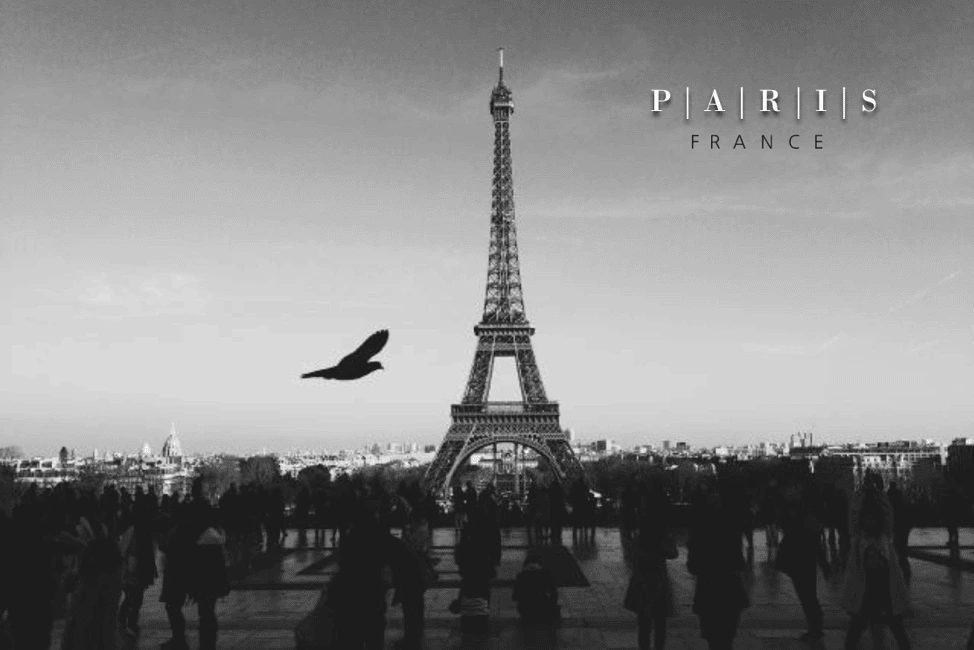
While your marketing pitch lives in the text, great images capture attention and evoke emotion. This Parisienne travel postcard gets viewers thinking about travel and romance with a pretty, black-and-white photograph of the Eiffel Tower. It’s good practice to choose an image that complements your brand and your offer, but the primary goal is to make a strong emotional connection.
Macro photography
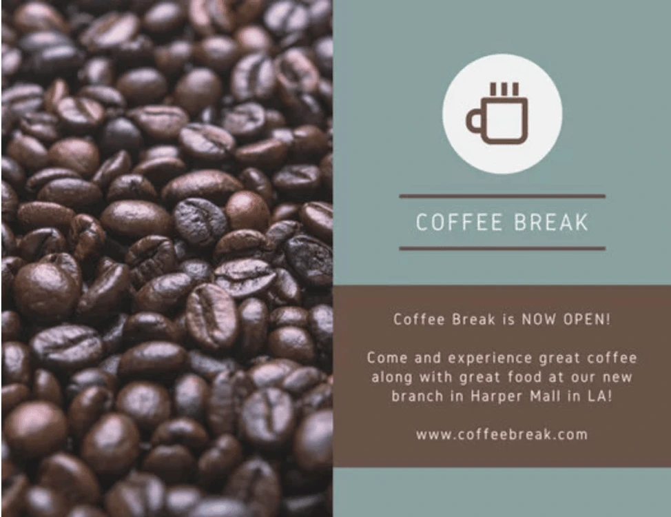
Direct mail pieces have to stand out from the stack of mail that people receive every day. Macro photography is a great way to provide a new perspective on a familiar object—and this direct mail piece from Canva puts this strategy to good use. Rather than a standard cup of coffee, this alluring photo evokes the scent, taste and tactile feel of coffee beans.
Of course, you don’t have to use coffee beans—or any food, for that matter. If there’s an object that represents your brand, product or service, use macro shots to highlight it. If you can use an image that’s personalized to your customers or local area, even better.
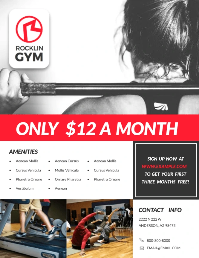
Eye-catching colors
When you look in your mailbox on an average day, what do you see? Probably a sea of white (and off-white) envelopes, most of which look the same. The bright red stripe on this gym fitness flyer immediately stands out and draws attention to the value proposition. Be prudent with your color pops—an overly bright direct mail piece can look tacky and overwhelming. Stick with tasteful highlights like those showcased in this design.
Different shapes
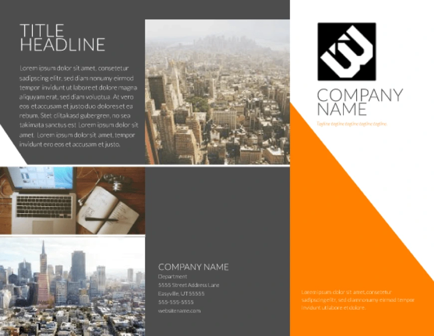
Mailboxes are crammed full of standard envelopes and flyers every day. If your advertising needs to stand out, why not try a different shape? This modern tri-fold brochure will grab people’s attention not only with its color-blocked design, but also with an unusual shape. Folded pieces have a three-dimensional aspect to them, making it more likely to get noticed.
A personalized map
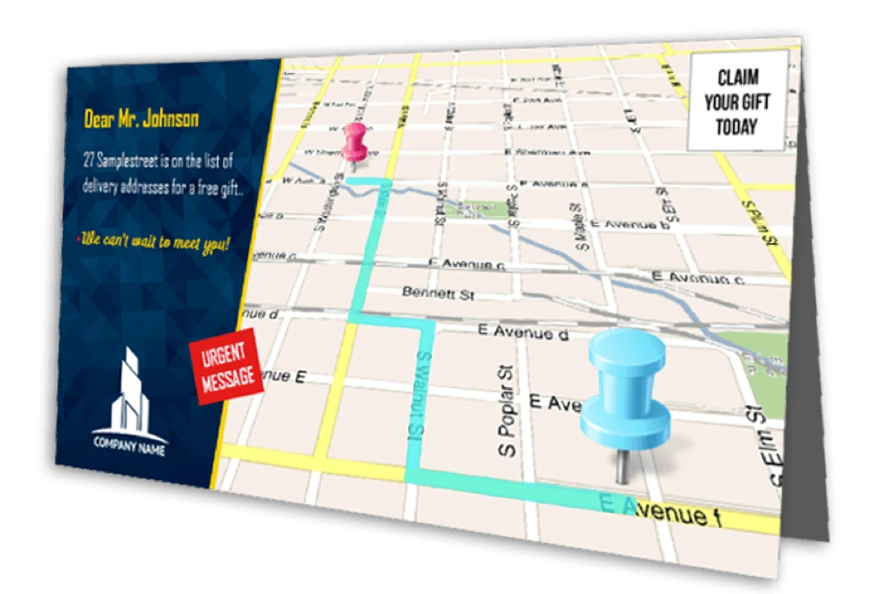
Personalization is a standard digital marketing tactic, but it’s more difficult to achieve in the direct mail space. Maps4Mail solved that by printing customized maps on each piece of mail, showing the recipient exactly where they need to go. The map is intuitive, personalized, and makes it easy for anyone to find your business. This is a great way to show customers you personally value their business as individuals.
If you don’t have the budget for such a granular campaign, you can still try other ways to add a personal touch to your direct mail. For example, you could include something specific to the local area, or you could include your signature.
Unusual materials
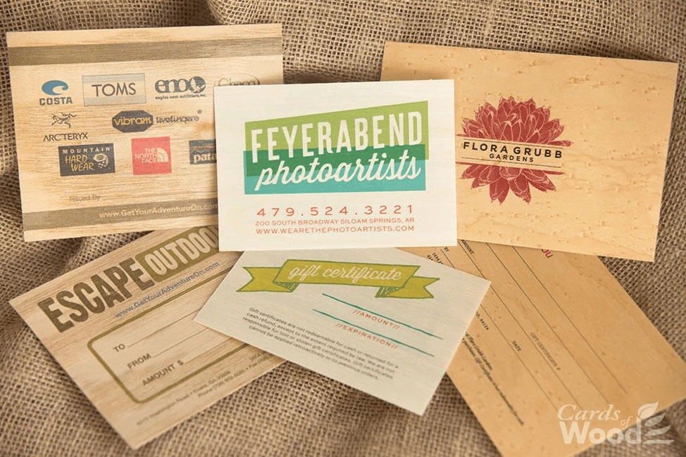
Most letters and flyers are printed on the same white paper. That’s not very exciting. If you can find materials or textures that stand out, you’ll have a big advantage over the competition. Heavy or textured paper work nicely, but if you really want to branch out, check this: These postcards from Cards of Wood are (as you would guess) made entirely of wood. Wood you believe it?
3D objects
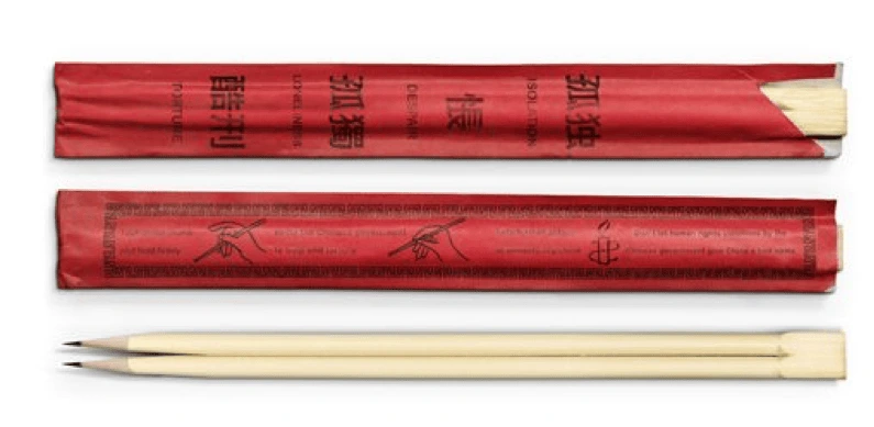
People are curious creatures, and we’re more likely to open packages that contain objects. If you can get your brand message across with an object, it can serve as a fantastic ad. Amnesty International sent out these pencil chopsticks to encourage people to write to the Chinese government. Thinking outside the box (or should we say inside) can get great results in direct mail because people spend more time with it.
Interactive mailers
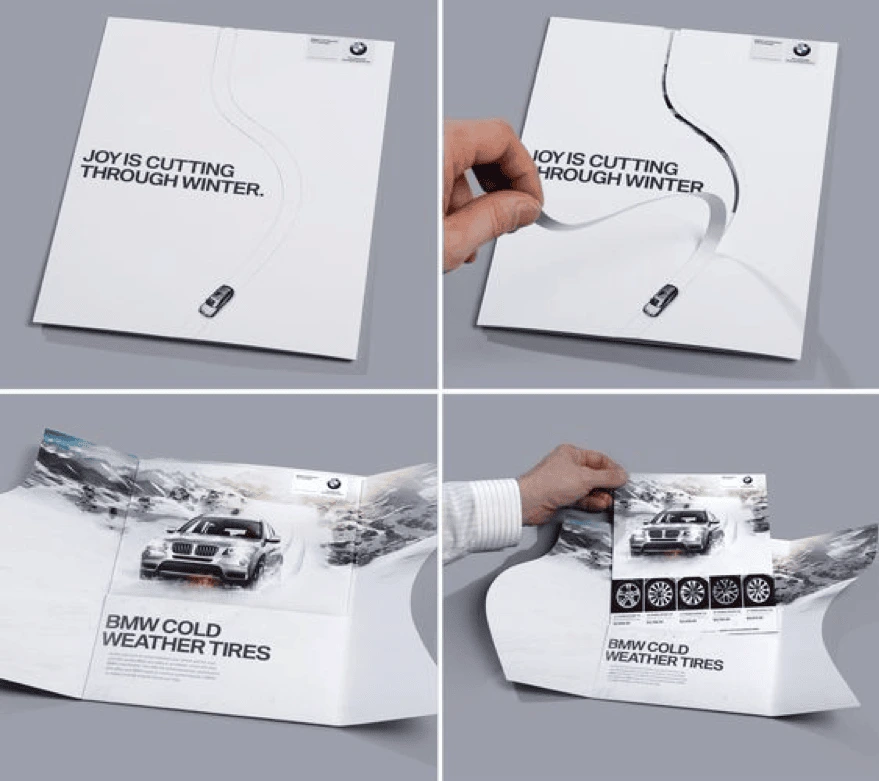
Not every brand can afford to design interactive mail pieces—but if you can, there might be no better way to connect with your customer. This piece from BMW had customers cutting a path through a wintery postcard to emphasize the reliability and control of their snow tires. Their combination of an envelope and mailer is great creative thinking.
Gifts
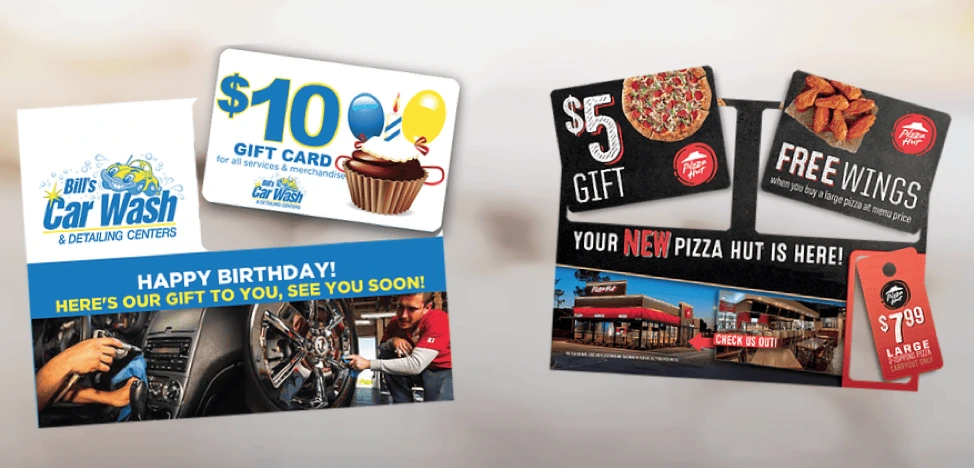
Many direct mail pieces focus on the value brands can provide to their customers—but you’ll have to go further if you want to stand out. A coupon is a good start, but that’s still fairly common. Consider including a punch-out gift card instead. It lets you take advantage of an unusual material (plastic) and give the recipient a gift. A great combination that’s tough to beat.
Key takeaway
People get a lot of mail they didn’t ask for, and different brands will find success with different types of direct mail. The most important thing is to stand out and provide real value to your audience. These examples should get your creative juices flowing and inspire the best direct mail campaign for your own marketing goals.
Ready to create your own direct mail designs in minutes? Check out our direct mail postcard templates.
The rapid rise of digital media—and the simultaneous decline of print media—has been glaringly obvious. Given the clear success of online methods like social media marketing, pay-per-click advertising, and search engine optimization, it’s not surprising to learn that many businesses are increasing digital spends.
Related: Why print will never die—Print vs. digital collateral
In terms of boosting brand awareness, digital is an obvious choice for many marketers. After all, more than three-quarters of Americans shop online. With digital, you can see which content is viewed most, where visitors spend their time, and when conversions have taken place…
…all benefits that we simply don’t see with print advertising.
Yet an important question remains: Is digital everything? Is digital enough to build brand awareness? There are subtle hints in recent studies that point to a surprising conclusion. Rather than going all-in on one or the other, your brand awareness might benefit most from a dual-approach. Let’s set the scene.
Is print media dead?
Remember how excited Amazon was when it launched the Kindle? Well, overall, eBook readers haven’t been anywhere near as successful as initially thought. In fact, eBook reader sales are in decline as readers prefer the look, smell and feel of a real book. The importance of tactile experiences in awareness & engagement is a factor we can’t overlook.
Print media and digital can’t always be described as standalone entities. Consider where digital would be without print. Alive? Sure. Alive and kicking? Probably not. There’s a lot of overlap between the two—QR codes, for example—which leads many to wonder whether a significant portion of digital’s success can be traced right back to print.
Ultimately, it seems that printing services are not as dead as they first appeared. Reports suggest that, while 88% of audiences will view a print ad for 2.8 seconds, only 4% of digital ads are viewed longer than 2 seconds. 35% of digital ads receive no views at all, a wasted opportunity that might be reclaimed with print ads.
Why use print to boost brand awareness?
Well, it comes down to how the brain works. Believe it or not, the brain seems to have a natural preference for printed materials.
Here are three scientific studies that show how effective print can be in boosting brand awareness.
Study #1: The emotional connection
Branding agency Millward Brown found that nothing compares to the emotional connection formed through print media. The agency claims that print leaves a much deeper footprint in the mind due to that personal, emotional bond. The study found that the parietal parts of the brain—responsible for absorbing and storing visual information—were more active in response to print ads than digital ones.
Study #2: Ease & simplicity
Neuromarketing firm True Impact has found that the average person uses 21% more cognitive effort to process digital information than print, suggesting that print materials are quite literally easier to absorb. The report backs its findings by demonstrating that 75% of those exposed to a print ad can successfully recall the brand at a later date, compared to just 44% of people who would could recall the same information after a digital ad.
Study 3: Out-performing across the board
In a study of direct mail conducted on behalf of the U.S. Postal Service, print media was found to out-perform digital materials in nearly every area. Print was the clear winner in terms of review time, stimulation, memory, speed, confidence, desirability and valuation. The only area in which digital performed better was gaining initial audience attention. Print materials can be tailored—personalized direct mail, for example—to combat this issue and come out on top.
Print vs. digital: Which is best?
Digital media has some clear advantages over print media. But looking at the research, it’s obvious that print still has a firm place in the marketing world. That’s why a number of businesses now focus on cross-media advertising, combining both print & digital to effectively and efficiently raise brand awareness.
By combining both methods, brands are able to target a much wider audience. Consider that, while 58% of newspaper subscribers prefer print, 28% say they are digital-oriented. There’s definitely a number of audiences who prefer print, so modern brands should reach out to these audiences, rather than isolate them.
Perhaps the best way to use both print & digital is to consider the unique advantages of both. Through multiple channels, you can reach multiple audiences and deliver your brand’s story. Consider reaching audiences with impressive print media, then create a more personalized experience through real-time, interactive digital media.
Ready to design your own cross-media campaigns? Lucidpress makes it easy to create beautifully branded content in a matter of minutes.
Why did you start your business? We’re pretty sure it wasn’t because you wanted to sell one product every blue moon, or because you don’t care about the services you provide.
Let’s be honest: We all want to make a difference, and we want to be recognized for delivering exceptional experiences. Without a positive reputation built on genuine feedback from satisfied customers, you can wave goodbye to local or worldwide recognition.
You’ve probably noticed that bigger brands tend to have this nailed down. You see that red-and-white logo and instantly recognize Coca-Cola, or that blue background and yellow text belonging to IKEA. Even those multi-million-dollar brands had to start from somewhere. How on earth do you create something memorable—something that a customer will recognize and trust right away?
One answer is product packaging. Packaging is the first thing someone will notice on a shelf or when they receive a delivery to their home. The more they relate to it, the more likely it is that they’ll purchase or recommend it to others.
However, before you reach stardom, there are several ways to increase the chance of getting noticed. From the way you speak about your brand to how you package your products, here’s how to tell a memorable brand story.
Write your story early on
Before you get too far in with your products, button up your brand story. Keep in mind that a business is generic and faceless without its history, values, mission, vision and personality.
To refine the story you’d like to convey to the public, ask yourself some of these questions:
- What beliefs drive you and your company?
- What makes your business and product unique?
- How would like to see the business a few (or many) years from now?
- How can your products change the lives of your consumers?
Once you’ve answered these, it’ll be easier to focus your brand story—and that story can inform the choices you make with product development and package design.
Give your product a persona
Don’t think of package design as just a way to deliver your product. To truly convey a message, a story or a brand identity through your product, you should think of it as a person. That’s right, just like in marketing, you’re creating a persona—but this time, it’s for your product. This is where brand personality comes in.
By thinking of your product as a person, it’ll be easier to design packaging that reflects the brand personality and resonates with your target audience. Potential buyers will notice that authenticity and gravitate toward the product before they even realize what it is. They’ll know that it’s been designed for them.
Colors draw in the customer
Without color, the canvas is blank. A customer won’t look twice at your product if it doesn’t stand out to them in the first place.
Think about what feelings you want someone to get from your product. Should it make them feel like having fun, like a quirky craft beer? Should it make them feel cared for, like a health-related product? Make a list of how you want your product to make customers feel, and find ways to translate that to your packaging.
It can be easy to match colors with feelings: calming blues, bright yellows, passionate reds. A customer could be drawn to a certain color, depending on what they’re looking for. Colors can help you convey your brand identity, as well.
Who is your audience?
As with any form of marketing, keeping your audience in mind throughout the process is a must. Who will buy your product, and what product packaging will appeal most to that particular audience? Think about colors, shapes, sizes—even the wording on each individual product’s package.
Customers often read the text on a product to reinforce their purchasing decisions in their minds. [ ] For example, younger audiences prefer brighter, eye-catching colors with quirky shapes and blocky fonts. Older audiences who purchase luxury products prefer colors like black and gold, combined with elegant fonts and sophisticated language. It’s all about knowing who you’re selling to. Once you do, the rest will come far more easily.
Delivery boxes
No matter the size of your business, it’s not only important to have great product packaging on the shelves. When a customer makes a purchase online, they should feel the same excitement for their delivery as they do for the product in the box.
Depending on the size of your business, you might need to batch-order boxes for delivering your products. Businesses often need extra help to meet customer demand. BCS box-making machinery can help to create quality, durable boxing that makes an impact.
Consider sprucing up your boxes with custom-branded stamps, tape and delivery labels—as well as adding extra protection for your product inside each box. Think about padding, branded freebies, and money-off coupons as ways to encourage repeat purchases from your customers.
Logos & graphics
If you’re not including your logo and other branded imagery on your packaging, how do you expect a customer to know it’s you? When people see a familiar logo, they know almost instantly whether they trust that business enough to buy the product.
Graphics, although not always brand-specific, can often make or break your product packaging. If you’re selling healthy products, you’re more likely to succeed with a green, leafy design. Think about what works, and use a bit of common sense to gauge how you want the product to come across.
Product blurbs
Your brand story is important. So important, in fact, that many businesses make space on their product packaging to write a little about how their business started. Other companies write about their values, such as Lush and their natural, eco-friendly approach.
You can probably think of a few other examples of brands who do this well—which means they’re doing things the right way. The care and effort you take here will pay off when customers remember your story and take it to heart. Shoppers will appreciate an attractive design with an inspiring blurb more than one with a cut-and-dry description. Don’t forget that it’s often the packaging of a product that sells it, not just what’s inside.
Don’t over-design it
It’s easy to succumb to this temptation. In trying to make a product the most eye-catching or unique, some companies over-complicate the packing design. Sometimes, these products luck out and sell well, but they do little to build or reinforce the company’s brand.
Don’t get too carried away with embellishing your packaging designs. Stick with simple, clear concepts that your audience will easily understand. Often, it’s the most simple and well-thought design that wins out in the hearts and minds of customers. [![]() ]
]
Be consistent
According to famous designer and author Robert Brunner, “Everything you do creates the brand experience. Ergo, design is your brand.”
Just as it’s important to maintain brand consistency in your marketing, it’s important to design product packaging that’s consistent with your brand’s identity and values.
We’re not saying you should slap your logo on everything. But you do need to design concepts that reflect your brand—concepts that could be informed by the logo, typography, color, etc. Even if your product doesn’t share the aesthetic characteristics of your brand, it should feel congruent with its values.
Invest in packaging
Don’t underestimate the power that packaging design can have on your brand. Because your packaging often sparks the first connection between a customer and your product, it’s often the first experience they’ll have with your brand.
On top of the time and money spent on product design, you should also carefully consider your packaging. Design packaging that stirs up emotions of excitement, joy, delight or amazement. Once you’ve created packaging that instantly connects with your customers, your brand awareness and recognition will benefit.
Key takeaway
An effective brand will help sell products and attract customers. If you want your customers to get excited about your new products before they’re even announced, build a strong brand using these concepts.
Bonus: Product packaging infographic
Want a few more tips and pointers on the importance of product packaging? Check out this data-packed infographic from our friends at Uppercut Box.
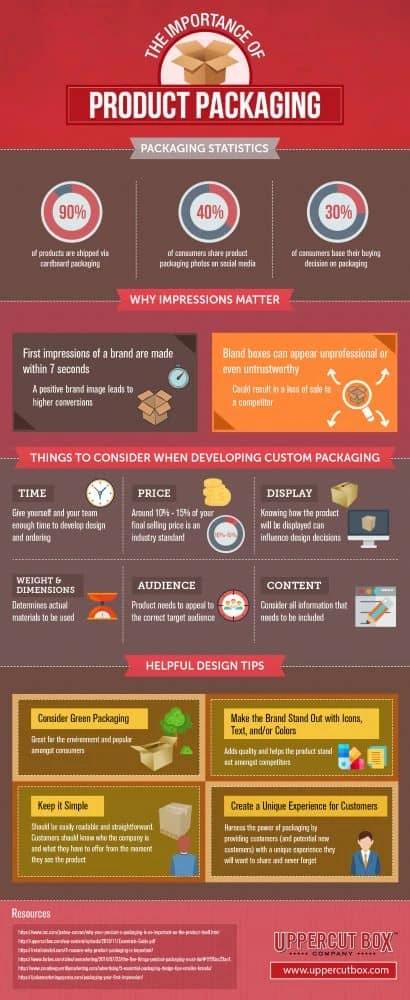
Despite the prominence of digital marketing, print collateral still has an important role to play in a balanced marketing strategy. A professionally produced brochure suggests a high budget and an established reputation.
Related: How to make a stunning travel brochure
Not only that, but brochures are versatile marketing tools. You can distribute them at trade shows, put them in brochure racks, send them via direct mail, and even publish them on your company website.
(They’re also very portable. Many people would prefer to grab a brochure and read it at their convenience rather than engage with a salesperson.)
Most brochures are just a few hundred words in length, so you don’t have a lot of space to get your message across. It’s important to make every word count. Here are eight tips for writing a brochure that signals professionalism and competence — and spurs your readers to action.
1. ) Create an outline or plan of attack
Brochures vary in content and length, but most follow a standard format.
- The front panel displays the company logo and headline.
- The inner panels make a case for the product/service using supporting facts and details.
- The final panel contains contact info and a call-to-action.
Please note: At the end of this post, we’ve included a cheat sheet of content types you can put in your inner panels.
Before you start writing, identify your target persona for the brochure including age, gender, location, role, income, interests and challenges.
This information will guide the tone, language and content of your brochure. It’ll also help you choose a call-to-action that appeals to your readers. For instance, an offer for a free white paper would likely be of interest to an executive, whereas a mobile app download would be more fitting for a college student.
Make note of where your target audience is in the buying cycle. Don’t waste space going on about the history of your organization if your readers have done business with you before.
Also consider the level of understanding your prospects already have about the topic. Are they experts, novices or somewhere in between? Keeping this in mind will help you avoid alienating readers by talking down to them or confusing them.
2.) Write a compelling headline
Your headline will determine whether a prospect picks up and reads your brochure or tosses it aside.
Avoid using headlines that don’t tell the reader anything about the contents of the brochure — for example, “Make a Good Impression.” What does this mean, who are you making a good impression on? And for what purpose?
You can provoke a reader’s curiosity without being vague. These example headlines spark interest while also telling readers exactly what they’ll get from reading the brochure:
- Scared of the Dentist? Learn How Sedation Dentistry Can Help
- The Ultimate College Prep Checklist: A Four-Year Plan for High School Freshmen
- 4 Reasons to Think Again Before Buying a Foreclosed Home
Don’t be afraid to use “power” words like free, quick, easy, results, exclusive, proven, etc. What they lack in originality, they make up for ineffectiveness.
3.) Be concise and use plain language
Your brochure should focus on one product or service. A trifold brochure only has space for about 350-450 words, so keep words, sentences and paragraphs short. Edit ruthlessly and include only the most relevant information, leaving room for white space and images.
Big walls of unbroken text look intimidating to readers, so use subheads liberally. Try not to put more than a couple of paragraphs in a row without introducing something else to break up the monotony, such as a subhead, bullet-point list or image.
With the help of Lucidpress’s online drag-and-drop editor, you can quickly design a professional-looking brochure with elements like callouts, pull quotes and tables.
4.) Limit the copy to 1-2 typefaces
The typefaces you choose should be easy to read and consistent with your branding. Often, if the subhead copy is in a serif face, the body copy will use a sans-serif face, and vice versa. There are some great free tools available to help you select a complementary font pairing.
Select font size, spacing and color with readability in mind so your prospects don’t have to work to read the brochure.
5.) Give readers a reason to keep your brochure
If you can, include a handy reference of some kind in your brochure to dissuade readers from throwing it away—for example:
- a map of a town marked with top attractions
- a “normal body weight” chart based on the reader’s height
- a list of program-specific student scholarships
- a cheat sheet for first-time homebuyers in a specific city
Also, consider printing the brochure on a high-quality glossy paper to boost its perceived value.
6. Include next steps or a call-to-action
The goal of your sales brochure should be to persuade your readers to take a specific action.
This call-to-action is usually placed on the last panel of the brochure, along with the contact info. To boost response rates, offer an incentive, such as a promo code or free product.
The following are some example actions you might want your readers to take:
- Sign up to your email list for a free white paper
- Visit your website to make a purchase or sign up for a program
- Call to book a free consultation
- Scan a QR code to download an app
- Enter for a chance to win
- Visit your store for an upcoming sale
7.) Proofread your brochure
No matter how much effort you put into your messaging and design, errors and inconsistencies in your printed literature can kill your credibility.
Verify that the tone of your brochure matches the rest of your brand messaging. Unlike informational brochures (which may take the third-person point-of-view), sales brochures usually use the second-person to build rapport with the reader.
Refer to your brand style guide for how to handle things like numerals, dates and titles in the text. If you don’t have a brand style guide, use an established style reference like AP Stylebook. And of course, look everything over for correct spelling, punctuation and grammar.
8.) Double-check for important details
Before the brochure goes to print, check that your logo and contact information are present and error-free. Also look for details you may have forgotten to include, such as:
- Purchasing info—how to place an order, accepted payment types, guarantees, warranties, refunds, shipping, etc.
- Visitor info—accessibility for people with disabilities, hours of operation, seasonal times, admission rates, group sizes, pets, directions, etc.
- Legal info—copyrights, trademarks, registration marks, disclaimers, etc.
You can also create branded templates for your brochures so you don’t miss anything important when you start a new project — Lucidpress handles printing as well.
Bonus: What should I put in my brochure?
For inspiration, here’s a cheat sheet of content types often found in sales brochures:
- Descriptions of products, services, exhibits or attractions
- Features and benefits
- Product specs
- Pricing charts
- Pros and cons
- Itinerary (e.g. winery tours)
- Narrative (e.g. history of a winery)
- How a product works
- How a service is delivered
- How to do something
- Checklists and questionnaires
- Images, illustrations, charts, graphs and maps
- Frequently asked questions
- Company blurb
- Social proof: case studies, testimonials or media quotes, client list, executive bios, etc.
Experiment with a few of these items and see where it takes you. You might be surprised at how quickly you run out of space!
What are you waiting for? Try your hand at design with any of our design templates.
Last week I received a letter in my mailbox for the first time in a long time. It’s been ages since someone (even a company) sent me physical mail rather than going the easier route with email.
It really felt good to have something that I can touch and feel with my own hands.
Related: 11 best direct mail pieces to inspire your next campaign
Sometimes, the dull and boring side of advanced technology makes us realize we’ve come a long way. There was a time when people used to get a lot of mail in their mailboxes, especially in the form of promotional material.
Gradually, companies left that behind and considered it defunct. But in reality, direct mail is still a great way to engage with one’s audience.
Why? Because in our modern age, it provides a personal touch that email can never replicate. Data published by the Data & Marketing Association in 2016 showed that the response rate of direct mail increased 43% year-over-year. This is a huge leap from previous years.
Companies should know that it’s short-sighted to completely do away with direct mail. It’s still an effective and useful tool. To drive home the point, here are eleven reasons why every brand should (re-)consider direct mail.
1. You can achieve a higher ROI
Most companies set up online ads hoping to see better ROI because of the huge number of internet users.
But, direct mail can drive even better impact: a median ROI of 29% compared to online display at 16%.
When someone receives physical mail, it carries more weight (and not just literally). Customers are more likely to respond to communication that feels personal, and direct mail makes it easier to send that message.
2. Direct mail pairs well with digital marketing
If you want to build your own brand online or enhance the reputation of your company, digital marketing is usually the best place to start.
For many brands, this includes publishing SEO-optimized content and setting up Facebook ads. It usually doesn’t include direct mail… but maybe it should.
Direct mail can help you bridge the gap between the digital world and the real one. You can reach potential customers who might otherwise never hear about you—and you don’t always have to sacrifice data to do it.
For example, a digital marketing agency in our own state (Utah) included a scannable code on the back of one direct mail piece. They could track engagement with that code just like they would any other online campaign. They also included a Twitter hashtag that people could use to interact with the campaign. These techniques help to tie everything together, so their team got a holistic look at their campaign’s performance.
3. You can hold direct mail
This might seem obvious, but humans are sensory creatures. An email lives on your digital gadgets, where you’ll never be able to touch it. People can actually touch and feel the direct mail that a company sends to them, and because of that, it leaves a stronger impact.
This is especially valid for pieces that provide real-world value, like a free sample or discount coupon. Customers are more likely to remember and redeem those promotions than the ones they’re inundated with via email.
4. Attention, please!
When people check their mail, they take and go through everything they’ve received. It’s almost guaranteed that they will look at each and every piece, even if it’s only for a moment. Then they have to decide what to do with each piece—deciding which ones are worth saving and which ones are okay to throw away.
Conversely, when someone’s checking their email, they’re often engaged in other behaviors and environments that divide their attention. For example, they could be multi-tasking at work or watching TV on the couch. Since direct mail deals with fewer distractions, it benefits from better attention spans.
5. You can track direct mail
There are plenty of email & direct marketing tools to track the progress of your email campaigns. What about direct mail? Yes, it’s true that the process isn’t fully automated in the same way—but you can make them easier to track.
For example, you can designate a phone number or email address solely for the target audience of your direct mail campaigns. You can also create specialized landing pages with unique URLs. This will greatly improve the quality of your data and the accuracy of your success metrics.
6. All ages welcome
Any time you opt for a particular marketing strategy, it’s vital to understand which age groups that strategy serves.
In the case of email marketing campaigns or online advertisements, seniors are often left out because they adopt technology later than the younger generations. If seniors are a key demographic for you, you’re probably leaving money on the table.
Instead, consider reaching that audience with direct mail. And don’t assume seniors are the only ones—other audiences could benefit, too. Take a look at your audience and think about whether direct mail could extend your reach.
7. When others zig, you zag
Since digital marketing has so thoroughly transformed the landscape, many companies have quit using direct mail altogether. Just because fewer people are using it, however, doesn’t mean it’s an obsolete tool.
In fact, there’s a little bit of irony at play here: Your brand can stand out by reincorporating direct mail as part of your campaign. The high ROI speaks for its validity, and you can get the best of both worlds by adding physical mail to your digital campaign.
8. Direct mail can help you target specific audiences
We’re used to seeing the targeting capabilities of various social media platforms. But, did you know that direct mail can also target specific audiences?
For example, the USPS website has a tool called Every Door Direct Mail, which lets you send mail to addresses within a selected geographic area. This is the same system Lucidpress uses to send direct mail postcards from our platform to the local areas you want to target.
It’s not only about location, though. Address databases often contain other details you can use to target an audience: age, income, marital status & more. With these, you have granular control over who to send your direct mail to.
9. You can raise brand awareness
Are you trying to raise awareness of your brand? If you’re willing to build a campaign around that goal, direct mail can be a very effective way to achieve it.
As always, brand consistency is key, so keep your direct mail pieces consistent with overall branding.
You can earn extra points by including a coupon or another special offer, increasing the likelihood that your recipient will keep it around. The more times they view your direct mail piece, the more familiar your brand will feel to them.
10. Direct mail tickles the senses
Quick: name the five senses. Now, name the senses you can activate with a digital marketing campaign. Suddenly, your options are a lot more limited.
Sensory experience is a huge part of getting a response from an audience. If you’re only marketing online, you’re limiting yourself to sight and sound.
With direct mail, you can activate more senses like smell, taste and touch. (For example, think about those perfume ads you used to find in magazines.)
The more senses you can trigger, the more likely your customer will be moved by your message.
11. You can let your creative juices flow
In digital marketing, where best practices and A/B testing determine all, have you noticed that most company websites look… pretty similar?
Refreshingly, direct mail is a channel that brands can experiment with to create something new and innovative.
In fact, the more your mail stands out, the better. Take a look at some of the fun, creative ideas in this Pinterest board of direct mail marketing ideas:
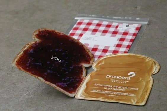
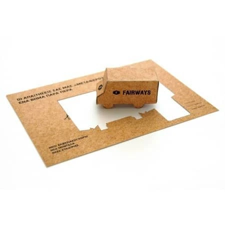
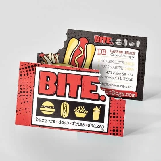
Key takeaway
Cutting direct mail from your marketing strategy because you assume it’s dead is misguided. Direct mail is still alive and well, and there are strong reasons to include it in a well-rounded campaign.
From higher ROI to stronger impact, brands are still reaping the benefits of direct mail today—and so can you. Bring these eleven reasons to your team the next time you’re planning a marketing campaign. They might just be surprised at the results.
Ready to build your own campaigns in minutes? Learn more about the direct mail features in Lucidpress, and give it a test drive.
Everybody loves a good poster. From colorful movie posters to out-of-the-box wood cut prints and more, there’s something about this versatile medium that always grabs our attention. Still, creating a memorable design can be challenging. Unlike a magazine or flyer, you’ve got much less wiggle room to include information, and your graphic elements need to immediately capture someone’s eye. With the right understanding of design principles though, designing an incredible poster for your brand or business can be a breeze.
Working on your own graphic design poster? Take a look through this quick guide to explore our top tips and advice on designing a fluid, unified, and memorable poster.
6 essential elements of graphic design posters
Typography
One of the most important but often overlooked aspects of poster design is font usage. Whether loose and flowy or strict and rigid, your choice of font can go a long way in relaying your poster’s message.
While it may be tempting to pick multiple creative fonts, ideally, you want to choose two or three total fonts for your design. Fonts used for titles should be a display typeface (either creative or sans serif fonts), while fonts used for text should be serif fonts because they are designed for readability. Your chosen fonts should be different enough to be easily distinguishable from one another, but also similar enough to convey a unified design.
We like how this graphic design poster incorporates two main fonts – one to immediately grab your attention, and one to convey more detailed information.
Balanced
The second element of graphic poster design to consider is balance. Balance in graphic design is exactly what it sounds like – how unified and cohesive something looks. When designs are unbalanced, they feel off, and can be uncomfortable or confusing for your audience.
In general, there are two different ways to create balance: through symmetry and asymmetry.
Symmetric layouts
In a symmetrically balanced layout, similar design elements are aligned in an equal way on either side of the vertical axis. This often results in a mirror-image effect, making it a great layout for a formal or static look. If you’re designing graphic posters for formal events, art gallery viewings, or informative gatherings, a symmetrical approach might be just right.
Asymmetric layouts
In an asymmetric layout, balance is achieved with an unequal arrangement of elements. Often, with the asymmetric layout, there could be a large object on one side balanced by a small object on the opposite side.
In general, these designs are more difficult and complex because the visual weight of each element and its arrangement need to be carefully considered. Asymmetric designs appear more casual than symmetric layouts and create excellent posters for rock concerts, museums and personal services.
Below are three excellent examples of asymmetrically balanced graphic design posters.
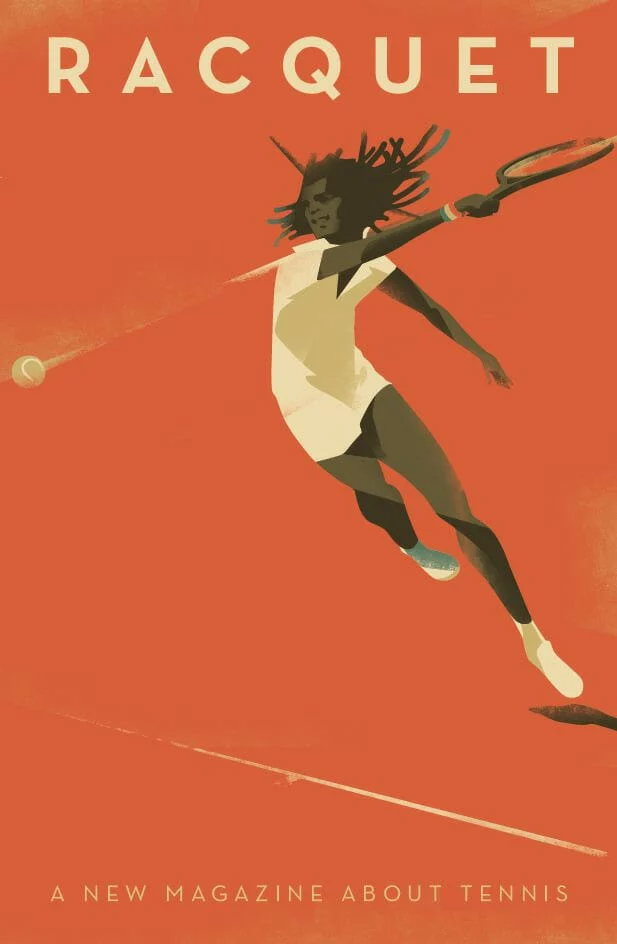
Color
Color is incredibly powerful, not only in conveying meaning but creating a cohesive look and feel to your graphic design poster. No matter who your audience is, color can be universally appreciated and used to communicate a variety of things. Learn more about color theory and color meanings here. When deciding which colors to use, consider how they will look together. Harmonious color schemes are based on balance, and can help tie your poster together. Below are a few different types of harmonious color palettes:
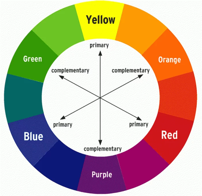
- Monochromatic palettes are limited to tints and shades of a single color
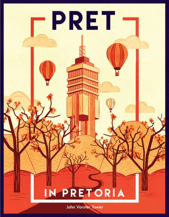
- Complementary colors color palettes include colors that are opposite to each other on the color wheel, such as red and green, or blue and orange. These color pairings can often look intense or bold.
- Split complementary colors occur when hues in a color scheme are equidistant from one another on the color wheel. For example, green, red-orange, and red-purple.
- Analogous color combinations
Contrast
Like balance, contrast is an essential element in creating a memorable, easy-to-look at poster. To create contrast, place two elements in opposing ways. This helps draw the eye and create a focal point within your design.
The elements you can use to create contrast include shapes, colors, lines, size and negative space. In the image below, you can see how the juxtaposition of distinct colors makes certain elements stand out.
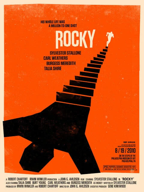
Poster design hierarchy
In addition to contrast, utilizing visual hierarchy in your poster design can also create a focal point. Visual hierarchy is the arrangement or presentation of elements in a way that implies importance. Put simply, it provides an intuitive direction for your eyes to move from most important information to least important information.
Here are a couple of ways to create hierarchy in your design:
- Alignment
- Size and scale
- Color and contrast
- Leading lines
- Negative space
- Repetition
- Proximity
Here’s a great example of a poster using the size, scale, and color/contrast of its typography to create a sense of visual hierarchy.
Shapes in poster design
A seemingly basic element, shapes have the power to help create a path for your eyes to follow as they scan a poster. When used intentionally, shapes can also give emphasis to the most important information in the poster. For example, designers often place text in front of squares or rectangles to draw attention.
Shapes can also alter the mood of your design. Softer shapes with curves, circles and organic lines can create a more fluid and relaxed mood.
Take the easy, breezy, flowing lines of this St. Tropez poster, for example:
Triangles, squares and other geometric shapes with sharp edges, on the other hand, are often associated with more serious, elevated, or masculine ideas.
5 graphic design poster templates to help inspire you
University poster template
With a bold color palette and a clear place for your call-to-action, this poster template makes a great choice for universities and educational centers. Just swap out your logo and choose a picture that best represents your school.
Duo campaign poster
Great for speaking engagements, local government, or other events, this template makes it easy to grab attention quickly with its asymmetric design.
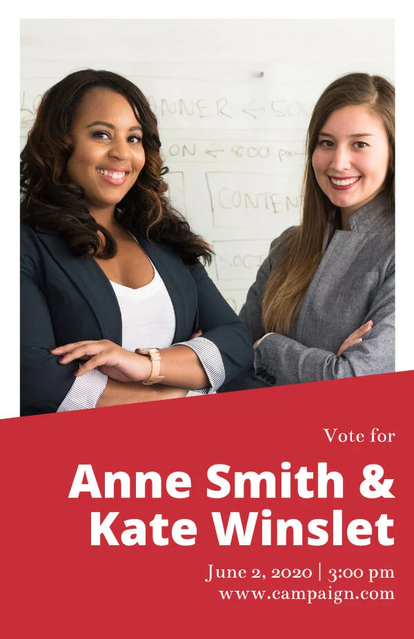
Nature retreat poster
Inspired by the layout of print magazine covers, this informal, slightly whimsical poster template is super versatile – especially when it comes to drumming up hype for events.

Into the unknown movie poster
Sometimes the best way to make an impact isn’t through your messaging. If you’ve got a beautiful piece of art or photography you want to showcase, this is the poster template for you.
Cobalt café e-poster
Great for highlighting visual businesses like restaurants and real estate, this balanced poster template makes it easy to highlight your unique brand imagery and provide detailed information for readers.

Ready to design your own poster? Explore our full free template library here.
Struggling to find fresh ideas for your next catalog? Does your existing approach to catalog layouts need a modern update? Despite the abundance of email and online marketing campaigns, catalogs still hold a vital place in communicating the style and purpose of your brand. From print brochures and booklets to online product catalogs, a dynamic, well-designed layout can make a significant impact on potential customers and clients.
Fortunately, you don’t have to go back to the veritable drawing board to come up with fresh catalog design ideas. Lucidpress has a customizable, easy-to-use collection of catalog templates that can be adapted to meet your needs no matter the industry or audience. Whether you’re looking for innovative product catalog design ideas or gorgeous, glossy catalog cover inspiration, our templates have you covered.
Check out the Lucidpress catalog creator to get started.
6 catalog design ideas to consider
When your catalog needs a refresh, look no further than the Lucidpress catalog template collection. Our customizable templates feature modern graphic design elements that can punch up the playful or create a sleek new look for your next campaign. Below are a few product catalog design ideas featuring bold branding and unique catalog cover design ideas that’ll transform your approach to print and online catalogs.
1. Let visuals lead
Our kid’s catalog template can be adapted to any approach where you want impactful visuals to do the talking. With minimal text overlaid against full-page photos, this catalog puts images front and center without the distraction of competing graphic design elements. This template is full of product catalog design ideas that create visual opportunities to frame your brand as an integral part of your customer’s daily life.
2. Play with patterns
Product catalog design ideas don’t have to be boring or minimalist. Playing with patterns or pops of color can provide a unique approach to catalog cover design ideas. This product catalog template maximizes the impact of a colorful pattern as a backdrop and then carries those same graphic design elements throughout the pages. This is one of several creative product catalog ideas in our template collection that leverage the use of color and pattern to create bold branding.

3. Choose clean design and modern lines
Put your products forward without the fuss. Our contemporary furniture catalog template offers clean catalog design ideas that let products shine and can be adapted to suit a wide range of items. Customizable page layouts include a large image approach or a windowpane of smaller images that lends flexibility to suit your product line. With modern lines and one of our most appealing, minimalist catalog cover design ideas, this template doesn’t have to shout to get attention.
4. Make it reader-friendly
Got a lot to say? That’s okay. Our catalog design ideas can accommodate extra text or be adapted to become online or print brochures. These high-quality layouts can be the cornerstone of your marketing approach at conferences or on the showroom floor. Whether you’re featuring products or services, this catalog template can be adapted to highlight a few items or expanded for a bird’s eye view of an entire product line. Add your own branding elements to this clean, traditional design to create professional catalogs and pamphlets that put your best foot forward.
5. Keep it simple
The strength of your catalog graphic design is defined by what’s on the page but also by what isn’t. Catalog cover design ideas like this template utilize blank space to create a breezy, beautiful layout perfect for a boutique brand. Sixteen pages of customizable templates mean you can show off highly stylized photos and explore catalog cover design ideas that create impact. Whether you’re an up-and-coming hipster brand or a company looking to embrace a new aesthetic, our boutique catalog template provides the space for your brand to find its voice.
6. Go bold with branding
This outdoor-themed catalog template isn’t just for sporting gear. It can be customized to tackle all kinds of product catalog design ideas, from clothing to housewares and more. This template’s perfect blend of visual content and graphic design elements creates a drag-and-drop catalog that is surprisingly adaptable for whatever adventures your campaign wants to take on. Go wild with your own brand colors, logos, and product layout pages and see where this catalog template can take you.