Before you start designing, you need to know what you’re going to say. Starting with an outline helps you get a good idea of the text you’ll be using on your slides, as well as the visuals that support your ideas. If you don’t know the information you’re going to present, it’s difficult to choose design elements that support it. So, spend some time thinking about your main points—you don’t need to get everything down, but make sure that you cover at least three main ideas for your presentation.
How to design presentations
Designing presentations isn’t easy. But with these 5 simple pieces of advice, you’ll avoid common mistakes and learn the best practices for creating great presentations. Marq makes it easy to design beautiful presentations in our intuitive online editor. Choose your slides from a lineup of professional templates, then customize the content to match your unique vision.

Haven't signed up yet?
Give us a try.
 Sign up with Google
By signing up you agree to our Terms of Service and Privacy Policy
Quick and easy
Our intuitive, drag-and-drop editor makes creating on-brand content quick and easy.
More features
Grow your brand
Advanced template locking empowers team members to customize co-owned templates — without going off-brand, in turn helping ensure content remains consistent.
More features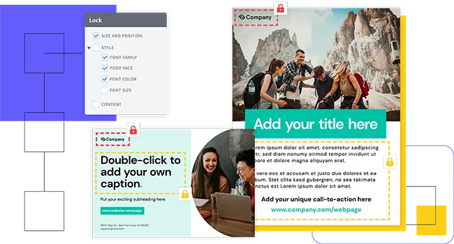
Empower your team
Share templates and brand assets with multiple team members and assign team roles to control who has access to what.
More features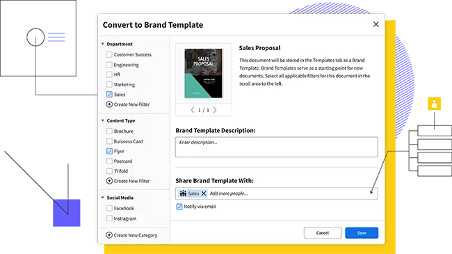
Purpose of a presentation
It’s good to remember what you want your presentation to do: share information efficiently and in an aesthetically pleasing manner. But it’s also important to keep your slides from distracting your audience. Keep that in mind while you’re designing. It’s easy to get carried away, and that results in presentations that are hard to follow. Let’s look at how to avoid that.
How to make a presentation
Step 1: Outline your presentation

Step 2: Think about tone
The tone of your presentation has a strong effect on your design decisions. If you’re going for a business-like tone, for example, you might not choose a flowery theme, and you might use more jargon and complicated terms. If your presentation is going to be light, airy & funny, you need to know that up front so you can make the right decisions along the way. Don’t be afraid to use a tone that’s different from what you might think of as “normal.” Business presentations can be informal, boring subjects can be made entertaining, and experience can be shared in novel ways.

Step 3: Choose a palette
With your outline and tone figured out, you can move on to design. First, you’ll want to decide on a color palette. Choose one or two main colors, and two or three secondary colors, to use in your slides. It’s good to use the basics of color theory to mix colors (hint: Adobe’s Kuler tool is a great way to discover color combinations). And keep your tone in mind; if you’re aiming for a fun, energetic feel, warm colors will suit your presentation well. If you’re aiming for a more professional tone, blues and grays might be more appropriate.

Step 4: Emphasize one point per slide
This is where many of us go wrong. Too often, we include tons of information on each slide—and sometimes end up reading from the slide instead of speaking extemporaneously. This is a recipe for a boring and forgettable presentation. Think of slides more like your notes: each slide should focus on a single idea and contain no more than a few lines of text. This ensures that your audience focuses on you, that you focus on your audience, and that you remind yourself of the main points you’re trying to get across. Seth Godin says you should have no more than six words on a single slide. Challenge yourself to meet this guideline.
Step 5: Make it visual
Appealing to the emotions of your audience will leave a strong impression and help them to remember what you said. Words are great for inspiring emotion—but pictures are much better. We strongly recommend using professional stock photos, like those from Unsplash or Pexel. You can use other visuals, too. If you’re emphasizing the growth of a particular value or figure, a simple chart will impress upon your audience just how much growth you’re talking about. As with words, keep your graphics simple and to-the-point.
Ready to make your presentation?
Once you’ve put these items together, you’re ready to give your presentation. All that’s left to do is practice your delivery and wow your audience. Don’t forget that we have a whole gallery of professional presentation templates available for free. Simply customize the design and put in your text, and you’ll have a killer presentation in just a few minutes.