Since the time of Pythagoras and Euclid, the idea of a Golden Ratio—dimensions that are pleasing to the eye—has influenced mathematicians, artists and philosophers. The ratio of approximately 1.6:1 can be seen in the Notre Dame cathedral and the contemporary architecture of le Corbusier. Products from widescreen televisions to light switch covers copy this ratio. It would seem that a sense of aesthetics is inherent to the human condition.
Related: 8 black branding & design experts you should follow
Incorporating great design into your business model can seem like a daunting task. It can be difficult to know where to begin. Whether you work in development, management or communications, it’s important to know that good design is good for business. A consistent look can build your brand and establish trust with consumers and tastemakers. Communication platforms, from websites to print media to social networks, incorporate design on both the visual and product levels. Just like the Golden Ratio that repeatedly appears in art and nature, there are simple aesthetic principles you can follow to improve design in your messaging.
Elements of design
Here’s an overview of basic design principles to keep in mind as you create documents for your business.
Composition

This is how elements on your page are organized. It’s important to nail page composition to keep your audience engaged. This year, most of the major newspapers have revamped their websites to incorporate more white space and have fewer distracting boxes. The mobile revolution has significantly impacted how designers think about document and webpage design, with a move towards flatter UIs and minimalism.
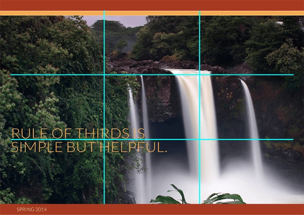
The rule of thirds
This handy rule of thumb can keep your photographs and documents looking balanced. Divide your canvas into thirds, like a Tic-tac-toe board. Your focal points should be at the intersections. Chopping your canvas in half can make it look clunky. When images follow the rule of thirds, they look better. Notice how the waterfall follows the grid lines.
Space and balance
On a canvas, there is positive space filled with text, shapes and forms. Then there’s negative space, which is the empty space around the text and forms. Not carefully considering the negative space can leave a page cluttered and unreadable. Margins are a form of negative space, as are gutters between columns.
Does your page have balance? One of the oldest principles of design is symmetry. This means that one side of your canvas mirrors another. You can see symmetry in building facades, human faces and book covers. You can balance out an image with a block of text.
Proximity

What are the focal points on your canvas? Think about the visual connection between different elements of your design. Match the size of a text box and a photograph. You can make all your images black and white to unite the elements of your canvas. Use a consistent template in a multi-page document.
Contrast and similarity
Bright colors pop against grays. Google uses the principle of similarity and contrast in their ever-changing Google doodle: a new design each day spelling out the same six letters.
This may seem to be a paradox—should a designer aim for sameness or difference? Audiences rely on continuity: when it comes to typefaces, think Times New Roman in the New York Times, or Helvetica in transit systems. Coca-Cola is associated with red, Google with primary colors, and Apple with neutrals like white and silver. On the other hand, a sense of surprise can draw your viewers in. Using a contrasting font in your header makes it stand out.
Alignment
Aligning the elements on your canvas helps to create order and organization. Just as it’s easier to find a pen or notepad on a well-organized desk, it’s easier to scan a well-aligned page. Try using a grid or guides to lay out your document. You can also place your objects on the canvas then align them once you’ve gotten them how you want them.
Typography
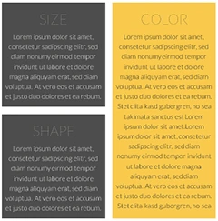
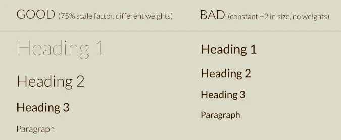
Although it’s easy to think of text as separate from the visual elements of your design, typography has its own rules. Your readers will notice everything from the style of your ampersands to the size of the ascenders and descenders. Don’t let your text formatting be an afterthought. For instance, follow the instructions in this image to choose font weights and sizing for headers in your document.
Color theory
Color is everywhere and deeply tied to emotion, yet it can be strangely overlooked by those putting together documents or sites. In the early days of the web, there were limited color palettes supported. Today, the possibilities to incorporate color are nearly limitless. Browsers and mobile apps are constantly improving in the sharpness of their displays, and modern printers can print documents with amazing clarity and range of color.
Understanding some fundamentals of color theory will help you become a better designer. Warm colors pop and cool colors recede. A tinted color has white added in, while a shaded color has black. Different color scheme possibilities for your document include monochromatic, analogous and complementary. This color scheme has both warm and cool tones:

Grow your business with good design
While these points seem interesting, you might not be convinced that pleasing design will affect your bottom line. Thoughtfully approaching the design of products, documents and sites can yield big dividends. Design-centric firms have a higher growth rate than average. As consumers are exposed to more and better layouts, they have higher expectations. You can meet and exceed those expectations by implementing a design strategy at every level of your business.
How can Lucidpress help?
Lucidpress is a cloud-based layout editor that has built-in templates designed with these principles in mind. You can create posters, brochures, Facebook banners, and magazines perfect for the digital age. Colors, fonts and alignment are carefully composed from the start but still allow a high degree of customization. Best of all, Lucidpress is free to try. You’ll be blown away by its browser-based capabilities and intuitive editor. Start designing documents that would make Pythagoras proud.
